Showing posts with label Describing Daredevil. Show all posts

Monday, 10 November 2014

Describing Daredevil #9

Or a look at a super effective page from Daredevil #9
by Mark Waid, Chris Samnee, Matt Wilson, and Joe Caramagna; Marvel Comics


Daredevil continues to be this consistently great comic that I read. The stories are always interesting and the book is always technically and visually dynamic. And  it always feels fresh, despite having a fairly a consistent creative team and being involved in a prolonged storyline. It's a comics work horse.

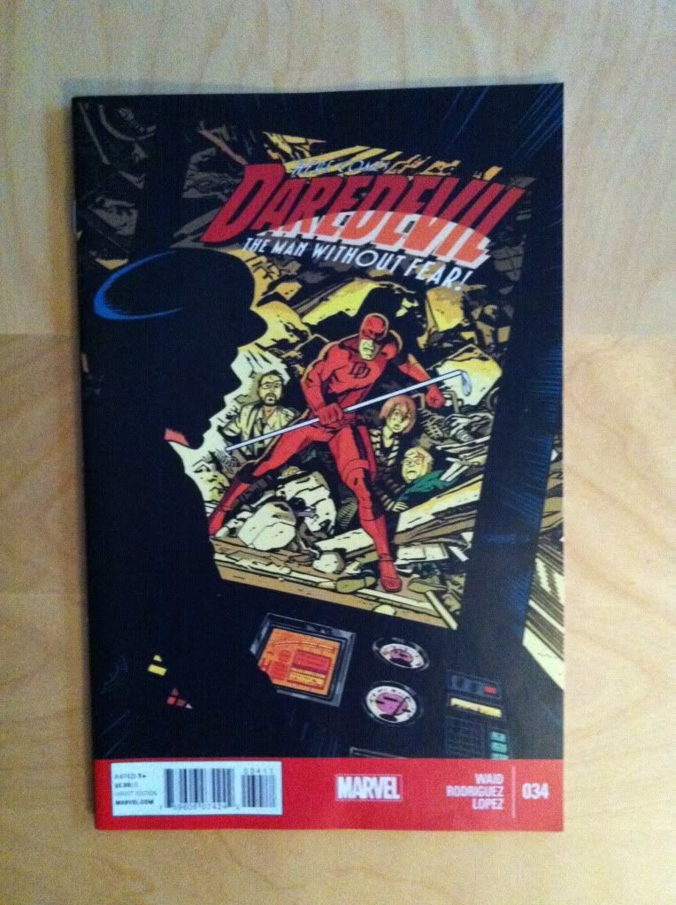
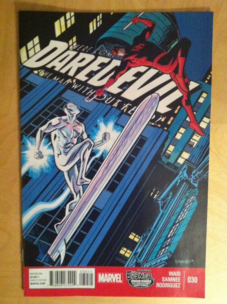
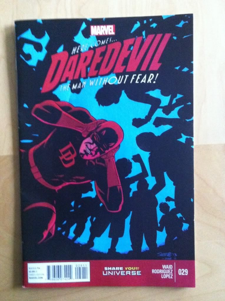
(Also how great is this cover? It sells the peril Daredevil faces from the mind-controlling Purple People in a way that tells you everything you need to know about the Purple Children and their relationship to the Purple Man. I don't like most comics covers, but I love this one.)

One of the strongest aspects of Daredevil is it's thoughtful approach to storytelling. Team Daredevil create some really compelling and really smart pages in their comic that are frequently worth taking a longer look at. Daredevil #9 has one of those great pages and I want to take a longer look at it.

There will be *SPOILERS* for Daredevil #9 below.


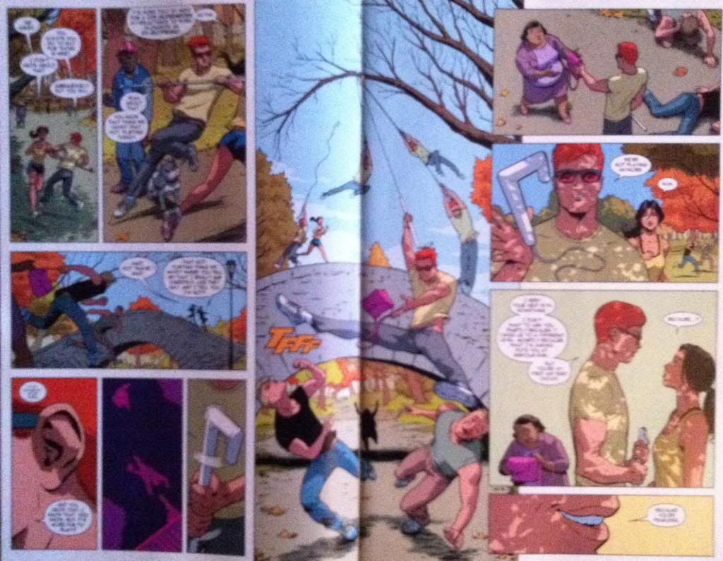
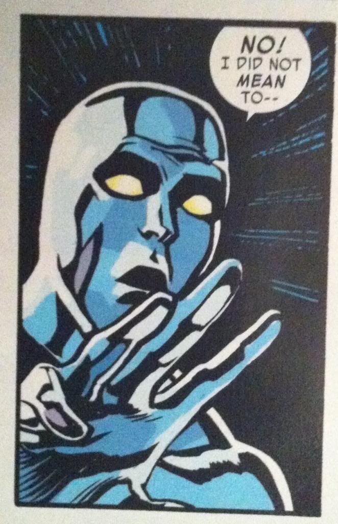
The story of this page is that The Purple children, with their mental powers, are leaking their own traumatic pasts and affecting everyone around them. Daredevil, who has his own tremendously dark history, something he has been striving to work past, finds this mental leak overwhelming and finds himself succumbing to his own despair. It's basically a weaponized empathy. It's a strong story beat that I'm definitely interested to see play out in the series. 

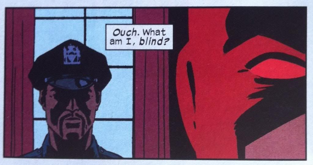
This page here makes this story element really come alive, and I feel like every single compositional element of this page is perfect to sell the experience of traumatic empathy. From a layout perspective we have stacked panels depicting parallel events with half faces placed along the inner edges of the panels. What this does is directly tells us that the Purple Child and Daredevil, whose half faces are pressed together, are remembering the similar events in the background, simultaneously and experiencing the same negative emotions. This effect is reinforced by the colours, which depict the two parallel panels with swapping analogous colours: red Daredevil with purple backgrounds, Purple Children ad red backgrounds. The analogous colours harmonize with each other to create a similar mood, and the use of the same two colours in both panels help emphasize that the characters are experiencing the same emotions. Yet, at the same time, the fact the colour palettes alternates helps to subtly differentiate the two panels: Daredevil and the Purple Children are all feeling anguish, but each specific memory is personal to the character remembering them, one is red and one is purple. And then there is the lettering which also helps with this effect by alternating sides down the page and dropping only one caption per tier of paired panels. What this does is it makes the reader treat each paired tier as a single story unit that takes place in the same moment, and that the "pain" and "loneliness" being narrated is true to both sides of the page, to both the Purple Children and Daredevil. The caption placement also forces the reader to scan back and forth across the page to quickly take in the events and faces on either side of the page to reinforce the association. It's every aspect of the comic working to create this feeling of terrible empathy.

But this page has even more worth looking at. Like, the gradual zoom in on the faces as the page drops down helps sell that the emotions are intensifying in Daredevil. Or the choice of purple for the colour of Daredevil's painful memories maybe insinuates that is an effect of the Purple Children's mind powers. And I absolutely love how Daredevil raises his fist in the last panel, creating the sense that he is getting ready to fight off the emotional weight and be heroic, before this is dispelled dramatically as he crumbles on the following page. This is just such an excellent page of comics.

Daredevil is a feat of collaborative comics, and I am still really enjoying it.

Post by Michael Bround

Previously:
Describing Daredevil 3: onomatopoeia 
Describing Daredevil 34: before and after
Describing Daredevil 33: condensed motion
Describing Daredevil 30: the vectors of artwork
Describing Daredevil 29: A great page

Monday, 2 June 2014

Describing Daredevl #3

Or some pretty excellent onomatopoeia in Daredevil #3
by Mark Waid, Chris Samnee, Javier Rodriguez, and Joe Caramagna; Marvel Comics


Daredevil is one of the most consistent comics in my top ten: it is always good. The stories from are fun and exciting and usually revolve around some thematic aspect of Daredevil's blindness. Couple that to some of the clearest storytelling in comics from Samnee and Rodriguez, and Daredevil just does not disappoint. One of my favourite things about Daredevil, is how the creative team works to represent Daredevil's powers in really interesting and innovative ways with topographic radar vision and some really adept use of onomatopoeia. Daredevil #3 has some really great examples of the use of sound effects I'd like to take a closer look at.

There will be *SPOILERS* for Daredevil #3. Typey typey type.


Usually I'm not a terribly big fan of onomatopoeia in comics (or typing it). When done poorly, it can look tacky and be a distraction from the dialogue and the acting in the panels... it's extra telling instead of showing. But in Daredevil it's just so thematically appropriate and handled with such skill that I kind of love it. From the blocky mechanical lettering of the gun action noises to the long, bright green arc of the whistle (itself dragging attention to Matt like a real life whistle) to the italicized, shakey sound of the phone vibrator, to the panel commanding in-your-face size of the SLAM, to the low-to-ground progression of the stomping, it's all perfect. In each instance the location, shape, size, and font of the lettering captures the emotional feeling of the sound. It really adds a lot to the comic.


While this is not onomatopoeia, per se, it's in a similar vein and I love it. The sort-of dialogue box with the deathstare symbol really captures the emotional weight of getting eye-knives thrown at you. A properly good glare is able to convey, non-verbally, a paragraph of information and the decision to give the glare here a dialogue box is very cognizant of this. A top-level deathstare also doesn't feel like just a person glaring at you, it feels like an entire universe of negative attention directed your way. So I think it's really adept that the deathstare logo means that Foggy is caught in the crossfire of two glares. The jolly-roger glare is such a small choice, but it really makes this panel and character interaction work for me. 


But this, this is my favourite bit of onomatopoeia in the entire issue of Daredevil #3. I had previously written a big long thing about why the ECG squiggle that is synonymous with heart sounds in comics bugs me because it's actually a symbol of the electrical signalling of the heart and has nothing to do with sound. It especially bothered me because hearts have a characteristic "lub dub" sound, so there really is no need to use the ECG squiggle (it's like using beep-beep-beep sounds instead of heart sounds in a film). But, since the ECG squiggle is so synonymous with heart rate in comics these days, as a symbol that conveys meaning its pretty important. What I LOVE about this onomatopoeia here is that it synthesizes the sound and the squiggle to create a new symbol that is based on sound of a heart beat but still has the ECG symbol that readers know means heart stuff. It's the perfect solution to my comics pet peeve and I fucking love it.

(Incidentally, I would love to know if Team Daredevil read my previous essay on heart sounds and if that had anything to do with the change in heart sound symbology. I'm going to have to go shopping for my next Science gig in the next year and think it would be super fun to have that on my CV...)

Previously:
Describing Daredevil 34: before and after
Describing Daredevil 33: condensed motion
Describing Daredevil 30: the vectors of artwork
Describing Daredevil 29: A great page

Friday, 10 January 2014

Describing Daredevil #34

Or a look at the beautiful transition pages in Daredevil #34
By Mark Waid, Javier Rodriguez, Alvaro Lopez, and Joe Caramagna; Marvel Comics


Daredevil continues to be one of the most consistently enjoyable Mainstream comics I've been reading. The stories are fun and unpredictable, and the artwork is always amazing and I am consistently left wanting the next instalment. One of the most noteworthy and interest aspects of Daredevil is the high level of design and technical storytelling that is present throughout the series. Daredevil #34 contains some great examples of design that make some excellent transitions worth a closer look.

There will be some mild *SPOILERS* for Daredevil #34 in this post.


My favourite sequences in Daredevil #34 all have to do with transition sequences where the left side of the composition portrays one status quo, a dramatic event occurs in the middle that changes the situation, and a new status quo is established on the right side of the composition. This double page spread here essentially shows the transition from Matt-Murdock-as-Daredevil-is-a-flirtatious-game to Matt-Murdock-is-Daredevil-and-a-new-partnership with a beautifully constructed action sequence in the middle. This whole sequence was unexpected and changed the issue, and probably the series going forward. It's great, smart comics.


This sequence here is an even more efficient and elegant transition scene. From a plot perspective this page simply conveys that the Sons of The Serpent rascists have shed their identifying vestments and donned the clothes, and associated authority, or civil authority figures. Part of this page is the balance, we have a group of Serpents in vestmens on the left, balanced on the fulcrum of the fire, and then an equal group of undercover-Serpents on the right: this tells us everything we need to know about the plot of this page. But this page has extra elements of construction that elevate the composition even further. For one, the images of the Serpents in either column show a step-by-step story of the Serpents stripping out of their villain-ginch on the left, and putting on authoritative clothes on the right going from top to bottom. Beyond even this, there are extra parallels between the panels on the left and right with images having very direct parallels between the two columns which helps emphasize that even though they are different men in each column, and even if they are dressed differently, they are still serpents. It's subtle but really, really great. This sequence here is a testament to what can be done with well designed, architectural comics.

Previously:
Describing Daredevil 33: condensed motion
Describing Daredevil 30: the vectors of artwork
Describing Daredevil 29: A great page

Friday, 13 December 2013

Describing Daredevil #33

Or some nifty layouts that create big movements in small spaces in Daredevil #33
By Mark Waid, Chris Samnee, Jason Copland, and Javier Rodriguez; Marvel Comics


I am a sucker for an interesting layout or sequence. While I love big grand, mind blowing layouts as much as the next guy, I'm endlessly fascinated by the small blue collar layouts that manage to convey basic storytelling information in especially efficient ways. Because as much as comics is big, crazy double page splashes, it is more often the less exciting business of conveying story and movement in panels and the way creators design the artwork to optimize storytelling is really important.

Daredevil #33 has a couple layouts that are super efficient and worth taking a longer look at.

This will be *SPOILER* light, but you know, proceed with caution.


At first glance this is a pretty simple layout that tells a pretty straightforward bit of action. Daredevil drives his baton/grappling gun into the mummy, fires the grapple through the monster, bounces the grapple through a lantern and threatens the mummy with his greatest fear, fire. And then he negotiates. The thing is, this sequence is deceptively simple and involves all kinds of really clever, small choices to make it as clear and impactful as it is.


The actual motion of the moment happens almost entirely in the vertical direction, but takes place almost entirely in two rows of panels. So the challenge of the storytelling in this sequence is to convey this upwards-to-the-right followed by a down-and-to-the-left motion in a clear way in a small space. And the layout uses a pretty robust tool box to encode this information.


So the first way the motion of the sequence is encoded is the shape of the panels. The two main motion panels are vaguely triangular, which creates the feeling that they are exploding towards the widest end. In the second panel, the one with the upward motion, the point of the triangle is at the bottom, where the source of the motion is and widens out at the top. The downward motion has the opposite orientation. The panels immediately make it obvious that the motion has an upward and downward direction and also make it really obvious the two panels are moving in the opposite direction. It's pretty great comics.


The next encoding device is the grapple itself. A fired grappling hook has two really handy characteristics: it has a grapple head and the actual rope. What this does is it gives a grapple polarity, it provides a visual way to tell what the front of the direction the fired grappling hook is travelling. These characteristics also provide a way to follow the path of the grapple: the rope tells you where the grapple head has travelled. This sequence makes wonderful use of the grappling hook and uses the shape of the grappling hook, and line of the rope as visual guides to lead the audience through the panels. And this makes it really clear the direction and nature of the motion. 

(In fact, these paths are so clear the final panel is read right-to-left in a way that feels completely natural. Which is also pretty darn cool.)

The thing is though, these pathways do more than show the path of the grapple. The guide paths on this page add the feeling of the action taking place. As readers trace the path through the page they actually get to experience the grapple moving up, bouncing, and coming crashing back down. The readers get to slide down the rope in the bottom panel, just like the flames that are creeping down on the mummy. So despite the lack of vertical space in the layout, the panel manages to feel like the motion taking place. Which is pretty great.


This layout also makes really great use of colouring and lettering to help the reader move through the page more efficiently. The page has a drab brown or white background colour, while the key aspects of the composition, and especially the motion, have bright yellow colours and bright yellow onomatopoeia lettering. This makes these aspects pop off the page and helps steer the reader through the motion. The way the lantern is highlighted yellow in the second panel is particularly cool, in that it makes it very obvious that it is the target of the shot. The colouring also really emphasizes the flames as important to the composition in a really effective way. It's remarkable how smart lettering and effective colouring can enhance a composition.

And put altogether this makes for one very effective bit of comics.


The sequence where Daredevil releases his mummy-hostage from his negotiating position is also pretty great and relies on a bunch of the same tricks. A few neat things is that the path is etched out largely by lettering and the handle of the grappling baton as it flies out of the panel. This is really cool in that the speed of the moment is encapsulated by the fact the panel only has the VERY END of the baton. It's as if the thing was moving so fast that the artist wasn't fast enough that he missed the perfect picture. Also, the way the colouring changes from the third to the fourth panel conveys that the lantern is snuffed out, which is pretty clever too. Basically, this is another great, clear sequence of comics.

And there you have it, two really simple storytelling moments told in super effective ways. 

Previously:
Describing Daredevil 30: the vectors of artwork
Describing Daredevil 29: A great page

Friday, 13 September 2013

Describing Daredevil #30

Or turning on and off the flow taps in Daredevil #30
By Mark Waid, Chris Samnee, Javier Rodriguez, and Joe Caramagna; Marvel Comics


Daredevil #30 is this great, kind of a Silver-agey story about Daredevil teaming up with The Silver Surfer to fight a menace. It's a bit goofy, but filled with a lot of unexpected, fun moments and a kernel of despair that sets up what looks like an important plot thread. It's another great comic in a series known for being great comics.

It's also a comic that has some great examples of different approaches to panel progression that I think maybe bear a closer look.

This post will contain *SPOILERS* for Daredevil #30. So read the comic first.


So, I'm pretty interested (obsessed?) with comic pages that exhibit especially fluid or directed storytelling. I'm interested in this because one of the problems sequential storytelling has to contend with is how to make a reader look at things in, well, the right sequence. If character A is reacting to event or character or speech B than the audience ought to see B before A for the best effect. And so the kinds of pages that lead the reader through the artwork in a way that correct queues events can add extra value and impact to the storytelling. Even in quiet talking scenes. And I think this page is a great example of a kind of holistic, natural approach to guiding the reader through events in the perfect order. It's all kinds of subtle, but damn if it isn't effective.


This page works its magic mostly by just framing events, and maybe subtly adjusting, the normal reading path of comics to create the perfect sequence for each storybeat. The view-path starts in the top left (the natural starting point) with the Daredevil-sense-silhouette of Kirsten McDuffie (love-interest/new lawyer partner) and then travels through the two conveniently placed word balloons to the edge of the first panel. You scan right, pick up the perfectly placed word balloon, and track across to Matt Murdock's confused face. You carriage return across the page and crash right into Matt's confused fez before carrying on the same view path to see Kirsten's reaction to his behaviour. You (or at least I) then dealt with this panel's word balloons before moving to the next panel taking in Kirsten standing and the first speech bubble before carrying on to Matt running out of the office and the second word balloon. Which is great because it basically splits this panel into two separate moments adding a sense of time and, as an added bonus, imparts the motion of Matt moving into the hallway. This neat movement effect is continued into the next panel where our eyes sweep around the corner, the actual motion of Murdoch, before crossing the page to the next row which is a continuation of Matts trajectory in this panel.  (Also, notice the split narration caption box adds to this sweeping motion.) The carriage return transition here also has the added bonus of being like a semi-page turn, making the shocked Matt in the bottom left panel suddenly appear adding a great extra weight to the panel. We then carry on across the page in the level of Matt's gaze straight (catching Matt in the next panel to add a nice sense of place) to the unexpected alien visitor. It's just a great page that uses really great layout, figure placement, and brilliant lettering to ensure everyone is seen and everything is read in just the right order while also adding extra drama to key events. It's great comics.

(I also love the use of green, which contrasts sharply with the red of Matt's glasses and hair to punch up the emotions of surprise in the top right and bottom left panels. Colour theory!)


This layout here is also pretty cool. Not because it flows effectively from panel to panel... but because it deliberately doesn't. I mean, if you look closely at each panel there is a clear sequence of events portrayed: Daredevil drives the Silver surfboard up, turns it around, swoops down and around and carries on. But this series of events broken up in a way that adds a lot of chaos to the scene, a haphazardness that really sells that Daredevil is just screwing around and plays on the gag of a blind fellow driving (and maybe also a little bit on New York cabbies who used to take the long way for a higher fare...). It's a really interesting choice. 


How this double page spread works, at least for me, is that the surf board becomes the key guiding shape: the board being a straight guide, and the long swooping contrail acting to impart a directionality to the guide. Basically, I feel like the Silver Surfboard acts as a vector that directs the reader. However it directs the reader not to the next logical location in a smooth series, but instead points in random, even opposing, directions to create the haphazard feelings of the scene.

So starting in the top left panel we have a vector that points not to the next panel, but instead sharply up and off the page as if Daredevil and Surfer are flying off the grid. We then move to the left panel which has a board vector almost perpendicular to the previous one and then move to the third panel where the vector opposes the one in the previous panel. There is no smooth transition from each of these positions and makes it feel fast (too fast to tie together) and random. We then carriage return from the top right panel to the bottom left along the vector of the board in the top right panel, swooping rapidly down along the path of the characters flight (which is pretty great). We then jog right, across a panel split designed only to further dilate time and add a sense of velocity, and see an unexpected downward pointed Silver Surfboard before moving to the final panel with yet another unconnected vector. Basically, to my eyes at least, the layout is a series of directional snapshots that don't entirely sync up but in a way that better sells the dramatic nature of the sequence. It's cool stuff.

So there you have it, two very different pages with opposite approaches to panel flow, one very guided and one deliberately disjointed, that both add a lot of drama to their individual scenes. 


Previously:
Describing Daredevil 29: A great page

Monday, 12 August 2013

Describing Daredevil #29

Or a wonky look at a great page in Daredevil #29
By Mark Waid, Javier Rodriguez, Alvaro Lopez, and Joe Caramagna; Marvel Comics


I really like Daredevil. It has reliably been an excellent comic. Mark Waid has a fresh take on the character, plays with some really interesting themes of blindness and revelation, and has the exciting habit of writing himself into corners. And the artwork has also been consistently excellent with a stable of talented artists including wizards like Marcos Martin, Paolo Rivera, and Chris Samnee. Daredevil always looks great and is editorially very well curated. Daredevil was one of my original top-ten comics, and I have always felt like it was worth it.

I haven't written about Daredevil before, because well, I haven't had anything particularly substantiative to say beyond "it's good" or "it's really good". But while reading Daredevil #29, a particular page jumped out at me as being particularly efficient and great, and I want to pick it apart. 

There will be *SPOILERS* in this post of Daredevil #29. Please go read the comic, I'll wait.

One of the things I find interesting about comic book art is how it has to convey, in just a few images, a huge amount of narrative information. The artwork has to portray the actions of the story: the events that occur and their sequence. Art has to establish the setting and give the portrayed events a sense of place. The art has to show all of the acting of the characters: how they move through the space, their body language, their expressions. And artwork also can establish the mood and atmosphere of the scene through colour selection, and style, and creative choices. And all of this has to be done as efficiently as possible.

I think this page here is a great example of effective and efficient comics storytelling.


Everything we need to know about this section of the story is captured in just four panels. To the point where I don't think I even need to "set up the clip" with any other story context: Daredevil and another guy are trapped at the top of the stairs by armed, SWAT looking people, and jump down the stairwell shaft to escape them. It's all on the page. How all of this is set up is brilliant and worth examining.


Like most remarkable pages, the foundation of what makes the page so effective is layout. The vast majority of Daredevil #29 is done in full-width panels with most pages split into three to five layers. The stairway panels on the page I want to look at all span the whole height of the page and split the page into three columns. What this does is change the comic from a horizontal, on-a-single-plane story into a vertical story. Which helps to establish the setting of the stairwell, and the atmosphere of teetering on the top of a great height. It's great.

But there is so much going on than just tall panels.


Panel 1 has the job of establishing the situation of the page. On the most basic level it shows us that Daredevil and the guy are at the top of a stairwell and that SWAT looking people are below them on the stairs and aiming weapons at them. But panel 1 does some other pretty neat things. For one, it feels like it is made of two implied panels. We come into this page and read the caption box on the most extreme top left corner, and then see whats up with Daredevil and guy and their dialogue which is all tightly packed around it. This top section of the page feels like its own moment perched on top of a long drop which sets up the feeling that Daredevil and guy are at the top of the stairwell. After dealing with the top implied panel, we look down the page and stairwell and see the SWAT-guys at the bottom of the page which again helps make the situation feel heighty, tells us the SWAT-guys are below Daredevil, and is actually part of the action of Daredevil and guy as they survey their position. But wait! There's more. The page also has two distinct planes: a distant one with Daredevil and guy, and a foreground one with the SWAT-guys. Therefore it feels like the SWAT-guys are BETWEEN us and Daredevil, who is smooshed into the top section of the panel, which conveys that Daredevil and guy are trapped by the SWAT-guys. This panel is great comics.


The second panel is just this truly inspired choice of viewpoint. The look down the stairwell gives this perfect sense of place for this scene that allows us to see how deep the stairwell is, how Daredevil and guy spatially relate to SWAT-guys, and exactly how their escape motion works. Speaking of the escape, this perspective allows the creation of an invisible line that follows Daredevil from the top landing, to his falling position, and onward to the vanishing point in the centre of the stair. You instantly get the path of their escape, actually looking DOWN it, which additionally helps convey the motion. All of this Daredevil motion takes place in the top 1/3 of the page, with the rest of the page below being fallow space action-wise, emphasizing the height of Daredevil's actions. The speed of the action is also encoded in an interesting way: we see two snapshots of Daredevil with no motion from the SWAT-guys showing that his dive off the landing was so quick that they didn't have time to react. The SWAT-guys also are arranged, motionless, in the fallow bottom of the page, which from a narrative perspective helps to emphasize that they are being left behind, that Daredevil is succeeding in escaping the SWAT-guys. More great comics.

(I once worked in a building with a 12 storey floating spiral staircase, because DNA, and I can't look at a down-stairwell shot without thinking of that perspective. Everyday I wanted to take a bouncey ball to work and drop it down space in the middle. Everyday.)


The third and fourth panels work together to convey the moment of the escape. The top panel portrays the Daredevil's grappling hook latching onto a railing. It is a very specific and key moment that turns Daredevil and guys dive from a desperate move, to a planned escape. As a separate panel, it conveys that the grappling hook is set before the diving scene depicted in the bottom panel, and given its position on top of the fourth panel, that this event occurs above the diving Daredevil. The bottom panel is all about diving and speed. Part of this is its location and simplicity: we look down from the top panel and can pretty seamlessly look down the panel all the way to Daredevil's face (near the very bottom of the panel). We get one long, relatively quick, downward eye motion which matches the motion of the dive. This sense is enhanced by the bullet lines: they add directional vectors in the same direction as motion which helps drive the downward eye motion. (Also, how great is the "BLAM" lettering, which conveys directionality to the lines, identifies them as bullet trajectories, and, by font size and layer arrangement, the position of the bullet paths!? I love it!) The speed of the dive is also emphasized by the lack of background: fewer details to slow our experience of the panel and all we see are objects/bodies in motion. Daredevil is falling on the same timescale as bullets whizzing past. It's more great comics.


That was a lot to unpack, but it's mostly invisible. Put all together we have four very effortless looking panels that quickly, and efficiently move us through the events with tremendous emotional weight. Rodriguez, Waid, Lopez, and Caramanga, create a really great page in a really great comic. It's concise, beautiful, and effective comics.