Friday 29 November 2013

Deep Sequencing: Hunting Wild Game

Or breaking conventions to enhance storytelling in Sweet Tooth: Wild Game
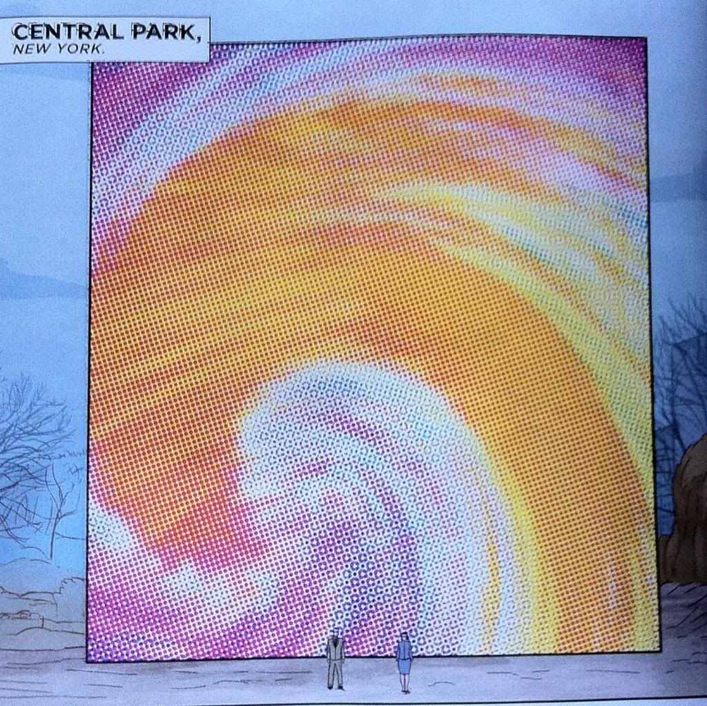
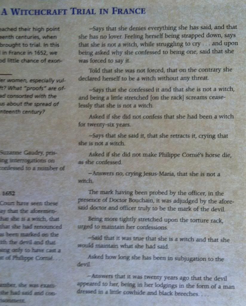
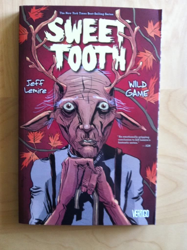
By Jeff Lemire; Vertigo Comics.


One of the essential characteristics of comics is that they follow a series of rules. The story is broken into images that contain text in a number of formalized boxes and balloons. The sequence of images, for American comics, run from top left to bottom right, moving across the page and then down a row. The pages are arranged in an order that goes from front cover to back cover. The point of these conventions is that everyone, readers and creators all, understand the basic structure of the narrative so that readers can focus on the story itself instead of exerting effort trying to figure out how to read it. It means that you and me can read a comic and pay absolutely no attention to how the comic works and still get a really great story.

The thing is, sometimes the conventions are not the best way to tell a particular story or sequence of events. Sometimes more dramatic information or atmosphere can be conveyed by breaking the rules and making comics that present the sequence of events in unpredictable and interesting ways. Of course, the trick to doing this is to create unconventional comics that don't confuse the readers. Sweet Tooth: Wild Games has a couple great examples of breaking the rules to make interesting comics.

This post will contain *SPOILERS* for Sweet Tooth.  


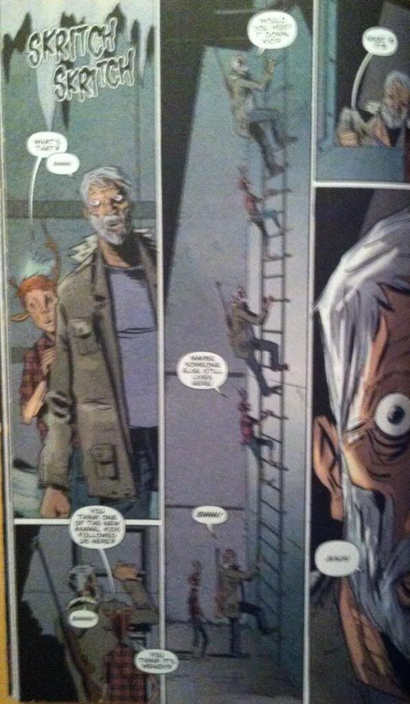
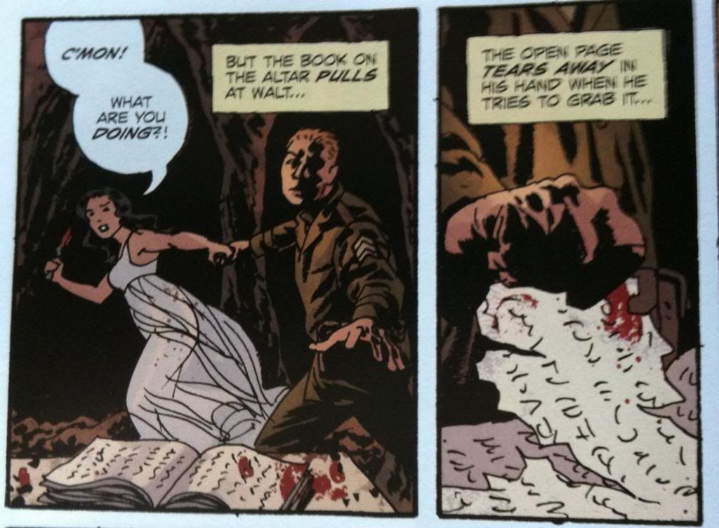
This page breaks the rules in a really simple, but effective way. The magic here is that instead of moving from the top left corner to the bottom right, the comics page has characters and events move from the bottom of the page to the top against the flow of conventions. This is pretty neat in that we literally get to travel up the ladder with the characters along a tall thin panel. The way this page leads readers through the unconventional ladder climb is pretty interesting too. Basically, this trick relies almost entirely on the speech balloons as a visual guide: in the bottom left panel, the speech balloon peaks into the tall middle panel which guides into the right starting point for the ladder climb. Then of course the speech bubbles along the climbing route keep everything on track. This sequence is rule breaking comics that elegantly enhances the moment, all while leading the reader through the page. It's simple, great comics.


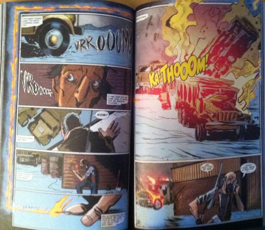
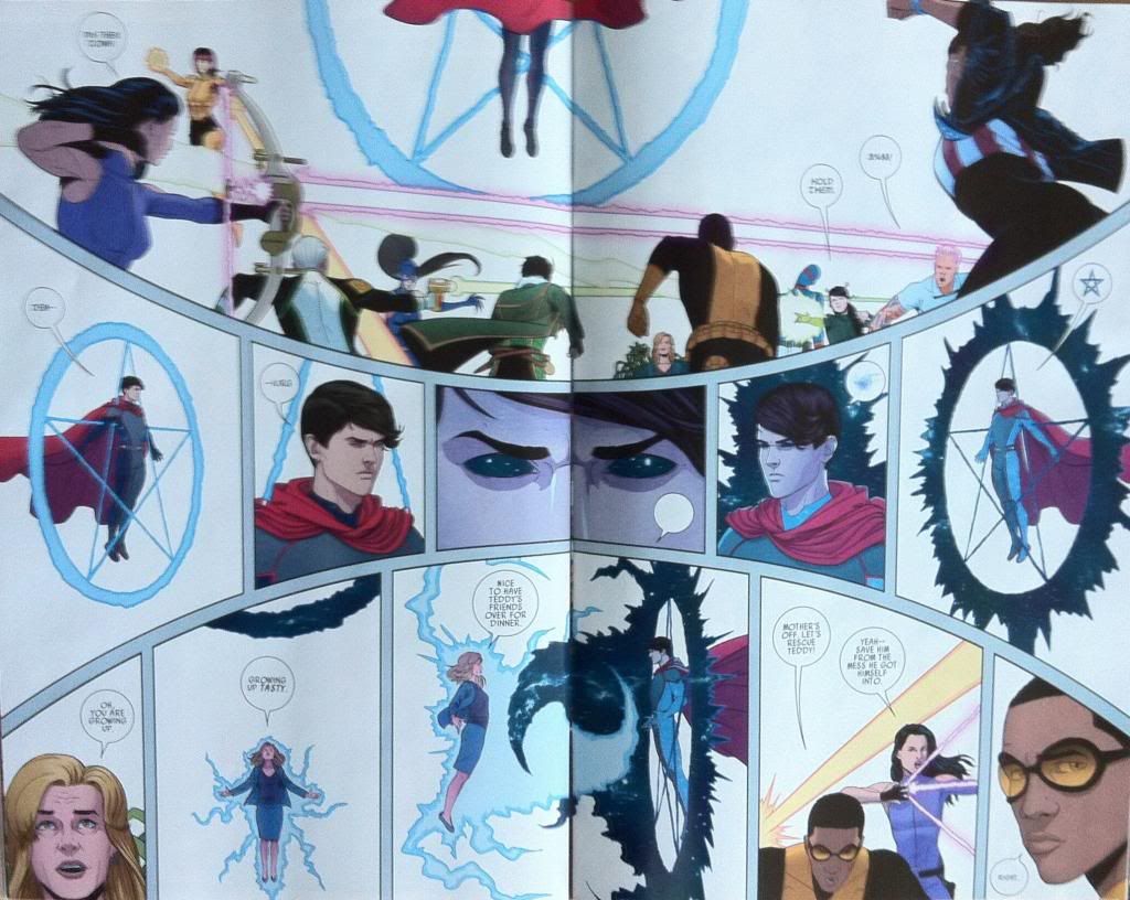
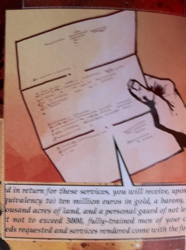
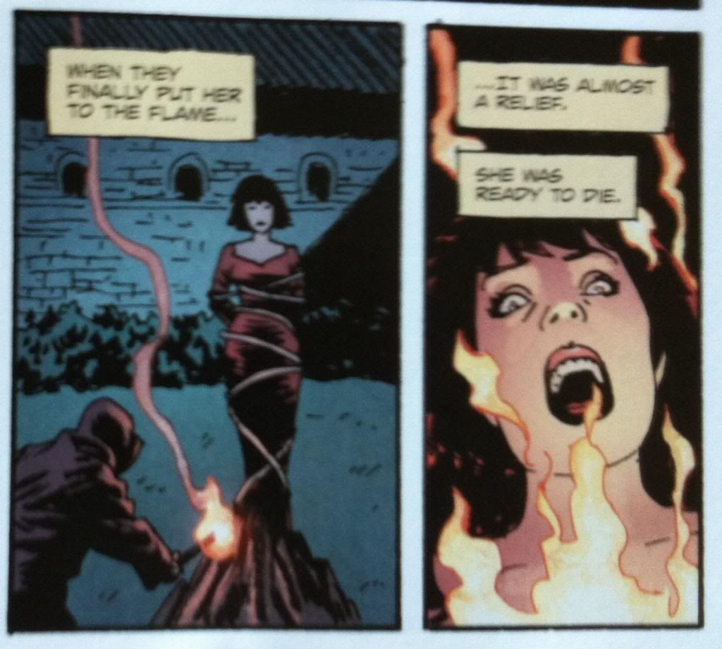
This double page spread does something even more unconventional and dramatic. In short, a trap is sprung that sees a series of hidden explosives destroy an incoming militia convoy. The convention breaking razzle-dazzle to this spread is the fuse, which does some pretty cool things. Rather than have the fuse go from left to right into the page gap seam, the fuse goes right to left, travels up the page, and then left to right across the top of the page. This does three really cool things. First it drags out the moment: like a real fuse which races breathlessly to an explosive the fiery line depicted here is so long that it holds the readers focus for the length of a real fuse. Second, the fact the fuse line in the comic runs from its origin to the explosion actually lets the audience trace the path of the burning fuse, which imparts a sense of time and motion to the fuse which adds so much drama. It's like the comics equivalent of the camera panning along the burning fuse in a movie. Third, this approach makes the explosion itself much more dramatic: by taking the reader the long way to the next page, the fuse stops the reader from getting to the explosion too quickly. Moreover, the fact the fuse breaks rules and requires extra reader concentration helps make the explosion pay off more... it's like a form of delayed gratification. This is a really, really great rule breaking sequence that hugely improves the sequence depicted.

So there you have it two convention shattering sequences from Sweet Tooth: Wild Game that exemplify the value of breaking the rules sometimes and how to do so in way that keeps reader in the loop. It's great comics.

Wednesday 27 November 2013

So I Read Sweet Tooth: Wild Game

A 250 word (or less) review of the sixth, and final, collection of Sweet Tooth
By Jeff Lemire; Vertigo Comics


There will be mild *SPOILERS* for earlier Sweet Tooth collections. For a *SPOILER* free review, please go here.

Sweet Tooth started as the story of Gus, a deer/human hybrid, and Tommy Jepperd, a hardened human survivor, as they attempt to stay alive in an apocalyptic future that sees humanity ravaged by a mysterious plague. As the comic progressed we learned that Gus may be more than another strange kid born after the plague, but may instead be an important factor in solving the origin of the disease. Sweet Tooth: Wild Game is the final chapter in the story and sees Gus, Jepperd, and their adoptive family finally reach Alaska and the secret government lab that Gus originated from. In this collection we see all mysteries solved, all scores settled, and a pretty satisfying end to a great comic. Sweet Tooth: Wild Game is as creepy, tense, and as heartfelt as everything that came before and manages to make a great final statement on the meaning of family in the face of adversity. I love a good ending. If you haven't tried Sweet Tooth yet, you owe it to yourself to give it a shot. The whole series is waiting for you.

Word count: 183

Previously:
So I Read Sweet Tooth Volume 1-4
So I Read Sweet Tooth: Unnatural Habits (Vol. 5)

Monday 25 November 2013

Favouring The Young Avengers #12 Pt. 1

Or more innovative page layouts from Young Avengers
By Kieron Gillen, Jamie McKelvie, Mike Norton, and Matt Wilson; Marvel Comics


One of my favourite things about Young Avengers is just how experimental it is. Nearly every issue of this series has had some example of artwork or design or layout that I've never seen in a superhero comic before. And the way these novel layouts, especially, are married to narrative to convey additional story elements or emotions is frankly brilliant comics. The layouts of the Young Avengers are absolutely worth examining to discover their magic.

Young Avengers #12 dances like it is on fire and has a bunch of cool design elements and amazing layouts.

This post will have *SPOILERS* for Young Avengers #12


The first bit of uncanny comics in Young Avengers #12 is the portal between Mother's dimension and the home dimension of the Young Avengers. Now, portals in comic books are nothing new: everyone uses portals between planets, places, and dimensions. But the portal in Young Avengers #12 is interesting in that takes the form of an impossible interface between comics and not-comics. Within the context of Young Avengers, comics-as-usual is reality with all of its panels, colours, etc. Mother's Dimension exists as this white space punctuated occasionally by ersatz comic panels, it's a little bit as if Mother's Dimension exists in the gutter space between all comics (if that makes sense). This portal is kind of an intermediate step between the comics of reality and the clean gutter of Mother. It takes the form of a panel embedded in the reality of the comic, which is impossible, but I think you can also look at it kind of like a box of gutter right in the middle of a panel of artwork. The colours play into this two, being broken up by old-timey printing artifacts. It creates the impression of a gutter space or corner that some colour bled onto, which, I think, is like the comic reality bleeding into the white space of Mother's Dimension. Which is kind of exactly what the portal is. It's really cool comics.


This layout here is meant to depict a battle between the collective young heroes of the Marvel Universe vs the fanarty, remixed Young Avenger knockoffs of the Mayfly Dimensions. First off, this layout is totally awesome: it depicts a guy firing a gatling gun mounted to a psychically animated stone man where the bullets are made of a comics battle. (If you don't think that is awesome, you are empirically wrong.) What it also is, is a really clever and original way to portray a large battle scene in a pretty small space. Young Avengers #12 has a lot of plot to cover but still needs to show a particularly epic battle and this single page manages to convey all of the relevant information for an emotionally satisfying brouhaha. For one the epically-epic nature of the photo, with the gatling gun and the golem and the zooming bullets, conveys that this battle is big crazy comic book action. And the 45 (if I counted correctly) bullet panels display the scope of the conflict: there are 45 (or so) separate scenes of different heroes and villains fighting all within this page. But the real brilliance of this is that all of this action, all 45 (!?) panels of action, are all occurring at the same time in the tiny instant of a moment when these bullets were in just this position. Like, in a fraction of an eyeblink there is so much happening in the battle that these 45 (I wish I had more confidence in my counting) bullets caught and reflected this much action. Which of course leaves open to the imagination just how much action we aren't seeing in this instant, or in the larger battle. It's very cool comics.


This double page spread is more pretty great, experimental comics. From a story perspective this layout is designed to communicate that Billy and the Young Avengers are leading an attack against Mother and her allies. In addition, Billy, with the power of magic, attempts to awaken the power of the Demiurge to combat Mother for all the marbles. The special feature of this page is the band of panels in the middle third of the spread. The structure of these panels, with its curve and perspectives, creates the illusion that the panels do not lay flat in the plane in the page and instead sort of wrap around our perspective (like Jordie Laforge's visor). What this does is that it puts this particular set of panels into its own dimension: that Billy's magic and Demiurge transition is so far above the ken of of the rest of the comic that it needs to occur in its own plane. It's a really great choice that continues the Young Avengers tradition of using really innovative, impossible layouts to convey the supernatural.

But this two page spread does something else really cool too: it actually uses, or at least accounts for, the seam between the pages. The page seam doesn't just literally split the spread into physical halves, but it also splits the artwork into distinct halves. For instance, in the mid-page band of panels the page seam clearly demarcates the transition point from Billy as Wiccan to Billy as the Demiurge. In the bottom third of the spread the page seam sits right in the middle of the yin-yang vortex between Mother and Billy as they magic-duel it out. This split not only shows a point of demarcation between the two battling godlings, but also splits the lower composition into the left, where the artwork shows mother entering battle, and the right side which focusses on the young avengers and primes the next page. Normally page seams are an annoying reality of double page spreads, but the way the seam is accounted for and maybe even used in this page is really thoughtful and really great comics.


And finally we get to the climatic battle of Billy-vs-Mother, and the Young Avengers against the league of villainous exes. This takes place in yet another really innovative and clever double page spread. The entire page is framed by the magic battle between Mother and Billy with the two godlings superimposed in a plane in front of all the other events. From a story perspective this conveys that the battle between Mother and Billy is more important than the other conflicts and these other events are in some way secondary, or behind, the magic fight. The choice of putting the godling battle in the foreground also allows the composition to be broken up by the lightening bolts of the spellbattle: the thickest forks of power separating the four sub-stories of the page, while the smaller branches of lightning provide the frames/gutters for within each individual story. This provides the structure of the page and also organically ties the whole thing together in a really visually interesting way. (This layout also consciously accounts for the page seam too.) It's more great comics.

There are also some neat colouring choice aspects to this spread as well. The most obvious is that Mother's powers appear as bright blue lightning while Billy's power manifests as lightning with the colour of the night sky, with specs of stars and the Milky Way. What this does is give a very easy to follow visual cue to assess the progress of the magic battle: by seeing how much bright blue and dark blue, and the shape of the that colour, readers can pretty quickly tell what is happening and who is winning the fight. It's pretty smart. But what is even cooler is that on this double page spread the interface between Mother-lightening and Billy-lightening has areas where the colouring rules break down. Instead of following the standard clean colouring of the rest of the issue, the lightening interface has spots of Billy-blue and Mother-blue bleed over into the opposite colour lightening. What this means, practically, is that regions of the lightening look to contain old fashioned comic printing dots. And this in turn feels like comic reality breaking down, as if there is so much power raging where the lightening meets that the comic itself is breaking, that printing errors are happening, and the very structure of the comic threatens to come undone. It is subtle, but such a cool choice. 

So there you have it, another great instalment of Young Avengers with more really great and interesting comics decisions. Tick-tock, time is running out, but goddamn if it isn't going to be a glorious final few moments.


Previously:
Favouring The Young Avengers #11
Favouring The Young Avengers #10
Favouring The Young Avengers #8
Favouring The Young Avengers #7


Friday 22 November 2013

Deep Sequencing: Prophet Colour Visions

Or some clever use of colour in Prophet: Brothers
By Brandon Graham, Simon Roy, Farel Dalrymple, Giannis Milonogiannis, Joseph Bergin III, Ed Brisson; Image Comics


I am really interested in colouring as a force in comic book art. When done well it breathes a certain life into line art and can add a sense of atmosphere or mood to a composition that the line art alone might not be able to accomplish. When done poorly colouring can be this busy nightmare of rendering and gradients that can completely obscure the beauty of the underlying lineart and all of the depth of the inking. It's gloriously complicated and can alternately really enhance a comic or detract from it in really interesting and significant ways. It's important and I really want to talk about it.

The trouble is, beyond saying its good or bad, I find it really hard to find a substantiative angle on colouring.

The thing is, really good colouring becomes such an organic part of the finished comic that its often hard to point out aspects of the design that stand out or the logic to it. I might be dumb or just not know enough about the art of colourng, but the genius of colours often is too subtle for me, too clever and respectful of the rest of the comic to jump out. It's really only the most obvious, most experimental colouring that I really can write about in any meaningful way. It's like talking about a bassist, it's super important to the music but unless you know a lot about music or playing the base it can be hard to pick out how great it is. (You know, unless it's Geddy Lee doing something crazy.) So despite the dearth of colouring analysis here, I'm appreciate how important it is and try to think about it.

Prophet: Brothers, fortunately, has some really obvious and deliberate colouring that I think maybe lends itself to a discussion of some of the ways colour can affect the atmosphere of the comic and convey extra information.

*SPOILERS* for Prophet: Brothers going forward. Proceed at your own risk. Boux!


The plot of the chapter of Prophet I want to unpack tells a story about the Prophet guy with a tail, as he attempts to escort the Empire Mother back to Earth Empire space. To get there he and his team must bring the Sister through the Ixtano Circus, a perpetual space battle. Complications ensue and Brother-Tail finds himself taken prisoner on a manufacturing barge, a kind of prison/slave ship. On this ship all prisoners are mind controlled into servitude and this is conveyed to us by colour.


All of the scenes that occur within the influence of the mind control are done in greyscale. This lends these scenes a muted, drab quality distinct from the coloured scenes. It's as if a certain sense has been removed from the comic, colour, which resonates with the mental blanket and lack of full cognitive ability of the Brother-Tail while he is under mind control. And beyond that, the change from colour to greyscale is a terrific visual metaphor for being under mind control: Brother-Tail and our own perception of reality has changed in a way that is expressed on the page. It's unsubtle but pretty smart.


The thing is though, this Prophet chapter continues to use colour in moments that act against the mind control. For instance, when the Empire Mother psychically reaches out to Brother-Tail she brings with her the colour red. This shows that she is able to piece the grey-mind-control-fog to reach Brother-Tail's mind but, given the monochromatic nature of the red, brings another kind of control, another unitary element of control. It is also, I think, a visual signifier of the violence inherent in the Earth Empire's influence: their mental colour is the same as blood.


Another neat colour trick is that the overseer's commands speech bubbles are coloured. This shows that their commands are able to pierce the grey mind control blanket and, based on their colour in a grey-scaled page, become the most striking and important elements on the page and to Brother-Tail. It's simple and it's pretty great.


The thing that saves Brother-Tail from mind controlled slavery is encountering Yun-Heath the Basidian, who releases spores that induce an element of mental freedom on those who inhale them. This too is given a colour, the spores as blue motes on a grey background and in one frame shift the colour of prophet into a blue-overlayed greyscale. Again this shows a message that is able to get through the mind fog by adding an element of colour. It is also a great visual metaphor of regaining an element of mental freedom: some colour has returned to the world but not all of it. Again it is pretty obvious but still pretty smart comics.


Eventually Brother-Tail and his fellow semi-free slaves rise up against their handlers and fight their way to the Over-Mind, the source of the mental control, to regain their freedom. This battle takes place mostly in greyscale, but certain elements are brought through as colour. Elements like blood and the toxic gas being spouted are coloured red and green respectively. It's as if the pain and the danger of the injuries, violence, and gas are sufficient to cut through the slave conditioning and awaken some basic Prophet survival mechanism that helps get Brother-Tail through the conflict. It also looks pretty darn cool.


And eventually Brother-Tail and company kill the Over-Mind and regain their mental freedom which returns normal reality to the characters and colour to the composition.

All in all, it's pretty deliberate and effective use of colour in comics. By using such straight forward and obvious colour choices Team Prophet is able to convey huge amounts of atmosphere and some pretty key story information visually. It made this chapter so much more engrossing and evocative than it would have been if it were coloured normally, or left black and white. Or, to put it another way, the colour was the visual effect that elevated the magic of the story above what it would have been otherwise. It's pretty great comics.

The thing is, good colouring is doing these kinds of things constantly in a way that is much less obvious and easy to talk about. It's always there tweaking the mood, providing extra visual information, and subtly improving the comic. It's there and when it's great, like in Prophet: Brothers, it's kind of magic.

Wednesday 20 November 2013

So I Read Prophet: Brothers

A 250 word (or less) review of Prophet Volume 2
By Brandon Graham, Simon Roy, Farel Dalrymple, Giannis Milonogiannis, Joseph Bergin III, Ed Brisson; Image Comics


This review will contain some mild *SPOILERS* for previous chapters of Prophet. For a *SPOILER* free review go here.


Prophet tells the story of the reawakened Earth Empire as it relaunches its ancient mission of interstellar conquest. It tells of the soldiers, the legion of far-flung John Prophet clone brothers, the insidious psychic Mothers, and the bizarre, alien galaxy in which they operate. Prophet: Brothers continues some of the storylines from the first chapters and focuses on the rebellious Old Man John Prophet as he gathers a fellowship of heroes to fight against the predations of the Earth Empire. Prophet: Brothers is another fantastically weird comic book: it has that magic of presenting truly alien places, and concepts, and people with this utter conviction. Everything feels at once totally real, but also impossibly strange. Which makes Prophet a pretty special work of Science Fiction. It's also worth noting that the art in this comic is gorgeous. Giannis Milonogiannis, who draws the majority of this collection, is just an incredible artist and storyteller. As weird and wonderful as the story of Prophet is, the artwork in Prophet: Brothers is worth the price of admission alone. In many ways Prophet as a series functions as an art book as much as a critically acclaimed Science Fiction comic story. Incidentally, Prophet: Brothers also adds a sense of continuance to the Prophet series: it really establishes the wildly different story threads of Prophet: Remission as elements of a single narrative with a unified purpose. The series is clearly going somewhere. Prophet: Brothers is a must read comic in a must read series. Boux!

Word count: 250

Previously
So I Read Prophet: Remission

Monday 18 November 2013

Deep Sequencing: The Unhistory of Pax Romana -Vs- My First Year History Textbook

Or how Pax Romana borrows the elements of a History textbook to tell the ultimate story about rewriting history.
Pax Romana is by Jonathan Hickman; Image Comics
World History: Volume 11, Since 1500, 5th Edition is by William J Duicker and Jackson J Spielvogel


Pax Romana is a great comic about the Catholic church sending a group of mercenaries back through time to prop up the church who instead go rogue and use the Roman Empire to enact a campaign of Scientific and social reform to change the future. Basically, it's a time travel comic where the objective of the travellers is to destroy history to save the future. It's a great, thinky, quintessentially Hickman plotted comic that also features his distinctive, deconstructed comic art style. It is also a comic that is framed as a history lesson given by The Gene Pope to a young Roman Emperor, and as such functions like an history textbook. This aspect of Pax Romana is enhanced by the inclusion of  several elements of an actual history text book.

I am that guy who kept all of his undergraduate textbooks, and incidentally still have a textbook from a World History survey course I took in my first year of University. I think it might be fun to compare Pax Romana to this textbook to illustrate the many ways Pax Romana borrows from textbooks to enhance this aspect of the comic.

This will contain *SPOILERS* for Pax Romana and human history, so keep reading at your own risk.

For instance, both Pax Romana and the textbook have timelines:


They both sport maps:


They both contain historic primary documents:


Both Pax Romana and the History textbook have portraits of historically significant people with descriptive captions.


The comic and the text both have transcripts of historic conversations:


Both the History Textbook and Pax Romana feature images of significant buildings and diagrams of their floorplans:


There are even historic correspondence in both books:


And of course both the textbook and the comic have their narrative framed by a disembodied authoritative voice:


By co-opting the design elements of History textbooks, Pax Romana banks on the authority of the textbooks which makes the comic feel more complete. These elements the difference between a comic that feels like a sci-fi comic geeking out and a reasonable, academic thought experiment with intellectual bonafides. And I think that these elements are a big part of the magic of Pax Romana and the reason I'm still thinking about this comic more than a year after I've last read it.

Friday 15 November 2013

Deep Sequencing: Unforgettable Characters And Changing Settings in Fatale

Or an examination of how Fatale explores the timeless nature of an archetype.
Ed Brubaker, Sean Phillips, Dave Stewart, Elizabeth Breitweiser; Image comics


The main Fatale storyline is about a woman cursed to control men at the cost of their ruin who is on the run from supernatural horrors. Jo, the title character therefore functions like as a literalized femme fatale: she literally is a dangerous, sexy woman who lures men to their doom. As such Jo is very much the embodiment of a certain literary archetype, the dangerous, seductive woman in peril. And as an archetype, Jo, or a character just like her, can be inserted into a wide variety of different dramatic situations in a really natural way. A big part of the ongoing series of Fatale is exploring how the archetype of the femme fatale fits into different stories in a really interesting way.

There will be *SPOILERS* for Fatale Vol. 1-3


In Fatale: Death Chases Me we see Jo written into a Pulp Crime story. In this chapter of the story Jo runs afoul of gangsters lead by Lovecraftian horrors. To escape their clutches she draws into her spell a young journalist and her slightly crooked detective lover. The trio manages to defeat the horrific gangsters but at the cost of the detectives life and the journalists family. It's a really gritty, really hardboiled crime comic that manages to tell a quintessential story about a dangerous dame.


Fatale: The Devil's Business takes Jo and throws her into a story inspired by Film Noir. This time Jo is living in opulent seclusion, trying to avoid the men she inevitably destroys. That is until a down-on-his luck actor accidentally violates her quarantine and brings Jo to the attention of an LA cult of satanists lead by a familiar horror. Again Jo manages to escape but at the cost of her lover's life. The Devil's Business, while still broadly a crime comic, is bigger, faster, and slicker than Death Chases Me and explores the femme fatale archetype through the lens of a movie heroine.


In one of the stories in Fatale: West of Hell, Mathilda, a woman in medieval France is cursed in the same manner as Jo: she too carries the power to control and ruin men. Her curse convinces those around her that she is a witch, forcing her to flee from society into the wilds. While fleeing she falls under the protection of Ganix, an elderly member of the very order of warrior clerics tasked with hunting witches. Which provides Mathilda with a level of serenity until his order catches up with them and enacts a terrible blood sacrifice that leaves Mathilda at the mercy of an unspeakable horror. This vignette in the broader Fatale comic tackles the fatale character in the context of a grim fairytale.


Another story in West of Hell features Black Bonnie, a gunslinging outlaw who is also afflicted with the femme fatale curse. The story has Bonnie living outside the law after her current life was violently ended. However her lawless ways are brought to an end when a pair of bounty hunters, Milkfed and Professor Smythe, take Bonnie under their wing and recruit her to help them steal an unholy book from an order of cultists. In the ensuing showdown the professor is killed, but Bonnie and Milkfed manage to procure the foul text and disappear into history. This section of the story is a wild west yarn that plays with the idea of the femme fatale within the genre conventions of western stories.


The final chapter in West of Hell tells a story about Jo set during the second world war 2. In this chapter Jo is caught in Europe during the war and spends time learning about the unseen world from a kindly old woman. Unfortunately Jo's curiosity gets the better of her and she goes to investigate the occultist agents of the Nazi Reich. The inevitable happens and Jo is captured by the Nazis and slated for ritual sacrifice. Fortunately Jo is rescued from doom by an American Commando. The pair then begin a whirlwind romance that will tragically end during the events of Fatale: Death Chases Me. This chapter explores the femme fatale archetype from the perspective of world war 2 and classic adventure serials.

Throughout the run of the comic Fatale has managed to tell a pretty diverse collection of stories with wildly different settings that borrow from a variety of genres. Fatale has told a hardboiled pulp crime story, a film noir inspired thriller, a classic creepy fairytale, a spaghetti western, and a war adventure serial while remarkably using the same main character. Because Jo in all her eras and Mathilda and Bonnie are, for all practical purposes, the same archetypical character, the same literalized realization of the femme fatale. And the way this archetypical character is seamlessly used in these diverse characters speaks to the universality and timelessness of this character. (As does, in a way, Jo/Mathilda/Bonnie's ageless immortality). And maybe this meditation on the femme fatales speaks more broadly to the universality of all character archetypes: the basic shapes of characters can be fit into any virtually any story in a meaningful and interesting way. And that, is pretty cool comics.

Wednesday 13 November 2013

So I Read Fatale: West of Hell

A 250 word (or less) review of the third Fatale collection
By Ed Brubaker, Sean Philips, Elizabeth Breitweiser, and Dave Stewart


Fatale is Ed Brubaker and Sean Philips excellent Lovecraftain Horror, Noir Crime comic about Josephine, a woman cursed to be a literal femme fatale. Jo has been gifted with seemingly eternal youth and the ability to influence the men around her, but with the price that she eventually drives the majority of them insane and inevitably brings them to ruin. The core story of the series is a sort of crime comic about Jo's relationship to Nick Lash, a young man with a family history tied to Jo and knotted with her curse. West of Hell shifts the focus away from this main story and instead shows us some of Jo's backstory as well as tales of other women afflicted with her curse. Basically, it is really gripping background for the series that reveals some of the mysterious forces in play. But beyond that, West of Hell dose some really neat things with its core concepts. Fatale is, as much as anything, a meditation and exploration of the archetypical character of the femme fatale. By setting its chapters in different settings: a traditional Lovecraftian horror story, a medieval witch/fairy tale, a western, and a war story; West of Hell displays how the femme fatale and heroines in general function within genre fiction. And beyond that, the comic shows how character tropes can transfer between subgenres and function in different milieus. Fatale: West of Hell is pretty damn clever and a great collection of comics.

Monday 11 November 2013

Marvelling at Captain Marvel #17

Or the symbiotic relationship between comics, creators, and their fans.
By Kelly Sue DeConnick, Filipe Andrade, Jordie Bellaire; Marvel Comics


Captain Marvel #17 is one of those comics I can't stop thinking about. It features gorgeous artwork by Filipe Andrade and Jordie Bellaire and hits the rarified air of a comic worth purchasing for the art alone. The story is full of charm, humour, and jaw-droppingly perfect moments with the rich character work and relationships that are the foundation of the series. It's a really fun, really emotionally satisfying issue of comics. But the reason that I can't stop thinking about CM#17 is that it's this amazing meditation on the relationship between superheroes comics and their fans. And this is completely worth trying to unpack.

There will be *SPOILERS* for Captain Marvel #17 in this post.


I'm a fan of Captain Marvel, I think it's been a really great comic by A-list creators which has pretty consistently told really great stories. When not dealing with crossovers, team Captain Marvel have turned in some of the best issues of comics I've read. And I'm clearly not alone in this: Captain Marvel has a fiercely loyal fanbase, The Carol Corps. A group of readers who don't just read Captain Marvel but engage with it, create Captain Marvel fanart, cosplay as the Captain, knit Captain Marvel woolies, and permanently scar their body with tattoos from the series. A group of people who gather in online spaces, including the really terrific one curated by series writer Kelly Sue DeConnick, to share and celebrate Captain Marvel and the series creators.


Captain Marvel #17 explicitly deals with this aspect of fandom. The premise of the issue is that the folks of New York City, in return for Captain Marvel's efforts to save the city from Yon-Rogg (Events from The Enemy Within Corssover), are throwing a rally of gratitude for Carol Danvers. This is literally a comic where the fans of Captain Marvel gather to celebrate their hero and show their appreciation of events which had taken place in a comic book. These are in continuity characters doing what we as fans do online after every issue.


Inherent in the nature of superhero comics, particularly Captain Marvel, is an element of aspiration. These are stories about being better than mortal, about fighting for an ideal, and about helping people. As a result superheroic comics can be very inspirational to fans. (Or maybe they just attract people for whom inspirational stories resonate...) And Captain Marvel has managed to be a pretty inspirational comic to a lot of people. With themes of heroism, particularly heroic women and relationships, Captain Marvel has become a kind of rallying flag for a group of women geeks who are often ignored or treated poorly by comics. Moreover, The Carol Corps, inspired by Captain Marvel, the creators, and each other have leveraged their fandom into a force for good by donating to charities and disaster relief funds. It's pretty damn cool to see.


Captain Marvel #17 acknowledges the aspirational nature of the hero fan relationship as well. In this case the comic uses the relationship between Carol and Kit, her young fan and neighbour, as the lens to frame this. The ongoing comic and CM#17 explicitly show that Kit sees Captain Marvel as a hero and that she clearly looks up to her. Captain Marvel #17 also has a scene where Kit stands up to a bully picking on a cosplaying friend in a way that feels very much inspired by the heroism of Carol. It's a pretty great scene that I think really strikes at the ideal of fanspiration.


The reality of comics is that they are a business: people ultimately have to buy comics for comics to be made. Creators have to be remunerated for their labour, printing and publishing costs have to be covered, and, especially for Marvel and DC comics, profits have to be realized. A book like Captain Marvel has a mandate to sell at a certain level to justify its existence. Failure to find an adequate audience ensures the books cancellation. In an environment where every new series and number one comes with a burst in sales, Captain Marvel exists during a time when there may even be an incentive to cancel under-performing, or perceived to be under-performing, titles. What this means is that for Captain Marvel to have her amazing adventures, for the creators to tell her stories, fans have to buy her comic. Captain Marvel needs her fans to be our hero.


Captain Marvel #17 tackles this aspect of comics as well. The conflict of Captain Marvel #17 is that a young business professional, with dubious morals and Ayn Randian Objectivist worldview, is bumped from a magazine for a Captain Marvel profile and wants revenge. Since this is comic books she decides the reasonable response is to send a flock of missile drones to attack Captain Marvel appreciation day. Explosions happen, Carol is vulnerable, and her fans have a "I am Sparta-err-Captain Marvel" moment which confuses the drones targeting software. This gives Carol the moment she needs to collect herself and superhero the crap out of the missile drones. But, from a more meta-relevant perspective, Captain Marvel is literally being saved from the personification of Capitalist forces by her fans. Which, I think, is a pretty deliberate shout out to the fans of Captain Marvel who've helped keep the series alive.


I frequently get the impression that the creators of Captain Marvel, particularly Kelly Sue DeConnick, enjoy the interactions they have with The Carol Corps and non-affiliated fans. It seems, as an outside observer, that team Captain Marvel is touched by the fact that a strong enough fanbase came out and bought Captain Marvel that the series ran 17 issues and is being relaunched and also getting a spinoff series. (A feat which apparently resulted in a lost bet.) It also seems, as an outside observer, that the creative people who make Captain Marvel are amazed by all of the fan generated creative projects, the charitable generosity of the Carol Corps, and pleasant demeanour and inclusiveness of much of the Captain Marvel fanbase. (Which hopefully balances out the soul destroying nonsense of the human garbage scows that Team Marvel doubtlessly also have to deal with.) Collectively, it seems to me that the creative team behind Captain Marvel is somewhat inspired by their readers.


Captain Marvel #17, I think, rather explicitly states this point. In one of the closing scenes of the issue, Captain Marvel and Kit are hanging out in Carol's new home, the gallery of the Statue of Liberty (and how many kinds of awesome is that!?), to have a "Captain Marvel Lesson". Captain Marvel, suffering as she does from memory loss (Enemy Within), confesses to Kit that she is unsure how to teach her how to be Captain Marvel. It's at this point that Kit reveals that her plan was, all along, to teach Carol how to be Captain Marvel using a comic book she made. Or, to meta this up, Kit, the ultimate Captain Marvel fan, is going to teach Carol what it means be Captain Marvel using the lens of being a fan. Which I feel is a pretty obvious "thank you" from Team Captain Marvel, as well as a revelation that the Carol Corps has helped shape what Captain Marvel means to its creators and maybe even changed how they think about heroism a bit. 

So, to try to integrate this whole thing, Captain Marvel #17 seems to suggest that this construction of Captain Marvel (character/book/community) has arisen from a kind of collaboration between creators, the character, and fans. This comic, I think, shows that while fans come to the comic for the character (and creators) and can draw on the book for inspiration, ultimately the creators rely on their fans and are in turn inspired by them. And the result of all of this is Captain Marvel and the Carol Corps and all of the fictional and real world goodness that's come out of this funny book. And that is pretty damn special and is why I can't stop thinking about Captain Marvel #17.

You really ought to be reading Captain Marvel and if you aren't, you should try out the nuCaptain Marvel book when it launches. It's gonna be a REAL comics party.


Previously
Marvelling at Captain Marvel 15-16: On tie ins
Marvelling At Captain Marvel #13-14: On The Enemy Within
Marvelling At Captain Marvel #12: Demarcating reality and fantasy
Marvelling At Captain Marvel #10: A dramatic contract
Marvelling At Captain Marvel #9: How your brain tells time
Marvelling At Captain Marvel #7: Saving a reporter in distress... AND ITS A MAN!
Marvelling At Captain Marvel #1: An alternate reading order that I liked more