Showing posts with label She-Hulk. Show all posts

Monday, 20 April 2015

Atoll Comics: Round 19

Or changes to my Top-Ten comics

Due to my spouse seeing how much I spend on comics and an urge to buy better comics, I have decided to be super-selective about which superhero comics I read. Harnessing the Awesome Power of Maths, I have determined that I can afford to read 10 ongoing titles. So I get to read 10, and only 10, titles published by either Marvel or DC as well as one trade paperback a week of my choosing.


A complication of this is that I am forced to drop an on-going title if I want to try reading a new on-going title, an act of very tough love. Being financially responsible is the worst.

I will be adding The Unbeatable Squirrel Girl and dropping She-Hulk.


Why The Unbeatable Squirrel Girl: Because it's Unbeatable, obviously. Why fight something that can't be beaten? That's just stupid. But really, it's delightful. TUSG #1 portrays a world where Doreen Green, Squirrel Girl, is going to college and thus must create a secret identity for herself as an Ordinary Person. And so she moves out of her "secret apartment" in the attic of the Avengers Mansion and into her college dormitory with Tippy-Toe her number-one squirrel.  Hijinks and super crime ensues, like it does. Squirrel Girl is a comic that I'm invested in reading because of how relentlessly fun it is. It's just, look, Squirrel Girl is inherently kind of ridiculous, and this is a comic that celebrates the joy, absurdity, humour, and well, whimsy of the character in a really charming way. I'm the kind of person who can get caught grinning like an idiot at sufficiently delightful things, and The Unbeatable Squirrel Girl made my face ache with gormless smiles. It's smiling kryptonite (in that it admits smiling radiation, not that it kills smiles... okay maybe this was an imperfect analogy...). I guess, what it boils down to is, sometimes I just like nice things and TUSG is pretty much the crystal statue of a unicorn surfing of nice things. You should read it.


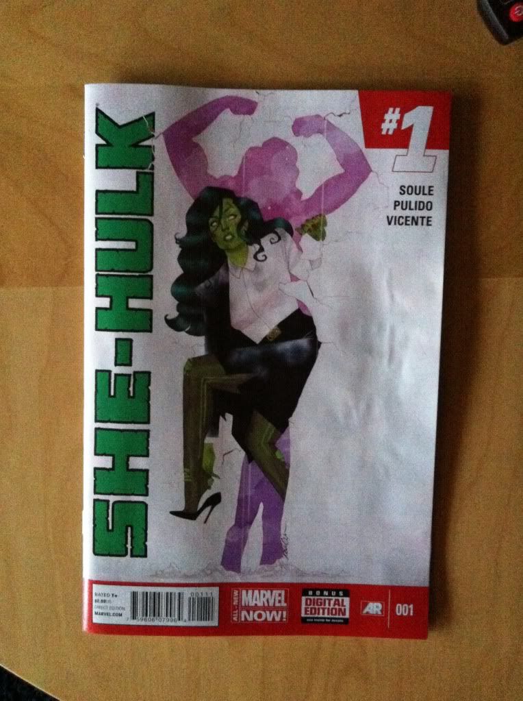
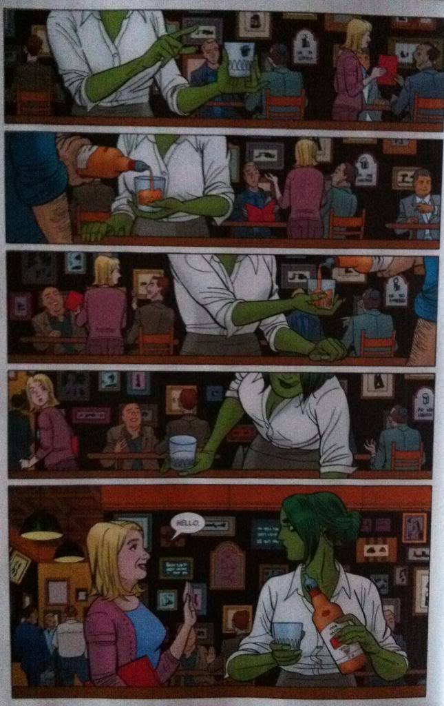
Why not She-Hulk: Because court is adjourned. She-Hulk has pled her case, made her closing remarks, and verdict is in and now the jurors get to go home. Or to put it another way, the current incarnation of the comic has ended. I have pretty mixed feelings about this too! She-Hulk delivered a great comics experience: authentic, engaging crime procedurals, sprinkled with just enough superheroics, and drawn in super stylish, dynamic artwork. I will miss it in my monthly comics purchase pile. But, it also got to tell a complete story, and I kind of love when comics get a chance to tell closed, satisfying stories in serial formats. Endings are sad, but also deeply important to the experience of fiction. Also, as great as She-Hulk was, it was also VERY idiosyncratic, and while I enjoyed it a lot, I feel like the premise may have had a limited lifespan for me, so maybe it's better that She-Hulk told a great, but closed story. There is one thing that cannot be legally refuted though: She-Hulk was good comics.

Monday, 16 March 2015

Sentencing She-Hulk #10, #11, and #12

Or a look at a great double page spread in She-Hulk #10 and #11
by Charles Soule, Javier Pulido, Munsta Vicente, Gus Pillsbury; Marvel Comics


I love comics that use unexpected and clever ways to encode extra information. I also love collaborative comics that showcase how every member of the creative team contributes to making bold storytelling choices work. She-Hulk routinely has a great double page spreads that exemplify both. Just these great flourishes of design that are just really interesting comics. Comics worth taking a closer look at.

This post has *SPOILERS* for She-Hulk #10  and #11 in it.

This super efficient double page spread from She-Hulk #10 conveys a ton of information in a really smart way. The story of the spread is that young Steve Rogers and his friend meet in New York and then travel by train to Los Angeles. And the way this is conveyed is perfectly clever and filled with comics goodness.


This page has a ton of layered collaborative tricks that makes it work in interesting ways. Broadly speaking the underlying design breaks the page into three storytelling zones: a triangular top section, a horizontal region bound by the train tracks, and a lower triangular section. The top section has drawings of the Brooklyn bridge and Empire State in the winter clearly establish the setting as New York, the train tracks then boldly signify rail travel, and the short sleaves and cinematic marquee in the bottom section depicts LA. This setting break is emphasized by the colouring which depicts old New York with a grey, grainy heavily muted colour like an old photograph but depicts LA in a warmer, sepia tone like old film. This colour shift helps to deliniate the two storytelling regions clearly. And then there is the lettering which interacts with the bold graphical elements, mainly the train tracks, to help guide the reader through the artwork in a manner that is counter-normal and adds a lot of cool effects. It's a great team effort.

What all of this does is make the page organically read in a weird way. Specifically the reader moves across the top of the page from left to right, and then down the tracks from right to left, before moving throgh the LA story portion left to right. This makes the reader travel an extra long way through the page which helps convey the emotional sense of distance and travelling. It also has the really cool effect of making the train tracks from New York to LA move East-to-West on North-to-South on the page like the actual journey. And in a cheeky bit of cleverness, the page has a decidedly "Z" shape to the reader route which is reflected in the "Mark of Zorro" marquee in LA which is totally fun. This is a fantastic page of comics.


She-Hulk #11 opens with some tremendous double-page spreads that make tremendous use of space, onomatopoeia, and design to magnify the events occurring in the pages. This first spread comes after a page turn and begins with Titania, the super-strong lady in purple, cold-cocking a surprised She-Hulk right off the page and through several walls. This spread, beyond being kind of beautiful, makes really great use of space to emphasize horizontal distance. Readers enter the page in the top left, get drawn into the circle shape of Titania's punch and then alone the sound effect and motion line of She-Hulk flying through the air and off the page. It's a quick journey left to right filled with surprise. Readers then shift down the page and read the "Titanium Blues" issue title which stretches from left to right across the whole width of the comic, which again results in rapid left to right eye path. Finally the reader carriage returns to the bottom row of panels and again cruises in a clean, uncluttered left to right pan along the flight path of She-Hulk as she tumbles through walls and offices. This way the reader has cruised across the full width of the comic three complete times following the original punch which really emphasizes just how far She-Hulk has flown from the blow. Which really emphasizes the force and drama of that punch. THWAMM!


Following another page turn the reader is confronted with another double-page spread that makes a thoughtful use of space to emphasize motion and action. In this case the larger canvas is used to emphasize vertical motion instead of horizontal, using tall narrow panels to change the orientation of events. Readers enter this layout in the top left in a panel where Titania snags Shulkie, pans down to Titania twirling She-Hulk by her leg and is thrown quickly to the top of the next panel column which mimics the motion depicted. The net column of panels is interesting in that the first image encountered is actually the final panel of a vertical sequence. The reader sees She-Hulk flying up off the page and then sees the preceding images of her smashing through the stories below and Titania's actual throw. By presenting these panels in reverse-chronological order this section of the page feels simultaneous, as if the events depicted are so fast that they cannot be presented in the normal order. It's like the comics equivalent of a sonic boom trailing a hypersonic jet. Also, by stacking these panels this section of the layout really sells the vertical orientation of the motion and sets the stage for the next region of the page. The last section of the layout takes the reader in a very clean, quick line from the top left with She-Hulk being launched from her office, over Manhattan at the apex of her flight, and down to her landing in the New Jersey Palisades. This part of the spread is interesting in that the reader path actually lies perpendicular to She-Hulk's flight path, and yet the details and iconography of her flight is so elegantly simplified that the reader can take it in as they progress from top left to bottom right. Which of course makes the page feel fairly quick. At the same time, the way that backsplash panel of She-Hulk in flight is sufficiently complicated that I found myself pausing on it and taking in the details for a moment, which for me is so amazingly evocative of that feeling of serene freefall. It's this moment of weightlessness and altitude that is just kind of perfect. This is a really, really cool chunk of comics.


This page from She-Hulk 12 is almost the polar opposite of the other double page spreads gathered here: perfect simplicity. While the other layouts are filled with complex guidelines and ornate layouts to capture complex storytelling or rapid motion, this double page spread distills everything down to a single perfect moment. Gone is the background. Gone is the design. All that remains is looming tidal wave of fearsome She-Hulk poised to crash down on Nightwatch hiding behind puny sibilant platitudes.  It's a breathless freezeframe of catharsis made all the better for it's scale and lack of distractions and cathartic ending to the series.

I hope She-Hulk is only in recess, because I am not ready for this concept and creative team to be adjourned.

Previously:
She-Hulk #1: Fun layouts

Friday, 28 February 2014

Sentencing She-Hulk #1

Or a look at some really innovative layouts in She-Hulk #1
by Charles Soule, Javier Pulido, Munsta Vicente; Marvel Comics


I really enjoyed She-Hulk #1. The hook of She-Hulk being the star of a law procedural with a light, comedic-ish air, while not completely original, is always good fun and Charles Soule, with his perspective as a practicing lawyer, really portrays the practice of law in an interesting and nuanced way in She-Hulk #1. It's a really fun comic.

She-Hulk #1 is also a really great looking, and technically interesting comic with some absolutely dynamite layouts by Javier Pulido paired with some fantastic colouring by Munsta Vicente. I'm going to take a closer look at a couple of my favourite layouts.

There will be *SPOILERS* for She-Hulk #1, so don't commit a crime against yourself and read the comic first.


I am absolutely in love with this page: Team Shulkie deliver a really interesting pair of sequences that happen simultaneously. One story on the page is that She-Hulk, having quit her high paying law job hits up the local lawyer bar to unwind with whiskey (as is proper [assuming it is done responsibly]). She-Hulk's story ends in the last panel when a lady suddenly appears and says hello. However, this page has a second story which shows the suddenly-appearing-woman canvassing the lawyer bar with a red folder in the background showing where this woman came from. The way I read the page, I saw the entire She-Hulk story without even noticing the second story of folder-woman, so that I was just as completely surprised by her appearance as She-Hulk. Which is kind of great comics: I experienced the same She-Hulk-self-involvement and then surprise as the protagonist.

Now, admittedly, this might be because I am terrible at reading comics and missed something obvious that everyone else in the world noticed. But, the thing is, I've noticed some design elements that seem designed to trick the reader into only following the She-Hulk story and then doubling back to read folder-lady's tale.


My first pass of this page was governed by She-Hulk. She is the sole character in the foreground and is making a number of interesting, dynamic gestures and motions that change from panel to panel and guide the the reader down the gradual left-to-right line of her positioning. Just by body language and posing there is a rich enough pool of visual information to keep the reader busy and focused on Shulkie. This effect is magnified by the colouring. She-Hulk is coloured her bright, emerald green and is wearing a bright, white blouse, which compared with the drab, cooler colours of the background stands out considerably. Especially, when you account for how BIG the emerald/white colour blocks are compared to the much smaller, broken up colour patches of the people and wall signs in the background. Basically, the colouring of the She-Hulk story is just brighter and bolder and helps keep the reader focused on her story instead of the background.

(And really, the She-Hulk story almost functions without any background since tumblr, bottle, waiters arm, and bar top convey the key setting information in the foreground. Which is a really smart choice if you buy my argument that the artwork is designed to misdirect the reader into paying less attention to the background.)

It was these elements that kept me focusing on She-Hulk and her story on this page and made the appearance of folder-lady such an effective surprise.


Of course, once folder-lady appeared, and I realized she was an important character, I went back through the page and found the whole other story. And many of the same compositional elements used to steer through the foreground are also used to move the reader through the background folder-lady story. Colours highlight the woman's blonder hair and the red of the folder to catch the reader. Similarly the woman's gesture and her relationship to the folder helps make a visual guide that leads the reader through her story so that the folder-lady part of the page ends just as effectively with her looking at She-Hulk. It's a pretty clean, nice little sequence. 

And combined, I think, these two layered sequences make this page super interesting. Misdirection keeps the reader focused on She-Hulk and maximizes surprise, and then rewards the reader with a hidden, yet important story of folder-lady failing to find a lawyer. It's really cool, and honestly, how often do you see comics pages designed to be read twice?


This double page spread is also pretty awesome and does some really cool things with panel shape and perspective to emphasize some really interesting elements of the page that makes the drama/comedy of the page work.


The crux of what I love about this spread is the LOOOoooooooonnnnngggg hallway and how the art emphasizes the heck out of this distance to great effect. The composition, with its 18th floor Ding!, takes from the top of the first panel into the top of the second panel. This places us at the end of the hall and then, as we, look down the very tall panel we see, and experience, just how far away She-Hulk is from the end of the hallway. What's even more great about this is Shulkie is on an angle and facing upwards along the hallway which makes the distance loom larger and emphasizes the uphill-climb-challenge of walking down this very long hallway. This leads into the next two panels which show She-Hulk progressing along the hallway, but also walking uphill, continuing to emphasize the gruelling effort of walking down such a long-ass hallway. The composition then doubles back towards the centre of the page where we meet Legal, Tony Starks lawyer. The result of this doubleback is that the reading path takes just about the longest route possible to get from the elevator to Legal which makes us the reader actually experience the length of the hall. It is absolutely an amazing bit of design and layout work.

She-Hulk #1 is a fantastic comic that has me super excited to read more She-Hulk.


Monday, 24 February 2014

Atoll Comics Round 12

Or changes to my top-ten comics 

Due to poverty and an urge to buy better comics, I have decided to be super-selective about which superhero comics I read. Harnessing the Awesome Power of Maths, I have determined that I can afford to read 10 ongoing titles. So I get to read 10, and only 10, titles published by either Marvel or DC as well as one trade paperback a week of my choosing.

A complication of this is that I am forced to drop an on-going title if I want to try reading a new on-going title, an act of very tough love. Being financially responsible is the worst.

I will be adding She-Hulk and dropping FF.


Why She-Hulk: She-Hulk is absolutely the kind of comic I want to read from mainstream Marvel. It's fun, has an interesting narrative angle (lawyer She-Hulk fixing problems she can't punchout), and is absolutely beautiful with just masterful artwork by Javier Pulido. It's great!

Actually, I think the magic of She-Hulk goes beyond quirk and execution. I'm a career academic who TA's to supplement my income which means I spend a lot of time trying to figure out when people have no idea what they are talking about. So I'd like to think I'm developing a sense for when people are experts or trying to fake it. And the thing is She-Hulk is a comic that is being written by Charles Soule who is an actual, real life lawyer and his expertise really shines through. The result is a comic that feels authentic and nuanced and interesting. While, you know, still being fun and charming and funny. 

And that's not even getting to the art team of Javier Pulido and Muntsa Vicente. She-Hulk is a comic that visually is basically perfect. Javier Pulido has a gorgeous clean style, amazing character acting chops, and just endlessly fascinating approaches to layout that make even the most legal-proceeding heavy sequences interesting to look at. Muntsa Vicente, meanwhile, is the perfect colourist with a bright, pop-arty, flat colouring style that is the perfect partner for Pulido's lineart. She-Hulk is a comic with the kind of art that is worth the price of admission.

If you like my taste in comics, especially those in my top-ten mainstream books, than the first issue of She-Hulk is pretty much a must read. If it is any indication of the kind of book the whole series will be, than it will absolutely be a top-ten comic.


Why not FF: FF is another great comic that has ended. For being a comic I almost didn't buy into, largely because I was so happy with Hickman's FF, I ended up really enjoying the Fraction/Allreds version. This FF wasn't the high concept Sci-fi book that emphasized the weird nature of child genius, but was instead, at its best, a book about a bunch of kooky comic book kids being fun. FF was like this joyful celebration of everything that is great about comics that was also a really well made comic. But like most really great and original mainstream comics, it has an ending and that means it's time to say goodbye and replace it in my Pull List.

Previously: