Showing posts with label Moon Knight. Show all posts

Wednesday, 27 April 2016

Monitoring Moon Knight #1

Or a look at the use of style to convey narrative in Moon Knight #1 
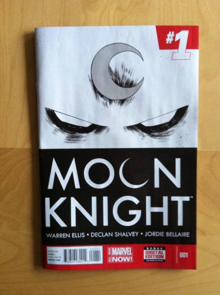
by Jeff Lemire, Greg Smallwood, Jordie Bellaire, and Cory Petit; Marvel Comics


Moon Knight #1 is the kind of comic I usually steer clear of. It's a relaunch of a series that has just been relaunched several times. I fairly recently read an iteration of the series that I *really* enjoyed as a cohesive, complete experience. I don't really have strong feelings about Moon Knight as a character, and since reading a little Cerebus I'm having some trouble taking him seriously ("Unorthodox Economic Vengeance!"). And yet... Jordie Bellaire only seems to work on good comics, Jeff Lemire has created several comics I enjoy, and Greg Smallwood's artwork is immediately, obvious good. So it's really on the strength of the creative team that I even tried this comic. And I am pretty glad that I did.

Moon Knight #1 is also the kind of comic I love to write about: it is a very accomplished comic that uses a number of stylistic elements to convey narrative information and create an immersive reading experience. Which I'll try and unpack below.

There will of course be *SPOILERS*.


One of the choices I really like about Moon Knight #1 is the use of very wide white gutter spaces. This choice gives the entire comic a soft, almost hazy feeling. This effect is apparent throughout the issue, but is particularly obvious in certain pages which actively use the white space to show Spectre slipping in and out of consciousness, whiting out in what feels like a slow and muzzy way. Overall, I suggest the passive and active use of white margins works to create a sense of floating, semi-conciousness that really adds to the ambiguity of the comic and sense that the narratoring perspective may be unreliable. It's great stuff.


Another of the stylistic choices in Moon Knight #1 that I find so effective is the dual colouring styles used in the issue. The comic opens on a pair of pages of Marc Spectre exploring an Ancient Egyptian temple as part of a hallucination/vision. This sequence features a grainy, sketchy colour palette that uses 'painted' highlights and specks of pigment to create a decidedly artificed world.  By which I mean, the stylistic choices of this opening sequence manages to look like something created by an artist (a fictional environment) but also extremely granular and high resolution (a hyper-realistic environment). The more mundane elements of the comic which tell the story of Marc Spectre committed to some sort of mental hospital feature flat colours and a much more conventional comics look. This creates an immediate codified demarcation between the fantastical world of the comic and the mundane world.


Part of what makes this colouring choice so powerful in the comic is how it works to collide the supernatural/insane elements of the comic with the mundane. When Spectre becomes Moon Knight or hears the voice of his god Kohnshu elements of the scratchy, granular colouring creep into the comic, creating an emotional contrast between these elements. This also creates a palpable sense of dread/power in the supernatural elements: they feature distinct colouring so *something* must be happening, maybe Spectre isn't insane...


And then there are the pages where the divisions break down and the flat colouring of the mundane world and the gritty, sketchy aesthetic of the supernatural collide. Where Moon Knight is free to attack the nurse/jackals that have been imprisoning and seemingly abusing him throughout the comic. This is depicted wonderfully in a flurry of small, circular panels that chaotically capture individual moments of violence. It's a page out-of-control and unhinged, and manages to capture a maniac fury in a clear and visually interesting way. Collectively, it's a great choice that I think manages to establish this incarnation of Moon Knight as dangerous and which implies that there is potentially an element of supernatural power about the possibly insane man.


I think this double-page spread is my favourite use of the supernatural/mundane colouring. The page depicts New York apparently mixed up with some sort of Ancient Egyptian-inspired hellscape. While I can spot elements of paint splatter and sketchy colours, these elements are subdued compared to panels and sequences that are more clearly entrenched in either Spectre's mind or the possibly hallucinated. Instead this page features mostly the more flat colouring of the mundane elements of the comic, despite the impossible thing being depicted. The white margins also fall away for the first time in the comic, making the page feel bigger, sharper, and more real. This creates this wonderful moment of ambiguity: is this all a hallucination of Spetre's? Could this really be happening? The colouring, which has been used to codify this, is unclear. And so by establishing, utilizing, and then subverting the colour conventions of the comic, Moon Knight #1 manages to call into question what in the comic is even really happening. Which is great.

I read Moon Knight #1 because of the creative team, but will read #2 on the strength of the execution of the first issue.

Previously:

Friday, 15 August 2014

Atoll Comics Round 15

Or changes to my Top-Ten comics

Due to my spouse seeing how much I spend on comics and an urge to buy better comics, I have decided to be super-selective about which superhero comics I read. Harnessing the Awesome Power of Maths, I have determined that I can afford to read 10 ongoing titles. So I get to read 10, and only 10, titles published by either Marvel or DC as well as one trade paperback a week of my choosing.


A complication of this is that I am forced to drop an on-going title if I want to try reading a new on-going title, an act of very tough love. Being financially responsible is the worst.

I will be adding Rocket Raccoon and dropping Moon Knight.


Why Rocket Raccoon: I've always thought Skottie Young had a fun, Saturday-morning cartoon aesthetic. Unfortunately, most of his projects haven't quite synched up with my interests. Since I only get to read a few ongoing comics it's important for them all to hit some weird arithmetic ideal of characters I'm keen on and creative teams I'm interested in, and the Skottie Young abacus has pretty much always been missing that character hook to get me reading. But with Rocket Raccoon we've finally found a title I'm curious about that seems, with the ludicrous notion of a crazy gun-toting space-raccoon, to be an ideal fit for the frenetic energy of Young's artwork. The result is idiosyncratic and crazy and fun and worth a look. I'm a couple issues in, and while I'm not convinced that I'll be a longterm reader for the series, I'm having lots of fun with it right now.


Why not Moon Knight: I read Moon Knight purely for the strength of its creative team. A comic by Warren Ellis is always worth at least a try and the collaboration between a top tier artist Declan Shavley and living legend colourist Jordie Bellaire, an artistic team that actually live together, would be worth seeing regardless of the writer. Together, well, Moon Knight was fantastic. It was always good, always beautifully made, and occasionally, at it's best, was the kind of semi-experimental master comic that I love. However, Ellis/Shavley/Bellaire are moving on and I think I will be moving on with them. The new creative team looks to be quite talented, but I was reading this comic for Ellis/Shavley/Bellaire and not out of any great love for Moon Knight. I'm happier having had a really great six issue run then press on for the sake of inertia. And I'd much rather save my money and attention for Injection, the new creator-owned project from Ellis/Shavley/Bellaire.

(And real talk: I have feels about Brian Wood and while I might not completely swear off all Brian Wood projects, I'll have to really like the main artist (who spends way more time on a comic than the writer) and really buy into the premise of the project to give it a try. Marginal interest projects like this I'm more inclined to skip.)

Previously:

Friday, 18 July 2014

Monitoring Moon Knight #5

Or how to make a drawn out action sequence not boring in Moon Knight #5
by Warren Ellis, Declan Shalvey, Jordie Bellaire, and Chris Eliopoulus; Marvel Comics


I am deeply interested in comics that solve narrative problems. Comics that dive into some storytelling aspect that is often done poorly and manages to make something banal great are super interesting. Moon Knight #5 is just one of those gutsy problem solving comics.

Paradoxically, for me, extended action sequences are one of the most fraught aspects of comics. They should be kinetic, exciting highlights but I find that the longer they drag on the more boring, confusing, and murky they usually become. Moon Knight #5 is an issue long action sequence that had me hanging off every single panel, every blow, splinter, slash, and contusion. And the way Moon Knight #5 works, the choices the creative team make hat keep the action interesting, are worth examining in further detail.

There will be *SPOILERS* for Moon Knight #5 in this post.


The foundation for any action sequence is its motivation. Why are people fighting? Why should the reader care? If this is not done right, if its two superheroes throwing down over a sandwich based disagreement (or whatever cliche shit) or if the objectives of the conflict are unclear it is hard to get emotionally invested or care about the consequences.  

Moon Knight #5 takes a really simple, straightforward approach to this. A girl has been kidnapped. She is being held captive on the fifth floor of a shithole walkup apartment. Between her and the door is floor after floor of thugs holding her captive. Moon Knight, because he is crazy, plans to walk in the front door and destroy everyone between him and the girl to ultimately affect a rescue. One wacky cape, a stairwell, a dozen or so goons, and a very clear, emotionally affective objective: a scared teenager. The simplicity of this approach helps provide a constant focus on what the point of all the violence is.

 One of the biggest problems with many protracted action sequences is a lack of a well defined location which really makes things feel inauthentic. The simple premise and setup of Moon Knight #5 also does a really effective job establishing a sense of place. By keeping it simple, the stairwell of a shitbox apartment, the comic provides a familiar space that adds a veneer of reality to the proceedings and provides context for all of the resulting action. It seems like such a little thing, but it makes a world of difference.


This little snippet of action here is completely awesome, but also a great example of how action works better with context and spatial positioning. Moon Knight throws scary giant thug off the stairwell and presumably to his death. Now, as a thing a person does, particularly an ostensibly good person, it is crazy and horrific to murder a person by... whatever the balcony equivalent of defenestration is. But, knowing that scary giant thug is involved in the kidnapping of a teenage girl, something that is also crazy and horrific, his dispatch at the hands of Moon Knight feels somewhat justified. We get why this brutal violence is happening. We also, because of the simple well defined layout of the action in a stairwell, understand that Moon Knight has muzzled and thrown scary giant thug through a railing and into the empty space in the centre of the stairwell. Without this sense of space it isn't obvious what the thug is being thrown through or what the consequences of the action are. But with a well established story objective and setting it all works.


Action scenes are a particularly kinetic species of comics. I find that I'm most engaged when the panels are quick to navigate and provide a really clear sequence of events so that they can be read rapidly and clearly. When done perfectly, with additional use of shapes and guides to draw the eye around the page, static panels can feel fast and alive in a really involving way. Moon Knight #5 is great at arranging panels and the events within panels to provide clear snapshots of the ongoing action and to make these snapshots very seamless and organic to read quickly.

 The above sequence is a great example of this: the panels show the three key moments of the scene (Moony grappling with thug, Moony tossing thug, and thug breaking himself on the railing) in a really clean way. Of particular interest in this sequence is how the thug, moving from left to right traces an arc, that takes advantage of our eyes natural progression across the page, to actually capture the feeling of the motion of the toss. It's great comics.


Moon Knight also has some really fantastic examples of fractured panel composition. Continuous composition, which I describe above, shows clear intermediate steps and leads the readers eyes through the composition and along motion vectors, is really good at making a sequence feel quick and kinetic. Fractured panel composition, which is deliberately showing images that don't connect and which have vectors of motion that do not sync up. This discontinuity makes each panel feel heavier: readers have to spend more time on each panel to understand how they relate and how to navigate through the page which makes each panel feel more significant and impactful. This is isn't graceful, this is dragged out, fuck-punching. 

The above collection of panels is a great example of this: as Moony beats the shit out of sideburns thug, there isn't a clear sequence of events from him brandishing his baton to cocking the guy in the face to kneeing him in the stomach to braining him. Which makes each panel a little surprising, and requires us to stop and figure out whats happening at each step. The panels also have very different vectors of motion: the first panel looks to be primarily coming out of the page while the second panel goes bottom left to top right, the motion of the third panel is upward-right, against the grain of the reader carriage-return, and the fourth panel is straight down. It's choppy to read but in a way that enhances the action.

By varying the two approaches throughout the comic, quick elegant violence and brutal, disjointed beat downs, Team Moon Knight gets the best of both worlds: the overall action manages to feel overall quick but punctuated by bone-crushing moments of extreme impact. Alternating panel pacing like this also helps keep the comic interesting. Readers are constantly being forced to adjust the pace of their reading and contend with these different modes of storytelling. And this challenge forces the reader to pay attention and actively decipher the violence. Which is a smart choice.


Long boring action scenes in Superhero comics tend to be weirdly sterile affairs. I mean sure, all of Metropolis might get destroyed in an orgy of property damage, and people are presumably killed in the process, but what we are shown is often nigh-invulnerable superbeings walloping each other while suffering only the most superficial of injuries. In real life violence does not just tear a costume or scratch a person up. Real violence is horrifying and has consequences.

Okay, I play beer league soccer because soccer is fun and jogging is awful, and right now I have a grotesquely swollen and bruised ankle from a sprain I suffered for having the hubris to try and change the direction in which I was moving. Not, you know, being kicked down the stairs by a crazy man in a mask or punched through a wall by a Spacegod. This wasn't even violence and I am hurt in a way that makes standing extremely sucky.

Watch MMA and you will see actual violence: dudes who are fucking beating the shit out of each other for our entertainment and suffering potentially mutilating injuries. (Which is why I cannot watch that stuff...) Humans when beating on one another are damaged and suffer. When scary people set out to hurt each other, people are actually fucking hurt. That is the nature of violence. When a protracted fight scene features untouchable beings throwing lazer beams at one another it does not connect to that frightening, lurid reality and as a result feels inauthentic. 

Moon Knight #5 is one of the most graphic depictions of realistic injury I have seen from mainstream comics. I mean, there are comics where more people are killed, but the granular depiction of realistic injury: the broken wrists, snapped legs, smashed in faces, in this comic are real and viscerally authentic. These are people being hurt in the way people are hurt when terrible violence is done to them. Moon Knight #5 is a comic that when it kicks you in the gut you fucking vomit. And this dedication to depicting the consequences of the action goes a long way to making the action feel real and feel like there are actual stakes. By making everything so goddamn cringe worthy, MK5 makes it impossible to be bored.


Another problem with drawn out superfights is that they tend to be surprisingly unimaginative. Page after page of dudes flying and punching one another in similar ways is not all that engaging. In all things in life, variety is super important.

Moon Knight #5 does a fantastic job of being creative with the application of violence. Moon Knight beats down each thug in a different way while relying on a variety of weapons and tactics in slightly different situations. Like, take the two sequences above where Moony uses the same weapon to dispatch Spider-head and SWAT-ginch thug. Both of these sequences are nothing like each other, and also kind of horrific snowflakes of originality. How often do you see a shuriken driven through the floor of a man's mouth, or a goon tripped down stairs by having a foot stapled to a tread? Not very often in a superhero comic, yeah? And Moon Knight #5 is full of these wild, bizarre feats of asskickery and its this constant experimentation with showing different examples of violence that helps keep such an extended action sequence feeling fresh.

And really, Moon Knight #5 is a comic where a baseline human dispatches other baseline humans on a stairwell. It is both a testament to Team Moon Knight and an indictment of the rest of the superhero comics industry that this very mundane premise is the most creative superhero action sequence I have seen in a long time. In comics where impossible people fight in impossible ways where literally anything imaginable can happen, there shouldn't be boring repetitive action. Ever.

So yeah, if you ever are wondering how to make protracting action super engaging, take a long hard look at Moon Knight #5. Go! Find a copy! 


Previously:
Monitoring Moon Knight #2

Monday, 14 April 2014

Monitoring Moon Knight #2

Or a look at the chilling, virtuosic layouts in Moon Knight #2
by Warren Ellis, Declan Shavley, and Jordie Bellaire


Moon Knight is turning out to be a downright chilling comic. Beyond the questionable mental status of the titular hero, the series is really going to some dark places. The first two issues of the comic have dealt with serial killers, a slasher out to steal other people's body parts and a sniper out for vengeance. The villains of both issues have also been marginalized in some way, veterans broken down and abandoned like old tools. Moon Knight is dark and engaging and challenging. 

It's also a wonderfully made comic, a great collaboration of writer and artist and colourist with a really cool, smart aesthetic and some really innovative use of colour. Moon Knight #2 also has my so far favourite sequence of the series: a truly smart and disturbed sequence of comics that is completely worth taking a closer look at.

There will be *SPOILERS* here. So go read the comic first.


The crux of this really great sequence is a deceptively simple format, repetition, and a certain crushing ruthlessness. Each page in the sequence shares this simple eight panel grid format, with each panel telling the story of a different workaholic, lonely financial worker. And on every single page of this sequence one of these workers is murdered.


Every time one of the characters is murdered, in a flash of red their story ends. The space that story occupied is then simply left empty in the grid. What was once a page filled with stories is chewed down systematically, until all that's left is emptiness. White. Dead.

As a visual metaphor for murder it's brilliant. The world starts complicated and rich, full of stories about the guy hiding his terminal cancer from his family, or the workaholic woman with the strained relationship. However, due to the action of the murderer, one by one, each of these stories are snuffed out. Ended. Leaving only an empty gaping hole of unfulfilled potential in the world. And as more people are murdered these spaces grow until the whole page is diminished and barren. It is chilling and crushing and hard.

This sequence is also an astute visual representation of a sniper. Each of the murdered people are unsuspecting, observed by us and the killer as they walk blithely into the path of a bullet. At the same time we don't see the sniper, who kills somewhere out of view, anonymous except for the bodies and the spaces in the world he leaves. His voice, when we hear it, is written in the empty spaces where a living character once occupied, further emphasizing this calculated, anonymous murder. We hear the sniper in the effects of his grim work. It's fucking brutal comics and a fantastic creative choice.

If this level of comics craft continues to be applied to the darkest corners of the human psyche, then Moon Knight is a must read comic.

Monday, 24 March 2014

Atoll Comics Round 13

Or changes to my Top-Ten comics

Due to poverty and an urge to buy better comics, I have decided to be super-selective about which superhero comics I read. Harnessing the Awesome Power of Maths, I have determined that I can afford to read 10 ongoing titles. So I get to read 10, and only 10, titles published by either Marvel or DC as well as one trade paperback a week of my choosing.


A complication of this is that I am forced to drop an on-going title if I want to try reading a new on-going title, an act of very tough love. Being financially responsible is the worst.

I will be adding Moon Knight and dropping Avengers.


Why Moon Knight: Sometimes you read a comic because you have some great interest or affinity for the leading character. You are just soooo into Batman that pretty much any comic with Batman in it is something you want to read. Other times you read a comic because the creative team making the thing demands your attention. Moon Knight by Warren Ellis, Declan Shalvey, and Jordie Bellaire is exactly that kind of comic. Warren Ellis has written some of my favourite comics, and its a joy to see him back writing more. Declan Shalvey is a great noiry artist and Jordie Bellaire is a reliable awesome colourist and together they are doing some really interesting things. It's maybe an especially interesting collaboration as, I've gathered, Shalvey and Bellaire live together, and that kind of geographically close collaboration between a penciller and colourist is pretty rare and potentially special. If the first issue of Moon Knight is any indication, the book looks poised to be pretty good: a fascinating trip into the mind of the supernaturalish-insane person that is Moon Knight rendered in this fantastic style that sees Mooney stark, flat white in a sumptuously rendered, coloured world. The first issue is a comic worth picking up for quality of the overall story but also just for the daring artwork. You ought to at least give it a try.


Why not Avengers: Avengers is the flagship, tentpole comic for one of Marvel's main publishing lines. It's a comic that draws Marvel's biggest characters and puts them into the biggest storylines, those linewide Events! that change the very nature of the Marvel Universe. Avengers plays for all of the marbles all of the time! OMG!

And... I'm kind of bored of it. The constant smashy crises, even with the best creators, tends to get a little repetitive: the world is ending and the heroes save it. Even worse, from my perspective, Avengers has a nasty habit of setting up and then interweaving with the Event! de jour which means the comic can seem like its either in a holding pattern, set up period, or a tie-in. Add to that a very large (and pleasantly diverse) cast, and there isn't much room for character development. I find I am more interested in reading character driven comics that have enough editorial freedom to tell stories without too much interference from Event! cycles. So, yeah, Avengers is out.

The thing is, I don't think Avengers should change! There is completely a place for this kind of Event! driven, character heavy, comic in Marvel's line. I used to love Events! and the interlocking stories with New Avengers, and I suspect that there is still a large block of readers that buy into this kind of storytelling. And the wonderful thing about a healthy comics publishing line is that there can be comics for everyone. Marvel publishes a lot of other comics that are more my speed, more than I can actually afford to read, so my comic tastes are being still being satisfied. Not every comic is for everyone, live and let live and find what comics work for you.


Previously: