Wednesday 31 July 2013

So I Read The Umbrella Academy: Dallas


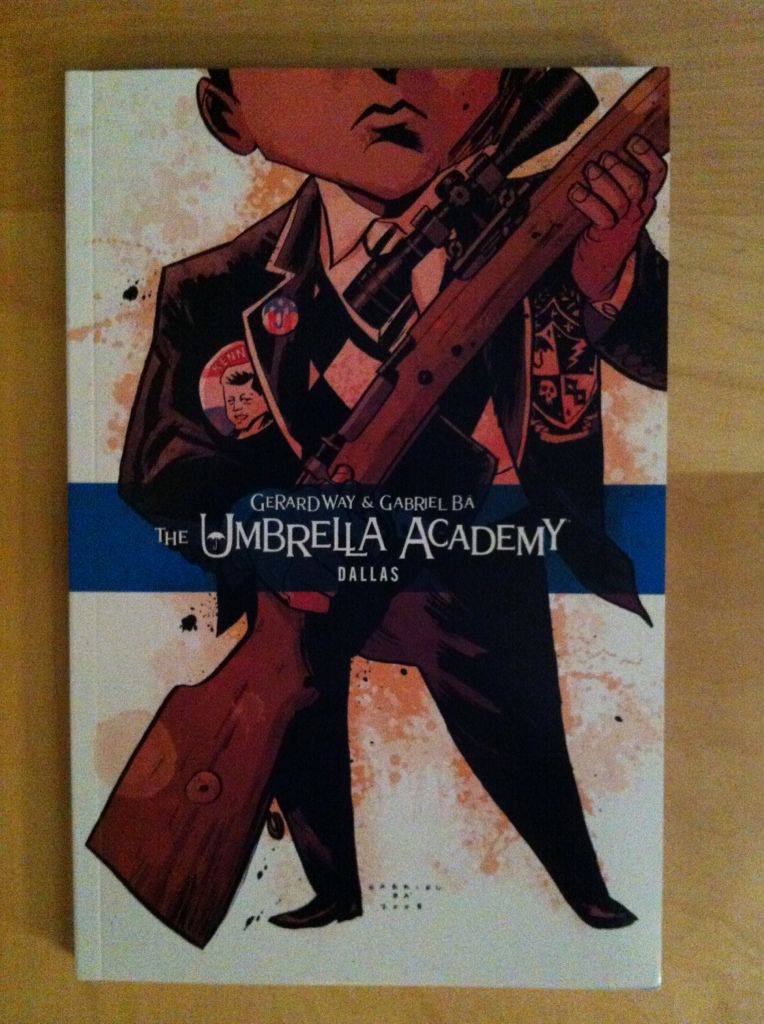
A 250 word (or less) review of the second The Umbrella Academy collection
By Gerard Way and Gabriel Ba; Dark Horse Books


Now this is more like it! I liked the first collection of The Umbrella Academy, Apocalypse Suite. I thought it had some neat ideas, amazing art, and solid storytelling, but felt that it was maybe too conventional? Too adverse to risk? Like, that the premise had a certain amount of untapped potential, which, if it could be wedded to Ba’s astounding art, could make The Umbrella Academy a truly great comic. I am happy to report that Dallas lives up to the full The Umbrella Academy potential. Dallas picks up where Apocalypse Suite leaves off, with the super-powered orphans of the academy traumatized, maimed, and scattered from the fallout of the previous chapter. Against this stark tableau the secret future/history of Number 5 is revealed as well as the horrific mission he and his family must undertake to save the future.  It is, more than anything, a confounding and brave comic. Where Apocalypse suite is kind of an avant garde take on the Superhero formula, Dallas is just balls out crazy originality.  It’s almost as if, with the basic foundations of The Umbrella Academy world established, Way and Ba are free to capitalize on their creativity. Every single page crackles with this manic energy and nearly every scene goes in an unexpected, yet satisfying direction. The entire comic is expansive and interesting and just utterly weird. Dallas is absolutely its own thing and it’s great. The Umbrella Academy: Dallas is the complete, realized Umbrella Academy package. It’s well worth reading.

Monday 29 July 2013

Eye on Hawkeye # Annual 1 Pt. 1

Or the use of silhouettes to make arguments better in the first Hawkeye Annual
By Matt Fraction, Javier Pulido, Matt Hollingsworth, and Clayton Cowles; Marvel Comics


The Hawkeye Annual is another great comic in the Hawkguy tradition. This issue follows Kate Bishop Hawkeye, Lady Hawkguy, as she packs her bags and Pizza Dog, travels to California, and has a run in with an old foe. It is a really fun issue. Because I am apparently becoming this series internet stalker, I noticed some smart creative decisions that are maybe worth unpacking.

As always *SPOILERS* will follow. Read the comic first.


The first thing I love about this comic is that Katey-Kate got the Hawkguy treatment: she gets beat up fighting some goons and gets to wear the trademark nose-bridge-bandaid. Which, actually, is a pretty great visual representation of how out of her element she is. In previous issues Kate has always been the Hawkeye with her life more-or-less together, and unlike Clint, she manages not to get her butt kicked and seldom is bandaged up. This is really the first issue that you see Kate scattered, and unprepared, and injured. It's fun.

(Also, I love how Pulido's Kate looks like a teenager. The contrast between her and Whitney Frost really emphasizes how young and inexperienced she is. I kind of love it when younger characters look young in comics.)

(Also, also, the decision to have a femme fatale go after a female character by using her glamour and kind of just being a nice person is a pretty refreshing twist on the archetype.)


Another neat aspect of the Hakweye Annual are the thought captions. For one, they are pretty cute, and frequently pretty funny and fun. But, I think they are also really smart for a couple reasons. The first is character: the cartoony faces, loose hand written font, and frequently goofy thoughts really help cement the youth and inexperience of Kate. Also, the range of thoughts and wildly expressive faces in these thought captions really bely the cool exterior of Kate we have seen throughout Hawkeye, so these captions really add a depth to her previous appearances. As cool as she may have looked, her internal life in these previous issues were probably alive with these kinds of thoughts. These captions are also really cool from a comics-information-encoding perspective by directly showing the emotions of Kate that come with each thought. Normal, text-only captions only show the language of the thoughts, so you can only infer the accompanying emotions, but the captions in the Hawkeye Annual unambiguously convey the emotions coupled to each thought. It's kind of like the comics equivalent of how internal monologues in film have the tone of the actor's voice to convey emotion. It's a straight forward approach that really enhances Kate's internal life. 

But, I think the neatest technical thing about the Hawkeye Annual is how the silhouette motif is used during some of the scenes. Now, representing characters by their black outlines occurs throughout the issue, and in a lot of scenes seems to be mostly a stylistic choice. But, in certain scenes the silhouettes seem designed to enhance certain personal disconnects between characters. Let me explain...


Okay. I feel like arguments, particularly hurtful ones, are about a breakdown in empathy. Instead of having a reasoned discussion, considering the needs and perspective of all involved, and reaching some kind of consensus or reasonable compromise, people just focus on what they want or how they feel and go with that. Maybe they say things that aren't true about the other person, but true of a kind of emotionally constructed version of the person they are arguing with. And maybe, as they become more hurt, arguing people say things they don't mean, that don't accurately reflect how they feel. This argument between Kate and Clint from the beginning of the Annual seems like that kind of argument.

And I think silhouettes are used in this conversation to emphasize the emotional disconnect and lack of empathy between Clint and Kate in this situation. When they say hurtful things, things that are not strictly fair and hurtful, they say them to silhouettes as if they aren't actually seeing each other. Moreover, when they say these hurtful things they are also represented in outline, as if they are not being themselves either when they say these things. And in those moments when Kate and Clint are genuinely concerned with people outside themselves we see them in detail: when Clint takes a moment to consider what Kate says in the first row, or seriously asks where she is going, or when Kate brings Pizza Dog with her out of concern for him we see the characters and they see each other. It's a really clever choice that adds a lot of tension to the argument.


This page here has kind of the same thing happening. In it Kate and her dad and his partner have another fight and again silhouettes are intelligently used to show emotional disconnects. Every person, Kate, Kate's Dad, Kate's Dad's wife (Hawkdad? Hawkspouse?) are all concerned with their own feelings and needs. Kate clearly wants to be treated as an adult and doesn't approve of her father's choice of spouse. Kate's Dad wants Kate to respect his choice and to spend time with him and be his daughter. And Kate's Dad's wife, I think, just wants Kate to like her a bit. But, they aren't really empathizing with each other, I mean other than the central third of the strip where, for a moment, actual conversation happens (and we see the characters). And so most of this conversation happens as shadowy not-people.

Which is kind of a perfect representation of a teenagers relationship with their parents (at least in some moments). Parents maybe see their teen children as kids and have a certain expectation of obedience while teens see their parents maybe as family institutions more than people while also rebelling against their parental authority. And in this context parents and teens don't necessarily relate to each others' perspectives with all of the love and baggage that clouds their interactions. And so these parent-teen fights are about arguing with silhouettes, representations of each other, rather than necessarily with each other. Which makes the use of outlines in this section kind of brilliant.

The Hawkeye Annual is a great comic and worth checking out even if you usually hate annuals.


Previously:

Friday 26 July 2013

Atoll Comics Round 9

Or changes to my top-ten


Due to poverty and an urge to buy better comics, I have decided to be super-selective about which superhero comics I read. Harnessing the Awesome Power of Maths, I have determined that I can afford to read 10 ongoing titles. So I get to read 10, and only 10, titles published by either Marvel or DC as well as one trade paperback a week of my choosing.

A complication of this is that I am forced to drop an on-going title if I want to try reading a new on-going title, an act of very tough love. Being financially responsible is the worst.

I will be adding The Movement and dropping The Indestructible Hulk.


Why The Movement: Gail Simone and Secret Six. Secret Six was this absolutely perfect moment of a comic: twisted, perverse, hilarious, and heartfelt. It was great and now it is gone. And with it a giant Secret Six sized hole opened within me that goes un-filled week after week and month after month. It is my hope that with some room to grow The Movement may become something nearly as good as Secret Six. It has a diverse cast of outsiders fighting back, in a super-heroed-violenced-up-Occupy style, against authorities who have ceased to care for their people. Which is an interesting concept. But what really nabs me is the potential: I see moments of Gail Simone's amazing humour, sharp dialogue, and fantastic compassion. I see characters capable of profound empathy and passionate infighting and startling psychosis. I see the bones of a comic that is good and, if it can sort out its growing pains, could be fantastic. And I would like to be reading it when it does.


Why not The Indestructible Hulk: Too much Hulk, not enough Banner essentially. Mark Waid absolutely hooked me with the his take on Banner as a Science guy who just wants to make a contribution to humanity when he isn't giant and green and smashy. And so each issue followed, in a very loose way, something about Banner and his Science-team and something about Hulk breaking things. And for a while it was exactly what I wanted. The trouble is that Hulk kept getting in the way of the Banner sections I was more interested in... and at a certain point, since I'm only allowed to read ten on-going comics, it just wasn't enough of what I wanted. It didn't become the Banner centric thing I was hoping it would. Also, Lenil Francis Yu, the starting artist who was a big part of my jumping on board The Indestrutible Hulk, was moved onto other projects at Marvel which also contributed to this comics shrinking stature. It is still good comics, great comics even, just not what I had hoped it would be in a time when I'm only reading ten comics....

Previously:
Atoll Comics Round 8: The Indestructible Hulk and FF in and Uncanny Avengers out
Atoll Comics Round 7: Young Avengers in and Winter Solider out
Atoll Comics Round 6: Either The Indestructible Hulk or FF in and Batwoman out
Atoll Comics Round 5: Avengers in and Fantastic Four/FF out
Atoll Comics Round 4: Avengers Assemble in and The Invincible Ironman out
Atoll Comics Round 3: Uncanny Avengers in and Ultimate Spider-Man out
Atoll Comics Round 2: Hawkeye in and The Flash out
Atoll Comics Round 1: Captain Marvel in and Thunderbots/Dark Avengers out
Atoll Comics Round 0: The originals

Wednesday 24 July 2013

So I Read Sweet Tooth: Unnatural Habitats


A 250 word (or less) review of Sweet Tooth volume 5
By Jeff Lemire and Matt Kindt, Vertigo Comics


Sweet Tooth: Unnatural Habitats continues Jeff Lemire’s post-apocalyptic story about a mysterious plague decimating humanity and the emergence of mysterious animal-hybrid children. Specifically Sweet Tooth focuses on Gus, a teenage human-deer hybrid, and Jeppard, a hard man and consummate survivor, as they try to unravel the mystery behind the plague. Unnatural Habitats is split into two stories. The first, set in 1911, tells the tale of an expedition to Alaska to rescue Jesuit missionaries which uncovers a horrible secret. The second chunk of Unnatural Habitats returns the lens of the story to Gus and Jeppard and their journey to Alaska for answers. This part of the comic feels like the conclusion of the second act: it concludes a bunch of lingering storylines and seems to set the stage for the conclusion of the story. It’s a satisfying read that pays off a lot of what comes before. Something occurred to me while I was working my way through this chapter: the juxtaposition of cartoony, animal-children with all the bleak and monstrous things in Sweet Tooth is CREEPY. I mean, the expressionist artwork of Lemire and Kindt is expressive and uncouth enough to generate a metric ton of atmosphere alone, but render some adorable pig and deer kids and suddenly there is this uncomfortable dramatic tension between the grim reality of post-plague life and the optimism, potential, and innocence of children. It’s an effective storytelling approach. Anyway, Sweet Tooth: Unnatural Habitats is a great chapter in a great comic.

Word count: 248

Previously:

Monday 22 July 2013

Eye On Hawkeye #12

Or how page progression and layout amplify a horrifying splash page in Hawkeye #12
By Matt Fraction and Francesco Francavilla


Hawkeye is a stupidly good comic. 

The story being created is exciting, emotionally involving, hilarious, and accessible. The artwork is gorgeous and brilliant in really subtle, technical ways. It's kind of the definition of great comics. It is also, in a way that always floors me, a really experimental comic. It is the comic that, more than any other, if you aren't reading, you are being dumb.

A pretty great aspect of Hawkeye is how well the series manages consistent quality despite a rotating cast of creators substituting in for Team Hawkguy. I mean, when your most regular series artist is David Aja making issues like Hawkeye #11, the fact that non-Aja issues don't feel like a let down is pretty remarkable. So respect to the Marvel editors who are making this happen, presumably Stephen Wacker, Tom Brennan, and Sana Amanat.

Hawkeye #12 once again sees Francesco Francavilla on art duties (last seen on Hawkeye #10). The issue deals with the arrival of Barney, the trick archer and brother of Clint, as well as a series of flashbacks to their awful childhood. It's another great issue in a great series. And like always there are some cool comics tricks on display.

This one is going to be *SPOILER* intensive, so please read the comic first.

The single moment in this comic that grabbed me the most was the car crash splash page towards the back of the comic. It just completely reached out and grabbed me with emotion and weight and the horror of the moment.


Now part of why I found this page so arresting is that it's a plenty horrific image. Francavilla paints a vivid image of twisted vehicular carnage with fire and windshield blood and jagged shards of bloodred glass showing dead faces and liquor and a broken speedometer. It's a terrifying nightmare image that ruthlessly and efficiently depicts the details of the crash. This picture would be shocking all by itself.

But, because Hawkeye #12 is a very, very smart comic there is more at work here.

The first is page progression. Because, as we read the comic, we go from this...


...turning the page.....

...To, suddenly, this:

And that is pretty surprsing! We go from a page of a character celebrating his cash windfall by indulging in his apparently problematic drinking... and then WHAM! a horrific scene of a car crash. And really with no clear warning: the preceding page leads into its horrific tail with the caption "Boys...". And while previous details in the comic clearly establish that Clint and Barney had a rough childhood (which gives the horrific car crash some narrative context), there was no obvious sign this was in the works. While hiding a surprising or important page (or pages) after a page-turn might be The-Oldest-Trick-In-The-Book-TM, the sheer explosive suddenness of its appearance carried tremendous emotional weight. Like being in a car accident, or hearing news of a loved on involved in one. It's really effective.

(I am of course assuming this was an intentional choice and not just fortuitous happenstance of ad placement. Because, I mean, this was just too perfect to be an accident, right?)

But I don't think the page-turn effect is the only systemic one adding to the weight of this image's appearance. I think layout throughout the issue also played a role in increasing the impact of the car crash page as well.


Nearly every page of Hawkeye #12 has a layout similar to this one. The page is a number of square or rectangular boxes separated by a noticeable, significant white gutter. (How great is the progression of events from left to right in each tier of this page? It's like four stacked independent strips that function individually but also as a larger whole. Francavilla, man.) 

Anyway, you see this squares with a white border layout. And then you see it again. 


And with subtle variations, again and again and again. Until you get used to seeing this layout, until it becomes the fabric of reality as its depicted in the comic.

And then you turn a page... and...


...and the rules, the common layout disappears. You are confronted, suddenly, with a page that lacks the common layout of boxes with a white gutter. It's bigger and full page. It has red, jagged subframes. It is, from a layout perspective completely different from everything that comes before it, completely outside the subtly established conventions of the comic. And this just makes it feel different, makes it jump out even more as an exclamation point. Maybe even makes it feel like a transgression against the order of the comic.

Anyway, this page absolutely levelled me. And I would argue that the suddenness of its appearance and the dramatic change of layout helped increase the weight of this horrific and dramatic moment. It's great comics.

Also, while I'm talking about Hawkeye #12, I'd like to point out some other really great choices in this issue:


So the only other time the white barriers between frames breaks down in Hawkeye #12 is when Barney and Clint reunite and hug it out. I like to imagine this was a choice made to emphasize the loss of isolation for Barney, the closeness of the brothers, and the warmth of the moment. (But I fear I may be reading into this too much.)


Another slight exception to the standard layout is this page which cants all of the panels on the page on a slight angle to emphasize the loss of control of the crashing van. It's subtle but exciting and effective. 


I absolutely love the use of colour in this issue, Francavilla makes all kinds of great choices. This page in particular is a great example, the way red and black are used to capture rage just increases the emotion and the tension in this page by orders of magnitude.


Previously:

Friday 19 July 2013

Favouring The Young Avengers #7

Or highlighting unconventional layouts in Young Avengers #7
By Kieron Gillen, Jamie McKelvie, and  Matthew Wilson; Marvel Comics


I'm really enjoying the Young Avengers. The story is fun, the characters are great and developing in really interesting ways, and the book is consistently gorgeous. It's great comics.

But it is also experimental comics. The creative team behind Young Avengers keeps trying new things with layout and design that are super effective and manage to convey additional story and character information. These choices are remarkable and worth taking a closer look at.

In Young Avengers #7 there are three such great comics layouts:


This page here shows an instagram-like stream of photos depicting the hijinks of the Young Avengers resplendent with social media comments on the bottom. From a purely story perspective it works as a great little montage that manages to convey the  passage of time (literally indicated in the top right hand corner of every box) in a way that keeps us readers up with what happened during the 3 month gap. It also shows the Young Avengers being friends, so that when we reconnect with them 3 months later, we get why they all sort of fit together better than they did when they were first thrust together. It's really smart.

This layout also does some really great character work. From the comments under each picture we get all kinds of information. Like that Loki is a total social media twerp, but that, since this is his faux-instagram, he is kind of the glue that holds the team together. Or we see that Noh-Varr is enthusiastic but kind of daft. Or that Miss America is too cool for social media. Or that Kate is at once kind of mature but also silly and cool. But I think most importantly, this spread solidifies that fact that the Young Avengers are YOUNG. It shows them being goofy teenagers, which is something that maybe gets lost a bit in all of the superheroic melodrama. It's a great page.


The next great bit of experimental layout work is this double page spread, which I think qualifies as THE experimental double page spread of this issue. From a story perspective it shows a flashback of Prodigy watching the Young Avengers fight the parent-interdimensional-parasite-monster-thing. And all of these events are layed out in the shape of Prodigy's face and trademark glasses. It looks pretty cool and conveys the flashback in an interesting, and unorthodox way (it is literally in his head). 

But beyond that, it tells us a lot about the character of Prodigy. First of all, it tells us how introverted he is: events literally take place in his head and, since he is depicted there, he is literally living in his own mind. What's more, I think this layout conveys how isolated Prodigy is from the rest of the world. His face layouts are surrounded by a white empty space, his flashback, the way he views the world, has a whole different mode of representation, and, hell, he is even in pressing his hands against the fourth wall of his face as if he were trapped there. I think these pages do a tremendous job of selling Prodigy as a smart guy who is maybe lonely and not great at socializing.


One of the cooler things about Young Avengers is how it visually conveys supernatural events. In issue  #7 it deals with some magic/superscience with this bit of comics-breaking layouts. In the top the characters jump into an interdimensional portal and literally break through the panel, fall through a splintery white space, and smash into a frame with a whole different aesthetic look and colouring style. The Young Avengers creative team take us from the usual-looking Young Avengers comic, take us into an impossible, comic-rule-breaking territory, and then deposit us into a comic world that looks completely different. And it totally sells the weird, amazing event of jumping from one dimension to another. It's more great comics.

Previously:
Favouring The Young Avengers #6
Favouring The Young Avengers #5

Favouring The Young Avengers #1-4

Wednesday 17 July 2013

So I Read Global Frequency


A 250 word (or less) review of the complete Global Frequency series
By Warren Ellis, Garry Leach, Simon Bisley, Glenn Fabry, Chris Sprouse, Liam Sharpe, Karl Story, Roy Allan Martinez, Lee Bermejo, Jon J Muth, Tomm Coker, David Lloyd, Jason Pearson, and Gene Ha; Verigto Comics


Global Frequency is an interesting comic. Structurally it’s a collection of stand-alone comics written by Warren Ellis and each drawn by a different artist. Collectively the comic follows the missions of The Global Frequency, a kind of crowd-sourced rescue organization of loosely affiliated experts and operatives founded by the enigmatic Miranda Zero to save the humanity from the manufactured terrors of the modern world. Each individual chapter of the Global Frequency sees Zero and Aleph, her mission coordinator/operator, activate a network of “on the frequency” operatives to tackle threats from runaway engineering projects to homegrown terrorist cults. It's an interesting premise executed superbly. Now I could go on about all of the different little reasons this comic resonated with me: like the striking similarities between Global Frequency and my childhood beloved International Rescue, or the groundbreaking use of crowd-sourcing in a book published before the rise of social media, or the masterful way in which the done-in-one stories are executed... but I think that's all secondary to what makes Global Frequency great. I think ultimately what makes Global Frequency so effective is the sheer empathy of these comics. In every single chapter Ellis conducts gigawatts of empathy into the comic and this made me care about every single character and worry about every single consequence, from the giant and existential to the small and personal.  This empathy elevates Global Frequency and makes it profound. Global Frequency is smart, tense, and beautiful. It’s nearly perfection and I cannot recommend it enough.

Word count: 250 

(Incidentally I was wondering how this comic hasn't been made into a series, and apparently they once made a pilot... so... question answered, I guess.)

Monday 15 July 2013

Measuring The Movement #3

Or wait, you mean Vengeance Moth isn't the techie?
By Gail Simone, Freddie Williams II, and Chris Sotomayor; DC Comics


I've been trying out The Movement recently because I desperately miss the bolus of madness and empathy that is the writing of Gail Simone. Particularly, the writing of Gail Simone on an ensemble book of unstable, desperate characters. And by that I mean, I miss Secret Six. Still. Every week. I miss it. And so I thought I try out The Movement, a comic about a ragtag group of marginalized people fighting back, Occupy style, against the authorities that ignore them. It's not quite Secret Six, and it's still growing into itself, but The Movement is pretty good.

It's definitely winning me over.


In Movement #3, Vengeance Moth, a wheelchair using team member whom we have never seen in action, reveals that she is not the techie member of The Movement. And she does so in a way that points out that assuming every character in a wheel chair is a super genius is pretty problematic and dumb. She tells us, in a roundabout way, to check our privilege and stop being ableist.

And oh man! I was totally guilty of assuming Vengeance Moth was the tech-savvy force behind The Movement.

But, I think there is more to my assumption than just being ableist, and I think it might be worth unpacking.

If I'm being completely honest, I am a little guilty of assuming Vengeance Moth would be an intellectual character due to her mobility issues. A character in a wheelchair has certain logistical limitations that make them maybe not the best candidates for parkour-esque motion through a cityscape or superheroic brawls. But limited mobility doesn't interfere with a person's mind, so it makes sense that she could contribute to the team in other ways. And, I mean, there is a precedent for this kind of approach with wheelchair using characters: the two most prominent characters with spinal injuries are Professor Xavier, a powerful telepath, and Oracle, an information technology specialist and hacker. But this kind of assumption is still pretty shitty and limiting and ableist. It's certainly food for thought, and for what its worth, I'm sorry I made it.

(Incidentally, the assumption that wheelchair using characters have to have a passive role in a superheroic team is also pretty dumb. Cape comics are complete, unadulterated fantasy, and literally ANYTHING is possible. There is no reason why a character who uses a wheelchair can't also be a fight-'em-up superhero. I mean, Daredevil is a blind acrobatic vigilante. Or Calamity, an athlete who had both his legs amputated who uses prosthetics to be a superspeedster, and Supernaut, a paralzyed war veteran who pilots a walking tank, from The Order. Or Komodo from The Avengers Initiative, a brilliant life scientist who had both legs amputated above the knee who transforms into a lizard lady. So really, it is just as likely that Vengeance Moth is a powerful telekinetic who can animate her legs or that she can turn into a giant Mothra monster.)

However, I think there are very real story reasons to think that Vengeance Moth was the tech-savvy member of The Movement.


To understand why we have to go back to The Movement #1, starting with the cover. The cover to this issue shows us all of the core team members of The Movement (at least so far). Going left to right we have Catharsis, Burden, Vengeance Moth, Virtue, Tremor, and Mouse. If you look carefully, you can make out a wheelchair handle behind Vengeance Moth. This is actually the only indication that Vengeance Moth uses a wheelchair in this issue.

(Which, I totally didn't see on my first pass of this comic! Unless a cover is really great (like Hawkeye #8), I barely look at it.)


The Movement #1 quickly establishes that The Movement (the team) is tech-savvy. We see ancillary-Movement protestors wearing silvery masks with small cameras imbedded in them and hold up phones displaying "i.c.u" on them. The implication being that the protestors are recording, and presumably broadcasting, the actions of the police caught on tape. And this, I think, suggests a certain level of skill: someone had to assemble the masks, and set up the wireless recording/broadcasting infrastructure. And all of this seems pretty integral to The Movements plans, so important in fact that we see the above scene BEFORE meeting any of The Movement. Which, I feel, if only in the conventions of team comics way, suggests that one of the core team members will be good at computers.


So, assuming that one of the core team members, displayed on the cover is a tech expert, I read the rest of the issue trying to deduce who the tech expert is. And this is what is shown in the first issue:

Virtue: is the leader of the team, and the moral compass of it. She has psychic/emotion powers. While she COULD be the tech, there is no evidence for it, and adding that to her other story duties seems like A LOT. So I assume its not her.

Catharsis: is the heavy of the team. She is hot-headed, strong, good at fighting, and has mechanical wings. She seems also to fit into the role of advocating for a more direct, violent from of protest for the Movement. She also does not display tech skill and doesn't have the temperament typically associated with being a techie. Also, the idea of camera-masks seems much to passive for her direct approach to protesting. So I assume it isn't her.

Tremor: has the power to make earthquakes and vibrations. She is very reserved and advocates for passive, moral high-ground protesting. While I don't see any reason why she couldn't be the tech character, there is absolutely no evidence for it yet in the comic. So I assume it isn't her either.

Mouse: is kind of a mouse-guy, I think? He has the power to control rats (or maybe rodents). He clearly shows a big kind heart, loves his rats, and may also be part rat. He very clearly has a perspective that is quite alien to most humans and is quite rodenty in attitude. I think it would be very, very unlikely that he is the tech character as he seems not at all suited to that kind of thinking.

Burden: turns into a demon, apparently. He was apparently raised in a religiously restrictive household and blames himself for his transformations. He may also maybe suffer from schizophrenia? As such, it he does not seem well suited to being a tech specialist. But beyond that, he is recruited to the team during the first issue which takes place AFTER the tech infrastructure has been established. So it can't be him.

Vengeance Moth: does not appear in the first issue. By process of elimination form The Movement #1, she is likely the tech character. And her absence supports this: Vengeance Moth might not be in the fight depicted in The Movement #1 because her role is more supportive/passive... like a tech specialist. And when you finally meet her, realize she uses a wheelchair and looks an awful lot like dearly retconned-out Oracle, it just supports the assumption. I mean, she has spectacles (which are often used as a visual symbol of intelligence in comics), has a laptop sized backpack, and yeah, she uses a wheelchair (which is at least associated with Oracle, the most prominent information technology expert in comics), so she looks like she might be the tech character.

I guess what I am trying to explain here is that the shape of the comic suggests that Vengeance Moth is the techie and that, more than her use of a wheelchair, was why I assumed she was the tech specialist of the team. I mean, I assumed she was the tech expert before I even realized she used a wheelchair.

Of course, there is still one more, not story-related reason for thinking Vengeance Moth is a techie. And that is Gail Simone.  Gail Simone is the writer, more than any other, who brought to life Oracle, the former Batgirl turned tech-guru following a paralyzing spinal injury. Oracle,  a character who was removed from continuity by the DC reboot and who was never properly replaced. (And honestly, I still think turning Oracle back into Batgirl was a pretty misguided choice: Female-Batman is a much less interesting concept than woman-overcomes-horrific-experience/injury-to-continue-doing-good.) Vengeance Moth therefore, at least superficially looked like maybe Gail Simone was trying to reintroduce an Oracle like character back into the DCU. Which, would be kind of great, wouldn't it?

And honestly, after learning she used a wheelchair but before I learned her name was Vengeance Moth, I kind of assumed she was literally the new Oracle.

So while there are certainly ableist reasons for assuming Vengeance Moth has to be a supergenius, there are also compelling story reasons and broader comics contextual reasons for believing she is probably the tech specialist of The Movement.

Regardless, we should all check our privilege and try not to make assumptions, no matter how well founded.


Friday 12 July 2013

Deep Sequencing: An Atomic Robo Timeline pt. 1

Or a graphical timeline of the first 3 collected volumes of Atomic Robo


Atomic Robo is the fantastic, funny comic about, well, Atomic Robo, the adventuring Action Scientist invented by Nicola Tesla. It's an infectiously fun to read comic that is also constructed in really smart, really unorthodox ways. One of these interesting creative decisions is how Atomic Robo uses time.

A lot of comics, particularly the more superhero-y comics have a weird relationship with time. For the most part time in these comics time is squishy, where publication order does not equate to narrative order and Batman is perpetually in his early thirties (or I guess mid-twenties in the new52). In these comics time is less about an exact measure of time than a... kind of inconvenient medium that events pass through.

Atomic Robo, which is a comic about an ageless robot going on Science Fantasy adventures, has really rigorously annotated time settings. Nearly every story not only has the year it is set in, but even the month and day. As a result, the Atomic Robo comic works like a kind of time capsule of human history during the century (and counting) of Robo's life. It makes for neat settings for stories and a fun look at cultural differences through time. 

But beyond being a nifty setting device, this thorough chronicling of time demands a 100 year long giant graphical timeline. So, I've made one, and will update it whenever I finish another Atomic Robo comic.

There will be mild *SPOILERS* in the timeline. Also, there is an up-to-date text based timeline on the Atomic Robo website. So this might be kind of redundant.

Timeline legend:
Vol. 1: Atomic Robo and The Fightin' Scientists of Tesladyne
Vol. 2: Atomic Robo and The Dogs of War
Vol. 3: Atomic Robo and The Shadow From Beyond Time


Previously:

Wednesday 10 July 2013

So I Read Atomic Robo And The Shadow From Beyond Time


A 250 word (or less) review of Atomic Robo Vol. 3
By Brian Clevinger and Scott Wegener, Robot 5 Comics


Atomic Robo And The Shadow From Beyond Time is the third chapter in the ongoing adventures of Nicola Tesla’s sentient robot invention as he participates in Action Science. Part of the hook of the character is that he was “born” in the 1920s and, gifted with a prodigious lifespan, has had decades spanning adventures.  Atomic Robo And The Shadow From Beyond Time makes one extremely clever use of this long-lived character premise. Let me explain. In Atomic Robo And The Shadow From Beyond Time, Atomic Robo combats a Lovecraftian horror/alien entity that exists outside of time, able to intersect with our linear universe at multiple instances. As such we see a story crafted around Atomic Robo encountering the entity during different decades of his life as part of a broader plot in a way that is really, really smart. Like, mind-bogglingly smart for a comic about a wise-cracking robot adventurer. Atomic Robo And The Shadow From Beyond Time is the chapter of Atomic Robo that solidified for me just how well written and cerebral this fun, swash-buckling adventure comic is. Of course, Atomic Robo ATSFBT is as bombastic and fun as preceding Atomic Robo chapters. For instance, the alien/horror entity LITERALLY sprouts from the head of HP Lovecraft and Carl Sagan shows up to say inspiring things and do action Science in some of the most absurd/amazing panels in all of comics. This comic is also properly funny, which is another hallmark of the Atomic Robo franchise. Check it out.