Showing posts with label Ales Kot. Show all posts

Friday, 14 August 2015

Deep Sequencing: Zero Repetition

Or a look at the diversity and aplomb of some of the art from Zero Vol. 3
by Ales Kot, Ricardo Lopez Ortiz, Adam Gorham, Alberto Ponticelli, Marek Oieksicki, Jordie Bellaire, and Clayton Cowles; Image Comics


Zero is an achingly sincere, brightly subversive, and horrifically violent Sci-fi espionage comic. The ongoing story about Edward Zero, a deeply broken secret agent programmed from childhood to be a killing tool, is fascinating and a comic that I highly recommend as a pure reading experience. It is also a comic that is a great example of an art showcase: every chapter of Zero features a different penciller with a dramatically different style. A style that series writer Ales Kot seems to craf a perfect script for and superstar colourist Jordie Bellaire adds the perfect finishing touch to. And the result is a comic that is a great Spy comic that is also one of the best art anthology comics I've read.

So I thought I would take a look at some examples of the diverse and fantastic artwork from Zero Vol. 3 and the way each artist's style is used to create a distinct chapter of the story.

There will be *SPOILERS*.


The first chapter of Zero Vol. 3 is drawn by Ricardo Lopez Ortiz and is this fantastic lesson in tension. The story of the issue is one where Agent Zero, living a civilian life in Iceland, is waiting for the other shoe to drop and to be attacked by The Agency he escaped from. The story shows Edward living an idyllic life, living on a farm with a beautiful young woman and yet everything about the comic screams THE SHIT IS ABOUT TO HAPPEN. And this is hugely pulled off by style: Ortiz brings this squinty, clenched quality to every panel of the story making the story feel flexed on the edge of catastrophe. Take the above selection where Edward, encouraged by his bubbly lover, is petting the chickens to make for happier eggs: the poses are hunched, Edward is scowling, and in the distance a volcano explodes while the background darkens into a concentrative loom. It's a scene depicting happy chickens being pet, and yet everything feels like the end of the world. It is absolutely brilliant comics.


The second chapter features pencils by Adam Gorham. The story of this chapter sees Edward Zero travel to a house in The United Kingdom infested with some sort of mind-assimilating fungal spore. The sequences around this segment of story are pure rot-horror. What I love about the artwork in this portion of the story, particularly the above selection, is how Gorham's clean and meticulous style juxtapose with the creeping chaos of the creeping fungus: we can see the underlying clean structure as well as the many tiny spores and mushroom caps and climbing molds that are trying to conquer everything in the room. Another thing I love about the above selection is how all of the tiny boxes simultaneously call attention to the finer details of the rot and also lend the page a huge amount of motion as things seemingly grow and spread and creep and drip through the page. It gives the page a sense of urgency and the fungus a ruthless, predatory presence it would otherwise be lacking. Which comes largely from the very smart, very distinct style of this chapter.


The final two chapters in Zero Vol. 3 are drawn by Alberto Ponticelli and Marek Oleksicki. These two artists are masters of brutal violence and do an amazing job capturing the horrendous, gut turning violence of these chapters. Zero is a comic that portrays it's violence not as noble performance art, but bloody, destructive, and disgusting episodes of the worst humanity has to offer. And both Ponticelli and Oleksicki really rise to the occasion delivering two of the most gloriously uncomfortable and best composed fight scenes I've ever read. I actually felt queasy and hot with animal fury at the end of each. I especially love how Ponticelli, above left, builds panel flow into his compositions giving his fight scene a speed and visceral directness that gives that chapter a feeling of people rapidly and viciously hurting each other . Oleksicki is just as impressive using layouts that are fractured, filled with surprising, disjointed vectors. This choice gives the fight in the final chapter a choppy, lurching quality that matches the story of two men animalistically tearing each other apart in this drawn out and oddly intimate way. It's spectacularly awful. Which again is a showcase of great artists using their respective styles to portray really skillful comics stories.

Which I think really speaks to a maybe under-appreciated strength of comics as a medium. Unlike most other storytelling mediums, particularly visual ones, comics have the lowest cost of radically altering styles between chapters. In movies, television, and animation, the time and monetary costs of radically altering the visual look of a project is steep. Comics, with their small creative teams and nigh endless-content budget, have a freedom to experiment with variety that is maybe unique to them. And this allows for comics with a serialized, common story to showcase tense chicken petting, ornate sci-fi horror, and nauseating acts of human destruction all in the same book. Which is pretty cool.

Zero, as a series, is really great at this, which is yet another reason you ought to be reading this comic.

Previously:
So I Read Zero: Vol. 1
So I Read Zero: Vol. 2
So I Read Zero: Vol. 3

Deep Sequencing: Brutal Action
Deep Sequencing: Gun fight!
Deep Sequencing: Zero Atlas

Wednesday, 12 August 2015

So I Read Zero: Tenderness Of Wolves

A 250 word (or less) review of Zero Vol. 3
by Ales Kot, Ricardo Lopez Ortiz, Adam Gorham, Alberto Ponticelli, Marek Oleksicki, Jordie Bellaire, and Clayton Cowles; Image Comics


Zero: Tenderness of Wolves is part of an ongoing series. To read about Vol. 1 go here.

Zero: Tenderness of Wolves continues the story of Edward Zero, an assassin and spy trained and indoctrinated from childhood to be an obedient killer. Except in Zero Vol. 3, Edward is free, living in a kind of happiness in Iceland. But when you are the kind of killer Zero is, there can never really be peace and when his former handler gives him an offer he can't refuse Edward Zero reactivates. Zero: Tenderness of Wolves continues the tradition of askew psychological drama with really brutal, really horrifying violence and is just a pretty great comic. Zero: Vol. 3 also really exemplifies the way Zero is also an art showcase anthology: every chapter/issue of Zero is a special story written to show off the skills of a different artist. Which gives every portion of Zero a unique visual identity and makes every story a fantastic example of oddly comedic tension or creepy futuristic horror or  truly brutal fight scenes of unbelievable violence. Zero is a worthwhile read both for the quality of its ongoing story and for the quality and variety of the artwork being showcased. You'll discover a subversive, violent world and maybe a new favourite creator or two. 

Word count: 199

Post by Michael Bround

Previously:
Zero: An Emergency
Zero: At The Heart Of It All

Deep Sequencing: Zero Mercy
Deep Sequencing: Zero Atlas
Deep Sequencing: Firefight

Monday, 6 July 2015

Brooding About Bucky Barnes: The Winter Soldier # 9

Or a look at incorporating character symbology into layout in BB:TWS #9
by Ales Kot, Marco Rudy, and Clayton Cowles; Marvel Comics


Bucky Barnes: The Winter Soldier continues to be a comic that exemplifies just how great painted-style comics can look. The comic is also a great showcase of just how effective layout can be as a tool to impart a sense of motion or identity to static artwork. Previously, I pointed out some of the really great ways the creative team incorporated character symbols into layout to visually key pages and spreads to certain characters. In BB:TWS #9, the team continues to play with this tool in some really interesting ways. Since I still find this approach so interesting, I'm going to take another look at it.

There will, as always, be *SPOILERS!* below.


Take these pages focusing on Crossbones as he targets the planet Mer-Z-Bow with a planet-sized gun. The layout is built out of a skull, the emblem of this villain, and so the pages are obviously linked to him. This layout is also, much like the threat Crossbones poses in the story, decidedly unsubtle: the pages are constructed out of a goddamn skull, with all of the menace and cultural meaning that implies. Crossbones represents poison and death and he is one deeply bad dude. Which is all conveyed from the way the layout is constructed.

(This is also a pretty significant moment in the broader themes of BB:TWS since Crossbones story is deeply tragic: his crusade of inter-universal murder originates in a childhood tragedy. For him to discuss his motivations, which bear a marked similarity to the security state, within the rictus of a skull is pretty significant stuff.)


A more subtle character note that is incorporated into layouts is Loki's. Early in the comic we see a page where the panels bend and warp to the shape of Loki's horned helm. It's a great structure since it is emblematic of the trickster's look and also tells us something about the god's role in the story: the very fabric of the comic bends to his imagination. As Loki's plan is revealed throughout the comic, I think we see this motif repeated providing a visual cue to Loki and to the way Loki has warped the comic to his will. It's a really clever choice.


This page is kind of the culmination of why I think these character based design elements are so clever. In the story this page represents the final domino in Loki's plan where he effectively gives the heroes of the story his catch 22: they can succumb to him and save Daisy Johnson from Crossbones, or stop him and probably doom their friend. This story is built into a layout that starts with normal square borders, gets drawn into the loki-horn warped panels as the plan is revealed, and then finally resolves into the radial bullseye iconography of Daisy Johnson as it is revealed she is in danger. It's a brilliant page that expresses the relevant characters at play in the fabric of the layout. Absolutely wonderful comics.

Previously:

Monday, 8 June 2015

Exposing Secret Avengers #15

Or a look at perfect lettering placement in a great moment in Secret Avengers #15
by Ales Kot, Michael Walsh, Matt Wilson, and Clayton Cowles; Marvel Comics


Secret Avengers is the final comic issue in the current iteration of the comic. It does a great job wrapping up the long running story in a satisfying way and giving each of the book's characters a worthy epilogue. The comic also, in a series of achingly beautiful little moments, directly addresses the themes of the comic and maybe some of the broader ideas Secret Avengers was built around. The sincerity on display in this comic is emblematic of what elevated Secret Avengers from a fun-silly comic to a book that I ended up really admiring. I'm going to miss this book.


One of the most significant and beautiful moments, arguably the climax to the book, also serves as a great study in how important and invisible lettering often is in comics. And I think it's worth exploring a little.

There will be major *SPOILERS* for Secret Avengers #15 below.


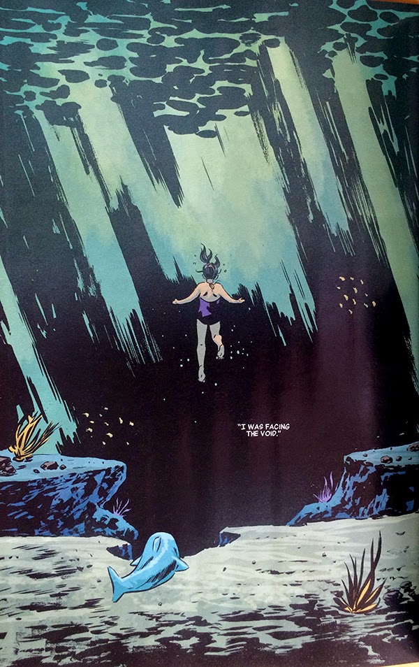
This sequence here is basically flawless. It is essentially the pivotal moment in an anecdote about Maria Hill's childhood where she, following some dolphins, instead encounters a shark. She reacts in fear and in the process of trying to evade the shark she sees the void, that wild expanse of open potential danger that would go on to define her life and role in SHIELD. It's a pretty powerful scene and a great metaphor for paranoia culture.

The thing about this sequence, aside from just how gloriously earnest it is, is just how perfectly the lettering is placed in the second page. 


Lettering is all about choices, about placing critical narrative information and dialogue into artwork in the best way possible. Which is frequently a tremendous balancing act. The text shouldn't obscure key features of the artwork. The text should be positioned in a logical way so that it is encountered in the correct order. The text should interact with the artwork so that it is read in a way that improves the storytelling on the page. The text can even be used in a way to drive or pull at attention and alter the flow and emotional resonance of the page. It should also just kind of look nice. Ideally the text is so well incorporated into the sequence that it seems effortless and virtually invisible. Which is why, when it's perfect, it is so damn impressive.

To a certain extent, when first approaching such a large, intentionally open page with so little text, the placement options are essentially legion.


Even whittling down the options to what I would, in my *very* amateur estimation, consider storytelling reasonable positions there are still some very different options. Like, would it be best to seat the text box somewhere in the top left to introduce the idea of the void first before encountering any of the figure work? Or would it best to put the text above Maria Hill, close to her, so that we see the idea of the void and look down through her and into the darkness? Or is it best to put the text of the void in the heart of it so that the idea and the thing are connected? Or is it best to put the the text at the very bottom of the page so the reader can take it all in organically, to see and experience the void, before we are told about it? Which makes the page work best? Which is the most impactful and organic? When broken down like this, it isn't immediately obvious to me.


Of course, once you see the final page it is perfectly obvious what the ideal placement is. The one chosen, which places the text in the heart of the void is brilliant. It allows the reader to make their way through the depth of the page, experiencing the silent, serene weight of the water above Maria. The reader then finds Maria, weightless in the heart of the page, and quickly moves from her, along her gaze, to the words "I WAS FACING THE VOID", hanging in a black wound in the background of the page. By putting the text here, Team Secret builds the concept of the void directly into the blackness, giving it an ominous quality it would otherwise lack: this is THE VOID it is scary and it is important. This choice also makes the void the centre of attention of the page and the logical termination of the reading path through the page: the implied tangent the reader has been following has ended in the dark heart of the page which also increases the weight and significance of the void. This choice also imparts significance to everything else in the page, letting the placid space work it's magic and allowing Maria to have her moment in a neutral emotional space before the crushing concept of the void is deployed. It's fantastic storytelling that relies on the lettering being just so.

Which is why this page is an example and lesson in how to do lettering really, really well.

Previously:
Secret Avengers #10 and 11: Some cool layouts

Secret Avengers #9: Interlocking stories
Secret Avengers #7: Labyrinthine panelling
Secret Avengers #4: Colour as character symbols.
Secret Avengers #2-3: Smart layouts.

Friday, 5 June 2015

Brooding About Bucky Barnes: The Winter Soldier #8

Or a look at  yet more dynamic layouts in BB:TWS #8
By Ales Kot, Marco Rudy, Clayton Cowles; Marvel Comics


Bucky Barnes: The Winter Soldier continues to be a comic that combines a trippy, empathetic storyline with some really far out, psychedelic visuals to make for a really fun and interesting reading experience. I like this comic, is what I’m saying.

BB:TWS is also an interesting comic from a technical perspective. Marco Rudy is a painter-style comics artist which means he uses colour and lighting to create gorgeous moments of story. The way talented painters can use light in their artwork in particular adds a wonderful layer of reality to their artwork which brings an added level of verisimilitude to a comic. That said, by fixing the lighting in their artwork, painters compositions can occasionally look  static. Painters also feature the challenge that their artwork tends to look it’s best in fewer, larger panels where they have the space to really let their artwork shine. But this comes with a cost too, fewer larger panels results in less sequential space to tell the story. BB:TWS is a comic that works within these considerations and uses innovative layouts to maximize Marcos Rudy’s skills as a painter while overcoming some of the limitations of this style of artwork.

And so I’m going to take a look at some of my favourite layouts from BB: TWS #8.

There will of course be *SPOILERS* for BB: TWS #8.


BB:TWS #8 starts with a scene where Daisy Johnson and her pterodactyl friend jump off a cliff and have a flying adventure. This is told over a double page spread that is composed of a number of skinny, blade-like panels that progress down the left edge of the layout. This gives the double page spread additional panel space to introduce the situation and draws the reader from the top of the spread to the bottom left corner. Critically the last three of these blade panels, as they transition from vertical and horizontal in the corner, have no text and are sparse on details and can be read very quickly. This means that when the reader looks upwards into the largest, main panel in the composition where the ptereodactyl-thing catches Daisy and carries her into the sky it feels very dramatic and kinetic. The reader’s eye has travelled down the page, down and up in a long arch that captures the motion and feel of falling and being caught; it’s wonderfully evocative stuff.
This double page spread here is very much an ideal storytelling space for a painter. It features a very large panel that is the centerpiece of the composition where the painter can make a really complicated and beautiful picture. It also features smaller panels that give the artist more room for storytelling which are also used to build motion into the layout of the page which lends a sense of dynamic movement to the fairly static images in each of the panels. This spread is ideally designed to play to the strengths of painters while cleverly overcoming the potential weaknesses of the style.


This page, which continues the story of Daisy and the peterodactyl-thing, is another great example of layouts being used to impart motion to a painted composition. This page uses the same essential tricks as the previous spread: long, blade like panels around a central feature image where the panel shape gives the layout motion. This page, though, takes the trickin last page and drives it even further: the shape of the small panels is much longer and curved, creating a rifled spiral around the page. This carries through the implied motion of the central panel where the pterodactyl-thing is swinging Daisy around and makes the entire page spin in a barrel-roll. It’s super dynamic and really showcases just how much motion can be built into a page through layout. Wooow!


I’m also really fond of this layout. The story of this page is that Bucky and old-Bucky have done a lot of the empathy drug Illum which has caused them to enter the dreams of Ventolin. Something, incidentally Ventolin knows about and consents to (which, btw, have I mentioned that I like Ales Kot a lot?). Anyway, this is another interesting double page spread that plays to the strengths of a painter. The page opens on an absolutely beautiful page of Ventolin sleeping in a bed, draped with wonderfully shadowed sheets that is a pleasure to look at and captures the peaceful beauty of sleep. The right side of the page though is split into a knot of smaller panels that originate from a braided rope of something biological and brain-tissue like that originates in Ventolin's head. These small panels depict the contents of names dream in biological shards that are obviously taking place in her mind. It’s another evocative composition that is emotionally effective and really maximizes the compromise between space to paint and panels to drive the story forward.


BB:TWS #15 is the Illum mind-trip issue where Bucky and old-Bucky have their consciousness expanded by the empathy drug.  This issue denotes the profound experiences the men have while on this drug using a fairly simple, but really effective trick: BB:TWS #15 uses double page spreads turned 90 degrees to convey the experience of an Illum high. It’s a really effective choice because it makes these pages feel special and different than typical comics and, since there is just something massive feeling about this angle, makes the pages feel massive and profound. It’s a cool choice.


Bucky Barnes: The Winter Soldier continues to be a great comic filled with some of the smartest, most effective painted comics I’ve ever read.

Previously:

Monday, 27 April 2015

Deep Sequencing: Zero Atlas

Or a geographic plot map of Zero Vol. 1-2
by Ales Kot, Michael Walsh, Tradd Moore, Mateus Santolouco, Morgan Jeske, Will Tempest, Vanesa R Del Rey, Matt Taylor, Jorge Coelho, Tonci Zonjic, Michael Gaydos, Jordie Bellaire, and Clayton Cowles; Image Comics


One of my favourite comic things is when a comic rigorously annotates time, date, and location. I think it adds a level of reality to the narrative that makes the comic feel much more authentic. It also means I can take the times, dates, and locations and make annotated plot maps! Zero is a globe trotting Sci-fi espionage comic that lends itself to making a plot-atlas. 

I guess there are kind of *SPOILERS* in it.

This version includes events in Zero Vol. 1 and 2. Click on the image for a larger version of the Zero plot-atlas. 


Previously:
So I Read Zero: Vol. 1
So I Read Zero: Vol. 2

Deep Sequencing: Brutal Action
Deep Sequencing: Gun fight!

Friday, 24 April 2015

Deep Sequencing: The Firefight at the heart of it all

Or the fantastic gun play in Zero Vol. 2
by Ales Kot, Jorge Coelho, Jordie Bellaire, Clayton Cowles; Image Comics


Zero is the transgressive, Sci-fi espionage comic that bleeds sincerity. It is also a showcase comic where a rotating cast of artists work with writer Ales Kot and legendary colourist Jordie Bellaire to make comics magic happen.  Every chapter of Zero is its own, interesting world with a distinct style and some aspect of comics storytelling done impeccably. Zero: Vol. 2 is no exception and the chapter drawn by Jorge Coelho has what might be the best gunfight I've read in comics. Specifically, there is a certain pair of pages that I think really showcase wha makes this chapter of Zero so special.

There will, as always, be *SPOILERS* below.


The thing about a firefight with multiple gunmen is that they are not linear, clear events. There are numerous participants, all moving through cover, trying to out position one another and gain an unexpected angle of attack. Every armed person can kill at range. Bullets can pass through unexpected barriers, or ricochet and careen,  wounding and killing in unpredictable ways. Basically, firefights are fluid, chaos situations that are composed of staccato moments of terror. 

I think this layout here absolutely captures the chaos, fluidity, and terror of a firefight perfectly. The chopped, quick panels that focus on consequences, the multiple interspersed narratives, and the sheer speed of the page make for a truly visceral and exciting experience.  It is, purely on the surface, awesome comics.


The thing that elevates this sequence for me even more is that I am still not entirely sure what the correct reading order is for these pages. I think you can read the pages either left and then right, or altogether as a double page spread, and be able to draw out a reasonably equivalent narrative experience. Or at the very least a logical chain of events. Whether this is intentional, or a side effect of me being a dummy, what this does for me is make the pages so much more chaotic and fluid, this firefight is so slippery that it defies an obvious reading order. And I think that is amazing comics, and such a great thing that I hope it was on purpose.

I love this sequence so much.

It's also a emblematic of the kind of comics discoveries that can be found in Zero. It's a great comic to be floored by something unexpected in.

Previously:
So I Read Zero: Vol. 1
So I Read Zero: Vol. 2

Deep Sequencing: Brutal Action

Wednesday, 22 April 2015

So I Read Zero: At The Heart Of It All

A 250 word (or less) review of Zero Vol. 2
by Ales Kot, Vanesa R. Del Rey, Matt Taylor, Jorge Coelho, Tonci Zonjic, Michael Gaydos, Jordie Bellaire, Clayton Cowles; Image Comics


This review is for an ongoing series and will have *SPOILERS*. For a clean review of Zero go here.


Zero is a remarkably interesting comic. From a story perspective Zero is a transgressive, brutal, and charmingly peculiar espionage comic. In Volume 1 we learned about Edward Zero and his childhood of conditioning, some of the terrible things he has been commanded to do, and the disastrous mission that killed the love of his life. In At The Heart Of It All we see the consequences of this as Agent Zero becomes unmoored and everything spirals out of control. From a more mechanistic perspective Zero Volume 2 works as a series of loosely connected stories designed to forward the overall narrative and also showcase a diverse group of hyper-talented artists. What this means is that every chapter of At The Heart Of It All is distinct and that the comic reads as a great infiltration comic and then a perfectly designed tale of betrayal and then the best fire fight I've ever seen portrayed before two chapters that are absolutely heart rending. Zero: At The Heart Of It All is a patchwork of different styles and tones, but each and every one of them tells a great story and is remarkably constructed comics you should be reading. I really can't wait until I can read the next chapter.


Word count: 208

Post by Michael Bround

Previously:

Friday, 6 March 2015

Brooding About Bucky Barnes: The Winter Soldier #3, #4, and #5

Or a look at more dynamic layouts in BB:TWS #3, #4, and #5
by Ales Kot, Marco Rudy, and Clayton Cowles; Marvel Comics


Bucky Barnes: The Winter Soldier is a comic that is all about innovation and atmosphere when it comes to layout and design. At this point, this isn't exactly news. However, BB:TWS continues to show such exciting and interesting comics that I still really want to take a closer look at how they work. So, without further ado, here are the most recent sequences from BB:TWS that have me really excited.

There will of course be *SPOILERS* for BB:TWS #3-5 below


The current iteration of The Winter Soldier is a trippy, Sci-fi espionage comic that is filled with exotic locations, psychedelic experiences, and evocative emotion-scapes. It is really impressive how the comic manages to use the structure of the page to give every location a particular visual identity and emotional resonance. In the above selection we see the inside of an alien warship filled with round, gunsight/lense panels that are different than the normal terrestrial grid and evocative of the martial paranoia and technological nature of the guardian spacecraft. Next we see a sequence on the planet that has the panels being drawn into a octogonal panel, which we have previously seen as a motif associated with this world and its Queen in previous issues. The next selection sees a conversation happening in the inner sanctum of the queen, which has an organic, garden motif to the panels. It gives the scene a very biological and intimate sense and really emphasizes the flirtation going on in the panels. Last we see a recurring layout used in a flowery meadow that sees the page revolve around the structure of a flower, which is resonate with the romantic location, but also unexpected and weird, like the dreamy/prophecy subject matter being discussed on panel. All of the pages have a distinct look that is consummate with both the kind of place where the story is happening, but also the emotional flavour of the story. It's great stuff.


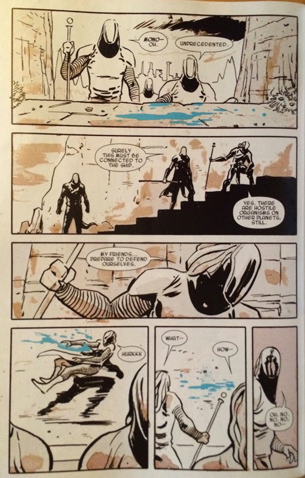
Another cool aspect of BB:TWS #3 is this sequence here. The story of the page is that a troop of psychic alien soldiers find their perceptions altered, presumably because their mental powers are being muted, and then picked off by a dangerous assassin. This is conveyed on the page by a loss of colour when the assassin activates his device. This is a great choice because it viscerally communicates altered perception in a way that changes the way we perceive the page: just like the soldiers who have their senses dampened and changed, so do we. As a visual metaphor for a loss of psychic powers, a loss of colour is pretty great. This choice is also effective as the bright blue of the alien blood in the sequence retains its colour and really pops out. This emphasizes the blood which really enhances the violence and tension of the scene. It's a really effective choice. 


I also am really impressed with this page. The page depicts the arrival of three different space ships arriving at the planet Mer-Z-Bow from three separate dimensions and this information is encoded in a bunch of clever ways. For one, Mer-Z-Bow, the central planet has jewel-like facets, including octagonal faces which play into the established visual motif and identity of the planet. And then there are the way the spacecraft, from separate dimensions, are sequestered from each other in panels that appear as layered planes, as if the ships are burrowing through the multiverse to arrive. This effect is enhanced as the spacecraft progress from the highest, closest to the reader panel-plane and recede towards the planet as the panels stack into the page. It's a cool effect. It is also really clever that Bucky and Daisy's ship, the one native to the universe of the comic, exists solely in the plane of the page and does not travel trough layered panels like the foreign ships. Despite being a pretty quiet logistical page, this sequence is pretty interesting.


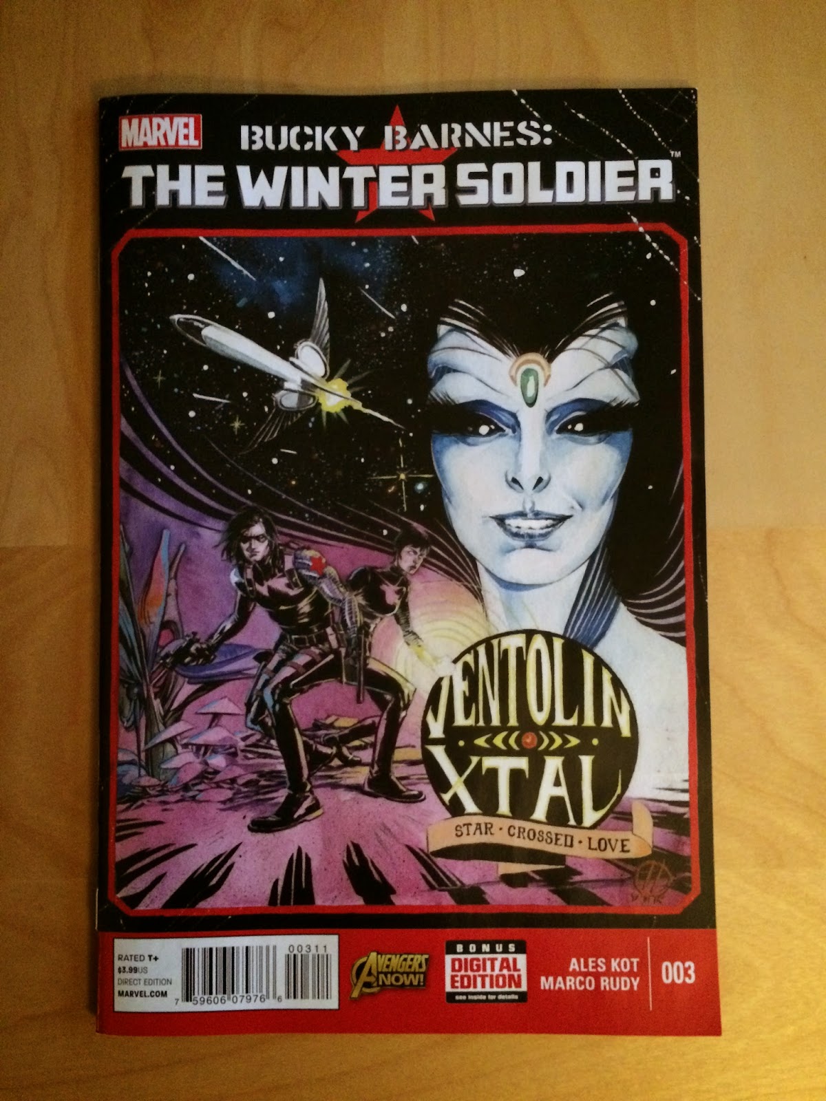
The layout that I find most fascinating in BB:TWS #3 is this double page spread right at the beginning of the comic. The story of the page is that we are introduced to the alien Queen, Ventolin Xtal, she is discussed as a destabilizer and assassination target, and then Daisy and Bucky have some charming roomate banter about their pet Reznor. The actual panels start with a picture of the Queen and then shift to Bucky doing maintenance on (reloading?) his mechanical arm followed by a sequence of their Reznor playing with a ball. The actual panels portray a story of a pretty casual situation, where Ventolin Xtal is merely part of the broader situation. However! The layout of the double page spread is all about her face: every panel is constructed into her profile. What this does is put all of these seemingly casual panels into context: while Bucky and Daisy might be bantering, their, or at least Bucky's mind, is still focused on Xtal. Despite what we are told she is absolutely the most important aspect of this sequence. It's a fantastic use of layout to tell us something unsaid that is going on in the comic. 


This page from BB:TWS #4 might be my very favourite so far. On the page, a stealthy Crossbones ambushes Daisy Johnson and stabs her through the heart. This is depicted in the absolute coolest, most horrifyingly amazing way! We see the figures of Daisy and Crossbones locked in a stabby embrace on a white page that is splattered in a smeared spray of blood red. It is immediately scary and visceral and evocative of the violence of the page. It is also a great way to depict the stabbing: the smeared blood captures the panicked scrabble of the wounded Daisy, and spray of splatter where the knife blade emerges from Daisy's body lends the image a sense of motion and sells the violence of the stabbing. The thing that floors me though, is that the entire blood red smear is in the shape of an explanted heart: the red triangle of ventricular walls, the hollow half circles at the top of atria, and tube like projections and spray at the top where all of the veins and arteries emerge from the organ. This instantly implies to us that Daisy has been stabbed through the heart and really ups the fear and tension of this cliff-hanger. It is, by far, the best depiction of a heart stabbing I have ever seen.

(And, as professional cardiac cell biologist who spends a lot of time thinking about and looking at hearts, this image just floors me. It is incredible.)


Another aspect of Bucky Barnes: The Winter Soldier which I have been quite impressed with is how character motifs are incorporated into the design of pages. This collection of pages from BB:TWS #5 show layouts that are built around the character symbology: the shoulder star of Bucky, the Jolly Roger of Crossbones, and the radial pattern of Daisy Johnson. We can instantly see which character is the focal point of each page by the motifs on display. It's an interesting approach to storytelling.

These selected pages are also noteworthy in that they are kind of awesome. Like, take the top Bucky Star page that has Bucky attacking Crossbones and being tossed across the page in a motion captured by the arc of stars. And then! Then crossbones stabs down with a knife that actually pierces through the layout itself in a truly fearsome moment of comics. Similarly, the Crossbones layout does an incredible job drawing out a truly horrifying and tense moment and the perspective of the knife blade tip pointing down at the reader is jaw dropping. The Daisy Johnson layout not only gives her a triumphant moment of power, but also fractures and splits down the right edge capturing the effects of her seismic attack and showcasing the way things fall apart as Crossbone triggers his contingency plan. Each of these layouts is a nifty use of character symbol motifs and a pretty amazing feat of comics.

Bucky Barnes: The Winter Solider is one of the best layout and design comics being made. You should be reading it. 

Previously:
BB:TWS #2
BB:TWS #1