Showing posts with label Christian Ward. Show all posts

Wednesday, 27 July 2016

Deep Sequencing: Oggling Ody-C Vol. 2

Or a roundup of my favourite artwork and storytelling from Ody-C Vol. 2
by Matt Fraction, Christian Ward, and Chris Eliopoulos; Image Comics


Ody-C continues to be a kind of perplexing comics experience for me. It's clearly a comic, it uses the interaction of words and pictures to tell a story, but in a somewhat different mode than I'm used to coming from a mostly American, genre comics background. Ody-C, to me, skirts this fine line between a traditional comic that uses illustration to convey events and a lyrical/prose story accompanied and supported by illustration. When you add in the psychedelic, inventive artwork and the surreal, lyrical translation of the narration, Ody-C is a challenging and wonderfully unreal comic. It's definitely worth a look, if only to see something unexpected.


Ody-C is also, I think, interesting from the standpoint of execution. Team Ody-C commits some really innovative feats of comics storytelling that are lurid and instructive and, if you are a comics wonk, worth the price of admission. I feel that this is particularly true in the second volume, Sons of The Wolf, which, in my opinion, really shows the creative team growing into their collaboration and the story. If you were not swept away by the first Ody-C chapter/trade, a second look might be in order.


(Conversely, it's possible that I liked Vol. 2 more because I had a better idea of what I was in for and had tempered my expectations accordingly. Is it growth of the creators or the training of the reader, or both?)


This post is going to examine some of my favourite storytelling from Ody-C Volume 2.


There will be *SPOILERS* for Ody-C: Sons of the Wolf below.


The thing that so impresses me about Ody-C is the way the page is molded to the needs of the storytelling. The above examples, taken from a part of the comic that features a story read in a book, are one of the more simple, yet effective examples of this. In this part of the comic the panel shapes and layouts have been given shapes that evoke paper pages in an old, hardcover book. It's a choice that clearly delineates which part of the comic are occurring within the story-within-the-story which enhances clarity. It's also a choice that creates a motif, which gives this section an interesting visual flavour making this segment feel unique and special. This is all fairly straightforward, but is a nice, simple example of how Team Ody-C uses innovative flourishes to make a better reading experience.


Here are some other noteworthy examples of the use of flourishes to construct awesome, evocative moments. 


In the page on the left Ene the Conquerer is warned about Proteus, the leviathan monster who destroys all who try and leave the world she is trapped on. This monster has tremendous power, apparently over space and time, and this is conveyed in the structure of the page. The space panels around the monster warp, and when the leviathan attacks, it breaks the layout of the page itself. This choice instantly conveys what a fearsome, insurmountable challenge Proteus is. 


The right page shows Ene, who is trying to hunt Proteus on a kind of bone-strewn, charnel world, being overtaken by the animated/levitated bones that surround her. The conceit of the page has the bones of the world as white outlines, which blend seamlessly into the gutters of the comic. The page is also noteworthy in that it uses a 16 panel grid, one of the rare occasions the comic uses such a traditional approach. This is important because it means that the reader instantly understands how the page is supposed to work, and allows the bone-conceit to play out as the primary feature in violation of the underlying grid. The page is great in that it shows Ene and her company swallowed up the white of the bones and page, and, because of how Ene progresses across the grid, creates the sense of her being dragged down, down, down. It is a highly evocative page of comics that uses a cool idea coupled with a simple, clear layout to powerful effect. 


Another striking, highly dramatic sequence in Ody-C Vol. 2 is this double page spread. The story playing out here as the Sons of the Wolf, jilted by their respective husband and wife who have taken one another as lovers, slaughter there way through an orgy in a garden. This sequence is a visceral, emotional, page of madness and carnage that is brilliantly executed. The spread once again uses a simple grid layout so that the reader can easily navigate the page. This is very much a choice made to limit distractions and to allow the engines of the page to show through as clearly as possible. One of these engines is the juxtaposition of violence and beauty, tranquility and slaughter. The high panel count allows the comic to jump from severed body part to flower to act of horrific violence to plant, all the while milking the dissonance between these two extremes for dramatic effect. At the same time, the comic uses the visual similarity between a flowers bloom and a burst of blood, the garden and the violence to alternately taint the purity of the beauty and to show the aesthetics of the slaughter. It is a discombobulating and uncomfortable bit of comics. The other engine that drives this page is the use of colour. While most of Ody-C has this complex, nuanced, painted style filled with layered and complicated colours, this sequence uses flat colours in a tightly constrained palette making it visually distinct. The chosen colours, blue, green, and red are simple and stark and when juxtaposed and repeated are lurid and attention grabbing. This makes this sequence feel important and crazy and helps make every image land with maximum impact on the reader. This is a very effective span of comics and one uses a simple layout and dramatic colours to convey a truly horrific moment of insanity.


I think this final, two part example is my favourite storytelling from Ody-C Vol. 2. In the comic the Sons of the Wolf, although twin brothers, are raised separately and unaware of each other. As the story goes their drive, strength, and unnatural charisma leads them to become rulers and amass armies and go to war with each other. This is told and conveyed in part on this beautiful double page spread. I love how this page uses symmetry of design and colour motifs (blue for one brother, red for the other), to show how the Sons of the Wolf are opposed to one another but evenly matched. I also really appreciate that the swirling design manages to create a sense of conflict. Part of this is that the swirl creates paths for the brothers to march along, creating a sense of progression towards a central climatic conflict. I also like that it creates a tense, unbalanced feeling layout that despite its symmetry, feels like it could tear itself apart. It is, at a glance, a layout that conveys two equally matched foes coming to battle. And that is amazing comics. 


This sequence is closed by this page which shows the brothers fighting, discovering their identities, and reconciling to form an empire building alliance. It is a great page. For one the page uses long, apposed motion of the sword swings break through the plane of symmetry created in the previous spread, to violate the balance of the page to show the brothers coming together. This page is also smart in how it uses the arrow created by the crossing blades and moon(/sun?) backlight circle to emphasize the hugging brothers on the bottom of the page. This makes this feel like the most significant moment on the page. I also love how the brothers hugging become this balance point for the rest of the page, a kind of foundation for a layout that feels more secure than what came before. The story transitions from symmetrical, unbalanced layout to a page that crosses over and finds a new, more steady state of rest. It is a very great segment of storytelling.

This is just a random sampling of the moments I found most interesting or useful to talk about as a comics wonk. Ody-C is filled with these kinds of bold storytelling choices that are worth checking out as well as moments that, while maybe less technically involved, are just glorious pictures to look at. If the artwork in a comic is important to you, Ody-C: Sons of the Wolf is a comic you should read.


Previously:


Monday, 9 November 2015

Deep Sequencing: Odd-Y-Layouts

Or a look at the fusion of storytelling objectives and design in Ody-C Vol. 1
by Matt Fraction, Christian Ward, Chris Eliopoulus, Dee Cunniffe; Image Comics


One of the most remarkable things about comics, is just how effective square panels are. With just a few square panels in a row, a storyteller can create compelling stories that use sequence to impart time. Scaled up to a simple grid, and the storytelling potential becomes nearly endless: nine or twelve square panels on a page can tell virtually any kind of story in a clear, compelling way. All that being said, there are a limitless ways to structure a page, and by using innovative and unorthodox layouts, creators can layer additional story information and emotional impact into the fabric of their comics.

Ody-C Vol. 1 is a comic that aggressively adapts page layout to story to tell a more effective story. I think it's worth taking a look at some of my favourites.

There will be *SPOILERS* below.


This page here, while a lot simpler than most of Ody-C's innovative layouts, is a great proof of concept. The page broadly follows a normal square panel format and features a great forced perspective in the top half of the page of the Ody-C's crew falling into a pit prison in the plane of the page. The smart bit of layout here is the addition of four narrow panels that sit isometrically to the main panel in the top half of the page. What these panels do is really sell the forced perspective which really makes the reader experience that moment of plummeting to certain doom. The addition of panels here also adds complexity to this part of the composition which also increases the sense of chaos on the page. It's fairly simple, but really effective.


Here is another fun use of perspective and isometric panels to enhance storytelling. The bottom half of this double page spread shows the crew of the Ody-C using a space-battling ram to smash through a door. What's cool about this is the square grid panels get canted isometrically as the ram is deployed, so that we get to see and experience the ram physically breaking through something. But there is a lot more to like here. For one the path of the ramming is directly in the line of the reading path lending the scene extra force and a wonderful sense of momentum. And then there are also the interspersed panels of rammers which help sell the isometric panels (by providing an in-plane contrast), and which break up the ramming panels giving the sequence a quick slam-break-slam-break rhythm which is very evocative of the motion. Great stuff.


One of my favourite things about Ody-C, or really any Christian Ward comic I've read, is the use of circular layouts. This page here is a great example. The story of the page is that the Ody-C and it's crew land on a plant and meet the locals. The concentric rings of the page make the arrival itself the focal point of the page and place all of the other events under the general purview of that moment. It also focuses the readers attention along the plane of arrival down the page; the other peripheral details are present, but secondary to the cone of storytelling at the core of the page. What this does is make the moment feel bigger and grander: like the moment requires more documentation than just the core story. This page also makes me think, with it's shapes and bright colours, of a stain glass window, which is probably a me-thing, but also helps punch up the grandeur of the moment. It's pretty cool the kind of things that can happen when an artist steps away from grid based layouts.


I am also a pretty big fan of this extended composition. The page starts with a pretty basic, but smart layout: conventional looking rectangular panels squeezed between narrow, page spanning spaceship panels that sell the speed of Ody-C careening through space. What's great about this composition is that as the ships speed reaches some sort of unsafe threshold the fabric of the page begins to break down. The regular panels on the first double page spread begin to fall off the perpendicular or bleed together as the ship in motion skids dangerously along its small strip. And then you turn the page and enter a page that repeats the motif, but devoid of the original structure. The ship is going so rapidly and the situation is so fucked up that everything is warped and broken and the ship itself is skidding through the unreality of blank white space. It's a beautifully broken layout designed to convey just how uncontrolled and desperate the situation is. It is grand comics.

Previously:


Wednesday, 4 November 2015

So I Read Ody-C: Off To Far Ithica

A 250 word (or less) review of Ody-C Volume 1
by Matt Fraction, Christian Ward, Chris Eliopoulos, Dee Cunniffe; Image Comics


Ody-C is a psychedelic space sojourn set in a distant future. In some ways it is familiar: Ody-C is literally a cultural/genre translation of Homer's Odyssey that sees mythic heroes transfigured into futuristic warriors who are lost in space. That said, Ody-C is also very much it's own thing too: the translational choices create a bizarre future where men are all but extinct and a culture of proud warrior women of alien custom struggle through the whims of capricious gods. It's pretty trippy stuff and a pretty unusual comics experience. The strength of Ody-C, beyond its concept, is the artwork of Christian Ward who has created a fluid, alien aesthetic married to innovative layouts which anchor the psychedelic sensibilities of the story and sells the sheer otherness of the comic. It's also gorgeous to look at. What is a bit more unclear to me is how the story of the comic interacts with the artwork: by being fairly literal in their translation of the Odyssey, Team Ody-C is melding a massive oral/prose construction to sequential art. At times, this can be a pretty cool fusion of media that makes the comic feel like an imagined version of a told story. At other times, the incomplete interface of narration and artwork makes Ody-C feel more like an illustrated story than a comic. Overall, I'd say the result is ambitious and interesting, if a little flawed at times, and that ultimately, Ody-C is a unique thing worth a look.


Word count: 247

Monday, 22 December 2014

Ogling ODY-C #1

Or a look at some interesting layouts in ODY-C #1
by Matt Fraction, Christian Ward, Dee Cunnifee, and Chris Eliopoulus; Image Comics


I'm a sucker for first issues. I love to at least try comics I've been looking forward to before budgeting realities force me back to tradewaiting. They are like these delicious little appetizers for comics I can't wait to read. And ODY-C, featuring writing by Matt Fraction and art by Christain Ward is pretty much the peanut buttercup of comics for me. So obviously I was going to read the first issue.

And, uh, wow, it's as good as I was expecting it to be. 

It's also a comic that has some pretty great layouts and comics which are worth taking a closer look at.

There will be *SPOILERS* below. You know, as much as a comic based on a 3000 yearold piece of literature can have spoilers. 


Probably the most exotic comics element in ODY-C is the 8 page gatefold which depicts the conquering Odyssia and her fellow warriors on the eve of Troiia's defeat. It is big and epic and ambitious and functions as an immediate mission statement that ODY-C is a big, epic, and ambitious comic. It also serves as a great statement about how important and dramatic the events of the Iliad (1ly-Ad?) were. It provides this really key bit of context: this really big, important war happened and now this other story can start. So this gatefold is pretty important and smart comics.

It's also noteworthy in that the otherside of the gatefold is a beautiful timeline of space-ancient-Greece and some wonderfully designed star charts acting as an atlas of the comics universe. As someone who loves comics inforgraphics I love these touches. More comics should show charts of information.


One of the things I find really exciting about creative teams that involve Christian Ward is he often uses elaborate layouts that are constructed around the theme of the narrative. This layout is probably my favourite example of this from ODY-C #1. The story here is that the ODY-C, the Swiftship of Odyssia, is wracked by some sort of divine/cosmic phenomenon that blows the ship off course. The crew panics, which is apparently disruptive to the function of the ODY-C, as Swiftships seem to run on crew consensus. This page here depicts Odyssia marshalling her crew to work together to bring the ship under control. What I love about this page is that we see Odyssia, in her piloting-hood thing in a circular panel that functions as the focal centre of the layout, around which we see a ring of crew pulling together to correct the flight of the ship. It's a layout that beautifully illustrates the theme of the crew working together under Odyssia. I also love how the ODY-C can be seen tumbling across the page wildly before stabilizing in the bottom right. The way the ship is shown flailing across the page, regardless of panels or events, helps sell how wildly the ship is moving and how disconnected it is from normal comics behaviour and phenomenon. It's really great stuff.


I am also pretty excited about this page of comics and how it uses a more traditional grid structure in innovative ways to create a pretty nifty action sequence. The key to this page is, I think, that the underlying 12 panel grid is used explicitly in the composition. In the first row, the scene is set with a row of three panels with a nested panel. The three panels discretely separate Odyssia from the Cicone raiders and create this panelled physical space between them. Which is eliminated in the second row of the 12 panel grid where Odyssia and the Cicone collide in the centre panel. The way these two rows of panels interact make the start of combat feel visceral and quick; they convey the sensation of charging soldiers. I also really like the use of the nested panels that float above the grid, that really punch up and complicate the action, adding impact and chaos to the design. However, it's the bottom two rows of the underlying 12 panel grid where this page gets really nifty. In the third row of panels Odyssia kicks one of her opponents through the panel gutter, which is totally rad. It feels impactful and really showcases that Odyssia is sufficiently powerful to break the laws of comics. In the final row of panels we see the broken gutter-stubs from the previous row reused as position markers for horizontal difference. These stub markers are used to show that Odyssia has advanced further to the right than in the previous row of panels. Which is really smart. This bottom row of panels also takes advantage of the down-left carriage return from the previous row of panels to make the reader start the bottom panels from the far left. This means that the reader cruises across the page in the direction of Odyssia's leap, which in another flourish of comics-rule breaking, takes her clear off the page. Which is also pretty rad. This is just a really technically smart page that uses and subverts comic grid structure to make a pretty compelling action sequence. It's great comics.

So ODY-C is a comic that I think everyone should try. If ODY-C #1 is any indication, this is going to be a really exciting series. That said, I might tradewait ODY-C. Don't get me wrong, I REALLY liked the first issue! I just found it had a very distinctive voice, both in the writing and art, which I found took some time to really get traction on. I feel like this a strength of ODY-C, but I also feel like it will maybe make the comic more rewarding to read in a bigger chunk. But you should definitely check it out and make that judgement for yourself.

I can't wait for the first trade.

Friday, 27 December 2013

Favouring The Young Avengers #14

Or looking at the use of panel shape in Young Avengers #14
by Kieron Gillen, Jamie McKelvie, Matt Wilson, Emma Vieceli, Lee Loughridge, Christian Ward, Annie Wu, and Jordie Bellaire; Marvel Comics


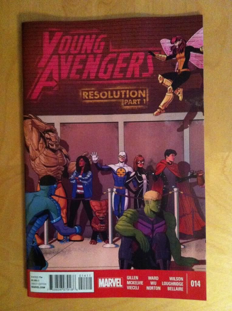
Young Avengers #14 is the first half of an extended "Resolution" to the series. It wraps up some loose ends and begins the unenviable task of providing some closure to a really remarkable series. It's a great issue, but difficult to talk about as it feels very much like a portion of a larger statement. 

So in lieu of a premature series retrospective, I'd like to use Young Avengers #14 to explore how panel shape can be used to enhance storytelling because the issue has some really nifty examples. 

There will, as always, be *SPOILERS* beyond this point. So be wary.

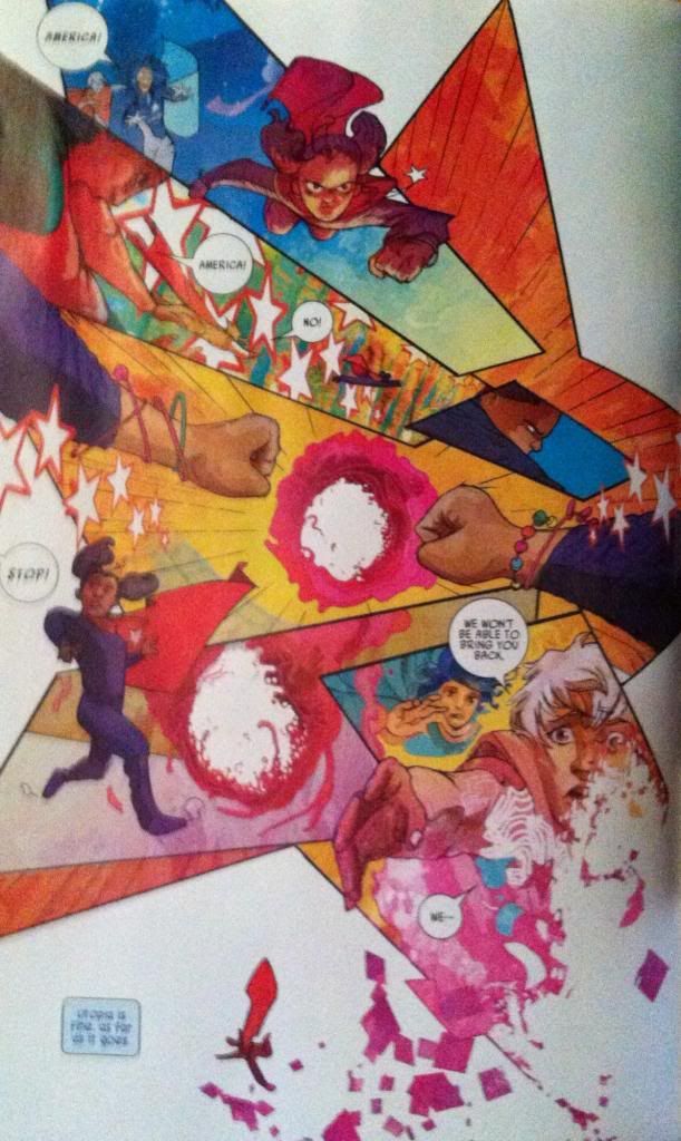
Specifically I want to talk about the America Chavez section of the issue drawn and coloured by Christian Ward. Ward has a really distinctive approach to artwork that makes really interesting use of colour and shape to convey additional story information. And it is completely worth taking a closer look at.


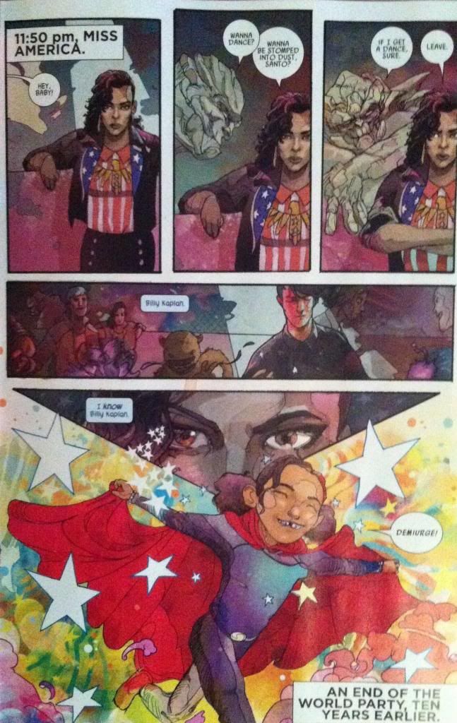
This page here has a bunch of interesting transitional elements. The page starts in the present with realistic, mature artwork that uses very structured panels and gritty, natural colouring, but transitions into a flashback sequence featuring America's childhood which is defined by a looser, more childlike style and a riot of brilliant colours. The change in colour and style clearly marks the difference between the flashback and present day sections of the comic and beautifully sets a tonal shift from the cynical, worldly perspective of grown up Chavez and the more joyful, naive perspective of young America. I also especially love the triangular fifth panel on this page showing the closeup of America's eyes. This panel makes a great use of shape here: the panel seems to be an arrow that points at what is happening in America's mind. It's a great way to effect the story transition that occurs between the fifth and sixth panels.


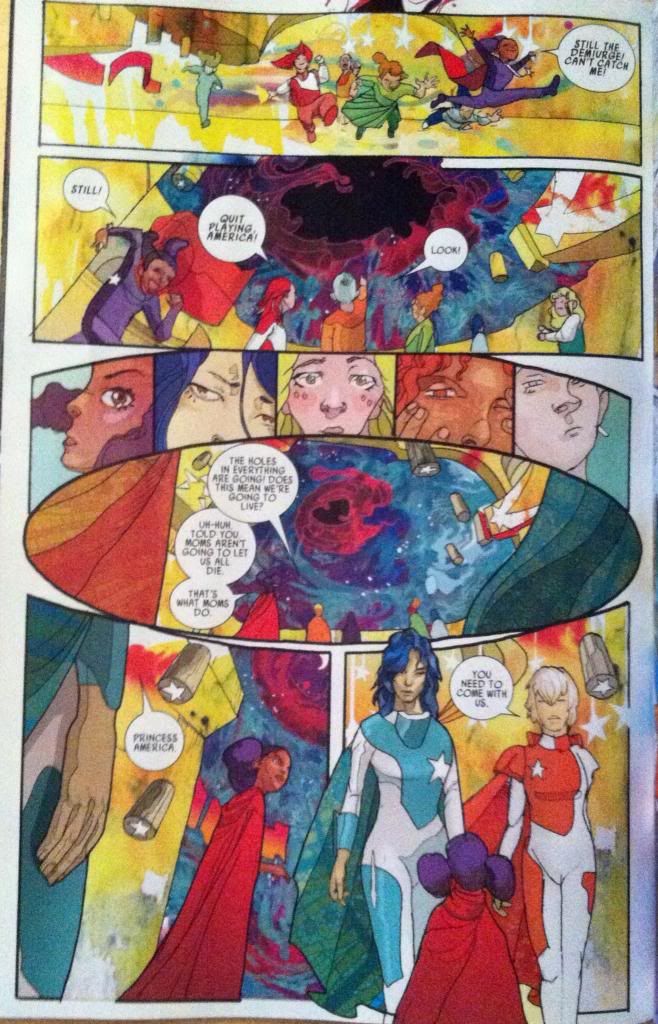
This page here has another pretty great use of shape. In this case the page uses a round panel in the centre of the page to add dramatic emphasis to the HOLE IN REALITY featured in the centre of the panel. It's as if the hole in the centre of the panel is a singularity pulling at the very fabric of the comic and warping the square panels around it into its orbit. It suggests that the hole in reality is vastly important to the larger story of America's childhood (of which we only get a glimpse) and really cements it as a focal point of this page and this section of the comic.

(Also notice the use of the Demiurge colour scheme around the hole in reality? The recurrent iconography in Young Avengers is pretty amazing.)


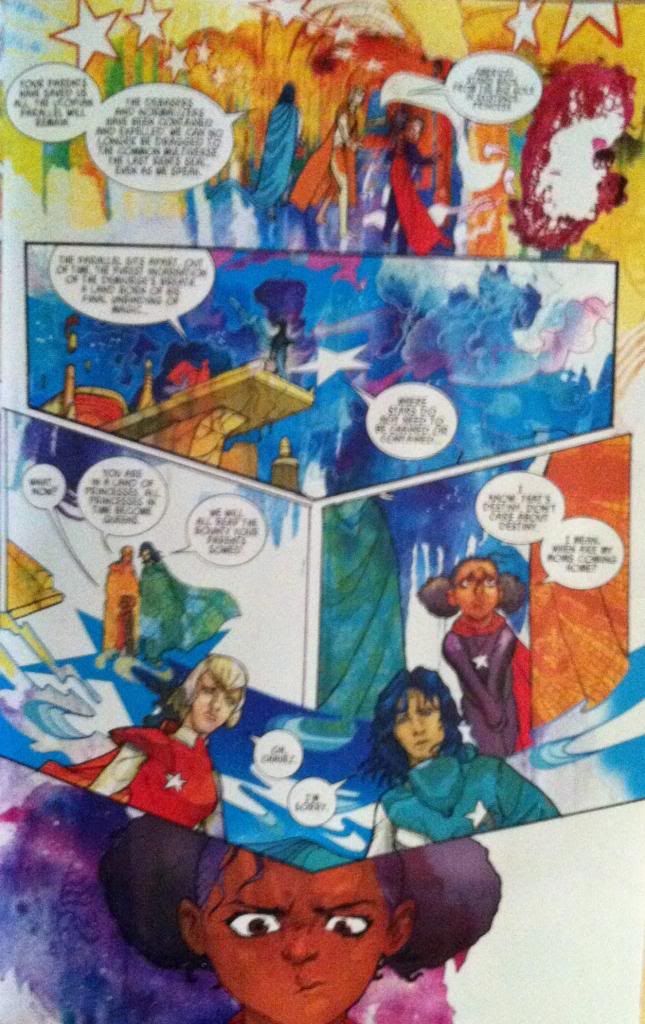
This page here makes a subtle, but really effective use of shape as well. Essentially the dramatic beat of this page is Chavez being presented with a choice, with the majority of the page containing the exposition leading to the choice which is revealed on the following page. What I find so great about this page is that the expositional elements come to a point on America's head as she makes a decision. I think this is clever because it's as if all of the information that effects Chavez decision is projecting above her head and literally on her mind. It's also quite clever as the decision that Chavez makes at the end of this page is the crux of the America section of Young Avengers 14 and the layout of the page focuses in, and balances on this decision. It's subtle, but great stuff.


This page is the dramatic climax of the America story and portrays young America Chavez breaking through the hole in reality, leaving utopia and casting herself on the path that would eventually land her in the events of Young Avengers. And, since this is a sequence that uses magic (demiurge magic judging by the colours) the page contains a breakdown in the progression of comics reality. In this case the page loses its structured panels and instead is drawn into a star-shaped, whirlwind of comics chaos that ends with America Chavez falling right out of the plane of the composition and into the background. Great comics.

(Also, incidentally, I had always assumed the stars associated with America Chavez were a United States of America thing, but I wonder if they had, perhaps, been a nod to the Demiurge all along?)

Avengers #14 is another great issue in an outstanding series with a bevy of great artists working on wrapping things up. I'm going to miss this series when it's gone...

Previously:
Favouring The Young Avengers #13

Favouring The Young Avengers #12 (pt. 2)
Favouring The Young Avengers #12 (pt. 1)
Favouring The Young Avengers #11
Favouring The Young Avengers #10
Favouring The Young Avengers #8
Favouring The Young Avengers #7