Showing posts with label Phil Noto. Show all posts

Monday, 23 March 2015

Interrogating Black Widow #14-16

Or a look at photorealistic character design in Black Widow
by Nathan Edmondson, Phil Noto, and Clayton Cowles; Marvel Comics

A thing that occurred to me about Black Widow is just how great the character design is in the comic. For a comic that is mostly based around photorealistic people dressed in real world clothing, the comic makes some really compelling and subtle choices that make key characters, Black Widow in particular, recognizable. And I think it is interesting enough to take a closer look at.

This is going to be mostly snapshots of 'Tasha, but assume *SPOILERS* are below for Black Widow 1-16.


This is Black Widow at her most recognizable. She is wearing her trademark black catsuit, drawn in the comic as a practical minimalist garment. You can see her trademark weapon gauntlets and the retro-round zipper pull that, along with her belt, complete the outfit. You can also see her red hair, another key visual signifier of the character. When Natatasha is in her "costume" she is instantly recognizable by her simple, yet very well established look. 


Black Widow is an espionage comic, though, and the notion of its main character running around in a recognizable and attention getting black catsuit while trying to be inconspicuous is ridiculous. So a lot of the time Black Widow is wearing plain clothes within the comic, trying to blend in using unobtrusive clothing. Yet we can still easily recognize Natasha on the page. And I think this is pretty interesting stuff. 

Now, clearly part of this is that she still has her very recognizable red hair which is part of her trademark look. But I think it is more than that: Phil Noto is an incredible artist when it comes to faces. Natasha has a distinct face that is instantly recognizable in a variety of situations. We know it is her because she looks like her. It's a character design choice that takes utilizes the realism of her depiction instead of more simple body shapes and or costume colours. 

One aspect of this character design that I've really come to rely on, is actually the two moles on Black Widow's face.


Black Widow makes the smart choice of having Black Widow dress in mission appropriate ways. She wears combat fatigues and body armour, white arctic camouflage suits, plain clothes, and celebrity-style semi-disguises. And yet, we can almost always see those moles, moments of individual imperfections that are distinct to Natasha. They help make her instantly recognizable in any situation where can see her face, regardless of her clothing, or the how the "lighting" makes her hair look. It's such a subtle but effective thing.


What is maybe even more cool about the use of these moles in the character design is that they persist even when Natasha is deliberately disguised. Even in the instances when Natasha wears a wig, which obscures her signature red hair, and dresses in clothes that run contrary to her usual choices, we can still see these moles and use them to recognize her. I really cannot emphasize how clever the use of these two small skin imperfections are in this comic.


These moles also translate through time. In Black Widow #16 we see a number of flashbacks to a young Natasha running away from the Red Room and spending time as a homeless child in Russia. Despite having the face of a child, and all credit to Phil Noto here since we can definitely see the resemblance to the defined features of the adult Black Widow, we still can see Natasha's trademark red hair and her striking facial moles. The versatility of these moles in portraying Black Widow in non-standard situations is quite remarkable.

Black Widow is a really interesting comic in the way it uses and strains against its photorealism. As much as I might write about other styles of comics more, Black Widow is definitely a comic worthy of closer examination.

Previously: 

Monday, 23 February 2015

Interrogating Black Widow #13

Or a look at the interesting colouring choices throughout Black Widow
by Nathan Edmondson, Phil Noto, and Clayton Cowles; Marvel Comics


Black Widow is another of those comics I have been reading for a good long while but haven't really written about. It reliably delivers a solid espionage story and really stands out in that it is entirely a spy comic from a publisher that is almost entirely focused on superheroics. I really like it.

The main reason I haven't written about Black Widow until now has to do with its style. Black Widow, in the art hands of Phil Noto, has a very distinct style: it has this cinematic painted look coupled to incredibly photorealistic characters and design. The combined effect is this comic that looks very realistic, and makes the events portrayed in it feel very believable. The trouble is, beyond pointing out its unique voice and realism, I didn't think there was very much I could say about Black Widow.

But then I noticed that Black Widow #13 does some subtle smart things with colour and that there are actually a few noteworthy examples of nifty colouring effects throughout the series. Which are maybe worth taking a closer look at.

There will be *SPOILERS* for Black Widow #1-13 below.


The majority of Black Widow is coloured in a decidedly photorealistic style. It is in full colour, with believable shades, and makes really great use of light to give everything a decidedly cinematic experience. It is a comic that often looks filmed which creates a sense that the events portrayed are actually happening. It's a great look and helps cement Black Widow as a more grounded espionage story. 

But sometimes Black Widow presents other colouring choices that operate to provide additional storytelling nuance.


In the theme of photorealism and cinematic style choices, this sequence here is really interesting. Black Widow has just assassinated a man and is fleeing from the scene of the crime. What gets my attention about how this scene is executed is how focus and blurring are used on the page. In film and photography lenses have very particular focal points or planes: for a certain configuration of lenses there is a point where everything is crystal clear and often, depending on the particular lenses, there are regions that are out of focus and blurry. This is what people mean when they say bokeh. This trait of camera lenses is actually considered pretty desirable in certain situations because it lets the photographer focus their pictures on a particular chunk of the composition. The key person, thing, or aspect of a photo can be focussed while other background or less essential parts of the photo can be left blurred or slightly out of focus so that they appear less important. And this sequence replicates bokeh to make for a very cool sequence. In the second level of panels we see Natasha in focus as she pushes through a crowd of blurry people, which let's us focus on her but still be aware that she is moving through a crowd. In the final panel, we see the foreground deliberately blurred with a semi-hidden Black Widow hiding in the midground. In this case we can still focus on Natasha despite her being hidden and also get a wonderful sense of depth in the panel. This use of bokeh-style blurring also makes the scene feel like it is being explicitly shot with a camera which adds a layer of drama to the scene. It feels like someone is observing Black Widow as she escapes and hides, which really sells the character's emotions and paranoia. It's a really subtle and great choice.


Another neat feature of Black Widow #13 is how colour is used in the hospital room scene. In the scene Natasha sneaks into visit her manager Isaiah who has been badly injured in an attempt to hurt Black Widow. It is a painful scene filled with shame and anger and remorse and physical pain. And the colouring absolutely enhances this. Instead of being in full colour like most of the issue, this sequence is done in muted, sickly sepia tones that wash out the colour, life, and humanity of the depicted characters. It's like the entire page is pale and miasmatic and as injured as Isaiah. It really captures just how hurt both Isaiah and Natasha are in this scene and also why I absolutely hate hospitals. It's great stuff.

And it reminded me that this kind of palette modification for emotional effect has happened in past issues of Black Widow. 


The interesting use of colour in Black Widow actually dates back to Back Widow #1. In this issue the key action sequence flashes red and gets rougher, darker line work that just screams danger and violence. It's a simple choice, but it makes this collection of red panels absolutely jump out and feel more important and dangerous than everything else in the issue. It was a really cool choice that a year later I still remembered enough to dig out for this post. Which tells you it's an effective choice.


In Black Widow #3 there is another interesting example of an altered colour palette in the mostly photorealistic comic. In this case, while trying to escape through the jungle with a liberated prisoner, Black Widow uses some sort of nightvision goggles to see in the dark. During this sequence the panels are coloured in a kind of nightvision pallette. Gone are the full painted colours, and instead things are coloured in muted brown and green with blue, light based highlights. It's a cool choice because it lends the entire scene a brooding, pursued quality and lets the comic happen in the dark of the night but still be visible to us readers in an authentic seeming way. It's also pretty adroitly done: the dark palette feels like night vision, but is still quite dark which is distinct from the bright green of actual night vision, or the glowing orange of infrared vision (like in the bottom right panel above). It's pretty great comics.

Altogether, I think these selections really show how smart colour choices can really play with photorealism to charge scenes with gigantic emotion and atmosphere. It's great stuff from a pretty great comic.

Post by Michael Bround 

Monday, 20 January 2014

Atoll Comics Round 10

Or changes to my top-ten


Due to poverty and an urge to buy better comics, I have decided to be super-selective about which superhero comics I read. Harnessing the Awesome Power of Maths, I have determined that I can afford to read 10 ongoing titles. So I get to read 10, and only 10, titles published by either Marvel or DC as well as one trade paperback a week of my choosing.

A complication of this is that I am forced to drop an on-going title if I want to try reading a new on-going title, an act of very tough love. Being financially responsible is the worst.

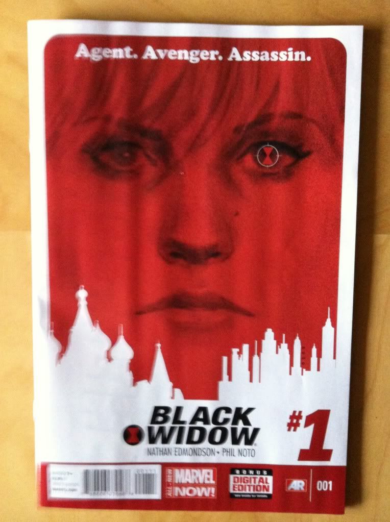
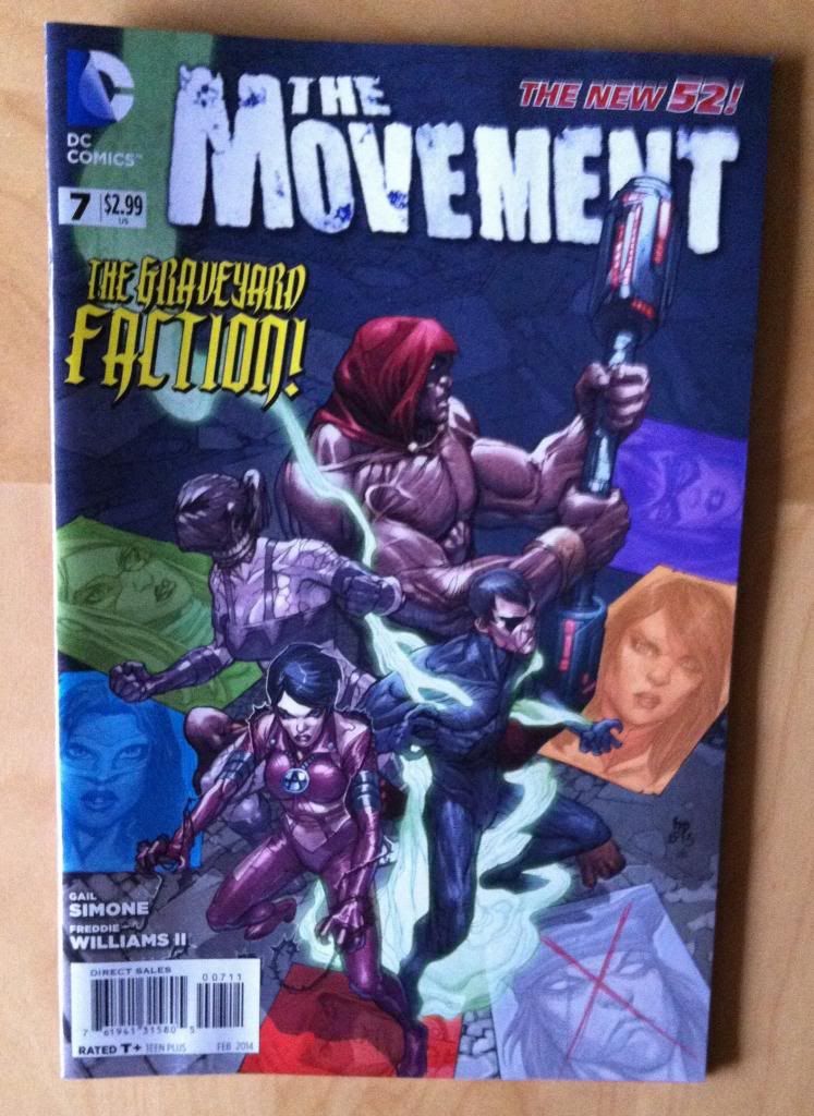
I will be adding Black Widow and dropping The Movement.


Why Black Widow: I feel like Black Widow is one of the most under-utilized characters in the Marvel roster: she is a femme fatale super spy that exists in a universe with all kinds of weird and interesting spy-stuff in a epoch when real life espionage is growing ever more prominent. Add in a solid movie presence and its a no-brainer that there should be a Black Widow comic. And I want a good, ongoing Black Widow comic so badly. Black Widow by Nathan Edmondson and Phil Noto has the potential to be this. The first issue was pretty solid, with some fun spy action rendered with Phil Noto's excellent character acting and cinematic style. It also has an encouraging premise: that Black Widow is taking freelance jobs to fund her various penance projects. My one reservation is that it portrays a pretty mortal, chatty Widow.... which flies in contrast a bit with my idea of the hyper-efficient, quietly ruthless Black Widow that lives in my imagination. But, I'd like to see where the creative team will take things and give Black Widow a chance to win me over. If nothing else, it's a very well made comic.


Why not The Movement: The Movement suffers from too much movement, and not enough of The Movement. Let me explain: I feel like The Movement is trying to do waaaay too much too quickly in a way that is robbing the series of a lot of its potential impact. In just seven issues we have been thrown into a new, corrupt location where a never-before-seen protest/rebel movement with a diverse core group of misfit superhumans are fighting the authorities, some rich dude, a serial killer, and an anti-Movement superteam. There has also been a traitor from within, the addition of a new team member, and an internal ideological struggle within The Movement. In seven issues. While too much decompression is boring and urgency is usually good for comics, I feel like The Movement is failing to explore key series concepts, rushing through characterization, and triggering plot moments before they have had a chance to develop significance. Like, I still don't entirely understand why the setting of the The Movement is bad enough to justify kidnapping cops or how The Movement works. The traitor from within plot was wrapped up before we knew who all the characters even were. Or characters are dropping significant character points in narration boxes that don't organically fit their situations. (I also think the story would be better served by a different artist with a more realistic style and a greater ability to tie setting to story, since I feel like this story begs to feel more grounded and real.) And it kills me that I feel like this: I love the series premise, and I love the way Team Movement are interested in representing groups of people who are typically ignored by comics. I really want to like this comic, but the execution isn't there if I am only going to read ten comics.

Don't get me wrong, this is still a pretty good comic. It just isn't living up to my expectations. However, I could see that if you belong to the aforementioned typically-ignored-by-comics groups how this series might mean the world to you. So I hope it keeps going (and maybe improves a bit) and maybe I can give it another try someday.

(I understand that the comics market is ruthless and DC comics has a policy of dropping under-performing titles pretty quickly, so there is an impetus for creators to rapidly tell their story to try and win an audience and tell their story before the axe might drop. That said, I think The Movement would have been great if it say took a sane (as opposed to Burden) character... say, Misfit, and showed her in the corrupt setting and joining The Movement as an opening arc. Then taking the events of these first issues of The Movement and spreading them out over a few arcs to let the story breath. Maybe there is something to be said about giving creators the security to make longterm plans?)

Previously:

Wednesday, 15 January 2014

So I Read Ghost: In The Smoke and Din

A 250 word (or less) review of the first Ghost collection
By Kelly Sue DeConnick, Phil Noto, and Lee Loughridge; Dark Horse Books


Ghost: In The Smoke and Din is a modern re-imagining of a very 90s gun-toting ghost superhero. It is also written by Kelly Sue DeConnick who is reliably one of my favourite mainstream comics writers. So despite the comic being, at least on the premise level, something I could live without, I trusted to talented creators and gave it a try. Ghost: In The Smoke and Din, begins with the stars of Phantom Finders, a paranormal investigation reality TV show, Vaughn Barnes, a disgraced jorunalist, and Tommy Byers, a bro-y believer, as they test a stolen device and discover a real live (dead?) Ghost. A Ghost with no memory of who she is and a burning desire to solve her own murder. A quest that will uncover a larger conspiracy of corruption and murder and supernatural horror. It's a pretty good superhero comic. I mean, from a plot perspective it is a bit straightforward and the art, while very nice, is not experimental enough to really sell the book as an art comic. That said, the character work in Ghost: In The Smoke and Din is fantastic: DeConnick's dialogue in this book sizzles and pops and, when paired with Noto's excellent facial acting chops, really brings the characters to life. It's this facet of the book that elevates Ghost and makes it more than a by-the-numbers superhero comic and worth the price of admission. If you are looking for some Superheroic action with some remarkably excellent dialogue, I recommend Ghost.

Word count: 250