Or how variety in comics is amazing and generally a good idea.
I spend a disproportionate amount of time trying to get friends to try reading comics. Most of this stems from the fact that I really, really enjoy reading comics and want to share that experience with the people I care about (as any good geek should). Part of this is maybe also motivated by the fact that I don't really have any comic friends, so it would be cool to convert a friend or two. But on a far more mercenary level, I think convincing a friend to read, and to maybe even buy comics is important for comics as an industry.
Comics, as we try to avoid thinking about, are a commodity. Comics creators are a kind of artisan that produce a specialized commodity for a niche consumer. Publishing companies, some merely facets of giant multinational media empires, act as merchant/distributors and bring the commodity to a retailer (a comic shop/bookstore/web ap/whatever) who then sells the product to consumers. As much as creators, publishers, and retailers are all important cogs in the comics machine, there would not be a comics industry without consumers. (I mean, I'm sure some people would still make and share comics they made for fun... but business-driven professional comics require someone to eventually buy them.) To a certain extent, the pool of comics consumers, the market for the weird, amazing commodity that is comics, dictates how much comics can viably be made and supports the people that actually make the things we care about.
In that light, bringing in new comics readers increases the size of the comics market and, as such, increases the amount of money available to comics which thereby increases the amount of comics that can/will be produced and the amount of money that eventually reaches creators (who are great). I know that in the years since a friend of mine slipped me a disk of bootleg comics in an Integral Calculus class I have spent THOUSANDS of dollars on comics and as such I have contributed to the continuance and manufacture of more comics. The way I figure it, every friend of mine I can convince to read and purchase comics represents money that is being fed into the comic machine that would otherwise not be there.
(And yes, my friends often liken me to a drug dealer.)
So back to convincing my friends and loved ones to try reading comics. I have found that most people are not interested in reading superhero comics. It's not that Superhero comics are stigmatized, really, it's that they are a known (or presumed to be known) quantity. Everyone thinks they know what Superhero comics are and has an opinion concerning whether or not they would like to read them. (And I would argue that everyone who is interested in reading superhero comics basically already is, and if they aren't, it isn't very hard for them to change that.) As a result, I have found that the trick to convincing people to try reading comics is to present them with the kind of smart, mature, well-written and beautifully drawn non-superhero comics that most people don't know or appreciate exist.
Almost universally, I have found that Y The Last Man is a perfect first comic to spring on the kind of people I am friends with. The comic has a very accessible and addictive script: it has a compelling central mystery and rolls out a relentless series of cliff hangers that keeps readers glued to the series. Moreover from a writing perspective, the comic manages to present extremely well realized, likeable characters, a snappy sense of humour, and a maturity and level of discourse that civilians are frequently surprised to find in comics. Paired with this is really accessible art: on the one hand it looks nice and services the story well and on the other it has a low panel count in conventional layouts and really doesn't experiment too much. Y The Last Man is also kind of the perfect length for a first comic reading experience. It's not so long that new readers burn out, but still long enough that they get to experience a fair amount of comics before reaching the end. Basically, Y The Last Man is a perfect storm of comics for new people.
That said, in my experience everyone has a different taste in media and wants slightly different things from the experience of it. Part of what makes Y The Last Man such a powerful gateway comic, beyond its execution, is that it manages to straddle a lot of genres and emotional responses simultaneously. Everyone I have ever lent it to has enjoyed it, but frequently for slightly different reasons... and from those responses come critical information about what comes next. And this is where variety (and hence the title of this blog entry) comes in.
(That didn't take a long time to get to at all...)
One of the more successful comic conversions I've had is a coworker I'll call subject A (one that has actually resulted in a comics purchase!). With this person I started with Phonogram which yielded pay dirt with The Singles Club but not Rue Britannia (which was too myopic for her). I then leant her Y The Last Man which she DEVOURED as fast as I would lend it to her. She then tried and enjoyed Scott Pilgrim, the output of Faith Erin Hicks, and Chew. She finally tried Julia Wertz's The Infinite Wait and Other Stories and was blown away and went and bought her first comic in Drinking at the Movies (well second comic, she gift-exchange-stole The Manhattan Projects: Science Bad. at our work Xmas party). She is currently slowly working her way through the Runaways and Octopus Pie (which she quite enjoys). Basically, she likes fun, humorous not super-intense comics that she can relate to.
A similar success story comes from a guy on my soccer teams... who I will call Subject 2. He too devoured Y The Last Man when I leant it to him. From there I tried giving him Chew... which he thought was too ridiculous and silly. So I leant him Criminal, which he apparently likes a lot and is slowly reading in fits and starts. While I am still figuring out what Subject 2 is really into, it seems he likes intense, realistic, page-turning comics.
Which is all proof that not everyone wants to read the same kind of comics. Moreover, it is evidence that the people who are not interested in Superhero comics immediately may be interested in other comics, and that finding what comics they like is mostly a matter of finding what genre of fiction they enjoy. And this is where variety comes in: the more KINDS of comics that are being made, the more likely a new reader will be able to find a comic that fits their media needs exactly (or the more likely I will find that perfect comic to force on my friends).
To take this idea a step further, maybe the way we can expand the audience, and therefore the market, for comics is not by making better and better and better superhero comics, but by making ALL KINDS of different comics. That way everyone can find the comic they want to read. And who knows? Maybe that will lead to them trying a comic.
And then another.
And another.
Previously:
Variety is the Spice of Comics Pt. 1: Pony Up
Variety is the Spice of Comics Pt. 2: Year in Review
Showing posts with label Y The Last Man. Show all posts
Showing posts with label Y The Last Man. Show all posts
Friday, 5 April 2013

Wednesday, 27 February 2013
So I Read Y The Last Man
A 250 word (or less) review of Y The Last Man the complete series
By Brian K Vaughan and Pia Guerra, Vertigo Comics

In my experience Y The Last Man is essentially universally likeable. The central hook of the comic is that every male organism on earth suddenly dies with the exception of two survivors: Yorick, a naive twenty-something, and his pet monkey Ampersand. The pair is eventually teamed up with Agent 355 and brilliant scientist Dr. Alison Mann to discover the source of the pair’s immunity and to cure the plague. The book hinges on the group saving humanity, escaping man-hating Amazons, surviving the predations of Israeli commandos, and finding Yorick's lost sweetheart, Beth, in a ladies-only dystopian future. Thematically the book is an extended examination of the relationship between genders and how they do or don't fit together. For all its action and suspense, Y is at its core a really insightful book. Brian K Vaughan is a superb writer who masterfully and seamlessly mixes humour, drama, comedy, and action to create an eminently readable story. Pia Guerra's art is similarly brilliant: with a clean, detailed, and expressive style that really enhances the story. Y The Last Man is also kind of the perfect comic for new readers: the story is a real page turner with lovable characters and endless cliff hangers and the artwork is gorgeous and accessible. I have leant this series to many non-comics readers and they have all enjoyed it and been open to trying another comic. So even if you aren’t comics people read Y The Last Man. Empirical data suggests you will not be disappointed.
By Brian K Vaughan and Pia Guerra, Vertigo Comics
In my experience Y The Last Man is essentially universally likeable. The central hook of the comic is that every male organism on earth suddenly dies with the exception of two survivors: Yorick, a naive twenty-something, and his pet monkey Ampersand. The pair is eventually teamed up with Agent 355 and brilliant scientist Dr. Alison Mann to discover the source of the pair’s immunity and to cure the plague. The book hinges on the group saving humanity, escaping man-hating Amazons, surviving the predations of Israeli commandos, and finding Yorick's lost sweetheart, Beth, in a ladies-only dystopian future. Thematically the book is an extended examination of the relationship between genders and how they do or don't fit together. For all its action and suspense, Y is at its core a really insightful book. Brian K Vaughan is a superb writer who masterfully and seamlessly mixes humour, drama, comedy, and action to create an eminently readable story. Pia Guerra's art is similarly brilliant: with a clean, detailed, and expressive style that really enhances the story. Y The Last Man is also kind of the perfect comic for new readers: the story is a real page turner with lovable characters and endless cliff hangers and the artwork is gorgeous and accessible. I have leant this series to many non-comics readers and they have all enjoyed it and been open to trying another comic. So even if you aren’t comics people read Y The Last Man. Empirical data suggests you will not be disappointed.
Word count: 250

Friday, 11 January 2013
Spinal Tapestry Pt. 1: Back Support.
On the under-appreciated art of comic book spines.
I love print comics. Love them. Especially the larger tradepaperbacks, collected editions, and original graphic novel formats. Part of it is that I think they are a more satisfying reading experience, especially for the more unconventional and challenging comics out there. It's also pretty great that they are more durable/portable format for sharing with friends. But something I really like about the format is that graphic novel format comics are displayable art objects.

This is the longest non-radiator wall in our apartment, outfitted with bookshelves, which I've been systematically turning into a library of my favourite novels and comics. (It's still a little measly due to my history of public library reading and the used bookstore trade-ins I did when I moved out of my parents house a few years ago... but I'm working on it.) Besides being an attractive way to decorate an apartment wall, this library really increases the home-iness of my home; all of these amazing worlds that I love are always right there to be seen, appreciated, fondly remembered or visited again. It's great.
But I've come to notice something: all I normally see of these comics are their spines. Actually, for the most part, all any of us see of bigger format comics are their spines: they are shelved at home spines out, shelved in comics shops spines out, and shelved in libraries and book stores spines out. And I think this fact might be under-appreciated by the comics industry.
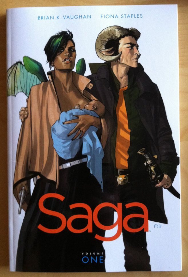
Take Saga: Volume 1, a comic that I absolutely loved reading (review pending). It has an absolutely great title page showing gorgeous artwork by Fiona Staples and a crisp, clean design aesthetic.
But the spine of Saga: Volume 1 is, well, it's boring. Just a lot of white space with small, bright coloured font that simply gets lost on a bookshelf.
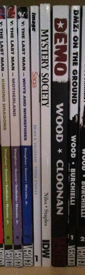
Here is my entire Brian K Vaughan section of my comics library. These are all great comics with solidly attractive and eye-catching covers. You'll notice though, that all we really see are the comic spines. You might also notice that these Brian K Vaughan comics, spine wise, are not all created equal and include examples of what I think are good and bad comic spine design.

Runaways: I'd call this one adequate spine design. Simple with a clearly visible font. It says what it is and doesn't get lost in the crowd. (Beige is the worst colour on Earth though... so...)
Ex Machina: This one is pretty bad. The spines of this series carries through the artwork on the cover which ends up making the spines black, with random blobs of colours. As a result, there is no unified design across the series. Worse, the title font is small and is obscured by the colour blobs. The only way I know this series is Ex Machina at a glance is its location between Runaways and Y The Last Man. Also, the old wildstorm logo on Ex Machina 5-10 is pretty unattractive.
Y The Last Man: In my opinion this is a pretty good spine design. There is a unified look across the series with each title having its own colour scheme. I can clearly see the series title, each volumes title, and the author credits. There is also a Thumbnail taken from each volumes cover at the top of the spine, which is a nice touch. This spine design is simple, fairly attractive, unified, and conveys the relevant information. I like it.
(Notice the evidence of lending? Huzzah for tradepaperbacks.)
Saga: While it's a little hard to judge with only a single volume, I'd say it isn't good. Less because it's actively bad, and more because it's bland to the point of boring. Maybe it will look better with some friends?
I guess my point in all of this is that comic spine design is an important part of making attractive, displayable print comics. Also, given how most comic shops display the majority of their comics, spine design might be important to actually selling comics. In my experience this design often isn't amazing and could be probably be improved with a bit more attention and love.
Let's make comics beautiful for bookshelves everywhere.
I love print comics. Love them. Especially the larger tradepaperbacks, collected editions, and original graphic novel formats. Part of it is that I think they are a more satisfying reading experience, especially for the more unconventional and challenging comics out there. It's also pretty great that they are more durable/portable format for sharing with friends. But something I really like about the format is that graphic novel format comics are displayable art objects.
This is the longest non-radiator wall in our apartment, outfitted with bookshelves, which I've been systematically turning into a library of my favourite novels and comics. (It's still a little measly due to my history of public library reading and the used bookstore trade-ins I did when I moved out of my parents house a few years ago... but I'm working on it.) Besides being an attractive way to decorate an apartment wall, this library really increases the home-iness of my home; all of these amazing worlds that I love are always right there to be seen, appreciated, fondly remembered or visited again. It's great.
But I've come to notice something: all I normally see of these comics are their spines. Actually, for the most part, all any of us see of bigger format comics are their spines: they are shelved at home spines out, shelved in comics shops spines out, and shelved in libraries and book stores spines out. And I think this fact might be under-appreciated by the comics industry.
Take Saga: Volume 1, a comic that I absolutely loved reading (review pending). It has an absolutely great title page showing gorgeous artwork by Fiona Staples and a crisp, clean design aesthetic.
But the spine of Saga: Volume 1 is, well, it's boring. Just a lot of white space with small, bright coloured font that simply gets lost on a bookshelf.
Here is my entire Brian K Vaughan section of my comics library. These are all great comics with solidly attractive and eye-catching covers. You'll notice though, that all we really see are the comic spines. You might also notice that these Brian K Vaughan comics, spine wise, are not all created equal and include examples of what I think are good and bad comic spine design.
Runaways: I'd call this one adequate spine design. Simple with a clearly visible font. It says what it is and doesn't get lost in the crowd. (Beige is the worst colour on Earth though... so...)
Ex Machina: This one is pretty bad. The spines of this series carries through the artwork on the cover which ends up making the spines black, with random blobs of colours. As a result, there is no unified design across the series. Worse, the title font is small and is obscured by the colour blobs. The only way I know this series is Ex Machina at a glance is its location between Runaways and Y The Last Man. Also, the old wildstorm logo on Ex Machina 5-10 is pretty unattractive.
Y The Last Man: In my opinion this is a pretty good spine design. There is a unified look across the series with each title having its own colour scheme. I can clearly see the series title, each volumes title, and the author credits. There is also a Thumbnail taken from each volumes cover at the top of the spine, which is a nice touch. This spine design is simple, fairly attractive, unified, and conveys the relevant information. I like it.
(Notice the evidence of lending? Huzzah for tradepaperbacks.)
Saga: While it's a little hard to judge with only a single volume, I'd say it isn't good. Less because it's actively bad, and more because it's bland to the point of boring. Maybe it will look better with some friends?
I guess my point in all of this is that comic spine design is an important part of making attractive, displayable print comics. Also, given how most comic shops display the majority of their comics, spine design might be important to actually selling comics. In my experience this design often isn't amazing and could be probably be improved with a bit more attention and love.
Let's make comics beautiful for bookshelves everywhere.
Subscribe to:
Posts (Atom)