Showing posts with label Matthew Wilson. Show all posts

Wednesday, 18 May 2016

Interrogating Black Widow #3

Or a look at out of focus storytelling in Black Widow #3
by Chris Samnee, Mark Waid, Matthew Wilson, and Joe Caramagna; Marvel Comics


Something that I've really enjoyed about the current iteration of Black Widow is how the creative team uses eye guiding to enhance storytelling. You might be tired of hearing me bang on about this, but I think it's really cool how eye guiding can be used to highlight key features of a page, pace the story, and to create a tangible sense of motion to make action feel more kinetic. When done well, like it so often is in Black Widow, it's amazing. Black Widow #3 puts an interesting twist on this kind of storytelling by not only calling the reader's attention to key elements of the composition, but by also bypassing other important moments in the page to create earned surprises. It is a really cool twist on eye guiding and I want to unpack a couple examples from the issue here.

There will be *SPOILERS* below. 


The first use of subterfuge-guiding in Black Widow #3 is this sequence of Black Widow being pursued through a crowd by a SHIELD agent. First of all it's a great example of eye guiding in comics. The page uses sight lines and speech bubbles to bring the reader across the top row, and uses the held wire in the top-right panel to orient the carriage return. The reader then encounters Black widow observing her tail which transitions into a crowd scene that uses colour and inset panels to show the agent, Black Widow, and her actions. This row is particularly interesting because it uses the tangents of the wire to nudge the reader to Black Widow and to swing the reader into the next panel where the character is tripped! The final panel uses the crowd to push the reader to the agent and his dialogue before the reader leaves the page. It's a pretty great composition.

On the next page Black Widow is wearing a disguise that she got from somewhere... Or maybe you noticed the one-armed naked mannikin at the very end of the page. Regardless, the key story snippet, the disguise itself, is buried in the composition in plain sight. The reader can see it, but because it isn't emphasized by the eye guiding, perhaps even hidden behind the emphasized Black Widow, it initially appears like background set dressing. It isn't until the nude mannikin or the disguise at the airport that the outfit in the window becomes important. Which is a neat trick because it allows the comic to deploy a little surprise that is constructed out of information available to the reader. 


A simpler, and maybe more directly relevant of subterfuge-guiding is this sequence. On this page, Black Widow garrotes a guard, sees a child or maybe memory of her childhood through a window, and then is surprisingly struck by the guard she was in the process of subduing. The eye guiding on this page is relatively straight forward, with clear east-to-west moves before a carriage return that heavily emphasizes the bright window with the girl in it. The page then takes a clear turn into the motion of the guard striking black widow using the shape of their arms and the onomatopoeia to pull the reader through the motion. What's cool about this sequence is that the girl-in-the-window panel is highlighted so much that it distracted me from the more peripheral elements of that panel. This meant that I didn't notice that the guard is depicted getting his hand under the garrotte wire and is escaping from the distracted Widow. As a result, when the guard strikes Black Widow in the final panel it was surprising and, because I could double back to the preceding panel, it felt earned and satisfying. Which is really fantastic storytelling: in the same way Widow is distracted from noticing the guard escape because of what she is seeing, the reader is also distracted from seeing the guard escape. It's using emphasis and slight-of-hand to generate the experience of the protagonist in the reader. 


Previously:
Black Widow #1

Black Widow #2

Monday, 5 January 2015

Worshipping The Wicked + The Divine #6

Or a look at possessions and characterization in WicDiv #6
by Kieron Gillen, Jamie McKelvie, Matt Wilson, and Clayton Cowles; Image Comics


The Wicked + The Divine is like a tour de force of finding innovative and effective ways to tell us about its characters. I've talked about how impressive and smart the character design is and I am also really intrigued by the way the god characters use allusion to myth and real life pop stars to imply character. But the thing that WicDiv #6 really cements for me is how clever the comic is in using setting and possessions as machines to further inform the audience about the characters in The Wicked + The Divine.

There will be *SPOILERS* for UP TO WicDiv #6 below.


In The Wicked + The Divine #6 we get an annotated glimpse in Laura's bedroom. We see her collection of god posters on the wall and get a sense through these decorations of how important these pop star deities are to her. But we get even more than that. We get an additional sense of how god obsessed Laura is by the fact she is drawing god fanart (P) (haha Sakhmet looks like Rihanna joke) and the fact Laura took the time to carefully rescue a beat up piece of Inanna memorabilia (K). We see that Laura is infatuated with Baal (N). We understand that maybe Laura isn't too concerned with following rules by her stolen Amaterasu poster (C). Through her small photo of friends, getting far less space than her pop idols, we see how disconnected Laura is from her previous life (G). And we see through the vacant spot on the wall how torn up Laura still is over Luci's death (B). We get a great picture into Laura's headspace just by viewing her room and belongings. It's great comics.

(The fact (L), the annotation for the hidden the magic cigarette and box is itself hidden is really clever. The fact that there is "No L" in an issue of comics that dropped in December is the kind of awful/amazing pun that I doubt is accidental. Well played Team WicDiv, well played on both accounts.)

I think it gets at a central truth about people that I don't see used very often in comics: you can learn a lot about someone by looking at their prominent decorations. Like, my living room, despite being fairly uncluttered and tidy (due to my clutter-averse spouse), still has an entire wall of bookshelves covered in my library of novels and comics. Bookshelves that have an accidentally giant canvas of a photo we took in Munich, Germany that has scaffolding all over one of the bell towers of the Faruenkirche, a sign of when we visited. There is my bachelor's degree diploma and the splatter painting from a coworkers' 27th art birthday party and a plant that started its life as garnish in a bouquet that my mother-in-law saved and gave to us. There is a handsaw that my grandfather confiscated from my dad when he destroyed a coffee table with it and later passed onto me near the tiny antique framed print of Lawren Harris' "Above Lake Superior" which belonged to my great grandmother (and which is maybe the most Canadianna thing I own). There is the cobblestone from the bricked over streetcar line that used to run by my apartment that I "acquired" when they lifted it to replace a water main. And there are a dozen other objects, souvenirs, gifts, keepsakes, and photos that tell a hundred stories about my wife and me on these bookshelves alone. I think you can learn a lot about my wife, me, and this little life we've built just by surveying an annotated photo of this wall. And I think The Wicked + The Divine #6 uses this phenomena really effectively.

And not just WicDiv #6, Team WicDiv have been doing this approach throughout the series.


Like, take this mural of Baal. While it is certainly a great riff on the intersection of religious worship and pop idolatry and a smart commentary on the ostentatiousness of certain pop-rappers, it is also really informative about Baal. This mural really showcases how confident Baal is and that he regards himself as a divine figure. It also displays that it is important to Baal that others see his status and acknowledge it. You don't have a mural of yourself painted if you weren't interested in showing off; it is the very definition of conspicuous consumption. It's also another example of a possession that provides key character information about its owner.


Another example of this is Woden. The summit of the gods in the first arch of WicDiv takes place in Valhalla, Woden's palace/fortress/sanctum/place, and from this we get a picture of Woden almost entirely defined by his belongings. We understand that he is a powerful and central figure to the pantheon as they meet in his magical, Daft-Tron location of his creation. We also learn that he has a cadre of women soldier/performers, the Valkyrie, who wear costumes that fit into his Daft-Tron motif. Significantly we see him clutch one of these women in a very possessive way, which seems to imply that he views the Valkyrie as another possession, another thing he has crafted. This suggests that maybe Woden is the kind of person who views others as things, which is a really nasty thing if its true. At the very least see that Woden lives in a world of things he owns, a world of his making where he is surrounded with beautiful women that he has some sort of seemingly problematic and unequal relationship with. Which I think tells us some unflattering things about Woden. (I mean, assuming that this impression is based on reliable information.)

What The Wicked + The Divine makes abundantly clear is that EVERYTHING in a comic can be used to teach us about the characters and story occurring within the panels. Which is the kind of great comics I'm proud to add to my own character defining possessions.

Previously:
WicDiv #1 and popart head-splosions
WicDiv #2 and the use of black-space
WicDiv #3 and character design

WicDiv #4 and body language 

WicDiv#5 and facial acting

Monday, 16 December 2013

Favouring The Young Avengers #13

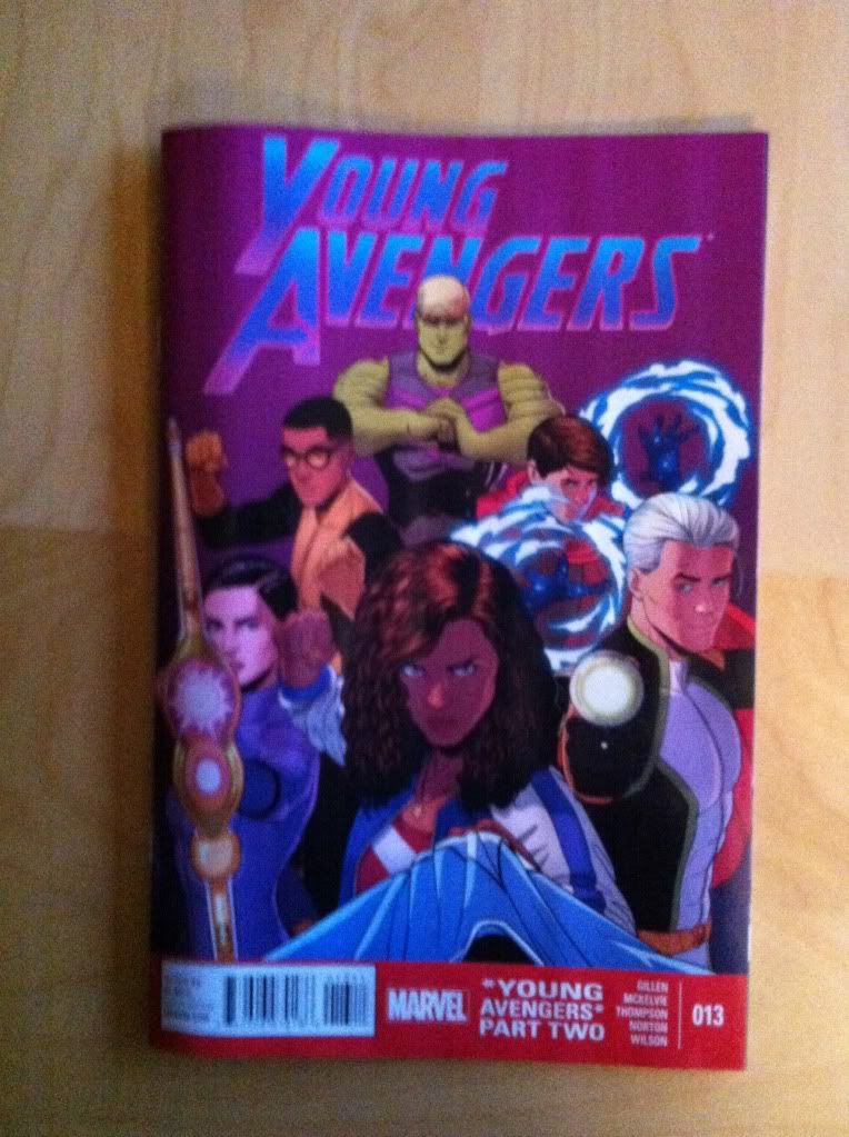
Or on the meta-layouts and meta-theories of Young Avengers #13
By Kieron Gillen, Jamie McKelvie, Stephen Thompson, Mike Norton, Matthew Wilson; Marvel Comics


Young Avengers! What is there to say that I haven't said already? The comic is clever, beautifully drawn, and full of draw dropping, medium challenging moments. It's a great comic that I like a lot. Young Avengers #13 contains the climatic scenes in a long running comic and, in the proud YA tradition, contains some pretty exciting story which is told using some astonishing comics. It also contains some more fodder for my critical theory of Young Avengers. So this post is going to take a look the innovative layouts in the comic, then change gears and do some meta-commenting.

There will of course be intensive *SPOILERS* for Young Avengers #13 and the series as a whole in this post.


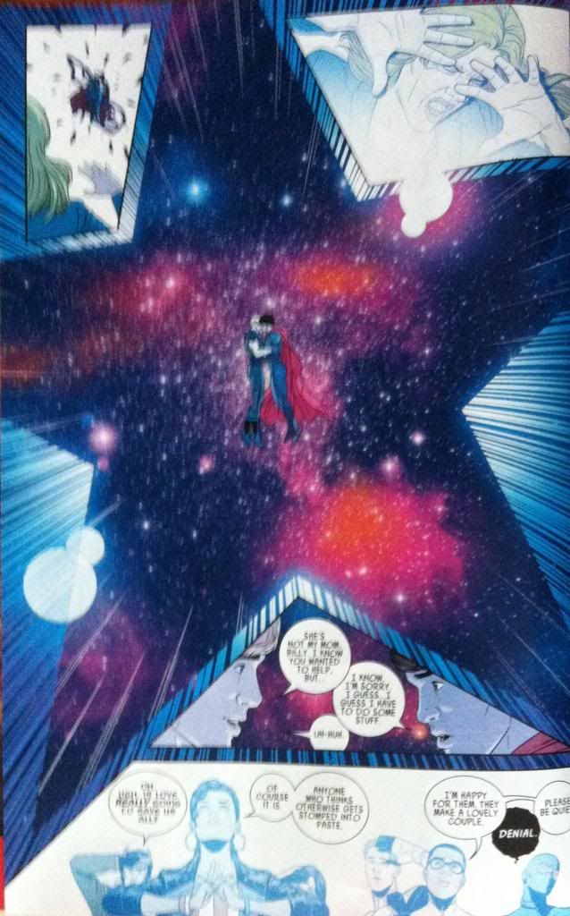
Part of the magic of Young Avengers is how effectively team YA uses colours and iconography to quickly and obviously convey story information. This scene here, shows the climatic reconciliation of Teddy and Billy which serves as the inspiration Billy needs to go full Demiurge (translation for the non-YA fan: Get really, really powerful). This power up is represented entirely through colour and shape: the star has been a recurring shape associated with Billy's use of power and the red-shifted space scenes are the colours of Billy's costume and power. This giant, page commanding Billy-coloured star tells everything we need to know about the moment. Which is pretty great.

(Also, D'awwwww.)


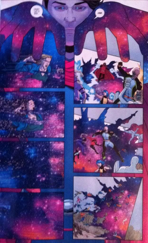
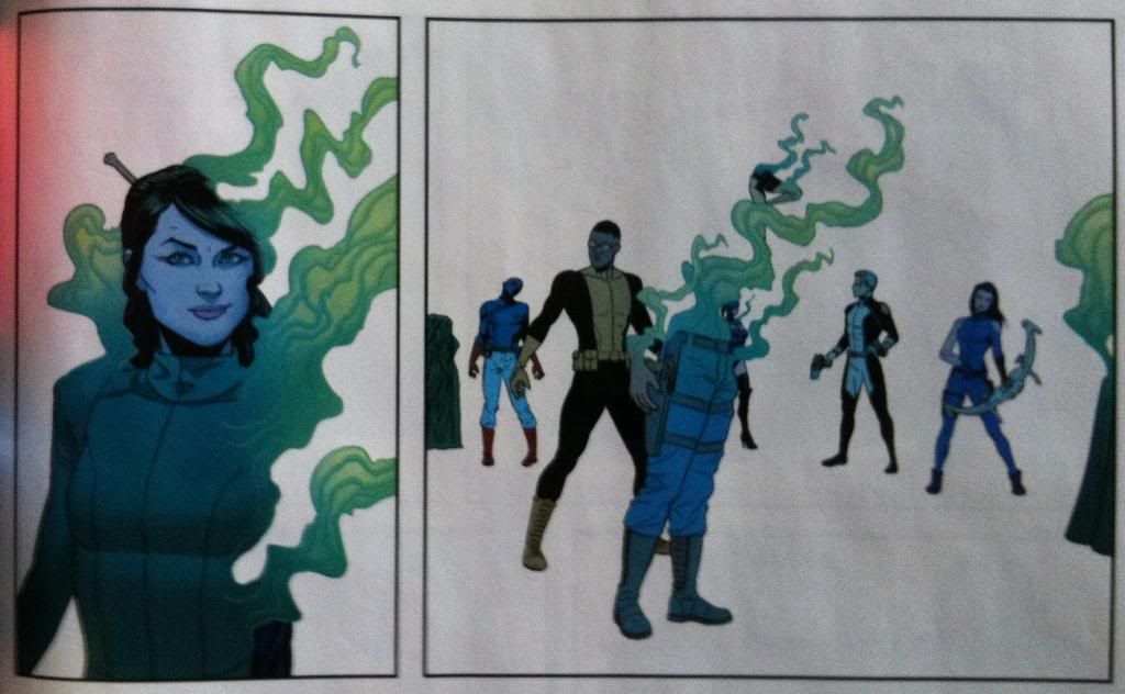
So the big deal about Billy unlocking the power of the demiurge is that he gains the ability to use his magic to manipulate the very fabric of reality. In Young Avengers, magic translates to big, bold, rule breaking comics, and for something as monumentous as redefining reality, we get a doozy. In this case, we see Billy literally reach out and grab onto the panels that constitute reality and change things. (He has the whoooole world in his haaannndsss as my very religious relatives are won't to hymn.) We see the Mother-Parasite washed away in a wind of Billy-colour, and Billy-colour fires tear through the invading Firefly-monsters. It's a very straight forward visual metaphor, but damn if it isn't a satisfying and effective one.

(It's also a pretty great visual representation of what comics creators literally do: with their hands they create and manipulate the very panels of (comics) reality.)


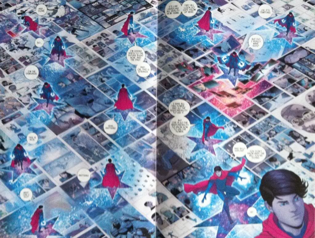
And this is the climax of the climax of the comic and such a cool page hat it would be criminal not to take a look at it. From a story perspective this double page spread shows Demiurge-Billy looking at the recent shape of history/reality and musing about whether he should use his amazing new power to change the past to improve it. And, beyond any of the clever metaphorical or smart process choices on the page, this is just an oh my god amazing bit of comics. Look at it and embrace the awesome. Beyond being wicked cool, this page is also an insanely smart way to portray the concept of a being with godlike powers over reality in a comic. Again and again the Young Avengers has portrayed "reality" within the comic as conventional comics, normal looking panels and magic as the ability to affect these panels in interesting and rule breaking ways. And what could be more rule breaking than a character stepping outside the comic and reading his reality? What could be more powerful than the ability to reach in and rearrange and edit the panels, the reality building blocks, of the Young Avengers world? In the context of comics the creators are gods, and in this layout Billy is endowed with the perspective and power of them in a very visually dynamic way. It is amazing comics.

It's also technically great comics. The way the panels sit in the background is incredible, and the way Billy interacts with them, sliding the last panel of the previous page into place, and then maybe undoing the panels of the very beginning of the story are really great touches. We also see the repeated Demiurge-star motif with it's Billy-colour which is a great continuing symbol for Billy in godmode. But I think my favourite thing about the page is how effectively it leads us through the page. Practically speaking we have Billy swooping a complex zig-zag around a page with no borders or obvious sequence indicators in the foreground (and a sea of unrelated panels in the background). This could be a super confusing page to navigate. But a combination of Billy's perspective (he looks at the next Billy location), word balloons, and the trail of white/blue speckles provide all of the visual information to make moving through the page super simple. It's the basic machinery that makes this complicated, beautifully experimental page work in a way that is completely effortless. 


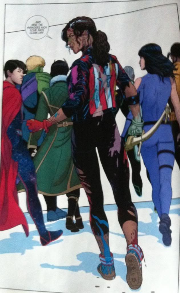
Oh and before I get to the meta-stuff, I just kind of want to point out how great the multicoloured blood is on Miss America here. The literal in story reason for it is that America has been punching the hell out of a aliens and mutants and monsters that bleed all kinds of different colours. But because Young Avengers is unapologetically meta, these colours, I think, have a dual role. I think they are meant to represent America punching comic characters so hard the artwork breaks. That the multicoloured splatter is not much blood, but the very INK of her foes torn from the page because she punched them so damn hard. Regardless, Miss America Chavez is a badass and this is a pretty sweet panel. 

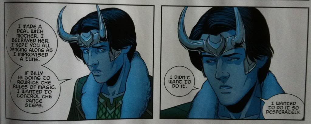
Alright. Now the meta stuff. I have a theory about Young Avengers that centres around the idea that Loki is a stand in for the creators of the comic. (Part 1 of the theory is here, and Part 2 can be read here.) He is a reality and character manipulating liar god that wants to control the team for his own ends and is manipulating Mother (a stand in for the audience) for control of reality (the comic). And this issue has lots of fodder to fuel this theory:


Like he admits that he is behind the events of the series and that he is "improvising" the "tune" that the other characters are "dancing along" to. And that his interest was to "control the dance steps" of the "rules of magic". I mean, it isn't explicit, but pretty close, eh?


And then after Loki confesses to his guilt/involvement in manipulating events his subconscious stops generating the League of Evil Exes. Which, if you look at it in a certain way, is Loki writing the villains out of the story. 


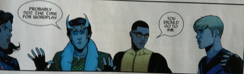
We get to see Loki make silly/quippy wordplay at an inopportune time which is such a comic writer move. (Also, think about this in the most meta way possible: Gillen had Loki do silly word play, then Gillen went something like "Gee that was quite silly for this dramatic moment" and then decided to have Loki point out that what was just said was too silly. Magnificent.)


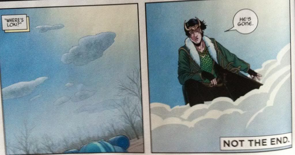
And in the end Loki writes himself out of the story.

Maybe at the end of the day that is the point of the meta-commentary on authorship in Young Avengers. Maybe the point is the creators need to take themselves out of the story (like Loki), with their goals and egos and needs, and just let the characters tell their own story (like Billy taking control of reality). That by letting the characters tell their own story the audience (Mother) can finally be defeated and by removing the creators from the story, critics (Leah) can also be sidestepped. And maybe this is the thematic conclusion of the Young Avengers story. Maybe...

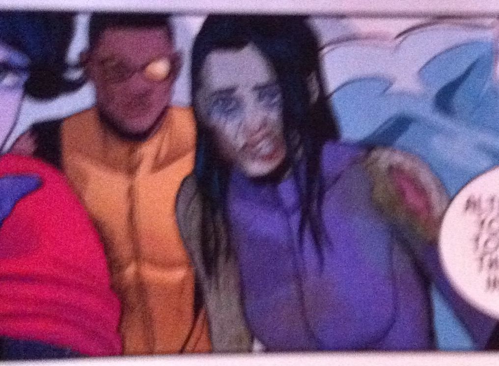
Also, ZOMBIE KATE BISHOP!


Previously:
Favouring The Young Avengers #12 (pt. 2)
Favouring The Young Avengers #12 (pt. 1)
Favouring The Young Avengers #11
Favouring The Young Avengers #10
Favouring The Young Avengers #8
Favouring The Young Avengers #7