by Greg Rucka, Nicola Scott, Chiara Arena, and Jodi Wynne; Image Comics
Black Magick is a supernatural detective noir story from Greg Rucka, Nicola Scott, Chiara Arena, and Jodi Wynne. In it, Rowan Black, is a Portsmouth police detective and secretly a real life witch. The comic opens with Black, being called away from a ritual with her coven when a hostage taker requests her by name. Black confronts the madman to find he is magically controlled and that some sort of powerful enemy is hunting witches. It's a well constructed, atmospheric read that uses a muted take on the supernatural and a sense of mundane realism to construct a compelling story world. Black Magick Vol. 1 is a promising introduction more than a standalone story, but is worth a look for the quality of the artwork and for getting in on the story to come. Hopefully, there will be more soon.
Black Magick is also worth talking about because of how it uses spot colouring to signify magic and because it contains a pretty cool little lesson in lettering. I'll try and explore both below.
There will, as always, be *SPOILERS*
Black Magick is another comic that uses colour as a visual signifier of magic and the supernatural. I've written about this before in Dr. Strange and Phonogram, but I think it's worth briefly touching on how colour is used in Black Magick. Unlike the aforementioned comics, which use bright, eye popping colours on sparse black-and-white compositions to represent the mystical world only Dr. Strange sees or to show the magical, pop-music fuelled battle between self-loathing Phonomancers, Black Magick uses colour to subtly layer magical elements and artifacts into its world. The comic, while largely black and white is sumptuously shaded to create a textured, realistic world that has a kind of noir seriousness. Against this greyscale palette, the muted, judicious bursts of colour stand out as visual oddities, violations of the baseline comic world. Basically, a visual metaphor for magic. At the same time the subtly of the application of colour makes this magic feel humble and well grounded. It's a choice that sets the magic of Black Magick up as a supernatural but serious in an otherwise realistic world. It's a judicious and effective choice.
The other thing about Black Magick that I think is worth unpacking is lettering. Specifically I want to look at a really, great example of lettering as storytelling guide and contrast that with a place where lettering breaks down where the same trick would have been useful. Mostly, because it's a great lesson in lettering. But before I throw I delve into that, I would like to just take a second to point out that the lettering in Black Magic is largely invisible, which is to say, quite good. It is clear to read, doesn't infringe unnecessarily with the underlying artwork, and occasionally helps steer the reader through the page. It does it's job seamlessly.
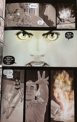
I really like the lettering in the middle section of this page. The cool feature of the lettering here is that one of the speech balloons is positioned so that it overlaps the panel gutter and breaks into the preceding panel. This means that this chunk of lettering is the first thing the reader encounters in this panel as they carriage return into the panel along a nice clear path of speech balloons. This allows the reader to instantly parse an unorthodox reading order of speech balloons in the panel without any ambiguity. It also... there is this thing in visual storytelling, mainly film, called the 180 rule. The 180 rule posits that it the perspective of a scene shouldn't flip between cuts. Or put another way, characters on the left side of the screen or panel should typically stay on the left and characters on the right should keep to the right. The idea being that rotating the perspective is a little confusing and requires the reader or viewer to expend mental energy keeping track of characters instead of just absorbing the story. (There are obvious caveats and limitations to this, like in Pretty Deadly where the perspective is spun to create a sense of chaos and confusion.) Anyway, what's cool about the lettering here is that the attention carrying speech bubble helps execute a 180 perspective change that is absolutely seamless to read. It's carried off so well that unless a reader is a nutbar like me, they probably just breezed right through this page. Which is pretty excellent storytelling.
Okay, if you are still with me on this deep dive into lettering, Black Magick also has an example where the same lettering trick isn't used and where storytelling breaks down slightly. In the above page the transition from the large central panel (which has great lettering BTW) into the lower panels creates a moment of ambiguity. It isn't immediately clear if the reader should treat the speech bubbles from left-to-right as per the normal sequence, or if they are meant to read the first panel they encounter on the carriage return entering the panel like in the above sequence. It's a moment where the reader has to spend time figuring out the correct reading order instead of just absorbing the story, which is not optimal. The correct order is to read the panels in reverse order, going right-to-left, and I think this could have been made instantly clearer by having the speech bubble break into the preceding panel like above. If this was done the correct speech bubble would gain instant visual primacy and inform the reader on the right order. Which all goes to show how just how finicky a craft lettering must be to get right.
So there you have it, a great little lesson on the power of lettering using a great example and a missed opportunity in Black Magick Vol. 1


No comments:
Post a Comment