Showing posts with label Secret Avengers. Show all posts

Friday, 12 June 2015

Atoll Comics Round 20

Or changes to my Top-Ten comics

Due to my spouse seeing how much I spend on comics and an urge to buy better comics, I have decided to be super-selective about which superhero comics I read. Harnessing the Awesome Power of Maths, I have determined that I can afford to read 10 ongoing titles. So I get to read 10, and only 10, titles published by either Marvel or DC as well as one trade paperback a week of my choosing.

A complication of this is that I am forced to drop an on-going title if I want to try reading a new on-going title, an act of very tough love. Being financially responsible is the worst.

I will be adding Howard The Duck and dropping Secret Avengers.


Why Howard The Duck: mostly because it’s something different. Chip Zdarsky and Joe Quinones are two creators that I’ve always enjoyed as slightly idiosyncratic. Chip Zdarsky in particular has an oddly earnest and just, uh, odd sense of humour that seemed like it would fit well with an oddball premise like an alien duck-man (man-duck?) trying to fit into a world of disgusting ape creatures by working as a down-n-his-luck private investigator. I also thought he would bring the funny. And so far Howard The Duck hasn’t disappointed being an amusing weird comic filled with duck puns. Which has made for a fun change of pace in my pull list. I do wonder, a little bit, if Howard The Duck has the staying power to be a comic I’ll read longterm, or if it is a fun premise I’ll enjoy for a while before moving on to something else. Still, for now, fun stuff.


Why not Secret Avengers: because Secret Avengers is over. This is another comic that had its moment in the sun, told its story, and finished it in a satisfying and enjoyable way. Ales Kot, Michael Walsh, Matt Wilson, and Clayton Cowles delivered a consistently uncouth, often funny, and deeply earnest comic filled with some really powerful moments and some really smart comics.  I will miss this book both as a reader and as an art critic. I’ll also deeply miss Secret Avengers take on MODOK whose combination of brilliance, insanity, and passionate sincerity has been a revelation and something, in a way that I find kind of worrying, I found myself really relating too. So goodbye Secret Avengers, goodbye noble Science mutant!

Previously:

Monday, 8 June 2015

Exposing Secret Avengers #15

Or a look at perfect lettering placement in a great moment in Secret Avengers #15
by Ales Kot, Michael Walsh, Matt Wilson, and Clayton Cowles; Marvel Comics


Secret Avengers is the final comic issue in the current iteration of the comic. It does a great job wrapping up the long running story in a satisfying way and giving each of the book's characters a worthy epilogue. The comic also, in a series of achingly beautiful little moments, directly addresses the themes of the comic and maybe some of the broader ideas Secret Avengers was built around. The sincerity on display in this comic is emblematic of what elevated Secret Avengers from a fun-silly comic to a book that I ended up really admiring. I'm going to miss this book.


One of the most significant and beautiful moments, arguably the climax to the book, also serves as a great study in how important and invisible lettering often is in comics. And I think it's worth exploring a little.

There will be major *SPOILERS* for Secret Avengers #15 below.


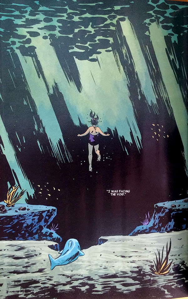
This sequence here is basically flawless. It is essentially the pivotal moment in an anecdote about Maria Hill's childhood where she, following some dolphins, instead encounters a shark. She reacts in fear and in the process of trying to evade the shark she sees the void, that wild expanse of open potential danger that would go on to define her life and role in SHIELD. It's a pretty powerful scene and a great metaphor for paranoia culture.

The thing about this sequence, aside from just how gloriously earnest it is, is just how perfectly the lettering is placed in the second page. 


Lettering is all about choices, about placing critical narrative information and dialogue into artwork in the best way possible. Which is frequently a tremendous balancing act. The text shouldn't obscure key features of the artwork. The text should be positioned in a logical way so that it is encountered in the correct order. The text should interact with the artwork so that it is read in a way that improves the storytelling on the page. The text can even be used in a way to drive or pull at attention and alter the flow and emotional resonance of the page. It should also just kind of look nice. Ideally the text is so well incorporated into the sequence that it seems effortless and virtually invisible. Which is why, when it's perfect, it is so damn impressive.

To a certain extent, when first approaching such a large, intentionally open page with so little text, the placement options are essentially legion.


Even whittling down the options to what I would, in my *very* amateur estimation, consider storytelling reasonable positions there are still some very different options. Like, would it be best to seat the text box somewhere in the top left to introduce the idea of the void first before encountering any of the figure work? Or would it best to put the text above Maria Hill, close to her, so that we see the idea of the void and look down through her and into the darkness? Or is it best to put the text of the void in the heart of it so that the idea and the thing are connected? Or is it best to put the the text at the very bottom of the page so the reader can take it all in organically, to see and experience the void, before we are told about it? Which makes the page work best? Which is the most impactful and organic? When broken down like this, it isn't immediately obvious to me.


Of course, once you see the final page it is perfectly obvious what the ideal placement is. The one chosen, which places the text in the heart of the void is brilliant. It allows the reader to make their way through the depth of the page, experiencing the silent, serene weight of the water above Maria. The reader then finds Maria, weightless in the heart of the page, and quickly moves from her, along her gaze, to the words "I WAS FACING THE VOID", hanging in a black wound in the background of the page. By putting the text here, Team Secret builds the concept of the void directly into the blackness, giving it an ominous quality it would otherwise lack: this is THE VOID it is scary and it is important. This choice also makes the void the centre of attention of the page and the logical termination of the reading path through the page: the implied tangent the reader has been following has ended in the dark heart of the page which also increases the weight and significance of the void. This choice also imparts significance to everything else in the page, letting the placid space work it's magic and allowing Maria to have her moment in a neutral emotional space before the crushing concept of the void is deployed. It's fantastic storytelling that relies on the lettering being just so.

Which is why this page is an example and lesson in how to do lettering really, really well.

Previously:
Secret Avengers #10 and 11: Some cool layouts

Secret Avengers #9: Interlocking stories
Secret Avengers #7: Labyrinthine panelling
Secret Avengers #4: Colour as character symbols.
Secret Avengers #2-3: Smart layouts.

Monday, 19 January 2015

Exposing The Secret Avengers #10 and #11

Or a look at the exciting layouts in Secret Avengers #10 and #11
by Ales Kot, Michael Walsh, Matt Wilson, and Clayton Cowles; Marvel Comics


Secret Avengers is such a good time, with it's slow burning tale of betrayal and love and dire extra-dimensional threats to reality. And hijinks! So many hijinks! It is a comic that balances compelling, warped espionage stories with delightfully absurd humour and rending sincerity to create really enjoyable comics.

Secret Avengers is also a comic that often features some really interesting layouts and splash pages that use unconventional story-telling in interesting ways. And I'd like to show you some.

There will be *SPOILERS* for Secret Avengers #10 and #11 below.


This double page spread from SA #10 is just kind of quietly wonderful comics. The story of the page has Agent Coulson, AWOL, travelling from the city where has been living into the jungle and Hawkeye pursuing him. The pages basically tell the story of two characters travelling from point A to point B. What I like about this layout is that it depicts both characters journeys simultaneously, in alternating, interspersed panels. What this does is allow the characters to play off one another and sell the idea the pursuit component of the story. In the first row of panels we see the two characters preparing and setting out on their journey in directly parallel panels, which establishes that both characters are starting the pursuit from at the same time and from a similar point of preparedness. It also puts them on seemingly equal footing, setting up the comedy of the page. The second row of panels is where the two characters have their paths intersect in alternating panels: Coulson gets in the bus and Hawkeye, being a total futzzing goof, misses the bus. The alternating panels here let us experience the comedy of Hawkeye's frantic screwup and Coulson's quiet ignorance of their near encounter. The final row of panels depicts both characters actually getting to their objective. Here the interspersed panels show Coulson's conventional journey and Hawkeye's amusing Deadpool-airlines gambit. Which makes for a fun contrast. Critically the interspersed panels have sufficient crossover, with Coulson spotting Hawkeyes plane, to help keep the chase elements of the scene feeling important. This page is basically a nifty take on two travel montages that allows for a frantic feeling pursuit and maximum comedy. It's pretty great comics.


This sequence from SA #11 I find endlessly fascinating. It's a very simple seeming sequence that manages to convey a lot of overlapping information in an effortless manner. The story of this row of panels is very straightforward: Spider-Woman mauls her way through a group of henchmen while racing to the aid of the captured Maria Hill. What's really cool about this sequence is how fast and impactful the sequence feels. Often speed and impact feel somewhat at odds with each other: fast sequences are usually about ease of navigation while impact often plays with techniques meant to slow the moment of impact and make it feel weightier. This sequence manages to do both at the same time.

The sequence manages to feel very quick because it has an obvious, simple reader guide shape: all of the action on the page and Spider-Woman's motion make a very clear V-shaped down and up path that can be quickly navigated. Add to that the focus of the composition: the action is pared down to the key moments without any distracting background details. This helps the reader navigate the sequence faster. What's particularly cool about this sequence is that without background the forward motion is completely due to how the characters move across the page and the trail of injured goons acting as horizontal distance markers. This provides all the needed spatial information without adding extra details. This sequence is a lesson in comics efficiency.

The impact of each blow in the sequence, meanwhile, is enhanced by the fact the motion of Spider-Woman doesn't quite sync up between panels. While the overall flow of her progress through the page is very clear, the way she goes from leap to kick to shock to knee-to-the-face is just a little vague and disjointed, which makes every moment in the composition stand out and each blow feel weighty despite the speed of the sequence. This aspect of the page is enhanced by the way Spider-Woman is partially clipped by each preceding panel which helps break up the details of her movement. The impact of this sequence is also emphasized by the colouring. Everything in this row of panels is coloured bright, dangerous red while the rest of the page this sequence resides in is in normal full colour. It makes this sequence stand out and feel more important and violent regardless of the action depicted. Combined these aspects of the sequence manage to really hammer home the ferocity of the action without greatly slowing down the speed of the composition. Which is great stuff.


Another thing that Secret Avengers really hammers home for me is just how *sincere* a comic it is. For being a comic filled with absurdity, comedy, lies, and hijinks it's also a comic that absolutely bleeds sincerity. Characters absolutely, ruthlessly believe and unrepentantly have feelings. For a while now I've been trying to pin down what exactly it is about Secret Avengers that I like so much, and I think it's this sincerity that elevates the whole comic above its remarkable constituent parts. I believe.

And sucks to irony and snark.

Post by Michael Bround

Previously:
Secret Avengers #9: Interlocking stories

Secret Avengers #7: Labyrinthine panelling
Secret Avengers #4: Colour as character symbols.
Secret Avengers #2-3: Smart layouts.


Monday, 17 November 2014

Exposing The Secret Avengers #9

Or a look at kind of a great page or whatever in Secret Avengers #9
by Ales Kot, Michael Walsh, Matt Wilson, and Clayton Cowles; Marvel Comics


Secret Avengers is one goofy and subversive comic book filled with a pleasantly complex plot and some delightfully dark moments. It's also a comic that has some really effective storytelling choices and artwork. And I want to take a closer look at one page from the issue that I thought was full of a bunch of small choices that make for a really interesting and effective page.

There will be *SPOILERS* after this. But you already knew that, right?


I think one of the most interesting challenges with depicting Hawkeye in comics is that ranged weaponry isn't particularly visual. Like, I mean you can draw and archer, an arrow in flight, and a target getting struck, but that isn't particularly interesting after a while. What I like about this page here is that it does a great job capturing the experience of archery in a visually interesting way.

The first thing I like about this page is how it sequesters the experience of firing a bow from the consequences of the arrow. Down one side of the page we have panels focussing on Hawkeye firing arrows, which are tightly cropped and have a universal purple colour and empty background, catching the tranquil space and focus of an archer. On the other side of the page we have the much more chaotic experience of being a target of arrows and being struck by projectiles. It's bow and then it's arrow.

Which is actually an interesting construct of comics because you effectively have three interlocking, simultaneous comic strips on the top half of this page.


You can equally read this page in three different ways. Down the left of the page is a three panel comic strip (red) that only shows Clint firing his arrows one after another. On the right side of the page is another comic strip (blue) showing the wrestler guy getting pummelled with arrows and being knocked over the railing. But you can also read the page left-to-right and top-to-bottom and get a three tiered comic (green) that shows Hawkeye firing his bow, his arrows in flight, and then his arrows striking the target guy. It's pretty cool stuff.

I'm also a big fan of how the arrow flight/ arrow collision is constructed. The transition from flight to impact to reaction is interesting and kind of funny. The fact the construct is used twice, does a great job setting up the grappling hook shot which changes from a left-to-right panel transition to an up-and-down transition, which sells the experience of nabbing something which is falling. Which is such a little thing, but is just super clever. Which is kind of what I love about this comic: it's fun and just filled with neat comics.

Post by Michael Bround

Previously:
Secret Avengers #7: Labyrinthine panelling
Secret Avengers #4: Colour as character symbols.
Secret Avengers #2-3: Smart layouts.


Monday, 25 August 2014

Exposing The Secret Avengers #7

Or a spiffy layout that I like in Secret Avengers #7
by Ales Kot, Michael Walsh, Matt Wilson, and Cayton Cowles; Marvel Comics


Secret Avengers continues to be a comic that for all of it's jokesy good fun is also full of interesting comics decisions. One aspect of the comic that is consistently well done is the use of innovative layouts that convey extra story details or evoke additional emotional reactions in the reader. Secret Avengers has a pretty interesting and fun layout that I thought it would be fun to take a closer look at.

There will be *SPOILERS* for Secret Avengers #7


I love this page. The way the layout tells the story clearly and adds a swirling, perspective challenging element to the panels is pretty cool. It is inherently interesting because it is different and unconventional. But it is even more interesting when you consider the additional thematic and emotional information the layout provides. The story of this page is that Maria Hill is bringing Spider-Woman into the confidence of her secret border-line-paranoid-delusion conspiracy investigation and into the secret room where she keeps her notes. The long, spiralling layout helps emphasize the convoluted, labyrinthine passages the women travel to the lair as well as the winding, twisted psychological space in which they are travelling. The readers get that things are going to a secretive and warped place. The choice of a spiralling layout also, I think, helps emphasize the madness of the moment: an Archimedean Spiral is a symbol of hypnosis and psychosis in our culture and it's use here subtly alerts us that things are going to a potentially crazy place. The swirling effect of the shifting perspective also might play a role in suggesting a clear demarcation between what comes before and after. In certain old-school television shows, most notably Batman '66 (since that's one we are all familiar with) a spiralling perspective shot is used to signify hard, time-jumping edit points, and this layout, at least for me, evokes that same sensibility. So yeah, I think this is a pretty interesting page of comics.

Previously:
Secret Avengers #4: Colour as character symbols.
Secret Avengers #2-3: Smart layouts.

Monday, 16 June 2014

Exposing The Secret Avengers #4

Or a look at colour tagging in Secret Avengers #4 
by Ales Kot, Michael Walsh, Matt Wilson, and Clayton Cowles; Marvel Comics


I love the little details that make comics tick. 

Sure, Secret Avengers #4 continues the super fun, crazy team Superhero espionage story that is, frankly, delightful to read. It also manages to take a very fun comic and add a layer of transgressive tension to the story that adds a substantial new dimension to the comic. It sets its story in Kowloon, which if you know nothing about Kowloon is a fascinating subject in its own right. So, sure, Secret Avengers #4 is a great comic for a lot of complicated, big picture reasons.

But instead of focussing on any of that, I'm going to highlight a little detail in Secret Avengers #4 that I think really enhanced storytelling in a subtle and clever ways.

There will be *SPOILERS* for Secret Avengers #4 within.


The story of Secret Avengers #4 finds Hawkeye (Clint Barton Hawkeye) and Nicholas Fury (the new-retconned in Nick Fury from the movies) lead a team of anonymous Shield Agents into the ghostly, manifested city of the demolished, lawless city of Kowloon in pursuit of the killer robot The Fury. The bulk of the issue revolves around Fury and Hawkeye with agents in small rooms searching for The Fury. To see in the dark Team Shield put on night vision goggles that emit a bright green glow. 


The Fury, meanwhile is a big, lumpy black robot man-thing that is characterized by a distinctive cluster of orange-red lights on its... I want to say head. 


What this means is that you can instantly keep all of the characters straight from the emission of their optics. Most of this comic takes place in a greyscale shadowscape where characters in various black and blue garments, many of whom are nameless and forgettable, sneak around. But, due to their green nightvision goggles, we readers can instantly tell, yep, those are good guys and not The Fury or random ghost-Kowloon denizens. It also instantly conveys any presence, no matter how periphery, of The Fury, since his red optics also stand out dramatically in the greyscale shadow scape. Which creates really great sequences like this where, silently, we can watch green-goggled-good-guys march into a room unsuspecting while the red-eyed-stare of The Fury tells us it is lurking in the background. Which is pretty clever.


And then there is this sequence. Fury (Nick) and Hawkeye (Clint) come up with a plan to catch The Fury (robot) that involves Hawkeye (Clint again) distracting the killer robot. He runs into an apartment, rides a ceiling fan, slides under a pursuing The Fury (robot) and then runs into Fury (Nick again). This is a sequence that is largely based on silhouettes in a dark room, in pretty tight, small panels. And yet, it is completely clear what is going on because all you really need is the blurred green and red lights of the characters optics. You can keep track of which silhouette is Clint and which is killer robot purely based on the bright smear of green and red. You can track the motion of each character by following the direction of the green or red glowing blurs. This is a beautiful example of how smart colouring can convey narrative information and how investing in this kind of colour tagging can really enhance all kinds of storytelling sequences within a comic. 

Secret Avengers, big crazy awesome espionage comic that does some cool stuff with goggle colours.


Previously:
Secret Avengers #2-3: Smart layouts.

Friday, 30 May 2014

Exposing The Secret Avengers #2-3

Or a look at the attention to detail in Secret Avengers #2 and #3 
by Ales Kot, Michael Walsh, Matt Wilson, Clayton Cowles; Marvel Comics


I'm really enjoying Secret Avengers. The formula of gonzo spy stories with a sense of fun is just the kind of mad, accessible comic I want in a Marvel team book. It's also a pretty excellent example of a creative team firing on all cylinders: all of the component parts of the comic are excellent, from the taught, bawdry scripts to the ambitious, clear storytelling of the line art, to the sharp, clean palette of the colours, Secret Avengers is one of Marvel's best made books. That said, for all of its oomph, Secret Avengers most impresses me with its attention to layout and how this enhances every aspect of storytelling.

There will be *SPOILERS* for Secret Avengers #2 and #3.

Before I go spiralling off to panel placements and colour selections and a bunch of other tiny, wonky choices, I want take a moment and explain why I am so enthused by these selections. The fact is there are a lot of very pretty, very well drawn comics being made: Marvel as a mainstream publishing house has really showcased some awesome artists lately. In a pretty large proportion of comics being made the really big moments are delivered beautifully. For me what really characterizes the best comics is a commitment to making every moment as visually interesting as the biggest moments. These are the comics that feature lovingly rendered explosions in space, but also make talking heads feel fresh and interesting. And this is usually a matter of a bunch of small, hard to notice choices that make the entire comic easier to read and more emotionally resonant throughout.

Secret Avengers is currently one of those comics.


You might not immediately realise it, but this is a Talking Heads page. The characters, stranded and floating in space, shooting the shit about their situation with a veneer of hollow bravado. All the action in the page is two dudes talking calmly, but the layout makes this super interesting and adds a layer of unspoken complexity to the situation that adds emotional nuance. The reality of being adrift in space is that there is no (or very little) friction to slow you down, and so any small motion, like falling out of a space station, results in an uncontrolled, spinning tumble. The way this page uses extra panels without a fixed perspective totally sells this motion: the reader, like the characters, has a view that swings wildly between empty space, Earth, and the agents as if they too are careening through the vastness of space. This helps sell the feeling of spacey-ness and quiet majesty, but also just how fucked the agents are. There is something stomach turning and claustrophobic about the tight, tumbling reader's perspective that, despite Fury and Coulson's bravado, really captures the terrifying hopelessness of the agents predicament. So, yeah, this is a talking head page that layout has made awesome and interesting. 


Secret Avengers #2 has four separate storylines that all converge on a single, exciting moment in time. A really important aspect of this structure is that the various plot threads have to feel urgent and simultaneous to really sell the climactic moment. This layout here does a really great job in helping to accomplish this. The key here is that it shows the other three story lines (just after checking in with the agents in space in the last page I showed you) in a way that acts as a time key for them all: the secret avengers in the field arrive at the space station exactly when MODOK is grimly surveying weaponized satellites precisely while something in a duct approaches an injured and very screwed Maria Hill. This provides the temporal context needed to keep track of the various story threads. 

This layout also has some really smart colouring, with each tier of panels having a slightly different palette. The top row has a black/grey/green scheme, while the middle tier shows a lot of blue/yellow/fleshtone, and the bottom tier is done in magenta. This clearly delineates the three bands of panels as belonging to separate narratives and enhances the clarity of the pages.


The climax to one of the story threads in Secret Avengers #2 is a team of Avengers converging on a broken computer and basically, using team work, plugging it back in. This should be the most underwhelming anti-climax ever, and yet, it felt really satisfying and important in the context of the story. And I think this layout is a big reason why. Our heroes enter the page and approach a zoomed in, focussed strip of panels that show the toggles and wire that need repair/reboot. Some fun dialogue happens, and we see our heroes spring to action and fix the computer. The excitement of the moment comes through, I think, due to the tight focus on the computer elements in the second and fourth rows, the repetition (it's important enough to show twice), the elevated moving centre panel in the bottom row, and in the dull to bright green colouring of the wire panels. This page is, for me, a great example of how smart storytelling can sell pretty much any moment.


This large panel from Secret Avengers #3 is another example of really astute storytelling choices. In Secret Avengers #3, our heroes are out to stop a crazy, failed poet with a sentient reality destroying bomb. Black Widow and Spider-woman must find a way to stop the madman while also saving Coulson who is freaking out. What this panel here does is provide a spatial taking stock before all of the action happens. It tells us where all of the characters are in relation to each other, using the face bubbles and colour coding to make the fairly detailed page really quick and easy to suss out. 


What that last layout does is provide context for all of this activity. After seeing the overall layout we can appreciate exactly where all of this frenetic action is happening which helps reader understanding and the speed with which the reader can absorb the scene. It's really smart comics.


I love how these panels are coloured. I'm not sure how to articulate the why of it, though... Have you ever been hit really hard in the face? And have you also smacked the back of your head really hard on something solid, like to the point of blacking out or dazing yourself? Well I have, and the way these two panels are coloured captures the differing sensations of the two collisions. If I ever have to explain how the two things are different, these panels are now my answer.


Of course, Secret Avengers also does the big moments with gusto too. This spread here from Secret Avengers #3 is some varsity level comics. It breaks the page clearly into five discrete narrative regions and moves three different sub-narratives along to their convergent conclusions in a clear way. Beyond just kind of being an awesome couple of pages, I really love how this page splits up the sections: the cliffside combat silouettes without a background split the top row from the bottom, and within the bottom, the use of the tilted panel borders help signify which parts of the bottom half of the spread belong to which narrative region. This is a spread that could be super confusing, but due to really smart storytelling is quick and action packed and crazy.

Just like all of Secret Avengers.