Showing posts with label Marco Rudy. Show all posts

Wednesday, 3 February 2016

Staring At Scarlet Witch #2

Or a look at layout motif in Scarlet Witch #2
by James Robinson, Marco Rudy, and Cory Petit; Marvel Comics


Scarlet Witch is a comic about a Marvel character who I have middling affinity for, but which is showcasing a rotating group of exciting artists, so I'm reading it anyway. The most recent issue features artwork by Marco Rudy who continues to combine his gorgeous painting with innovative comics layout to create really interesting pages of comics. And here are some of my favourite pages.

There will be *SPOILERS* below.


An aspect of Marco Rudy's comics that I really enjoy is how layout is used to build theme motifs into the page. On the left, Greecian-urn style interlocking panels carry the conversational aspects, which creates space to show the gorgeous hillside town,  but also helps give the artwork a foreign, Greek aspect to help establish a sense of place. Meanwhile, the pages featuring the Minotaur often feature twisting, labyrinthine panels that both tie the artwork to the idea of the monster and which also create a tortured, uncomfortable aspect to the page. When compared, the two layout are remarkably different and help differentiate sections of the comics to create distinct, emotionally charged moments. It's always remarkable how effective layout can be as a storytelling element.


This is probably my favourite layout from the issue. For one, it is absolutely gorgeous from a pure picture-type perspective; there is something to be said about things just looking nice. This layout also does a great job catching the feeling of the moment: the fluid panels capture the sense of ocean waves and breezes and help build a tactile sense of place into the comic. The layout is also quite adept in that the wavey elements of the comic boil out of The Scarlet Witch's head, helping to convey that this  is a conversation occurring on a mental/mystical plane and not in the physical world. It is always pretty great when a layout encodes important narrative information into its fabric. This is just a really, remarkably nuanced sequence that is visually interesting and clear to read.

It is also a pretty interesting sequence of comics due to the very active role that lettering plays in increasing readability. The underlying artwork, to me, is somewhat open to reading multiple ways. To my eye, it generally originates in the lower left corner and vectors outward across the page in a sort of explosion of panels. Meanwhile the lettering provides a clear path from panel-to-panel through the fluid panels which keys the reader into a logical order. Taken together, you get the grand vistas of the page but also a roadmap for navigating it. It's great comics.


Monday, 6 July 2015

Brooding About Bucky Barnes: The Winter Soldier # 9

Or a look at incorporating character symbology into layout in BB:TWS #9
by Ales Kot, Marco Rudy, and Clayton Cowles; Marvel Comics


Bucky Barnes: The Winter Soldier continues to be a comic that exemplifies just how great painted-style comics can look. The comic is also a great showcase of just how effective layout can be as a tool to impart a sense of motion or identity to static artwork. Previously, I pointed out some of the really great ways the creative team incorporated character symbols into layout to visually key pages and spreads to certain characters. In BB:TWS #9, the team continues to play with this tool in some really interesting ways. Since I still find this approach so interesting, I'm going to take another look at it.

There will, as always, be *SPOILERS!* below.


Take these pages focusing on Crossbones as he targets the planet Mer-Z-Bow with a planet-sized gun. The layout is built out of a skull, the emblem of this villain, and so the pages are obviously linked to him. This layout is also, much like the threat Crossbones poses in the story, decidedly unsubtle: the pages are constructed out of a goddamn skull, with all of the menace and cultural meaning that implies. Crossbones represents poison and death and he is one deeply bad dude. Which is all conveyed from the way the layout is constructed.

(This is also a pretty significant moment in the broader themes of BB:TWS since Crossbones story is deeply tragic: his crusade of inter-universal murder originates in a childhood tragedy. For him to discuss his motivations, which bear a marked similarity to the security state, within the rictus of a skull is pretty significant stuff.)


A more subtle character note that is incorporated into layouts is Loki's. Early in the comic we see a page where the panels bend and warp to the shape of Loki's horned helm. It's a great structure since it is emblematic of the trickster's look and also tells us something about the god's role in the story: the very fabric of the comic bends to his imagination. As Loki's plan is revealed throughout the comic, I think we see this motif repeated providing a visual cue to Loki and to the way Loki has warped the comic to his will. It's a really clever choice.


This page is kind of the culmination of why I think these character based design elements are so clever. In the story this page represents the final domino in Loki's plan where he effectively gives the heroes of the story his catch 22: they can succumb to him and save Daisy Johnson from Crossbones, or stop him and probably doom their friend. This story is built into a layout that starts with normal square borders, gets drawn into the loki-horn warped panels as the plan is revealed, and then finally resolves into the radial bullseye iconography of Daisy Johnson as it is revealed she is in danger. It's a brilliant page that expresses the relevant characters at play in the fabric of the layout. Absolutely wonderful comics.

Previously:

Friday, 5 June 2015

Brooding About Bucky Barnes: The Winter Soldier #8

Or a look at  yet more dynamic layouts in BB:TWS #8
By Ales Kot, Marco Rudy, Clayton Cowles; Marvel Comics


Bucky Barnes: The Winter Soldier continues to be a comic that combines a trippy, empathetic storyline with some really far out, psychedelic visuals to make for a really fun and interesting reading experience. I like this comic, is what I’m saying.

BB:TWS is also an interesting comic from a technical perspective. Marco Rudy is a painter-style comics artist which means he uses colour and lighting to create gorgeous moments of story. The way talented painters can use light in their artwork in particular adds a wonderful layer of reality to their artwork which brings an added level of verisimilitude to a comic. That said, by fixing the lighting in their artwork, painters compositions can occasionally look  static. Painters also feature the challenge that their artwork tends to look it’s best in fewer, larger panels where they have the space to really let their artwork shine. But this comes with a cost too, fewer larger panels results in less sequential space to tell the story. BB:TWS is a comic that works within these considerations and uses innovative layouts to maximize Marcos Rudy’s skills as a painter while overcoming some of the limitations of this style of artwork.

And so I’m going to take a look at some of my favourite layouts from BB: TWS #8.

There will of course be *SPOILERS* for BB: TWS #8.


BB:TWS #8 starts with a scene where Daisy Johnson and her pterodactyl friend jump off a cliff and have a flying adventure. This is told over a double page spread that is composed of a number of skinny, blade-like panels that progress down the left edge of the layout. This gives the double page spread additional panel space to introduce the situation and draws the reader from the top of the spread to the bottom left corner. Critically the last three of these blade panels, as they transition from vertical and horizontal in the corner, have no text and are sparse on details and can be read very quickly. This means that when the reader looks upwards into the largest, main panel in the composition where the ptereodactyl-thing catches Daisy and carries her into the sky it feels very dramatic and kinetic. The reader’s eye has travelled down the page, down and up in a long arch that captures the motion and feel of falling and being caught; it’s wonderfully evocative stuff.
This double page spread here is very much an ideal storytelling space for a painter. It features a very large panel that is the centerpiece of the composition where the painter can make a really complicated and beautiful picture. It also features smaller panels that give the artist more room for storytelling which are also used to build motion into the layout of the page which lends a sense of dynamic movement to the fairly static images in each of the panels. This spread is ideally designed to play to the strengths of painters while cleverly overcoming the potential weaknesses of the style.


This page, which continues the story of Daisy and the peterodactyl-thing, is another great example of layouts being used to impart motion to a painted composition. This page uses the same essential tricks as the previous spread: long, blade like panels around a central feature image where the panel shape gives the layout motion. This page, though, takes the trickin last page and drives it even further: the shape of the small panels is much longer and curved, creating a rifled spiral around the page. This carries through the implied motion of the central panel where the pterodactyl-thing is swinging Daisy around and makes the entire page spin in a barrel-roll. It’s super dynamic and really showcases just how much motion can be built into a page through layout. Wooow!


I’m also really fond of this layout. The story of this page is that Bucky and old-Bucky have done a lot of the empathy drug Illum which has caused them to enter the dreams of Ventolin. Something, incidentally Ventolin knows about and consents to (which, btw, have I mentioned that I like Ales Kot a lot?). Anyway, this is another interesting double page spread that plays to the strengths of a painter. The page opens on an absolutely beautiful page of Ventolin sleeping in a bed, draped with wonderfully shadowed sheets that is a pleasure to look at and captures the peaceful beauty of sleep. The right side of the page though is split into a knot of smaller panels that originate from a braided rope of something biological and brain-tissue like that originates in Ventolin's head. These small panels depict the contents of names dream in biological shards that are obviously taking place in her mind. It’s another evocative composition that is emotionally effective and really maximizes the compromise between space to paint and panels to drive the story forward.


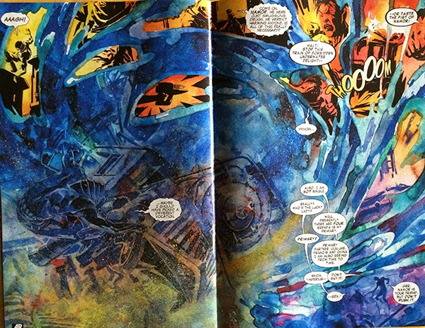
BB:TWS #15 is the Illum mind-trip issue where Bucky and old-Bucky have their consciousness expanded by the empathy drug.  This issue denotes the profound experiences the men have while on this drug using a fairly simple, but really effective trick: BB:TWS #15 uses double page spreads turned 90 degrees to convey the experience of an Illum high. It’s a really effective choice because it makes these pages feel special and different than typical comics and, since there is just something massive feeling about this angle, makes the pages feel massive and profound. It’s a cool choice.


Bucky Barnes: The Winter Soldier continues to be a great comic filled with some of the smartest, most effective painted comics I’ve ever read.

Previously:

Friday, 6 March 2015

Brooding About Bucky Barnes: The Winter Soldier #3, #4, and #5

Or a look at more dynamic layouts in BB:TWS #3, #4, and #5
by Ales Kot, Marco Rudy, and Clayton Cowles; Marvel Comics


Bucky Barnes: The Winter Soldier is a comic that is all about innovation and atmosphere when it comes to layout and design. At this point, this isn't exactly news. However, BB:TWS continues to show such exciting and interesting comics that I still really want to take a closer look at how they work. So, without further ado, here are the most recent sequences from BB:TWS that have me really excited.

There will of course be *SPOILERS* for BB:TWS #3-5 below


The current iteration of The Winter Soldier is a trippy, Sci-fi espionage comic that is filled with exotic locations, psychedelic experiences, and evocative emotion-scapes. It is really impressive how the comic manages to use the structure of the page to give every location a particular visual identity and emotional resonance. In the above selection we see the inside of an alien warship filled with round, gunsight/lense panels that are different than the normal terrestrial grid and evocative of the martial paranoia and technological nature of the guardian spacecraft. Next we see a sequence on the planet that has the panels being drawn into a octogonal panel, which we have previously seen as a motif associated with this world and its Queen in previous issues. The next selection sees a conversation happening in the inner sanctum of the queen, which has an organic, garden motif to the panels. It gives the scene a very biological and intimate sense and really emphasizes the flirtation going on in the panels. Last we see a recurring layout used in a flowery meadow that sees the page revolve around the structure of a flower, which is resonate with the romantic location, but also unexpected and weird, like the dreamy/prophecy subject matter being discussed on panel. All of the pages have a distinct look that is consummate with both the kind of place where the story is happening, but also the emotional flavour of the story. It's great stuff.


Another cool aspect of BB:TWS #3 is this sequence here. The story of the page is that a troop of psychic alien soldiers find their perceptions altered, presumably because their mental powers are being muted, and then picked off by a dangerous assassin. This is conveyed on the page by a loss of colour when the assassin activates his device. This is a great choice because it viscerally communicates altered perception in a way that changes the way we perceive the page: just like the soldiers who have their senses dampened and changed, so do we. As a visual metaphor for a loss of psychic powers, a loss of colour is pretty great. This choice is also effective as the bright blue of the alien blood in the sequence retains its colour and really pops out. This emphasizes the blood which really enhances the violence and tension of the scene. It's a really effective choice. 


I also am really impressed with this page. The page depicts the arrival of three different space ships arriving at the planet Mer-Z-Bow from three separate dimensions and this information is encoded in a bunch of clever ways. For one, Mer-Z-Bow, the central planet has jewel-like facets, including octagonal faces which play into the established visual motif and identity of the planet. And then there are the way the spacecraft, from separate dimensions, are sequestered from each other in panels that appear as layered planes, as if the ships are burrowing through the multiverse to arrive. This effect is enhanced as the spacecraft progress from the highest, closest to the reader panel-plane and recede towards the planet as the panels stack into the page. It's a cool effect. It is also really clever that Bucky and Daisy's ship, the one native to the universe of the comic, exists solely in the plane of the page and does not travel trough layered panels like the foreign ships. Despite being a pretty quiet logistical page, this sequence is pretty interesting.


The layout that I find most fascinating in BB:TWS #3 is this double page spread right at the beginning of the comic. The story of the page is that we are introduced to the alien Queen, Ventolin Xtal, she is discussed as a destabilizer and assassination target, and then Daisy and Bucky have some charming roomate banter about their pet Reznor. The actual panels start with a picture of the Queen and then shift to Bucky doing maintenance on (reloading?) his mechanical arm followed by a sequence of their Reznor playing with a ball. The actual panels portray a story of a pretty casual situation, where Ventolin Xtal is merely part of the broader situation. However! The layout of the double page spread is all about her face: every panel is constructed into her profile. What this does is put all of these seemingly casual panels into context: while Bucky and Daisy might be bantering, their, or at least Bucky's mind, is still focused on Xtal. Despite what we are told she is absolutely the most important aspect of this sequence. It's a fantastic use of layout to tell us something unsaid that is going on in the comic. 


This page from BB:TWS #4 might be my very favourite so far. On the page, a stealthy Crossbones ambushes Daisy Johnson and stabs her through the heart. This is depicted in the absolute coolest, most horrifyingly amazing way! We see the figures of Daisy and Crossbones locked in a stabby embrace on a white page that is splattered in a smeared spray of blood red. It is immediately scary and visceral and evocative of the violence of the page. It is also a great way to depict the stabbing: the smeared blood captures the panicked scrabble of the wounded Daisy, and spray of splatter where the knife blade emerges from Daisy's body lends the image a sense of motion and sells the violence of the stabbing. The thing that floors me though, is that the entire blood red smear is in the shape of an explanted heart: the red triangle of ventricular walls, the hollow half circles at the top of atria, and tube like projections and spray at the top where all of the veins and arteries emerge from the organ. This instantly implies to us that Daisy has been stabbed through the heart and really ups the fear and tension of this cliff-hanger. It is, by far, the best depiction of a heart stabbing I have ever seen.

(And, as professional cardiac cell biologist who spends a lot of time thinking about and looking at hearts, this image just floors me. It is incredible.)


Another aspect of Bucky Barnes: The Winter Soldier which I have been quite impressed with is how character motifs are incorporated into the design of pages. This collection of pages from BB:TWS #5 show layouts that are built around the character symbology: the shoulder star of Bucky, the Jolly Roger of Crossbones, and the radial pattern of Daisy Johnson. We can instantly see which character is the focal point of each page by the motifs on display. It's an interesting approach to storytelling.

These selected pages are also noteworthy in that they are kind of awesome. Like, take the top Bucky Star page that has Bucky attacking Crossbones and being tossed across the page in a motion captured by the arc of stars. And then! Then crossbones stabs down with a knife that actually pierces through the layout itself in a truly fearsome moment of comics. Similarly, the Crossbones layout does an incredible job drawing out a truly horrifying and tense moment and the perspective of the knife blade tip pointing down at the reader is jaw dropping. The Daisy Johnson layout not only gives her a triumphant moment of power, but also fractures and splits down the right edge capturing the effects of her seismic attack and showcasing the way things fall apart as Crossbone triggers his contingency plan. Each of these layouts is a nifty use of character symbol motifs and a pretty amazing feat of comics.

Bucky Barnes: The Winter Solider is one of the best layout and design comics being made. You should be reading it. 

Previously:
BB:TWS #2
BB:TWS #1

Monday, 29 December 2014

Brooding About Bucky Barnes: The Winter Soldier #2

Or a look at more dynamic layouts in BB: TWS #2,
by Ales Kot, Marco Rudy, Clayton Cowles; Marvel Comics


Bucky Barnes: The Winter Soldier is a trippy, psychedelic spy thriller that uses innovative and dynamic layouts to tell its story. Every page of the comic offers a unique design that incorporates the narrative elements of the page to maximize storytelling. Plus the layouts just look wicked cool. So here are some of my favourite layouts from BB: TWS #2

There will be *SPOILERS* below.


This double page spread has a huge amount of narrative information that is encoded in some really adept ways. The story of the spread is that Bucky Barnes, the Winter Soldier, is infiltrating Asgardia to speak with Loki (or one of the Lokis or Loki-aspects? What is Loki's deal these days?). On these pages Bucky is scaling the cliffs of Asgardia while on the influence of a drug he was exposed to in the previous issue and speaking with his partner Daisy Johnson who is in space. And all of this is layered into the page design. The panels are all tight and tall, which emphasizes the vertical direction and helps sell the feeling of Bucky climbing the cliffs. Daisy Johnson, meanwhile, is portrayed with the icy colouring of space and is surrounded by radial broadcast lines which help convey that she is communicating from a distance. The narcotic that Bucky was exposed to was associated with this hot pink colour, and we see it used in this layout in the gutters between panels. What's interesting is we see the height and intensity of the pink in the panel gutters increase as we progress from left to right, and I think this was a deliberate choice to show the increasing influence of the drug on Bucky. Another interesting aspect of this layout is the introduction of Loki, who seems to grow into the layout in a way that implies that he is aware of Bucky's impending intrusion and which also ties the deity to the hot-pink drug which Bucky is tripping on. It's a deceptively simple layout that is just loaded with thoughtful touches that layer in extra-narrative information in innovative ways.


One of the things I'm digging the most about BB:TWS is how even the simplest layouts play with story context to capture the emotion of the moment. This page here is a great example of this. Daisy Johnson is aboard a small spacecraft hiding in space near Asgardia. The panels depicting what she is up to are these great little window shaped boxes that really capture this sense of outer space. They are reminiscent of the tiny windows on modern space vehicles in real life and also, given their small size on a large page, really build a sense of claustrophobia and isolation into the page. It's great stuff.


This is another two page spread that uses layout and colour beautifully to carry the narrative. The story of the pages is that Bucky escapes into a hall of mirror, while very high, and harassed by Loki. He then emerges from the mirrored tunnel to stand in a colourful plain where he is stalked by a giant wolf monster. I love the narrow, shard panels that are used to depict the hall of mirrors, and the horrific feeling that exists between the skewed reflections, looming wolf, and the grinning Loki who lurks behind the scene. It is wonderfully evocative. And the contrast between the bleached, icy blue mirror panels and the warm, flowing pastels of the bottom half of the page is surprising and kind of magical. As a reader I really get a sense of the abrupt change in setting and the wild trip that Bucky is on. It's a great page of comics.


I just kind of love everything about this page. The tidal wave shape of the lunging wolves is dramatic and just explodes with emotional impact. It's also an approach that is very kinetic: this page feels like it is in motion, that it is an unstable snapshot. Which is actually pretty special: I find that a lot of painted styles have a rigidity that more lineart/animated styles can get around. This page is a great example of using evocative shapes to convey motion in a static picture. It's great painted comics. And poster-ably rad as Hel.

Bucky Barnes: The Winter Soldier continues to be a comic filled with really interesting cerebral comics. I picked my favourite pages from the comic to talk about here, but really, the entire issue operates like this: every page has something innovative or remarkable going on in it. If you are someone who is invested in reading paradigm challenging comics, BB:TWS should be on your pull list.

Post by Michael Bround

Previously:
BB: TWS #1: Interesting layouts

Monday, 3 November 2014

Brooding About Bucky Barnes: The Winter Soldier #1

Or a look at the psychedelic layouts of Bucky Barnes: The Winter Solder #1
by Ales Kot and Marco Rudy; Marvel Comics


A lot of really good comics use layout as a machine to deliver narrative in the most efficient way possible. Familiar panel layouts and structure might be used so that the anatomy of the page becomes secondary to the writing and character acting. Or, maybe a hidden skeleton of guidelines and carefully positioned artwork creates vectors that guide the reader through points of interest in the page helping to create speed, dynamism, and impact. Such helpful approaches can make for fantastic reading experiences.

Some comics though create layouts that firmly reject this straight forward storytelling and instead utilize page layouts and panel arrangements that are deeply unconventional and somewhat difficult to navigate. And sometimes these challenging constructions can lead to storytelling that is just, if not more effective and atmospheric and interesting than more traditional layouts.

Bucky Barnes: The Winter Solider uses radically challenging page layouts in really interesting and arresting ways that I think are worth talking about.

I suspect this is going to evolve into a series, but for the sake of this post, I'm going to focus on how different, unconventional layout strategies within the issue are used to establish diverse feeling and emotionally evocative settings.

This post will have *SPOILERS* for BB:TWS #1


I feel like one of the more interesting aspects of the panel layouts in BB:TWS #1 is how the internal directions of the various pages evoke the setting they are placed against. For instance this page here, one of the most conventional layouts in the comic, depicts a quiet moment that happens on a space station orbiting Earth. From a practical standpoint that page is mostly a series of stacked panels that show the conversation taking place. And yet the panels radiate out from a pensive giant Bucky face on the left of the page which gives the page a very orbital vibe: the fairly light conversation is orbiting and tethered to Bucky's larger concerns. Moreover, the page creates a feeling of a non-central gravity like you might have on a space station that, say, relies on spin to generate artificial gravity. Combined, the giant Bucky face and radial panels create a sense of orbit and rotation that solidifies the experience of being on a space station. It's a great page.


I cannot get enough of this page here: the daring, non-conventional layout and use of colour on this page is nothing short of masterful. It's also another great example of how layout is used to convey narrative information and establish setting. For one, the red bullseye in the bottom right corner is like a gaping blackhole for eyes: no matter where you enter the page that red circle is going to yank your view to it rapidly. But the page also contains a wealth of other relevant narrative information that I think can be moved through in at least three distinct paths. The female sniper is a pretty obvious figure on the page and her silver/blue rifle commands a lot of attention. On my fest pass of the page I saw her, was drawn down the rifle barrel and steered right into the bullseye. Blam. The bullseye is filled with narrative information as well. You can draw a fairly straight line through the relevant narrative information from the pulled trigger, to the bullet in flight, to the bullet approachin gthe stage, to the shattered chains, to the blood splatter at the heart of the bullseye. And then there is the lettering, almost an afterthought, that meanders through the key compositional elements and almost strains against the direct vectors within the page. It's a complicated great page!

When all combined the page does a beautiful job of selling the moment of sniper assassination. The gravity of the red circle in the bottom right rapidly draws our eyes, no matter the path, to the point of impact and makes that moment feel heavy, visceral, and dramatic. The various straight line vectors also help emphasize speed and directionality: you move down these straight lines to impact and get the feeling of a bullet in flight. The fact there are multiple vectors and paths helps sell the chaos of the moment: a shot goes out and it is a moment of crisis when chaos reigns. It also removes the idea of a fixed reference frame, which I feel also helps establish the feeling of the sniper and bullet travelling through the gravity-less vacuum of space. There is a metric tonne of emotion and information here to enjoy.


This layout here, featuring enigmatic aliens which will likely be important to the ongoing series of BB:TWS is great because of how resoundingly alien it is. All of the pages focusing on these aliens have weird, sharp edged panels that revolve around a hub that they do not directly interact with. Moreover, the page utilizes a panel progression that shuns the top-to-bottom left-to-right standard and instead uses a circular, clockwise progression. By using such a bizarre layout the page manages to convey a completely alien feel, as if these pages of comics are not of this Earth. It’s a relatively straightforward approach, but it works wonderfully to evoke a certain emotional reaction.


This double page spread is a great example of another page that uses layout to cell a non-conventional setting. This page, which takes place underwater, also refuses to conform to a standard page layout and instead flows around wildly like the crazy undersea currents the page depicts. Which makes the page feel, well aquatic. We the reader have to swim and contend with the wild wave action of the page to migrate through the key elements. Which again makes the layout feel distinctly like being under water and completely unlike normal terrestrial comics. This is another great example of a page that uses layout to transport us to another world and mindset.

BB:TWS #1 is a treasure trove of innovative storytelling worth a closer look. 

This post is by Michael Bround