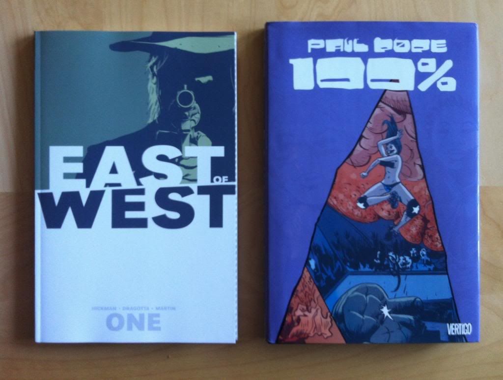
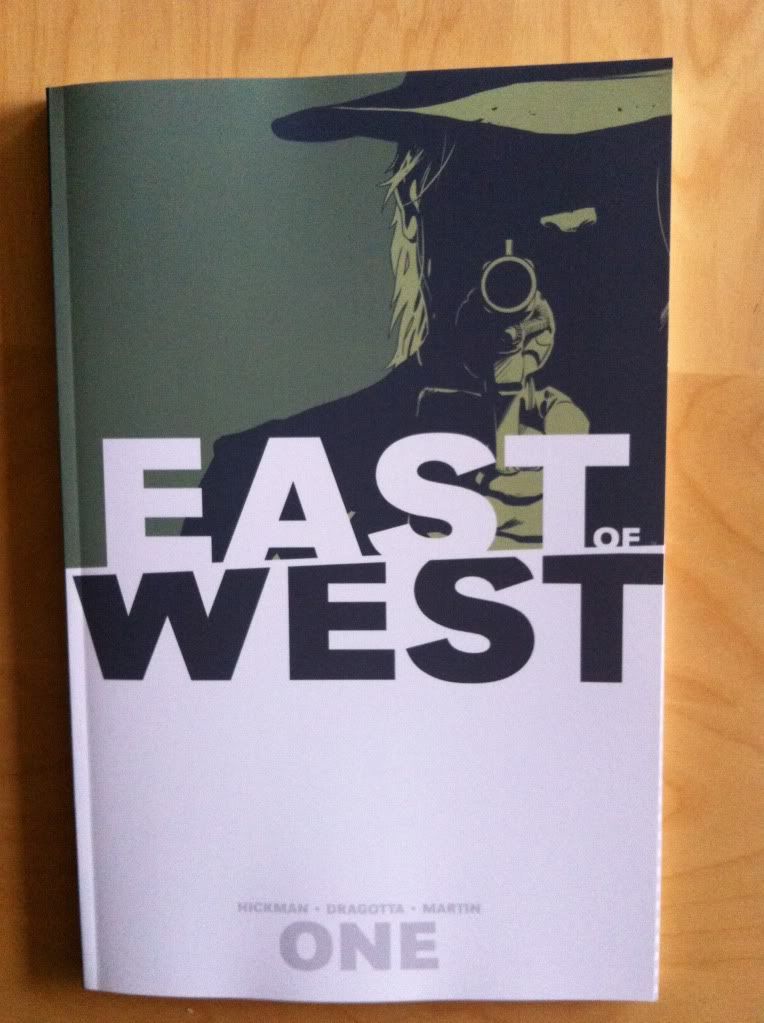
by Jonathan Hickman, Nick Dragotta, Frank Martin, Rus Wooton; Image Comics

East of West is a pretty great comic. It is a comic about the end of the world in a kind of Sci-fi/Western alternate universe. In the world of East of West the US Civil War (and concurrent American Indian Wars) ended in a stalemate when a comet crashed and decimated much of the continent. As a result the US is divided into a number of warring states, once locked in an uneasy peace, and now openly warring. Oh, and the four horsemen of the Apocalypse stalk the land while Death rides in search of his lost son, the harbinger of the Endtimes. East of West is choked full of memorable characters, cool Sci-fi concepts, intrigue, and beautifully composed action. It is absolutely a comic worth reading.
I want to take a closer look at a particularly nifty action sequence from East of West Vol. 5 to try and unpack what I like about it and to showcase something cool it does using symmetrical layouts.
There will be *SPOILERS* below.


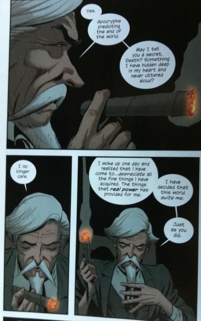
The sequence I want to talk about is a selection from a longer, excellent action set piece. The story of this chapter shows a number of ninja-like assassins infiltrating the palace of The People's Republic of America to murder Mao Xiaolian, the leader of this polity. Specifically sequence has the assasins corner the leader bathing, apparently vulnerable, and Xiaolian fighting back against her wouldbe killers. The entire story is wonderfully composed and very effective comics.
I'm going to focus in on these three pages though, since I think they showcase the strength of the storytelling and because they do a couple interesting things.
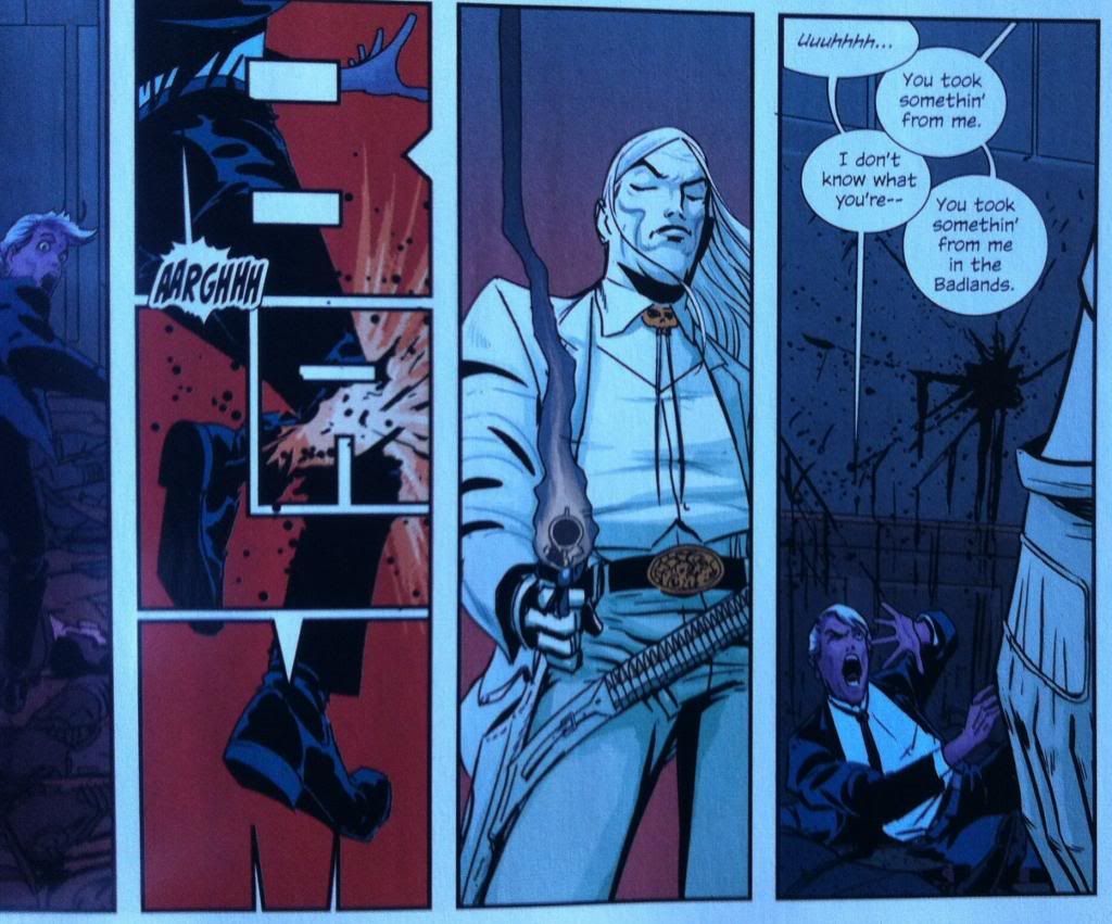
The first page is a pretty good example of the majority of the action storytelling in East of West. The composition here makes great use of how the reader naturally wants to navigate a comics page to deliver the action in a compelling way. The reader traces the arc of a tangent to quickly take in the key elements of the first panel in a way that creates a sense of the assassins charging at the naked, and seemingly vulnerable Xiaolian. This brings the reader to an across the page carriage return that is abruptly stopped by Xiaolian catching the sword blade in one of her robotic fists. The reader then sweeps up into the next moment and then into another carriage return that delivers the speed and force of Xiaolian's kick. It's overall a page that feels quick and visceral.
The second page initially uses the many of the same storytelling elements, except this time the flow of motion opposes the readers natural eye tracking. The first panel has a hilt-chop that moves against the left-to-right flow of the reader, making the moment more visceral, and then an impaling which also happens against the grain. And then this page does something really important: it zooms out and gives a static feeling glance of the action. This large panel reminds the reader that four of Xiaolian's servants sacrificed themselves to save her, reminding the reader of the stakes, shows how many assassins have been dispatched, and reveals how many killers are still active. This choice really highlights the scope of the remaining danger and provides critical context for just how dire the situation is. It is a great example of why pulling the lens out and establishing a sense of space can improve action storytelling.
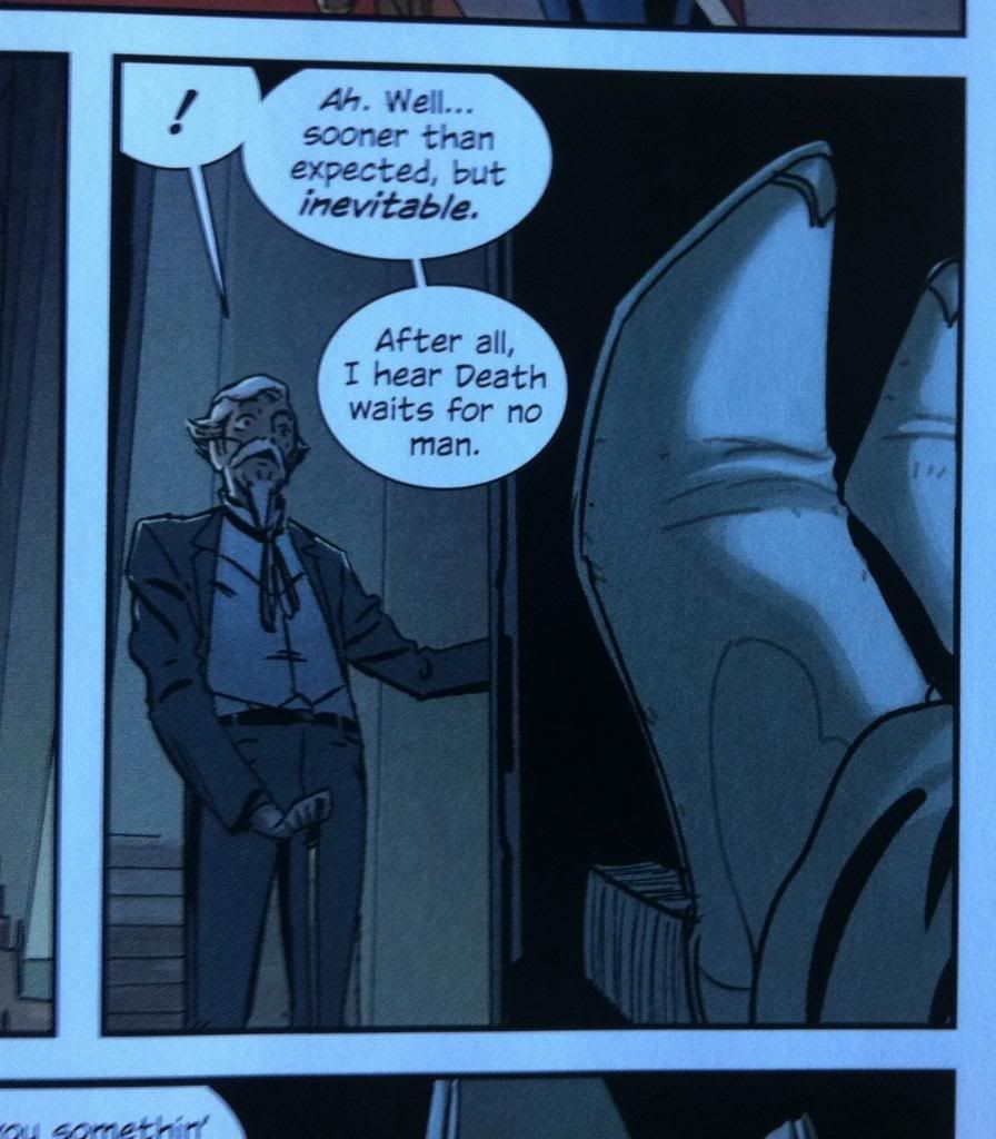
The final page in this selection is the most interesting to me. Unlike the previous pages which use the normal back-and-forth path through the page, the third page here is all about convincing the reader to navigate straight down the page. I think this is largely accomplished through the use of symmetry in the layout. The way the top panel frames Xiaolian in the centre of the page makes her the obvious focal point of the first panel. When the reader moves down to the next tier, the narrowing of the central panels and simple, tall outer panels function to funnel the reader through the centre and into the final dramatic panel. When combined, this makes the page read as one clear motion, through the straining, splitting blade and into the double block in one amazing flurry of activity. It's a glorious page of comics that conveys a pretty complex sequence of events clearly, stylishly, and evocatively. It is fantastic stuff.
Previously:
Criticism:
Reviews: