Showing posts with label Spinal Tapestry. Show all posts

Friday, 6 February 2015

Spinal Tapestry Pt. 4: Blast-off

Or the fantastic book spine design of Rocket Girl Vol. 1
by Brandon Montclare and Amy Reeder; Image Comics


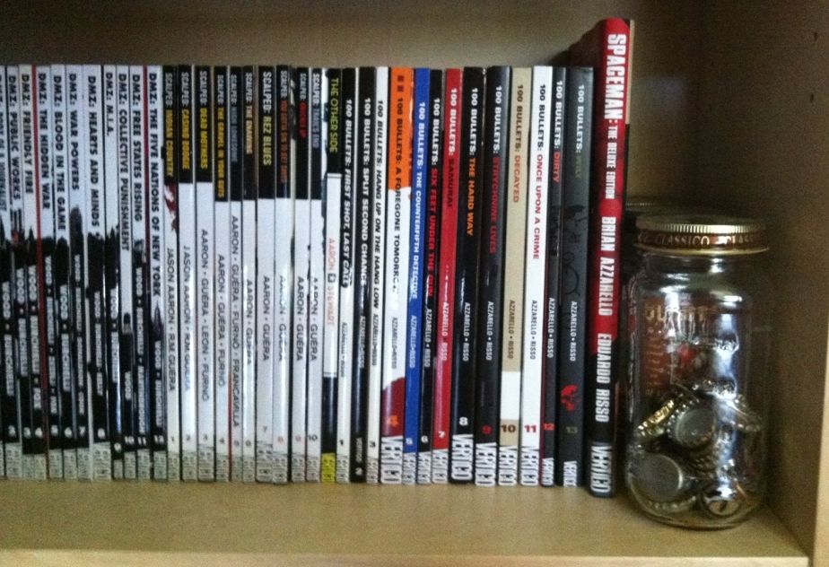
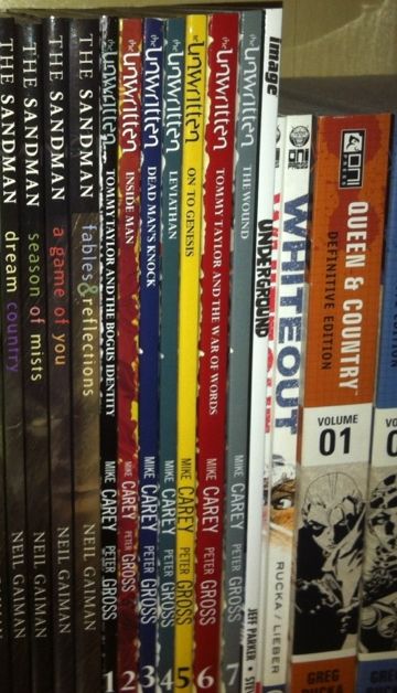
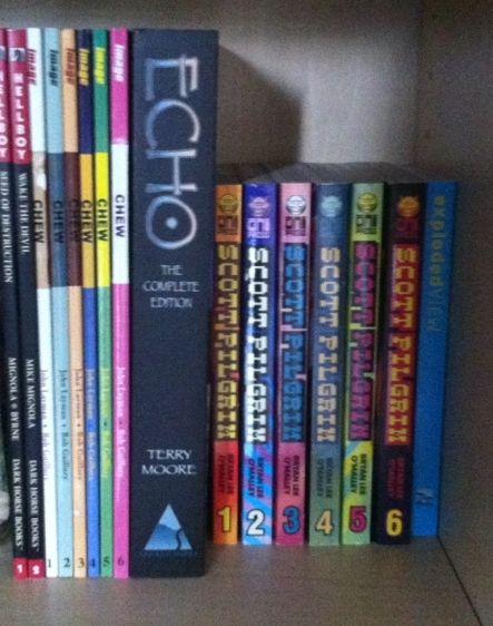
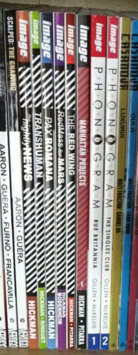
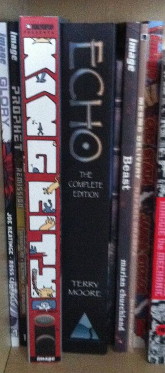
One of my comic book obsessions is the design of the comic book spines. I love collecting physical books because I vastly prefer the reading experience and because I love decorating my home with these books as art objects. It's a lot like filling my living space with physical idea machines. So it is important to me that comics look nice. The trouble is that comics seem to focus their attention making the covers of the comics look nice (which is important) and neglect the design of the spines of the comics. Which is tragic because most of the time when you look at comics on book shelves all you see is there spine. So I really wish more attention was put into making the spine of comics more memorable and visually interesting.

(I would also make the case that most comics shops, aside from highlighted and new titles, display their comics spines out, so there is an economic incentive to put more effort into spine design.)


Rocket Girl Vol. 1 is a comic with a great, memorable spine design. It is really a comic that jumps off a book shelf by doing something creative: including the protagonist, the Rocket Girl herself, on the book's spine.  Which is a perfect choice.


The reason this is a perfect choice is that the character design of Rocket Girl is pretty fantastic. The comic itself is really good: a super fun time travel story that bounces between a gonzo future and a stylish, 1980s past. It's a really great comic that taps right into the nostalgia of the best sci-fi media from the '80s. At first glance though, you don't know any of this. But, if you've seen Rocket Girl with her rocket jetpack and great retro-futurist costume, I think there is a pretty strong chance you're intrigued by the comic. I know that I decided to try Rocket Girl largely because of Amy Reeder's artistic track record and by how cool and fun Rocket Girl the character looked. I think, on a purely marketting standpoint, the design of Rocket Girl is one of the comic's strongest assets.


By prominently featuring the awesome character design of Rocket Girl on the spine of the comic, Team Rocket manages to make their comic stand out from type-logo only comics and showcase the fantastic design of their character. Which is a great advertisement for the comic in a store, and for me, as a collector and reader, a great reminder of the essence of the comic and why I enjoyed it so much. It is absolutely the kind of comic spine design I'd like to see more of.

Previously:
Spinal Tapestry 1
Spinal Tapestry 2

Spinal Tapestry 3

Friday, 24 May 2013

Spinal Tapestry 3: Reading Rainbow

Or the under-appreciated art of comic book spines

Book spines are, I think, the most overlooked component of book design in collected editions of comics. Whether because of all the emphasis placed on cover pages or the comic industry's infatuation with staple bound invertebrate single issues, comic spines don't generally get the love they deserve. Which is a shame, because in most settings, be they home bookshelf or retail bookshelf, the comic spine is the only part of the comic visible. Ignoring this portion of the comic's exterior hurts a print comics value as an art object (which I think is one of the key value-added features of the print format) and probably has an adverse effect on a comics retail performance. Paying attention to it can make comics look great and stand out from the crowd.

When dealing with long comics series in collected editions, I think one of the key design choices that can really improve the look and visual impact of a series is a unifying design. By tying individual books together with common elements, a series gains an identity and becomes instantly recognizable as an aggregated whole. Generally, one of the keys to this seems to be choosing a few colours to give the comics a harmonious relationship. By wildly varying spine colours, you can pretty much ruin the look of a series.


100 Bullets, by Brian Azzarello and Eduardo Risso,  is a fantastic crime comic about the opportunity to avenge injustice wrapped in a grand conspiracy. The interior of the comic is gorgeous, absolute brutality drawn with precise elegance by Risso, and the covers of the series (including these collections), by Anthony Johnson, are perfect. That said, the spines of this series are terrible. It seems the choice was made to make the spines of the 100 Bullets collections entirely dependent on cover art, which makes the spines lack identifiable common elements or common colours. When put next to the clean, unified design of Scalped, or the brilliant design of DMZ, 100 Bullets looks like a mess of random comics instead of a lovingly appointed series. And I think it's shelf presence suffers for that.


The Unwritten, by Mike Carey and Peter Gross, is a great comic about the power of literature to affect society and people with the bourgeoning power to tap into it. The Unwritten is also another comic with great interior art and superb covers, by Yuko Shimizu, but poor spine design. The Unwritten makes that fairly common mistake of giving each edition its own colour to make a rainbow effect. The problem is that this breaks up any cohesion over the entire series and doesn't really tell us anything about the identity of the Unwritten. Varying colours like this is almost never the best choice.


But like all rules there are exceptions. Scott Pilgrim and Chew are two comics that absolutely break what common sense suggests is good book design. They use bright, obnoxious colours that change and clash between books. And while they do maintain common elements between books (Chew's cutout and Scot Pilgrims weighty logo), their overall look is just garish as hell. The thing is, this WORKS for these comics. Chew, by John Layman and Rob Guillory, is an insane comic about people with mental food powers solving ridiculous food crimes: the plot is crazy, the art is bombastic and cartoony, and the aesthetic of the book is frankly pretty garish. So a cover spine design that clashes between issues and uses bright, cartoony colours completely sells the identity of the book. Similarly  Scott Pilgrim, by Brian Lee O'Malley, also has a cartoony look and bombastic style. Scott Pilgrim is a comic about being brave enough to love while being an adrift 20-something, and has a style influenced by manga and 1990's video games that is just really inviting and fun. The spines of the Scott Pilgrim books, with their garish bright colours, manga-ish book size, and pixelated logo font absolutely evoke the visual identity of the book. What I am saying, basically, is that these comics, by having insane cartoony spines,  are able to convey their visual identity instantly. And that is, I think, the core of book design.

Previously:
Spinal Tapestry 1
Spinal Tapestry 2

Monday, 14 January 2013

Spinal Tapestry Pt. 2: Bringing the Sexy Back

On the under-appreciated art of comic book spines.

I love purchasing collected editions of comics and displaying them as art objects. They're attractive, a visible expression of my interests, and a constantly present collection of some my favourite things. Also, when the Big Earthquake comes, I'll have a great collection of reading material during the daylight hours. 

In the last post I talked about the idea that comic book spines are important in larger formats like tradepaperbacks or graphic novels because on a bookshelf the spine is the most visible part of the comic. I also used the Brian K Vaughan comics to show some examples of what I consider good and bad spine design.

This time I want to highlight some of the best and most interesting comic spines in my slowly growing comics library. These are the book spines that clearly show their designers understand how important a book spine is to a comic's on the shelf appearance. (And perhaps on the importance of standing out on a bookshelf from a retail perspective.)


Phonogram: This is kind of the epitome of a good simple spine design for me. The "Phonogram" title uses the font of the cover title, with several logo elements incorporated. This clearly states the books identity in a clear and visually interesting way. Couple that with simple, agreeable colours that don't vary book to book and clean writing that is easily read and you get a great comic book spine. (By Kieron Gillen & Jamie McKelvie: Reviews)

Jonathon Hickman comics: This one is less aesthetically pleasing and more manipulative and clever. Every Jonathon Hickman book has a striped pattern on the spine. When rendered in black and white it is EXTREMELY eye catching (particularly when shelved as a group). The human eye is wired to pay attention to black-white-black lines and the illusion of movement these give off out of some mammals-of-the-savannah evolutionary quirk. So this Hickman block of books is super eye catching. While not the prettiest design, it is uniquely Hickman and identifies his work. More importantly, these books do not get lost on the shelf. (By Jonathan Hickman & Nick Pitarra, JM Ringuet, Ryan Bodenheim: Reviews)


(From a retail perspective this approach might be even more brilliant: only his books have this stripy pattern and its associated attention nabbing effect. If we accept the premise that the point of an eye-catching cover is to get a consumer to pick up a book, then this eye-catching spine design might represent a retail advantage.)

DMZ: This is one of the most clever and aesthetically appealing comic spine designs I've seen. Let me explain, DMZ is the story of a modern civil war fought between the US government and an insurgent movement. A key aspect of this story, and how it works, is the use of Manhattan Island as a war torn battlefield. It creates context for the story and serves to illustrate the horrors of modern warfare in a familiar setting. As such, a key character in DMZ is Manhattan itself. The spines of the DMZ comics are a visually pleasing design that is white behind the title writing and black behind the author text. Brilliantly, a New York landmark is included at the interface between the top and bottom half of the spine. When looking at an individual volume, it's a sharp design.  When looking at the entire series, it creates a miniature and very recognizable New York skyline effect. It's clean, unifying, unique, and highlights a key aspect of DMZ. It's great. (By Brian Wood & Riccardo Burchielli, and others)


King City: This big, complete series trade shows off what you can do with the real estate of an extra wide collection. The letters that spell out King City, beyond being in an interesting and high catching graffiti-esque font, are also the frames of a tiny comic strips about a cat (presumably Earthling) stalking and dispatching a little cartoon man. It's silly, fun, really well thought out in this making-really-intelligent-use-of-space-and-storytelling kind of way, and pretty representative of the kind of comic King City is on the inside. The spine of King City is a better cover than a lot of covers. (By Brendan Graham: Review)

Also, just kind of as a case in point about the importance of interesting spine design, I've taken a picture of King City next to the extra-wide Echo The Complete Series collection. Echo actually has a pretty nice spine design: simple, has some pretty unique elements, and black always looks nice. But when you put it next to King City with its more creative use of space it kind of gets lost, doesn't it? (Echo by Terry Moore: Review)


Sweet Tooth:
Okay, this one isn't about a good spine design... this is a little thing I noticed. So the concept of Sweet Tooth's spine is pretty solid: clean black spine, unique Sweet Tooth font, and a nice plaid pattern on the top bit of the spine. It catches the quirkiness of the series, and because a red plaid shirt is intrinsically tied to the design of title character Gus, it really catches the feel of the series. Trouble is, I think a mistake was made at some point during the design process. 
If we zoom in on the plaid pattern along the top you can see the plaid checker alternates between Volumes 1 and 2, but then doesn't ever change again. So instead of getting the checker pattern of a plaid shirt across the series (Vol. 1 and 3 matching and complement the opposite pattern on 2 and 4)... we get mismatched, unconnected plaid colours. Which all makes it feel like a great design that was compromised by a mistake or neglect. Hopefully it gets fixed on a future print? (By Jeff Lemire: Review)

In my opinion these are some of the better and more interesting comic designs out there. They manage to look good, make a statement about their series, and stand out from their competition. I certainly appreciate the extra effort.


Friday, 11 January 2013

Spinal Tapestry Pt. 1: Back Support.

On the under-appreciated art of comic book spines.

I love print comics. Love them. Especially the larger tradepaperbacks, collected editions, and original graphic novel formats. Part of it is that I think they are a more satisfying reading experience, especially for the more unconventional and challenging comics out there. It's also pretty great that they are more durable/portable format for sharing with friends. But something I really like about the format is that graphic novel format comics are displayable art objects.


This is the longest non-radiator wall in our apartment, outfitted with bookshelves, which I've been systematically turning into a library of my favourite novels and comics. (It's still a little measly due to my history of public library reading and the used bookstore trade-ins I did when I moved out of my parents house a few years ago... but I'm working on it.)  Besides being an attractive way to decorate an apartment wall, this library really increases the home-iness of my home; all of these amazing worlds that I love are always right there to be seen, appreciated, fondly remembered or visited again. It's great.

But I've come to notice something: all I normally see of these comics are their spines. Actually, for the most part, all any of us see of bigger format comics are their spines: they are shelved at home spines out, shelved in comics shops spines out, and shelved in libraries and book stores spines out. And I think this fact might be under-appreciated by the comics industry.

Take Saga: Volume 1, a comic that I absolutely loved reading (review pending). It has an absolutely great title page showing gorgeous artwork by Fiona Staples and a crisp, clean design aesthetic.


But the spine of Saga: Volume 1 is, well, it's boring. Just a lot of white space with small, bright coloured font that simply gets lost on a bookshelf.


Here is my entire Brian K Vaughan section of my comics library. These are all great comics with solidly attractive and eye-catching covers.  You'll notice though, that all we really see are the comic spines. You might also notice that these Brian K Vaughan comics, spine wise, are not all created equal and include examples of what I think are good and bad comic spine design.


Runaways: I'd call this one adequate spine design. Simple with a clearly visible font. It says what it is and doesn't get lost in the crowd. (Beige is the worst colour on Earth though... so...)

Ex Machina: This one is pretty bad. The spines of this series carries through the artwork on the cover which ends up making the spines black, with random blobs of colours. As a result, there is no unified design across the series. Worse, the title font is small and is obscured by the colour blobs. The only way I know this series is Ex Machina at a glance is its location between Runaways and Y The Last Man. Also, the old wildstorm logo on Ex Machina 5-10 is pretty unattractive.

Y The Last Man: In my opinion this is a pretty good spine design. There is a unified look across the series with each title having its own colour scheme. I can clearly see the series title, each volumes title, and the author credits. There is also a Thumbnail taken from each volumes cover at the top of the spine, which is a nice touch. This spine design is simple, fairly attractive, unified, and conveys the relevant information. I like it.

(Notice the evidence of lending? Huzzah for tradepaperbacks.)

Saga: While it's a little hard to judge with only a single volume, I'd say it isn't good. Less because it's actively bad, and more because it's bland to the point of boring. Maybe it will look better with some friends?

I guess my point in all of this is that comic spine design is an important part of making attractive, displayable print comics. Also, given how most comic shops display the majority of their comics, spine design might be important to actually selling comics. In my experience this design often isn't amazing and could be probably be improved with a bit more attention and love. 

Let's make comics beautiful for bookshelves everywhere.