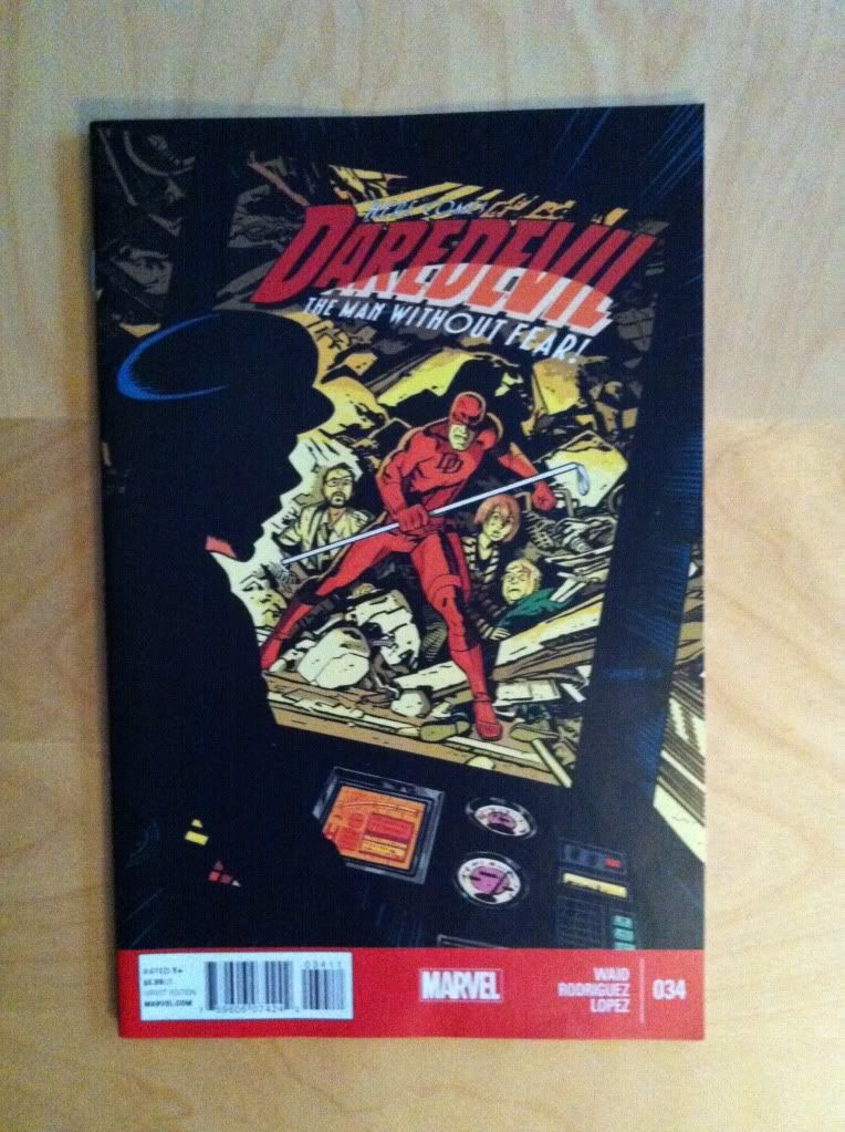
By Mark Waid, Javier Rodriguez, Alvaro Lopez, and Joe Caramagna; Marvel Comics
Daredevil continues to be one of the most consistently enjoyable Mainstream comics I've been reading. The stories are fun and unpredictable, and the artwork is always amazing and I am consistently left wanting the next instalment. One of the most noteworthy and interest aspects of Daredevil is the high level of design and technical storytelling that is present throughout the series. Daredevil #34 contains some great examples of design that make some excellent transitions worth a closer look.
There will be some mild *SPOILERS* for Daredevil #34 in this post.
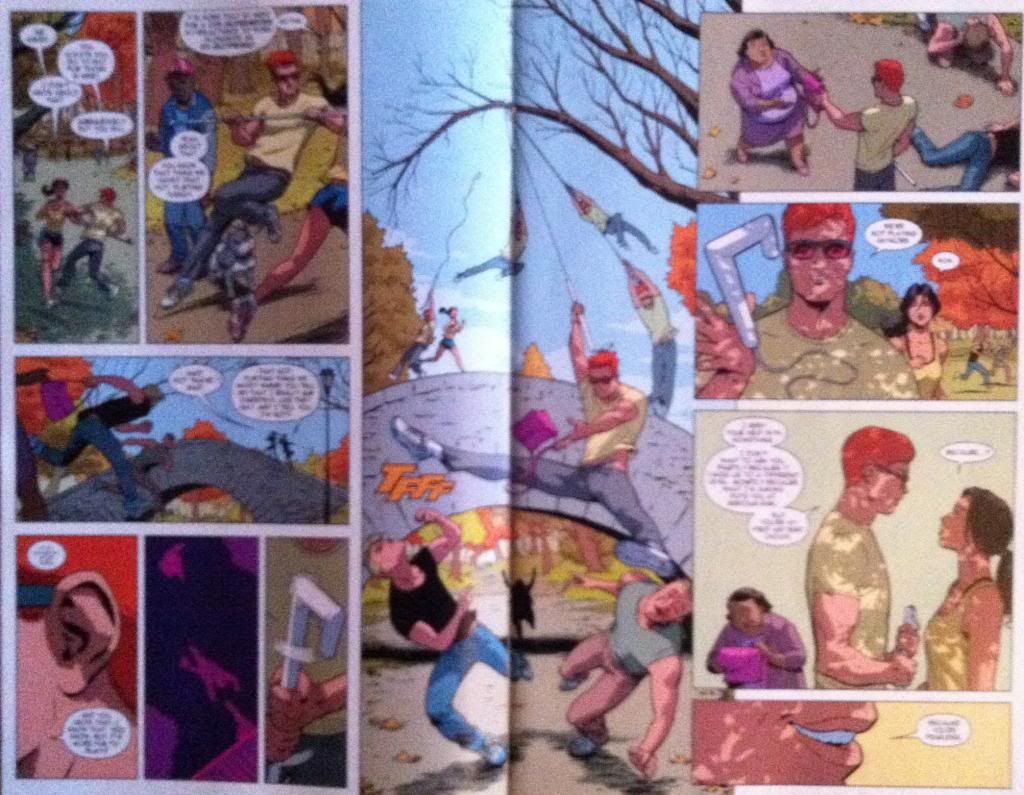
My favourite sequences in Daredevil #34 all have to do with transition sequences where the left side of the composition portrays one status quo, a dramatic event occurs in the middle that changes the situation, and a new status quo is established on the right side of the composition. This double page spread here essentially shows the transition from Matt-Murdock-as-Daredevil-is-a-flirtatious-game to Matt-Murdock-is-Daredevil-and-a-new-partnership with a beautifully constructed action sequence in the middle. This whole sequence was unexpected and changed the issue, and probably the series going forward. It's great, smart comics.
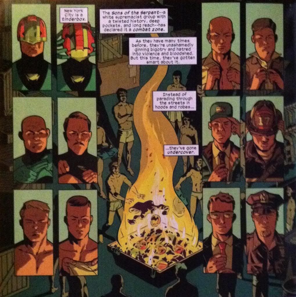
This sequence here is an even more efficient and elegant transition scene. From a plot perspective this page simply conveys that the Sons of The Serpent rascists have shed their identifying vestments and donned the clothes, and associated authority, or civil authority figures. Part of this page is the balance, we have a group of Serpents in vestmens on the left, balanced on the fulcrum of the fire, and then an equal group of undercover-Serpents on the right: this tells us everything we need to know about the plot of this page. But this page has extra elements of construction that elevate the composition even further. For one, the images of the Serpents in either column show a step-by-step story of the Serpents stripping out of their villain-ginch on the left, and putting on authoritative clothes on the right going from top to bottom. Beyond even this, there are extra parallels between the panels on the left and right with images having very direct parallels between the two columns which helps emphasize that even though they are different men in each column, and even if they are dressed differently, they are still serpents. It's subtle but really, really great. This sequence here is a testament to what can be done with well designed, architectural comics.
Previously:
Describing Daredevil 33: condensed motion
Describing Daredevil 30: the vectors of artwork
Describing Daredevil 29: A great page


Beautiful work. I love the team of Waid/Samnee but ... wow! I'm a fan of Mr. Rodriquez now.
ReplyDeleteYeah, I'm always excited to see Javier Rodriguez pencil an issue. He has a really nifty grasp of super architectural composition. The post about Daredevil #29 also features his artwork.
Delete