Showing posts with label Eye on Hawkeye. Show all posts

Monday, 16 February 2015

Eye on Hawkeye #21

Or breaking down the layers of storytelling in Hawkeye #21
by Matt Fraction, David Aja, Matt Hollingsworth, and Chris Eliopoulous; Marvel Comics


Hawkeye is the comic that first got me interested in writing about layouts and sequential storytelling. Every issue has some thing, some aspect of comics craft that is worth taking a closer look at. The newest issue (bro! new issue bro!) isn't an exception. There is a ton of really cool comics in Hawkeye #21, but there is one page in particular that I think is really interesting and instructive. So I'm going to try pulling it apart to uncover why I like it so much. 

There will be *SPOILERS* for Hawkeye #21.


Okay, so, this page here has its hooks in my brain. At first glance, it might not look particularly interesting. I mean, its Team Hawkguy comics, so it looks really nice and dynamic, but it didn't initially strike me as an especially complicated page. But... I kept coming back to it after I finished the issue and I think this page has a bunch of great, somewhat hidden choices that make it work extremely well. This is why I think this page has my attention.


Part of the magic of the page is it's context in the comic. The story of the page is a sneak attack, the first trap in Clint's home-brewed defence strategy, and represents the first blast of violence in the issue. It's the transition from the quiet of before the storm to the light and noise of conflict. Part of what made this page so effective for me was how surprising and unexpected it was. The previous pages showed the Tracksuit Draculas, the villains of the issue, pulling up, unpacking, and the first line of ragtag defenders fleeing their position in fear. The comic felt relentless, the villains an unstoppable tide of tracksuits. And then there is a page turn and suddenly burning coals are raining down on the villains in a shocking, visceral burst of pain and hope. The pacing of the hopeless page and the page turn work to instantly make this page feel more sudden and drastic right from the very first panel. 


The next element of this page that makes it so effective is the overall layout. To give this page a sense of gravity and height, which is critical to the story, the page uses long, tall panels in the top half of the page. These tall panels instantly change the sense of the page to a vertical orientation that creates space to make the falling, burning coals feel impactful. The use of the tall panels on the left and right side of the page has the additional effect of making the many panels in the middle of the page read as a single storytelling unit. This ensures we read these six panels in a group before proceeding to the right-side tall panel and makes the depicted moments feel simultaneous and quick. The choice of using many panels in this region of the page instead of a single tall one is also significant as it adds additional weight and drama to each impact and moment. Instead of being a single moment of collision, it is several discrete, jarring instances of pain and panic which makes this whole sequence feel more visceral and exciting. It's really effective comics.


I am also super impressed by how this page uses the natural motion of the eye and the order of panels to add drama and interest to the page. Because of the nifty layout on this page, the readers eye follows a lot of paths that emphasize the vertical motion of the action. We enter the page on the top left and instantly see the surprise of burning coals, and then quickly look down the panel, along the path of the falling objects as they rain down on the Draculas. Our eye motion is along the vector of the action which makes everything feel faster and more dramatic. We then, much like the Draculas, quickly look up to the very top of the composition and building and see Gil's dad dumping the grill's coals, which again couples eye motion to the experience of the characters inside the composition. Our eyes then rattle down the central collection of panels, always going down, but arresting in the chaos and pain of the impacts. This central reading path captures the overall motion of the action. In this section of the page we also encounter, and get the surprise of, arrows falling on the Tracksuit thugs, shot from somewhere above. Again, we glance up the page and in the far-right panel see Clint perched on the fire escape shooting arrows. This page does a fantastic job marrying eye motion to action and dolling out information in the most surprising yet organic way. It reads beautifully.


This page is also noteworthy in how colour is used to emphasize key aspects of the composition. The orange of the burning coals instantly grabs our attention when we enter the page and works throughout the page to catch our eye and help guide us through the page. Similarly the RED! backgrounds in the centre column of panels adds to the feelings of violence, pain, and shock to these panels. It's all really effective and adds a ton of atmosphere and information to the composition. Compare the coloured page to the grey-scaled page here: it lacks the emphasis of the orange flames and added emotional impact of the red panels and is a poorer page for it. Colour, it really matters!


So after spending some time with this page, it's really obvious that it is filled with really nifty comics. This is why I love trying to pull apart and analyze comics pages. There is so much craft that goes into every page of comics, so many little choices that work together and combine to make an effortless, and exciting seeming moment of action or drama or story. Hawkeye #21 is a great comic, filled with exciting, interesting pages like this. Read it, analyze it, pick it apart!

Eye on Hawkeye #18: Colours and setting.
Eye on Hawkeye #15: Composition, Layout, and colours.
Eye on Hawkeye #16: Smart layouts and chilling moods.
Eye on Hawkeye #14: Repetitive panels as a device.


Monday, 15 September 2014

Eye On Hawkeye #20

Or a look at the complicated timeline of Hawkeye #20 
by Matt Fraction, Annie Wu, Matt Hollingsworth, & Chris Eliopoulus; Marvel Comics


One of the aspects of Hawkeye that I continue to find interesting is just how complicated the narrative often is. In most superhero comics I read, the order of events tends to be pretty straightforward: the narrative starts and then follows a linear chronology to the end of the issue. Frequently there are multiple, divergent story threads, or maybe a flashback, but the main thrust of the story has a very clear, easy to follow timeline. Hawkeye bucks this convention with issues that fit together in an overlapping chonological jigsaw and individual issues that sometimes provide narratives in dramatically non-linear fashions. Hawkeye #20 is a great, non-linear narrative comic, and because I like timelines, I thought I'd take a stab at making one for the issue.

Since this is a timeline, it is inherently *SPOILERS* intensive. That said, I did take steps to avoid the most blatant spoilers of the issue.


Beyond just being an interesting way to deliver a comic, this non-linear approach to storytelling provides some novel tools to Team Hawkguy. For instance, the ability to frontload the comic with later events allows the creative team to setup, in a weird inverted way, some of the key reveals of the issue which helps make them feel significant and earned. This comic is one of very few where I feel like giving away some of the ending early actually made for a better comic.

Actually, I think it goes beyond foreshadowing: the suspense engine of the entire issue might rely on knowing that Kate is going to discover a big secret and that Kate is going to have the futz beat out of her. This puts the entire story in the lens of "how did we get here?", which makes every situation potentially where Kate finds her secret (which is exciting) or where Kate gets Clint-levels of contused (which is suspenseful). Knowing that big reveals and big hurts are coming massively increases the tension throughout the comic. It's a really effective engine that I think emerges directly from the structure of the comic.

Also, Annie Wu is a goddamn comics wizard. Hawkeye was better for her participation, and I'm excited to see what her next thing is.

Previously
Eye on Hawkeye #19 pt. 2: Structural wayfinding.
Eye on Hawkeye #19 pt.1: Empathy Machine
Eye on Hawkeye #18: Colours and setting.
Eye on Hawkeye #15: Composition, Layout, and colours.
Eye on Hawkeye #16: Smart layouts and chilling moods.
Eye on Hawkeye #14: Repetitive panels as a device.

Monday, 11 August 2014

Eye on Hawkeye #19 pt. 2

Or a look at the use of layout and colour as thematic wayfinders in Hawkeye #19
by Matt Fraction, David Aja, Matt Hollingsworth, and Chris Elipoulos; Marvel Comics


Hawkeye #19 is another pretty special issue of comics. Like the Eisner winning Pizza Dog issue, it uses comics in unconventional, experimental ways to give us a unique comics experience. More importantly Hawkeye #19 also manages to teach us a bit about American Sign Language, provide a perspective of some of the challenges of being deaf, and, through the use of ASL, create an experience of deafness in readers that maybe gives us some clue as to what it feels like to be unable to understand and participate in communication. Which is all really cool, really noteworthy comics that people celebrate. The thing is, Hawkeye #19 is also a super formally interesting comic in more conventional ways.

Specifically, I am really interested in how Hawkeye #19 uses parallel layouts and colour tagging to instil emotional effects in readers and seamlessly convey varying time points.

There will, as always, be *SPOILERS* for Hawkeye #19 below.


Okay, this might be unsurprising, but I find design, infographics, and architecture really interesting. As a result I listen to a pretty great podcast called 99% Invisible which tells stories about the unseen thought that goes into pretty much every aspect of our manufactured world. A recent episode (which you can listen to here) discusses the hidden art of using architectural considerations to affect behaviour. There are people trying to figure out ways to subtly nudge you to walk a certain way or visit a certain store by using structural elements. They use obvious things like signs, but also really subtle things like the angle of a kiosk desk, sight-lines, and even floor tile patterns to guide your behaviour. It is called wayfinding and it strikes me as devilishly cool.

The thing is, Hawkeye #19 makes me think about this architectural wayfinding in the context of comics because it uses structural, layout choices and subtle colour to affect how we understand and emotionally experience the comic.


Interspersed throughout Hawkeye #19 are two different periods of time that depict Clint's struggles with deafness in the present as well as his childhood experience with deafness. None of this is explicitly stated in narration and instead this information is encoded in the artwork, layout structure, and colouring of the comic. The net effect of this is that we as the audience understand the time shifts and become emotionally invested in the parallelisms between the trials of child and adult Clint. But all of the little ways this information is encoded are worth examining.


The primary means of communicating the parallels come from the art. This two-page spread is the opening of the comic and is split between two distinct stories. Down one side of the page a doctor is handwriting a note about a deafness diagnosis for a little boy and his family. Down the right side of the page we see a series of similar images showing a deafness diagnosis being written out for an adult Clint. Now clearly the left side of the spread depicts young Clint and the right shows virtually the same diagnosis for adult Clint. We aren't explicitly told, but it's obvious.

Part of how this information is encoded is the use of related images. We see similar language used in the writing boxes, and a very similar doctor office layout with the same relationship between clint, his family, and the doctor on both sides of the layout. Critically, we finish the page on the left with child-Clint's face split over four panels, a pretty idiosyncratic layout choice, that is immediately reflected on the top panel of the next page in adult-Clint's face split over the same four panels. This instantly clues us in to the identity of the boy on the left, but really the various related images spread across the pages collectively convey this information.


The relationship between the two pages in the spread isn't, however, limited to the signs, the actual depicted events on the page. There is also subtle structural choices at work to establish that the events depicted are parallel and related. Specifically, the layours between the two pages use deeply related layouts. On both pages we have a large central panel bordered by two zones, one of which is split into two levels. What this parallel layout does is help reinforce that the events on the two pages are meant to reflect each other. However, the layouts are not identical, in that the two pages overall shape are actual inverted to one another. While this may have just been an aesthetic decision or designed to place the boy/adult Clint eye panels in close alignment for maximal effect, for me this choice helps to solidify the different place adult Clint is in: he has been here before. He is experiencing the events depicted on the right while remembering the traumatic events of his childhood deafness. And I feel this is reflected on the level of layout.


One of the aspects I find so impressive about this sequence, and comic in general, is how effortlessly and seamlessly it moves between the various time frames. A ton of this is done with tiny wayfinding choices peripheral to the central events. I mean sure, the most obvious indicator is whether Clint and Barney are depicted as children or beaten up adults but there are a wide variety of subtle indicators. The most important wayfinder is colour: the past events on the left are coloured in a brown-sepia wash that we have come to associate with aged, or old fashioned photography and the past, while the modern events are coloured in the purple/blue that we have come to associate with the modern-day Hawkguy status quo. It's straight forward, but unannounced and taking full advantage of our unspoken common colour biases. It's great stuff. 

And then there is all of the subtle set dressing choices made to indicate the span of time: past-male doctor -vs- modern-female doctor (something exceedingly rare during Clint's childhood) and the doctor using handwritten notes and having an old-fashioned phone -vs- the modern computerized workstation and phone of the modern doctor being the most obvious. And then there are the subtle things: the CT films and light boxes in the modern doctors office, the modern anatomy poster, the steel exam table, the modern firecode levered doorknob (as opposed to the disability unfriendly round doorknob), and in the historic office the wooden display table and old fashioned looking Snellen chart which seems indicative of older printing technology. All of these little setting choices help to ground the two scenes in specific moments in time and help reinforce the time changes for the rest of the comic. 

Also, I can't believe there was a time when a doctor would fill out a diagnosis pad with "with love and...". That's crazy!


You see all of these techniques used throughout Hawkeye #19, but I think the next best example is this double page spread. Again we have two different unlabelled time points that utilize directly corresponding images, sepia-vs-hawkeye colouring, and parallel layouts to accomplish the feelings of time displacement and narrative connectivity. What's maybe cool about this spread is the layouts are directly corresponding: the past left page scheme perfectly matches (well more or less) the present right page scheme. This might be reading into it too much, but I feel like this choice is to help cement that this is the end of the journey begun on the first double spread (the thing we looked at first) and is the point where clint is no longer reacting to his past traumas and is stepping forward into the future. I feel like the layout is meant to evoke that at the past and present narrative moment both child-Clint and adult-Clint feel a kind of parallel resolution to meet their challenges and situations head on. Regardless, it's great comics.

So yeah, once again Team Hawkguy create a remarkable experimental comic that is also a really smart comic in a conventional way too. This comic guys, this comic.


Previously:
Eye on Hawkeye #19 pt.1: Empathy Machine
Eye on Hawkeye #18: Colours and setting.
Eye on Hawkeye #15: Composition, Layout, and colours.
Eye on Hawkeye #16: Smart layouts and chilling moods.
Eye on Hawkeye #14: Repetitive panels as a device.

Friday, 1 August 2014

Eye On Hawkeye #19 Pt. 1

The silent sound of privledge in Hawkeye #19
by Matt Fraction, David Aja, Matt Hollingsworth and Chris Eliopoulos; Marvel Comics


It's after 1am  Thursday morning and I have to get up early tomorrow for a fairly pointless meeting but I've just finished reading Hawkeye. I've just finished reading Hawkeye #19, right through, just the story, no peaking or search engine aids to help educate and translate the American Sign Language inside. I know what I could deduce from context, but that's it. There are still swaths of Hawkeye I don't really understand yet. And I want to write about that experience.

This post isn't going to go too much into story details beyond, well, *SPOILERS* from previous Hawkeye issues. But I am going to post some pictures from the issue, which are at least a little *SPOILERS*-y. So be wary.


Okay, backing up a bit: Hawkeye #19 features a ton of American Sign Language and is written largely from a deaf characters perspective.  This means that most of the speech bubbles are empty and that much of the comics verbal communication is conveyed through pictograms depicting the motion of ASL signs. This is all done without additional english prose translation or explanation. Hawkeye #19 is ASL and deafness and get with the program.

And I think this is really, really interesting.


Because here's the magic of the issue for me. As great as Hawkeye #19 is on a comics craft level (which I'll write about later), and as interesting and cool as the primer on ASL are (I kind of want to learn ASL), for me the really momentous thing about Hawkeye #19 is how it confronts privilege and creates empathy. Let me explain.

I'm a very privileged person. I'm straight, white, and male in a society that treats each of these things too well. I'm healthy, able bodied, smart, and grew up with a stable family situation. I'm married to a great person, live in a safe place, have achieved some success at a career I love, and am mostly financially solvent. I am very fortunate.

It can be easy to forget just how privileged I am.


The thing about systemic privilege is it's insidious. Unlike oppression which frequently comes with blatant, transparent consequences along with all of the much less visible social disadvantages, privilege is very often not super obvious. It can often manifest as a lack of the consequences of oppression which unless you have some understanding of the oppressed, is elusive. If you are super privileged, particularly if you are a straight-white-dude, I think you can easily move through life without confronting the nexus of your fortune.

Which means you have to actively engage with our privilege and seek out a better understanding of less-privileged people.


There are a bunch of ways to try tackling this, from reading diverse blogs, to listening to smart feminist friends, to walking a mile in someone else's situation (although this often smacks of touristy appropriation...). But one of the most effective machines for generating empathy is fiction: we get to ride along with a protagonist and see their situation, and in the case of prose fiction, experience their thoughts and emotions. We get to temporarily live a different life and learn to love or at least relate to someone who is different than us. 

An example that sticks with me is a scene from Michael Chabon's The Amazing Adventures of Kavalier and Clay (*SPOILERS*) where a gay-and-just-realizing-it character and the-man-he-is-kind-of-in-love-with share the most perfect kiss in all of fiction (in my opinion). And despite being straight and not finding anything particularly exciting about dudes kissing, I completely wanted that kiss to happen for that character. I cannot fathom encountering that scene and walking away without the kernel of knowledge that love between homosexual people is just as real and worthwhile as love between heterosexual people.

Hawkeye #19 is also a great empathy engine. Part of this is that it depicts, in a really clear way, what life with a hearing injury might be like. We see Clint being unable to hear words, be too ashamed to speak himself, and the struggle to communicate non-verbally. From this we get a shallow understanding of what it might be like to be deaf. But more importantly, more brilliantly, we get to experience a sort of deafness for ourselves.


I don't know ASL, and on my first read through of Hawkeye #19, just now, I had difficulty understanding what information was being conveyed. I got the gist through acting and deduction, but there was still a great deal of information and nuance that I completely missed. Speaking happened but I was unable to understand it. I was deaf to the ASL. And that feeling, that knowledge that communication is happening that I cannot parse, and the associated challenge and feelings of alienation, frustration, and inadequacy is pretty powerful stuff. I can now maybe imagine what it feels like to be deaf in a spoken world.

And that's just after playing tourist for 20 minutes while reading a for fun comic and not dealing with it in real life all the time.

Which makes me think about my privilege and what it might mean to be deaf.

And that, more than all of the other elements, makes Hawkeye #19 a great comic.

It's now 2 am.


Previously:
Eye on Hawkeye #18: Colours and setting.
Eye on Hawkeye #15: Composition, Layout, and colours.

Eye on Hawkeye #16: Smart layouts and chilling moods.
Eye on Hawkeye #14: Repetitive panels as a device.

Monday, 31 March 2014

Eye On Hawkeye #18

Or a look at how colouring is used to manage setting in Hawkeye #18
by Matt Fraction, Annie Wu, and Matt Hollingsworth; Marvel Comics


Hawkeye continues to be that dang comic. 

I didn't write about Hawkeye #17, the Winter Friends issue because its release date managed to land right in the middle of Busy Times, and because I didn't have much to say about the issue other than it was absolutely tons of fun. I mean, there were a great many interesting parallels between the issue and the series as a whole, but they were obvious and no one likes overtly obvious criticism. (Oh my god, you guys! Steve was TOTALLY Clint!!)

Fortunately for my purposes, Hawkeye #18 is a much more conventional issue of Hawkeye that is pregnat with interesting comics to try and figure out. The thing that struck me most about Hawkeye #18 was just how dense an issue of comics it was: it took substantially longer to read than an average super hero comic. Hawkeye #18, I think, gets its density from both a higher than normal panel count (a hallmark of the Hawkeye series), but also by the sheer number of settings in the issue. Seriously, over 20 story pages Hawkeye #18 has  at least 13 discreet settings (and that's being stingy and not counting all of the flashback scenes or in-transit sequences as settings.) This is a lot of settings!

The thing about a comic with so many locations is that there is the potential for the entire beast to be one confusing mess. But Team Hawkguy is really great at making ambitious comics work through studious attention to detail. To solve the problem of multiple settings in a relatively short comic book, Team Hawkguy leverage work done in previous issues by revisiting, in part, some familiar settings. There is also,of course, the clear storytelling of the Wu/Fraction collaboration and the simple fact that every setting is smartly designed and drawn well. But to me, maybe the most interesting way Team Hawkguy effortlessly encodes information about multiple settings is in the colouring of the issue.

There will of course be *SPOILERS* for Hawkeye #18 throughout this post.

One of the main ways Hawkeye #18 managed to seamlessly juggle so many settings discrete settings and handle characters moving from one location to another was through the use of lighting. Every setting, very nearly, had its own discrete lighting which which affected the tone of every colour in the effected composition. This is just a random sampling, but there is the bright, artificial lighting of the grocery store, the semi-dark lighting of an unlit apartment in chaos, the glaring white brilliance of bathroom lighting, the warm glow of being at the beach in direct sunlight, the dark blue shadow of being outside at night, and the gentle lighting of a tastefully lit restaurant. Each of these scenes looks and feels different, despite the same character colours (Hawkeye is always purple), making each place visually and emotionally distinct. Furthermore, changes in lighting, and particularly shadow, really help keep character location straight as the darkness of the LA night makes it very clear when characters leave one location and move to another. Hawkeye #18 is a masterclass in how effective and thoughtful lighting effects in colouring can convey a huge amount of information about setting.


Hawkeye #18 also leverages colour directly to help solidify each setting as a discrete location. Many of the key scenes have a distinct colour palette that makes each feel unique. Kate's trailer is coloured in tones of purple, since everything Hawkeye must be, while the scary mansion is rendered in blacks and shadowy blues. The bathroom is white-white-white while in the flashback sequences the LA skyline is a sunset, nostalgic orange, hollywood parties are opulent red, purple, and pink, and the beach is a study in tan-yellows and skyblues. Even at a cursory inspection, like in the selection above, each of these settings is clearly different and unique both visually and emotionally. Clearly, say, the dark and creepy mansion is in a different physical space and story location than the swank, fancypants Hollywood party. It's great stuff.

(For sake of argument, think about a Batman comic. I love Batman, but when it comes to setting, Gotham is usually rendered universally as this dark, black and blue, urban landscape that heavily features shadowed lighting. It often feels like this looming, monolithic space of indistinct urban-ness, fear, and violence. Which I think often makes Gotham seem less like a place and, maybe intentionally, more of an indistinct nightmare land. Hawkeye, with this smart use of tying colours to locations, feels much more real and diverse in the spaces visited. Which is a choice so subtle that, I think, it's easy to miss: colouring, when done well, is this permeating invisible thing that can drive so much storytelling.)


Hawkeye #18 also has some great exampls of colouring as a storytelling device that go beyond establishing setting. In the top selection the way colour is dropped in the second panel suggests, with no words or artwork to support it, that Hawkeye is focussing on making a tricky arrow shot. The colour, and the world, fall away for a moment of aiming and we the audience understand the story message of the panel based solely on the colouring information. The second selection works this way too: we see the red and blue glare of rollers and understand that our heroes have been stopped by the LAPD. This is again based solely off colouring information, since we never actually see a cop car drawn in any of the preceding or subsequent panels in this sequence. Which is just more evidence that effective colouring choices can be a fantastic storytelling tool. 

Hawkeye #18 is a treasure trove, I tell ya.


Previously:
Eye on Hawkeye #15: Composition, Layout, and colours.

Eye on Hawkeye #16: Smart layouts and chilling moods.
Eye on Hawkeye #14: Repetitive panels as a device.


Monday, 10 March 2014

Eye on Hawkeye #15

Or a look at some of the great creative choices in Hawkeye #15
by Matt Fraction, David Aja, Matt Hollingsworth, and Chris Eliopoulos; Marvel Comics


One of my favourite things about trying to write a comic criticism blog is that by looking really hard at comics I've maybe learned a few things about how comics work and some of the tricks comics use to structurally shape a reading experience. The comic I've maybe learned the most from is Hawkeye: it was one of the first comics that I really started taking a closer look at and writing about from a layout perspective. And it's just a really, really well made comic that rewards closer inspection. (And you know, totes engaging and fun to read.) The way Team Hawkeye uses layout and implied motion and colour in Hawkeye #15 is, as always, really interesting and worthy of a closer look. 

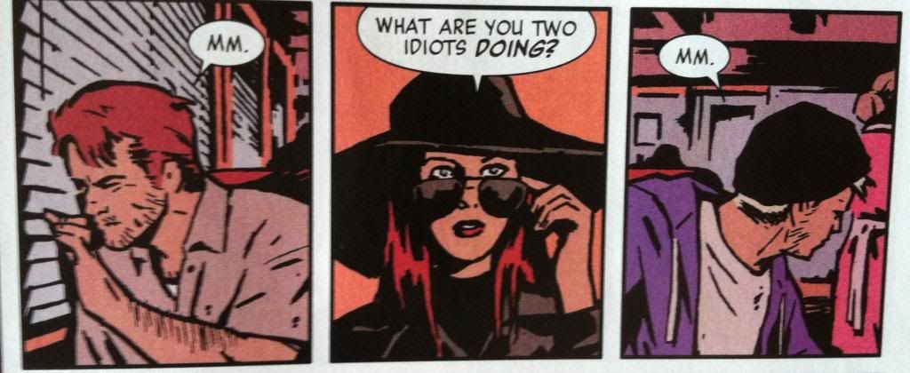
(Also, how great is the cover? Beyond the circled words I've managed to spot a "Pulido", "Wu", "Amanat", "Gruenwald", "Bro", and "Brown".)

There will of course be *SPOILERS*, some of which are pretty HUGE below. So don't read this until you've given yourself a chance to appreciate Hawkeye #15 yourself.


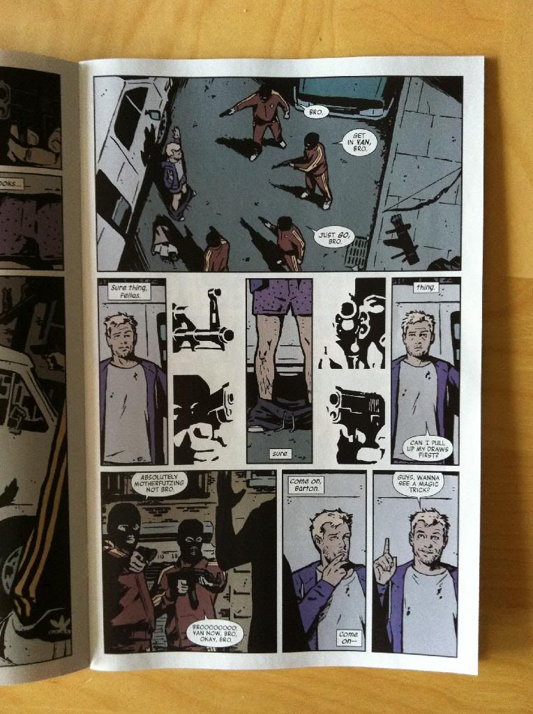
For instance, this page here is a masterwork in the use of shapes, guides, and lettering to guide the reader through the page in a really interesting and cool way.


The top panel on the page, I think, uses a circle guide to help us navigate the page. Our eyes are naturally drawn to shapes and guided by them, and Clint and the bros (and the associated speech balloons) flow in a circle that lets us quickly count the 1 Clint and 4 armed bros. Moreover, the use of a circle helps emphasize that Clint is encircled, surrounded by the bros. Smart, efficient comics.

The second row of panels does something even cooler: the combination of tall thin panels and the placement of letting at the top and bottom of panels forces the readers attention to rove up and down the page. What this does, is it causes us to look from Clints underwear down to his pants-around-his-ankles on the ground. This is a classic camera work where, in film or television, the camera looks down (whah-whah) to the pants on the ground for comedic purposes. And this motion-based panning is absolutely pulled off in a static story telling medium, which is pretty dang cool. (This comedy shot is also enhanced by the black-and-white bro guns around the periphery: they are indistinct enough to be read over quickly, but solid enough that they convey the danger, but also with the directionality of their aim, emphasize and frame the hilarious pants-fall-down shot. And the guns maybe also punch up the comedy by contrasting the danger of the situation with the absurdity of the underwear.) 

The third row of panels guides the reader through the page using the same up-and-down frame/lettering to guide the reader and to cause the Ah-ha! I have an idea! panel on the far right to be on an upstroke. (Since as we all know, ideas are vertical in nature.)

All in all, it's a great, flowing page that enhances all of the key moments using keen control of the reader's eye path. It's great stuff.


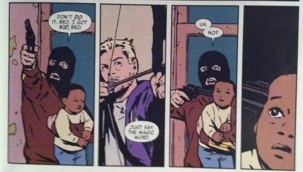
There is also a wonderful example of an effective page turn in Hawkeye #15 where this stand off, on the bottom row of a page, leads directly into...


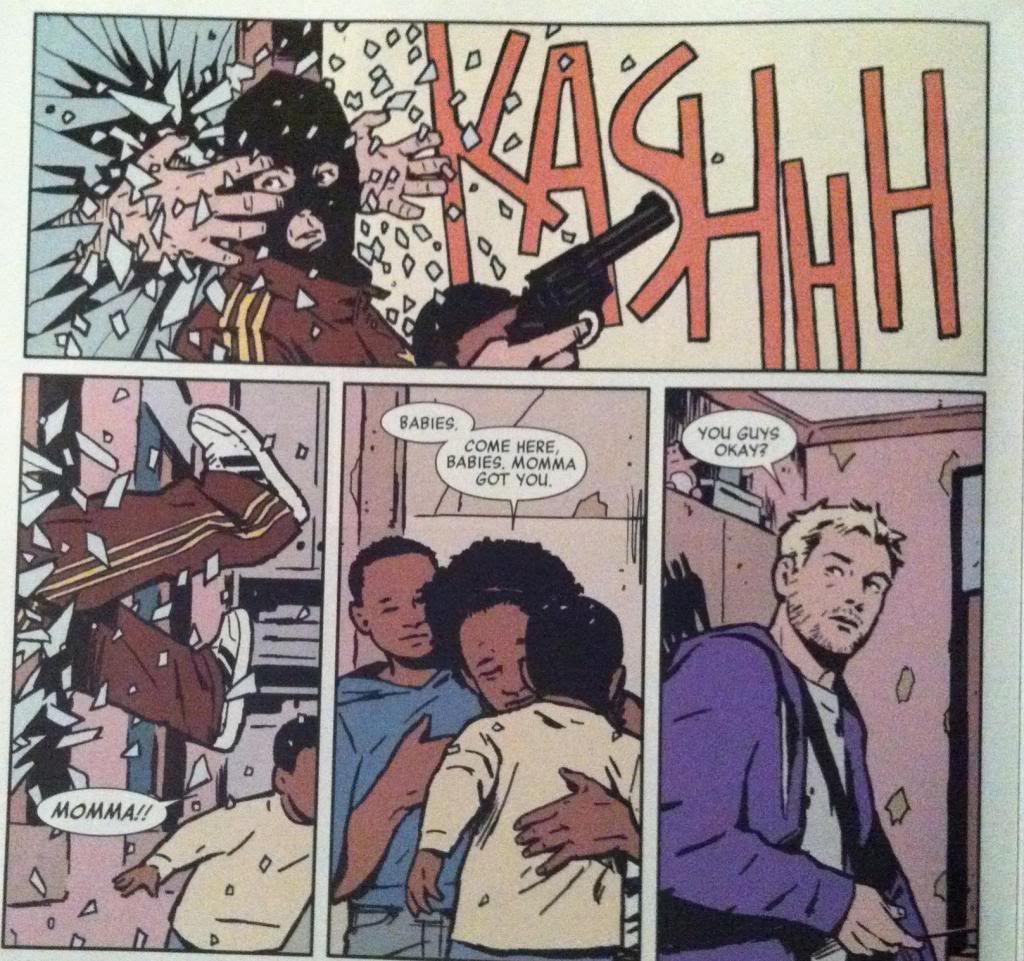
... the surprising appearance of Barney through the glass, grabbing the balaclava bro in the top panel. The use of a page turn here absolutely increases the surprise and the impact of Barneys entrance into the scene and the ensuing sequence of events.


This sequence also makes really smart use of eye motion to enhance the moment of defenestration. Barney bursting through the window drives our eyes to the right along the top panel where the onomatopoeia of the glass breaking keeps our attention and takes us to the far right of the top panel. So when our eyes carriage-return to the second row of panels, they take the longest path, allowing our eyes to pick up momentum so that when we arrive at the panel where the bro is yanked through the window our vision is travelling quickly down the same vector. Basically, this arrangement matches our reading experience to the kinetics of the events depicted to enhance the jarring, quick movement of getting dragged through a window. It's a great sequence.


Another cool feature of Hawkeye #15 is the way that orange is used throughout the comic. Many panels that depict key moments of violence or surprise or danger remove background detail and instead float in fields of this burnished orange. This is a nifty choice, in part, because stripping out background details keeps the readers focus on the moment of violence or danger depicted in the panels. It's also interesting comics because orange is a pretty alarming colour and its use, particularly after a few examples to set the tone, instantly tells us that things are not okay. We are quickly trained that in Hawkeye #15 burnished orange is bad news and the events depicted with an orange background are DANGEROUS and IMPORTANT. Which contributes to the overall sense of creeping dread throughout the issue.

Another aspect of Hawkeye #15 that I find very fascinating is the way that the Assassin-clown is framed in the majority of his panels during action sequences. While other characters are portrayed with their full bodies visible, carrying out actions, the Assassin-clown is shown in much tighter shots that show only a portion of him and only the barest hint of an action. What this does is give the Assassin-clown this super menacing sense of control: while other characters flail about in desperation, the Assassin makes decisions and small, deliberate actions that always have highly violent repercussions. It's a really fascinating choice that helps cement (along with the holy fuckfuckfuck ending) the Assassin as a properly terrifying villain. 

(Of course, there are exceptions to the close cropped Assassin-clown framing when key setting or stage-directing information is needed because as great as atmospheric comics are, storytelling is always primary.)


Previously:
Eye on Hawkeye #16: Smart layouts and chilling moods.

Eye on Hawkeye #14: Repetitive panels as a device.