Or some nifty layouts that create big movements in small spaces in Daredevil #33
By Mark Waid, Chris Samnee, Jason Copland, and Javier Rodriguez; Marvel Comics
I am a sucker for an interesting layout or sequence. While I love big grand, mind blowing layouts as much as the next guy, I'm endlessly fascinated by the small blue collar layouts that manage to convey basic storytelling information in especially efficient ways. Because as much as comics is big, crazy double page splashes, it is more often the less exciting business of conveying story and movement in panels and the way creators design the artwork to optimize storytelling is really important.
Daredevil #33 has a couple layouts that are super efficient and worth taking a longer look at.
This will be *SPOILER* light, but you know, proceed with caution.
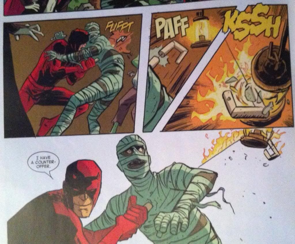
At first glance this is a pretty simple layout that tells a pretty straightforward bit of action. Daredevil drives his baton/grappling gun into the mummy, fires the grapple through the monster, bounces the grapple through a lantern and threatens the mummy with his greatest fear, fire. And then he negotiates. The thing is, this sequence is deceptively simple and involves all kinds of really clever, small choices to make it as clear and impactful as it is.
The actual motion of the moment happens almost entirely in the vertical direction, but takes place almost entirely in two rows of panels. So the challenge of the storytelling in this sequence is to convey this upwards-to-the-right followed by a down-and-to-the-left motion in a clear way in a small space. And the layout uses a pretty robust tool box to encode this information.
So the first way the motion of the sequence is encoded is the shape of the panels. The two main motion panels are vaguely triangular, which creates the feeling that they are exploding towards the widest end. In the second panel, the one with the upward motion, the point of the triangle is at the bottom, where the source of the motion is and widens out at the top. The downward motion has the opposite orientation. The panels immediately make it obvious that the motion has an upward and downward direction and also make it really obvious the two panels are moving in the opposite direction. It's pretty great comics.
The next encoding device is the grapple itself. A fired grappling hook has two really handy characteristics: it has a grapple head and the actual rope. What this does is it gives a grapple polarity, it provides a visual way to tell what the front of the direction the fired grappling hook is travelling. These characteristics also provide a way to follow the path of the grapple: the rope tells you where the grapple head has travelled. This sequence makes wonderful use of the grappling hook and uses the shape of the grappling hook, and line of the rope as visual guides to lead the audience through the panels. And this makes it really clear the direction and nature of the motion.
(In fact, these paths are so clear the final panel is read right-to-left in a way that feels completely natural. Which is also pretty darn cool.)
The thing is though, these pathways do more than show the path of the grapple. The guide paths on this page add the feeling of the action taking place. As readers trace the path through the page they actually get to experience the grapple moving up, bouncing, and coming crashing back down. The readers get to slide down the rope in the bottom panel, just like the flames that are creeping down on the mummy. So despite the lack of vertical space in the layout, the panel manages to feel like the motion taking place. Which is pretty great.
This layout also makes really great use of colouring and lettering to help the reader move through the page more efficiently. The page has a drab brown or white background colour, while the key aspects of the composition, and especially the motion, have bright yellow colours and bright yellow onomatopoeia lettering. This makes these aspects pop off the page and helps steer the reader through the motion. The way the lantern is highlighted yellow in the second panel is particularly cool, in that it makes it very obvious that it is the target of the shot. The colouring also really emphasizes the flames as important to the composition in a really effective way. It's remarkable how smart lettering and effective colouring can enhance a composition.
And put altogether this makes for one very effective bit of comics.
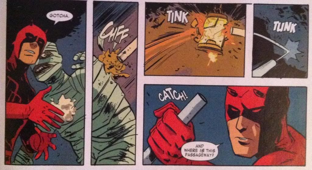
The sequence where Daredevil releases his mummy-hostage from his negotiating position is also pretty great and relies on a bunch of the same tricks. A few neat things is that the path is etched out largely by lettering and the handle of the grappling baton as it flies out of the panel. This is really cool in that the speed of the moment is encapsulated by the fact the panel only has the VERY END of the baton. It's as if the thing was moving so fast that the artist wasn't fast enough that he missed the perfect picture. Also, the way the colouring changes from the third to the fourth panel conveys that the lantern is snuffed out, which is pretty clever too. Basically, this is another great, clear sequence of comics.
And there you have it, two really simple storytelling moments told in super effective ways.
Previously:
Describing Daredevil 30: the vectors of artwork
Describing Daredevil 29: A great page


No comments:
Post a Comment