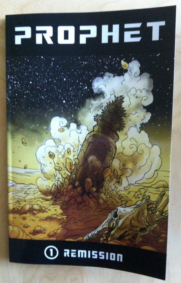
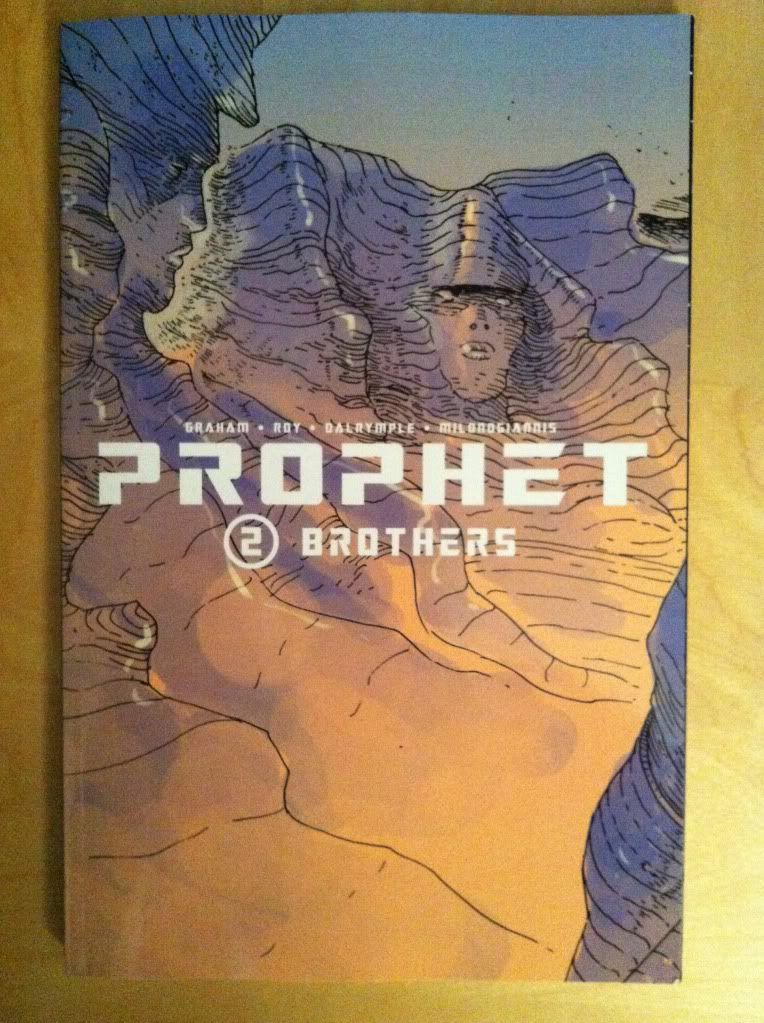
By Brandon Graham, Simon Roy, Farel Dalrymple, Giannis Milonogiannis, Joseph Bergin III, Ed Brisson; Image Comics
I am really interested in colouring as a force in comic book art. When done well it breathes a certain life into line art and can add a sense of atmosphere or mood to a composition that the line art alone might not be able to accomplish. When done poorly colouring can be this busy nightmare of rendering and gradients that can completely obscure the beauty of the underlying lineart and all of the depth of the inking. It's gloriously complicated and can alternately really enhance a comic or detract from it in really interesting and significant ways. It's important and I really want to talk about it.
The trouble is, beyond saying its good or bad, I find it really hard to find a substantiative angle on colouring.
The thing is, really good colouring becomes such an organic part of the finished comic that its often hard to point out aspects of the design that stand out or the logic to it. I might be dumb or just not know enough about the art of colourng, but the genius of colours often is too subtle for me, too clever and respectful of the rest of the comic to jump out. It's really only the most obvious, most experimental colouring that I really can write about in any meaningful way. It's like talking about a bassist, it's super important to the music but unless you know a lot about music or playing the base it can be hard to pick out how great it is. (You know, unless it's Geddy Lee doing something crazy.) So despite the dearth of colouring analysis here, I'm appreciate how important it is and try to think about it.
Prophet: Brothers, fortunately, has some really obvious and deliberate colouring that I think maybe lends itself to a discussion of some of the ways colour can affect the atmosphere of the comic and convey extra information.
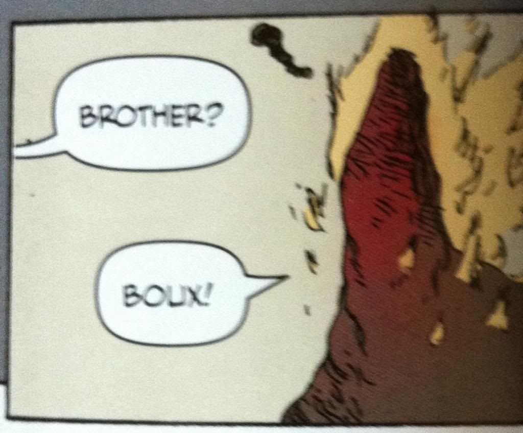
*SPOILERS* for Prophet: Brothers going forward. Proceed at your own risk. Boux!

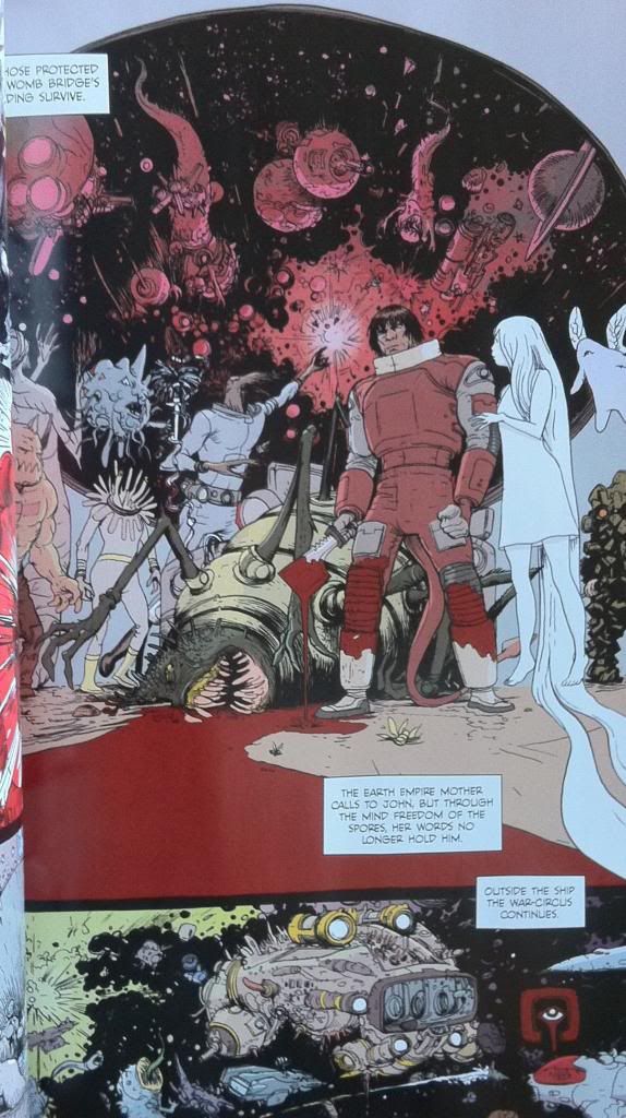
The plot of the chapter of Prophet I want to unpack tells a story about the Prophet guy with a tail, as he attempts to escort the Empire Mother back to Earth Empire space. To get there he and his team must bring the Sister through the Ixtano Circus, a perpetual space battle. Complications ensue and Brother-Tail finds himself taken prisoner on a manufacturing barge, a kind of prison/slave ship. On this ship all prisoners are mind controlled into servitude and this is conveyed to us by colour.
All of the scenes that occur within the influence of the mind control are done in greyscale. This lends these scenes a muted, drab quality distinct from the coloured scenes. It's as if a certain sense has been removed from the comic, colour, which resonates with the mental blanket and lack of full cognitive ability of the Brother-Tail while he is under mind control. And beyond that, the change from colour to greyscale is a terrific visual metaphor for being under mind control: Brother-Tail and our own perception of reality has changed in a way that is expressed on the page. It's unsubtle but pretty smart.

The thing is though, this Prophet chapter continues to use colour in moments that act against the mind control. For instance, when the Empire Mother psychically reaches out to Brother-Tail she brings with her the colour red. This shows that she is able to piece the grey-mind-control-fog to reach Brother-Tail's mind but, given the monochromatic nature of the red, brings another kind of control, another unitary element of control. It is also, I think, a visual signifier of the violence inherent in the Earth Empire's influence: their mental colour is the same as blood.
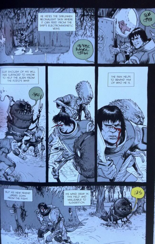
Another neat colour trick is that the overseer's commands speech bubbles are coloured. This shows that their commands are able to pierce the grey mind control blanket and, based on their colour in a grey-scaled page, become the most striking and important elements on the page and to Brother-Tail. It's simple and it's pretty great.
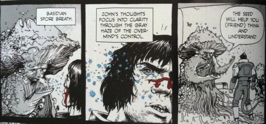
The thing that saves Brother-Tail from mind controlled slavery is encountering Yun-Heath the Basidian, who releases spores that induce an element of mental freedom on those who inhale them. This too is given a colour, the spores as blue motes on a grey background and in one frame shift the colour of prophet into a blue-overlayed greyscale. Again this shows a message that is able to get through the mind fog by adding an element of colour. It is also a great visual metaphor of regaining an element of mental freedom: some colour has returned to the world but not all of it. Again it is pretty obvious but still pretty smart comics.
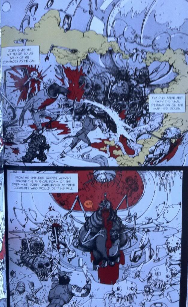
Eventually Brother-Tail and his fellow semi-free slaves rise up against their handlers and fight their way to the Over-Mind, the source of the mental control, to regain their freedom. This battle takes place mostly in greyscale, but certain elements are brought through as colour. Elements like blood and the toxic gas being spouted are coloured red and green respectively. It's as if the pain and the danger of the injuries, violence, and gas are sufficient to cut through the slave conditioning and awaken some basic Prophet survival mechanism that helps get Brother-Tail through the conflict. It also looks pretty darn cool.
And eventually Brother-Tail and company kill the Over-Mind and regain their mental freedom which returns normal reality to the characters and colour to the composition.
All in all, it's pretty deliberate and effective use of colour in comics. By using such straight forward and obvious colour choices Team Prophet is able to convey huge amounts of atmosphere and some pretty key story information visually. It made this chapter so much more engrossing and evocative than it would have been if it were coloured normally, or left black and white. Or, to put it another way, the colour was the visual effect that elevated the magic of the story above what it would have been otherwise. It's pretty great comics.
The thing is, good colouring is doing these kinds of things constantly in a way that is much less obvious and easy to talk about. It's always there tweaking the mood, providing extra visual information, and subtly improving the comic. It's there and when it's great, like in Prophet: Brothers, it's kind of magic.