Or a wonky look at a great page in Daredevil #29
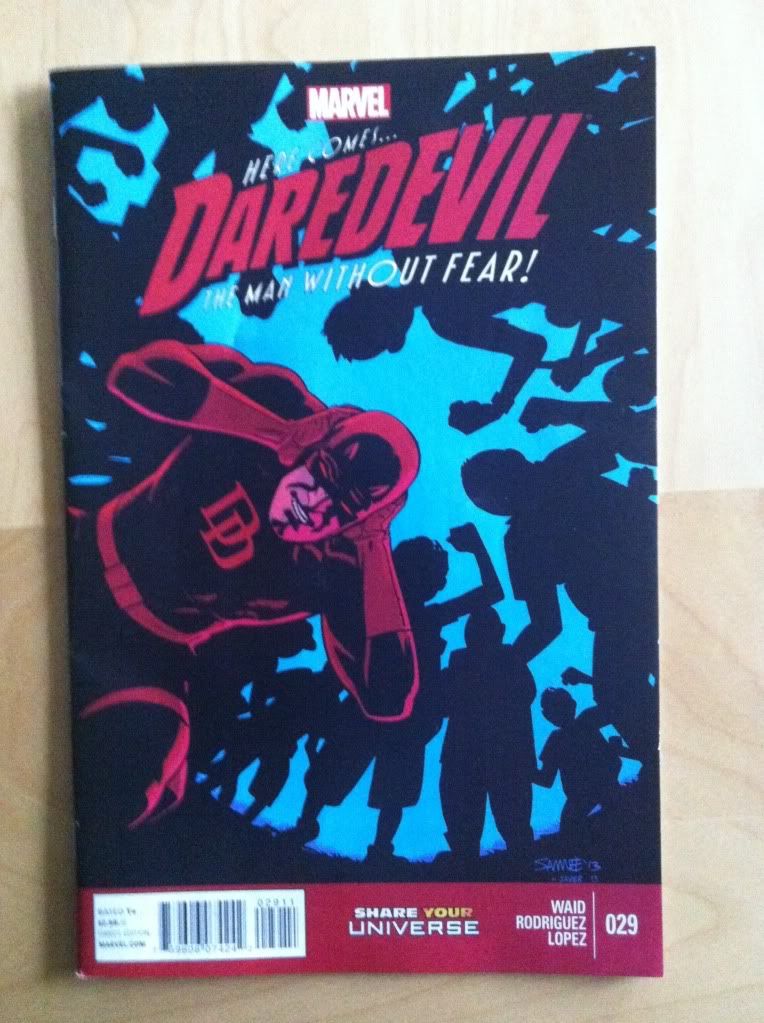
By Mark Waid, Javier Rodriguez, Alvaro Lopez, and Joe Caramagna; Marvel Comics
I really like Daredevil. It has reliably been an excellent comic. Mark Waid has a fresh take on the character, plays with some really interesting themes of blindness and revelation, and has the exciting habit of writing himself into corners. And the artwork has also been consistently excellent with a stable of talented artists including wizards like Marcos Martin, Paolo Rivera, and Chris Samnee. Daredevil always looks great and is editorially very well curated. Daredevil was one of my original top-ten comics, and I have always felt like it was worth it.
I haven't written about Daredevil before, because well, I haven't had anything particularly substantiative to say beyond "it's good" or "it's really good". But while reading Daredevil #29, a particular page jumped out at me as being particularly efficient and great, and I want to pick it apart.
There will be *SPOILERS* in this post of Daredevil #29. Please go read the comic, I'll wait.
One of the things I find interesting about comic book art is how it has to convey, in just a few images, a huge amount of narrative information. The artwork has to portray the actions of the story: the events that occur and their sequence. Art has to establish the setting and give the portrayed events a sense of place. The art has to show all of the acting of the characters: how they move through the space, their body language, their expressions. And artwork also can establish the mood and atmosphere of the scene through colour selection, and style, and creative choices. And all of this has to be done as efficiently as possible.
I think this page here is a great example of effective and efficient comics storytelling.
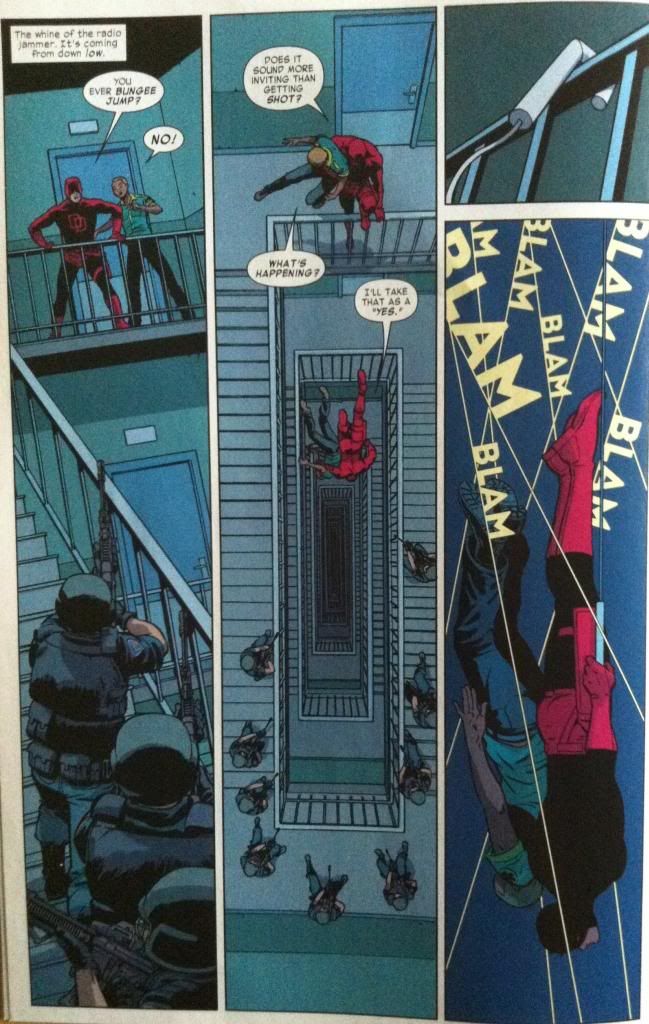
Everything we need to know about this section of the story is captured in just four panels. To the point where I don't think I even need to "set up the clip" with any other story context: Daredevil and another guy are trapped at the top of the stairs by armed, SWAT looking people, and jump down the stairwell shaft to escape them. It's all on the page. How all of this is set up is brilliant and worth examining.
Like most remarkable pages, the foundation of what makes the page so effective is layout. The vast majority of Daredevil #29 is done in full-width panels with most pages split into three to five layers. The stairway panels on the page I want to look at all span the whole height of the page and split the page into three columns. What this does is change the comic from a horizontal, on-a-single-plane story into a vertical story. Which helps to establish the setting of the stairwell, and the atmosphere of teetering on the top of a great height. It's great.
But there is so much going on than just tall panels.
Panel 1 has the job of establishing the situation of the page. On the most basic level it shows us that Daredevil and the guy are at the top of a stairwell and that SWAT looking people are below them on the stairs and aiming weapons at them. But panel 1 does some other pretty neat things. For one, it feels like it is made of two implied panels. We come into this page and read the caption box on the most extreme top left corner, and then see whats up with Daredevil and guy and their dialogue which is all tightly packed around it. This top section of the page feels like its own moment perched on top of a long drop which sets up the feeling that Daredevil and guy are at the top of the stairwell. After dealing with the top implied panel, we look down the page and stairwell and see the SWAT-guys at the bottom of the page which again helps make the situation feel heighty, tells us the SWAT-guys are below Daredevil, and is actually part of the action of Daredevil and guy as they survey their position. But wait! There's more. The page also has two distinct planes: a distant one with Daredevil and guy, and a foreground one with the SWAT-guys. Therefore it feels like the SWAT-guys are BETWEEN us and Daredevil, who is smooshed into the top section of the panel, which conveys that Daredevil and guy are trapped by the SWAT-guys. This panel is great comics.
The second panel is just this truly inspired choice of viewpoint. The look down the stairwell gives this perfect sense of place for this scene that allows us to see how deep the stairwell is, how Daredevil and guy spatially relate to SWAT-guys, and exactly how their escape motion works. Speaking of the escape, this perspective allows the creation of an invisible line that follows Daredevil from the top landing, to his falling position, and onward to the vanishing point in the centre of the stair. You instantly get the path of their escape, actually looking DOWN it, which additionally helps convey the motion. All of this Daredevil motion takes place in the top 1/3 of the page, with the rest of the page below being fallow space action-wise, emphasizing the height of Daredevil's actions. The speed of the action is also encoded in an interesting way: we see two snapshots of Daredevil with no motion from the SWAT-guys showing that his dive off the landing was so quick that they didn't have time to react. The SWAT-guys also are arranged, motionless, in the fallow bottom of the page, which from a narrative perspective helps to emphasize that they are being left behind, that Daredevil is succeeding in escaping the SWAT-guys. More great comics.
(I once worked in a building with a 12 storey floating spiral staircase, because DNA, and I can't look at a down-stairwell shot without thinking of that perspective. Everyday I wanted to take a bouncey ball to work and drop it down space in the middle. Everyday.)
The third and fourth panels work together to convey the moment of the escape. The top panel portrays the Daredevil's grappling hook latching onto a railing. It is a very specific and key moment that turns Daredevil and guys dive from a desperate move, to a planned escape. As a separate panel, it conveys that the grappling hook is set before the diving scene depicted in the bottom panel, and given its position on top of the fourth panel, that this event occurs above the diving Daredevil. The bottom panel is all about diving and speed. Part of this is its location and simplicity: we look down from the top panel and can pretty seamlessly look down the panel all the way to Daredevil's face (near the very bottom of the panel). We get one long, relatively quick, downward eye motion which matches the motion of the dive. This sense is enhanced by the bullet lines: they add directional vectors in the same direction as motion which helps drive the downward eye motion. (Also, how great is the "BLAM" lettering, which conveys directionality to the lines, identifies them as bullet trajectories, and, by font size and layer arrangement, the position of the bullet paths!? I love it!) The speed of the dive is also emphasized by the lack of background: fewer details to slow our experience of the panel and all we see are objects/bodies in motion. Daredevil is falling on the same timescale as bullets whizzing past. It's more great comics.
That was a lot to unpack, but it's mostly invisible. Put all together we have four very effortless looking panels that quickly, and efficiently move us through the events with tremendous emotional weight. Rodriguez, Waid, Lopez, and Caramanga, create a really great page in a really great comic. It's concise, beautiful, and effective comics.


No comments:
Post a Comment