Monday 31 March 2014

Eye On Hawkeye #18

Or a look at how colouring is used to manage setting in Hawkeye #18
by Matt Fraction, Annie Wu, and Matt Hollingsworth; Marvel Comics


Hawkeye continues to be that dang comic. 

I didn't write about Hawkeye #17, the Winter Friends issue because its release date managed to land right in the middle of Busy Times, and because I didn't have much to say about the issue other than it was absolutely tons of fun. I mean, there were a great many interesting parallels between the issue and the series as a whole, but they were obvious and no one likes overtly obvious criticism. (Oh my god, you guys! Steve was TOTALLY Clint!!)

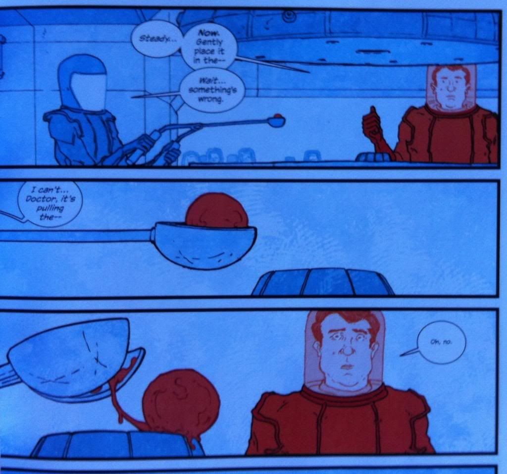
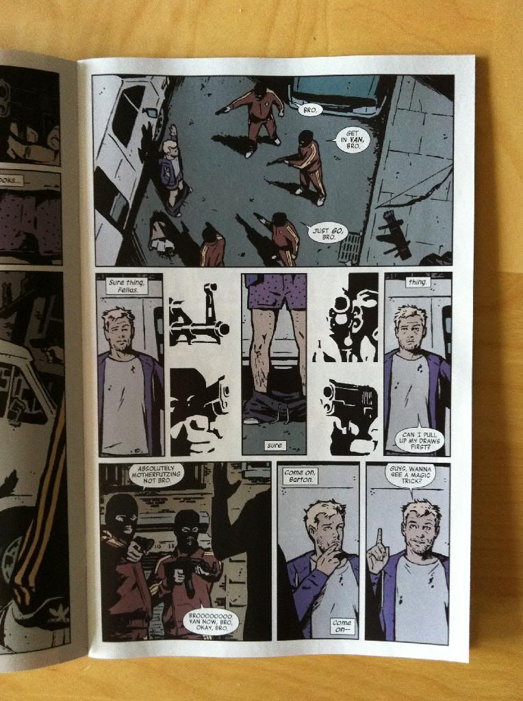
Fortunately for my purposes, Hawkeye #18 is a much more conventional issue of Hawkeye that is pregnat with interesting comics to try and figure out. The thing that struck me most about Hawkeye #18 was just how dense an issue of comics it was: it took substantially longer to read than an average super hero comic. Hawkeye #18, I think, gets its density from both a higher than normal panel count (a hallmark of the Hawkeye series), but also by the sheer number of settings in the issue. Seriously, over 20 story pages Hawkeye #18 has  at least 13 discreet settings (and that's being stingy and not counting all of the flashback scenes or in-transit sequences as settings.) This is a lot of settings!

The thing about a comic with so many locations is that there is the potential for the entire beast to be one confusing mess. But Team Hawkguy is really great at making ambitious comics work through studious attention to detail. To solve the problem of multiple settings in a relatively short comic book, Team Hawkguy leverage work done in previous issues by revisiting, in part, some familiar settings. There is also,of course, the clear storytelling of the Wu/Fraction collaboration and the simple fact that every setting is smartly designed and drawn well. But to me, maybe the most interesting way Team Hawkguy effortlessly encodes information about multiple settings is in the colouring of the issue.

There will of course be *SPOILERS* for Hawkeye #18 throughout this post.

One of the main ways Hawkeye #18 managed to seamlessly juggle so many settings discrete settings and handle characters moving from one location to another was through the use of lighting. Every setting, very nearly, had its own discrete lighting which which affected the tone of every colour in the effected composition. This is just a random sampling, but there is the bright, artificial lighting of the grocery store, the semi-dark lighting of an unlit apartment in chaos, the glaring white brilliance of bathroom lighting, the warm glow of being at the beach in direct sunlight, the dark blue shadow of being outside at night, and the gentle lighting of a tastefully lit restaurant. Each of these scenes looks and feels different, despite the same character colours (Hawkeye is always purple), making each place visually and emotionally distinct. Furthermore, changes in lighting, and particularly shadow, really help keep character location straight as the darkness of the LA night makes it very clear when characters leave one location and move to another. Hawkeye #18 is a masterclass in how effective and thoughtful lighting effects in colouring can convey a huge amount of information about setting.


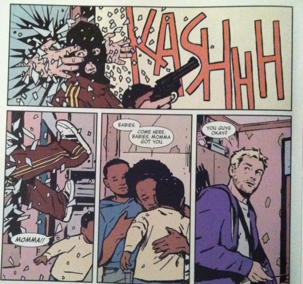
Hawkeye #18 also leverages colour directly to help solidify each setting as a discrete location. Many of the key scenes have a distinct colour palette that makes each feel unique. Kate's trailer is coloured in tones of purple, since everything Hawkeye must be, while the scary mansion is rendered in blacks and shadowy blues. The bathroom is white-white-white while in the flashback sequences the LA skyline is a sunset, nostalgic orange, hollywood parties are opulent red, purple, and pink, and the beach is a study in tan-yellows and skyblues. Even at a cursory inspection, like in the selection above, each of these settings is clearly different and unique both visually and emotionally. Clearly, say, the dark and creepy mansion is in a different physical space and story location than the swank, fancypants Hollywood party. It's great stuff.

(For sake of argument, think about a Batman comic. I love Batman, but when it comes to setting, Gotham is usually rendered universally as this dark, black and blue, urban landscape that heavily features shadowed lighting. It often feels like this looming, monolithic space of indistinct urban-ness, fear, and violence. Which I think often makes Gotham seem less like a place and, maybe intentionally, more of an indistinct nightmare land. Hawkeye, with this smart use of tying colours to locations, feels much more real and diverse in the spaces visited. Which is a choice so subtle that, I think, it's easy to miss: colouring, when done well, is this permeating invisible thing that can drive so much storytelling.)


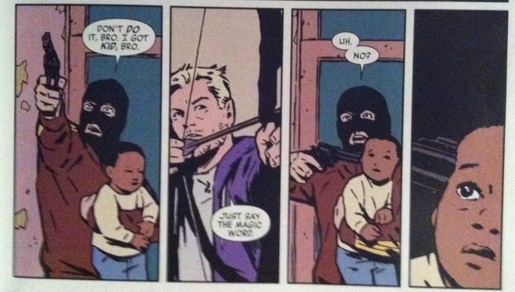
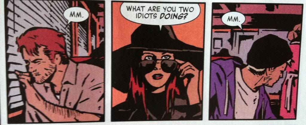
Hawkeye #18 also has some great exampls of colouring as a storytelling device that go beyond establishing setting. In the top selection the way colour is dropped in the second panel suggests, with no words or artwork to support it, that Hawkeye is focussing on making a tricky arrow shot. The colour, and the world, fall away for a moment of aiming and we the audience understand the story message of the panel based solely on the colouring information. The second selection works this way too: we see the red and blue glare of rollers and understand that our heroes have been stopped by the LAPD. This is again based solely off colouring information, since we never actually see a cop car drawn in any of the preceding or subsequent panels in this sequence. Which is just more evidence that effective colouring choices can be a fantastic storytelling tool. 

Hawkeye #18 is a treasure trove, I tell ya.


Previously:
Eye on Hawkeye #15: Composition, Layout, and colours.

Eye on Hawkeye #16: Smart layouts and chilling moods.
Eye on Hawkeye #14: Repetitive panels as a device.


Friday 28 March 2014

The Dispossessed Is A Good Book

Or why you should read The Dispossessed by Ursula K Le Guin,


The Dispossessed is a utopian Science Fiction novel about binary contrasts and the human spirit. The novel is set in the twin planets Urras and Anarras in the Tau Ceti star system. Despite their proximity, the two planets are diametric opposites: Urras, is a lush, fertile garden world of plentiful resources while Anarras is a hostile, arid world rich in minerals but poor in natural life. While both planets are inhabited by the Cetain species, the cultures of the two worlds are radically different. Urras is mostly an aggressively capitalist planet, divided into warring nation-states which are governed by vaguely authoritarian governments. Urrasti society, as a result, is very much divided between the rich and the poor, the powerful and the repressed. Anarres, in contrast, is a world without governments, ownership, commerce, or hierarchies. Anarresti society, based on the collectivist/anarchist philosophy of Odo, is defined around equality, sharing, achieving personal happiness, and surviving the harsh Anarras environment and the collective poverty of the world. The two worlds, Urras and Anarres, despite their proximity are, aside from some minor trade, completely isolated from each other and have been for generations. It is against this contrasting background that the novel tells the story of the brilliant Anarresti theoretical physicist Shevek, who in his quest to achieve a General Temporal Theory, must consult alien physicists and chooses to travel to Urras to pursue his research. And in doing so Shevek becomes a lens to explore both societies, both halves of the binary, and in so doing examines what it means to be human in a society. It's a brilliantly smart and humane work of fiction.

I would recommend The Dispossessed to any Science Fiction fan: if you have pretensions of being a serious Sci-fi reader this is a must read book. It's beautifully written, emotionally deep, and painfully intelligent (although in a very accessible way). It is also one of the most astute political explorations I've ever read, and unlike most landmark social speculation novels it does't rely on dystopia. Instead it's a frank look at different societies in a way that is aware that few societies are completely shit: most, for all their problems, also have strengths, and the way The Dispossessed uses and breaks its binaries is really mindful of that. It's pretty refreshing. And so I would also recommend this book to anyone into fiction with a heavy element of social meditation because this is Sci-fi built for political nerds. The Dispossessed is also a novel that I would recommend to people looking for more great Sci-fi by women authors. Part of why I picked this book up was having it pointed out/realizing just how few women authors I read and a desire to find out if I'm missing out on some great Sci-fi. And, well, The Dispossessed is exactly the kind of novel I was afraid I was missing out on.


Wednesday 26 March 2014

So I Read Bandette: Presto!

A 250 (word or less) review of Bandette Volume One
By Paul Tobin and Colleen Coover; Dark Horse Books/Monkeybrain Comics


Sometimes it's okay for a comic just to be fun. I like brooding drama and intricate mechanical plots with relentless character stakes as much as the next person, but sometimes it's nice to read a comic where everything is pretty okay and all the characters are enjoying themselves. Bandette: Presto! is a relentlessly fun comic. The comic is about Bandette: a French master thief with dubious morals, a penchant for altruism, an infectious zest for the joys of stealing, and a sweet tooth. Presto! introduces Bandette, showcases some of her enjoyable capers, and colours her world with her band of merry urchin accomplices, debonair gentleman rivals, cartoonish inspectors, and Parisian rooftops. Presto! also sets up an ongoing conflict with FINIS and it's leader Absinthe, with a series of crimes meant to infuriate and damage the nefarious organization. The entire package, from the giant grin on Bandette's fez to her chihuahua Pimento, is invitingly, glaringly, relentlessly fun. It's the kind of comic that scampers over rooftops with glee, somersaults gracefully through spells of silliness, and flirts dangerously with the sharp edge of inanity, but somehow manages to tumble through as a really enjoyable, surprisingly mature and smart comic. Bandette is very much the ultra-fun comic for fans who don't typically enjoy silly comics. It's a comic you really ought to try.

Word count: 220

Monday 24 March 2014

Atoll Comics Round 13

Or changes to my Top-Ten comics

Due to poverty and an urge to buy better comics, I have decided to be super-selective about which superhero comics I read. Harnessing the Awesome Power of Maths, I have determined that I can afford to read 10 ongoing titles. So I get to read 10, and only 10, titles published by either Marvel or DC as well as one trade paperback a week of my choosing.


A complication of this is that I am forced to drop an on-going title if I want to try reading a new on-going title, an act of very tough love. Being financially responsible is the worst.

I will be adding Moon Knight and dropping Avengers.


Why Moon Knight: Sometimes you read a comic because you have some great interest or affinity for the leading character. You are just soooo into Batman that pretty much any comic with Batman in it is something you want to read. Other times you read a comic because the creative team making the thing demands your attention. Moon Knight by Warren Ellis, Declan Shalvey, and Jordie Bellaire is exactly that kind of comic. Warren Ellis has written some of my favourite comics, and its a joy to see him back writing more. Declan Shalvey is a great noiry artist and Jordie Bellaire is a reliable awesome colourist and together they are doing some really interesting things. It's maybe an especially interesting collaboration as, I've gathered, Shalvey and Bellaire live together, and that kind of geographically close collaboration between a penciller and colourist is pretty rare and potentially special. If the first issue of Moon Knight is any indication, the book looks poised to be pretty good: a fascinating trip into the mind of the supernaturalish-insane person that is Moon Knight rendered in this fantastic style that sees Mooney stark, flat white in a sumptuously rendered, coloured world. The first issue is a comic worth picking up for quality of the overall story but also just for the daring artwork. You ought to at least give it a try.


Why not Avengers: Avengers is the flagship, tentpole comic for one of Marvel's main publishing lines. It's a comic that draws Marvel's biggest characters and puts them into the biggest storylines, those linewide Events! that change the very nature of the Marvel Universe. Avengers plays for all of the marbles all of the time! OMG!

And... I'm kind of bored of it. The constant smashy crises, even with the best creators, tends to get a little repetitive: the world is ending and the heroes save it. Even worse, from my perspective, Avengers has a nasty habit of setting up and then interweaving with the Event! de jour which means the comic can seem like its either in a holding pattern, set up period, or a tie-in. Add to that a very large (and pleasantly diverse) cast, and there isn't much room for character development. I find I am more interested in reading character driven comics that have enough editorial freedom to tell stories without too much interference from Event! cycles. So, yeah, Avengers is out.

The thing is, I don't think Avengers should change! There is completely a place for this kind of Event! driven, character heavy, comic in Marvel's line. I used to love Events! and the interlocking stories with New Avengers, and I suspect that there is still a large block of readers that buy into this kind of storytelling. And the wonderful thing about a healthy comics publishing line is that there can be comics for everyone. Marvel publishes a lot of other comics that are more my speed, more than I can actually afford to read, so my comic tastes are being still being satisfied. Not every comic is for everyone, live and let live and find what comics work for you.


Previously:

Friday 21 March 2014

Deep Sequencing: Red-shift, Blue-shift

Or how binary colour schemes are used in The Manhattan Projects Volume 3
by Jonathan Hickman, Nick Pitarra, and Jordie Bellaire, Image Comics


The Manhattan Projects beyond being inane, hilarious, and shockingly horrifying is also a really pretty and visually interesting comic. Obviously, Nick Pitarra, the penciller of the series deserves a lot of the credit for how great the comic looks: his designs and effectively tell the story and enhance the tension or comedy of every scene. But I think part of the magic of The Manhattan projects is the colouring by Jordie Bellaire. I'm particularly interested in the way she colours flashbacks and mental sequences. So here is a look at her use of weird blues and weird reds in The Manhattan Projects: Vol. 3

There will be mild *SPOILERS* for The Manhattan Projects. Proceed with caution and PPC*

(* PPC = Personal Protective Clothing, it's lab jargon for goggles and lab coats and respirators etc...)


The hook of The Manhattan Projects flashback sequences is the contrast between the Blue and Red colours. They are absolutely the colours of madness and Science: these are two very unnatural colours, a kind of textured bright blue, crackling with electricity and Bunsen flames, and a vaguely neon red, glowing like some kind of mutant blood. Neither colour feels entirely real, enhancing the fantastic, afronte-to-nature-ness of The Manhattan Projects, while the yawning contrast between the two extremes is just pure dreamscape insanity. I love it.

Beyond the interesting colour selection, the use of un-Blue and un-Red is also pretty fascinating. In the above sequence, the red and blue are used to emphasize Daghlian in his red containment suit and the glob of presumably plutonium that would change his life forever. It's a pretty simple approach to highlighting key elements, but it absolutely razor focuses the readers attention to the key elements in the composition.


The un-Red and un-Blue is also used to elegantly highlight the isolation of radiation-monster Daghlian after his accident. By colouring him in the angry, unnatural red and every other human in the blue colour, Bellaire manages to perfectly capture the loneliness, and almost literal alienation of Daghlian from the human world now that he is a walking radioactive disaster. It's great comics.

(Also, note that in this sequence Enrico Fermi is in the above panel coloured in blue. This is going to be important in the second.)


In the same way that colour is used to emphasize the isolation of Daghlian, it's also used to show the end of it. Where previously Fermi was coloured as blue, while Daghlian was coloured red, now, with the gift of the radiation containment backpack thing, Fermi is also coloured red. This colouring really helps establish that Daghlian has now found a kindred spirit and is no longer alone. It also helps cement how important the friendship with Fermi is to Daghlian which is a warm human moment and also great set up for Fermi's eventual betrayal.


The red and blue colouring is also used at the funeral of Fermi to establish demarcations. In this case, it really helps establish that the deceased, traitorous Fermi has been cast out of The Manhattan Projects. All of the members in good standing of The Manhattan Projects are coloured in un-red while Fermi's casket, headstone, and photo (in the top left) are all coloured blue. This manages to simultaneously emphasize that Fermi is no longer one of the team (he is no longer coloured red) and that he is no longer alive (his elements are coloured in the same blue as the chairs and shovels and cake). 


The un-red and un-blue colouring strategy is also during the War of the Oppenheimers in which the cannibalistic Joseph Oppenheimer and the consumed Robert Oppenheimer fight a war for the control of The Oppenhemer's mind. It's very much a war of ideas and imagination fought with metaphors and proxy Oppenheimers co-opted by either primary Oppenheimer. Which is a pretty trippy collection of ideas. However, the colouring keeps it straight forward to look at: the armies of Robert and coloured blue, while the armies of Joseph are coloured red. So visually the whole insane mess is distilled the very understandable red-vs-blue. It's a simple approach, but is stunningly effective.


Previously:

Wednesday 19 March 2014

So I Read The Manhattan Projects Vol. 3

A 250 word (or less) review of the third Manhattan Projects collection.
By Jonathan Hickman, Nick Pitarra, and Jordie Bellaire; Image Comics


I am a professional Scientist. I believe in the power of Science as a lever to improve human life and elevate humanity to something better. I research cures for diseases and I sacrifice my time, financial security, and how interesting I am at parties on the altar of Science. I am a good person trying to do good things. The Manhattan Projects thinks I'm a goddamn monstrous asshole. And I love it.  The Manhattan Projects is a comic about how the real life geniuses of The Manhattan Projects are a bunch of ruthless, sociopathic geniuses performing terrible acts of Science because they can. The third volume of the comic focuses on the inevitable murderous betrayal that occurs during all Scientific collaborations. The thing about volume 3 is that it really embodies the mad in Mad Science. One of the things about madness that I've always found chilling is how quickly it can shift from something weird and harmless into something fucking terrifying. And third volume of the Manhattan Projects has really thrown itself into the terrifying. It is a very smart, very chilling comic that builds on the ongoing story and pays off a lot of the ongoing plotlines. Volume 3 also cuts out the safety net and increases the stakes of series going forward: the house that Science built is on unsound, faintly radioactive footings. So, despite the toxic things The Manhattan Projects Vol. 3 has to say about me and my colleagues, it is really worth checking out.


Word count: 250


Previously:

Monday 17 March 2014

Deep Sequencing: Phono-Infogram Pt.3 Setting

Or an infogram of location in Phonogram: Singles Club
By Kieron Gillen, Jamie McKelvie, and Matt Wilson; Image Comics


Phonogram: The Singles Club is kind of a masterpiece of comics craft. Part of this is that The Singles Club is exceptionally well written, with its dynamite premise, an engaging troupe of characters, and perfectly tuned dialogue. It's also a comic with beautiful artwork: fantastic acting, dynamic use of space, and aggressively thoughtful colouring. But the thing that makes Phonogram: The Singles Club the kind of comic that everyone should be taking a very close look at is the way Team Phonogram embeds the story so completely in setting. Structurally, The Singles club tells seven interlocking stories with common settings that occur simultaneously on the same night, and, this complicated, multifaceted beast fits together PERFECTLY. This narratives thread like a tapestry, the chapters obey the timeline of the story like a Teutonic train schedule, and the physical spaces are complete enough to pass building codes. Phonogram: The Singles Club is just about the most granular, engineered short comics run I've ever read.

Because Phonogram: The Singles Club is so well crafted, you can literally create page-by-page maps of plot, time, and setting of really remarkable detail. And, because I love making infographics, I've done just that.

Phono-Infograms:
1: Plot Map
2: Timeline
3: Setting Map

Setting Map: This is, as accurately as I can figure it out, the location of every page and event in Phonogram: The Singles Club. I tried to be as accurate as possible given the information available in the comic (including Jamie McKelvie's great backup info about the club design which I tried to back-engineer). That said, I took artistic license in a few places (the room behind the bar in the club, for instance), had to make some inferences (like Laura starting in Penny's bathroom, and Penny living in a dorm or room in her parent's house instead of an apartment...), and decided not to draw all of Bristol, so outside is just the area not enclosed in a room. Use your imagination. Areas with free drawn, squiggly lines are kind of my fog-of-war demarcations for areas where I lacked enough information to guess at layout. It's also worth noting that I guessed at overall dimensions of spaces, so that is all kind of eyeball approximate. Despite all of this attention to detail, I strongly suspect I still made some other errors in here. (Like in Lloyd's parent's (I guess) house, the leftmost mainfloor wall is, I think, the barrier wall of the home which I imagine is a rowhouse. Lloyd's room on the second floor, then, shouldn't project past it, but the place it seems to fit easiest (and maybe best given the door opening) violates this...) I am also shit at drawing cars from above. But yeah, overall I think it's pretty okay. Please use the other diagrams for time and plot locations.

(Also, it's pretty cool that I got to use my highschool drafting electives for something after all. Woo.)

This diagram is a plot map so there will be *SPOILERS* in the diagram. Be wary.


I don't really have any after commentary for this one, other than setting is just done FLAWLESSLY in The Singles Club. The fact I could look at the comic and generate reasonable floorplans for spaces in the story is CRAZY (even if I cheated and used the club 3D model pictures in the backup). The way this comic uses is setting is absolutely worth looking at in detail.

(Incidentally, this is my first blog post as married Hoo-mon. Weird...)

Previously:
So I Read Phonogram: Rue Britainia
So I Read Phonogram: The Singles Club

Deep Sequencing: Phono-Infogram: Plot Maps
Deep Sequencing: Phono-Infogram: Timeline

Friday 14 March 2014

Deep Sequencing: Phono-Infogram Pt.2 Timeline

Or an infogram of time in Phonogram: Singles Club
By Kieron Gillen, Jamie McKelvie, and Matt Wilson; Image Comics


Phonogram: The Singles Club is kind of a masterpiece of comics craft. Part of this is that The Singles Club is exceptionally well written, with its dynamite premise, an engaging troupe of characters, and perfectly tuned dialogue. It's also a comic with beautiful artwork: fantastic acting, dynamic use of space, and aggressively thoughtful colouring. But the thing that makes Phonogram: The Singles Club the kind of comic that everyone should be taking a very close look at is the way Team Phonogram embeds the story so completely in setting. Structurally, The Singles club tells seven interlocking stories with common settings that occur simultaneously on the same night, and, this complicated, multifaceted beast fits together PERFECTLY. This narratives thread like a tapestry, the chapters obey the timeline of the story like a Teutonic train schedule, and the physical spaces are complete enough to pass building codes. Phonogram: The Singles Club is just about the most granular, engineered short comics run I've ever read.

Because Phonogram: The Singles Club is so well crafted, you can literally create page-by-page maps of plot, time, and setting of really remarkable detail. And, because I love making infographics, I've done just that.

Phono-Infograms:
1: Plot Map
2: Timeline
3: Setting Map 

Timeline: This is, as accurately as I can figure it out, the timeline of Phonogram complete with the music that is explicitly stated. Bear in the mind that there is NO SCALE to the y-axis, because that would be really hard to do. Also keep in mind that some of these placements are best guess and that I am a terrible fraud. Also, for plot details please refer to last week's plot maps to tie this to goings on.

(Apologies in advance for any mistakes or omissions.)

This diagram is a plot map so there will be *SPOILERS* in the diagram. Be wary.


One of the cool things I got out of doing the timeline is how the DJ intensive fourth chapter functions as the time key to the series. Between the songs and the fact the DJs arrive before and leave after the party this Chapter functions as The Single Club's metronome. Which beyond being structurally cool comics is kind of a formally interesting nod to what real life DJs are doing: controlling song choices controls the shape, rhythm, and timing of the party.

(Incidentally, as someone who just had to hammer together a wedding reception playlist, DJing is now a thing I have so much more respect for... but still not enough money to hire out.)

(Stay tuned for more Singles Club Infographics.)

Wednesday 12 March 2014

So I Read Scenes from an Impending Marriage

A 250 word (or less) review of a Prenuptial Memoir
By Adrian Tomine; Drawn and Quarterly


Planning a wedding is actually the worst. It's an elaborate process that is basically designed to hoover up all of your money, no matter the budget, in a series of largely unnecessary appointments. It's a process you have no experience with but is laden with all kinds of bizarre expectations and obligations. Basically it is one of the most surreal and complicated puzzles I have ever contended with. (Have I mentioned that my hometeam has been planning a wedding?) Scenes from an Impending Marriage, the prenuptial memoir of Adrian Tomine and his fiancee Sarah is their wedding keepsake that recounts their journey through the absurd process of planning a wedding. It's short and sweet and a lovely little glimpse into a pretty intimate time in the couple's lives. Scenes from an Impending Marriage are also, if you happen to be planning a wedding, fucking hilarious. Hilarious because of impeccable comedic timing and because, goddamnit, the hometeam had very nearly the same absurd, hurtful, and confused conversations. I read this comic on an airplane and laughed more than is appropriate to laugh on an airplane. That said, I am not sure if everyone will get the same enjoyment out of this comic that I did. So I recommend this comic for you poor wedding planners and maybe as a gift idea for those of you who know someone planning a wedding. (Incidentally my wedding is on Saturday.)

Word count: 240

Monday 10 March 2014

Eye on Hawkeye #15

Or a look at some of the great creative choices in Hawkeye #15
by Matt Fraction, David Aja, Matt Hollingsworth, and Chris Eliopoulos; Marvel Comics


One of my favourite things about trying to write a comic criticism blog is that by looking really hard at comics I've maybe learned a few things about how comics work and some of the tricks comics use to structurally shape a reading experience. The comic I've maybe learned the most from is Hawkeye: it was one of the first comics that I really started taking a closer look at and writing about from a layout perspective. And it's just a really, really well made comic that rewards closer inspection. (And you know, totes engaging and fun to read.) The way Team Hawkeye uses layout and implied motion and colour in Hawkeye #15 is, as always, really interesting and worthy of a closer look. 

(Also, how great is the cover? Beyond the circled words I've managed to spot a "Pulido", "Wu", "Amanat", "Gruenwald", "Bro", and "Brown".)

There will of course be *SPOILERS*, some of which are pretty HUGE below. So don't read this until you've given yourself a chance to appreciate Hawkeye #15 yourself.


For instance, this page here is a masterwork in the use of shapes, guides, and lettering to guide the reader through the page in a really interesting and cool way.


The top panel on the page, I think, uses a circle guide to help us navigate the page. Our eyes are naturally drawn to shapes and guided by them, and Clint and the bros (and the associated speech balloons) flow in a circle that lets us quickly count the 1 Clint and 4 armed bros. Moreover, the use of a circle helps emphasize that Clint is encircled, surrounded by the bros. Smart, efficient comics.

The second row of panels does something even cooler: the combination of tall thin panels and the placement of letting at the top and bottom of panels forces the readers attention to rove up and down the page. What this does, is it causes us to look from Clints underwear down to his pants-around-his-ankles on the ground. This is a classic camera work where, in film or television, the camera looks down (whah-whah) to the pants on the ground for comedic purposes. And this motion-based panning is absolutely pulled off in a static story telling medium, which is pretty dang cool. (This comedy shot is also enhanced by the black-and-white bro guns around the periphery: they are indistinct enough to be read over quickly, but solid enough that they convey the danger, but also with the directionality of their aim, emphasize and frame the hilarious pants-fall-down shot. And the guns maybe also punch up the comedy by contrasting the danger of the situation with the absurdity of the underwear.) 

The third row of panels guides the reader through the page using the same up-and-down frame/lettering to guide the reader and to cause the Ah-ha! I have an idea! panel on the far right to be on an upstroke. (Since as we all know, ideas are vertical in nature.)

All in all, it's a great, flowing page that enhances all of the key moments using keen control of the reader's eye path. It's great stuff.


There is also a wonderful example of an effective page turn in Hawkeye #15 where this stand off, on the bottom row of a page, leads directly into...


... the surprising appearance of Barney through the glass, grabbing the balaclava bro in the top panel. The use of a page turn here absolutely increases the surprise and the impact of Barneys entrance into the scene and the ensuing sequence of events.


This sequence also makes really smart use of eye motion to enhance the moment of defenestration. Barney bursting through the window drives our eyes to the right along the top panel where the onomatopoeia of the glass breaking keeps our attention and takes us to the far right of the top panel. So when our eyes carriage-return to the second row of panels, they take the longest path, allowing our eyes to pick up momentum so that when we arrive at the panel where the bro is yanked through the window our vision is travelling quickly down the same vector. Basically, this arrangement matches our reading experience to the kinetics of the events depicted to enhance the jarring, quick movement of getting dragged through a window. It's a great sequence.


Another cool feature of Hawkeye #15 is the way that orange is used throughout the comic. Many panels that depict key moments of violence or surprise or danger remove background detail and instead float in fields of this burnished orange. This is a nifty choice, in part, because stripping out background details keeps the readers focus on the moment of violence or danger depicted in the panels. It's also interesting comics because orange is a pretty alarming colour and its use, particularly after a few examples to set the tone, instantly tells us that things are not okay. We are quickly trained that in Hawkeye #15 burnished orange is bad news and the events depicted with an orange background are DANGEROUS and IMPORTANT. Which contributes to the overall sense of creeping dread throughout the issue.

Another aspect of Hawkeye #15 that I find very fascinating is the way that the Assassin-clown is framed in the majority of his panels during action sequences. While other characters are portrayed with their full bodies visible, carrying out actions, the Assassin-clown is shown in much tighter shots that show only a portion of him and only the barest hint of an action. What this does is give the Assassin-clown this super menacing sense of control: while other characters flail about in desperation, the Assassin makes decisions and small, deliberate actions that always have highly violent repercussions. It's a really fascinating choice that helps cement (along with the holy fuckfuckfuck ending) the Assassin as a properly terrifying villain. 

(Of course, there are exceptions to the close cropped Assassin-clown framing when key setting or stage-directing information is needed because as great as atmospheric comics are, storytelling is always primary.)


Previously:
Eye on Hawkeye #16: Smart layouts and chilling moods.

Eye on Hawkeye #14: Repetitive panels as a device.

Friday 7 March 2014

Deep Sequencing: Phono-Infogram Pt.1

Or an infogram of character interactions in Phonogram: Singles Club
By Kieron Gillen, Jamie McKelvie, and Matt Wilson; Image Comics


I really like Phonogram: The Singles Club. Phonogram's premise of music as literally a kind of magic is brilliant and a wonderful metaphor for appreciating media. The way The Singles Club grows this idea and complicates it by portraying a more diverse group of Phonmancers enhances everything I loved about the first volume and tells a fantastic story. It is literally the first comic that the one coworker I've got kind of reading comics tried, and its a big part of why she's still kind of reading comics. Basically The Singles Club is a fantastic, smart, fun and accessible comic that everyone should read. 

The thing is, Phonogram: The Singles Club is also kind of a masterpiece of comics craft. Part of this is that The Singles Club is exceptionally well written, with its dynamite premise, engaging troupe of characters, and perfectly tuned dialogue. It's also a comic with beautiful artwork: fantastic acting, dynamic use of space, and aggressively thoughtful colouring (which in hindsight is worthy of its own analysis, seriously). But the thing that makes Phonogram: The Singles Club the kind of comic that everyone should be taking a very close look at, is the way Team Phonogram embeds the story so completely in setting. Structurally, The Singles club tells seven interlocking stories with common settings that occur simultaneously on the same night, and this complicated, multifaceted beast fits together PERFECTLY. This narratives thread like a tapestry, the chapters obey the timeline of the story like a Teutonic train schedule, and the physical spaces are complete enough to pass building codes. Phonogram: The Singles Club is just about the most granular, engineered short comics run I've ever read.

Because Phonogram: The Singles Club is so well crafted, you can literally create page-by-page maps of plot, time, and setting of really remarkable detail. And, because I love making infographics, I've done just that.

Phono-Infograms:
1: Plot Map
2: Timeline 
3: Setting Map 

Plot Map: The idea here is to give a loose appreciation of each characters overall plot that accounts for interactions and provides loose information on sequence and location. Bear in mind that the y-axis on this sucker is set to absolutely no kind of scale, although events within given lines occur in the order shown, and that generally speaking events at the top of the diagram precede events shown further down. In many ways this diagram is meant chiefly to show character interactions, provide overall shape to the plot, and to function as a unifying plot key for the other two infograms. 

(Apologies in advance for any mistakes or omissions.)

This diagram is a plot map so there will be *SPOILERS* in the diagram. Be wary.


A couple kind of cool things pop out once you look at the plot this way. For instance, Penny, the protagonist of Chapter 1, also acts as a framing narrative as she, like the popular party person she is, circulates around the club and touches base with most of the key characters and narratives. Seriously, study this comic!

(Stay tuned for more Singles Club Infographics.)

Previously:
So I Read Phonogram: Rue Britainia
So I Read Phonogram: The Singles Club