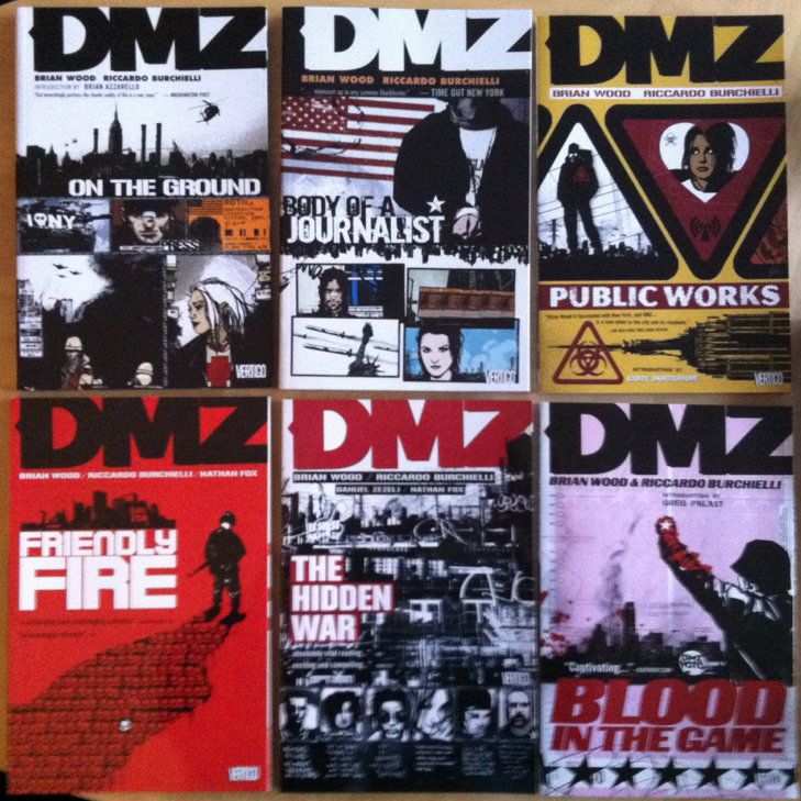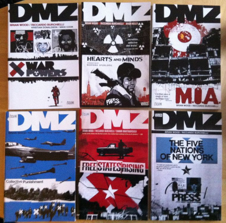
Or a photo montage of DMZ and my 2009 New York Vacation
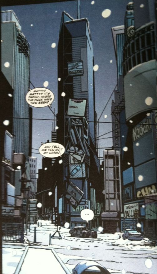
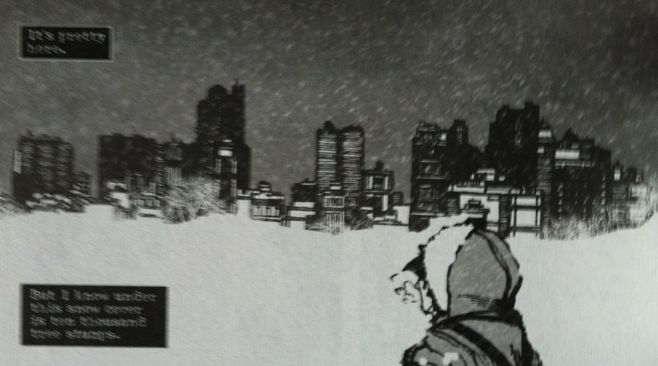
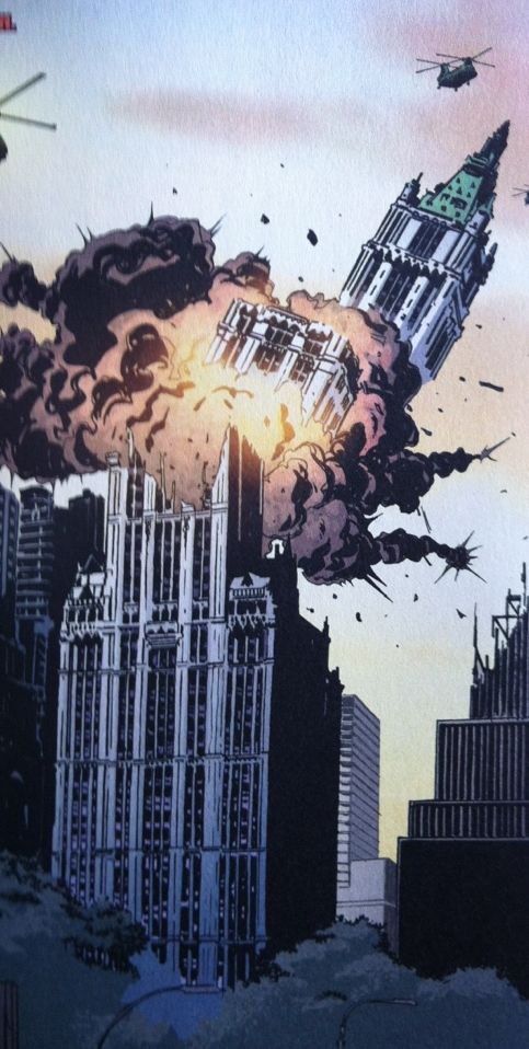
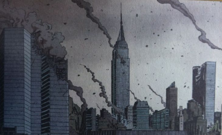
One of the formative components of comic books is setting. Background art and setting give comics an important sense of place and provide narrative context that grounds the story in all kinds of intangible and difficult to explain ways (which is to say a story set on Mars is very different than a story set in Gotham). At the best of times, this background involvement in the narrative can become so important to the story that it is functionally a character in the story. In the case of DMZ I would argue that setting is not only a character in the story, but is an essential component of the comic's theme.
DMZ is the story of a modern US civil war complete that viscerally portrays all the hellish realities of modern warfare. It's violent, chaotic, and a profoundly tension filled comic with an important message to those of us who live in our cushy first world homes and have never experienced what war is first hand. DMZ tells us that one of the biggest costs of war, one I think we under appreciate, is the suffering experienced by civillian populations. And the way DMZ uses setting to provide the context we need to understand this message is really smart.
One of the key problems in understanding the cost of war in other places around the world is that we don't have a great understanding of what life is like there. Like... in medicine, to interpret changes in health that might be caused by disease doctors have to have a baseline idea of health. For example, to tell if a mole is growing alarmingly, or has always been giant and hairy, doctors and patients need to know something about the history of the mole. When it comes to wars abroad, I don't think we accurate enough ideas of what baseline life looks like for places like Iraq or Somalia, and therefore its hard to tell if the changes we see from violence are dramatic, or mild, or maybe even improving things. We lack accurate context and experience with the locations of our modern wars. And to overcome this shortcoming DMZ uses a familiar setting to create this essential context.
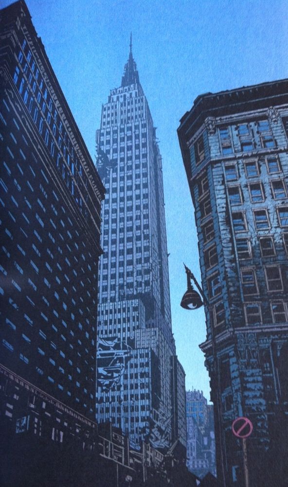
DMZ is set in the Demilitarized Zone of Manhattan Island, caught between the entrenched Free States Army in New Jersey and the camp of the US Army located in Brooklyn. Thus the setting of the comic is basically a wartorn modern Manhattan in New York City. Now, Manhattan is probably the most familiar place in North America. It lives in our media like no other place on Earth. It is in our movies, it is the setting of a huge amount of our television programs, and it is the setting of many of our favourite comic book stories. It has this perfect synergy of population, affluence, iconic architecture, and cultural diversity that makes it a terrific microcosm for America and recognizable as hell. We all instantly recognize the New York skyline; the Empire State, the Chrysler Building, Central Park, the Island itself. We know what this place SHOULD look like, what life there resembles, and therefore we can understand the toll war takes on it. And using this familiarity to demonstrate what happens to a place caught in a war is absolutely brilliant.
Incidentally, Manhattan is also a place I have been, just for a little over a week, and seeing some of these places I have actually visited torn about by violence was particularly effecting. DMZ is a comic well worth checking out.
Showing posts with label DMZ. Show all posts
Friday, 17 May 2013
Wednesday, 15 May 2013
So I read DMZ
A 250 word (or less) review of DMZ the complete
series.
By Brian Wood, Riccardo Burchielli, Kristian Donaldson, Nathan Fox, Viktor Kalvachev, Danijel Zezelj, Nikki Cook, Ryan Kelly, Andrea Mutti, Cliff Chiang, David Lapham, and Shawn Martinbrough, Vertigo Comics.
The United States is fighting and has fought in
a lot of armed conflicts in countries around the world. Meanwhile, America
hasn't had anything resembling a war fought within its own borders since its
Civil War. (I'm Canadian, so this is all effectively true of my country too). I
think a consequence of the foreign nature of our modern wars is that its
difficult to contextualize the violence. As a result, I think it's difficult for
North American civilians to properly understand what contemporary warfare really is;
the reality of what it looks like and the cost to civilians caught in it.
Well, in DMZ, Brain Wood, Riccardo Burchielli, and others have created a story
to give North Americans context for modern war. They do this by creating a
civil war between the United States and the Free States Army, an ideological insurgent
militia, and placing these armies in a military standoff on either side of a
demilitarized, war torn Manhattan Island. They then place Matty Roth, an
aspiring photojournalist, right in the middle of the maelstrom and explore the
conflict with all of its violence, military excess, warlords, corrupt
corporations, and would be dictators. DMZ is an alarming and exciting read that
makes brilliant use of Manhattan, a place that lives in our society’s
imagination like no other, to illustrate what warfare actually looks like.1
And I think you should read this comic, both because its good and because it
has something important to say.
Word count: 246
1: Personally, I've visited New York, and reading about these
places I've been torn apart by war was really affecting.
Monday, 14 January 2013
Spinal Tapestry Pt. 2: Bringing the Sexy Back
On the under-appreciated art of comic book spines.
I love purchasing collected editions of comics and displaying them as art objects. They're attractive, a visible expression of my interests, and a constantly present collection of some my favourite things. Also, when the Big Earthquake comes, I'll have a great collection of reading material during the daylight hours.
In the last post I talked about the idea that comic book spines are important in larger formats like tradepaperbacks or graphic novels because on a bookshelf the spine is the most visible part of the comic. I also used the Brian K Vaughan comics to show some examples of what I consider good and bad spine design.
This time I want to highlight some of the best and most interesting comic spines in my slowly growing comics library. These are the book spines that clearly show their designers understand how important a book spine is to a comic's on the shelf appearance. (And perhaps on the importance of standing out on a bookshelf from a retail perspective.)
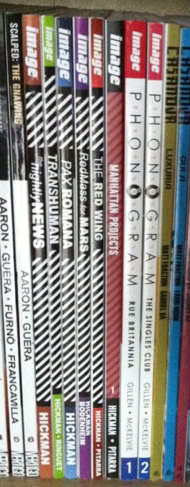
Phonogram: This is kind of the epitome of a good simple spine design for me. The "Phonogram" title uses the font of the cover title, with several logo elements incorporated. This clearly states the books identity in a clear and visually interesting way. Couple that with simple, agreeable colours that don't vary book to book and clean writing that is easily read and you get a great comic book spine. (By Kieron Gillen & Jamie McKelvie: Reviews)
Jonathon Hickman comics: This one is less aesthetically pleasing and more manipulative and clever. Every Jonathon Hickman book has a striped pattern on the spine. When rendered in black and white it is EXTREMELY eye catching (particularly when shelved as a group). The human eye is wired to pay attention to black-white-black lines and the illusion of movement these give off out of some mammals-of-the-savannah evolutionary quirk. So this Hickman block of books is super eye catching. While not the prettiest design, it is uniquely Hickman and identifies his work. More importantly, these books do not get lost on the shelf. (By Jonathan Hickman & Nick Pitarra, JM Ringuet, Ryan Bodenheim: Reviews)

(From a retail perspective this approach might be even more brilliant: only his books have this stripy pattern and its associated attention nabbing effect. If we accept the premise that the point of an eye-catching cover is to get a consumer to pick up a book, then this eye-catching spine design might represent a retail advantage.)
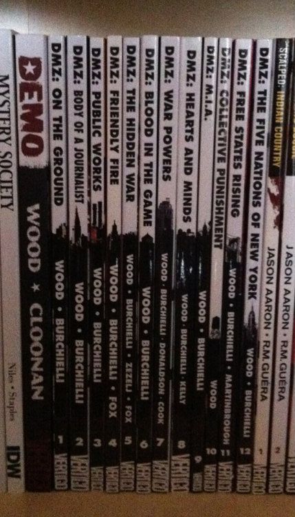
DMZ: This is one of the most clever and aesthetically appealing comic spine designs I've seen. Let me explain, DMZ is the story of a modern civil war fought between the US government and an insurgent movement. A key aspect of this story, and how it works, is the use of Manhattan Island as a war torn battlefield. It creates context for the story and serves to illustrate the horrors of modern warfare in a familiar setting. As such, a key character in DMZ is Manhattan itself. The spines of the DMZ comics are a visually pleasing design that is white behind the title writing and black behind the author text. Brilliantly, a New York landmark is included at the interface between the top and bottom half of the spine. When looking at an individual volume, it's a sharp design. When looking at the entire series, it creates a miniature and very recognizable New York skyline effect. It's clean, unifying, unique, and highlights a key aspect of DMZ. It's great. (By Brian Wood & Riccardo Burchielli, and others)

King City: This big, complete series trade shows off what you can do with the real estate of an extra wide collection. The letters that spell out King City, beyond being in an interesting and high catching graffiti-esque font, are also the frames of a tiny comic strips about a cat (presumably Earthling) stalking and dispatching a little cartoon man. It's silly, fun, really well thought out in this making-really-intelligent-use-of-space-and-storytelling kind of way, and pretty representative of the kind of comic King City is on the inside. The spine of King City is a better cover than a lot of covers. (By Brendan Graham: Review)
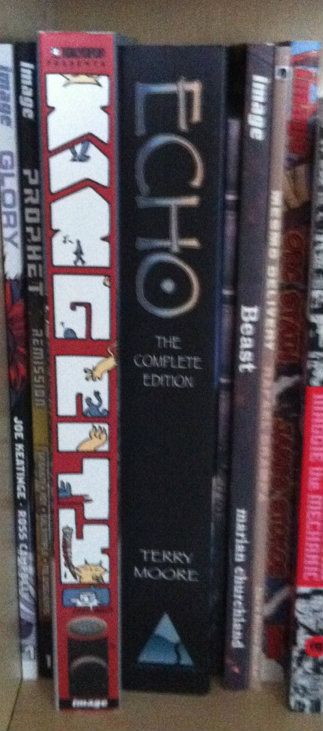
Also, just kind of as a case in point about the importance of interesting spine design, I've taken a picture of King City next to the extra-wide Echo The Complete Series collection. Echo actually has a pretty nice spine design: simple, has some pretty unique elements, and black always looks nice. But when you put it next to King City with its more creative use of space it kind of gets lost, doesn't it? (Echo by Terry Moore: Review)

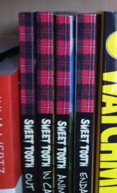
Sweet Tooth: Okay, this one isn't about a good spine design... this is a little thing I noticed. So the concept of Sweet Tooth's spine is pretty solid: clean black spine, unique Sweet Tooth font, and a nice plaid pattern on the top bit of the spine. It catches the quirkiness of the series, and because a red plaid shirt is intrinsically tied to the design of title character Gus, it really catches the feel of the series. Trouble is, I think a mistake was made at some point during the design process. If we zoom in on the plaid pattern along the top you can see the plaid checker alternates between Volumes 1 and 2, but then doesn't ever change again. So instead of getting the checker pattern of a plaid shirt across the series (Vol. 1 and 3 matching and complement the opposite pattern on 2 and 4)... we get mismatched, unconnected plaid colours. Which all makes it feel like a great design that was compromised by a mistake or neglect. Hopefully it gets fixed on a future print? (By Jeff Lemire: Review)
I love purchasing collected editions of comics and displaying them as art objects. They're attractive, a visible expression of my interests, and a constantly present collection of some my favourite things. Also, when the Big Earthquake comes, I'll have a great collection of reading material during the daylight hours.
In the last post I talked about the idea that comic book spines are important in larger formats like tradepaperbacks or graphic novels because on a bookshelf the spine is the most visible part of the comic. I also used the Brian K Vaughan comics to show some examples of what I consider good and bad spine design.
This time I want to highlight some of the best and most interesting comic spines in my slowly growing comics library. These are the book spines that clearly show their designers understand how important a book spine is to a comic's on the shelf appearance. (And perhaps on the importance of standing out on a bookshelf from a retail perspective.)
Phonogram: This is kind of the epitome of a good simple spine design for me. The "Phonogram" title uses the font of the cover title, with several logo elements incorporated. This clearly states the books identity in a clear and visually interesting way. Couple that with simple, agreeable colours that don't vary book to book and clean writing that is easily read and you get a great comic book spine. (By Kieron Gillen & Jamie McKelvie: Reviews)
Jonathon Hickman comics: This one is less aesthetically pleasing and more manipulative and clever. Every Jonathon Hickman book has a striped pattern on the spine. When rendered in black and white it is EXTREMELY eye catching (particularly when shelved as a group). The human eye is wired to pay attention to black-white-black lines and the illusion of movement these give off out of some mammals-of-the-savannah evolutionary quirk. So this Hickman block of books is super eye catching. While not the prettiest design, it is uniquely Hickman and identifies his work. More importantly, these books do not get lost on the shelf. (By Jonathan Hickman & Nick Pitarra, JM Ringuet, Ryan Bodenheim: Reviews)

(From a retail perspective this approach might be even more brilliant: only his books have this stripy pattern and its associated attention nabbing effect. If we accept the premise that the point of an eye-catching cover is to get a consumer to pick up a book, then this eye-catching spine design might represent a retail advantage.)
DMZ: This is one of the most clever and aesthetically appealing comic spine designs I've seen. Let me explain, DMZ is the story of a modern civil war fought between the US government and an insurgent movement. A key aspect of this story, and how it works, is the use of Manhattan Island as a war torn battlefield. It creates context for the story and serves to illustrate the horrors of modern warfare in a familiar setting. As such, a key character in DMZ is Manhattan itself. The spines of the DMZ comics are a visually pleasing design that is white behind the title writing and black behind the author text. Brilliantly, a New York landmark is included at the interface between the top and bottom half of the spine. When looking at an individual volume, it's a sharp design. When looking at the entire series, it creates a miniature and very recognizable New York skyline effect. It's clean, unifying, unique, and highlights a key aspect of DMZ. It's great. (By Brian Wood & Riccardo Burchielli, and others)

King City: This big, complete series trade shows off what you can do with the real estate of an extra wide collection. The letters that spell out King City, beyond being in an interesting and high catching graffiti-esque font, are also the frames of a tiny comic strips about a cat (presumably Earthling) stalking and dispatching a little cartoon man. It's silly, fun, really well thought out in this making-really-intelligent-use-of-space-and-storytelling kind of way, and pretty representative of the kind of comic King City is on the inside. The spine of King City is a better cover than a lot of covers. (By Brendan Graham: Review)
Also, just kind of as a case in point about the importance of interesting spine design, I've taken a picture of King City next to the extra-wide Echo The Complete Series collection. Echo actually has a pretty nice spine design: simple, has some pretty unique elements, and black always looks nice. But when you put it next to King City with its more creative use of space it kind of gets lost, doesn't it? (Echo by Terry Moore: Review)

Sweet Tooth: Okay, this one isn't about a good spine design... this is a little thing I noticed. So the concept of Sweet Tooth's spine is pretty solid: clean black spine, unique Sweet Tooth font, and a nice plaid pattern on the top bit of the spine. It catches the quirkiness of the series, and because a red plaid shirt is intrinsically tied to the design of title character Gus, it really catches the feel of the series. Trouble is, I think a mistake was made at some point during the design process. If we zoom in on the plaid pattern along the top you can see the plaid checker alternates between Volumes 1 and 2, but then doesn't ever change again. So instead of getting the checker pattern of a plaid shirt across the series (Vol. 1 and 3 matching and complement the opposite pattern on 2 and 4)... we get mismatched, unconnected plaid colours. Which all makes it feel like a great design that was compromised by a mistake or neglect. Hopefully it gets fixed on a future print? (By Jeff Lemire: Review)
In my opinion these are some of the better and more interesting comic designs out there. They manage to look good, make a statement about their series, and stand out from their competition. I certainly appreciate the extra effort.
Labels:
Brandon Graham,
Brian Wood,
DMZ,
Echo,
Jamie McKelvie,
Jeff Lemire,
Jonathan Hickman,
Kieron Gillen,
King City,
Phonogram,
Riccardo Burchielli,
Spinal Tapestry,
Sweet Tooth,
Terry Moore,
Waxing Philosophic
Subscribe to:
Posts (Atom)