Or a look at panel grids as story motifs in Bitch Planet #8
by Kelly Sue DeConnick, Valentine De Landro, Cris Peter, and Clayton Cowles; Image Comics
Bitch Planet is ostensibly a feminist take on exploitative women in prison movies. I say ostensibly, because despite some stylistic similarities to pulp film, this comic is doing some pretty complicated thematic heavy lifting. Most of the thematic substance of Bitch Planet has to do with intersectional feminism, an area I am eminently unqualified to essay about. So in lieu of that, I think it's worth looking at some of the structural/layout motifs used in the comic to convey narrative information.
There will be *SPOILERS* in this post.
The above sequence is an example of a "normal" layout in Bitch Planet. It is clean, uses different sized panels, and provides a clear narrative space. The fact the panel size is varied creates a flexible storytelling where the panel number and relative size can be modulated to serve the events depicted and to customize the reading experience. Like in the above sequence, where the comic depicts a father cleverly determining that his beloved daughter, a noncompliant prisoner, has secretly died, this storytelling can be effectively used to create heart rending, brilliant comics. It's a very good business as usual.


The first page of every issue of Bitch Planet has used this 12-panel grid layout. I've written about this approach before, but it bears repeating here in the context of BP #8. These pages, like the selection here, show women living in the "compliant" world, behaving within the patriarchal, garbage world of Earth. This approach ties layout to the motif of control that exists within the Earth of Bitch Planet since the 12-panel grid is a very rigid, orderly, and somewhat old fashioned storytelling approach. It is a comic style that bends the action depicted, the movement of the characters to a set layout, which is an approach that puts the system before the action/characters. It is a strong, visual metaphor for oppression. The white panel gutters of a 12-panel grid also forms a shape reminiscent of prison bars, making these pages look like the view through an idealized cell window. We are gazing into, or perhaps out of, a prison. This sequence, and it's counterparts in other issues of BP, provide a wonderful example of how layout and structure can create visual, thematic motifs.


I bring all of this up again because Bitch Planet #8 uses another panel grid system as a stylistic motif. In this case the comic uses an 18 panel grid to create a unique visual identity and a sense of a unique storyspace. The basis of this grid is the 1-2-3 panel row which has actually been used and riffed on throughout the series. This three panel row, usually featuring the two guard/engineer/controller guys interspersed with surveillance video has been an ongoing visual motif that has been used to showcase the separation between Noncompliant prisoners and their guards, the attitudes/plight of the guards, and the pervasive surveillance the NC's live under. Here this three panel motif is repeated over and over to create an 18 panel grid. The first 5 rows of panels in the grid are directly the 'usual' layout with one of the 'usual' controller-guys, which provides information to the reader that they are viewing a story sequence that takes place in the controller's location/distinct storyspace. The 16 panel grid carries through to remind the reader that the following events remain within the special controller-space. What is particularly interesting about this is that the actual illustrated spaces do not conform to the 16 panel grid, but rather the underlying artwork is overlaid with the grid and broken up. This is a pretty good sign that the grid here is more about a visual motif/sensation than about the direct storytelling of the actions. Which is pretty cool.
Beyond being a visual signifier of location (controller-land), this motif manages to capture the emotional sense of what it means to be one of the controller/guards. The 16-panels break the page into many small windows to see the action, like the bank of surveillance screens the controller-guys use to watch the prisoners. I also find that, particularly because of the way the panel gutters infringe on the underlying artwork, that these panels remind me of grating. It's as if the reader is peaking through an airvent or stormcover or, to geek out, Jeffry's tube gate to see a secret, mechanical space behind the comic. It really sets the world of the controllers up as a technical, but behind-the-scenes space and not part of the prison world or compliant world of Earth. It's evocative and a great use of layout as motif.
Previously:
Uncaging Bitch Planet #1
Uncaging Bitch Planet #2
Uncgaing Bitch Planet #3
Uncaging Bitch Planet #4
Uncaging Bitch Planet #5
Surviving Bitch Planet #1
Or a look at some of my favourite storytelling in Black Widow #4
by Chris Samnee, Mark Waid, Matt Wilson, and Joe Caramagna; Marvel Comics
Black Widow remains a very exciting comic to analyze from a comics wonk perspective. With issue #4 the creative team delivers another instalment filled with skillful and interesting storytelling. Unlike previous issues where I could find a worthwhile throughline to frame an analysis, Black Widow #4 showcases a pretty varied mix of techniques. So, I guess in honour of this being issue #4, I'm going to discuss four sequences that I find fascinating.
There will be *SPOILERS* beyond this point.


1. I've talked about this before but Team Widow is really, really good at creating dynamic sequences that use eye tracking to focus the reader and create a sense of motion. This sequence is another great example to this approach. The page opens with a panel that has the black silhouetted Widow in the bottom left corner, then uses the tank-things to create a guide to Widow in the top right panel. This gets the reader efficiently across the page and sets the stakes of the sequence: one covert agent against a place with sci-fi tanks. From the top right panel, the reader drops to the next panel where Black Widow tosses a stone, which guides the reader back to the left, across the page in a carriage-return, and into the next panel where the stone hits the guard. Action, movement, consequence. The reader then moves onto the following panel where distracted-guard is hauled bodily out of frame in a way that synchs the readers eye path to the motion. The following panel, with the guard running, uses the angle of the guards body (and implied motion) to create an arc to the alarm box and inset circular panel. We see the SHNK effect in the round panel, and then carry across the page, creating the down-and-to-the-left motion of the guard yanking the alarm lever. This brings the reader to the bottom left panel where the heavy black of Widow creates an initial focus point. The reader then moves down and through the knife thrust, using eyes and the blade as a guide, and smoothly into the final panel where the long blood smear takes the reader to the end of the page where Widow is dragging the corpses. It is also significant that this final panel's motion seems to carry right out of the panel and into the next page which helps keep the motion going (something that was pointed out in this great video breakdown). It's a great, efficient, and exciting page constructed out very fluid eye tracking.


2. Another aspect of Black Widow I've talked about previously was the use of misdirection in panels to hide story elements in the periphery of panels. This page here has another pretty remarkable example of this. In this case the page opens with Black Widow and two corpses she dragged out of the previous page. Widow is looking up toward the next panel which gives a great guide to focus the reader on where to go next. The reader enters the next page and sees that the guard in the middle of the panel has a brighter colouring and is the most visually emphasized part of the panel. If you are a reader like me, you then move onto the next panel and see Widow breaking into a room and go, wait, what? And then you maybe loop back to the previous panel and find Widow hidden in the top right corner of the panel. She is drawn as a black silhouette blended into the shadow of the wall/turret. This makes widow another black area in a part of the page rich with identical heavy blacks and very easy, I think, to miss. Especially since the one guard is emphasized so prominently by the colours. This is a fantastic choice since it has Black Widow literally sneaking through the panel! Which is awesome!


3. Black Widow #4 also has a tremendous quiet section where a wounded Natasha speaks with Iosef, apparently a former teacher who rescued her. The entire sequence is a feat of acting and atmosphere and how to make exposition interesting, but this sequence here I think is superbly executed.
One of the key aspects of Black Widow for me, is that we do not get direct thought narration from Widow. Black Widow for me is defined as being supremely competent and vaguely mysterious. Making this work in a comic where she is the central character requires a certain degree of inaccessibility to the protagonist: we can't see her literal thoughts without losing that critical ambiguity. At the same time, for the story to be compelling the reader needs to have some glimpse of the protagonists inner life. Which puts a huge burden on character acting and colouring to provide enough emotional queues that the reader can engage with the protagonist. Black Widow absolutely nails this.
The other challenge of this kind of storytelling is conveying critical story information in visual, organic ways. This above sequence functions to show that Iosef and Widow know each other from the past. In a thought narration comic this would be accomplished, probably, by a caption like: "Ah, Iosef, my old teacher. I haven't seen him in years..." In Black Widow it is all about visual information. We see a flashback, made obvious by the sepia colouring of a faded photograph. In this flashback we see a recognizable Widow, although a younger version of her, with an unknown man. We then see an older man, haggard but still recognizably the same man probably. Which, is actually a pretty remarkable feat of figure drawing. The thing that removes any ambiguity, though, is how the two characters relate to each other. Iosef and Widow have the same spatial relationship throughout the page with Widow prone and to the left of Iosef throughout the page. This is especially true of the top right and bottom right panels where the poses are nearly identical and create an obvious parallel. By the time we leave the page we understand the relationship between Iosef and Widow without it ever being explicitly stated and that is really, really smart storytelling.


4. From a purely comics wonk perspective I think this page, though, is my favourite in the issue.
The top half of the page provides a sequence of Black Widow sneaking into a secure facility in a series of inset panels on a maze-motif background. This is a great choice because it uses the symbology of a maze to convey to the reader that Widow is forced to navigate a convoluted route to reach her objectives. This allows the reader to appreciate the time and complexity of Widow's implied movement without having to depict every step, which reduces the space needed for this chunk of story. The use of the maze motif is also pretty interesting because, for me at least, it calls to mind the wire lines of circuitry. This along with the perspective, I think, makes the round panel in the top left feel like a shot taken by a nearby security camera. Which implies, along with the earlier pulled alarm lever, that Black Widow has been observed by the masters of the base she is infiltrating. To me this is part of the comic telling the reader, without making it explicit, that Widow is sneaking into a trap of sorts. It's pretty cool stuff.
The bottom half of the page is where I think some really nifty, if easily overlooked choices are being made. The sequence here is pretty straightforward: Black Widow, having snuck her way to her goal stands behind a dramatically opening door. The execution here, the way the story is constructed, is perfect. The most obvious aspect of this is that as the door opens, the amount of open space in the panel increases. This is enhanced by the shape of the panels which are not square, but fall into a shape with a angled top. This means that as the doorway opens, the panels themselves become taller and more "open" to the reader. In addition the angled top line helps sell a sense of upward motion to pull the readers attention from bottom left to top right. (To get a sense of why this is effective, compare it to the diagram that does the same shot using static square panels.) This sequence uses yet another trick as well: the perspective of the panels ascends with the door. By this I mean each subsequent image is aimed a little higher along Widow's body (which I breakdown in the bottom diagram). What this does is create a sense of upward momentum to the sequence since the door and the perspective are both ascending at the same time to create the feeling of motion. (Again, comparison to the static square diagram will show just how much more dynamic the ascending perspective is.) This choice also has the additional advantage of letting the final panel focus on Widows determined/angry eyes. Which all combined makes this three panel sequence have a tremendous amount of momentum that all focuses on the Widow in an important, solid emotional beat before the next part of the story is unveiled. It's a fairly effortless reading chunk of story constructed out of some very smart, complicated storytelling and why I think Black Widow is such an exciting comic to read and analyze.

As an aside, the maze motif also recently popped up in Bitch Planet #8 by Kelly Sue DeConnick, Valentine De Landro, Cris Peter, and Clayton Cowles. In this sequence the characters are sneaking through a prison during a blackout to find a secret, isolated prison cell. Again the use of the maze motif is used to efficiently sell the idea of movement through a convoluted story space without investing a large amount of space to it. In this case, the maze motif is particularly apt because the characters are navigating in the dark from a hastily memorized map. It's a great choice that shows how convergent solutions to similar story challenges can exist.
Or a look at layout complexity and narrative pacing in Bitch Planet #5
by Kelly Sue DeConnick, Valentine De Landro, Cris Peter, and Clayton Cowles; Image Comics
I'm beginning to think Bitch Planet might be one of those comics ideally suited to my brand of analysis. Every issue it seems like there is some aspect of the book worth examining, or a clever creative choice, or just something done really, really well. One layout in particular in Bitch Planet #5 struck me as particularly interesting and so I'm going to try and break down why. So without further ado...
There will be significant *SPOILERS* for Bitch Planet #5 below.
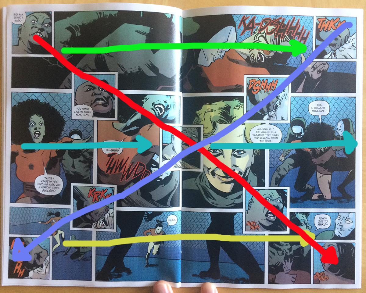
This double page spread is a really fascinating, really strong bit of comics making. It comes at a key moment in the story and represents the first half of the climax of the issue. It also makes really, really smart use of layout complexity to deliver the perfect moment.


The magic of this layout is the X-shaped collection of panels superimposed over the background. This choice adds a huge amount of immediate visual complexity to the page and instantly changes the pitch of the page. Functionally the page works like two superimposed stories, with the "background" panels describing one string of narrative while the "foreground" panels describe another part of the story that occurs simultaneously, which again adds considerable complexity to the page. That said, because the "foreground" panels from an X, they attempt to drag attention linearly along their lines, despite this not being the chronological order of the story, which ends up making the page feel like five separate, interlocking narrative spaces. This of course multiplies the experienced complexity of the page dramatically.
Taken together this page feels chaotic! It reads very much like the structure of the comic is breaking down and it instills a sense of overwhelmingness on the reader.
This sense of chaos and confusion is enhanced by how this interesting layout compares to preceding pages. When compared to the preceding pages in the Megaton sports storyline, which tend to use short wide panels that move across the page in clear straight lines (and do a wonderful job separating the sports pages from the other sections of the story). By ratcheting up the complexity of the key layout, the comic really slams home the danger of the events happening.


When you look at the entire sports section of the comic in aggregate, there is a clear progression of complexity. As the scrimage being depicted in the comic begins to build, extra panels are introduced, and the pages complexity mounts a little, but then in the final page of the sequence, when things dramatically escalate and spiral out of control the page itself escalates into a complicated, almost confusing layout that captures the drama of the page. Because of the pacing of these layouts we get to feel things slowly get out of hand until finally we get that perfect moment of the shit-hitting-the-fan fuckedness.

The other thing I love about this layout is how well it sets up the final moments of the climax of the comic. We go from a very busy, confusing, chaotic page to one that is downright austere and measured. When the shoe drops, when the truly fucked up thing happens, the comic slows and simplifies, giving each panel a weight. It's... when I was a kid, I fell twelve feet or so out of a tree. There was a moment there, hanging in the air, that I realized what was happening, that there would be no going back, before I hit the ground. It's a breathless moment of crystallized doom that I still carry around with me. And this is the comics equivalent of that. By going so quickly from frenzy to slow, yawning stillness as the final moments play out, Team Bitch Planet manage to replicate crystallized doom and make a powerful moment truly resonate.
Sometimes the best parts of comics are as much about what they set up as they are about the moments they depict.
And maybe pacing is one of the most important, and perhaps underlooked components of comics.
Previously:
Uncaging Bitch Planet #1
Uncaging Bitch Planet #2
Uncgaing Bitch Planet #3
Uncaging Bitch Planet #4
Surviving Bitch Planet #1
Or a look at structural separation and breaking barriers
by Kelly Sue DeConnick, Valentine De Landro, Cris Peter, and Clayton Cowles
Bitch Planet is a comic about a Sci-fi penal colony for Non-Compliant women who reject the control of a dystopian patriarchy. It's a badass, middle-finger raised take on women-in-prison exploitation cinema and a feminist examination of the bullshit woman experience at the hands of society. It's also a really, really well made comic that does a variety of technically impressive things worth taking a closer look at.
Bitch Planet #4 continues the trend and pays off a long running structural element in a really interesting and satisfying way.
There will be *SPOILERS* for Bitch Planet #4.
One of the recurrent elements in Bitch Planet are two semi-omnipresent guard characters. These two characters seem to run some sort of prison control station and have a very high degree of access to the events happening on Bitch Planet. On the one hand, they are interesting in that they operate as semi-narrators, sharing their knowledge of Bitch Planet with the reader from a position of authority. Which is, in and of itself, a pretty nifty choice.

What is also interesting about these guards is their ironclad separation from the inmate population. We never see these guards in the same panel as any of the Non-Compliant women. Which is a choice that helps cement these control room guards as semi-narrators: they exist in a story... zone between the reader and the story as they are observers who are apart from the main story. This choice is also quite significant as these guards are the only male faces we see on Bitch Planet, and they are scrupulously kept separated from the women. This helps establish a story rule where the men in charge of the prison are segregated from the women.

Of course, Bitch Planet does have other male guards. However, we never really see them as individual people. All of the guards who actually mix with the inmate population wear masks that completely cover their faces. This further suggests that their is a structural, institutional rationale for the strictly enforced separation between women and men. I think you could argue this is interesting from a feminist perspective since we see a patriarchal penal system that punishes women and drives structural divisions between genders. I also think it's quite interesting from a storytelling perspective since it sets a precedent and creates a narrative tension that can be exploited in interesting ways.
And Bitch Planet #4 pays this tension off in some really cool and satisfying ways.
One of the most technically impressive sequences in Bitch Planet so far leverages the separation between men and women on Bitch Planet to tell a really daring and effective bit of story. The story of the scene is that Kam is given covert information by a pair of women who enjoy shower sex, in part, as a smokescreen for moments of "privacy". This being Bitch Planet, there is no real privacy, and their sexual relationship is observed by a peeping tom who doesn't report their illicit dalliance in return for being allowed to peep. Which is quintessential women in prison exploitation story fodder.
This is also a scene that is some expert level comics. For one it plays with the barrier between women and men in some cool ways. The peeping tom is separated from the non-compliant women in the shower by a wall and his mask, which is, in a way, consistent with the rules of segregation on Bitch Planet. In a perverse way the barriers between men and women are still intact. And yet, the separation of sexes is incomplete since the peeper has a hole in the wall to peak through and we can clearly see his eyeball. This is a clear violation of the narrative rules of the comic and represents a storytelling transgression which enhances the inherent perversity of the peeper's behaviour. Which is a pretty nifty use of the gender separation trope which has been established.
This scene is also pretty great in the way it makes the hole in the wall and the peeper the central part of each pages composition. By driving the readers attention to the peeper instead of the naked women, this composition drives home the wrongness of the peeper's behaviour and serves to associate any titillation we might experience as readers with his perversity. Which really takes what could be a pervy, exploitive scene and repurposes it into something that transcends its problematic roots and makes some broader points.

The conclusion of Bitch Planet #4 also does some pretty spectacular things with the separation of men and women on the prison planet. Specifically, the closing pages of the comic see Kam smash through the shower wall, breaking down the barrier between genders, and drag the peeping tom guard into the prison. This is significant because it represents the first time we have seen a man on panel with the Non-Compliants. As such this represents a complete violation of the segregation rules in the prison. It also represents a violation of the narrative rules that have, until this point, served to keep the women and men apart in the comic. As such this scene feels hugely significant and deeply transgressive: because Kam is overcoming the inertia of the comic structurally keeping men and women apart this scene feels extra shocking and powerful. It also makes Kam's achievement here that much more impressive since, in a way, she defeated the comic itself to nab herself a perverted man-guard. Which is a great payoff to a thoroughly established narrative tension and really sells just how much trouble this perverted guard is in.
Bitch Planet is a comic you should be reading.
Previously:
Uncaging Bitch Planet #1
Uncaging Bitch Planet #2
Uncgaing Bitch Planet #3
Surviving Bitch Planet #1
Or a look at the use of old fashioned colouring in Bitch Planet #3
by Kelly Sue DeConnick, Valentine De Landro, Robert Wilson IV, Cris Peter, and Clayton Cowles; Image Comics
Bitch Planet #3 is the first of the character-centric issues that feature artwork by a guest artist. This issue focuses on Penny Rolle, the big, shit-kicking member of the Non-Compliant ensemble who is The Best. The comic pits her against a panel of judgemental men who, against the backdrop of her tragic backstory, decide if she can be made to Conform. It's a pretty great issue of comics that manages to somehow be simultaneously infuriating and delightful.
Bitch Planet #3 is also noteworthy in how it uses antiquated colouring techniques to differentiate the contemporary portions of the story from the flashbacks. Which is maybe worth some discussion.
There will be *SPOILERS* for up to Bitch Planet #3 below this point.


Bitch Planet #3 uses two different approaches to colouring. The modern portions of the story uses modern printing techniques to create even blocks of rich colour that fill drawn regions. Additionally cel shading is added to create regions of highlights and shadows to give the artwork additional depth and shape. In these parts of the comic, the colouring is consistent with how contemporary comics look. The flashback regions of the comic use a much older colouring technique. Instead of using saturated colouring, the flashback sequences use a from of spot colouring, Ben-Day dots, I think. This form of colouring uses spots of mixed colours to create the shade of a region and then uses the space between the dots to control the darkness of the shade. This was apparently a popular approach to colouring because it used far less coloured ink than modern methods. The use of this technique in flashback sequences makes them look like a comic published thirty or more years ago.
Bitch Planet #3 also uses background page colour to further emphasize these effects. The current sequences of the story are printed on white glossy pages giving the colours a clean vibrancy and the gutters a clear, eggshell white glow. The flashbacks have a slightly brown background colour. This bleeds into the spaces in the spot colours and gives a brown colouration to the gutters in the page. This also adds a sense of age to the flashback sequences: old comics, including those made when spot colouring was popular, where printed on cheaper newsprint paper. Newsprint paper will yellow and brown with age, so the use of a brown background colour in flashbacks, replicates the patina of aged dot printed period comics.


Effectively what this does is to give each region of the comic a discrete feeling of period. The modern colours in the current regions of the plot give them a feeling of now-ness, a story happening in a brand new comic. The flashback regions with their dot colours and brown faux-patina lends these sections of the story the feeling of a closet-aged vintage comic, which gives the portrayed events a certain historic feeling. Basically, the flashbacks look and feel old. This gives the modern and flashback portions of the comic their own unique visual and emotional identity which helps differentiate the interspersed sections and increase their resonance with the reader. It's a great choice.
It's also not the only time spot colours have been used in Bitch Planet to create an interesting visual effect.
Hell, it's not even the only example in the above pages.
If you look closely at the men on screens, the esteemed douchebags of the patriarchy, you see they are also coloured with Ben-Day dots. These spots are much smaller, finer and closer together, so they are much less obvious. This means they don't stand out and create a sense of historic printing like in the flashbacks, but instead add a certain grainy pixellation to the telepresence screens. This works to help sell that the faces are being projected on monitors and to help differentiate the in-the-flesh Penny from the telepresence jerks. It's a subtle choice but very effective at what it does.


We've actually seen dot colours used before in Bitch Planet. Bitch Planet #2 used Ben-Day dots in the holodeck-esque solitary prison cell that Kam is thrown into. Here the large colour dots are used to give the moving screen elements of the holo-cell a highly pixellated look which helps differentiate the projected elements from the real, in-the-flesh people and objects within the cell. It is literally a background choice, but it really helps keep everything straight and sell the holo-cell concept.

Spot colouring has showed up in this great multi-planar layout design from Bitch Planet #2 in the giant fitness video screens in the background. Again, the large dot colouring lends the screens pixels and gives readers a way to quickly separate the human characters from the on-screen projected ones. This is especially critical for this sequence because it really demarcates the depth of the page and the division between background and the other storytelling planes. This allows for a really complicated page with a busy background of fitness videos. Which in turn allows for the absolutely delightful juxtaposition of brawling Non-Compliants against the pink background of fitness warden-barbie. It's smart stuff.
Previously:
Uncaging Bitch Planet #2
Uncaging Bitch Planet #1
Surviving Bitch Planet #1