Friday 27 February 2015

Deep Sequencing: Timely Layouts

Or a look at how layout is used to make nifty time travel effects  in Trillium,
by Jeff Lemire; Image Comics


Trillium is a psychedelic time-travel love story. Trillium sees a wounded World War 1 soldier and a traumatized Scientist from a future where a sentient virus is eradicating humanity come into contact and fall in love through alien intervention. It's a nifty Sci-fi comic worth checking out.

Trillium is also a comic that does some interesting structural things with layout to make some of its more exotic timetravel elements work. And it is worth taking a closer look at.

There will be extensive *SPOILERS* for Trillium below.

The first issue of Trillium existed as a flipbook. Read in one direction and orientation the comic tells the story of Nika, the future Scientist, while read in the other direction it tells the story of William, the solider of the past. (Sadly, these two chapters just run as sequential subchapters of in the Trillium collected edition.) This formatting decision creates a clear physical separation between the two storylines and timelines, they are completely separate eras and therefore completely separate stories that do not intersect or overlap. It is an interesting gimmick and an effective storytelling choice.


However, due to the intervention of an alien pyramid Nika and William find themselves travelling through time and meeting in the past. Their narratives intertwine and begin to function as a single storyline that works like a normal comic. It's a structural, layout indication that their stories have melded and become a single narrative due to their time travel. And yet, the comic still takes steps to remind the reader that timetravel is in effect. Like, this double page spread where Nika and William break into their era's respective timetravel-pyramids. In this case their parallel situations are reflected in parallel drawings, yet their different chronological locations in history are indicated by inverted orientations. It is immediately apparent that despite standing in the same apparent rooms, these two characters exist in non-linear narrative spaces. It's a neat idea.


Due to some misguided damage to the time-travel pyramids Nika and William find themselves flung into the time stream and lost, essentially in each others lives. Nika awakes to find herself a recovering soldier in a steampunk London following a much different alternate history WW1. William, meanwhile, finds himself living the life of a far-future survivor of the sentient plague wiping out humanity. And so our two heroes find themselves relegates to separate eras and narrative streams. This time this aspect of the comic is represented by chopping each page in half, devoting equal space to either narrative, and flipping the orientation of the images between the stories. This does some interesting things. For one, it emphasizes the separation between the two stories: the different orientation cements each story as occurring in a different historical location and that the two stories do not narratively overlap. And yet, this layout construction allows the two narratives to play off each other and to emphasize the parallels between the two stories. Whats more, this setup also creates a... common narrative timeline, let's say. While the two stories are in different eras, this layout allows the reader to order the events narratively between the two stories such that story blocks occurring on the same page take place, narratively, at the same time. It's a really interesting and effective layout approach.


As Trillium progresses, Nika and William remember each other and, displaced as they are, begin to work their way back to the time-travel pyramids. Panels from different eras still have flipped orientations, but now they are interspersed, providing a structural indication that the two narratives are drawing back together. It is layout being used to show that while the events are happening in separate time spaces, there really is one story taking place on any given page. It's another very effective choice.


Trillium continues to do interesting things with layout. On this set of pages, Nika falls through a gateway between her current timeline and a into a new, different location and era. The layout here does a great job conveying this. For one, this layout is a double page spread that is flipped on its side, a particularly rare construction that helps convey just how special and impossible the event of Nika's time-tumble is. This layout is also remarkable in that there are two different panel planes at work here. The page enters in a sideways orientation, with panels moving along the tallest aspect of the page, and yet, when Nika falls into the machine, the orientation swings back into a conventional approach. Which, given the association with orientation and time-era in the comic, tells the reader that Nika has been transported from one chronological location to another, that timetravel has happened. Which is all information conveyed using layout, which is pretty impressive.


Finally at the climax of the comic a number of impossible and psychedelic things happen in Trillium. Nika and William, in an act of sacrifice that potentially saves the human race, steer themselves into a blackhole. As they are consumed by the singularity they are dragged across the page in another exciting tilted doublepage spread. The pair relive their lives here and then on the next pages, we see the characters reach into their moments of greatest trauma, and save each other. These pages again rely on the previously established convention of using opposite page orientations for events occurring in different narrative spaces and eras. It's a beautiful and perectly communicated moment. A moment that leads into another beautiful doublepage spread that shows the timetravelling lovers, finally at peace, stretching off into infinity. It's a great ending that uses layout to communicate just how impossible and significant these final moments are.  It's a great ending.

Trillium is a structurally interesting comic. The way it uses layout and panel orientation to convey story structure and time setting is a really cool feature of the comic that is really worth checking out and studying. It is really effective. It also makes me wonder about what other techniques may have been used in addition: how would Trillium have looked and worked if, say, colour or panel design were also altered between timelines? Would it have been more effective? Given how prevalent timetravel is as a trope in genre comics, it might be worth thinking more about the strengths and potential areas for improvement in Trillium.

Also, read Trillium, it's pretty good comics!

Post by Michael Bround

Previously:

Wednesday 25 February 2015

So I Read Trillium

A 250 word (or less) review of Trillium
by Jeff Lemire; Vertigo Comics


Trillium is a Science Fiction time travel story that explores love in the face of human extinction. In the distant future Nika is a Scientist tasked with exploring the planet Atabithi. On this planet is a temple filled with white flowers that are a potential vaccine for The Caul, a sentient virus that has wiped out nearly all of humanity. Nika seeks to make peaceful contact with the aliens of this planet to secure the cure before her compatriots resort to force. But doing so will cause something inexplicable to occur. In the past, in the year 1920, William is a veteran of the First World War trying to find meaning in his life following the trauma he suffered. In search of adventure he and his brother set on a quest to South America to rediscover The Lost Temple of The Incas to find riches and fame and excitement. But when he arrives at the temple something unexpected happens. Our two protagonists find themselves caught in some sort of phenomenon that causes them to become unstuck in time, meet and experience each others lives. Trillium explores whether these two damaged time travellers can save humanity from extinction and whether they can find love in the face of trauma. Trillium is an interesting comic filled with a classic Science Fiction story told with empathy and constructed with Lemire's evocative style. The comic also features some interesting experiments using layout and structure to delineate different time streams. It’s well worth a look.

Word count: 250

Post by Michael Bround

Tuesday 24 February 2015

Turbulence Is A Good Book

Or why you should read Turbulence 
By Samit Basu


As a person who enjoys superhero comics and also enjoys reading novels, the idea of a novel about superheroes is pretty attractive. It's one of my favourite genres explored using one of my favourite media; media that has a considerably different set of tools to explore the themes, tropes, and stories of the genre. The trouble is, a lot of superhero prose novels are pretty crumby. Many of them are tie in novels of established properties or are done with the objective of being serviceable cash-ins on the presumed popularity of superheroes. I feel like the quality and originality often isn't there. More merchandizing than literature. (To be fair, I haven't read a tremendously large sample size of this genre due to poor experiences... but it's what I've noticed). The few superhero inspired novels that I have enjoyed tend to either be more about them as a phenomenon (Kavalier and Clay) or take a very meta, very self-aware approach to the genre (Soon I Will Be Invincible). But, properly good, literature that are also superhero fiction are thin on the ground.

Turbulence by Samit Basu is a straight forward superhero novel that is the well written, exciting, and literate superhero prose novel I've been craving.

The premise of the novel is that a number of largely Indian and British nationals, on a flight from London to Delhi, inexplicably find themselves possessed of supernatural abilities. The mysterious powers are diverse and seem to be somehow connected to the wishes and desires of those affected. Aman Sen, a young Indian who wishes for more human connectedness is able to control information technology with his mind. Vir, an indian fighter pilot finds himself able to fly and nigh invulnerable. Uzma, who has dreams of being a Bollywood movie star, becomes irresistibly charismatic. Jai, a fanatical Indian soldier becomes the perfect weapon, powerful and indestructible. These new superhumans must decide what their powers are for and struggle to determine who will rule the future. But first some punching.

From a pure I-like-superhero-fiction perspective Turbulence is pretty much perfect. The story is filled with action and imagination, wonderfully relatable and charismatic characters, and plays with many of my favourite genre tropes. Critically it also doesn't take itself too seriously: superheroes are meant to be fun and are inherently a bit goofy. The fact that Turbulence is willing to have fun with itself is deeply appreciated. From a purely surface level angle, Turbulence is a very enjoyable read.

Turbulence is also pretty interesting from a cultural standpoint. Superheroes are as American as apple pie in that both are tied to America, but also enjoyed pretty much everywhere else. But, as an english speaker, superheroes are for me, very much tied up with certain cultural ideals of the United States (and keep in mind folks, I'm Canadian.) Turbulence is a classic superhero tale starring Indians and taking place largely within India. Which is a great lampoon of the America-centric nature of mainstream superherodom (statistically the super people are more likely to originate in more populous countries after all) and just interesting. The way Turbulence uses the super familiar machinery of a superhero story as a lens to examine India and Indian culture and the dreams of Indian people is fascinating. The tension between Turbulence and it's Indian superheroes and mainstream comics and their American heroes, how the two mythos overlap and differ, I think is an interesting discussion. Turbulence is a great book from the perspective of a cultural guide that uses something familiar to teach us about something outside our experience. It's great.

Honestly, I would recommend this book to anyone who likes superhero comics and movies. It's accessible, very well written, and interesting both as a straightforward action story and as a work of cross-cultural literature. It isn't examining the history of cape comics or trying to dissect the genre in a self aware way like other books I would recommend, but it's interesting and a blast to read. If you read this blog, there is a high likelihood you should try it.

Monday 23 February 2015

Interrogating Black Widow #13

Or a look at the interesting colouring choices throughout Black Widow
by Nathan Edmondson, Phil Noto, and Clayton Cowles; Marvel Comics


Black Widow is another of those comics I have been reading for a good long while but haven't really written about. It reliably delivers a solid espionage story and really stands out in that it is entirely a spy comic from a publisher that is almost entirely focused on superheroics. I really like it.

The main reason I haven't written about Black Widow until now has to do with its style. Black Widow, in the art hands of Phil Noto, has a very distinct style: it has this cinematic painted look coupled to incredibly photorealistic characters and design. The combined effect is this comic that looks very realistic, and makes the events portrayed in it feel very believable. The trouble is, beyond pointing out its unique voice and realism, I didn't think there was very much I could say about Black Widow.

But then I noticed that Black Widow #13 does some subtle smart things with colour and that there are actually a few noteworthy examples of nifty colouring effects throughout the series. Which are maybe worth taking a closer look at.

There will be *SPOILERS* for Black Widow #1-13 below.


The majority of Black Widow is coloured in a decidedly photorealistic style. It is in full colour, with believable shades, and makes really great use of light to give everything a decidedly cinematic experience. It is a comic that often looks filmed which creates a sense that the events portrayed are actually happening. It's a great look and helps cement Black Widow as a more grounded espionage story. 

But sometimes Black Widow presents other colouring choices that operate to provide additional storytelling nuance.


In the theme of photorealism and cinematic style choices, this sequence here is really interesting. Black Widow has just assassinated a man and is fleeing from the scene of the crime. What gets my attention about how this scene is executed is how focus and blurring are used on the page. In film and photography lenses have very particular focal points or planes: for a certain configuration of lenses there is a point where everything is crystal clear and often, depending on the particular lenses, there are regions that are out of focus and blurry. This is what people mean when they say bokeh. This trait of camera lenses is actually considered pretty desirable in certain situations because it lets the photographer focus their pictures on a particular chunk of the composition. The key person, thing, or aspect of a photo can be focussed while other background or less essential parts of the photo can be left blurred or slightly out of focus so that they appear less important. And this sequence replicates bokeh to make for a very cool sequence. In the second level of panels we see Natasha in focus as she pushes through a crowd of blurry people, which let's us focus on her but still be aware that she is moving through a crowd. In the final panel, we see the foreground deliberately blurred with a semi-hidden Black Widow hiding in the midground. In this case we can still focus on Natasha despite her being hidden and also get a wonderful sense of depth in the panel. This use of bokeh-style blurring also makes the scene feel like it is being explicitly shot with a camera which adds a layer of drama to the scene. It feels like someone is observing Black Widow as she escapes and hides, which really sells the character's emotions and paranoia. It's a really subtle and great choice.


Another neat feature of Black Widow #13 is how colour is used in the hospital room scene. In the scene Natasha sneaks into visit her manager Isaiah who has been badly injured in an attempt to hurt Black Widow. It is a painful scene filled with shame and anger and remorse and physical pain. And the colouring absolutely enhances this. Instead of being in full colour like most of the issue, this sequence is done in muted, sickly sepia tones that wash out the colour, life, and humanity of the depicted characters. It's like the entire page is pale and miasmatic and as injured as Isaiah. It really captures just how hurt both Isaiah and Natasha are in this scene and also why I absolutely hate hospitals. It's great stuff.

And it reminded me that this kind of palette modification for emotional effect has happened in past issues of Black Widow. 


The interesting use of colour in Black Widow actually dates back to Back Widow #1. In this issue the key action sequence flashes red and gets rougher, darker line work that just screams danger and violence. It's a simple choice, but it makes this collection of red panels absolutely jump out and feel more important and dangerous than everything else in the issue. It was a really cool choice that a year later I still remembered enough to dig out for this post. Which tells you it's an effective choice.


In Black Widow #3 there is another interesting example of an altered colour palette in the mostly photorealistic comic. In this case, while trying to escape through the jungle with a liberated prisoner, Black Widow uses some sort of nightvision goggles to see in the dark. During this sequence the panels are coloured in a kind of nightvision pallette. Gone are the full painted colours, and instead things are coloured in muted brown and green with blue, light based highlights. It's a cool choice because it lends the entire scene a brooding, pursued quality and lets the comic happen in the dark of the night but still be visible to us readers in an authentic seeming way. It's also pretty adroitly done: the dark palette feels like night vision, but is still quite dark which is distinct from the bright green of actual night vision, or the glowing orange of infrared vision (like in the bottom right panel above). It's pretty great comics.

Altogether, I think these selections really show how smart colour choices can really play with photorealism to charge scenes with gigantic emotion and atmosphere. It's great stuff from a pretty great comic.

Post by Michael Bround 

Friday 20 February 2015

Cover Roundup: Covering Harley Quinn

Or a look at the knowledge hidden in the Harley Quinn variant covers


Comic covers are important business. When comics are solicited to the public and the retailers who actually drive the publishers, covers are often the only artwork we see. Later, when actually in stores, covers are the identifier and chief visible advertisement to curious readers. In this way covers are really the public face of comics and when done well, can be a driver of reader and retailer interest.

Despite thinking covers are important and worth discussing, I've always steered clear writing about them because I've lacked a good angle of attack to discuss them in a meaningful way. Fortunately DC comics has decided to give me an in! Apparently February is Harley Quinn variant cover month so we have a variety of Harley Quinn covers by a variety of artists. And so we have this really great collection of covers that have a similar theme to directly compare. Whats more, these alternate covers are also paired with the regular covers for most of these titles, so we have a second level of comparison too. This is what we in the Science Bizz call a rich dataset and one I'd like to try to analyze.

On my first pass of the Harley Quinn sample population I wanted to pull out some examples of what I thought were good covers and some examples of poor covers. To do this I needed some criteria for what makes a good cover. This is what I came up with:

1. The cover is visually appealing and eye catching. If it doesn't look good it's game over.
2. The cover is intriguing, it makes me want to pick up, read, and buy the comic.
3. The cover fits the narrative tone of the interior of the comic. Mismatching isn't good.
4. Since these are variants: The cover represents the title and Harley Quinn equally well.


Using this metric there are four comic covers that I think are particularly good and I think represent the best of the pack.


The Harley Quinn/Batgirl variant (left) I think is the best combination of the four criteria. The cover has bold colours, clear composition, and just pretty Cliff Chiang artwork that bursts with character. The cover also does a great job setting up an intriguing story: the idea of Batgirl having a madcap adventure with Harley Quinn that ends with her telling Harley to "Smile" looks fun to read. The cover also does a great job representing both titles catching both the youthful, tech-savvy tone of Batgirl with the iphone photo, and the rudeness and fun of Harley Quinn. It succeeds the most on all fronts out of the titles considered and works really well as a Batgirl cover and a Harley Quinn variant. Also Cliff Chiang art!

That said, when compared to the actual Batgirl cover (right) for February, the variant is less of an obvious winner. Cameron Stewart delivers a bold cover that, while ever so slightly less graphically appealing, just oozes intrigue. Why does Batgirl's new community of Burnside hate her? Why is she fleeing? As a new Batgirl reader I am very intrigued! While the Harley Quinn variant is very nice, I think the main Batgirl cover is the better cover.


The Harley Quinn/Detective Comics variant (left) is my favourite for how it looks. The composition is bold, the colouring is dramatic and manic, and the NANANANA graphic in the back is eye catching and makes the whole cover pop. I would stop and look at this comic just for how it looks. Add in the best gag of the pack: Harley Quinn is NANANANANANA Batgirl! because she has baseball bats! and you have a great, eye catching cover. Dave Johnson is a wizard. Where the cover maybe fails a little is in matching the tone of Harley Quinn, who seems to be more of a light hearted character right now. This cover is great, but feels more Jokery than Harley-y. But damn does it look good.

The normal Detective Comics cover (right) is also damn cool looking. The colours are wild and exciting, the image is visceral, and the graphic of "reconstruct" over motorized destruction is intriguing. I would pick this comic up too. Detective Comics has two very good covers in February.


The flash (top left) and Aquaman (top right) variants are just totally fun. They might not be as graphically or compositionally interesting as the previous covers, but they just set up such fun premises that I'm hooked by them anyway. Who wouldn't want to read a comic about Harley Quinn trying to race The Flash using a cheetah chariot or getting in trouble for weaponizing dolphins? These covers are both by Amanda Conner one of the writers in the actual Harley Quinn creative team, which makes me legitimately interested in reading Harley Quinn: if the actual comic is this gonzo and fun then I am missing out! These covers are great advertising for the main series.

How do these covers compare to the normal Flash (bottom left) and Aquaman (bottom right) covers? Well, the Flash one has pterodactyls which is pretty rad, so it gets dinosaur points. So I'll call that one a wash. The Aquaman cover is pretty boring though and... real talk, that character is supposed to be Aquaman's mother and that is totally bonkers! Common sense maths would suggest she is probably at least in her 60s, which her white hair would seem to confirm, so why does she have the body of a 20-yearold woman who has impossible breasts? Even if we ignore the sexism problems, it is super distracting and suspension of disbelief ruining. It makes no sense! Point variant cover!


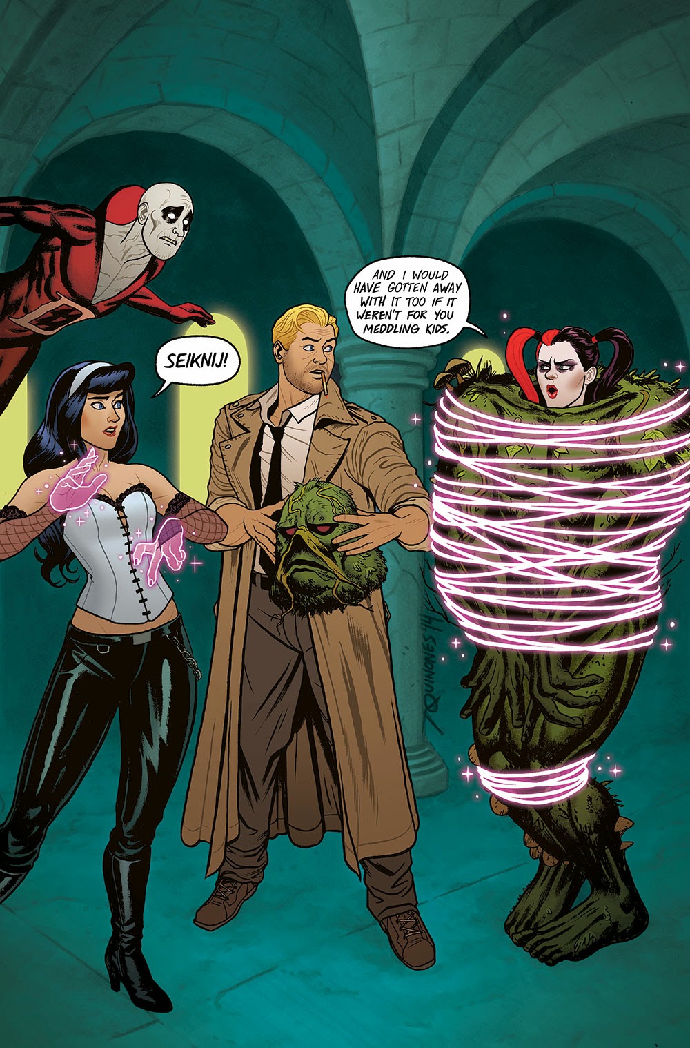
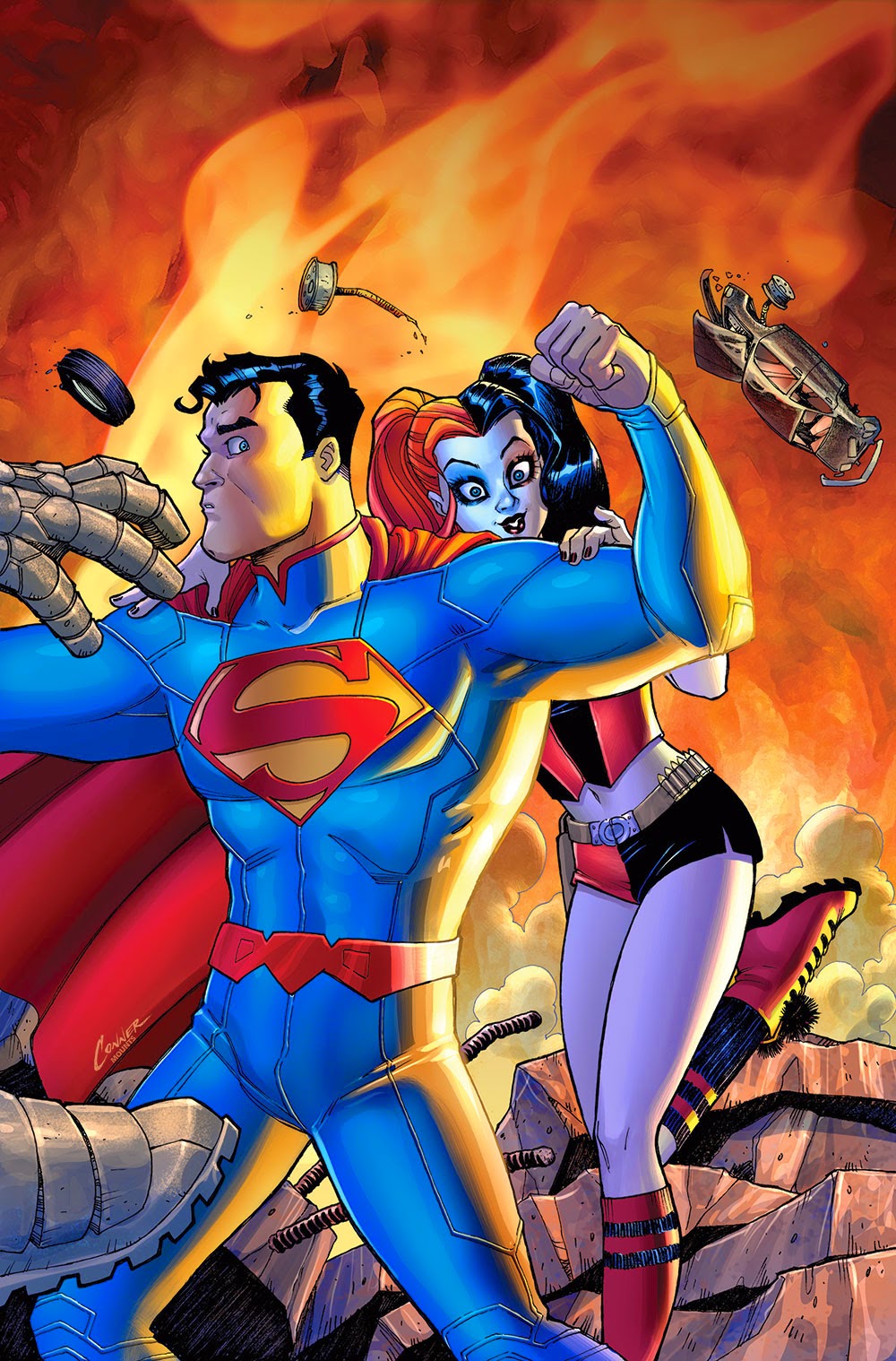
And then there are a bunch of Harley Quinn variant covers that don't really illicit a strong reaction from me. They mostly look like pretty normal comic book fare to me and wouldn't make me pick up their comics, but also aren't terrible or offensive. I mean, the Conner Superman variant is kind of fun, and the Justice League dark one is clever in a tumblr reblog sort of way, and the Sinestro variant is a very pretty illustration, but I'm not really intrigued or compelled by these covers. Similarly, some of these covers aren't my favourite style and lean too far into the sexualizing Harley Quinn direction for my tastes, but I'm not horrified by them either. In a few cases, like the Teen Titan cover, the fun-slapstick covers seem to tonally mismatch with the comics they are on based on dark, disturbing normal covers which isn't great. Your mileage and opinions, of course, may vary.


These are two of the covers I think are actually actively bad. The Green Lantern Corps variant (left) I think is kind of unattractive and not very eye catching. I think this has to do mostly with the colouring which has a really bright background and magic trick box thingy, but really dark muddled colours on the characters. Which for me makes the whole cover just look kind of messy and indistinct and, worst of all, forgettable when compared to many of the other covers. The Batman variant cover (right) is just off putting. There is this weird mix of infantilization and sexualization going on with Harley Quinn here that is totally creepy and makes me less likely to pick up this comic. If for no other reason than I'd rather not have other humans see this comic in my possession. 


This Catwoman cover (left), though, is the worst of the variants in my opinion. The anatomy of the characters depicted is weird with Catwoman's legs doing unrealistic things in unrealistic proportions and both women's breasts are ginormous and weird looking. The composition is also really weird: the picture shows Catwoman breaking Harley Quinn's mallet with a kick, but I didn't get that right away because of how static the characters look and how posed their faces are. It's really weird to me. Add in some super glossy colouring and a distractingly granular background and you have a cover that is kind of bad looking and boring. I'd never pick up this comic based on this cover.

Which is even more crazy when you look at the normal Catwoman cover (right) which is fantastic! It is a striking piece of art with its smart use of black and white space, dramatic tilt, and intriguing, suspenseful picture. This is a cover that demands attention and teases a story worth reading. It is night and day better than the variant cover it is being paired with in February. These two covers make a great contrast between a cover done well and a cover done poorly. 


And as a control, here are the Harley Quinn covers which are both very nice and effective. The story of the issue, which according to the solicit, is about Harley Quinn getting overwhelmed with her various identities and tasks and having a mental break. Which both covers capture quite well.

So there you have it, the good, the okay, and the ugly of the Harley Quinn variant cover month.