Friday 31 May 2013

London Falling Is A Good Book

Or why you should read London Falling by Paul Cornell


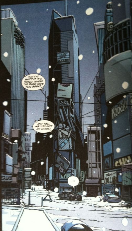
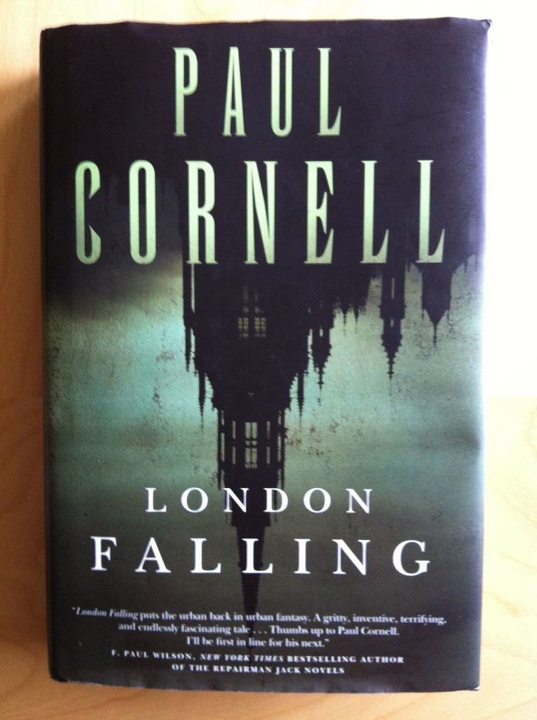
London Falling begins with the capture of Rob Toshack,  a preternaturally successful London crime boss. However, rather than being a triumph for the Police whose longterm operation nicked the druglord, things go horribly and bizarrely awry as the hidden powers behind Toshack enact a terrible revenge. A terrible revenge that sees Detective Inspecter James Quill, a Copper of the old school; undercover officers Tony Costain, a man comfortable living beyond the law, and Kevin Sefton, an alienated man who feels split between two worlds; and civilian analyst Lisa Ross, a woman with a zealot's drive and a secret; confronted with the occult underbelly of London and gifted with a terrible Sight. Together these Police must investigate the uncanny and apprehend the ancient power behind Toshack's success.

Functionally, London Falling is a genre bending blend of Detective story, Urban Fantasy, and Horror. It is a beautifully written novel with vivid, complicated characters, a satisfying mystery, and some really clever and creative takes on the included genres. London Falling also very much makes good on the promises of its various genres by being properly suspenseful, engrossingly mysterious, queasingly creepy, and confoundingly mad. It is a very complete and superbly crafted book.

Incidentally, it also has one of the most satisfying and effective sentences I have ever read in a novel. I mean, holy shit, Paul Cornell, you magnificent bastard. You will know it when you see it.

But, all that said, the real magic of London Falling is its conviction in the uncanny. I find the quality of Urban Fantasy and Supernatural Horror experiences is largely tied to how well the author negotiates the strange to sell the magic of the story. Done well, things seem profound and uncanny and massive and tangibly intangible and like, well, magic. But, steer too far into the uncanny, or be injudiciously creative, and things can seem more silly than compelling. It's... the difference between the magic of Neil Gaiman's American Gods and Anansi Boys and the less-than-it-could-have-been China Mieville novel Kraken. London Falling pulls off the uncanny brilliantly and with utter sincerity.

London Falling sells the supernatural of its story by constructing a truly remarkable system of dream logic. Every reality defying thing in the novel, no matter how creative, feels valid because of the elaborate set of rules which contextualize them. Rules, of course, that use a completely demented set of values and are presented with the ferver and faith of the most unmedicated schizophrenic. Which, in and of itself, carries a frightening, compelling, instability: London Calling is belief and madness in equal measure. And all of this uncanny is brilliantly contrasted with the logical, lawful, and familiar world of the Police Procedural story elements which grounds, contextualizes, and emphasizes all of the supernatural. As a result, London Falling completely sells its uncanny elements, and at the end of the day this is the lifeblood that truly animates the suspense, the mystery, the horror, and the madness of the story. It's really, really well done.

So, I think it's safe to say I'd recommend London Falling to just about anyone. It's a bit challenging at times, particularly the most daft and spectacular blocks of dream logic, and takes a bit of patience and effort up front (especially sussing some of the English-English if you are, like me, a colonial), but the investment is easily worth it. I'd also like to especially recommend this book to any Science Graduate Student studying for their Comprehenssive/Qualifying Exam, because the juxtaposition of Cornell's madness and the grinding formal logic of Scientific literature is a proper mind fuck. So yeah, absolutely go out and try London Falling.

(Fair warning though, the novel itself might be a magical artifact, as my copy ate my Berlin-transit-stub-turned-bookmark, did not yield it back despite intensive searching, and then regurgitated it to me most of a week later from a region of book I had already read. It was uncanny.)

Wednesday 29 May 2013

So I Read Zombies Calling

A 250 word (or less) review of the Zombies Calling graphic novel
By Faith Erin Hicks, SLG Publishing


Zombies Calling is a silly book. It tells the story of Jocelyn, a dorky and naive young Canadian university undergraduate and her flatmates, the gothy Sonnet and the dudebro-y Robyn, as they try to survive university and an adorable zombie apocalypse. Luckily for the group Jocelyn is an expert on zombie fiction and plans to use her knowledge of “The Rules” of the genre to survive. It's overall a quirky, fun, and humorous read. Have I mentioned the zombies are adorable? The book also explores some deliberate themes about the zombifying effects of modern, for profit, diploma mill, university education and the awful terror that is student loans. As a graduate student I can relate to these themes, since I already view undergrads as filthy, shambling, mindless creatures. Overall I'd recommend Zombies Calling: it's a cute, fun comic that with an accessible story and inviting artwork. Also, if the "London University" decimated by zombies in the comic is standing in for Western Univeristy (the worst part of Canada) than this comic might actually be the greatest ever. If not, Zombies Calling will likely at least stand as the most adorable and Canadian zombie apocalypse ever depicted.

Word count: 196

Monday 27 May 2013

Favouring The Young Avengers #5

Or yet more thoughts on the brilliant page layouts of Young Avengers

There are easily dozens of reasons to read Young Avengers. Kieron Gillen has created a big campy superhero story that is simultaneously a hugely empathetic metaphor for growing up, with all of the hurt, beauty, and drama that entails. The art team, led by Jamie McKelvie, are creating a book that is easily one of the best looking comics around: it's expressive, elaborately technical, and distinct from everything else. What I'm trying to say is that Young Avengers is great comics.

But for all that, I think I can pinpoint my favourite thing about Young Avengers, which is the crazy, experimental layouts that function as the focal points of every issue.

Now, part of this love comes from the fact that these are very pretty and interesting to look at from a purely aesthetic perspective. But what really elevates them is that they are also, from a story standpoint, so much more...

Note: there will be moderate *SPOILERS* in beyond this point. Procede at your own risk.


This is the layout from Young Avengers #5. From a purely plot perspective it shows Loki's magic powering up the other Young Avengers so that they can defeat the alien-parasite-parent-things that are the story's current antagonist/s. From a purely-a-mechanism-to-tell-the-story perspective, this layout is brilliant: it seamlessly manages to convey six separate plot threads occurring simultaneously in an interesting and perfectly understandable manner. It's the kind of thing that could only really work in comics, and is just... well, great.

But like all of the focal point layouts in Young Avengers, I think this one from issue 5 manages to make a statement about the characters of the comic. In this case, the layout suggests a whole series of things about Loki. For instance the layout has a web shape to it with a pensive/concentrating Loki in the centre with the other Young Avengers active in the webbing. This immediately puts Loki into comparison with a spider, incidentally an animal totemic of a trickster god, and the events surrounding him as the results of his plotting, his spiderweb. On the one hand that makes the web a trap for the parasite/aliens, that they have been caught and dispatched as a result of his constructed spell. But also, given Loki's nefarious nature and role in weaving together the Young Avengers in the first place, the web reflects how Loki has ensnared the Young Avengers in the plot he has spun. And speaking of his nefarious nature, a spider is a brilliant metaphor for what Loki is, a creature useful for his ability to eliminate parasites, but also dangerous and poisonous to be around. (Actually, the fact Loki is sitting in a pentagram, a symbol used to contain evil, is also rather emblematic of the fact that he is a semi-tame danger to the Young Avengers.) There are just layers and layers of additional meaning to this composition.

Which, all-in-all, is why it's my favourite part of Young Avengers #5.

Friday 24 May 2013

Spinal Tapestry 3: Reading Rainbow

Or the under-appreciated art of comic book spines

Book spines are, I think, the most overlooked component of book design in collected editions of comics. Whether because of all the emphasis placed on cover pages or the comic industry's infatuation with staple bound invertebrate single issues, comic spines don't generally get the love they deserve. Which is a shame, because in most settings, be they home bookshelf or retail bookshelf, the comic spine is the only part of the comic visible. Ignoring this portion of the comic's exterior hurts a print comics value as an art object (which I think is one of the key value-added features of the print format) and probably has an adverse effect on a comics retail performance. Paying attention to it can make comics look great and stand out from the crowd.

When dealing with long comics series in collected editions, I think one of the key design choices that can really improve the look and visual impact of a series is a unifying design. By tying individual books together with common elements, a series gains an identity and becomes instantly recognizable as an aggregated whole. Generally, one of the keys to this seems to be choosing a few colours to give the comics a harmonious relationship. By wildly varying spine colours, you can pretty much ruin the look of a series.


100 Bullets, by Brian Azzarello and Eduardo Risso,  is a fantastic crime comic about the opportunity to avenge injustice wrapped in a grand conspiracy. The interior of the comic is gorgeous, absolute brutality drawn with precise elegance by Risso, and the covers of the series (including these collections), by Anthony Johnson, are perfect. That said, the spines of this series are terrible. It seems the choice was made to make the spines of the 100 Bullets collections entirely dependent on cover art, which makes the spines lack identifiable common elements or common colours. When put next to the clean, unified design of Scalped, or the brilliant design of DMZ, 100 Bullets looks like a mess of random comics instead of a lovingly appointed series. And I think it's shelf presence suffers for that.


The Unwritten, by Mike Carey and Peter Gross, is a great comic about the power of literature to affect society and people with the bourgeoning power to tap into it. The Unwritten is also another comic with great interior art and superb covers, by Yuko Shimizu, but poor spine design. The Unwritten makes that fairly common mistake of giving each edition its own colour to make a rainbow effect. The problem is that this breaks up any cohesion over the entire series and doesn't really tell us anything about the identity of the Unwritten. Varying colours like this is almost never the best choice.


But like all rules there are exceptions. Scott Pilgrim and Chew are two comics that absolutely break what common sense suggests is good book design. They use bright, obnoxious colours that change and clash between books. And while they do maintain common elements between books (Chew's cutout and Scot Pilgrims weighty logo), their overall look is just garish as hell. The thing is, this WORKS for these comics. Chew, by John Layman and Rob Guillory, is an insane comic about people with mental food powers solving ridiculous food crimes: the plot is crazy, the art is bombastic and cartoony, and the aesthetic of the book is frankly pretty garish. So a cover spine design that clashes between issues and uses bright, cartoony colours completely sells the identity of the book. Similarly  Scott Pilgrim, by Brian Lee O'Malley, also has a cartoony look and bombastic style. Scott Pilgrim is a comic about being brave enough to love while being an adrift 20-something, and has a style influenced by manga and 1990's video games that is just really inviting and fun. The spines of the Scott Pilgrim books, with their garish bright colours, manga-ish book size, and pixelated logo font absolutely evoke the visual identity of the book. What I am saying, basically, is that these comics, by having insane cartoony spines,  are able to convey their visual identity instantly. And that is, I think, the core of book design.

Previously:
Spinal Tapestry 1
Spinal Tapestry 2

Wednesday 22 May 2013

So I Read Fatale: The Devil's Business

A 250 word (or less) review of Fatale Volume 2
By Ed Brubaker and Sean Phillips, Image Comics


Fatale: The Devil’s Business continues the Lovecraftian Crime\Horror story of Nicholas Lash and femme fatale Josephine. Unlike Death Chases Me (Vol. 1), which focuses on its male protagonists, The Devils Business sets its lens on Josephine, the woman cursed with immortality, beauty, and the ability to influence the men around her at the expense of their obsession and ruin. Fatale Volume 2 finds Josephine living in reclusion during the golden age of Hollywood where a chance encounter with a wounded woman and a down-on-his-luck actor bring her to the attention of a Satanist cult of drug dealers, pimps, and a terror from her past. While The Devil’s Business still has a heroine stuck vein of crime, it's appropriately a more cinematic and less pulpy kind of Noir. The Horror elements in Volume Two, though, are as creepy, grounded, and quietly pervasive as ever. By focusing more on Josephine, The Devil’s Business really crystallizes how brilliant a concept the literalised femme fatale is: Josephine is LITERALLY a woman cursed to seduce and bring ruin to the men around her. The exploration of how this influence over men is both a horrific curse and a source of power is a fresh and nuanced approach to this character trope. Fatale: The Devil’s Business is another brilliant chapter in a creepy and arresting story. Well worth a look.

Word count: 225

Monday 20 May 2013

You Is A Good Book

Or why you should read You, by Austin Grossman


I don't understand how "Gamer" has become a cultural signifier. I mean, I enjoy video and computer games and grew up with an N64 and an XBOX and various behind-the-curve PCs. I remember hours  spent killing my friends in first person shooters, epic arguments about fighting game conduct, the names and places and story details of my favourite RPGs, and deciding all games that involve timed jumping puzzles are absolute bullshit forever. But video games were always a pastime for me; a not-serious-enough-to-call-a-hobby activity to occupy an idle afternoon. And now, with a career, and a partner, actual hobbies, and a shortage of idle afternoons, electronic games have kind of been left behind. So I am constantly a little mystified that there is a whole society of people for whom enjoying electronic games isn't just their hobby, but has become their IDENTITY. To me, it's always seemed a bit like someone who likes to golf on the weekends telling people that they are culturally a Golfer. Or a Longjumper. Or a Bumper Car-er. I guess what I'm trying to say is that despite getting the appeal of the activity, I don't understand how people can call themselves Gamers.

You is a story about video games. Set in 1997, incidentally about the time of my first console and first computer worth the name, You follows Russel, an adrift outsider, turning to a job making computer games for Black Arts, a company forged by his high school friends Simon, a deceased coding genius and outsider, Darren, a charismatic and visionary designer, and Lisa, the savvy programmer and obligate female hero. Can Russel find his place in the world, discover the flaw in the WAFFLE game engine hidden deep in his own history, and help create the Greatest video game ever on deadline? You will have to be the judge.

Structurally You weaves its central narrative through a broader question of what videogames are. By staging its "present day" story elements at a game developer, You provides an insider view into what video games literally are and the process of making them. You also manages to be a pretty thorough survey of the history of video games, from their inception on underpowered computers to the dawning of the modern console age, by having Russel play through Black Arts' games in his bug fixing quest. The brilliance of You is that it takes these two mildly dry topics and seamlessly integrates them into the core narrative about Russel finding his place in the world: lots of interesting exposition delivered in an emotionally satisfying story. If you are curious about video games, You is a satisfying read.

But for me the real magic of You is that it explains who Gamers are and why they exist. Russel's and Simon's and Darren's and Lisa's search for meaning, for escape, and for a quest bigger than themselves tells the story of Gamers, who they are, and why video games are so important to them. I kind of get it now.

I would recommend You to anyone interested in video games: be they Gamer, hobbyist, or afternoon waster. I'd also recommend this book to anyone who enjoyed Soon I Will Be Invincible, because You has that same mix of accessible, loving exposition coupled to a fun, engaging story. You was a very satisfying read.

Friday 17 May 2013

Deep Sequencing: How DMZ Uses Landmarks to Contextualize Modern Warfare

Or a photo montage of DMZ and my 2009 New York Vacation


One of the formative components of comic books is setting. Background art and setting give comics an important sense of place and provide narrative context that grounds the story in all kinds of intangible and difficult to explain ways (which is to say a story set on Mars is very different than a story set in Gotham). At the best of times, this background involvement in the narrative can become so important to the story that it is functionally a character in the story. In the case of DMZ I would argue that setting is not only a character in the story, but is an essential component of the comic's theme.


DMZ is the story of a modern US civil war complete that viscerally portrays all the hellish realities of modern warfare. It's violent, chaotic, and a profoundly tension filled comic with an important message to those of us who live in our cushy first world homes and have never experienced what war is first hand. DMZ tells us that one of the biggest costs of war, one I think we under appreciate, is the suffering experienced by civillian populations. And the way DMZ uses setting to provide the context we need to understand this message is really smart.


One of the key problems in understanding the cost of war in other places around the world is that we don't have a great understanding of what life is like there. Like... in medicine, to interpret changes in health that might be caused by disease doctors have to have a baseline idea of health. For example, to tell if a mole is growing alarmingly, or has always been giant and hairy, doctors and patients need to know something about the history of the mole. When it comes to wars abroad, I don't think we accurate enough ideas of what baseline life looks like for places like Iraq or Somalia, and therefore its hard to tell if the changes we see from violence are dramatic, or mild, or maybe even improving things. We lack accurate context and experience with the locations of our modern wars. And  to overcome this shortcoming  DMZ uses a familiar setting to create this essential context.


DMZ is set in the Demilitarized Zone of Manhattan Island, caught between the entrenched Free States Army in New Jersey and the camp of the US Army located in Brooklyn. Thus the setting of the comic is basically a wartorn modern Manhattan in New York City. Now, Manhattan is probably the most familiar place in North America. It lives in our media like no other place on Earth. It is in our movies, it is the setting of a huge amount of our television programs, and it is the setting of many of our favourite comic book stories.  It has this perfect synergy of population, affluence, iconic architecture, and cultural diversity that makes it a terrific microcosm for America and recognizable as hell. We all instantly recognize the New York skyline; the Empire State, the Chrysler Building, Central Park, the Island itself. We know what this place SHOULD look like, what life there resembles, and therefore we can understand the toll war takes on it. And using this familiarity to demonstrate what happens to a place caught in a war is absolutely brilliant.


Incidentally, Manhattan is also a place I have been, just for a little over a week, and seeing some of these places I have actually visited torn about by violence was particularly effecting. DMZ is a comic well worth checking out.


Wednesday 15 May 2013

So I read DMZ


A 250 word (or less) review of DMZ the complete series.
By Brian Wood, Riccardo Burchielli, Kristian Donaldson, Nathan Fox, Viktor Kalvachev, Danijel Zezelj, Nikki Cook, Ryan Kelly, Andrea Mutti, Cliff Chiang, David Lapham, and Shawn Martinbrough, Vertigo Comics.


The United States is fighting and has fought in a lot of armed conflicts in countries around the world. Meanwhile, America hasn't had anything resembling a war fought within its own borders since its Civil War. (I'm Canadian, so this is all effectively true of my country too). I think a consequence of the foreign nature of our modern wars is that its difficult to contextualize the violence. As a result, I think it's difficult for North American civilians to properly understand what contemporary warfare really is; the reality of what it looks like and the cost to civilians caught in it. Well, in DMZ, Brain Wood, Riccardo Burchielli, and others have created a story to give North Americans context for modern war. They do this by creating a civil war between the United States and the Free States Army, an ideological insurgent militia, and placing these armies in a military standoff on either side of a demilitarized, war torn Manhattan Island. They then place Matty Roth, an aspiring photojournalist, right in the middle of the maelstrom and explore the conflict with all of its violence, military excess, warlords, corrupt corporations, and would be dictators. DMZ is an alarming and exciting read that makes brilliant use of Manhattan, a place that lives in our society’s imagination like no other, to illustrate what warfare actually looks like.1 And I think you should read this comic, both because its good and because it has something important to say.

Word count: 246


1: Personally, I've visited New York, and reading about these places I've been torn apart by war was really affecting.

Monday 13 May 2013

Critical Space, Patriot Acts, and Walking Dead Are Good Books

Or why you should read the second three novels in the Atticus Kodiak Series by Greg Rucka


The second three Atticus Kodiak Novels are, I think, a trilogy unto themselves. It is difficult to talk about plot specifics in these novels without hitting major *SPOILERS*, but basically they are about the return of Drama, the world renowned assassin from Smoker, and what happens when she is pursued by another of The Ten assassins for failing to kill her targets, the lengths she will go to protect herself, and the lengths Atticus will go to do what seems right. From a plot perspective there is a pretty dramatic shift from Atticus Kodiak as the bright, stoic Personal Security Agent (Bodyguard for the ill-informed) with a slightly problematic temper who champions progressive causes to an Atticus Kodiak that has fallen out of his life and into something darker and more complicated. From a thematic standpoint these novels, while still properly thrilling, are much more challenging, tackling some pretty awful topics and placing Atticus in some morally awkward positions. And the result of this change are novels that are distinctly intense, in this very intimate and emotionally affecting manner. I really enjoyed them.


I think this shift in focus and quality is partially due a change in Rucka's writing. Where the first three Kodiak Novels are thriller novels crafted with exact timing and delicate components moving with smooth, well lubricated motions, this second ersatz-trilogy is much rougher. Those same lean thriller story mechanisms are present, but they have been deliberately abraded to create a different kind of storytelling machine. And this all makes for a much rougher reading experience: one where you are at once sliding along a Ruckian plot-chute until you hitch up on a patch of moral corrosion, arrest on it, and dangle uncomfortably from it. It is, at times, emotionally eviscerating, but is also completely engrossing and thrilling and dangerous.

I mean, seriously, there are moments in these novels that are literary gutshots. Moments of looking up from the book, bodily ejected from the prose, and emitting an audible "woof" at the events portrayed. It can be rough, guttering going, especially in Walking Dead.

Basically if you liked the suspense and action of The First Three Kodiak novels but wished they had more of the Noir-infused grit and challenging ethics of A Shooting At Midnight, you will love Critical Space, Patriot Acts, and Walking Dead. Just expect to get beaten and tore up a little during the ride.

Friday 10 May 2013

Red Planet Blues Is A Good Book

Or why you should read Red Planet Blues by Robert J Sawyer


There's Martian fossils in the red hills of Mars beyond the frontier town of New Klondike. Fossils and the promise of fortune for any enterprising human or uploaded-human-android Transfer lucky enough to find the perfect specimen.  Or better yet, there is the possibility of finding the long lost Alpha Deposit, the mother lode of exquisite, priceless Martian fossils, and becoming rich beyond anyone's wildest dreams. And so New Klondike is a town of hopeful prospectors, dejected failures, and the seedy economy of a hard-on-its-luck frontier town built in a dome on Mars. New Klondike is also a company town where the law is less interested in Justice than keeping the piece and protecting the owners assets. And so Alex Lomax, the only Private Eye on Mars, is on the case. These are his Red Planet Blues.

Red Planet Blues is a tale of frontier life, of gold rushes and arctic explorers and greed; extrapolated into a Science Fiction story exploring the concepts of Martian colonies, alien palaeontology, and humans uploading their minds into robots; presented with the style and panache of a pulp Dectective serial. To a certain extent Red Planet Blues, as is perhaps appropriate for a novel set on a planet with a fraction of Terrestrial gravity, is a bouncy read. In being such a loving pastiche of pulp storytelling the novel provides a lot of swashbuckling adventure but also, in its dangerous dames and sassy puns, an inherent eyebrow-shrugging-goofiness. The result is a fairly light and infectiously fun novel that clearly reads like it was a ton of fun to write.

But that isn't to say that Red Planet Blues isn't also a smart piece of Science Fiction. While the action as fast and lose with the rules as the protagonist, the high concept Science Fiction is grounded and thoughtful. The tribulations of living on Mars and the treatment of the Martian Fossils carries the authoritative weight all of Sawyer's work seems to. Moreover, the concept of having Transfers, androids run by the minds of uploaded humans, as robots exploring Mars for signs of life is just such a brilliantly clever and timely decision. At once gobsmackingly obvious and deviously subversive. (It also, I think, makes Red Planet Blues a semi-sequel to Mindscan, another great Sawyer novel.) My point here is that under the hood of the adventuring detective story is an elaborate engine of Sci-fi that gives the novel some literary depth.

My only real criticism of the novel is that some of the earlier who-dunnits of Red Planet Blues were kind of obvious to me. Now, it might be that I've read a few novels lately that play with the idea of human minds as software (Accelerando and Glasshouse, The Accord) or it could be that my significant other and I have watched too much mid-nineties Law and Order, but some of the cases just immediately suggested their solutions. To be fair though, as the novel progresses the capers become more convoluted and complicated, leading to some satisfying and unexpected twists in later parts. Which, if you think about it, is probably the right direction for increasing complexity.

At the end of the day I'd recommend this book to fans of genre fiction, be they Sci-fi, detective, or adventure aficionados. Red Planet Blues is, after all, a stupendous combination of these genres. I also can't help but think this is a novel that could be foisted well onto youth readers: it's fun, informative, and exciting enough to keep pages turning. Just be aware that it's genre-appropriately violent and acknowledges the existence of sex in a way that is somewhat discrete but still honest about how things work. Depending on your parenting style, it might get a bit racey. But yeah, I whole-heartedly recommend this book.

Wednesday 8 May 2013

So I Read Saucer Country: Run


A 250 word (or less) review of Saucer Country Volume 1
By Paul Cornell, Ryan Kelly, Jimmy Braxton, and Goran Sudzuka, Vertigo Comics


My biggest childhood fear was aliens visiting earth and abducting people. I used to lay awake in bed staring out the window imagining creative and worrying providence for all the moving lights in the sky. ET scared the shit out of me and I can't watch that creepy little space monster to this day. So reading Saucer Country was a fraught decision for me. Saucer Country is a comic exploring the mythology/culture/phenomenon of alien abductions. This exploration is built into a narrative about Arcadia Alvarado, the Governer of New Mexico who has an alien abduction experience just before announcing her candidacy for President of the United States. To determine the truth of what happened to her she recruits the assistance of her Chief of Staff, her dubious campaign manager, a UFO researcher of questionable sanity, and her fellow abductee and ex-husband. Saucer Country is a starkly mature, informative, exciting and creepy comic that maintains its central mystery with a perfect balance of belief, skepticism, and ambiguity. It's a solidly good book. I was actually somewhat surprised by it; Cornell's superhero work usually has a trademark sense of fun and goofiness about it that really isn't present in Saucer Country's mature and dark landscape. I was also impressed by the strength of Kelly's pencils: the acting and storytelling chops on display in this comic are incredible. Saucer Country is really a fantastically crafted comic. The adult me enjoyed the comic immensely and the 12-year-old boy in me was terrified by it. 

Word count: 250

Monday 6 May 2013

Eye On Hawkeye #10

Or how a shift in colouring takes the audience on a foray into nightmare land.


In this instalment of my continuing studies into what makes Hawkeye such an effortlessly effective read, I'm finally going to write something about colouring. Haweye #10 is the first issue of the series not coloured by regular tint-ist Matt Hollingsworth and is instead imbued with hue by the issues all-in-one artist Francesco Francavilla. And maybe it's a case of not missing something until it's gone... but this change in colourist, and the style of the shade-wizardry, has had a huge impact of in my experience with this comic.

To avoid *SPOILERS* I'm going to avoid talking about the plot in any detail, but suffice it so say that Hawkeye #10 focusses on a new villain, giving us context and background and making him loom so much more sinister than he might have without this issue. And, a lot of this is due to the brilliant nightmarish colouring of Francavilla. But I think, more than that, is the loss of normalcy that occurs when we lose the familiar style and colour palette of Hollingsworth on colours.

As I mentioned earlier, Matt Hollingsworth has done all of the colours in Hawkeye #1-9, which makes him the only artist on the book to contribute to every preceding issue. Due to the rapid-fire publishing schedule of Marvel a variety of artists have pencilled the interiors of Hawkeye including Javier Pulido, Steve Lieber, and Jesse Hamm along with series regular Daivd Aja. And yet, there has been a unified look to the comic. Now, part of this is that the rotating artists, aside from the Cartoony Hamm, all have a very... classic and cinematic look. But I think this unity of aesthetic is mostly dictated by the colours of Hollingsworth.


Here are four random pages, each drawn by a different Hawkeye artist, but coloured by Hollingsworth. (Clockwise: Aja, Pulido, Hamm and Lieber.) You'll notice that each have this beautiful flat colouring that features a purple-enhanced life-like palette. People are coloured like people, purple and occasionally a muted red are the main wardrobe colours, and the backgrounds are pleasant colours that lovingly compliment the featured purple. The effect is pure cool with an old world cinema classiness. For me this collection of colours is integral to Hawkeye feeling like itself: this is a key component of the visual identity of Hawkeye.


Hollingsworth's colour pallete is so integral, that even small deivations, such as the SLAPP frames from Hawkeye #9, with their bright yellow backgrounds, break the trend, stand out as weird, and therefore just pop off the page.

Hawkeye #10, has a completely different look and feel from the preceding issues of the comic. And that look and feeling is W-R-O-N-G. Everything about this issue feels askance and creepy and not like the Hawkeye we all love. (In a really smart, good and effective way!) And I think a lot of this is the colours that Francavilla uses.


This issue uses two different colour palettes, one for the current narrative and one for flashbacks, and both are crazy. The present story is bright, fierce blues and purples that bleed over characters and subsume them. Flashback scenes are orange and fiery, lending them an agressive, surreal immediacy. The story swaps back and forth between fierce, bight cool colours, and explosive fiery ones, pulsating between two very unnatural colour palettes making everything feel like a psychedelic fever dream. It's an absolutely perfect match for the story and artwork.

And if you compare the colours Francavilla uses to the Hollingsworth colour palette above, you see Francavilla's colour choices are radically different. So radically different that Hawkeye #10 lacks that colour visual identity that's needed to make the comic feel like Hawkeye standard. Which takes the feeling of wrongness created by the fever colours and enhances it, sowing a feeling of discord: we were expecting to see our familiar Hawkeye and instead got something radically different, something beautiful and terrible and strange. It's great.

So Hwakeye #10 brings us a chilling new villain, and because of the masterful shift in colouring we are menaced and told the party is over.


Friday 3 May 2013

Accelerando And Glasshouse Are Good Books

Or why you should read Accelerando and Glasshouse by Charles Stross


Accelerando is the story of the yawning Singularity, that epoch when all of humanity's thinking creations become exponentially smarter than their makers. When software agents become like gods, in a very imprecise nutshell. The story follows the exploits of a single family over three generations and a couple hundred years of human/computer coevolution: from futurist socialist iconoclast Manfred Macx and his IRS agent, dominatrix wife Pamela to  their daughter Amber Macx, space exploring royalty, to her son Siran al-Khurasani, a socially inept academic living in a post-human enclave on Saturn. It's a book of mad ideas and brain blisteringly smart concepts. I don't think it is any exaggeration to call Accelerando a modern classic of Science Fiction. 

I don't think I can overemphasize how smart this novel is either. The idea density in Accelerando is staggering: virtually every sentence of prose hints at a dozen other ideas, each worthy of their own consideration. And of course these hyper-dense ideas are delivered with a frenetic pace that just increases as the novel progresses. And so we never catch up, staggering about stupidly, overwhelmed by the sheer mass of ideas, and the thoughts those ideas spawn. The result is pure future shock. Which of course works brilliantly with the themes being discussed. Because, in the future, humanity as we know it, is obsolete.

I can whole heartedly recommend this book to anyone. It's a brilliant representation of what good contemporary Science Fiction can be: wickedly smart, mature in its treatment of big concepts, but still with a sense of mad fun. Also, you can legally give Accelerando a try for free from the author's website.


Glasshouse is in a lot of ways the opposite of Accelerando despite being a semi-sequel. Instead of showing us a few hundreds years of contemporary humans flung into a barely comprehendible future dictated by software agents beyond our meat-brained understanding, Glasshouse takes post-humans eking out a comfortable living on the fringes of the singularity and hurls them back in time to a simulation of 20th century living. In the novel, Robin, an amnesiac man who has undergone selective memory surgery to forget his shadowy and violent past, is forced by the threat of assassination to volunteer for an experiment to recreate 20th century life. But the experiment isn't what he expected, and he finds himself trapped with the very people he was trying to escape.

Glasshouse is another aggressively smart book. It portrays a post-singularity society with its awesome technology, radically different social norms, and with the particularly unsettling aspects of perfectly mutable human software. Glasshouse is even better in its portrayal of 20th century living. In the design of its experiment we see, from the future perspective of Robin, just how dysfunctional the 20th and 21st century are. Glasshouse very much holds up a mirror that reveals just how arbitrary and draconian our modern gender politics, economics, and social standards are. It's disquieting and completely relentless and tied to a properly tense mystery/thriller plot.

On the whole I'd recommend Glasshouse. It's wickedly smart, high concept Sci-fi that plays with some pretty important themes while still being eminently readable. It was the first Stross novel I ever tried, and I enjoyed it enough to dive head first into his bibliography. That said, Glasshouse does have it's faults: one of it's "mystery reveals"is pretty obvious (although less out of authorial negligence and more because the narrative demanded it, although still requiring characters to have a paradoxically 20th century attitude) and the discussion of feminist theory is "very 101" according to a friend I lent the book to. So your mileage may vary. But I really enjoyed this book, and if you like high concept Sci-fi, I suspect you will enjoy it too.

(To be fair, criticizing a "mainstream" novel for being too simple in its portrayal of feminism is, I think, unfair. I have NEVER taken a feminist course during either of my Science degrees, and I suspect this experience is true for a lot of non-Humanities students... and probably most straight male students in general. As a result, I think there is value in placing these basic ideas where we uneducated slobs can encounter them and learn the basics. It's part of why I like Glasshouse and why The Handmaids Tale is an ESSENTIAL piece of literature.) 

Wednesday 1 May 2013

So I Read Spaceman


A 250 word (or less) review of Spaceman
By Brian Azzarello and Eduardo Risso, Vertigo Comics


Spaceman tells the story of Orson a, well, Spaceman: a hulking, Neanderthalesque person genetically engineered to survive the deleterious effects of a manned space mission to Mars. In his inner life Orson fantasizes about the future he was meant to have; the mission to Mars with his Spaceman bruddas. In real life Orson lives a solitary life salvaging scrap from a global warming sunk metropolis, living in poverty, and speaking in a pidgin of broken English and text messaging. That is until he encounters Tara, a stolen child star of the hit realtee program The Arc, which drags him into a cut throat world of kidnappers, criminals, bounty hunters, and realtee producers. Basically it's an exciting crime comic set in a dystopian future. But Spaceman is also a cautionary tale.  The comic makes a pretty provocative statement by contrasting an ideal future where we send genetically engineered supermen to Mars with a decidedly shitty one built of our brainless devotion to media, our growing quasi-literacy, our entrenched economic inequality, and our complete inability to curb a brewing ecological disaster. The fact this ideal future only exists in the head of someone living in the shit future feels like a rather scathing indictment of our society. Suffice it to say Azzarello has written one tight and thoughtful book. Risso, meanwhile, draws his beautiful and expressive cartoon artwork with an elegant brutality that matches the script. Spaceman is well worth checking out.

Word count: 240