Or a look at panel shape in WicDiv #12
by Kieron Gillen, Kate Brown, Jamie KcKelvie, Matt Wilson, and Clayton Cowles; Marvel Comics
The newest issue of WicDiv represents a change in The Wicked + The Divine. Instead of the familiar artwork of Jamie McKelvie, the series is now going through a cycle where a number of group artists are joining the comic for a series of character focused issues. WicDiv #12 represents the first issue and is drawn by Kate Brown, and continues the WicDiv tradition of being formally interesting comics.
There will be *SPOILERS* for WicDiv #12 below.
Sometimes the smallest things in a comic end up being really effective story telling tools. In the case of WicDiv #12, the small but important tool is panel shape. WicDiv #13 follows a team of Cassandra's former documentarian assistants as they make a film about the gods. It is established very early in the comic that these rounded edge panels are filmed segments of the comic. This was done in a clever way by showing a deceased character in the frames with a date-stamp and with film symbols like fast-forward and pause to cement the technique.
On a surface level this choice allows the reader to easily distinguish the filmed sections of the comic from the real time parts of the comic. This way the comic can intersperse the different threads of the story effortlessly and without having to take the time to formally establish which is which. It's a tiny thing but it makes the issue work really well.
But I think this tool works on another, more subtle level as well. By using these rounded panels for quiet, static documentary shots, WicDiv #12 gets into a kind of rhythm: we get into a pattern of repetitive, dialogue shots that give sections of the issue a certain stillness. Which I think works like an anchor.
So that when the action breaks lose in WicDiv #12, everything looks different. Instead of the rounded edges of the quiet panels, there are the sharp, jagged lines of danger. Instead of the neat, orderly panels with clear celluloid margins, there is chaos, with events breaking through margins in a swirling vortex of wild violence. These amazing compositions would be effective regardless, but the contrasting styles, I think, really emphasize just how wild the action scenes in WicDiv #12 get. It's a tiny choice, but for me it results in some really great comics.
Also, I absolutely love how clinical and static the camera lens elements in the action scenes are. It's a fun commentary on the role of observer to events, which I think plays with the role of creator and audience in interesting ways.
Previously:
WicDiv #1 and popart head-splosions
WicDiv #2 and the use of black-space
WicDiv #3 and character design
WicDiv #4 and body language
WicDiv#5 and facial acting
WicDiv #6 and possessions as character
WicDiv #7 and the power of lettering
WicDiv #8 and the disorienting layout
WicDiv #9 and the economics of design
WicDiv #10 and powers as character design
WicDiv #11 and stretching the moment
Showing posts with label Kate Brown. Show all posts
Friday, 17 July 2015
Monday, 1 July 2013
Favouring The Young Avengers #6
Or highlighting yet another centrepiece layout in Young Avengers
By Kieron Gillen and Kate Brown; Marvel Comics
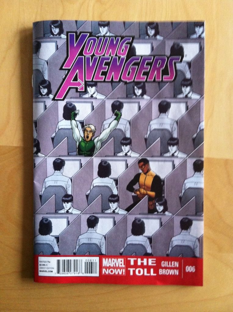
There are easily dozens of reasons to read Young Avengers. Kieron Gillen has created a big campy superhero story that is simultaneously a hugely empathetic metaphor for growing up, with all of the hurt, beauty, and drama that entails. This issue is drawn and coloured by artist Kate Brown who maintains the high standards of the comic usually maintained by series regular artist Jamie McKelvie. Young Avengers #6 is still great comics.
As usual, my favourite part of the issue is the keynote, experimental layout that is the trademark of the Young Avengers series. And what makes it so great, beyond its aesthetic value, is that provides additional story and character information. Which is kind of great...
Note: there will be *SPOILERS* in beyond this point. Procede at your own risk.
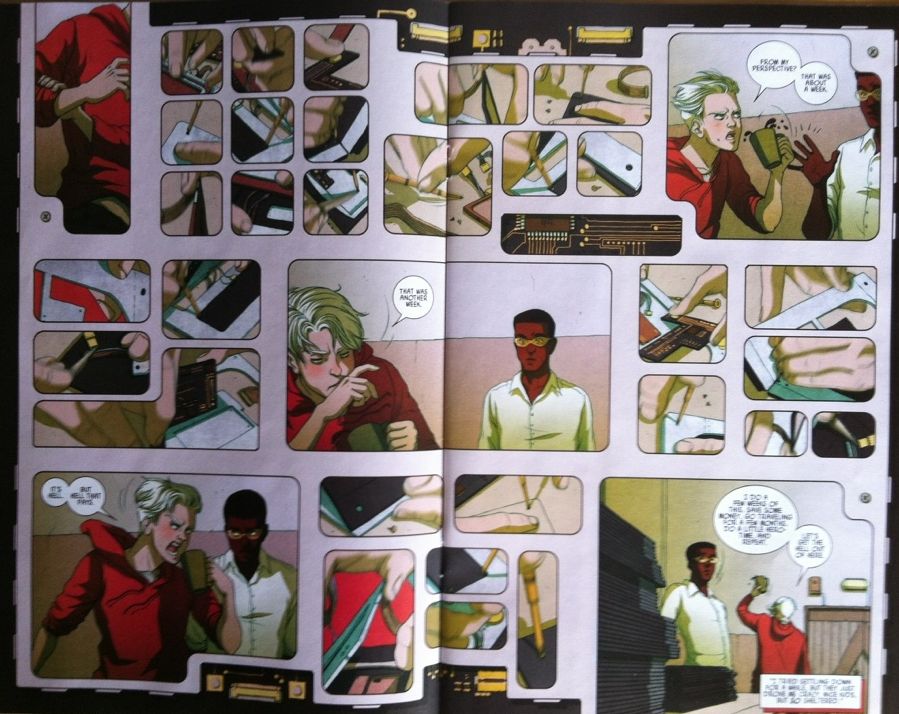
In this issue of Young Avengers we focus on super speester and former Young Avenger, Speed and the depowered mutant Prodigy, whose mind contains all of the knowledge of the X-men. The hook of the issue is that these two former heroes are trying to make it after all by working in a boring office where Prodigy provides tech support and Speed does superfast manufacturing. The layout above depicts Speeds rapid construction work and does a really effective job portraying the speed and intricacy of the process. Specifically the blurring and disjointed nature of all the little inserts convey speed, and the glimpsed intricate manufacturing steps as well as the component like frames sell the intricacy of the process. Which is all really cool.
But what makes this even niftier is the idea, explained in the dialogue of the panels that Speed experiences these rapid moments subjectively as weeks of his life. And the way we BARELY glimpse the manufacturing, and dont really get to see or understand the process really sells the temporal disconnect between Speed and us "Snails". And this I think really sells the unique experience of being Speed, what it is like to be a normal-speeded character around Speed, and gives some neat insite into why Speed is a bit of an arrogant, flighty jerk. And this is even cooler.
Previously:
Favouring The Young Avengers #5
Favouring The Young Avengers #1-4
By Kieron Gillen and Kate Brown; Marvel Comics
There are easily dozens of reasons to read Young Avengers. Kieron Gillen has created a big campy superhero story that is simultaneously a hugely empathetic metaphor for growing up, with all of the hurt, beauty, and drama that entails. This issue is drawn and coloured by artist Kate Brown who maintains the high standards of the comic usually maintained by series regular artist Jamie McKelvie. Young Avengers #6 is still great comics.
As usual, my favourite part of the issue is the keynote, experimental layout that is the trademark of the Young Avengers series. And what makes it so great, beyond its aesthetic value, is that provides additional story and character information. Which is kind of great...
Note: there will be *SPOILERS* in beyond this point. Procede at your own risk.
In this issue of Young Avengers we focus on super speester and former Young Avenger, Speed and the depowered mutant Prodigy, whose mind contains all of the knowledge of the X-men. The hook of the issue is that these two former heroes are trying to make it after all by working in a boring office where Prodigy provides tech support and Speed does superfast manufacturing. The layout above depicts Speeds rapid construction work and does a really effective job portraying the speed and intricacy of the process. Specifically the blurring and disjointed nature of all the little inserts convey speed, and the glimpsed intricate manufacturing steps as well as the component like frames sell the intricacy of the process. Which is all really cool.
But what makes this even niftier is the idea, explained in the dialogue of the panels that Speed experiences these rapid moments subjectively as weeks of his life. And the way we BARELY glimpse the manufacturing, and dont really get to see or understand the process really sells the temporal disconnect between Speed and us "Snails". And this I think really sells the unique experience of being Speed, what it is like to be a normal-speeded character around Speed, and gives some neat insite into why Speed is a bit of an arrogant, flighty jerk. And this is even cooler.
Previously:
Favouring The Young Avengers #5
Favouring The Young Avengers #1-4
Subscribe to:
Posts (Atom)