Showing posts with label Brian Azzarello. Show all posts

Thursday, 19 February 2015

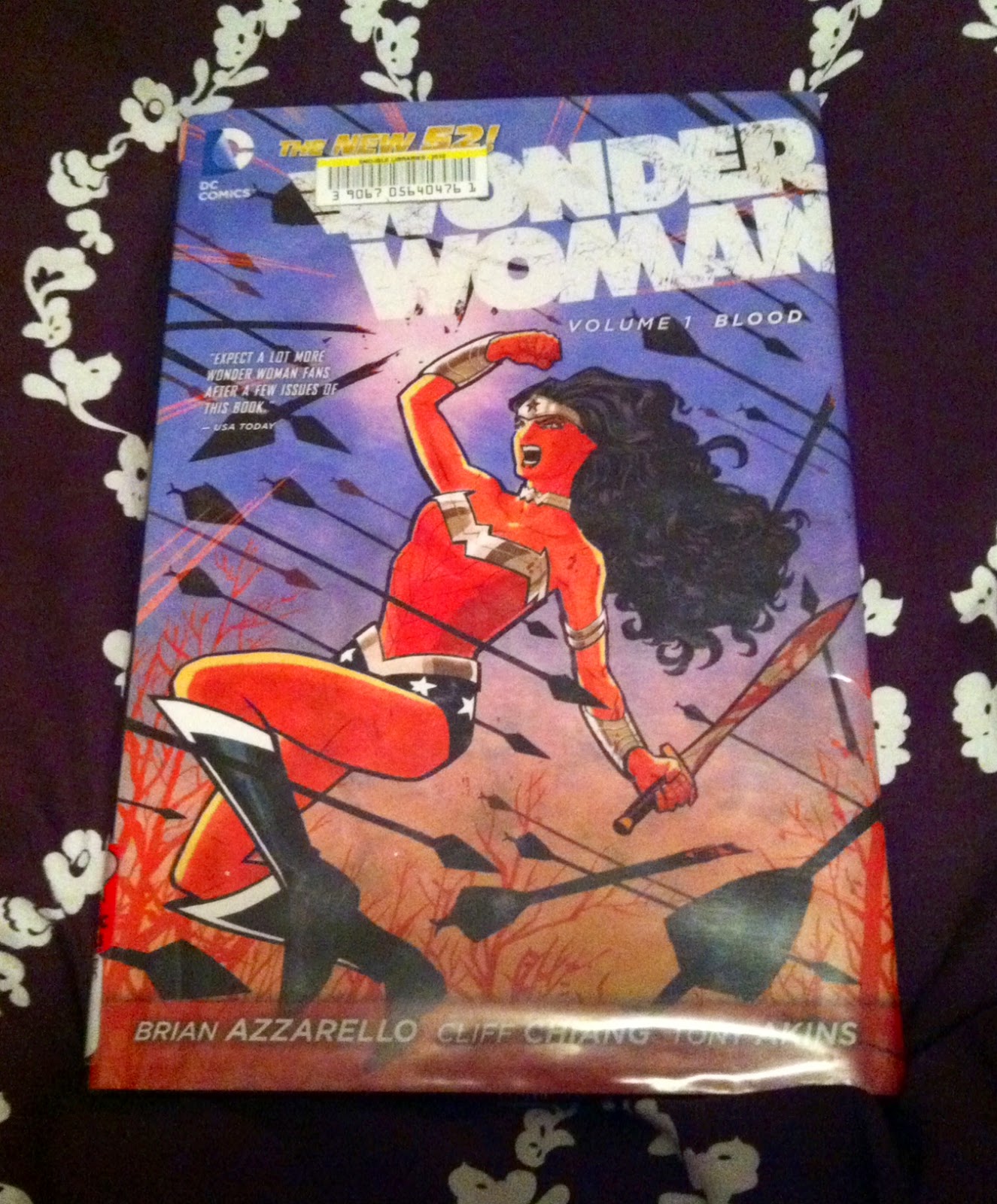
So Jenn Read Wonder Woman: Blood

A review of Wonder Woman Volume 1
Brian Azzarello, Cliff Chiang, Tony Akins, Matt Wilson, and Jared K Fletcher; DC Comics


Blood is the first collected trade of DC’s New 52 Wonder Woman run, a fairly easy jumping on point to get a taste for a hero I’ve never read before. We open with a young woman, Zola, being pursued by mystery assailants. Hermes comes to her aid, and it’s revealed that she’s pregnant with Zeus’ child. She ends up in Diana’s care, and the story grows around the familiar relationships of Greek Gods. Zeus has disappeared, Hera is upset about his many infidelities, and there’s a power vacuum on Olympus to be filled. Diana takes Zola and Hermes to Paradise Island and the protection of her family of Amazonian sisters, where she must also address newfound family history with her mother, Hippolyta, and what ramifications this information may have on Olympus.  Azzarello makes a smart choice grounding the story in Greek myth –it guarantees some familiarity with the characters Diana interacts with, freeing the story from extensive exposition and allowing the action to begin quickly. The spectacular art only adds to the experience—I love Cliff Chiang’s interpretation of Diana and her sisters – strong, but still beautiful and feminine. Diana looks like she could crush a man with her thighs, in the absolute best way. The story is sufficiently gory, with some dark moments and unexpected twists. As a character, Diana is someone I want to follow further—and I will absolutely be reading Volume 2.


Word Count: 236

Post by Jennifer DePrey

Monday, 7 October 2013

Wondering About Wonder Woman: First Born Special

Or some great comics in The First Born-Wonder Woman Special 
Brian Azzarello, Aco, Matt Wilson, and Jared K Fletcher; DC Comics


I have really been enjoying Wonder Woman. I think Brian Azzarello's take on Wonder Woman as more of a mythical figure and less of a straightforward superhero is interesting, and the melodrama generated by the infighting and family dynamics of the Greek Parthenon provides a relatable emotional core. And then there is the art of series main artist Cliff Chiang who is just a fantastic artist: his distinctive style and endlessly fascinating character designs are really reason enough to read this comic. Add to this the colouring of Matt Wilson, who has created this really fascinating, distinct palette that unifies the series between artists and adds so much visual interest to the book. Wonder Woman is easily one of the most consistently good looking and interesting comics in my reading list.

The First Born special, written by Brian Azzarello and featuring art by Aco and Matt Wilson is by far the best of the Villian Month tie-in comics I read. It tells the backstory of The First Born, a fairly enigmatic new villain, in what really feels like the next chapter of the ongoing Wonder Woman story. Unlike most of the Villain Month books, which largely featured stories unrelated to the ongoing stories with characters we either haven't seen in the nuDCU or versions of characters that depart from their nuDCU versions, this comic felt like it existed for a reason. Which, as a budget conscious comics reader, I really appreciated.

It is also really great comics with a few pretty great features worth unpacking.

(Just as an aside, I feel like pointing out that most of the Villians Month comics felt like such a rip-off. I bought most of them solely because 1: my comic shop which cannot return them grabbed them for my pull box so I felt obligated to buy them, and 2: all of the order limit nonsense for the 3D covers which made me doubley grateful and indebted to my shop. My comic shop ordered them because they were billed as part of Batman or Wonder Woman and therefore assumed they would relate to the series and that I would want these books. Basically DC screwed both of us into buying a bunch of extra comics to inflate their sales, and frankly I am pretty unhappy about it. (They weren't necessarily bad comics, just unnecessary.) The WORST part of reading a DC comic these days is all of its publisher level nonsense. It's a sign of just how much I  enjoy those few DC books I read, given how much of an ordeal DC comics makes reading their books.)

(Alright, back to what I like.)

This post will contain some light *SPOILERS* for the First Born Special, most of which should be obvious from the overall shape of the Wonder Woman comic series. That said, you ought to read the comic first.


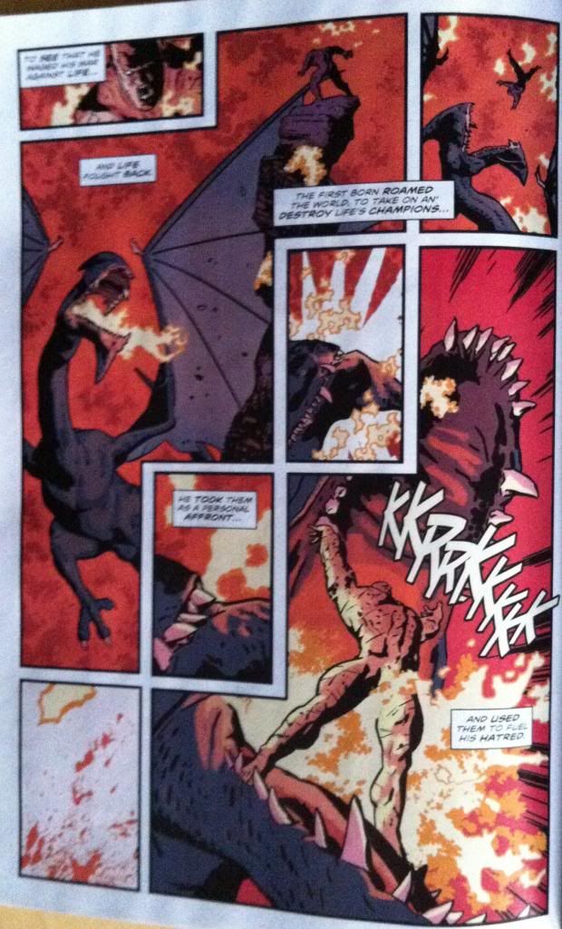
The First Born special makes use of a bunch of deceptively simple, but really effective page layouts. This page is probably my favourite from the issue, because it is awesome but also because it's a great example of using the carriage return from top-right to bottom-left to enhance the effects of the page. 


The small panel in the top left is where we enter the page. Our vision is drawn down to the second narration box and then on to the mouth of the fire breathing dragon-monster thing. From there we progress to the next text caption and the First Born perching, nude, on the top of the stone column. (This narration caption, incidentally overlaps with the next panel, acting as a temporal bridge to the next panel, which is pretty cool.) This brings us to the top right hand panel that depicts the First Born diving into the dragon's mouth, a motion that is continued rapidly down this parallel through the next three panels. We see the First Born dive, then swing our eyes along the path of his dive, to see the dragon swallow him, slowing our path on the next narration caption to lengthen the dramatic beat of the Dragon holding the First Born in its mouth, before we carry on to the fiery explosion in the bottom left panel of the page. We then move our vision up and to the right, again along the path of motion, to see the First Born burst out of the Dragons mouth and final narration caption. This panel transition works doubley well because the rapid, panel framed, cross page parallel works to corral our vision so that the final panel explodes into our focus in a dramatic reveal. This is a great page that showcases some of the very cool things that can be done in the carriage return. 

Another of the nifty comics techniques on display in the First Born is the use of colours. 

The First Born's scenes, particularly those that depict martial triumph are done with a heavy red background. Red, a colour of blood and fire and passion and violence. It emphasizes the First Born as a dangerous and powerful dude through colour alone.


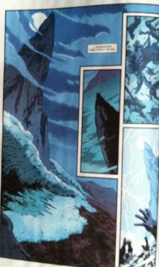
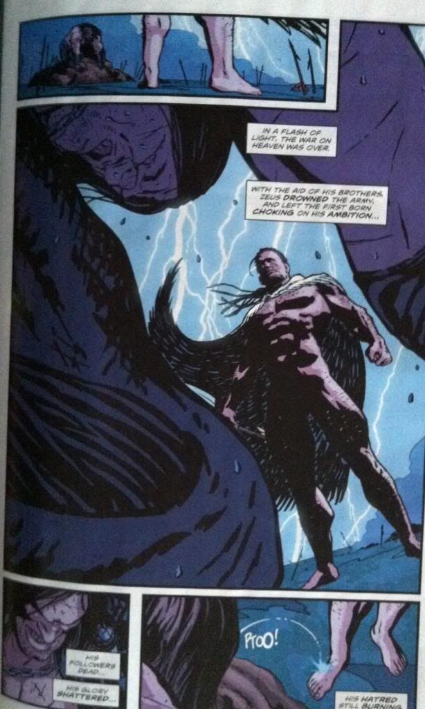
Meanwhile, scenes of the Olympian gods, particularly Zeus, are done in bright, firece blues. The kind of bright blue that is of electricity and the sky. The kind of blue that comes from the hottest and most exotic flames. It emphasizes the power and otherworldly nature of the Olympian gods.

The blue/red contrast also beautifully sets up the emotional conflict of the First Born versus the Olympians. The colours are dramatically opposed, they cannot coexist peacefully. The colours also, I think, establish how much greater the electric blue power of Zeus is when compared to the red, terrestrial power of the First Born. It's a really smart, really great use of colour.

So, there you have it, the First Born special is a great comic in a great series.


Friday, 23 August 2013

Deep Sequencing: The Male Gaze In 100 Bullets: Hang Up On The Hang Low

Or the self-aware use of sexualized imagery to service story in 100 Bullets: Volume 3.
By Brian Azzarello and Eduardo Risso; Vertigo Comics


100 Bullets is a pretty ugly comic. I mean, it's exquisitely drawn by Edurardo Risso, but the comic is full of terrible people doing godawful things in horrifying ways. Despite how entertaining and smart it is, 100 Bullets is a WILDLY problematic comic in a LOT of ways.

One of the more striking ways 100 Bullets is problematic is in its portrayal of women. They really get the shittiest end of the shitstick and have all kinds of dramatically terrible things happen to them. They are also portrayed in a VERY sexual, very objectified way. Eduardo Risso is a master of the male gaze: drawing attractive women with fantasy proportions and then framing panels to highlight the bejesus out of them. It's complicated and problematic and skeevy and sometimes hard to reconcile with the story. I mean, I think the over-sexualizing of women in the comic is about deliberately creating a certain transgressive atmosphere of hyper-violence and hyper-sexuality... But maybe Eduardo Risso just likes to draw beautiful, fantasy women in dangerous situations? Regardless, it's a facet of the series, and it's one that I have a hard time reconciling myself with or really understanding completely within the context of the comic. It is not my favourite part of 100 Bullets.

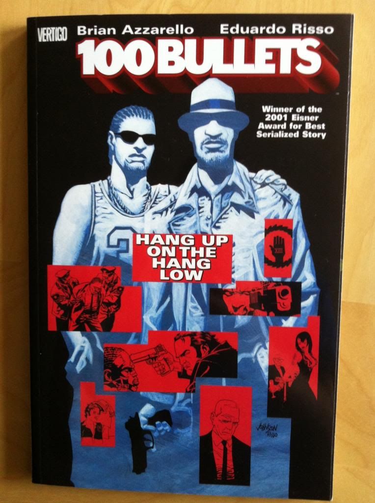
However, there is one chapter of 100 Bullets where the male-gaze objectification of a female character is used in this really self-aware way and in service to the story. This is in the third collected chapter: Hang Up On The Hang Low.

This post will deal with extensive *SPOILERS* to this chapter of the comic. So read it first.


In this section of the story Agent Graves, the shadowy purveyor of Revenge, gives Loop, a young black man, a clean gun, 100 untraceable bullets, protection from law enforcement, and information as to where he can find his deadbeat father. Loop tracks down his father, an enforcer for a local crime boss, and rather than kill his dad, he joins him in the family business. Unfortunately things go sideways, Loop's father is murdered, and Loop decides to kill the crime boss responsible. It's a neat character study, revenge scenario, and like all of 100 Bullets, arresting comics.


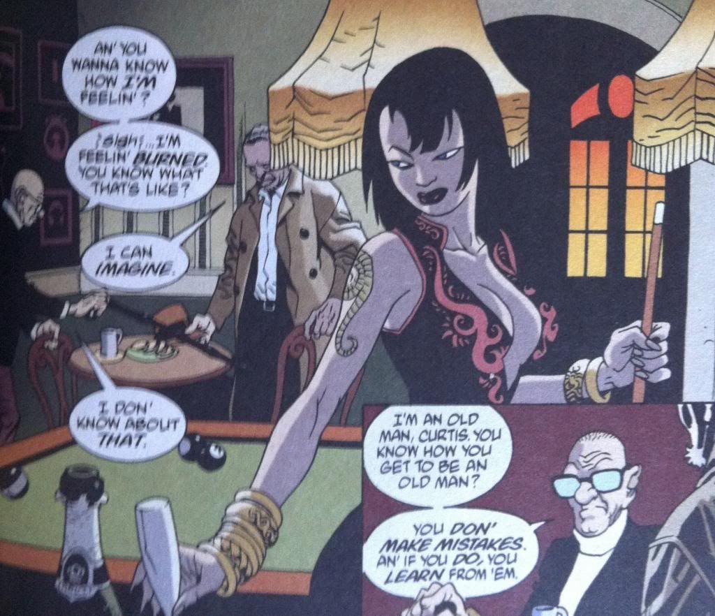
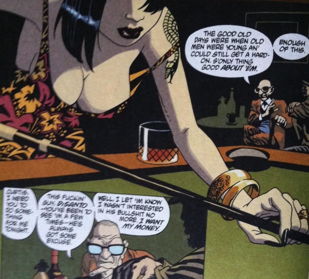
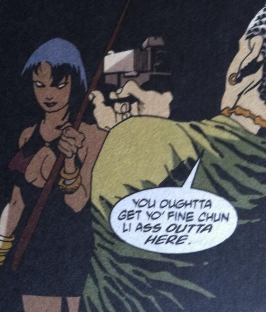
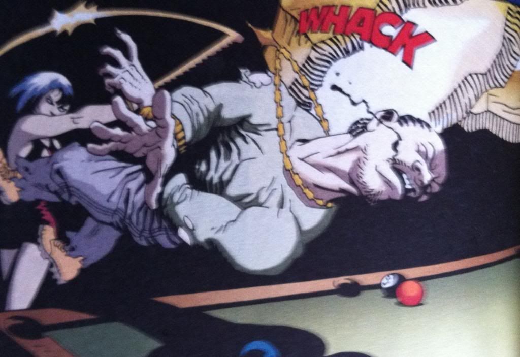
One of the cooler aspects of this comic is how the male gaze, using image framing to show off sexy body parts, is used to sexualize the asian woman playing pool. I mean the first time you see her, based on her dress, how the comic frames her, and the context of the situation, you make some assumptions. I mean, this young woman is wearing provocative clothing, playing pool alone in a room with a little old man who is a crime boss and within the context of the story holds all the power. Moreover, the comic artwork focuses on her breasts and places her in the background, disinterested and silent, like, to borrow a DeConnick-ism, a sexy lamp who really likes Billiards.  So we all assume that she is most likely there to be eye-candy for the creepy crime boss, or a sexual plaything, or something equally fucking deplorable and exploitative.


Which makes it so amazing and surprising when she turns out to be a bodyguard. We, and Loop, and make the assumption she is a sexy lamp, and then BAM we find out she is really a stonecold shitkicking motherfucker. This comic has used the male gaze to cause us to make assumptions based on gender roles and appearance which leads us to underestimate this character and disguise her true role in the story. And this is pretty self-aware and effective use of the male-gaze to actually drive a story instead of just glorify in smut, and it makes the point that we should check our assumptions when it comes to sexuality and gender. It's cool comics.


I mean, there is still a lot of problematic male gaze use in 100 Bullets, but this particular example, I think, is pretty great. (But you know, still problematic, which is pretty much how all of 100 Bullets works.)


Previously:
Deep Sequencing: Guilt and Crime Comics

Wednesday, 21 August 2013

So I Read 100 Bullets

A 250 word (or less) review of 100 Bullets, the complete series
By Brian Azzarello and Eduardo Risso, Vertigo Comics


What would you do with the perfect opportunity for revenge? 100 Bullets, in its earliest chapters, asks just that question when the mysterious Agent Graves gives characters lurking on the edges of society a briefcase containing a clean handgun, 100 bullets of untraceable ammunition, incontrovertible proof of a perpetrators guilt, and the promise of no repercussions. From these grisly, intense moral experiments, 100 Bullets grows into an immense and convoluted crime epic about the power of the shadowy Trust, broken by greed and ambition and guilt, and the horribly flawed enforcers whose job is to referee it. In many ways 100 Bullets is a comic of flaws: horrendously, glorious flawed characters performing flawed and reprehensible acts, for reasons that are equally disgusting and flawed. It is an absolutely brutal read, that, I think contains within it, amongst the shock and violence, some truly remarkable and sublime moments. Brian Azzarello delivers an unrelenting script that never shies from going to the most uncomfortable and tragic places; it is a brave and audacious story. Eduardo Risso, meanwhile, is a goddamn genius. His artwork, this minimalistic cartoon line, has such beauty and elegance of composition to it, and yet, renders such brutality and evil with such ease. It is worth the price of admission alone. That said, 100 Bullets does have some flaws itself: some creative decisions treat groups of characters, particularly women, in spectacularly shitty ways that are wildly problematic. 100 Bullets is a gloriously, horribly flawed comic that you should read. 

Word count: 250


Friday, 24 May 2013

Spinal Tapestry 3: Reading Rainbow

Or the under-appreciated art of comic book spines

Book spines are, I think, the most overlooked component of book design in collected editions of comics. Whether because of all the emphasis placed on cover pages or the comic industry's infatuation with staple bound invertebrate single issues, comic spines don't generally get the love they deserve. Which is a shame, because in most settings, be they home bookshelf or retail bookshelf, the comic spine is the only part of the comic visible. Ignoring this portion of the comic's exterior hurts a print comics value as an art object (which I think is one of the key value-added features of the print format) and probably has an adverse effect on a comics retail performance. Paying attention to it can make comics look great and stand out from the crowd.

When dealing with long comics series in collected editions, I think one of the key design choices that can really improve the look and visual impact of a series is a unifying design. By tying individual books together with common elements, a series gains an identity and becomes instantly recognizable as an aggregated whole. Generally, one of the keys to this seems to be choosing a few colours to give the comics a harmonious relationship. By wildly varying spine colours, you can pretty much ruin the look of a series.
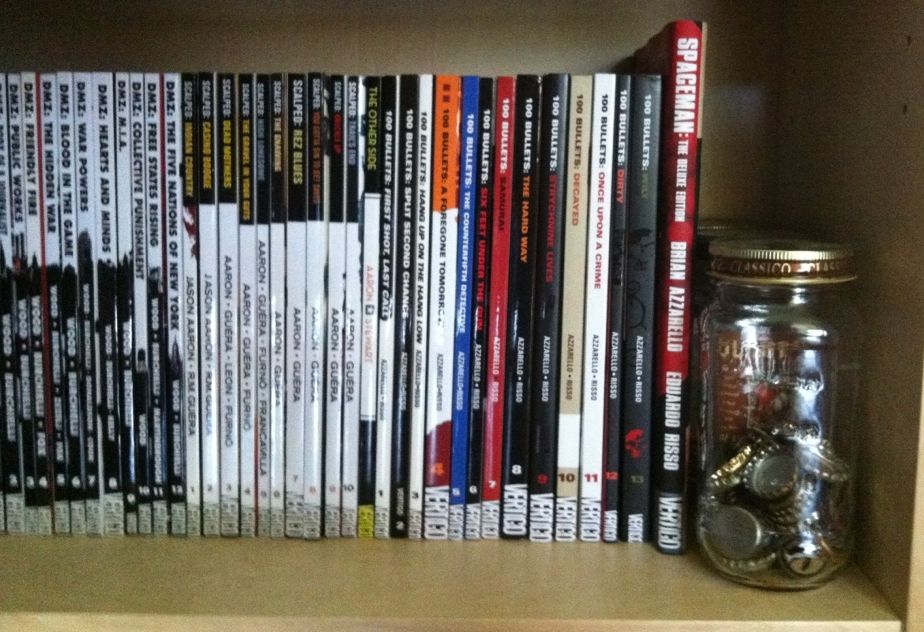

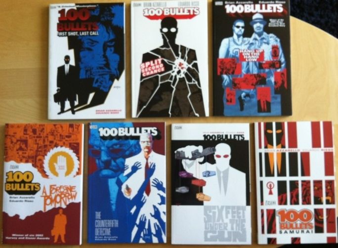
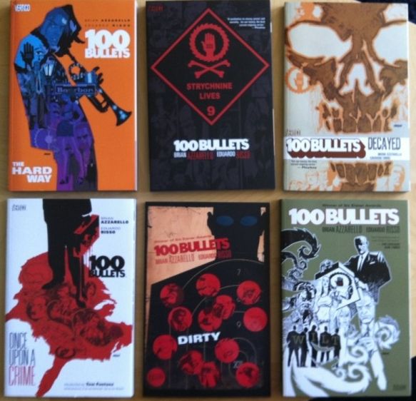
100 Bullets, by Brian Azzarello and Eduardo Risso,  is a fantastic crime comic about the opportunity to avenge injustice wrapped in a grand conspiracy. The interior of the comic is gorgeous, absolute brutality drawn with precise elegance by Risso, and the covers of the series (including these collections), by Anthony Johnson, are perfect. That said, the spines of this series are terrible. It seems the choice was made to make the spines of the 100 Bullets collections entirely dependent on cover art, which makes the spines lack identifiable common elements or common colours. When put next to the clean, unified design of Scalped, or the brilliant design of DMZ, 100 Bullets looks like a mess of random comics instead of a lovingly appointed series. And I think it's shelf presence suffers for that.


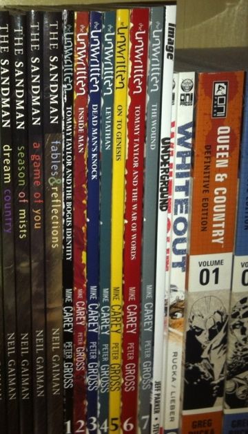
The Unwritten, by Mike Carey and Peter Gross, is a great comic about the power of literature to affect society and people with the bourgeoning power to tap into it. The Unwritten is also another comic with great interior art and superb covers, by Yuko Shimizu, but poor spine design. The Unwritten makes that fairly common mistake of giving each edition its own colour to make a rainbow effect. The problem is that this breaks up any cohesion over the entire series and doesn't really tell us anything about the identity of the Unwritten. Varying colours like this is almost never the best choice.


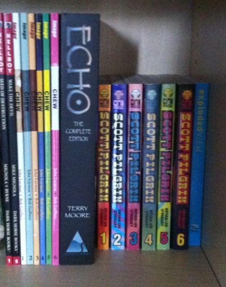
But like all rules there are exceptions. Scott Pilgrim and Chew are two comics that absolutely break what common sense suggests is good book design. They use bright, obnoxious colours that change and clash between books. And while they do maintain common elements between books (Chew's cutout and Scot Pilgrims weighty logo), their overall look is just garish as hell. The thing is, this WORKS for these comics. Chew, by John Layman and Rob Guillory, is an insane comic about people with mental food powers solving ridiculous food crimes: the plot is crazy, the art is bombastic and cartoony, and the aesthetic of the book is frankly pretty garish. So a cover spine design that clashes between issues and uses bright, cartoony colours completely sells the identity of the book. Similarly  Scott Pilgrim, by Brian Lee O'Malley, also has a cartoony look and bombastic style. Scott Pilgrim is a comic about being brave enough to love while being an adrift 20-something, and has a style influenced by manga and 1990's video games that is just really inviting and fun. The spines of the Scott Pilgrim books, with their garish bright colours, manga-ish book size, and pixelated logo font absolutely evoke the visual identity of the book. What I am saying, basically, is that these comics, by having insane cartoony spines,  are able to convey their visual identity instantly. And that is, I think, the core of book design.

Previously:
Spinal Tapestry 1
Spinal Tapestry 2
Wednesday, 1 May 2013

So I Read Spaceman


A 250 word (or less) review of Spaceman
By Brian Azzarello and Eduardo Risso, Vertigo Comics


Spaceman tells the story of Orson a, well, Spaceman: a hulking, Neanderthalesque person genetically engineered to survive the deleterious effects of a manned space mission to Mars. In his inner life Orson fantasizes about the future he was meant to have; the mission to Mars with his Spaceman bruddas. In real life Orson lives a solitary life salvaging scrap from a global warming sunk metropolis, living in poverty, and speaking in a pidgin of broken English and text messaging. That is until he encounters Tara, a stolen child star of the hit realtee program The Arc, which drags him into a cut throat world of kidnappers, criminals, bounty hunters, and realtee producers. Basically it's an exciting crime comic set in a dystopian future. But Spaceman is also a cautionary tale.  The comic makes a pretty provocative statement by contrasting an ideal future where we send genetically engineered supermen to Mars with a decidedly shitty one built of our brainless devotion to media, our growing quasi-literacy, our entrenched economic inequality, and our complete inability to curb a brewing ecological disaster. The fact this ideal future only exists in the head of someone living in the shit future feels like a rather scathing indictment of our society. Suffice it to say Azzarello has written one tight and thoughtful book. Risso, meanwhile, draws his beautiful and expressive cartoon artwork with an elegant brutality that matches the script. Spaceman is well worth checking out.

Word count: 240

Friday, 19 April 2013

Deep Sequencing: Guilt, Culpability, and Crime Comics

Or how Criminal, 100 Bullets, and Scalped implicate the reader to generate a guilty response.
Comics by Ed Brubaker and Sean Phillips, Brian Azzarello and Eduardo Risso, Jason Aaron and RM Guerra with others.

I really like Crime Comics. There is just something about the gritty, intense world of people living outside the law that is endlessly fascinating and shockingly entertaining. Now there are probably endless reasons why these comics are so compelling... but looking at some of my favourite examples I think I've figured out one of the genre's key genetic elements.

Guilt.

Guilt is an emotion that I have a complicated relationship with. Whether its competent parenting, a Roman Catholic education, or some fluke of genetics I feel an overwhelming and insistent sense of SHAME whenever I think of certain mistakes I've made. Just writing this I'm probably turning a bit red. My point is that for me guilt is an exceptionally powerful emotion. It's a thing I feel deep down in the bowels of my stomach, something that chills the skin and tightens my back and gives me the weirdest sweats. It's lurid and disgusting and probably one of the handful of strongest emotions I feel.

And the best Crime comics make me feel guilty in spades.

(I've tried to keep this *SPOILER* light, but you know, procede at your own peril.)


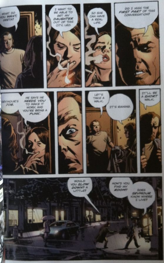
Criminal is the absolutely masterful Crime series by Ed Brubaker and Sean Phillips. Criminal is not so much a series of Crime stories as a WORLD of crime stories populated by granular characters living in an uncompromisingly realized world. You don't so much read these comics as visit them and get blood and grit all over yourself. And part of what makes this experience so engrossing is how Brubaker and Phillips use guilt and culpability.

One of the key components of the Criminal forumla to me is perversely abused empathy. Most of the protagonists in the Criminal stories are, despite their flaws, immensely likeable. Despite knowing that these characters are thieves and thugs and murderers we end up sympathizing with them despite ourselves. This sympathy slowly turns to empathy and we soon find ourselves actively rooting for our protagonists to succeed at whatever their unlawful enterprise is. As the story unfurls, best laid plans are ruined, and the terrible consequences of the protagonists choices become clear we see the fallout of what we wanted. We realize we too are culpable: by actively rooting for the lead character we have become accomplices. And therefore we feel the lurid weight of guilt.


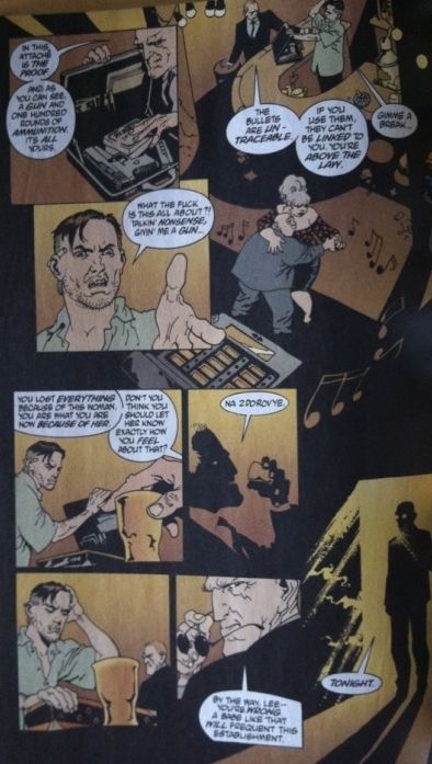
100 Bullets is another great Crime comic by Brian Azzarello and Eduardo Rizzo. Filled with intrigue, conspiracy, murder, and some of the most aggressively flawed characters I have encountered, 100 Bullets is a sprawling comic that revels in the excesses on the edges of society. It's mercilessly written and filled with horrendous images rendered by the exquisite, and beautiful line of Eduardo Risso. But, at the end of the day, one of the most brilliant things in this comic is 100 Bullet's opening premise and how effectively it evokes guilt in the reader.

Throughout the introductory chapters of 100 bullets we see the shadowy Agent Graves approach characters with a brief case and an opportunity. Inside this briefcase is a clean handgun, 100 bullets of untraceable ammunition, and incontrovertible proof that someone who has deeply wronged the character receiving the briefcase is guilty. With these items comes the promise of total immunity from prosecution if said character decides to act on this opportunity  The character then invariable pursues this chance for vengeance in some way and carries through the morality experiment to some sort of conclusion. As a hook it's absolutely perfect.

This premise is also an absolutely perfect way of nabbing the reader and making them culpable in the protagonists decisions. When presented with the scenario, carte blanche to enact justice and the reality of the crimes committed, we can't help but game it out for ourselves. What would you do in the characters' shoes? Would you kill the guilty person if he had you falsely imprisoned? What if he murdered your wife? Raped your daughter? Or could you stop yourself out of some higher moral obligation? By mentally playing these situations out and deciding that vengeance is justified we become just as guilty as the character in the comic when they decide to go through with it. And in doing so, the consequences of their actions become the consequences of our own decision. And so we feel that lurid weight of guilt.


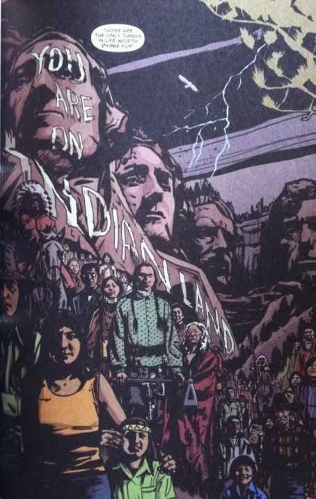
Scalped is another astounding Crime comic by Jason Aaron, RM Guerra, and various collaborators (art above is by Jean Paul Leon). Scalped tells the story of crime on an American Indian Reservation. It is easily one of the most tense, brutal, and heart-pounding reads I've ever enjoyed. It also contains one of the most effective and intelligent uses of reader evoked guilt in comics.

Let me explain. If you are a North American who isn't a full-blooded aboriginal (First Nations if you're Canadian) then you are heir to a pretty awful legacy. We are, all of us, living on land stolen from the people who inhabited it. People who our governments and ancestors swindled, crushed in wars, and basically attempted to commit genocide against. (HBC, Canada's oldest company sent smallpox laced blankets to Canadian First Nations... for instance.) And even after killing the majority of these people and displacing the rest, we, as a society, attempted to wipe out their culture. As if all of this wasn't disgusting enough, we still treat North American aboriginals horrendously, leaving them in far too many cases disenfranchised, marginalized, and impoverished. It's fucking disgusting, and to a certain extent we are all complicit in this. We are all of us guilty.

The thing that Scalped does, beyond displaying how horribly we have betrayed these people, is frame the events portrayed in relation to our guilt. Basically, every awful thing that happens in Scalped is our fault: the situations, the poverty, the desperation  everything is a result of the sins of our past. And so for every crime, every murder, every horrendous thing in Scalped we are all preemptively guilty. And for that reason we experience a much more intimate, visceral, and immediate feeling of guilt. It's hugely effective.