Monday 30 December 2013

Pondering About Pretty Deadly #3

Or more Holy Shit artwork and moments from Pretty Deadly #3
By Kelly Sue DeConnick, Emma Rios, Jordie Bellaire,Clayton Cowles; Image Comics


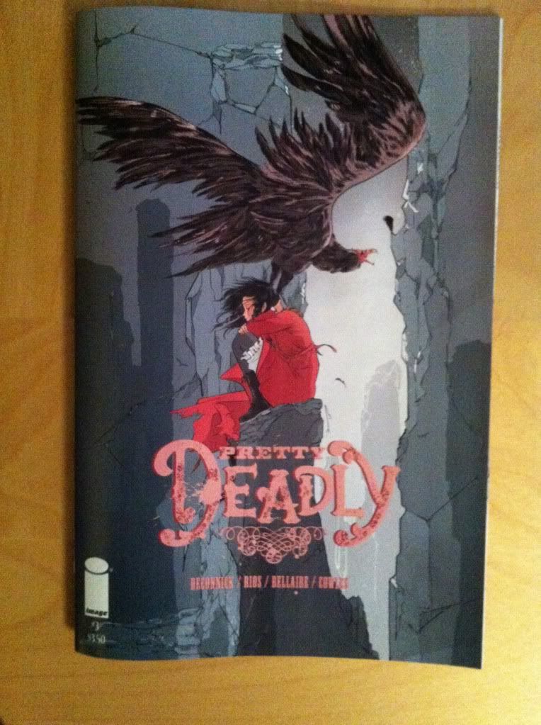
Pretty Deadly continues to be a pretty mind explodingly good comic filled with awesome artwork and cuss-out-loud moments of storytelling. Pretty Deadly #3 is very much a comic worth taking a closer look at, and since the approach of working through an issue's Holy Shit moments and artistic highlights seemed to work alright last time, I'm going try that again. That said, Pretty Deadly #3 works as the issue that sets the stage of what I think may be the ongoing conflict of the series, and two Holy Shit moments are pretty important revelations so this review is going to be VERY *SPOILERS*.

Seriously folks, if you haven't read Pretty Deadly #3 there will be fury-inducing *SPOILERS*. If you have never read Pretty Deadly and want to gauge if the series is for you, this post is Spoiler free, and this more indepth post is Spoiler-lite. Okay? I would absolutely hate to ruin some of the surprises in this issue for you...


If the second issue of Pretty Deadly was defined by a symphony of violent beauty, Pretty Deadly #3 is governed by surprises and brutally effective sequences of conversation or exposition. This short sequence here is a good example of this issues approach to dialogue exchanges and how these conversations are these beautifully layered constructions of art and writing. 

From a writing/script perspective this exchange here is pretty damn cool just from the dialogue: 


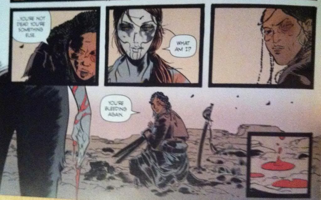
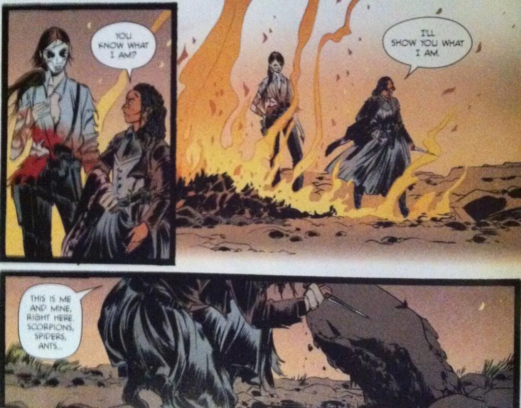
            Sarah: "...you're not dead. You're something else."

            Ginny: "What am I?"

            Sarah: "You're bleeding again."

Even without any artwork or accompanying exposition or description, these three lines of dialogue convey a huge amount of information pertinent to the character of Ginny and Sarah, how they relate to each other, and is badass in a way that is very much the tone of Pretty Deadly. As much as I might focus more on elements of artwork or plot in these reviews, the dialogue in Pretty Deadly is amazing in and of itself and is fundamental to my enjoyment of the series. It's really, really good.


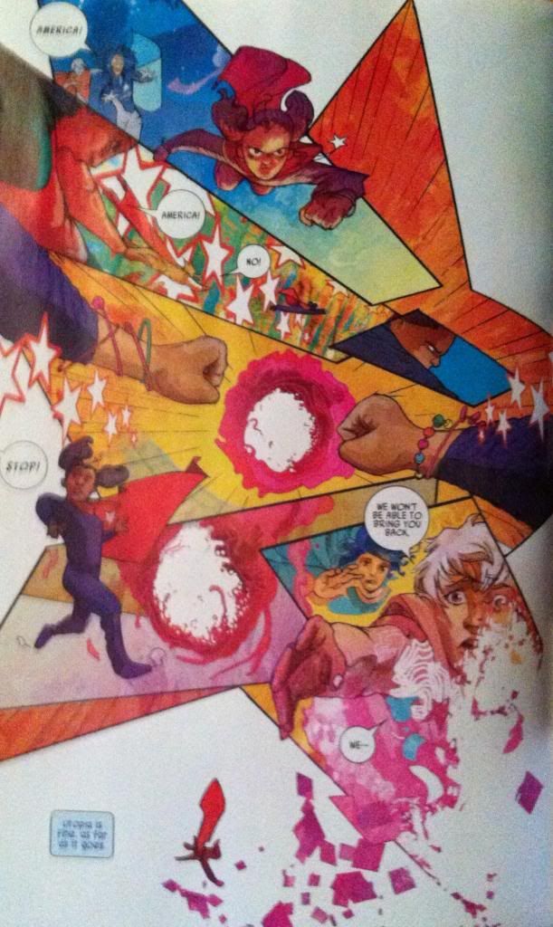
This dialogue, as good as it is, is coupled seamlessly to artwork that enhances every aspect of the exchange. The way the composition, colouring, and dialogue box placement leads the reader through this sequence adds enormous weight and characterization. The first two panels emphasize that Sarah is stooped and kneeling while Ginny is standing and conveys the power differential between the characters and the fact that Ginny has control over the situation. However this is undone in the third panel where Sarah draws herself up, with a look of defiance, and places herself compositionally on the same level as Ginny in the preceding panel. We visually see Sarah reject the power dynamic in the preceding panels. The artwork then takes us across the page to the fourth panel in reverse order (right to left) so that we read the "bleeding" dialogue before we see Ginny's hand with its bright flash of red blood. This is nifty for a couple reasons: it places defiant-Sarah in the third panel above the bloody hand, implying that her defiant strength is tied to her realization that Ginny is bleeding. It's also a cool bit of layout as it draws our eyes to Ginny's wrist so that our eyes can traces the red streams of blood down to her hand: we get to experience the blood running down her arm. It's great.

Another cool feature of this page is the isolated fifth panel of the blood dripping onto the ground. Due to it's corner position it is somewhat isolated from the rest of the sequence which gives it a certain remoteness and significance. It's also almost a panel form the tarot image banner that Sissy and Foxy use to tell stories: it seems to emphasize that the blood is the most important take away from this page. Ginny for all her badassery is mortal.

The thing about this sequence that is maybe more remarkable than the quality of the script or artwork alone is just how efficient it is. In five panels we learn a really impressive amount of information about Sarah and Ginny in a really interesting way. Ginny is cemented further as an exceptionally tough woman since she had to have it pointed out by another character that she was bleeding pretty profusely.  We also have it directly emphasized that Ginny is mortal: she can be hurt and she can be killed. We also get the impression that Rachel is herself a properly steely character as, even after seeing the violent power of Ginny, she still draws herself up in defiance, deduces Ginny's vulnerability, and manages to grunt out some bravado. This sequence also conveys a bunch of information about the relationship between Ginny and Sarah: it shows that while Ginny is in control, Sarah has no intention of remaining in her power. All of this in a minor sequence of five panels. 


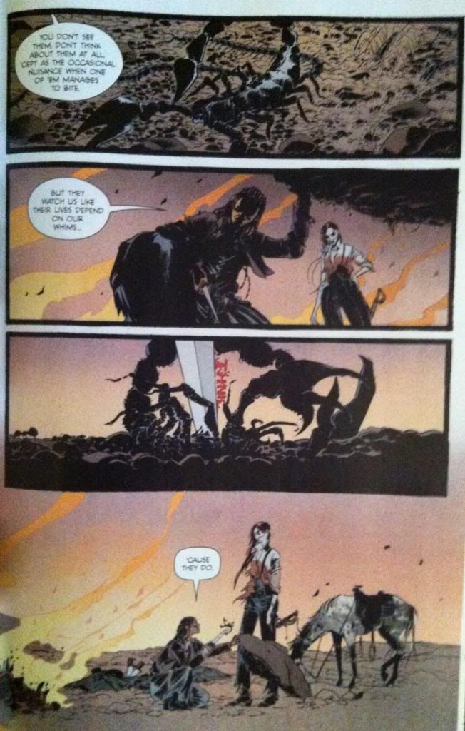
This big, long sequence contains Holy Shit Moment #1 and Holy Shit Moment #2 and perfectly encapsulates what I love about this series. It's brutal and beautifully drawn, the dialogue is intricate and complicated and just when the story seems to be going a certain way, it turns and rears unexpectedly in absolutely guttering directions. It's absolutely virtuosic comics and emblematic of how good Pretty Deadly can be.

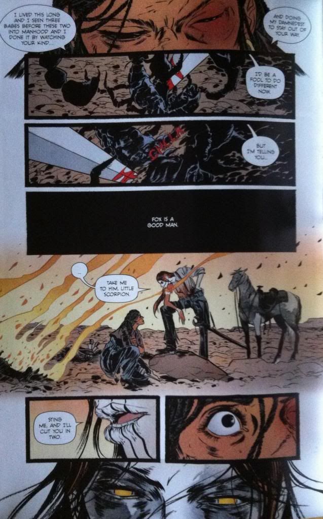
This extended sequence contains what I think is my favourite run of dialogue in Pretty Deadly to date. It starts with Sarah comparing herself to a bug at the mercy of a human, suggesting that the humans of Pretty Deadly are under tremendous threat by the whims of Ginny and the other supernatural elements of the comic. She stabs a scorpion to emphasize the point, which for me, is Holy Shit Moment #1. As a metaphor, it is brutally direct. This sequence than continues with Ginny AGREEING and using the metaphor to threaten Sarah into cooperating. It is Ginny argeeing that she is a merciless, godlike monster who views Sarah as a potentially useful bug. Which is Holy Shit Moment #2.

But beyond being a masterstroke sequence of dialogue and plot, this series has some really interesting comics going on in the artwork.


There are an absolute ton of small, elegant touches throughout this sequence. For one, the way the composition leads the eye through the stabbing and cutting of the scorpion so the eye darts along the path of the blade is brilliant and visceral. Another fantastic element are the flames burning in the background throughout the composition, which add an atmosphere of ruin and quiet menace to the entire sequence. And then there is the size differential between Sarah and Ginny throughout the sequence: Ginny is consistently portrayed looming over Sarah as a very clear visual signifier of their difference in power. It's just absolutely brilliant comics.


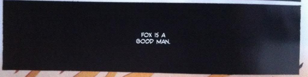
But I think my favourite thing about this sequence is this panel of dialogue here. From a story perspective, this panel has a black background as Ginny has kicked back over the rock the scorpions and bugs live under, so it conveys a nice bit of story information between panels. But what is brilliant about this panel is that the idea it contains, that "Fox is a good man" is portrayed in black and white. It is portrayed as an absolute. Which implies that Sarah, who says this, absolutely believes this idea. But, since we can't see Ginny listening to this statement this panel implies that she is deaf to it: Sarah is expressing this idea into a vacuum. What I love about the use of black and white here is just how solid and binary it is, its an idea you accept or an idea you reject and the fact that Sarah believes it and Ginny does not seems as if it will be the crux of their conflict. And this is all encapsulated in this single panel. Love it.


This sequence here is really great, largely for how it leads the reader so seamlessly through the composition and builds so much force and drama into every moment. The way the artwork captures the motion of Sissy crashing in a huff or spectacularly builds up the moment and explosive motion of Fox punching the rock face is great comics. The layout guiding even manages to capture the motion of Foxy's unstable stumble following the punch. And then the final three panels in the series beautifully and succinctly captures the emotions and status of all of the characters following the rage-punch. It's a really dramatic and efficient page.

Okay this next bit is going to be ginormous *SPOILERS* so please stop now if you haven't read the issue yet or if you are tradewaiting.


So the *SPOILER* intensive next section of the comic is the story of The Mason (the cuckolded husband of The Beauty who was the mother of Ginny). This section builds to a dramatic revelation which is Holy Shit Moment #3 and makes use of some really cool comics along the way.

This page here features one of the cooler mechanics at play during this section which is that Sissy is actively painting the story of The Mason, as related by Foxy, in the style of the Tarot images used for The Song of Death Face Ginny during a sudden rainstorm. This is kind of magical: it's a comic literally being made by a collaboration between Foxy and Sissy within another comic. And the way this process engages with the narrative and the fact that Pretty Deadly is itself a crafted comic leads to pretty interesting quirks. For instance, the two drawn panels in the middle third of the page: they depict The Mason holding his dead wife and deciding to die with her followed by another panel where the rain washes it away. This is a panel Sissy drew made of fantasy that is undone by the flow of reality. And then both of these panels are contrasted with the pose of Foxy immediately below them as he crouches on the ground in what can only be described as FORESHADOWING. (Incidentally, this is when I went "oh fuck, is that what's going on...?")

This page also features another really cool decision, which is the placement the panel about digging at the very bottom of the page, under the level of the ground. It's a panel about digging that is literally buried in the composition. It's a small, but very effective choice.


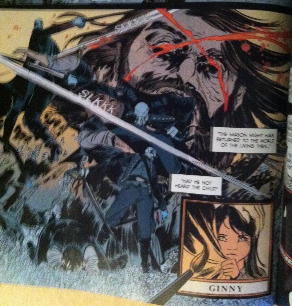
Foxy's story of The Mason eventually brings us to the *SPOILER* intensive Holy Shit Moment #3: Foxy IS The Mason. This fact is so brilliantly, brutally, obviously perfect that it is amazing. It explains so much of Ginny's motivation and Foxy's behaviour and adds a cord of dramatic connectivity to the entire series. It is also depicted on another amazing page that shows more of Pretty Deadly's trademark elegant composition in convention straining chaotic violence. This sequence of the blinding of Foxy/Mason by Death swirls about with seeming abandon, with Death and Foxy/Mason appearing almost randomly around the page in front of the giant, agonized face of Foxy. But closer inspection reveals a carefully arranged set of guides that steer the reader effortlessly through the chaos with the speed and exactness of Death's sabre: it's great comics.

It is also a pretty interesting sequence because of the contrast and similarities between the action/motion of Sissy's brush strokes and the strokes of Death's sabre. In the same way Ginny slashes her brush across say, Ginny's face in the last panel to draw a strand of hair, Death slashes across Foxy/Mason's head to carve the blinding X into the man's face. Which leads to a bunch of interesting ideas, like, what is the relationship between creation and destruction? Or what are the differences between enacting and depicting violence? Or, if we take things a little wider and look at the role of Team Pretty Deadly as slashers of pens and brushes, what is the relationship between violence and the creation of imagined violence. Pretty Deadly is a very thematically dense and complicated comic.

As dramatic and satisfying a revelation as Foxy's true identity is, it pales in comparison to how cool and amazing the revelation that comprises Holy Shit Moment #4 of the comic. But this moment is too perfect, too important to ruin here on the internet. So you will have to go and read Pretty Deadly #3 if you want to experience it. Which you should, because Pretty Deadly #3 is amazing.

Previously:
Pretty Deadly #2: Holy Shit Moments depicted with Holy Shit artwork
Pretty Deadly #1 pt. 2: The Song of Deathface Ginny
Pretty Deadly #1 pt.1: Breaking Rules

Friday 27 December 2013

Favouring The Young Avengers #14

Or looking at the use of panel shape in Young Avengers #14
by Kieron Gillen, Jamie McKelvie, Matt Wilson, Emma Vieceli, Lee Loughridge, Christian Ward, Annie Wu, and Jordie Bellaire; Marvel Comics


Young Avengers #14 is the first half of an extended "Resolution" to the series. It wraps up some loose ends and begins the unenviable task of providing some closure to a really remarkable series. It's a great issue, but difficult to talk about as it feels very much like a portion of a larger statement. 

So in lieu of a premature series retrospective, I'd like to use Young Avengers #14 to explore how panel shape can be used to enhance storytelling because the issue has some really nifty examples. 

There will, as always, be *SPOILERS* beyond this point. So be wary.

Specifically I want to talk about the America Chavez section of the issue drawn and coloured by Christian Ward. Ward has a really distinctive approach to artwork that makes really interesting use of colour and shape to convey additional story information. And it is completely worth taking a closer look at.


This page here has a bunch of interesting transitional elements. The page starts in the present with realistic, mature artwork that uses very structured panels and gritty, natural colouring, but transitions into a flashback sequence featuring America's childhood which is defined by a looser, more childlike style and a riot of brilliant colours. The change in colour and style clearly marks the difference between the flashback and present day sections of the comic and beautifully sets a tonal shift from the cynical, worldly perspective of grown up Chavez and the more joyful, naive perspective of young America. I also especially love the triangular fifth panel on this page showing the closeup of America's eyes. This panel makes a great use of shape here: the panel seems to be an arrow that points at what is happening in America's mind. It's a great way to effect the story transition that occurs between the fifth and sixth panels.


This page here has another pretty great use of shape. In this case the page uses a round panel in the centre of the page to add dramatic emphasis to the HOLE IN REALITY featured in the centre of the panel. It's as if the hole in the centre of the panel is a singularity pulling at the very fabric of the comic and warping the square panels around it into its orbit. It suggests that the hole in reality is vastly important to the larger story of America's childhood (of which we only get a glimpse) and really cements it as a focal point of this page and this section of the comic.

(Also notice the use of the Demiurge colour scheme around the hole in reality? The recurrent iconography in Young Avengers is pretty amazing.)


This page here makes a subtle, but really effective use of shape as well. Essentially the dramatic beat of this page is Chavez being presented with a choice, with the majority of the page containing the exposition leading to the choice which is revealed on the following page. What I find so great about this page is that the expositional elements come to a point on America's head as she makes a decision. I think this is clever because it's as if all of the information that effects Chavez decision is projecting above her head and literally on her mind. It's also quite clever as the decision that Chavez makes at the end of this page is the crux of the America section of Young Avengers 14 and the layout of the page focuses in, and balances on this decision. It's subtle, but great stuff.


This page is the dramatic climax of the America story and portrays young America Chavez breaking through the hole in reality, leaving utopia and casting herself on the path that would eventually land her in the events of Young Avengers. And, since this is a sequence that uses magic (demiurge magic judging by the colours) the page contains a breakdown in the progression of comics reality. In this case the page loses its structured panels and instead is drawn into a star-shaped, whirlwind of comics chaos that ends with America Chavez falling right out of the plane of the composition and into the background. Great comics.

(Also, incidentally, I had always assumed the stars associated with America Chavez were a United States of America thing, but I wonder if they had, perhaps, been a nod to the Demiurge all along?)

Avengers #14 is another great issue in an outstanding series with a bevy of great artists working on wrapping things up. I'm going to miss this series when it's gone...

Previously:
Favouring The Young Avengers #13

Favouring The Young Avengers #12 (pt. 2)
Favouring The Young Avengers #12 (pt. 1)
Favouring The Young Avengers #11
Favouring The Young Avengers #10
Favouring The Young Avengers #8
Favouring The Young Avengers #7


Wednesday 25 December 2013

So I Read I Kill Giants

A 250 word (or less) review of the I Kill Giants graphic novel
By Joe Kelly and JM Ken Niimura; Image Comics


I Kill Giants is the story of Barbara Thorson, a girl who is obsessed with killing giants. She knows the giants are coming and that it is absolutely up to her to wield the mighty hammer Coveleski to slay her gigantic foes and protect her family from certain destruction. Barbara is also an elementary school student where she is a dorky, Dungeons and Dragons obsessed loner with a penchant for offending authority. And yet there is something else Barabara must deal with, another monstrous reality that she cannot face. And so instead she kills giants. I Kill Giants is a pretty heartfelt comic that tells a story that, like some sort of emotions singularity, just drags empathy out of you. It is also a pretty clever comic, balancing the opposing forces of fantasy and reality to sort of play with that fuzzy space inbetween in this pretty interesting way. I Kill Giants is a pretty fun comic too: the story has an energy to it, characters are vibrant, and Barabara is pretty hilarious. But I think the thing that nabs me most is that I found the comic eminently relatable. Shockingly, I was a pretty dorky kid who, before I found my peeps, leaned into the fictional world (your sci-fi, your fantasy, etc) to get through the special hell of the educational system. Now, my situation was nowhere as tough as Barbara's, but I get where she is coming from, in a way I too killed giants. Try it.

Word count: 249

Monday 23 December 2013

The Moon Is A Harsh Mistress Is A Good Book

Or why you should read The Moon Is A Harsh Mistress by Robert A Heinlein


There are some works of Science Fiction that are classic, baby, classic. And it's hard to get much more classic than Robert A Heinlein, and hard to get much more classic Heinlein than The Moon Is A Harsh Mistress. He is one of the big three early Sci-fi authors and The Moon Is A Harsh Mistress is considered one of his most important and best novels.

The Moon Is A Harsh Mistress is about the greatest revolution for independence in space. In the novel the Moon is the worlds penal colony, where criminals from almost every nation on Earth are sent on a one way trip to farm the lunar tunnels and send their produce back to a starving Earth. However, within the free folk of the Moon is growing dissatisfaction and the knowledge that the Loonies are losing precious, irreplaceable resources. And so a conspiracy is formed between  Manuel Garcia "Mannie" O'Kelly-Davis, a computer expert and local farmer, Wyoming "Wyo" Knott, a lunar freedom activist, and Professor Bernardo de la Paz, an elderly political exile to free the Moon from the control of Federal Earth. With the help of Mike, a sentient emergent intelligence living within the Lunar computer network the Loonies slowly build the conditions for a revolution that will pit the tiny Moon against the mighty power of Earth.

And it's easy to see why The Moon Is A Harsh Mistress is so well regarded. The way the Lunar revolution is rolled out makes a lot of sense and while there are Scientific inaccuracies within the book, the majority of the mechanics of life on the Moon and the Loonies revolutionary strategy is constructed with the precision of an engineer. Add to that the brilliance of the conversation about computer sentience and control at a time well before the emergence of computers and a really cheeky look at polyandry as a family model, particularly in a location with severe gender imbalance. There really is a lot that holds up in this novel.

Unfortunately, there is an equal amount about The Moon Is A Harsh Mistress that reads pretty poorly from a modern perspective. The most obvious issue it that this novel is wildly problematic. Robert J Heinlein has a world view that is very, very much shaped by his era: his gender politics are quite icky, the novel praises Ayn Rand, and a character literally uses Black-face as a disguise. While I don't think Heinlein meant to be malicious with these choices, it is really uncomfortable to read them. A less significant, but more systemic problem, is that The Moon Is A Harsh Mistress uses a kind of Loonie Slang that is mostly just English that is slightly ungrammatical. While it isn't disgusting, it is REALLY distracting and took some time to warm up to every time I opened the book.  So despite some great Sci-fi in it, The Moon Is A Harsh Mistress is a pretty flawed book.

I'd really only recommend this book to Sci-fi completists. I mean, there is certainly fun to be had with The Moon Is A Harsh Mistress, but I feel like there are enough better contemporary and classic Sci-fi novels that you could read instead. But at the same time, if you wanted to read all of Sci-fi's touchstone works, The Moon Is A Harsh Mistress would obviously be included.  If you are looking for a good Heinlein novel, I'd recommend Starship troopers instead.

Previously:
Starship Troopers

Friday 20 December 2013

Mindscan is a Good Book

Or why you should read Mindscan by Robert J Sawyer


Robert J Sawyer is kind of the master of using small human stories to explore really big concept, Hard Science Fiction. Mindscan is kind of a quintessential example of this kind of Robert J Sawyer novel. It's also, I think, a great litmus test book to see if you like his approach to novel writing. It's probably also a great book to read if you've never tried a Sawyer novel before.


(Incidentally it's the first one of his novels I tried).

Mindscan posits a future where the fabulously wealthy can upload their consciousness into android bodies to achieve a kind of immortality. Despite being a relatively young man Jake Sullivan, the heir to a local brewing empire, decides to undergo the process to escape a terminal, hair-trigger brain defect. The new Mindscan-Jake gets a new lease on life and meets Karen Bassarian, the Mindscan of an elderly author of a very successful children's novel series (a la Harry Potter). The two fall in love and try to build their new lives together. But when the flesh and blood Karen dies, her biological son brings a suit against Mindscan Karen for her wealth. And so the book becomes one about identity, both in the emotional sense and the legal sense... that is until the flesh and blood Jake wants his life back too.

I would recommend this book to any Sci-fi fan, everyone who loves the genre really ought to try at least one Robert J Sawyer novel. But I think this book could appeal to a wider fiction audience: despite the Sci-fi underpinnings Mindscan is also a love story and social drama that I think transcends genre conventions in a way that I think will appeal to a lot of general fiction lovers.

Previously:
The Neanderthal Parallax Trilogy 
Red Planet Blues 
Triggers
The WWW Trilogy

Wednesday 18 December 2013

So I Read Saucer Country: The Reticulan Candidate

A 250 word (or less) review of Saucer Country: Volume 2
By Paul Cornell, Ryan Kelly, David Lapham, Mirko Colak, and Andrea Mutti; Vertigo Comics


This review will contain mild *SPOILERS*. For a *SPOILER* free review of Saucer Country please go here.


Saucer Country is a comic series designed to prey specifically on my childhood fear of extraterrestrials, and it is pretty great. The Series follows Arcadia Alvarado, a democratic nominee for President of The United States, as she searches for the truth behind her alien abduction experiences. The Reticulan Candidate picks up well into the election cycle, with Alvarado and her supporters running the gauntlet of debates and primaries and campaigning in the public spotlight. Against this scrutiny the group is also continuing their search to uncover the truth about Alvarado's abduction and the broader truth about extraterrestrial visitors to Earth. The Reticulan Candidate adds some really compelling layers of complexity to an already very elaborate conspiracy and smacks us with some pretty great revelations and surprises about the ongoing story. It’s a fantastic second chapter. One of the greatest strengths of The Reticulan Candidate, and Saucer Country in general, is how well it manipulates its audience’s relationship with conspiracy. The comic is very aware that we are simultaneously skeptical of the most fantastic elements of the comic and demand rational explanations, while also deeply invested in the existence and story of the supernatural elements. The way The Reticulan Candidate walks the tight rope between disappointing us with mundane reality or disappointing us by embracing pure fantasy is brilliant. And in doing so, the comic really becomes this exploration of what conspiracy is, and how it preys on the belief of its faithful to exist. The Reticulan Candidate is great comics.

Word count: 250

Monday 16 December 2013

Favouring The Young Avengers #13

Or on the meta-layouts and meta-theories of Young Avengers #13
By Kieron Gillen, Jamie McKelvie, Stephen Thompson, Mike Norton, Matthew Wilson; Marvel Comics


Young Avengers! What is there to say that I haven't said already? The comic is clever, beautifully drawn, and full of draw dropping, medium challenging moments. It's a great comic that I like a lot. Young Avengers #13 contains the climatic scenes in a long running comic and, in the proud YA tradition, contains some pretty exciting story which is told using some astonishing comics. It also contains some more fodder for my critical theory of Young Avengers. So this post is going to take a look the innovative layouts in the comic, then change gears and do some meta-commenting.

There will of course be intensive *SPOILERS* for Young Avengers #13 and the series as a whole in this post.


Part of the magic of Young Avengers is how effectively team YA uses colours and iconography to quickly and obviously convey story information. This scene here, shows the climatic reconciliation of Teddy and Billy which serves as the inspiration Billy needs to go full Demiurge (translation for the non-YA fan: Get really, really powerful). This power up is represented entirely through colour and shape: the star has been a recurring shape associated with Billy's use of power and the red-shifted space scenes are the colours of Billy's costume and power. This giant, page commanding Billy-coloured star tells everything we need to know about the moment. Which is pretty great.

(Also, D'awwwww.)


So the big deal about Billy unlocking the power of the demiurge is that he gains the ability to use his magic to manipulate the very fabric of reality. In Young Avengers, magic translates to big, bold, rule breaking comics, and for something as monumentous as redefining reality, we get a doozy. In this case, we see Billy literally reach out and grab onto the panels that constitute reality and change things. (He has the whoooole world in his haaannndsss as my very religious relatives are won't to hymn.) We see the Mother-Parasite washed away in a wind of Billy-colour, and Billy-colour fires tear through the invading Firefly-monsters. It's a very straight forward visual metaphor, but damn if it isn't a satisfying and effective one.

(It's also a pretty great visual representation of what comics creators literally do: with their hands they create and manipulate the very panels of (comics) reality.)


And this is the climax of the climax of the comic and such a cool page hat it would be criminal not to take a look at it. From a story perspective this double page spread shows Demiurge-Billy looking at the recent shape of history/reality and musing about whether he should use his amazing new power to change the past to improve it. And, beyond any of the clever metaphorical or smart process choices on the page, this is just an oh my god amazing bit of comics. Look at it and embrace the awesome. Beyond being wicked cool, this page is also an insanely smart way to portray the concept of a being with godlike powers over reality in a comic. Again and again the Young Avengers has portrayed "reality" within the comic as conventional comics, normal looking panels and magic as the ability to affect these panels in interesting and rule breaking ways. And what could be more rule breaking than a character stepping outside the comic and reading his reality? What could be more powerful than the ability to reach in and rearrange and edit the panels, the reality building blocks, of the Young Avengers world? In the context of comics the creators are gods, and in this layout Billy is endowed with the perspective and power of them in a very visually dynamic way. It is amazing comics.

It's also technically great comics. The way the panels sit in the background is incredible, and the way Billy interacts with them, sliding the last panel of the previous page into place, and then maybe undoing the panels of the very beginning of the story are really great touches. We also see the repeated Demiurge-star motif with it's Billy-colour which is a great continuing symbol for Billy in godmode. But I think my favourite thing about the page is how effectively it leads us through the page. Practically speaking we have Billy swooping a complex zig-zag around a page with no borders or obvious sequence indicators in the foreground (and a sea of unrelated panels in the background). This could be a super confusing page to navigate. But a combination of Billy's perspective (he looks at the next Billy location), word balloons, and the trail of white/blue speckles provide all of the visual information to make moving through the page super simple. It's the basic machinery that makes this complicated, beautifully experimental page work in a way that is completely effortless. 


Oh and before I get to the meta-stuff, I just kind of want to point out how great the multicoloured blood is on Miss America here. The literal in story reason for it is that America has been punching the hell out of a aliens and mutants and monsters that bleed all kinds of different colours. But because Young Avengers is unapologetically meta, these colours, I think, have a dual role. I think they are meant to represent America punching comic characters so hard the artwork breaks. That the multicoloured splatter is not much blood, but the very INK of her foes torn from the page because she punched them so damn hard. Regardless, Miss America Chavez is a badass and this is a pretty sweet panel. 

Alright. Now the meta stuff. I have a theory about Young Avengers that centres around the idea that Loki is a stand in for the creators of the comic. (Part 1 of the theory is here, and Part 2 can be read here.) He is a reality and character manipulating liar god that wants to control the team for his own ends and is manipulating Mother (a stand in for the audience) for control of reality (the comic). And this issue has lots of fodder to fuel this theory:


Like he admits that he is behind the events of the series and that he is "improvising" the "tune" that the other characters are "dancing along" to. And that his interest was to "control the dance steps" of the "rules of magic". I mean, it isn't explicit, but pretty close, eh?


And then after Loki confesses to his guilt/involvement in manipulating events his subconscious stops generating the League of Evil Exes. Which, if you look at it in a certain way, is Loki writing the villains out of the story. 


We get to see Loki make silly/quippy wordplay at an inopportune time which is such a comic writer move. (Also, think about this in the most meta way possible: Gillen had Loki do silly word play, then Gillen went something like "Gee that was quite silly for this dramatic moment" and then decided to have Loki point out that what was just said was too silly. Magnificent.)


And in the end Loki writes himself out of the story.

Maybe at the end of the day that is the point of the meta-commentary on authorship in Young Avengers. Maybe the point is the creators need to take themselves out of the story (like Loki), with their goals and egos and needs, and just let the characters tell their own story (like Billy taking control of reality). That by letting the characters tell their own story the audience (Mother) can finally be defeated and by removing the creators from the story, critics (Leah) can also be sidestepped. And maybe this is the thematic conclusion of the Young Avengers story. Maybe...

Also, ZOMBIE KATE BISHOP!


Previously:
Favouring The Young Avengers #12 (pt. 2)
Favouring The Young Avengers #12 (pt. 1)
Favouring The Young Avengers #11
Favouring The Young Avengers #10
Favouring The Young Avengers #8
Favouring The Young Avengers #7

Friday 13 December 2013

Describing Daredevil #33

Or some nifty layouts that create big movements in small spaces in Daredevil #33
By Mark Waid, Chris Samnee, Jason Copland, and Javier Rodriguez; Marvel Comics


I am a sucker for an interesting layout or sequence. While I love big grand, mind blowing layouts as much as the next guy, I'm endlessly fascinated by the small blue collar layouts that manage to convey basic storytelling information in especially efficient ways. Because as much as comics is big, crazy double page splashes, it is more often the less exciting business of conveying story and movement in panels and the way creators design the artwork to optimize storytelling is really important.

Daredevil #33 has a couple layouts that are super efficient and worth taking a longer look at.

This will be *SPOILER* light, but you know, proceed with caution.


At first glance this is a pretty simple layout that tells a pretty straightforward bit of action. Daredevil drives his baton/grappling gun into the mummy, fires the grapple through the monster, bounces the grapple through a lantern and threatens the mummy with his greatest fear, fire. And then he negotiates. The thing is, this sequence is deceptively simple and involves all kinds of really clever, small choices to make it as clear and impactful as it is.


The actual motion of the moment happens almost entirely in the vertical direction, but takes place almost entirely in two rows of panels. So the challenge of the storytelling in this sequence is to convey this upwards-to-the-right followed by a down-and-to-the-left motion in a clear way in a small space. And the layout uses a pretty robust tool box to encode this information.


So the first way the motion of the sequence is encoded is the shape of the panels. The two main motion panels are vaguely triangular, which creates the feeling that they are exploding towards the widest end. In the second panel, the one with the upward motion, the point of the triangle is at the bottom, where the source of the motion is and widens out at the top. The downward motion has the opposite orientation. The panels immediately make it obvious that the motion has an upward and downward direction and also make it really obvious the two panels are moving in the opposite direction. It's pretty great comics.


The next encoding device is the grapple itself. A fired grappling hook has two really handy characteristics: it has a grapple head and the actual rope. What this does is it gives a grapple polarity, it provides a visual way to tell what the front of the direction the fired grappling hook is travelling. These characteristics also provide a way to follow the path of the grapple: the rope tells you where the grapple head has travelled. This sequence makes wonderful use of the grappling hook and uses the shape of the grappling hook, and line of the rope as visual guides to lead the audience through the panels. And this makes it really clear the direction and nature of the motion. 

(In fact, these paths are so clear the final panel is read right-to-left in a way that feels completely natural. Which is also pretty darn cool.)

The thing is though, these pathways do more than show the path of the grapple. The guide paths on this page add the feeling of the action taking place. As readers trace the path through the page they actually get to experience the grapple moving up, bouncing, and coming crashing back down. The readers get to slide down the rope in the bottom panel, just like the flames that are creeping down on the mummy. So despite the lack of vertical space in the layout, the panel manages to feel like the motion taking place. Which is pretty great.


This layout also makes really great use of colouring and lettering to help the reader move through the page more efficiently. The page has a drab brown or white background colour, while the key aspects of the composition, and especially the motion, have bright yellow colours and bright yellow onomatopoeia lettering. This makes these aspects pop off the page and helps steer the reader through the motion. The way the lantern is highlighted yellow in the second panel is particularly cool, in that it makes it very obvious that it is the target of the shot. The colouring also really emphasizes the flames as important to the composition in a really effective way. It's remarkable how smart lettering and effective colouring can enhance a composition.

And put altogether this makes for one very effective bit of comics.


The sequence where Daredevil releases his mummy-hostage from his negotiating position is also pretty great and relies on a bunch of the same tricks. A few neat things is that the path is etched out largely by lettering and the handle of the grappling baton as it flies out of the panel. This is really cool in that the speed of the moment is encapsulated by the fact the panel only has the VERY END of the baton. It's as if the thing was moving so fast that the artist wasn't fast enough that he missed the perfect picture. Also, the way the colouring changes from the third to the fourth panel conveys that the lantern is snuffed out, which is pretty clever too. Basically, this is another great, clear sequence of comics.

And there you have it, two really simple storytelling moments told in super effective ways. 

Previously:
Describing Daredevil 30: the vectors of artwork
Describing Daredevil 29: A great page

Wednesday 11 December 2013

So I Read Love And Rockets: Palomar Omnibuses

A 250 word (or less) review of Heartbreak Soup, Human Diastrophism, and Beyond Palomar
By Gilbert Hernandez, Fantagraphics Books


There is a kind of magic here. Gilbert Hernandez's chunk of Love and Rockets is this marvellous and bizarre and expression of... well, life, I guess. The comic revolves around the fictional town of Palomar, a poor backwater community in an unspecified South American country, and the colourful people that inhabit it. The dozens of colourful, complex, gloriously weird people that inhabit it. While the Palomar books certainly have characters who get more attention, like Luba, the single mother and bath lady turned local business mogul turned mayor, the comics manage to tell the interlocking stories of this astonishing wide swathe of people in rich detail. And not just shortly glimpsed vignettes: Gilbert Hernandez's Love and Rockets follows the tribulations of the Palomarians for half a life time, literally decades of their lives. It's pretty special. But the Palomar Love and Rockets is also sort of large: some really big, dramatic stories about civil wars and gangsters and serial killers occur over the course of these omnibuses. And yet, the series never loses the focus of Palomar and its characters... it's like the comic is intent on showing the small and intimate moments against an epic background. The Gilbert Hernandez Palomar portion of Love and Rockets is every bit as deep, and heartfelt, and crazy, and beautiful, and alive, and unique as the Jaimie Hernandez Locas chunk and is, like its counterpart, an absolutely must read comics. 

Word count: 237

Previously:
Love and Rockets: Locas Omnibuses