by Kelly Sue DeConnick, Valentine De Landro, Cris Peter, and Clayton Cowles; Image Comics
I'm beginning to think Bitch Planet might be one of those comics ideally suited to my brand of analysis. Every issue it seems like there is some aspect of the book worth examining, or a clever creative choice, or just something done really, really well. One layout in particular in Bitch Planet #5 struck me as particularly interesting and so I'm going to try and break down why. So without further ado...
There will be significant *SPOILERS* for Bitch Planet #5 below.
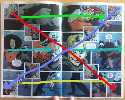
This double page spread is a really fascinating, really strong bit of comics making. It comes at a key moment in the story and represents the first half of the climax of the issue. It also makes really, really smart use of layout complexity to deliver the perfect moment.
The magic of this layout is the X-shaped collection of panels superimposed over the background. This choice adds a huge amount of immediate visual complexity to the page and instantly changes the pitch of the page. Functionally the page works like two superimposed stories, with the "background" panels describing one string of narrative while the "foreground" panels describe another part of the story that occurs simultaneously, which again adds considerable complexity to the page. That said, because the "foreground" panels from an X, they attempt to drag attention linearly along their lines, despite this not being the chronological order of the story, which ends up making the page feel like five separate, interlocking narrative spaces. This of course multiplies the experienced complexity of the page dramatically.
Taken together this page feels chaotic! It reads very much like the structure of the comic is breaking down and it instills a sense of overwhelmingness on the reader.
This sense of chaos and confusion is enhanced by how this interesting layout compares to preceding pages. When compared to the preceding pages in the Megaton sports storyline, which tend to use short wide panels that move across the page in clear straight lines (and do a wonderful job separating the sports pages from the other sections of the story). By ratcheting up the complexity of the key layout, the comic really slams home the danger of the events happening.
When you look at the entire sports section of the comic in aggregate, there is a clear progression of complexity. As the scrimage being depicted in the comic begins to build, extra panels are introduced, and the pages complexity mounts a little, but then in the final page of the sequence, when things dramatically escalate and spiral out of control the page itself escalates into a complicated, almost confusing layout that captures the drama of the page. Because of the pacing of these layouts we get to feel things slowly get out of hand until finally we get that perfect moment of the shit-hitting-the-fan fuckedness.
The other thing I love about this layout is how well it sets up the final moments of the climax of the comic. We go from a very busy, confusing, chaotic page to one that is downright austere and measured. When the shoe drops, when the truly fucked up thing happens, the comic slows and simplifies, giving each panel a weight. It's... when I was a kid, I fell twelve feet or so out of a tree. There was a moment there, hanging in the air, that I realized what was happening, that there would be no going back, before I hit the ground. It's a breathless moment of crystallized doom that I still carry around with me. And this is the comics equivalent of that. By going so quickly from frenzy to slow, yawning stillness as the final moments play out, Team Bitch Planet manage to replicate crystallized doom and make a powerful moment truly resonate.
Sometimes the best parts of comics are as much about what they set up as they are about the moments they depict.
And maybe pacing is one of the most important, and perhaps underlooked components of comics.
Previously:
Uncaging Bitch Planet #1
Uncaging Bitch Planet #2
Uncgaing Bitch Planet #3
Uncaging Bitch Planet #4
Surviving Bitch Planet #1


No comments:
Post a Comment