by Ales Kot, Michael Walsh, Matt Wilson, and Clayton Cowles; Marvel Comics

Secret Avengers is the final comic issue in the current iteration of the comic. It does a great job wrapping up the long running story in a satisfying way and giving each of the book's characters a worthy epilogue. The comic also, in a series of achingly beautiful little moments, directly addresses the themes of the comic and maybe some of the broader ideas Secret Avengers was built around. The sincerity on display in this comic is emblematic of what elevated Secret Avengers from a fun-silly comic to a book that I ended up really admiring. I'm going to miss this book.
There will be major *SPOILERS* for Secret Avengers #15 below.


The thing about this sequence, aside from just how gloriously earnest it is, is just how perfectly the lettering is placed in the second page.

Lettering is all about choices, about placing critical narrative information and dialogue into artwork in the best way possible. Which is frequently a tremendous balancing act. The text shouldn't obscure key features of the artwork. The text should be positioned in a logical way so that it is encountered in the correct order. The text should interact with the artwork so that it is read in a way that improves the storytelling on the page. The text can even be used in a way to drive or pull at attention and alter the flow and emotional resonance of the page. It should also just kind of look nice. Ideally the text is so well incorporated into the sequence that it seems effortless and virtually invisible. Which is why, when it's perfect, it is so damn impressive.
To a certain extent, when first approaching such a large, intentionally open page with so little text, the placement options are essentially legion.


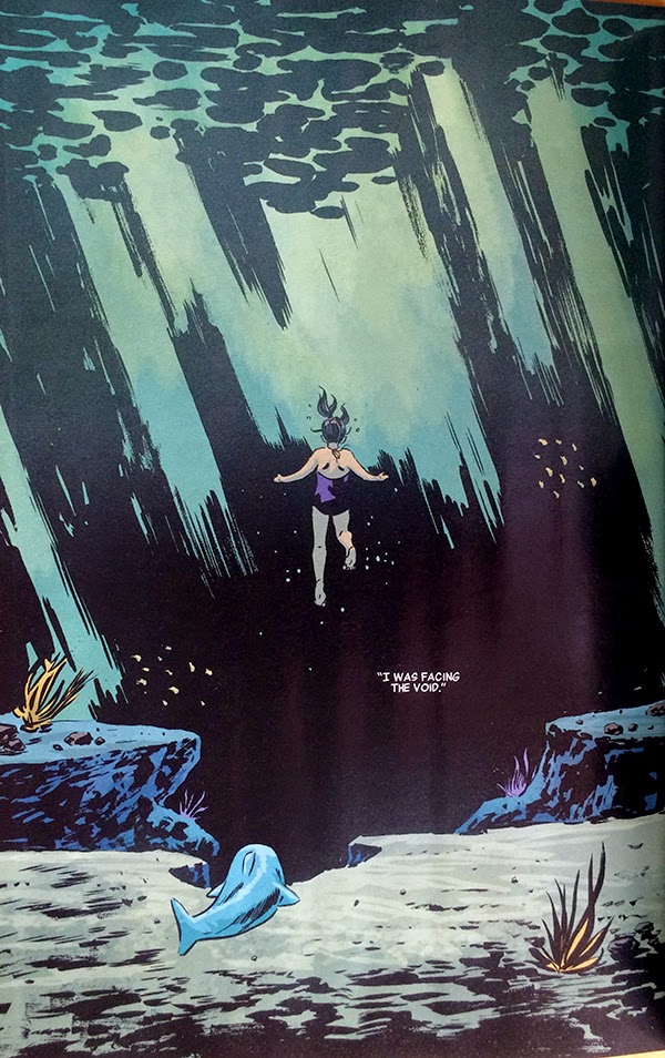

Even whittling down the options to what I would, in my *very* amateur estimation, consider storytelling reasonable positions there are still some very different options. Like, would it be best to seat the text box somewhere in the top left to introduce the idea of the void first before encountering any of the figure work? Or would it best to put the text above Maria Hill, close to her, so that we see the idea of the void and look down through her and into the darkness? Or is it best to put the text of the void in the heart of it so that the idea and the thing are connected? Or is it best to put the the text at the very bottom of the page so the reader can take it all in organically, to see and experience the void, before we are told about it? Which makes the page work best? Which is the most impactful and organic? When broken down like this, it isn't immediately obvious to me.


Of course, once you see the final page it is perfectly obvious what the ideal placement is. The one chosen, which places the text in the heart of the void is brilliant. It allows the reader to make their way through the depth of the page, experiencing the silent, serene weight of the water above Maria. The reader then finds Maria, weightless in the heart of the page, and quickly moves from her, along her gaze, to the words "I WAS FACING THE VOID", hanging in a black wound in the background of the page. By putting the text here, Team Secret builds the concept of the void directly into the blackness, giving it an ominous quality it would otherwise lack: this is THE VOID it is scary and it is important. This choice also makes the void the centre of attention of the page and the logical termination of the reading path through the page: the implied tangent the reader has been following has ended in the dark heart of the page which also increases the weight and significance of the void. This choice also imparts significance to everything else in the page, letting the placid space work it's magic and allowing Maria to have her moment in a neutral emotional space before the crushing concept of the void is deployed. It's fantastic storytelling that relies on the lettering being just so.
Which is why this page is an example and lesson in how to do lettering really, really well.
Previously:
Secret Avengers #10 and 11: Some cool layouts
Secret Avengers #9: Interlocking stories
Secret Avengers #7: Labyrinthine panelling
Secret Avengers #4: Colour as character symbols.
Secret Avengers #2-3: Smart layouts.
No comments:
Post a Comment