Comic covers are important business. When comics are solicited to the public and the retailers who actually drive the publishers, covers are often the only artwork we see. Later, when actually in stores, covers are the identifier and chief visible advertisement to curious readers. In this way covers are really the public face of comics and when done well, can be a driver of reader and retailer interest.
Despite thinking covers are important and worth discussing, I've always steered clear writing about them because I've lacked a good angle of attack to discuss them in a meaningful way. Fortunately DC comics has decided to give me an in! Apparently February is Harley Quinn variant cover month so we have a variety of Harley Quinn covers by a variety of artists. And so we have this really great collection of covers that have a similar theme to directly compare. Whats more, these alternate covers are also paired with the regular covers for most of these titles, so we have a second level of comparison too. This is what we in the Science Bizz call a rich dataset and one I'd like to try to analyze.
On my first pass of the Harley Quinn sample population I wanted to pull out some examples of what I thought were good covers and some examples of poor covers. To do this I needed some criteria for what makes a good cover. This is what I came up with:
1. The cover is visually appealing and eye catching. If it doesn't look good it's game over.
2. The cover is intriguing, it makes me want to pick up, read, and buy the comic.
3. The cover fits the narrative tone of the interior of the comic. Mismatching isn't good.
4. Since these are variants: The cover represents the title and Harley Quinn equally well.
Using this metric there are four comic covers that I think are particularly good and I think represent the best of the pack.
The Harley Quinn/Batgirl variant (left) I think is the best combination of the four criteria. The cover has bold colours, clear composition, and just pretty Cliff Chiang artwork that bursts with character. The cover also does a great job setting up an intriguing story: the idea of Batgirl having a madcap adventure with Harley Quinn that ends with her telling Harley to "Smile" looks fun to read. The cover also does a great job representing both titles catching both the youthful, tech-savvy tone of Batgirl with the iphone photo, and the rudeness and fun of Harley Quinn. It succeeds the most on all fronts out of the titles considered and works really well as a Batgirl cover and a Harley Quinn variant. Also Cliff Chiang art!
That said, when compared to the actual Batgirl cover (right) for February, the variant is less of an obvious winner. Cameron Stewart delivers a bold cover that, while ever so slightly less graphically appealing, just oozes intrigue. Why does Batgirl's new community of Burnside hate her? Why is she fleeing? As a new Batgirl reader I am very intrigued! While the Harley Quinn variant is very nice, I think the main Batgirl cover is the better cover.
The Harley Quinn/Detective Comics variant (left) is my favourite for how it looks. The composition is bold, the colouring is dramatic and manic, and the NANANANA graphic in the back is eye catching and makes the whole cover pop. I would stop and look at this comic just for how it looks. Add in the best gag of the pack: Harley Quinn is NANANANANANA Batgirl! because she has baseball bats! and you have a great, eye catching cover. Dave Johnson is a wizard. Where the cover maybe fails a little is in matching the tone of Harley Quinn, who seems to be more of a light hearted character right now. This cover is great, but feels more Jokery than Harley-y. But damn does it look good.
The normal Detective Comics cover (right) is also damn cool looking. The colours are wild and exciting, the image is visceral, and the graphic of "reconstruct" over motorized destruction is intriguing. I would pick this comic up too. Detective Comics has two very good covers in February.
The flash (top left) and Aquaman (top right) variants are just totally fun. They might not be as graphically or compositionally interesting as the previous covers, but they just set up such fun premises that I'm hooked by them anyway. Who wouldn't want to read a comic about Harley Quinn trying to race The Flash using a cheetah chariot or getting in trouble for weaponizing dolphins? These covers are both by Amanda Conner one of the writers in the actual Harley Quinn creative team, which makes me legitimately interested in reading Harley Quinn: if the actual comic is this gonzo and fun then I am missing out! These covers are great advertising for the main series.
How do these covers compare to the normal Flash (bottom left) and Aquaman (bottom right) covers? Well, the Flash one has pterodactyls which is pretty rad, so it gets dinosaur points. So I'll call that one a wash. The Aquaman cover is pretty boring though and... real talk, that character is supposed to be Aquaman's mother and that is totally bonkers! Common sense maths would suggest she is probably at least in her 60s, which her white hair would seem to confirm, so why does she have the body of a 20-yearold woman who has impossible breasts? Even if we ignore the sexism problems, it is super distracting and suspension of disbelief ruining. It makes no sense! Point variant cover!
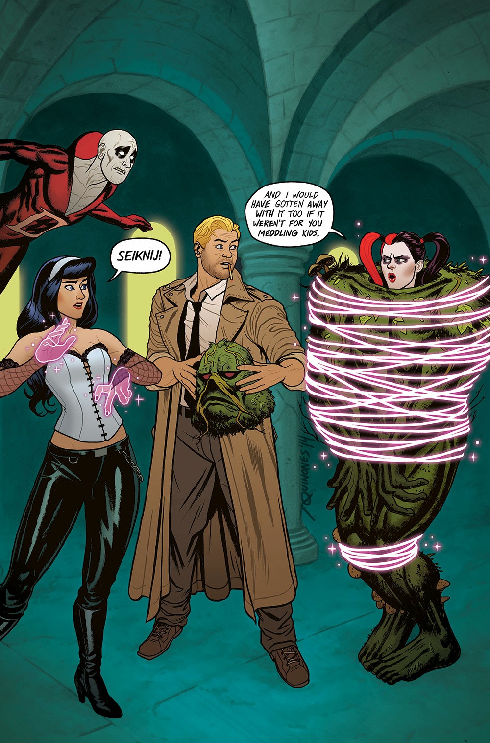
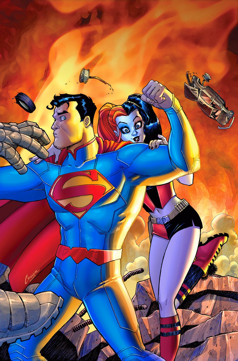
And then there are a bunch of Harley Quinn variant covers that don't really illicit a strong reaction from me. They mostly look like pretty normal comic book fare to me and wouldn't make me pick up their comics, but also aren't terrible or offensive. I mean, the Conner Superman variant is kind of fun, and the Justice League dark one is clever in a tumblr reblog sort of way, and the Sinestro variant is a very pretty illustration, but I'm not really intrigued or compelled by these covers. Similarly, some of these covers aren't my favourite style and lean too far into the sexualizing Harley Quinn direction for my tastes, but I'm not horrified by them either. In a few cases, like the Teen Titan cover, the fun-slapstick covers seem to tonally mismatch with the comics they are on based on dark, disturbing normal covers which isn't great. Your mileage and opinions, of course, may vary.
These are two of the covers I think are actually actively bad. The Green Lantern Corps variant (left) I think is kind of unattractive and not very eye catching. I think this has to do mostly with the colouring which has a really bright background and magic trick box thingy, but really dark muddled colours on the characters. Which for me makes the whole cover just look kind of messy and indistinct and, worst of all, forgettable when compared to many of the other covers. The Batman variant cover (right) is just off putting. There is this weird mix of infantilization and sexualization going on with Harley Quinn here that is totally creepy and makes me less likely to pick up this comic. If for no other reason than I'd rather not have other humans see this comic in my possession.
This Catwoman cover (left), though, is the worst of the variants in my opinion. The anatomy of the characters depicted is weird with Catwoman's legs doing unrealistic things in unrealistic proportions and both women's breasts are ginormous and weird looking. The composition is also really weird: the picture shows Catwoman breaking Harley Quinn's mallet with a kick, but I didn't get that right away because of how static the characters look and how posed their faces are. It's really weird to me. Add in some super glossy colouring and a distractingly granular background and you have a cover that is kind of bad looking and boring. I'd never pick up this comic based on this cover.
Which is even more crazy when you look at the normal Catwoman cover (right) which is fantastic! It is a striking piece of art with its smart use of black and white space, dramatic tilt, and intriguing, suspenseful picture. This is a cover that demands attention and teases a story worth reading. It is night and day better than the variant cover it is being paired with in February. These two covers make a great contrast between a cover done well and a cover done poorly.
And as a control, here are the Harley Quinn covers which are both very nice and effective. The story of the issue, which according to the solicit, is about Harley Quinn getting overwhelmed with her various identities and tasks and having a mental break. Which both covers capture quite well.
So there you have it, the good, the okay, and the ugly of the Harley Quinn variant cover month.


No comments:
Post a Comment