by Kieron Gillen, Jamie McKelvie, Becky Cloonan, Ming Doyle, Joe Quinones, Jordie Bellaire, Maris Wicks, Matthew Wilson; Marvel Comics
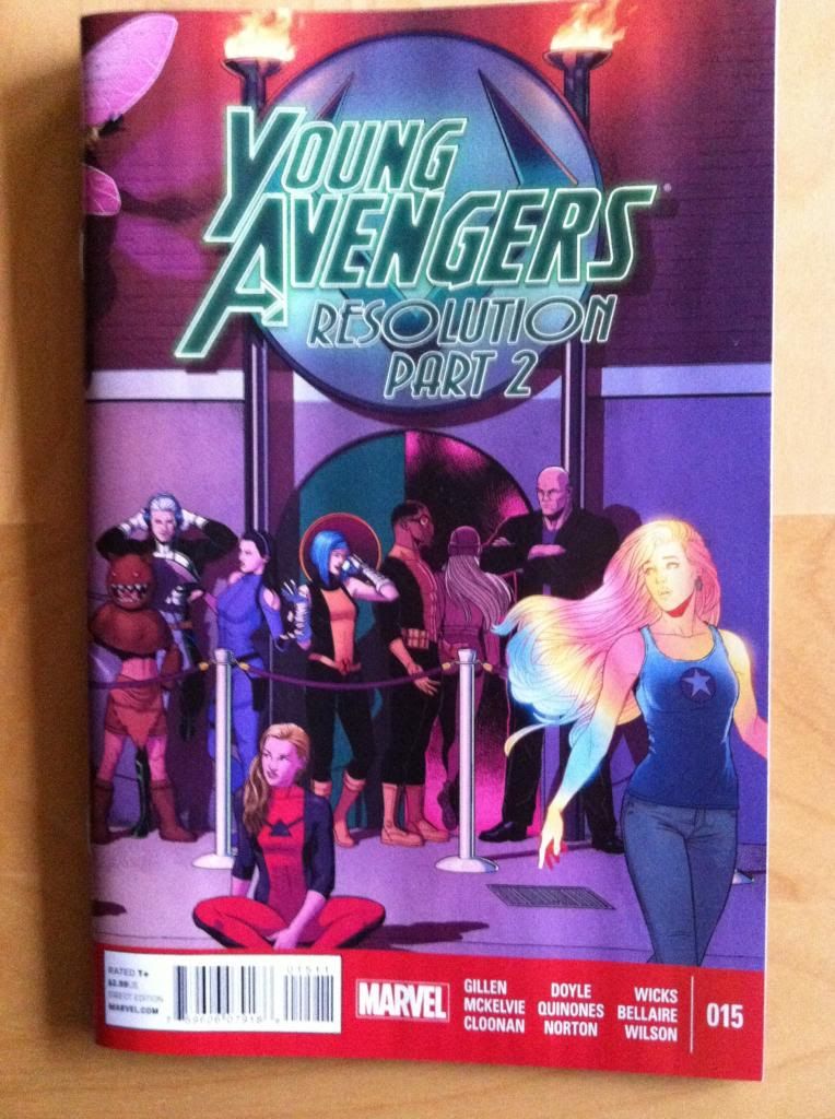
Young Avengers #15 is the final, goodbye issue of Young Avengers. It's pretty much a pitch perfect issue that, along with #14, does a really great job providing closure to the various character-plots of the series in a fun and VERY Young Avengers way. YA#15 is a testament to everything I love about the series and a perfect note to go out on.
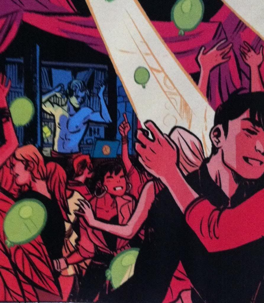
Young Aveners #15 is also a comic that features a Noh-Varr section, with art by Becky Cloonan and Jordie Bellaire, with some really clever colouring. Colouring is an aspect of comics that I find really fascinating and important, but given the subtlety of it, pretty difficult to talk about. That said, YA#15 features colouring that is obvious in its intelligence and effectiveness.
There will of course be *SPOILERS* for Young Avengers #15 in this post.
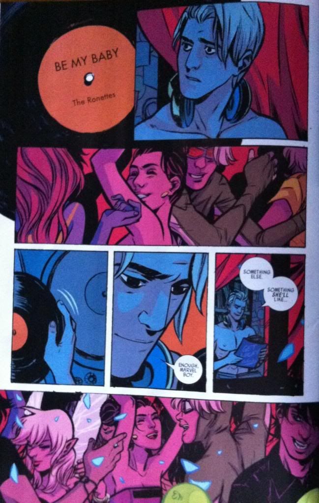
Actually, before I get to the colouring of this section of YA#15, I'd like to point out how great the pencils by Becky Cloonan are. The characters are alive with emotion, the story telling is crisp and clear, and the entire composition lives every moment in a really evocative way. The Noh-Varr section of the comic may be short but it really highlights the tremendous acting, compositional chops, and the ineffable magic of Cloonan's artwork. It's always a pleasure to read comics drawn by Becky Cloonan.
The plot of the Noh-Varr portion of YA#15 is essentially that Marvel Boy is ruminating on how his relationship with Hawkeye ended and meditating on the bittersweet flavour of love lost. This is all played out while Noh-Varr is behind the mixing table DJing and watching Kate having fun and being beautiful on the dance floor. As such, much of the dramatic weight of this sequence is the physical and emotional separation between Kate and Noh. This is accomplished in a bunch of ways: from the very discrete ideological demarcation between DJ and crowd (cerberal-observant/emotional-active) to the way the pencils separate the two groups physically and contrast Noh-Varrs aloneness in the booth to Kate's position in the people of the dance floor. But I think one of the most effective ways the separation between the two characters is emphasized is through the way the sequence is coloured.
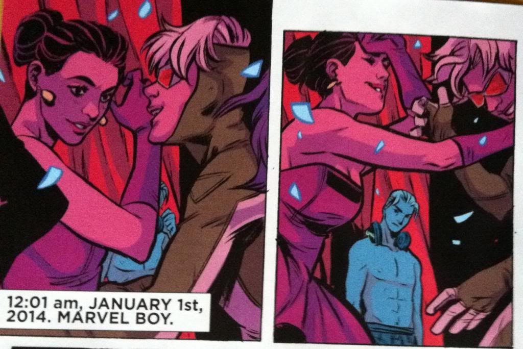


The brilliance of the colouring is that it colours Noh-Varr in a different way than Kate and the dancing crowd and this contrast in colour emphasizes the separation between characters. Simple stated, Noh-Varr is colouring in a cool, shadowy blue, while Kate and the dancing crowd are bathed in a red glow that permeates every aspect of their colouring. Now, this fits very well into the plot of the series as the dancers are all lit by the dancefloor lighting which is the in-story source of the red glow, while Noh-Varr working in the DJ booth is not lit-up and therefore living in the shadows. So this colour separation makes perfect story sense. But it also makes really great emotional sense too: the cool blue of Noh-Varr fits his melancholy (he is literally blue!) while the hot, passionate red captures the fun and energy of the dancers. This difference in colouring, then, manages to emphasize both the physical separation (booth/dancefloor), the emotional difference (sad/celebrating), and the story distance between the Kate and Noh-Varr in a seamless way that brilliantly enhances the composition and storytelling. It's great colouring and great comics.
Previously:
Favouring The Young Avengers #14
Favouring The Young Avengers #13
Favouring The Young Avengers #12 (pt. 2)
Favouring The Young Avengers #12 (pt. 1)
Favouring The Young Avengers #11
Favouring The Young Avengers #10
Favouring The Young Avengers #8
Favouring The Young Avengers #7
No comments:
Post a Comment