Or a look at the ballsiest comics car chase in Stumptown: The Case of The Baby in The Velvet Case
By Greg Rucka, Matthew Southworth, and Rico Renzi; Oni Press
In the hallowed days before digital special effects made movies lazy and terrible, there was a glorious halcyon age of stunts in action films that climaxed in dramatic, beautifully shot car chases. These car chases were high octane spectacles, meticulously crafted acts of stunt driving, grounded in the plausibility of having to actually have happened. And yet, these film segments were somehow larger than life, shot with the widest of angles in dynamic, kinetic styles that are so much bigger than the static, tighter angles of the more conversational story sections. These car chases are awesome, and special, and completely an artifact of a certain kind of film.
Or so I thought.
Because Stumptown: The Case of the Baby in the Velvet Case somehow pulls this off in a static, comics form. It is magnificent.
This post will contain *SPOILERS* for Stumptown: Vol. 2. Do yourself a favour and read the comic first; it's really, really great.
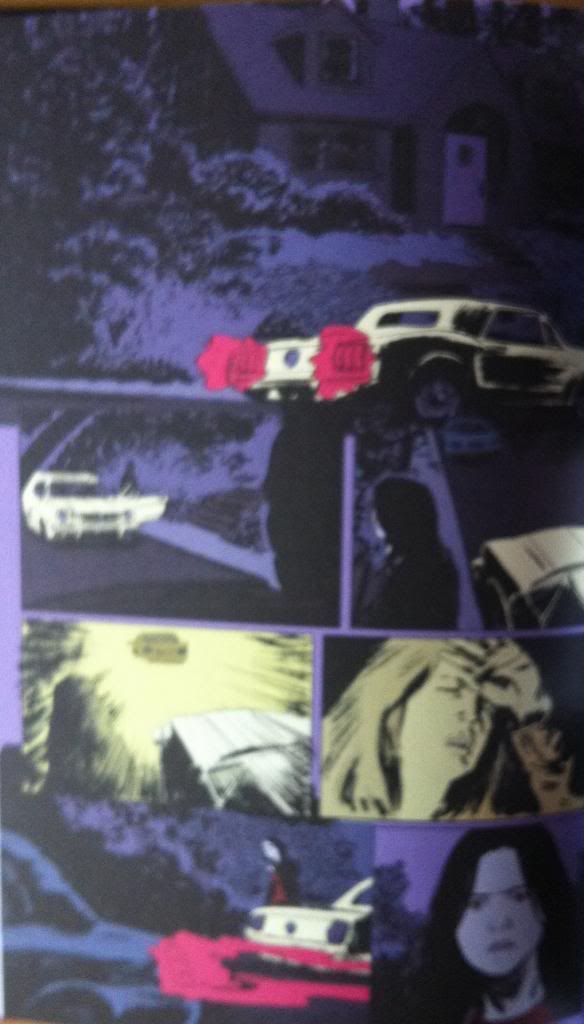
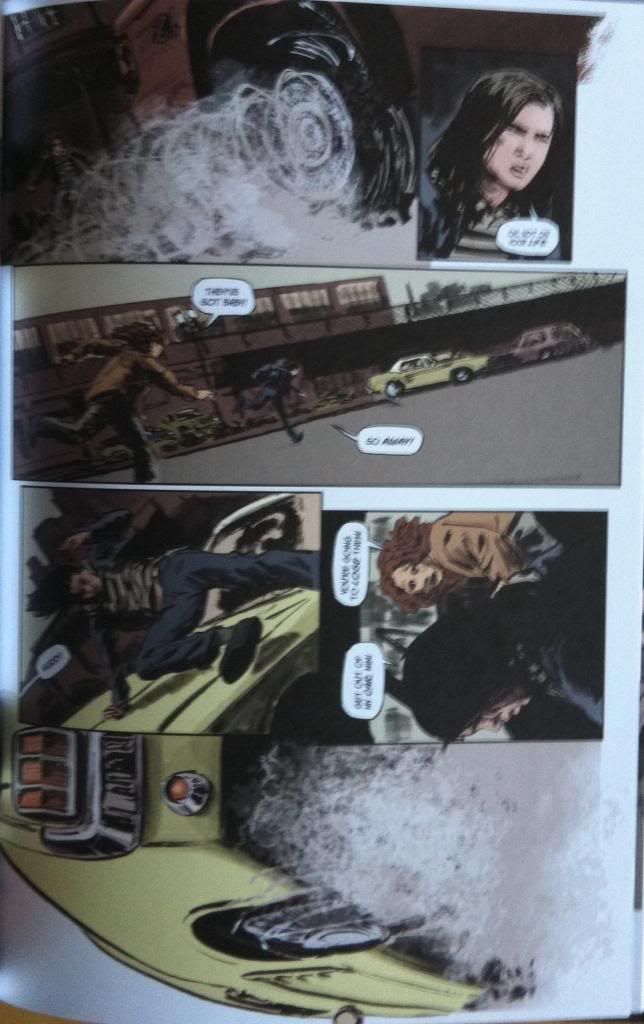
So part of the magic of the car chase scene is how it contrasts to the more conventionally drawn portions of the comic. The majority of Stumptown: Vol. 2 is drawn beautifully and atmospherically in the standard mode of comics with panels progressing from the top left of the page to the bottom right. It's the comics equivalent of tight angled dramatic shooting.
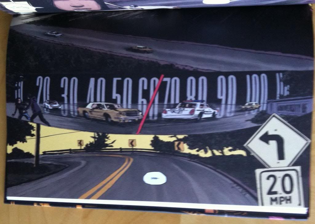
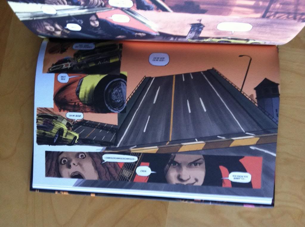
The brilliant choice, that makes the entire car chase scene feel huge and cinematographic is that they took the page....
...and turned it on its side.
And the result is pure comics widescreen magic.
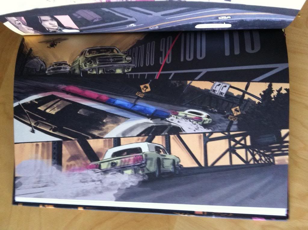
By turning the page on its side, Team Stumptown changes the entire feel of the comic. The unorthodox page orientation instantly makes the car chase sequence feel special, like its not comics as usual. But it's so much more than a simple gimmick, because altering the page orientation also changes the page into a series of short, wide panels that emphasize horizontal space and movement which enhances the feeling of speed throughout the chase. Add in some really clever, cinematic angles, stylish blurring, and really great use of the speedometer and street signs and team Stumptown completely catches the giant, amazing feeling of a true movie car chase in a comic. It couldnt get much better...
...until...
They jump the fucking bridge!
How amazing is this double page spread? Everything about this moment is perfect: the bridge decks peeking into either side of the spread to set boundaries, the tiny car hanging in the void, angled toward the apex of the leap. Perfect. By maintaining the widescreen page orientation, the double page spread manages to emphasize both the height and the tremendous distance of the jump. The relative simplicty of the page also helps punch up the moment: the single colour background and the minimalist elements all help make the jump feel exceptionally fast, and yet due to its iconic simplicity, somehow timeless. It perfectly captures that sense of a super short moment, that due to the tension and insanity of it, just seems to stretch on and on. It's perfect comics.
Stumptown is a comic that I cannot recommend enough.
Previously
Stumptown: The Case of the Baby in the Velvet Case
Stumptown: The Case of The Girl Who Took Her Shampoo (But Left Her Mini)
A Fistful of Rain
Deep Sequencing: Making an entrance in Stumptown




No comments:
Post a Comment