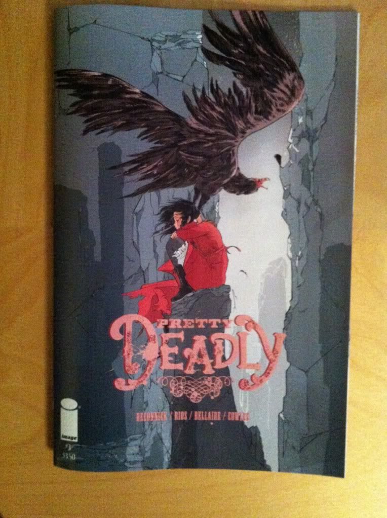
Or more Holy Shit artwork and moments from Pretty Deadly #3
By Kelly Sue DeConnick, Emma Rios, Jordie Bellaire,Clayton Cowles; Image ComicsPretty Deadly continues to be a pretty mind explodingly good comic filled with awesome artwork and cuss-out-loud moments of storytelling. Pretty Deadly #3 is very much a comic worth taking a closer look at, and since the approach of working through an issue's Holy Shit moments and artistic highlights seemed to work alright last time, I'm going try that again. That said, Pretty Deadly #3 works as the issue that sets the stage of what I think may be the ongoing conflict of the series, and two Holy Shit moments are pretty important revelations so this review is going to be VERY *SPOILERS*.
Seriously folks, if you haven't read Pretty Deadly #3 there will be fury-inducing *SPOILERS*. If you have never read Pretty Deadly and want to gauge if the series is for you, this post is Spoiler free, and this more indepth post is Spoiler-lite. Okay? I would absolutely hate to ruin some of the surprises in this issue for you...
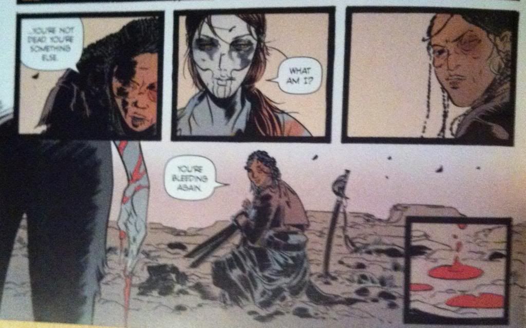
From a writing/script perspective this exchange here is pretty damn cool just from the dialogue:
Sarah: "...you're not dead. You're something else."
Ginny: "What am I?"
Sarah: "You're bleeding again."
Even without any artwork or accompanying exposition or description, these three lines of dialogue convey a huge amount of information pertinent to the character of Ginny and Sarah, how they relate to each other, and is badass in a way that is very much the tone of Pretty Deadly. As much as I might focus more on elements of artwork or plot in these reviews, the dialogue in Pretty Deadly is amazing in and of itself and is fundamental to my enjoyment of the series. It's really, really good.
This dialogue, as good as it is, is coupled seamlessly to artwork that enhances every aspect of the exchange. The way the composition, colouring, and dialogue box placement leads the reader through this sequence adds enormous weight and characterization. The first two panels emphasize that Sarah is stooped and kneeling while Ginny is standing and conveys the power differential between the characters and the fact that Ginny has control over the situation. However this is undone in the third panel where Sarah draws herself up, with a look of defiance, and places herself compositionally on the same level as Ginny in the preceding panel. We visually see Sarah reject the power dynamic in the preceding panels. The artwork then takes us across the page to the fourth panel in reverse order (right to left) so that we read the "bleeding" dialogue before we see Ginny's hand with its bright flash of red blood. This is nifty for a couple reasons: it places defiant-Sarah in the third panel above the bloody hand, implying that her defiant strength is tied to her realization that Ginny is bleeding. It's also a cool bit of layout as it draws our eyes to Ginny's wrist so that our eyes can traces the red streams of blood down to her hand: we get to experience the blood running down her arm. It's great.
Another cool feature of this page is the isolated fifth panel of the blood dripping onto the ground. Due to it's corner position it is somewhat isolated from the rest of the sequence which gives it a certain remoteness and significance. It's also almost a panel form the tarot image banner that Sissy and Foxy use to tell stories: it seems to emphasize that the blood is the most important take away from this page. Ginny for all her badassery is mortal.
The thing about this sequence that is maybe more remarkable than the quality of the script or artwork alone is just how efficient it is. In five panels we learn a really impressive amount of information about Sarah and Ginny in a really interesting way. Ginny is cemented further as an exceptionally tough woman since she had to have it pointed out by another character that she was bleeding pretty profusely. We also have it directly emphasized that Ginny is mortal: she can be hurt and she can be killed. We also get the impression that Rachel is herself a properly steely character as, even after seeing the violent power of Ginny, she still draws herself up in defiance, deduces Ginny's vulnerability, and manages to grunt out some bravado. This sequence also conveys a bunch of information about the relationship between Ginny and Sarah: it shows that while Ginny is in control, Sarah has no intention of remaining in her power. All of this in a minor sequence of five panels.
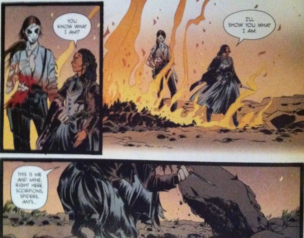
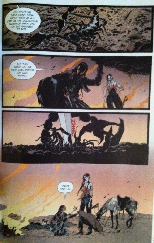
This big, long sequence contains Holy Shit Moment #1 and Holy Shit Moment #2 and perfectly encapsulates what I love about this series. It's brutal and beautifully drawn, the dialogue is intricate and complicated and just when the story seems to be going a certain way, it turns and rears unexpectedly in absolutely guttering directions. It's absolutely virtuosic comics and emblematic of how good Pretty Deadly can be.
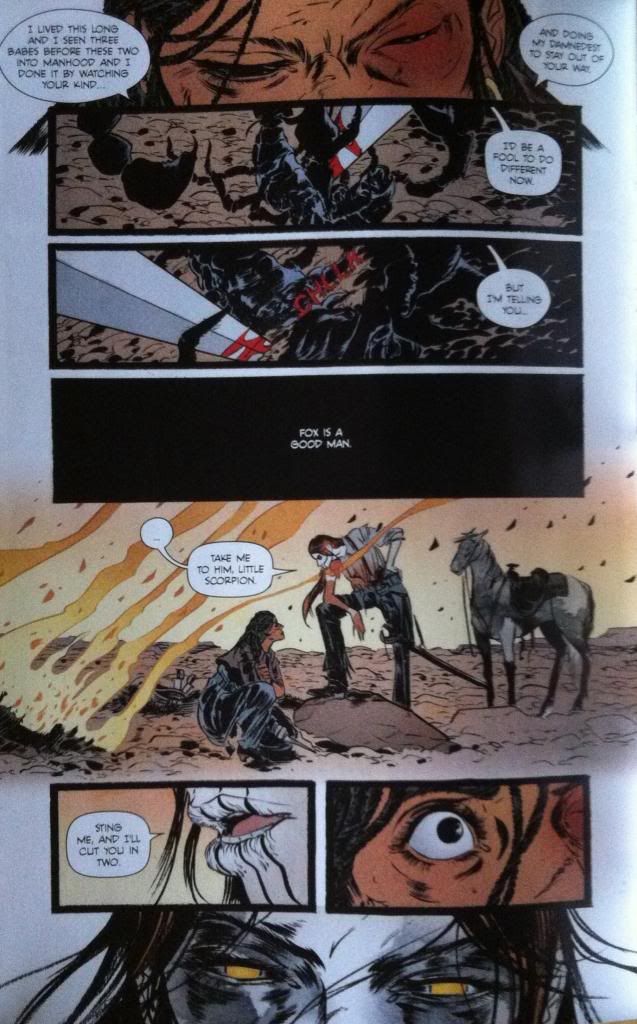
This extended sequence contains what I think is my favourite run of dialogue in Pretty Deadly to date. It starts with Sarah comparing herself to a bug at the mercy of a human, suggesting that the humans of Pretty Deadly are under tremendous threat by the whims of Ginny and the other supernatural elements of the comic. She stabs a scorpion to emphasize the point, which for me, is Holy Shit Moment #1. As a metaphor, it is brutally direct. This sequence than continues with Ginny AGREEING and using the metaphor to threaten Sarah into cooperating. It is Ginny argeeing that she is a merciless, godlike monster who views Sarah as a potentially useful bug. Which is Holy Shit Moment #2.
But beyond being a masterstroke sequence of dialogue and plot, this series has some really interesting comics going on in the artwork.
There are an absolute ton of small, elegant touches throughout this sequence. For one, the way the composition leads the eye through the stabbing and cutting of the scorpion so the eye darts along the path of the blade is brilliant and visceral. Another fantastic element are the flames burning in the background throughout the composition, which add an atmosphere of ruin and quiet menace to the entire sequence. And then there is the size differential between Sarah and Ginny throughout the sequence: Ginny is consistently portrayed looming over Sarah as a very clear visual signifier of their difference in power. It's just absolutely brilliant comics.
But I think my favourite thing about this sequence is this panel of dialogue here. From a story perspective, this panel has a black background as Ginny has kicked back over the rock the scorpions and bugs live under, so it conveys a nice bit of story information between panels. But what is brilliant about this panel is that the idea it contains, that "Fox is a good man" is portrayed in black and white. It is portrayed as an absolute. Which implies that Sarah, who says this, absolutely believes this idea. But, since we can't see Ginny listening to this statement this panel implies that she is deaf to it: Sarah is expressing this idea into a vacuum. What I love about the use of black and white here is just how solid and binary it is, its an idea you accept or an idea you reject and the fact that Sarah believes it and Ginny does not seems as if it will be the crux of their conflict. And this is all encapsulated in this single panel. Love it.
This sequence here is really great, largely for how it leads the reader so seamlessly through the composition and builds so much force and drama into every moment. The way the artwork captures the motion of Sissy crashing in a huff or spectacularly builds up the moment and explosive motion of Fox punching the rock face is great comics. The layout guiding even manages to capture the motion of Foxy's unstable stumble following the punch. And then the final three panels in the series beautifully and succinctly captures the emotions and status of all of the characters following the rage-punch. It's a really dramatic and efficient page.
Okay this next bit is going to be ginormous *SPOILERS* so please stop now if you haven't read the issue yet or if you are tradewaiting.
So the *SPOILER* intensive next section of the comic is the story of The Mason (the cuckolded husband of The Beauty who was the mother of Ginny). This section builds to a dramatic revelation which is Holy Shit Moment #3 and makes use of some really cool comics along the way.
This page here features one of the cooler mechanics at play during this section which is that Sissy is actively painting the story of The Mason, as related by Foxy, in the style of the Tarot images used for The Song of Death Face Ginny during a sudden rainstorm. This is kind of magical: it's a comic literally being made by a collaboration between Foxy and Sissy within another comic. And the way this process engages with the narrative and the fact that Pretty Deadly is itself a crafted comic leads to pretty interesting quirks. For instance, the two drawn panels in the middle third of the page: they depict The Mason holding his dead wife and deciding to die with her followed by another panel where the rain washes it away. This is a panel Sissy drew made of fantasy that is undone by the flow of reality. And then both of these panels are contrasted with the pose of Foxy immediately below them as he crouches on the ground in what can only be described as FORESHADOWING. (Incidentally, this is when I went "oh fuck, is that what's going on...?")
This page also features another really cool decision, which is the placement the panel about digging at the very bottom of the page, under the level of the ground. It's a panel about digging that is literally buried in the composition. It's a small, but very effective choice.
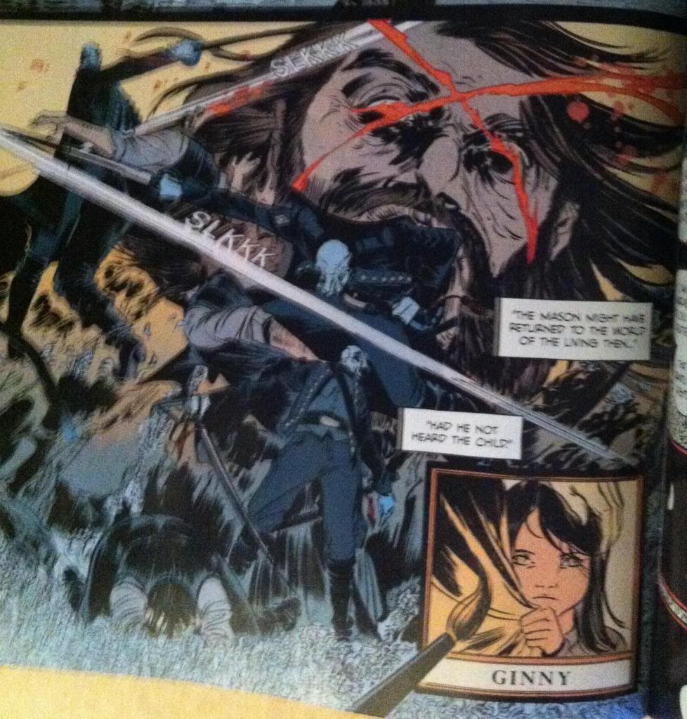
Foxy's story of The Mason eventually brings us to the *SPOILER* intensive Holy Shit Moment #3: Foxy IS The Mason. This fact is so brilliantly, brutally, obviously perfect that it is amazing. It explains so much of Ginny's motivation and Foxy's behaviour and adds a cord of dramatic connectivity to the entire series. It is also depicted on another amazing page that shows more of Pretty Deadly's trademark elegant composition in convention straining chaotic violence. This sequence of the blinding of Foxy/Mason by Death swirls about with seeming abandon, with Death and Foxy/Mason appearing almost randomly around the page in front of the giant, agonized face of Foxy. But closer inspection reveals a carefully arranged set of guides that steer the reader effortlessly through the chaos with the speed and exactness of Death's sabre: it's great comics.
It is also a pretty interesting sequence because of the contrast and similarities between the action/motion of Sissy's brush strokes and the strokes of Death's sabre. In the same way Ginny slashes her brush across say, Ginny's face in the last panel to draw a strand of hair, Death slashes across Foxy/Mason's head to carve the blinding X into the man's face. Which leads to a bunch of interesting ideas, like, what is the relationship between creation and destruction? Or what are the differences between enacting and depicting violence? Or, if we take things a little wider and look at the role of Team Pretty Deadly as slashers of pens and brushes, what is the relationship between violence and the creation of imagined violence. Pretty Deadly is a very thematically dense and complicated comic.
As dramatic and satisfying a revelation as Foxy's true identity is, it pales in comparison to how cool and amazing the revelation that comprises Holy Shit Moment #4 of the comic. But this moment is too perfect, too important to ruin here on the internet. So you will have to go and read Pretty Deadly #3 if you want to experience it. Which you should, because Pretty Deadly #3 is amazing.
Previously:
Pretty Deadly #2: Holy Shit Moments depicted with Holy Shit artwork
Pretty Deadly #1 pt. 2: The Song of Deathface Ginny
Pretty Deadly #1 pt.1: Breaking Rules





No comments:
Post a Comment