By Matt Fraction, Annie Wu, and Matt Hollingsworth; Image Comics
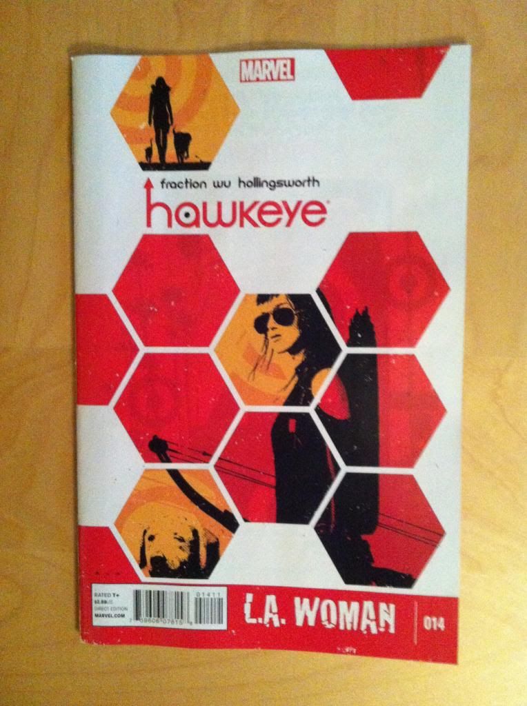
Hawkeye #14 is another ludicrously fun and well made comic in a series characterized by being super fun and meticulously crafted. It is the first regular issue of Hawkeye that features Kate having a summer of self-discovery and cat sitting on the West Coast. It is also an issue that sees Annie Wu on interior pencils, and she easily lives up to the pedigree of the book and is a welcome addition to Team Hawkguy. A couple things in particular about her artwork are really striking. First, she is extremely talented "at acting", at conveying emotion through facial and body language: Kate in this issue scowls, smirks, wheedles, and trudges in a huff in a way that is very nearly sublime. Second, Annie Wu is an expert at using repetitive panels for comedic and dramatic effect in a way that is completely worth examining.
There will as always be *SPOILERS* in this review. So, futzin' read it already.
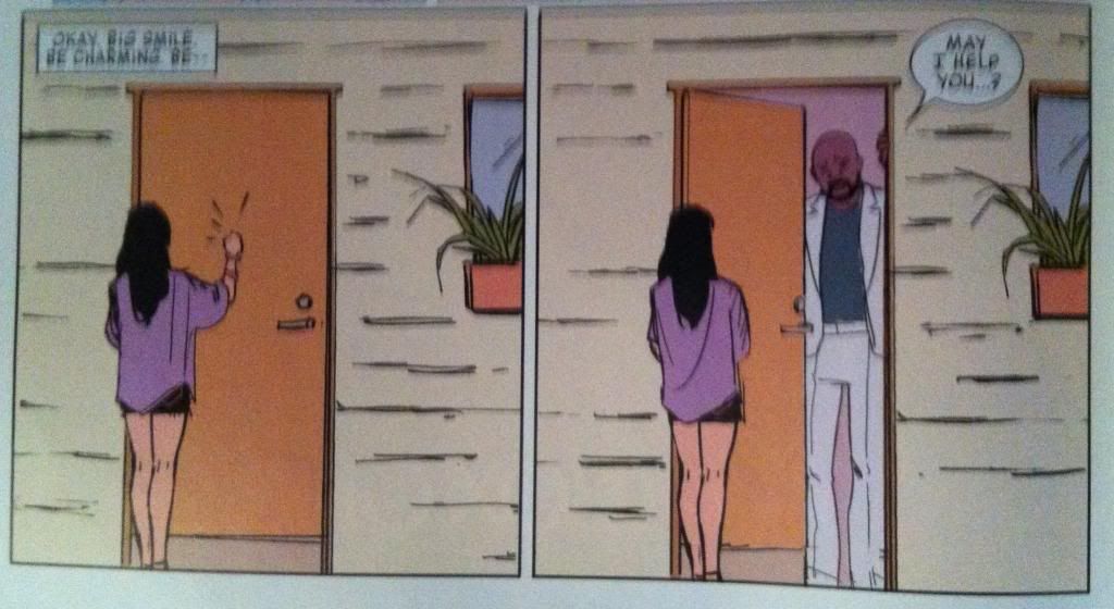
So what I mean by repetitive panels are adjacent images where the majority of the composition is the same, but only a few small details have changed: a facial expression, body posture, or, say, a door opening. On the one hand it's just simple sequential storytelling: show a scene than show the next important action that occurs within the same scene. Comics at it's most basic. But I think it goes past that and adds a certain extra element of time to the space between like a long, potentially awkward pause. As if things stayed so still that the artist didn't have to move her mental camera to catch the next moment. And I think that adds a certain flatness to the dramatic beat that can do some cool things.
Team Hawkguy does some really interesting things with this approach to comics in this issue.
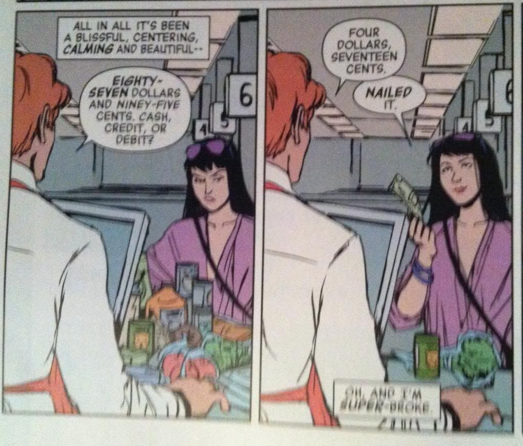
This joke here works purely because of the repetition of panel elements. By showing the two images immediately next to each other we readers get to see a direct comparison between the amount of groceries Kate wants (a full load) and the amount she can afford (broccoli). If these panels had been interspersed by her say, putting things back and doing math, it would not have been anywhere near as impactful and funny.
(Have you ever noticed that explaining jokes just sucks all of the fun out of them. A bald man, when asked about his baldness, says "I blame my mother". See, it's funny because baldness is an X-chromosome linked genetic trait and men only get their X-chromsome from their mother, so the baldness is in a warped way his mother's fault. And there is this trope of men blaming their mother for emotional issues. Except this time, instead of being hand-wavvy psychology, its actually kind of true. See, jokes!)

Here is another great example of comical repetition that is super cool. Instead of being adjacent panels with repetitive elements, it's a number of repetitive elements all in the same panel. Specifically we see Kate trying to figure out how to be a detective using the power of the internet, and get discouraged by the process, going from caffeinated and on-the-ball to collapsing in defeat on the right. Again the humour of this panel comes from the comparison of each image in a group: putting all of the study-Kates together lets this happen quickly enough to make the joke work. But! There is so much more to why this image is great comics. For another thing it's a really great way to show a long passage of time in a small space: it's like a one panel montage that (along with the diverse search boxes) conveys that Kate has spent a ton of time on this and gotten nowhere. It also, I think, shows how this time all blends together into a kind of drawn out morass by the lack of panel breaks between each individual study-Kate. It's like when you go on the internet and time passes and passes but doesn't actual feel like it out of a combination of boredom and the time destroying power of the net. Time has happened, but it feels like very little has passed by. Another thing I love about the panel is the shape of the repetition. You can almost draw a slope that starts high on the left side of the study-Kate row and narrows to a point in the right hand corner where defeated-Kate slumps. This literal downward slide of study-Kates really sells the emotion of the moment and works because of the repetitive approach. This is such great comics.

This is yet another pretty fantastic use of repetition and just a great all around sequence. From a story perspective this group of panels tells the story of Kate meeting detective Caudle, who in this meeting ignores her and condescends at her. The multiple repetitive panels of Kate work to convey just how disrespectfully she is treated. In the first narrow panel she is spoken at, and interrupted, by someone off panel, someone who doesn't even look at her. In the next panel she is left to stew in silence for a time as she is still not acknowledged She is then left standing in the background as the detective lectures her without even looking up at her from his work. And finally in the last panel she is left, ignored, to let herself out. The repetition here draws out the scene and emphasizes how Kate is jut left standing there in the distance by the curmudgeonly detective. It's great.
But this sequence is brilliant for a whole other reason as well. Part of the dramatic beat of this scene is that Kate is left feeling small and alone by this encounter. And in this scene Kate is drawn quite small. In each of the repetitive images she is a fraction of the size of the detective and is drawn in these small, close cropped boxes with no background or size references. She is literally as small as she feels. And it even goes further than that: in the fourth panel she is in a tiny panel right against the margin, drawn all alone after ring rebuffed by a potential ally. Kate has literally been marginalized. How great is that!?
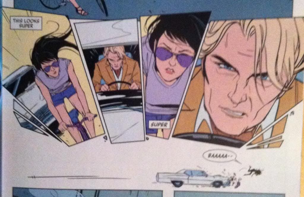
This sequence here is just great and is (kind of) another example of using repetition to tell great comics stories. In this case the repeating element is the interspersed faces of Kate and Flynt Ward. The crux of this series is that Ward is trying to hit Kate with his car, and the looming faces is the mechanism that conveys both the motion of the movement and the drama of the moment. By switching back and forth between face, the reader can instantly see the size differences between them, which creates the sense that the motion of the movement is approaching. It's like the faces are coming towards us and flying out of the page. Which is a pretty cool approach to selling motion. This series is also pretty nifty in that the shape of the elements within this series forms an arc: if you trace a line starting in the car's windshield and through the eyes of the faces you will see what I mean. This helps emphasize the motion of the moment in that an arc is a much more dynamic, and movey than a strict grid. It's really great comics.
I am also completely in love with the tiny car and Kate in the collision beneath the face sequence.
Anyway, Hawkeye #14 is another great issue with more really, really great comics going on. And Annie Wu is another great addition to Team Hawkguy.
Previously
Eye on Hawkeye # Annual Pt. 1: Using silhouettes in arguments
Eye on Hawkeye #12: Setting up the perfect splash page
Eye on Hawkeye #12: Setting up the perfect splash page
No comments:
Post a Comment