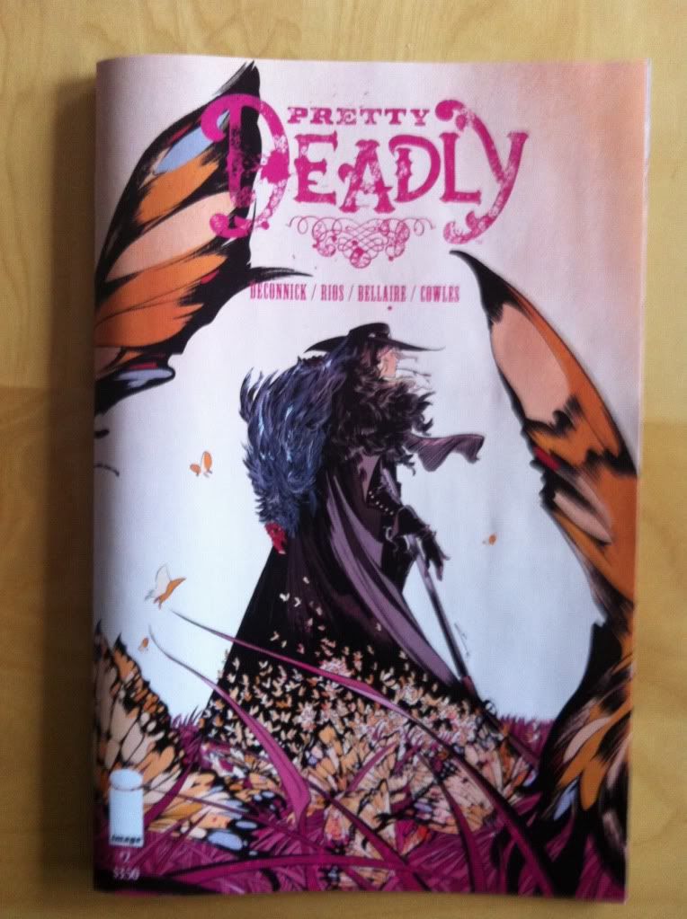
By Kelly Sue DeConnick, Emma Rios, and Jordie Bellaire; Image Comics
Pretty Deadly is still a comic that kind of confounds me. I mean, it is really good, but I have no idea how to talk about it. Usually with comics that have something interesting going on, I can find an angle or aspect and build a theme or narrative around it. Look at this great panel in Young Avengers, or isn't the timeline interesting in Hawkeye, or whatever. But the thing I'm finding about Pretty Deadly is just how elusive and great it is: there are so many remarkable, unconventional things to see, large and small, that I don't know how to prioritize them or thread the needle of a story about them. So for Pretty Deadly #2, I am going to just be a giant hack and work through a laundry list of great things in chronological order. Because there is really a lot to see.
Pretty Deadly is also a comic pretty much built out of Holy Shit moments. Just draw dropping moments of violence or action or badassery or comics brilliance that just has to be marvelled at. And maybe that is a narrative angle I can use to just bounce between the really cool moments in the issue? So, yeah, here is Pretty Deadly #2 through the lens of it's badass Holy Shit moments.
This thing will be built upon *SPOILERS* and also contain some NSFW sexy scenes. Okay? Okay.
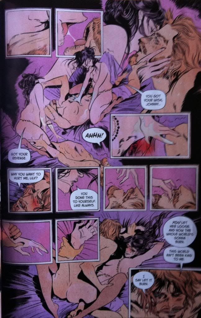
So a thing I absolutely love about Emma Rios' artwork is how she pairs open, flowing scenes with these little snapshots of emotion or sound or noise that take place within the context of the flowing scenes. This sex scene here is a perfect example of how effective this storytelling approach is. On this page the open flowing scene show two characters having sex, in images that take place over a field of purple sheets. But scattered across this open, organic sex-making are these snapshots of mouths kissing with saliva, blood and sweat and fluids, closeups of touch and the struggle/play for control. It's the wet, tactile, world of sex made explicit: it's all the momentary sensations that are the language of intercourse played out on top of the wider motions of sex. It's such a great, great way of telling the visceral experience of sex.
(It's also pretty great how human the anatomy of the characters are: the fact that they look how actual humans look is so much more real and sexy than polished, too-perfect sex avatars having an idealized fantasy interaction. This is wild and raw, real and flawed. It's sex.)
This page, incidentally is also a great example of how Emma Rios designs her pages to be really easy to follow. For all of the unconventional story structure, the open frameless transitions between images and the storm of overlayed panels, each relevant image leads directly into the next image in a way that is really easy to follow. This is especially true of the free-flowing parts of the compostion where the copulating bodies touch each other and clearly show the path to transition from one region to another. It's such great comics.
If you want to know why Emma Rios' approach to story in Pretty Deadly is so effective, this page is a pretty good place to start looking.
On the next page is a small sequence that is kind of brilliant in its simple elegance. In the first three panels in the row here there is a match being lit. The second panel where the match is struck is taller than all of the panels in the row which is kind of perfect. That explosive flash of flame when a mach is struck is as integral to my experience of a match as the heat or smell or finger burning, and the way the panel makes extra room for the flame of the just-struck match totally encapsulates that experience. It's such a little tiny moment in the comic, but it shows the fantastic attention to detail that makes every moment of Pretty Deadly a discovery.
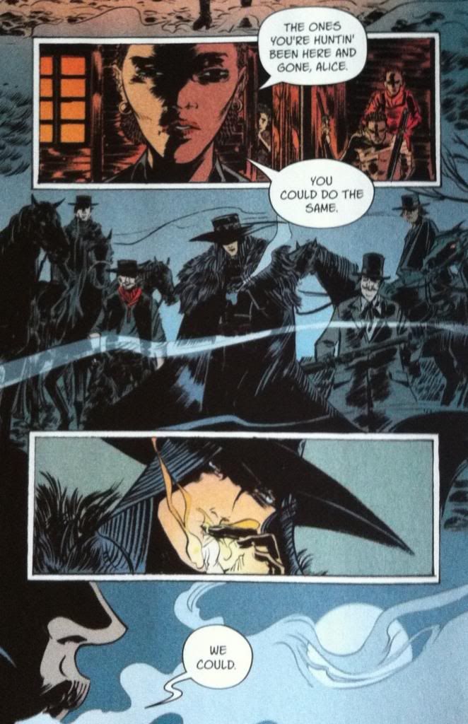
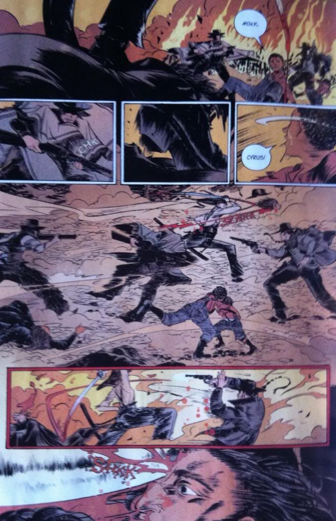
Which brings us to Holy Shit Moment #2. Alice and her gang go to work on Sarah and her family, burning down their home and beating her and her children. However, one of Sarah's kids, Cyrus, has learned the Song of Deathface Ginny and in desperation calls out for the agent of vengeance. And at long last we meet Deathface Ginny as she makes her entrance into the comic proper by driving a blade through the fucking mouth of the top-hatted goon. It's visceral and unexpected and a great way for Ginny to finally make her entrance.
The other side of the brilliance of Emma Rios' composition is how she depicts violence, and I think this page is a perfect example of it. The first panoramic panel established the setting, the odds (Ginny-vs-at least two henchmen), and the stakes (the two children). (Also how great is it that the kid is Holy Shit!-ing Holy Shit Moment #2 here?) The next series of panels are the Rios-trademark moments within the composition: the sound/action of a rifle being cocked, the sound/action of a boot scuffing the ground as motion begins, and a child calling for his brother. It's three snapshots of the same moment in time, in the tense second before bloodshed. (It also repeats the odds of armed henchmen, Ginny, and the stakes of the children). This leads into the wide, rapid, swirling vortex of visceral action that is the large full width panel in the heart of the page. It at once feels chaotic and fast: bloody motion given form. It is also pretty cool in that there are, in my opinion, two opposing compositional elements at play: the panel feels chaotic as the three elements tied to the preceding three panels are scattered around the panel, and yet the panel still reads very clearly as the elements within the panel guide the reader through the composition. It's like there is the feeling of disorder within a carefully crafted, orderly machine. And this of course leads to, and culminates in, Ginny splitting a dudes skull open. This comic is fucking brutal and great.
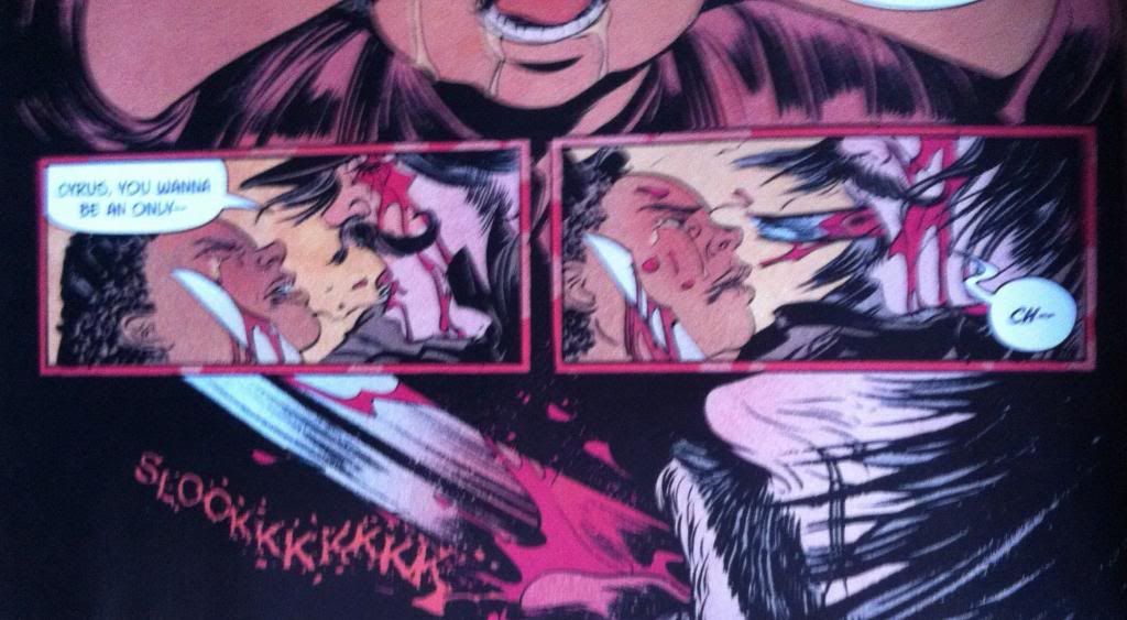
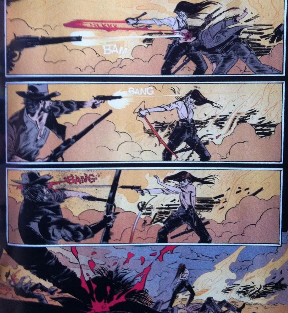
Which brings us to Holy Shit Moment #3. Alice, after fighting Ginny to a standstill grabs Ginny's sword tip and cuts the skull pattern of Ginny's face into her own face. And Jesus Fucking Christ. There is just something about self-mutilation that just gets me right in the creepies. The indulgence of pain, the wanton disregard for well being, just to taunt Ginny cements Alice as a properly scary person. This sequence also feels kind of sexual, with the shape of the blade tip and the way it is passed lovingly around the mouth (with all of its similarities to the earlier sex scene), and this makes everything so much more transgressive and creepy. It also adds an intimacy to the moment that I think sells the connection between Ginny and Alice in an interesting but disturbing way.
(Also, from a storytelling perspective, the way Ginny's face is dropped into the third panel here to provide a clue as to what Alice is cutting into her face is another example of the exquisite attention to detail everywhere in this comic.)
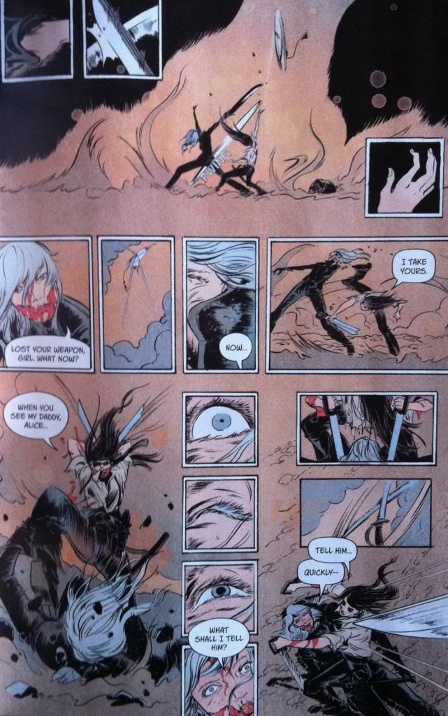
This page here is absolutely remarkable. Essentially it depicts the threshold of the climax to the fight between Ginny and Alice and ends on Holy Shit Moment #4. The top half of the page is more great Rios style action, with small moments of action within the larger composition. Again the page does a superb job leading the reader through the erelvant elements in a really organic, efficient way. Like, in the top composition where the sword spinning in the air is far above the outstretched empty hand panel. Or in the middle row of panels where the second panel with sword spinning in the air draws the reader's eye up a little, so that when they progress to the third panel, the kick to the face is even more surprising and impactful. But the really brilliant layout work in this panel is in the bottom half of the page. Specifically, the stacked four panels in the middle of the page are just so great. What they effectively do is change this half of the page from a primarily horizontal, panorama layout to a vertical layout. This is key because it alerts the reader to the fact that the really cool part of this sequence is happening in the vertical axis and also helps steer the reader up to the top of the third column so that the wicked surprise at the bottom right corner of the page is left to be discovered at just the right moment. From a story perspective this stacked column, with the eye braced for death and cautiously opening creates the sense that mercy is forthcoming from Ginny, which also increases the impact when the reader eventually makes it to that bottom corner and sees the fucking sword plummeting to skewer Alice's head. HOLY. SHIT.
And this of course leads to the surprise reveal on the next page which is Holy Shit Moment #5. Which I'm going to leave alone in the hopes you pick up this comic.
Because Holy Shit is it great.
Previously:
Pretty Deadly #1 pt. 2: The Song of Deathface Ginny
Pretty Deadly #1 pt.1: Breaking Rules









Thanks! I would love to see some of Rio's process. She has such attention to detail and flair, and I would love to know how she thinks about the page. I mean, I'm mostly just guessing.
ReplyDeleteAnd yeah, if what we have seen is any indication of what this beast is going to be, it is going to be a comic to watch. I suspect Pretty Deadly is going to be a comic I write about a lot.