by Kieron Gillen, Jamie McKelvie, Matt Wilson, Emma Vieceli, Lee Loughridge, Christian Ward, Annie Wu, and Jordie Bellaire; Marvel Comics
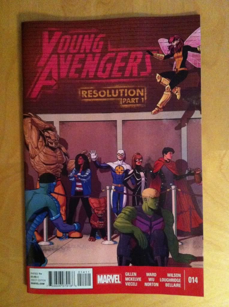
Young Avengers #14 is the first half of an extended "Resolution" to the series. It wraps up some loose ends and begins the unenviable task of providing some closure to a really remarkable series. It's a great issue, but difficult to talk about as it feels very much like a portion of a larger statement.
So in lieu of a premature series retrospective, I'd like to use Young Avengers #14 to explore how panel shape can be used to enhance storytelling because the issue has some really nifty examples.
There will, as always, be *SPOILERS* beyond this point. So be wary.
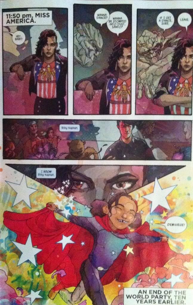
Specifically I want to talk about the America Chavez section of the issue drawn and coloured by Christian Ward. Ward has a really distinctive approach to artwork that makes really interesting use of colour and shape to convey additional story information. And it is completely worth taking a closer look at.
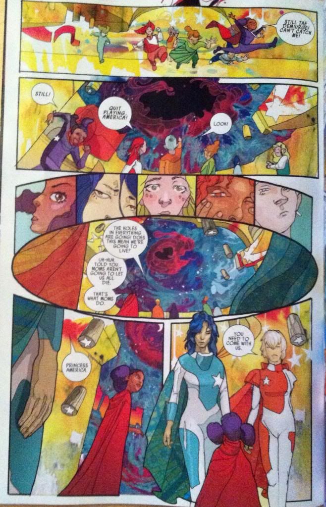
This page here has another pretty great use of shape. In this case the page uses a round panel in the centre of the page to add dramatic emphasis to the HOLE IN REALITY featured in the centre of the panel. It's as if the hole in the centre of the panel is a singularity pulling at the very fabric of the comic and warping the square panels around it into its orbit. It suggests that the hole in reality is vastly important to the larger story of America's childhood (of which we only get a glimpse) and really cements it as a focal point of this page and this section of the comic.
(Also notice the use of the Demiurge colour scheme around the hole in reality? The recurrent iconography in Young Avengers is pretty amazing.)
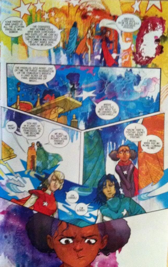
This page here makes a subtle, but really effective use of shape as well. Essentially the dramatic beat of this page is Chavez being presented with a choice, with the majority of the page containing the exposition leading to the choice which is revealed on the following page. What I find so great about this page is that the expositional elements come to a point on America's head as she makes a decision. I think this is clever because it's as if all of the information that effects Chavez decision is projecting above her head and literally on her mind. It's also quite clever as the decision that Chavez makes at the end of this page is the crux of the America section of Young Avengers 14 and the layout of the page focuses in, and balances on this decision. It's subtle, but great stuff.
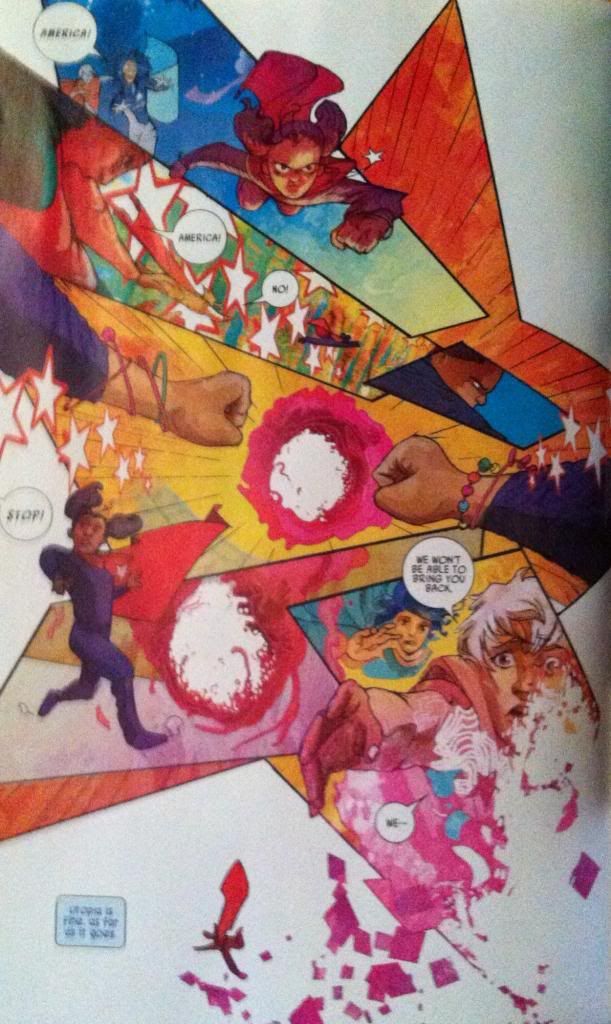
This page is the dramatic climax of the America story and portrays young America Chavez breaking through the hole in reality, leaving utopia and casting herself on the path that would eventually land her in the events of Young Avengers. And, since this is a sequence that uses magic (demiurge magic judging by the colours) the page contains a breakdown in the progression of comics reality. In this case the page loses its structured panels and instead is drawn into a star-shaped, whirlwind of comics chaos that ends with America Chavez falling right out of the plane of the composition and into the background. Great comics.
(Also, incidentally, I had always assumed the stars associated with America Chavez were a United States of America thing, but I wonder if they had, perhaps, been a nod to the Demiurge all along?)
Avengers #14 is another great issue in an outstanding series with a bevy of great artists working on wrapping things up. I'm going to miss this series when it's gone...
Previously:
Favouring The Young Avengers #13
Favouring The Young Avengers #12 (pt. 2)
Favouring The Young Avengers #12 (pt. 1)
Favouring The Young Avengers #11
Favouring The Young Avengers #10
Favouring The Young Avengers #8
Favouring The Young Avengers #7
No comments:
Post a Comment