Wednesday, 10 June 2015

So I Read The Manhattan Projects Volume 5

A 250 word (or less) review of The Manhattan Projects fifthcollection
by Jonathan Hickman, Nick Pitarra, Jordie Bellaire, and Rus Wooton; Image Comics


The Manhattan Projects is an ongoing comic. To read a review of Vol. 1 go here.

As a real-life scientists I find The Manhattan Projects an insulting and unrealistic smear job, but as a comic reader I find it to be andelightfully entertaining comic. While The Manhattan Projects might be a hideous caricature of Science, the one thing it gets right is that it's always about what comes next. Real, ethical Scientists are always pushing, trying to find that next idea or thing that will benefit humankind. Volume 5 of The Manhattan Projects is also a quest for what comes next: the mission to save poor Laika, the lost space exploring dog; the struggles to co-opt the US government; the tension with the alien force behind the Soviet Government; and a multiverse safari. It is a fresh take on Mad Science and a great continuation of what has come before in The Manhattan Projects. It's as hilarious, weird, inappropriate, and chillingly believable as the true history the comic parallels. As a comic reader I highly recommend it. As a Scientist I have to point out a factual error: the Einsteins conclude that a dirigible monster shot with incendiary rounds cannot hold Noble gasses since it did not burn. This is wrong because Noble gasses are so named for their chemically inert nature, due to their full valence orbitals, and cannot oxidize and burn. Their results instead indicate that the dirigible beasts DO contain Noble gasses. I expect better accuracy from my Mad Science Exploitation comics. C'mon guys.

Word count: 241

Post by Michael Bround

Previously:

Tuesday, 9 June 2015

Dead Pig Collector Is A Good Short Story

Or Why You Should Read Dead Pig Collector,
by Warren Ellis


Dead Pig Collector is a short story explaining exactly how you go about disposing a dead body.  The story is about Mister Sun, a self-styled Dead Pig Collector who, for the right price, provides a certain service. He will kill a target and then discreetly dispose of their body. His current assignment sees him visiting loathsome Los Angeles to kill and disappear a certain target, but when he arrives he finds his client dead at the hands of his victim-to-be. A former victim who is eager to learn the art of disposing of a body. Dead Pig Collector is some creepy and informative shit and an arresting brief read.

I would recommend Dead Pig Collector to mature readers looking for a quick, chilling read. It's short, brutal, creepy, and surprisingly charming and a great way to fill about a half hour. Dead Pig Collector is only available digitally, so purchase wherever fine ebooks are sold. 

Monday, 8 June 2015

Exposing Secret Avengers #15

Or a look at perfect lettering placement in a great moment in Secret Avengers #15
by Ales Kot, Michael Walsh, Matt Wilson, and Clayton Cowles; Marvel Comics


Secret Avengers is the final comic issue in the current iteration of the comic. It does a great job wrapping up the long running story in a satisfying way and giving each of the book's characters a worthy epilogue. The comic also, in a series of achingly beautiful little moments, directly addresses the themes of the comic and maybe some of the broader ideas Secret Avengers was built around. The sincerity on display in this comic is emblematic of what elevated Secret Avengers from a fun-silly comic to a book that I ended up really admiring. I'm going to miss this book.


One of the most significant and beautiful moments, arguably the climax to the book, also serves as a great study in how important and invisible lettering often is in comics. And I think it's worth exploring a little.

There will be major *SPOILERS* for Secret Avengers #15 below.


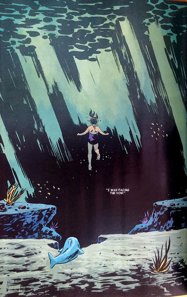
This sequence here is basically flawless. It is essentially the pivotal moment in an anecdote about Maria Hill's childhood where she, following some dolphins, instead encounters a shark. She reacts in fear and in the process of trying to evade the shark she sees the void, that wild expanse of open potential danger that would go on to define her life and role in SHIELD. It's a pretty powerful scene and a great metaphor for paranoia culture.

The thing about this sequence, aside from just how gloriously earnest it is, is just how perfectly the lettering is placed in the second page. 


Lettering is all about choices, about placing critical narrative information and dialogue into artwork in the best way possible. Which is frequently a tremendous balancing act. The text shouldn't obscure key features of the artwork. The text should be positioned in a logical way so that it is encountered in the correct order. The text should interact with the artwork so that it is read in a way that improves the storytelling on the page. The text can even be used in a way to drive or pull at attention and alter the flow and emotional resonance of the page. It should also just kind of look nice. Ideally the text is so well incorporated into the sequence that it seems effortless and virtually invisible. Which is why, when it's perfect, it is so damn impressive.

To a certain extent, when first approaching such a large, intentionally open page with so little text, the placement options are essentially legion.


Even whittling down the options to what I would, in my *very* amateur estimation, consider storytelling reasonable positions there are still some very different options. Like, would it be best to seat the text box somewhere in the top left to introduce the idea of the void first before encountering any of the figure work? Or would it best to put the text above Maria Hill, close to her, so that we see the idea of the void and look down through her and into the darkness? Or is it best to put the text of the void in the heart of it so that the idea and the thing are connected? Or is it best to put the the text at the very bottom of the page so the reader can take it all in organically, to see and experience the void, before we are told about it? Which makes the page work best? Which is the most impactful and organic? When broken down like this, it isn't immediately obvious to me.


Of course, once you see the final page it is perfectly obvious what the ideal placement is. The one chosen, which places the text in the heart of the void is brilliant. It allows the reader to make their way through the depth of the page, experiencing the silent, serene weight of the water above Maria. The reader then finds Maria, weightless in the heart of the page, and quickly moves from her, along her gaze, to the words "I WAS FACING THE VOID", hanging in a black wound in the background of the page. By putting the text here, Team Secret builds the concept of the void directly into the blackness, giving it an ominous quality it would otherwise lack: this is THE VOID it is scary and it is important. This choice also makes the void the centre of attention of the page and the logical termination of the reading path through the page: the implied tangent the reader has been following has ended in the dark heart of the page which also increases the weight and significance of the void. This choice also imparts significance to everything else in the page, letting the placid space work it's magic and allowing Maria to have her moment in a neutral emotional space before the crushing concept of the void is deployed. It's fantastic storytelling that relies on the lettering being just so.

Which is why this page is an example and lesson in how to do lettering really, really well.

Previously:
Secret Avengers #10 and 11: Some cool layouts

Secret Avengers #9: Interlocking stories
Secret Avengers #7: Labyrinthine panelling
Secret Avengers #4: Colour as character symbols.
Secret Avengers #2-3: Smart layouts.

Friday, 5 June 2015

Brooding About Bucky Barnes: The Winter Soldier #8

Or a look at  yet more dynamic layouts in BB:TWS #8
By Ales Kot, Marco Rudy, Clayton Cowles; Marvel Comics


Bucky Barnes: The Winter Soldier continues to be a comic that combines a trippy, empathetic storyline with some really far out, psychedelic visuals to make for a really fun and interesting reading experience. I like this comic, is what I’m saying.

BB:TWS is also an interesting comic from a technical perspective. Marco Rudy is a painter-style comics artist which means he uses colour and lighting to create gorgeous moments of story. The way talented painters can use light in their artwork in particular adds a wonderful layer of reality to their artwork which brings an added level of verisimilitude to a comic. That said, by fixing the lighting in their artwork, painters compositions can occasionally look  static. Painters also feature the challenge that their artwork tends to look it’s best in fewer, larger panels where they have the space to really let their artwork shine. But this comes with a cost too, fewer larger panels results in less sequential space to tell the story. BB:TWS is a comic that works within these considerations and uses innovative layouts to maximize Marcos Rudy’s skills as a painter while overcoming some of the limitations of this style of artwork.

And so I’m going to take a look at some of my favourite layouts from BB: TWS #8.

There will of course be *SPOILERS* for BB: TWS #8.


BB:TWS #8 starts with a scene where Daisy Johnson and her pterodactyl friend jump off a cliff and have a flying adventure. This is told over a double page spread that is composed of a number of skinny, blade-like panels that progress down the left edge of the layout. This gives the double page spread additional panel space to introduce the situation and draws the reader from the top of the spread to the bottom left corner. Critically the last three of these blade panels, as they transition from vertical and horizontal in the corner, have no text and are sparse on details and can be read very quickly. This means that when the reader looks upwards into the largest, main panel in the composition where the ptereodactyl-thing catches Daisy and carries her into the sky it feels very dramatic and kinetic. The reader’s eye has travelled down the page, down and up in a long arch that captures the motion and feel of falling and being caught; it’s wonderfully evocative stuff.
This double page spread here is very much an ideal storytelling space for a painter. It features a very large panel that is the centerpiece of the composition where the painter can make a really complicated and beautiful picture. It also features smaller panels that give the artist more room for storytelling which are also used to build motion into the layout of the page which lends a sense of dynamic movement to the fairly static images in each of the panels. This spread is ideally designed to play to the strengths of painters while cleverly overcoming the potential weaknesses of the style.


This page, which continues the story of Daisy and the peterodactyl-thing, is another great example of layouts being used to impart motion to a painted composition. This page uses the same essential tricks as the previous spread: long, blade like panels around a central feature image where the panel shape gives the layout motion. This page, though, takes the trickin last page and drives it even further: the shape of the small panels is much longer and curved, creating a rifled spiral around the page. This carries through the implied motion of the central panel where the pterodactyl-thing is swinging Daisy around and makes the entire page spin in a barrel-roll. It’s super dynamic and really showcases just how much motion can be built into a page through layout. Wooow!


I’m also really fond of this layout. The story of this page is that Bucky and old-Bucky have done a lot of the empathy drug Illum which has caused them to enter the dreams of Ventolin. Something, incidentally Ventolin knows about and consents to (which, btw, have I mentioned that I like Ales Kot a lot?). Anyway, this is another interesting double page spread that plays to the strengths of a painter. The page opens on an absolutely beautiful page of Ventolin sleeping in a bed, draped with wonderfully shadowed sheets that is a pleasure to look at and captures the peaceful beauty of sleep. The right side of the page though is split into a knot of smaller panels that originate from a braided rope of something biological and brain-tissue like that originates in Ventolin's head. These small panels depict the contents of names dream in biological shards that are obviously taking place in her mind. It’s another evocative composition that is emotionally effective and really maximizes the compromise between space to paint and panels to drive the story forward.


BB:TWS #15 is the Illum mind-trip issue where Bucky and old-Bucky have their consciousness expanded by the empathy drug.  This issue denotes the profound experiences the men have while on this drug using a fairly simple, but really effective trick: BB:TWS #15 uses double page spreads turned 90 degrees to convey the experience of an Illum high. It’s a really effective choice because it makes these pages feel special and different than typical comics and, since there is just something massive feeling about this angle, makes the pages feel massive and profound. It’s a cool choice.


Bucky Barnes: The Winter Soldier continues to be a great comic filled with some of the smartest, most effective painted comics I’ve ever read.

Previously:

Wednesday, 3 June 2015

So I Read Comics Class

A 250 word (or less) review of Comics Class
by Matthew Forsythe; Koyama Press


Some say those that can't do, teach. Those people are idiots. Doing is easy, teaching is hard. Comics Class is a charming little comic about Matthew Forsythe attempting to teach a class on comics making to kids in a school. The comic shows Mr. Forsythe struggles as he inexpertly flails in front of a room of disinterested youths and generally makes a mess of things. While the events portrayed are clearly exaggerated for comedic effect, Comics Class really captures the ridiculous reality of trying to teach. I TA a biochemistry lab class, and while I feel like I do a pretty okay job of it, the truth is Teacher's Assistants are amateur teachers who have practical knowledge but no actual demagoguery training. Which of course, makes teaching a class this hustle of trying to figure out the best tools to teach with on the go. At it's best it's really rewarding, but at its worst it is absolutely Comics Class. 

Word count: 160

Post by Michael Bround 

Tuesday, 2 June 2015

Wolf In White Van Is A Good Book

Or why you should read Wolf In White Van,
by John Darnielle


Wolf In White Van is kind of a hard novel to pin down. I think I would classify it mostly as a mystery. The novel centres around the tragic life of Sean Phillips, a man who was horrendously disfigured as a teenager. Following the emotional and physical fallout of his injury, Sean turns inward and creates Trace Italian, an elaborate puzzle world of choices and consequences set in a post-apocalyptic United States. Now an isolated adult, Sean runs Trace Italian as a mail order roleplaying game and gets by. At least until Lance and Carrie, a pair of Florida high school students decide to play out their game in real life with disastrous consequences. Now Sean must reckon with the fate of these wayward gamers and his responsibility in their, and his own, defining tragedies.

I found Wolf In White Van to be highly compelling and exquisitely uncomfortable to read.

Part of this is that the novel is downright lurid to read. The main engine of Wolf In White Van is curiosity and the burning question of what exactly transpired when Sean was hurt and what exactly is the nature of his injury and disfigurement. This mystery unfolds expertly, slowly, and as a reader I found myself drawn in and deeply interested. But interested in a way that never quite felt appropriate. Reading Wolf In White Van feels like staring, like gawking. It feels like standing on the sidewalk watching the unfolding of a deeply private tragedy. It's the prose equivalent of rubbernecking a car wreck to staring at someone with an obvious disability. Which is a reading experience that feels transgressive, rude, and uncompassionate. It is also completely engrossing.

Wolf In White Van was also an effective novel for me in how it thematically explores the knife-edge balance of life. The novel explores the way choices, made in an instant, reverberate and can have endless, tremendous consequences. Which really showcases how fucking delicate life really is, how easy it is to have it all blown away with a slight misstep. And I found myself re-experiencing that moment of falling out of a tree as a child, that breathless moment of regretting a mistake, before slamming into the ground and breaking my collar bone. And, incidentally, barely missing impaling my chest on the stump of a bush; a bush whose roots I had half dug out that morning lending it just enough give to stop a puncture. This novel just taps right into that horrifying sense of irrevocability and the joy of still being here despite the fickle chaos of life. I guess what I'm trying to say is I found this novel emotionally involving.

I would recommend this book to anyone with too much curiosity for their own good. If you are the kind of person who can't help but poke your nose where it doesn't belong, to google any dumb, slightly rude thing you hear about, the mystery in Wolf In White Van will absolutely prey on this character flaw to great effect. I think the novel could appeal to any fiction fan: it's very well written and engaging, but I think it will absolutely gut the overtly curious introvert.

Monday, 1 June 2015

Marvelling At Captain Marvel #15

Or a look at the triumphs and tribulations of Captain Marvel #15
by Kelly Sue DeConnick, David Lopez, Lee Loughridge, and Joe Caramangna; Marvel Comics


A really smart critic, whose writing I really enjoy, is overall pretty dismissive of the Superhero genre in general and corporate (Marvel and DC comics) in particular. As part of a discussion on this topic she challenged people about why they like Superhero comics and whether they had artistic merit. My stance on corporate Superhero comics is that at worst they provide some fun escapism, but at their best they can be really exciting, well made comics that transcend their genre-trappings to tell some really powerful stories. Captain Marvel #15 is one of those comics that transcends it's genre to approach a level of dramatic truth that I think exemplifies why I still read Superhero comics.

Of course, Captain Marvel #15 also tragically suffers from the kind of corporate comics nonsense that I find deeply infuriating.

I want to take a look at the triumphs of Captain Marvel #15, the things that make it a powerful work of art, and the tribulations of the issue, the unnecessary choices that try and cheapen a great comic.

There will be *SPOILERS* for Captain Marvel #15


The thing about Superhero comics is that punching spacegods, while exciting, is just pure escapism for me, and not especially heroic. While people who put themselves into danger on behalf of others are certainly heroic, I think that violence is objectively a sad thing. So I am kind of uncomfortable with glorifying fighting and combat as standards of heroism, as entertaining as explosions might be. But I am also stymied by such portrayals of heroism because they fundamentally miss an essential truth: there is so much ordinary, human heroism all around us. People perform amazing feats of emotional courage in so many ways; ways that are often quiet and private or seemingly passive and not punching spacegods. And I think this ordinary heroism is tragically largely missed by mainstream Superhero comics.


My wife's grandmother passed away on Christmas Day 2014. Grandma Shirley was a generous, warm, and wonderfully salty woman who was a regular fixture of every family gathering. She was very close to her whole family and she will be profoundly missed. She lived 91 years and saw her children grow up and prosper, knew her grandkids, and even got to meet some of her great grandchildren. She was, among many other things, a favourite travel companion of my wife during most of her wandering years.  She was also an old woman, in her nineties, and was suffering from a precipitous decrease in her health. She knew she was dying and had seemingly made her peace with it and managed to die in her home with her mind intact. Other than the timing, she died the way she wanted to. Death, even in the best of circumstances, is a fucking bastard.

Losing a loved one on Christmas Day is awful. However, while obviously sad, my family-thing rallied and has largely celebrated Shirley's life and taken solace that she died according to her wishes. And while Christmas next year is going to certainly have a pallor, my family-thing, with stoicism, humour, and each other, has done their best to keep living their lives. To do the next right thing. It's what Shirley would have wanted. I've never lost anyone I've so deeply loved and so I am absolutely stunned by the strength of my wife and in-laws. Deciding to walk forward, to take on life after death is an act of everyday heroism that takes as much courage as any Superhero who has ever punched a spacegod. My family, my wife, are fucking heroes. 


Captain Marvel #15 captures this reality. It is a comic that shows two "generations" of friends and loved ones banding together following a death and making that heroic, incredible decision to move on with their lives and continue living. It's on the face of it, a beautiful story. But it's also a moment of real, human heroism that stands out in a comic largely about the nature of heroism. This is a story that is True, that is resonate with something fundamental to the human experience, that transcends fiction and touches people. This is Art. And this is in a superhero comic book.

True art can be anywhere.

Captain Marvel #15 is an amazing comic by talented and honest creators. It is beautiful and triumphant.


Captain Marvel #15 is also a comic that is marred by it's corporate comics nature. While the story itself is powerful and transcendent beyond the trappings of its genre and medium, it's also ultimately hurt by it's genre and nature. Captain Marvel #15 ends with an uplifting moment when the dearly departed essentially lured her loved ones to the beach in a faux-ash scattering to help her friends celebrate life. It's a beautiful, uplifting perfect moment. That ends in Marvel Comics advertisement for Secret Wars (Hey! Hey! Everyone! Shut the fuck up! Did you know? SECRET WARS IS A THING! Guys! Guys!). Not only is there an ugly advertisement sitting like a turd on this perfect moment, but the tone of the ad is that everything is doomed because of Secret Wars. Which means that this near-perfect comic about celebrating life and moving past death, in the triumphant moment of catharsis, has a message of doom and death shat onto it. It is tone deaf and disgusting and emblematic of everything wrong with corporate comics. I am heartbroken that this was done.

Look, I have no idea who in the editorial chain approves or places these kind of ads. I do know that everyone who works in comics, works at Marvel, clearly cares about comics and making the best books they can. What I don't understand is how people who care so much about comics can mar their work, especially comics this special with stupid, unnecessary, tone deaf advertisements. And as a comic consumer who dropped ~$5CAN on this book I am really annoyed that an advertisement damaged this beautiful product that I spent a non-trivial amount of money on. It's really frustrating as a reader and a customer and it's emblematic of why some really smart critics do not have respect for Marvel comics. 

I profoundly hope this is corrected for the eventual collection and that Marvel shows more thoughtful ad placement in the future.

Previously:
Howard The Duck #1: How a Marvel Ad hurt a joke

Marvelling at Captain Marvel #9: a rhyme map of a rock and roll space opera
Marvelling at Captain Marvel #4: Joyous collaboration.
Marvelling at Captain Marvel #3: When joke and story telling collide
Marvelling at Captain Marvel 17: A meta-fandom salute
Marvelling at Captain Marvel 15-16: On tie ins
Marvelling At Captain Marvel #13-14: On The Enemy Within
Marvelling At Captain Marvel #12: Demarcating reality and fantasy
Marvelling At Captain Marvel #10: A dramatic contract
Marvelling At Captain Marvel #9: How your brain tells time
Marvelling At Captain Marvel #7: Saving a reporter in distress... AND ITS A MAN!
Marvelling At Captain Marvel #1: An alternate reading order that I liked more