Monday, 17 March 2014

Deep Sequencing: Phono-Infogram Pt.3 Setting

Or an infogram of location in Phonogram: Singles Club
By Kieron Gillen, Jamie McKelvie, and Matt Wilson; Image Comics


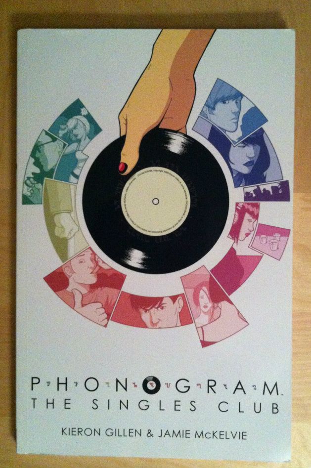
Phonogram: The Singles Club is kind of a masterpiece of comics craft. Part of this is that The Singles Club is exceptionally well written, with its dynamite premise, an engaging troupe of characters, and perfectly tuned dialogue. It's also a comic with beautiful artwork: fantastic acting, dynamic use of space, and aggressively thoughtful colouring. But the thing that makes Phonogram: The Singles Club the kind of comic that everyone should be taking a very close look at is the way Team Phonogram embeds the story so completely in setting. Structurally, The Singles club tells seven interlocking stories with common settings that occur simultaneously on the same night, and, this complicated, multifaceted beast fits together PERFECTLY. This narratives thread like a tapestry, the chapters obey the timeline of the story like a Teutonic train schedule, and the physical spaces are complete enough to pass building codes. Phonogram: The Singles Club is just about the most granular, engineered short comics run I've ever read.

Because Phonogram: The Singles Club is so well crafted, you can literally create page-by-page maps of plot, time, and setting of really remarkable detail. And, because I love making infographics, I've done just that.

Phono-Infograms:
1: Plot Map
2: Timeline
3: Setting Map

Setting Map: This is, as accurately as I can figure it out, the location of every page and event in Phonogram: The Singles Club. I tried to be as accurate as possible given the information available in the comic (including Jamie McKelvie's great backup info about the club design which I tried to back-engineer). That said, I took artistic license in a few places (the room behind the bar in the club, for instance), had to make some inferences (like Laura starting in Penny's bathroom, and Penny living in a dorm or room in her parent's house instead of an apartment...), and decided not to draw all of Bristol, so outside is just the area not enclosed in a room. Use your imagination. Areas with free drawn, squiggly lines are kind of my fog-of-war demarcations for areas where I lacked enough information to guess at layout. It's also worth noting that I guessed at overall dimensions of spaces, so that is all kind of eyeball approximate. Despite all of this attention to detail, I strongly suspect I still made some other errors in here. (Like in Lloyd's parent's (I guess) house, the leftmost mainfloor wall is, I think, the barrier wall of the home which I imagine is a rowhouse. Lloyd's room on the second floor, then, shouldn't project past it, but the place it seems to fit easiest (and maybe best given the door opening) violates this...) I am also shit at drawing cars from above. But yeah, overall I think it's pretty okay. Please use the other diagrams for time and plot locations.

(Also, it's pretty cool that I got to use my highschool drafting electives for something after all. Woo.)

This diagram is a plot map so there will be *SPOILERS* in the diagram. Be wary.


I don't really have any after commentary for this one, other than setting is just done FLAWLESSLY in The Singles Club. The fact I could look at the comic and generate reasonable floorplans for spaces in the story is CRAZY (even if I cheated and used the club 3D model pictures in the backup). The way this comic uses is setting is absolutely worth looking at in detail.

(Incidentally, this is my first blog post as married Hoo-mon. Weird...)

Previously:
So I Read Phonogram: Rue Britainia
So I Read Phonogram: The Singles Club

Deep Sequencing: Phono-Infogram: Plot Maps
Deep Sequencing: Phono-Infogram: Timeline

Friday, 14 March 2014

Deep Sequencing: Phono-Infogram Pt.2 Timeline

Or an infogram of time in Phonogram: Singles Club
By Kieron Gillen, Jamie McKelvie, and Matt Wilson; Image Comics


Phonogram: The Singles Club is kind of a masterpiece of comics craft. Part of this is that The Singles Club is exceptionally well written, with its dynamite premise, an engaging troupe of characters, and perfectly tuned dialogue. It's also a comic with beautiful artwork: fantastic acting, dynamic use of space, and aggressively thoughtful colouring. But the thing that makes Phonogram: The Singles Club the kind of comic that everyone should be taking a very close look at is the way Team Phonogram embeds the story so completely in setting. Structurally, The Singles club tells seven interlocking stories with common settings that occur simultaneously on the same night, and, this complicated, multifaceted beast fits together PERFECTLY. This narratives thread like a tapestry, the chapters obey the timeline of the story like a Teutonic train schedule, and the physical spaces are complete enough to pass building codes. Phonogram: The Singles Club is just about the most granular, engineered short comics run I've ever read.

Because Phonogram: The Singles Club is so well crafted, you can literally create page-by-page maps of plot, time, and setting of really remarkable detail. And, because I love making infographics, I've done just that.

Phono-Infograms:
1: Plot Map
2: Timeline
3: Setting Map 

Timeline: This is, as accurately as I can figure it out, the timeline of Phonogram complete with the music that is explicitly stated. Bear in the mind that there is NO SCALE to the y-axis, because that would be really hard to do. Also keep in mind that some of these placements are best guess and that I am a terrible fraud. Also, for plot details please refer to last week's plot maps to tie this to goings on.

(Apologies in advance for any mistakes or omissions.)

This diagram is a plot map so there will be *SPOILERS* in the diagram. Be wary.


One of the cool things I got out of doing the timeline is how the DJ intensive fourth chapter functions as the time key to the series. Between the songs and the fact the DJs arrive before and leave after the party this Chapter functions as The Single Club's metronome. Which beyond being structurally cool comics is kind of a formally interesting nod to what real life DJs are doing: controlling song choices controls the shape, rhythm, and timing of the party.

(Incidentally, as someone who just had to hammer together a wedding reception playlist, DJing is now a thing I have so much more respect for... but still not enough money to hire out.)

(Stay tuned for more Singles Club Infographics.)

Wednesday, 12 March 2014

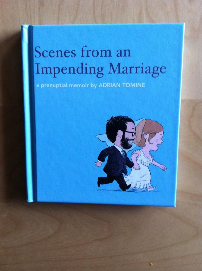
So I Read Scenes from an Impending Marriage

A 250 word (or less) review of a Prenuptial Memoir
By Adrian Tomine; Drawn and Quarterly


Planning a wedding is actually the worst. It's an elaborate process that is basically designed to hoover up all of your money, no matter the budget, in a series of largely unnecessary appointments. It's a process you have no experience with but is laden with all kinds of bizarre expectations and obligations. Basically it is one of the most surreal and complicated puzzles I have ever contended with. (Have I mentioned that my hometeam has been planning a wedding?) Scenes from an Impending Marriage, the prenuptial memoir of Adrian Tomine and his fiancee Sarah is their wedding keepsake that recounts their journey through the absurd process of planning a wedding. It's short and sweet and a lovely little glimpse into a pretty intimate time in the couple's lives. Scenes from an Impending Marriage are also, if you happen to be planning a wedding, fucking hilarious. Hilarious because of impeccable comedic timing and because, goddamnit, the hometeam had very nearly the same absurd, hurtful, and confused conversations. I read this comic on an airplane and laughed more than is appropriate to laugh on an airplane. That said, I am not sure if everyone will get the same enjoyment out of this comic that I did. So I recommend this comic for you poor wedding planners and maybe as a gift idea for those of you who know someone planning a wedding. (Incidentally my wedding is on Saturday.)

Word count: 240

Monday, 10 March 2014

Eye on Hawkeye #15

Or a look at some of the great creative choices in Hawkeye #15
by Matt Fraction, David Aja, Matt Hollingsworth, and Chris Eliopoulos; Marvel Comics


One of my favourite things about trying to write a comic criticism blog is that by looking really hard at comics I've maybe learned a few things about how comics work and some of the tricks comics use to structurally shape a reading experience. The comic I've maybe learned the most from is Hawkeye: it was one of the first comics that I really started taking a closer look at and writing about from a layout perspective. And it's just a really, really well made comic that rewards closer inspection. (And you know, totes engaging and fun to read.) The way Team Hawkeye uses layout and implied motion and colour in Hawkeye #15 is, as always, really interesting and worthy of a closer look. 

(Also, how great is the cover? Beyond the circled words I've managed to spot a "Pulido", "Wu", "Amanat", "Gruenwald", "Bro", and "Brown".)

There will of course be *SPOILERS*, some of which are pretty HUGE below. So don't read this until you've given yourself a chance to appreciate Hawkeye #15 yourself.


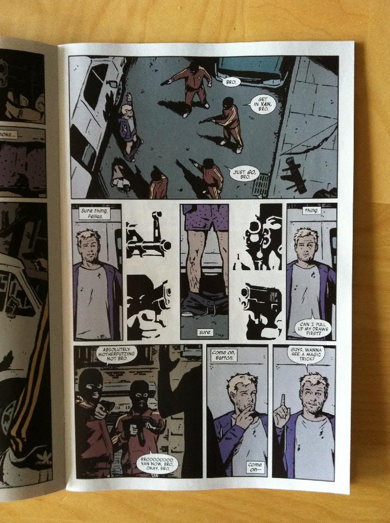
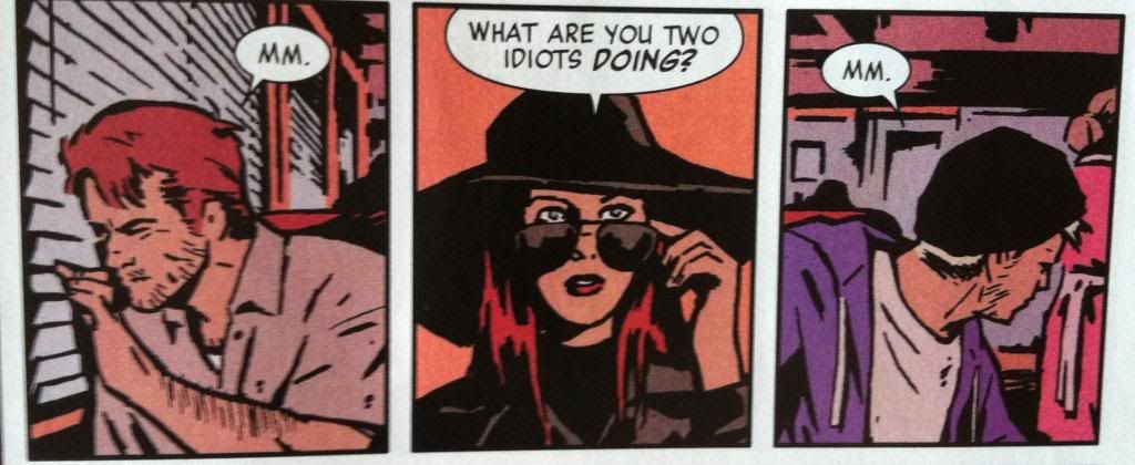
For instance, this page here is a masterwork in the use of shapes, guides, and lettering to guide the reader through the page in a really interesting and cool way.


The top panel on the page, I think, uses a circle guide to help us navigate the page. Our eyes are naturally drawn to shapes and guided by them, and Clint and the bros (and the associated speech balloons) flow in a circle that lets us quickly count the 1 Clint and 4 armed bros. Moreover, the use of a circle helps emphasize that Clint is encircled, surrounded by the bros. Smart, efficient comics.

The second row of panels does something even cooler: the combination of tall thin panels and the placement of letting at the top and bottom of panels forces the readers attention to rove up and down the page. What this does, is it causes us to look from Clints underwear down to his pants-around-his-ankles on the ground. This is a classic camera work where, in film or television, the camera looks down (whah-whah) to the pants on the ground for comedic purposes. And this motion-based panning is absolutely pulled off in a static story telling medium, which is pretty dang cool. (This comedy shot is also enhanced by the black-and-white bro guns around the periphery: they are indistinct enough to be read over quickly, but solid enough that they convey the danger, but also with the directionality of their aim, emphasize and frame the hilarious pants-fall-down shot. And the guns maybe also punch up the comedy by contrasting the danger of the situation with the absurdity of the underwear.) 

The third row of panels guides the reader through the page using the same up-and-down frame/lettering to guide the reader and to cause the Ah-ha! I have an idea! panel on the far right to be on an upstroke. (Since as we all know, ideas are vertical in nature.)

All in all, it's a great, flowing page that enhances all of the key moments using keen control of the reader's eye path. It's great stuff.


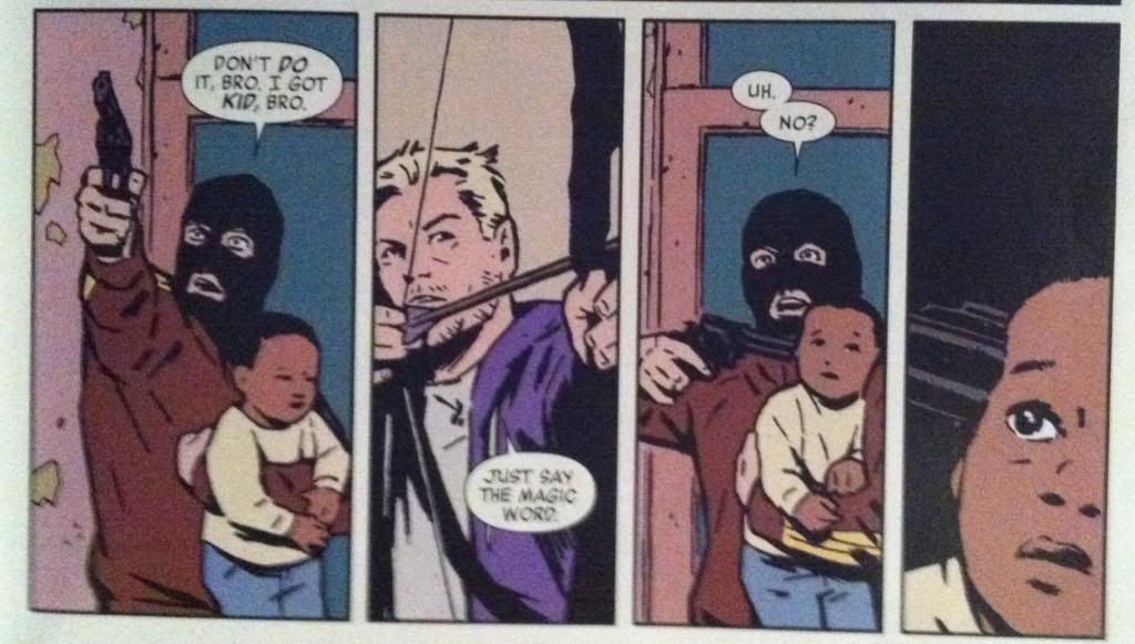
There is also a wonderful example of an effective page turn in Hawkeye #15 where this stand off, on the bottom row of a page, leads directly into...


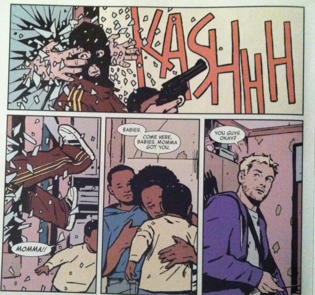
... the surprising appearance of Barney through the glass, grabbing the balaclava bro in the top panel. The use of a page turn here absolutely increases the surprise and the impact of Barneys entrance into the scene and the ensuing sequence of events.


This sequence also makes really smart use of eye motion to enhance the moment of defenestration. Barney bursting through the window drives our eyes to the right along the top panel where the onomatopoeia of the glass breaking keeps our attention and takes us to the far right of the top panel. So when our eyes carriage-return to the second row of panels, they take the longest path, allowing our eyes to pick up momentum so that when we arrive at the panel where the bro is yanked through the window our vision is travelling quickly down the same vector. Basically, this arrangement matches our reading experience to the kinetics of the events depicted to enhance the jarring, quick movement of getting dragged through a window. It's a great sequence.


Another cool feature of Hawkeye #15 is the way that orange is used throughout the comic. Many panels that depict key moments of violence or surprise or danger remove background detail and instead float in fields of this burnished orange. This is a nifty choice, in part, because stripping out background details keeps the readers focus on the moment of violence or danger depicted in the panels. It's also interesting comics because orange is a pretty alarming colour and its use, particularly after a few examples to set the tone, instantly tells us that things are not okay. We are quickly trained that in Hawkeye #15 burnished orange is bad news and the events depicted with an orange background are DANGEROUS and IMPORTANT. Which contributes to the overall sense of creeping dread throughout the issue.

Another aspect of Hawkeye #15 that I find very fascinating is the way that the Assassin-clown is framed in the majority of his panels during action sequences. While other characters are portrayed with their full bodies visible, carrying out actions, the Assassin-clown is shown in much tighter shots that show only a portion of him and only the barest hint of an action. What this does is give the Assassin-clown this super menacing sense of control: while other characters flail about in desperation, the Assassin makes decisions and small, deliberate actions that always have highly violent repercussions. It's a really fascinating choice that helps cement (along with the holy fuckfuckfuck ending) the Assassin as a properly terrifying villain. 

(Of course, there are exceptions to the close cropped Assassin-clown framing when key setting or stage-directing information is needed because as great as atmospheric comics are, storytelling is always primary.)


Previously:
Eye on Hawkeye #16: Smart layouts and chilling moods.

Eye on Hawkeye #14: Repetitive panels as a device.

Friday, 7 March 2014

Deep Sequencing: Phono-Infogram Pt.1

Or an infogram of character interactions in Phonogram: Singles Club
By Kieron Gillen, Jamie McKelvie, and Matt Wilson; Image Comics


I really like Phonogram: The Singles Club. Phonogram's premise of music as literally a kind of magic is brilliant and a wonderful metaphor for appreciating media. The way The Singles Club grows this idea and complicates it by portraying a more diverse group of Phonmancers enhances everything I loved about the first volume and tells a fantastic story. It is literally the first comic that the one coworker I've got kind of reading comics tried, and its a big part of why she's still kind of reading comics. Basically The Singles Club is a fantastic, smart, fun and accessible comic that everyone should read. 

The thing is, Phonogram: The Singles Club is also kind of a masterpiece of comics craft. Part of this is that The Singles Club is exceptionally well written, with its dynamite premise, engaging troupe of characters, and perfectly tuned dialogue. It's also a comic with beautiful artwork: fantastic acting, dynamic use of space, and aggressively thoughtful colouring (which in hindsight is worthy of its own analysis, seriously). But the thing that makes Phonogram: The Singles Club the kind of comic that everyone should be taking a very close look at, is the way Team Phonogram embeds the story so completely in setting. Structurally, The Singles club tells seven interlocking stories with common settings that occur simultaneously on the same night, and this complicated, multifaceted beast fits together PERFECTLY. This narratives thread like a tapestry, the chapters obey the timeline of the story like a Teutonic train schedule, and the physical spaces are complete enough to pass building codes. Phonogram: The Singles Club is just about the most granular, engineered short comics run I've ever read.

Because Phonogram: The Singles Club is so well crafted, you can literally create page-by-page maps of plot, time, and setting of really remarkable detail. And, because I love making infographics, I've done just that.

Phono-Infograms:
1: Plot Map
2: Timeline 
3: Setting Map 

Plot Map: The idea here is to give a loose appreciation of each characters overall plot that accounts for interactions and provides loose information on sequence and location. Bear in mind that the y-axis on this sucker is set to absolutely no kind of scale, although events within given lines occur in the order shown, and that generally speaking events at the top of the diagram precede events shown further down. In many ways this diagram is meant chiefly to show character interactions, provide overall shape to the plot, and to function as a unifying plot key for the other two infograms. 

(Apologies in advance for any mistakes or omissions.)

This diagram is a plot map so there will be *SPOILERS* in the diagram. Be wary.


A couple kind of cool things pop out once you look at the plot this way. For instance, Penny, the protagonist of Chapter 1, also acts as a framing narrative as she, like the popular party person she is, circulates around the club and touches base with most of the key characters and narratives. Seriously, study this comic!

(Stay tuned for more Singles Club Infographics.)

Previously:
So I Read Phonogram: Rue Britainia
So I Read Phonogram: The Singles Club

Wednesday, 5 March 2014

So I Read Mara

A 250 word (or less) review of the Mara graphic novel
By Brian Wood, Ming Doyle, and Jordie Bellaire; Image Comics


Mara is a Sci-fi-Superhero comic set in a militaristic, hyper-regimented future that is really passionate about volleyball. In the comic Mara, an international volleyball superstar, is living the high life: she's famous, she's got sponsors, she has legions of adoring fans. That is until she exhibits superpowers while on the court and it all comes crashing down. With artwork by Ming Doyle and Jordie Bellaire, Mara is a fantastic looking comic well worth looking at. Unfortunately the script of Mara doesn’t really deliver on the premise or live up to the art quality. When Mara was launched it was hyped as a feminist Sci-fi epic which tackled materialistic, authoritarian themes of modern society and also volleyball. And for me Mara just didn’t deliver enough on these themes. The issue, I think, is that the comic tried to play with too many ideas and included too much plot for the short length of the comic. As a result, Mara failed to really develop the themes, characters, and relationships that were the most interesting to me. And so Mara really felt more like a trippy, Twilight-Zoney Superhero tale than the high concept comic or character study I was hoping for: a short weird story in a cool setting with some heady ideas instead of a fully developed discussion. That said, I think if you approach Mara with an open mind, there is still an enjoyable comics experience to be had. Or at the very least a pretty one.

Word count: 246

Monday, 3 March 2014

The Seed To Harvest Omnibus Is A Good Book

Or why you should read Wild Seed, Mind Of My Mind, Clay's Ark, and Patternmaster by Octavia E. Butler


Seed to Harvest is a nice big omnibus book that contains a bunch of great novels by Octavia E. Butler. Broadly speaking the novels tell the story of an emergent culture of humans bred for their supernatural powers. Wild Seed tells the story of Anyanwu, an African woman with powers of healing and transformation, who is wooed and collected by Doro, an immortal being who consumes souls to inhabit bodies, and brought to 1700s America to further his plans to breed the perfect people. Mind of My Mind picks up the story hundreds of years later in vaguely contemporary times with the coming of age of Mary, a teenage girl belonging to Doro with the potential to be something unique, something that might be the key to uniting Doro's scattered people. Clay's Ark throws a wrinkle in the story with the arrival of a horrible alien virus that makes people give into their most base animal instincts. Finally, Patternmaster closes the series with a story set in the far future that sees the Patternists, the mentally powerful and rigidly controlled descendants of Doro's people, in a bitter war with the Clayarks, the mutant race of the alien disease, as a struggle emerges over who will be the next Patternmaster, leader of the Patternists. Together they tell the story of several hundred years of human social and biological evolution that explores what it means to be human in a society,

Thematically, the novels of Seed to Harvest are dense books. With elegant and accessible prose these novel ask some really difficult questions in some really brutally honest ways. The most central thematic question is one of control, and the role dominance plays in every facet of human life. For instance in Wild Seed, Butler explores control as an aspect of community and the tension between freedom in isolation and the regimented living of civilization. In Mind of My Mind Butler deals with the same question but moves the lens from the controlled to the master and delves into the role of control and ownership in building communities. Clay's Ark goes the other way and looks at how people are slaves to their animal nature and how thin the barrier of civilization really is. Finally, Patternmaster extrapolates these questions to their conclusion and portrays societies that are diametrically opposed: one structured and intellectual but where every member is relentlessly controlled and the other free but bestial and wretched. Collectively the novels of Seed to Harvest create an engaging space for a lot of really heavy conversations. It's great Science Fiction.

It's also Sci-fi that, I think, is really particular to the novels' author and her particular worldview. Now, most of the novels I read are by really smart white dudes who often have a penchant for geekery. And I think they write great books that are often fairly progressive. The thing is, I can't see a straight white author writing these books: the way they explore themes of control and slavery, belonging and alienation from the perspective of the victimized as well as the powerful is beyond, I think, the ken of those of us exclusively on the powerful side of the fence. Octavia E. Butler is an American woman of African descent and I think this helped inform the worldview that makes these books such insightful works of Sci-fi. I mean, the novels of Seed to Harvest are good books because Octavia E. Butler is a fabulously talented writer, but I still feel like they are improved and informed by her perspective as a woman and person of colour. And I think this unique and interesting perspective makes a pretty compelling argument for trying books by women and minority authors: they have interesting stories to tell that might not occur to mainstream white, male authors and, if nothing else, reading something new is always pretty great.

I would recommend the Seed to Harvest omnibus, and all of its collective novels, to anyone. They are beautifully written, engrossingly plotted, and ask some really interesting and fundamental questions from a really interesting perspective. Seed to Harvest contains big league Science Fiction that has the timelessness of classics and the literary skill of contemporary novels. If you are a serious reader of Science Fiction you really out to read Wild Seed, Mind Of My Mind, Clay's Ark, and Patternmaster. They are really good books.