by Matt Fraction, David Aja, Matt Hollingsworth, and Chris Eliopoulos; Marvel Comics

One of my favourite things about trying to write a comic criticism blog is that by looking really hard at comics I've maybe learned a few things about how comics work and some of the tricks comics use to structurally shape a reading experience. The comic I've maybe learned the most from is Hawkeye: it was one of the first comics that I really started taking a closer look at and writing about from a layout perspective. And it's just a really, really well made comic that rewards closer inspection. (And you know, totes engaging and fun to read.) The way Team Hawkeye uses layout and implied motion and colour in Hawkeye #15 is, as always, really interesting and worthy of a closer look.
(Also, how great is the cover? Beyond the circled words I've managed to spot a "Pulido", "Wu", "Amanat", "Gruenwald", "Bro", and "Brown".)
There will of course be *SPOILERS*, some of which are pretty HUGE below. So don't read this until you've given yourself a chance to appreciate Hawkeye #15 yourself.
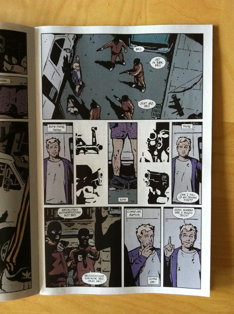
For instance, this page here is a masterwork in the use of shapes, guides, and lettering to guide the reader through the page in a really interesting and cool way.

The top panel on the page, I think, uses a circle guide to help us navigate the page. Our eyes are naturally drawn to shapes and guided by them, and Clint and the bros (and the associated speech balloons) flow in a circle that lets us quickly count the 1 Clint and 4 armed bros. Moreover, the use of a circle helps emphasize that Clint is encircled, surrounded by the bros. Smart, efficient comics.
The second row of panels does something even cooler: the combination of tall thin panels and the placement of letting at the top and bottom of panels forces the readers attention to rove up and down the page. What this does, is it causes us to look from Clints underwear down to his pants-around-his-ankles on the ground. This is a classic camera work where, in film or television, the camera looks down (whah-whah) to the pants on the ground for comedic purposes. And this motion-based panning is absolutely pulled off in a static story telling medium, which is pretty dang cool. (This comedy shot is also enhanced by the black-and-white bro guns around the periphery: they are indistinct enough to be read over quickly, but solid enough that they convey the danger, but also with the directionality of their aim, emphasize and frame the hilarious pants-fall-down shot. And the guns maybe also punch up the comedy by contrasting the danger of the situation with the absurdity of the underwear.)
The third row of panels guides the reader through the page using the same up-and-down frame/lettering to guide the reader and to cause the Ah-ha! I have an idea! panel on the far right to be on an upstroke. (Since as we all know, ideas are vertical in nature.)
All in all, it's a great, flowing page that enhances all of the key moments using keen control of the reader's eye path. It's great stuff.
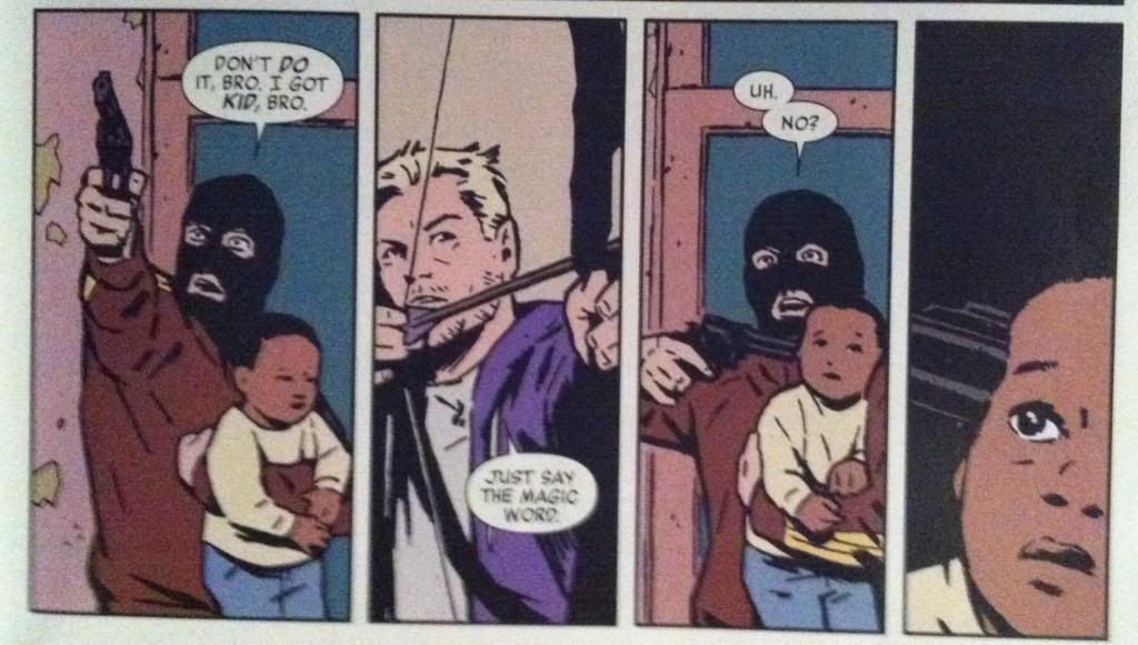
... the surprising appearance of Barney through the glass, grabbing the balaclava bro in the top panel. The use of a page turn here absolutely increases the surprise and the impact of Barneys entrance into the scene and the ensuing sequence of events.

This sequence also makes really smart use of eye motion to enhance the moment of defenestration. Barney bursting through the window drives our eyes to the right along the top panel where the onomatopoeia of the glass breaking keeps our attention and takes us to the far right of the top panel. So when our eyes carriage-return to the second row of panels, they take the longest path, allowing our eyes to pick up momentum so that when we arrive at the panel where the bro is yanked through the window our vision is travelling quickly down the same vector. Basically, this arrangement matches our reading experience to the kinetics of the events depicted to enhance the jarring, quick movement of getting dragged through a window. It's a great sequence.

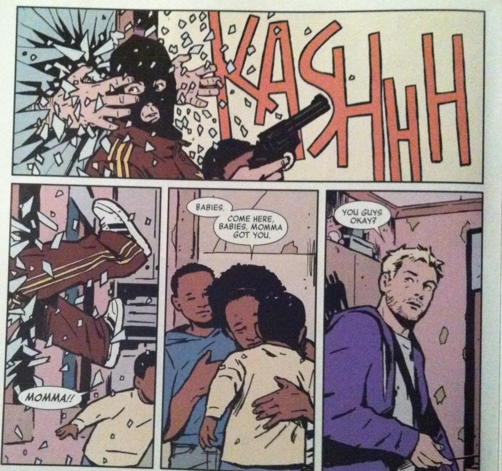
Another cool feature of Hawkeye #15 is the way that orange is used throughout the comic. Many panels that depict key moments of violence or surprise or danger remove background detail and instead float in fields of this burnished orange. This is a nifty choice, in part, because stripping out background details keeps the readers focus on the moment of violence or danger depicted in the panels. It's also interesting comics because orange is a pretty alarming colour and its use, particularly after a few examples to set the tone, instantly tells us that things are not okay. We are quickly trained that in Hawkeye #15 burnished orange is bad news and the events depicted with an orange background are DANGEROUS and IMPORTANT. Which contributes to the overall sense of creeping dread throughout the issue.

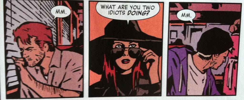
Another aspect of Hawkeye #15 that I find very fascinating is the way that the Assassin-clown is framed in the majority of his panels during action sequences. While other characters are portrayed with their full bodies visible, carrying out actions, the Assassin-clown is shown in much tighter shots that show only a portion of him and only the barest hint of an action. What this does is give the Assassin-clown this super menacing sense of control: while other characters flail about in desperation, the Assassin makes decisions and small, deliberate actions that always have highly violent repercussions. It's a really fascinating choice that helps cement (along with the holy fuckfuckfuck ending) the Assassin as a properly terrifying villain.
(Of course, there are exceptions to the close cropped Assassin-clown framing when key setting or stage-directing information is needed because as great as atmospheric comics are, storytelling is always primary.)
Eye on Hawkeye #16: Smart layouts and chilling moods.
Eye on Hawkeye #14: Repetitive panels as a device.
Eye on Hawkeye # Annual Pt. 1: Using silhouettes in arguments
Eye on Hawkeye #12: Setting up the perfect splash page
Eye on Hawkeye #12: Setting up the perfect splash page
No comments:
Post a Comment