Wednesday, 19 February 2014

So I Read Pyongyang, Shenzhen, and Burma Chronicles

A 250 word (or less) review of the travellogue comics of Guy Delisle
Guy Delisle; Drawn and Quarterly (English Editions)


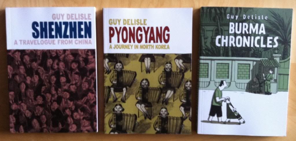
Sometimes it is easy to forget how great it is to live in a reasonably free country with a judiciary and rule of law and a million other taken for granted things. It can be easy to forget that millions or even billions of people live in places where safety or poverty or injustice are endemic. And when we do think of these people we can just as easily forget that they ARE people and that their cultures and homes can be just as beautiful as they are tragic. Guy Delisle's travelogue comics offer a really interesting and fair look into some of the more marginalized places on Earth. In Shenzhen, Deslisle takes us into the walled Chinese factory city where all of our stuff is made as he works with Chinese animators. Similarly, In Pyongyang we journey with Deslisle on another French animation project into the secretive and elaborately bizarre world of North Korea. In Burma Deslisle and his Medicens Sans Frontiers partner travel to Burma, a country that was tightly shuttered by a ruthless and strange Military Junta. In these comics we get to see life inside these locales as Deslisle embeds himself into the fabric of these societies. We get to see his day-to-day routine and meet a variety of locals, but also tackle some of the larger issues that isolate these locations. It’s a wonderful blending of slice-of-life comic autobiography and hard-hitting journalism. These comics are also, for my money, the best travel companions.


Word count: 248

Previously:
Jerusalem: Tales from the Holy City

Monday, 17 February 2014

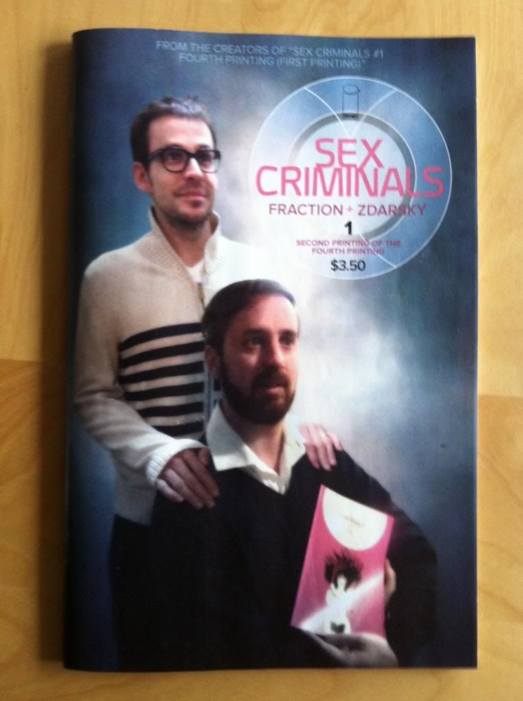
Investigating Sex Crminals #1: The Reprint Of The Fourth Printing

A look at some of the nifty colouring in Sex Criminals #1
by Matt Fraction and Chip Zdarsky, Image Comics


I have a few rules about buying comics. Rule 1: Have a limit on the number of comics I buy in issues (my top-ten ongoing titles). Rule 2: Focus on creator owned stuff by by tradewaiting and buying one tradepaperback or graphic novel format comic a week. Rule 3: Never, ever, ever buy an issue of a comic for a gimicky cover. Never.

Well, Sex Criminals #1, the reprint of the fourth printing, has made me break all these rules. Congratulations Misters Fraction and Zdarsky (IF THOSE ARE YOUR REAL NAMES!) for making me a giant money wasting hypocrite. (The comic was really good, and uh, the cover is super fun.)

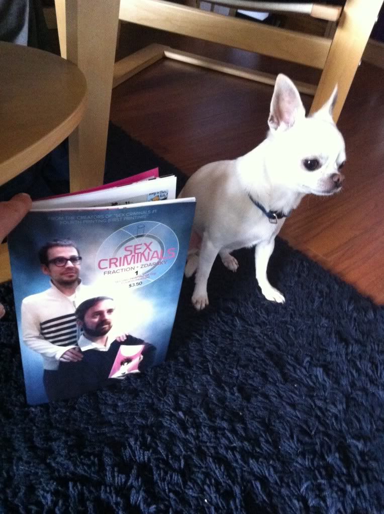
Anyway, I was inspired by the cover so this happened:


(I was trying to get something more all in a row, but Marls was NOT HAVING IT. So we compromised.)

I'm late to the Sex Criminals Party, since I was previously doing my best to tradewait for the first collection. Alas I could only delay gratification for so long and caved to a pair of pretty faces. I was just too excited. What can I say about the comic that hasn't already been said in a more timely fashion? It's a pretty great comic that manages to be pretty funny, wildly juvenile, and surprisingly heartfelt. And by trying to tackle the idea of sex in a humorous and honest way it manages to be something kind of special and maybe unique in todays comics scene. Oh yeah, it's also a comic where two people can stop time by having orgasms and decide to use the power to rob a bank. So it's probably worth a look.

Sex Criminals is also a comic that makes some really clever and effective use of colouring.

There will be *SPOILERS* for Sex Criminals #1 below.


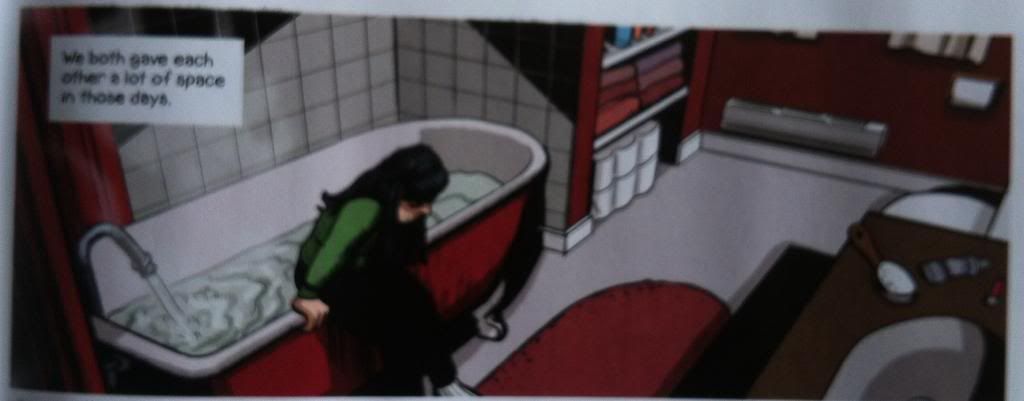
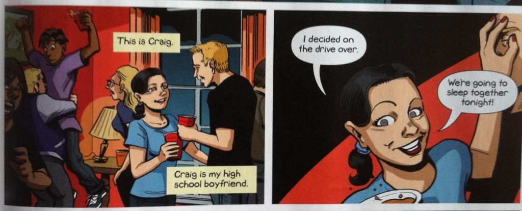
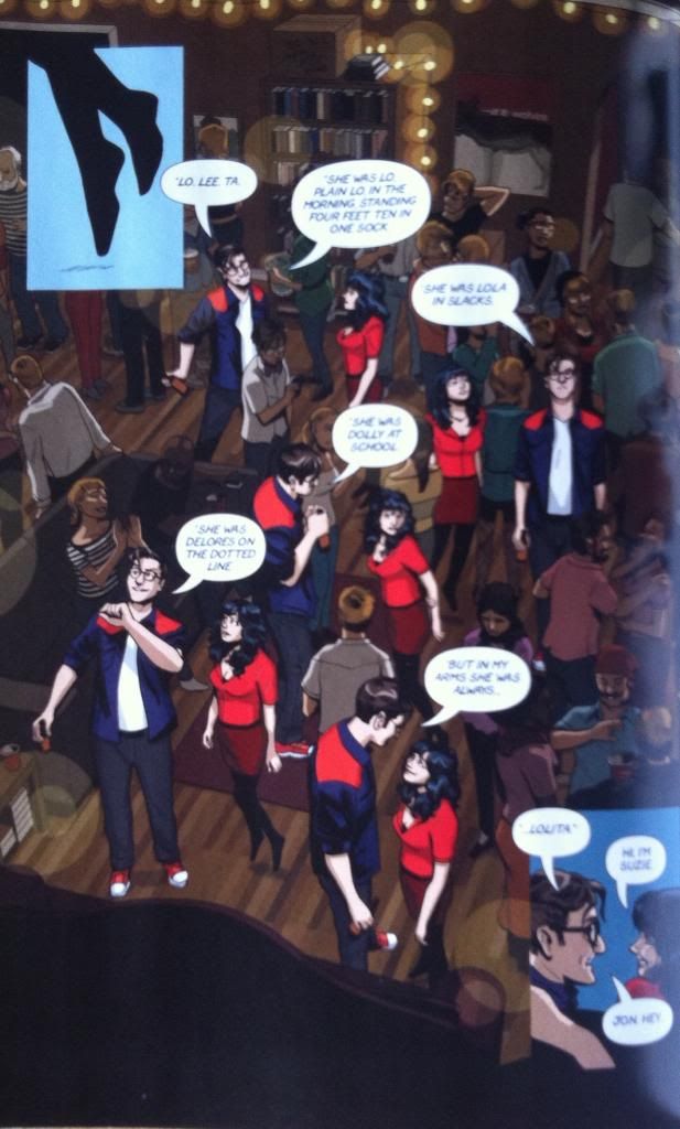
A thing I noticed about the colouring in Sex Crimnals is how much it plays with contrasting, complimentary colours to make Suzie just pop out. By having a green shirted kid Suzie in the mostly Red bathroom or teenage Suzie in her blue tshirt in the orangey-red party, the colours contrast in just the right way to make her pop out in a really simple way that just looks really nice. It's smart and fun.


And then there is this page. The way this page uses red to guide the eye through a pretty complicated page is really smart and great. This time the knack of it is that red is bright and eye catching, so our eyes are naturally drawn to the cherry red of Suzie's shirt and the shoulders of Jon's shirt. Couple that with a background that has a grey, shawdowy muted quality, and there is basically a red guideline that runs in a zig-ag from the top left corner to the bottom right corner. Basically, this lets the reader easily navigate the space and focus on the key characters while still having a rich, crowded background filled with party goers. It also, by so clearly demarcating Suzie and Jon as the focus of the page, creates the emotion of the moment of meeting the perfect person at a party and having the rest of the world just kind of fall away. This is a really smart page that is a great example of how thoughtful colouring can just make comics work better.

So yeah, Sex Criminals is a fun, interesting comic with some really smart compositional elements amongst all of the funny dick jokes.


Friday, 14 February 2014

Deep Sequencing: On The Air

Or some of my favourite quotes from comic books
By G Willow Wilson, Warren Ellis, Jonathan Hickman, Brian Clevinger, Matt Fraction, Alan Moore, Brian K Vaughn, Kelly Sue DeConnick

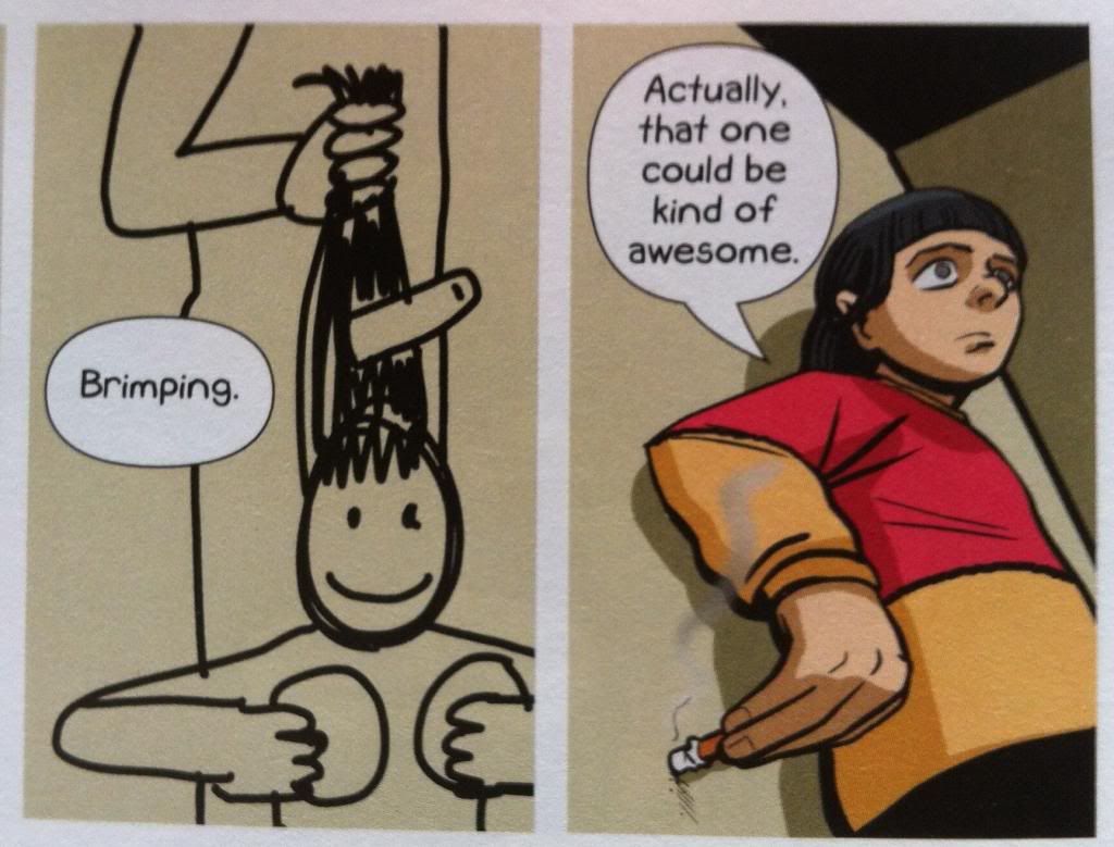
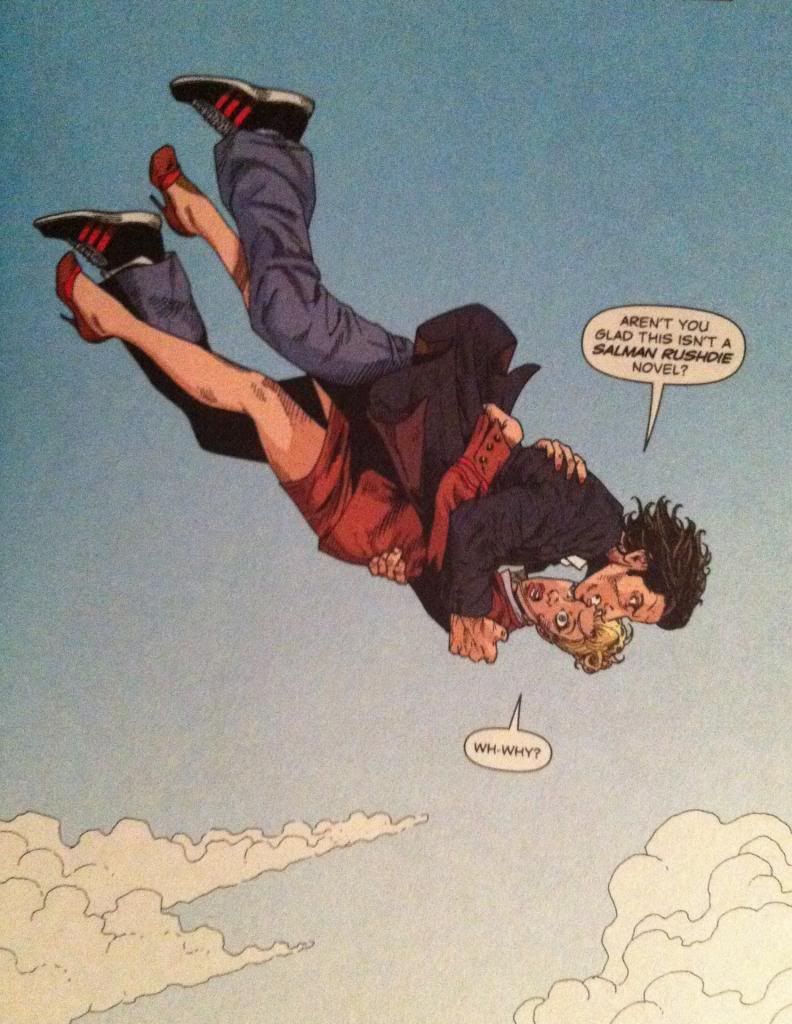
One of the things I love about Air is that it has this absolutely perfect line of dialogue right off the bat that really establishes the tone and feeling of the series. It also did a really great job piquing my interest as a reader and establishing G Willow Wilson as a writer with some serious chops. Even now, months after I finished Air, I think of the quote in question whenever I consider the series. It's really a remarkable and effective bit of writing.


Which got me thinking, what are some of the other comics quotes that have really stuck with me months or even years after I finished reading a given comic? What are the bits of writing that reflect some ideal truth or moment that are worth sharing and being appreciated by other people?

And so in celebration of Air's quotable moment, here is a completely unscientific info graphic of memorable comics quotes that immediately occurred to me when I decided to write this post:


Despite the very random nature of this list, there are a couple things in common between these quotes that have stuck with me. A lot of them are at the beginning of a comic collection, series, or issue and solidifies the tone of the issue or series. Actually, most of these quotes go beyond that for me and shape the overall understanding of the larger story. Like the hospital quote from Casanova let's us know that Gula would be a much darker, harder comic than Luxuria. Or the Ex Machina quote, from the final issue, reflects the way that last issue alters the fabric the entire preceding series. Which maybe speaks to just how important writing is to comics: as much as amazing art elevates the best comics, great writing can latch on with the strength of the most brilliant visual. Hurray for writers.

(Also, dramatically dropping Pa-Zow! in everyday situations is more fun than it should be.)

What are some of your favourite quotes?

Wednesday, 12 February 2014

So I Read Air

A 250 word (or less) review of Air the complete series
By G. Willow Wilson and M.K. Perker; Vertigo Comics


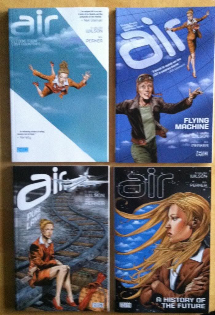
Air travel is inherently interesting. It's this mind-boggling realization of an impossible primordial dream. It's Applied Science and bleeding-edge engineering. It's a surreal process that encapsulates people in one place and then deposits them somewhere completely new. It's the promise of the future and the romance of the past. It's completely unnatural and absolutely terrifying. Air is a comic about air travel in all of its literal, cultural, and metaphorical dimensions. In Air, Blythe, a flight attendant for a new kind of airline, is dragged into a shadowy war between the vigilante Etesian Front and a mysterious terrorism suspect. A secret war that will decide the future of flight, delve into the history of air travel, reveal hidden countries, and teach Blythe about the secret power within herself. Air is one crazy and surreal comic book. A lot of the themes Air explores swing pretty far into the metaphorical and, as a result, the book spends a fair amount of time navigating through some pretty non-Euclidean geometries. Fortunately, Air tackles its more fantastical elements with a dream logic infused conviction that really sells its most fantastic elements. It’s a beautiful kind of crazy. My only real complaint about Air is that, due to capricious publishing, the comic ends pretty abruptly with a lot of untapped potential left unrealized. I mean, it reaches a satisfying conclusion, but I feel like Air had still had more to say. But better to have flown for a moment than to have never tried. So try Air.

Word count: 250

Monday, 10 February 2014

Atoll Comics Round 11

Or changes to my top-ten


Due to poverty and an urge to buy better comics, I have decided to be super-selective about which superhero comics I read. Harnessing the Awesome Power of Maths, I have determined that I can afford to read 10 ongoing titles. So I get to read 10, and only 10, titles published by either Marvel or DC as well as one trade paperback a week of my choosing.

A complication of this is that I am forced to drop an on-going title if I want to try reading a new on-going title, an act of very tough love. Being financially responsible is the worst.

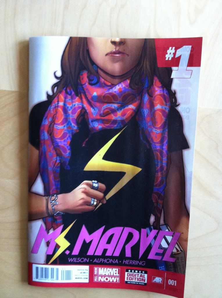
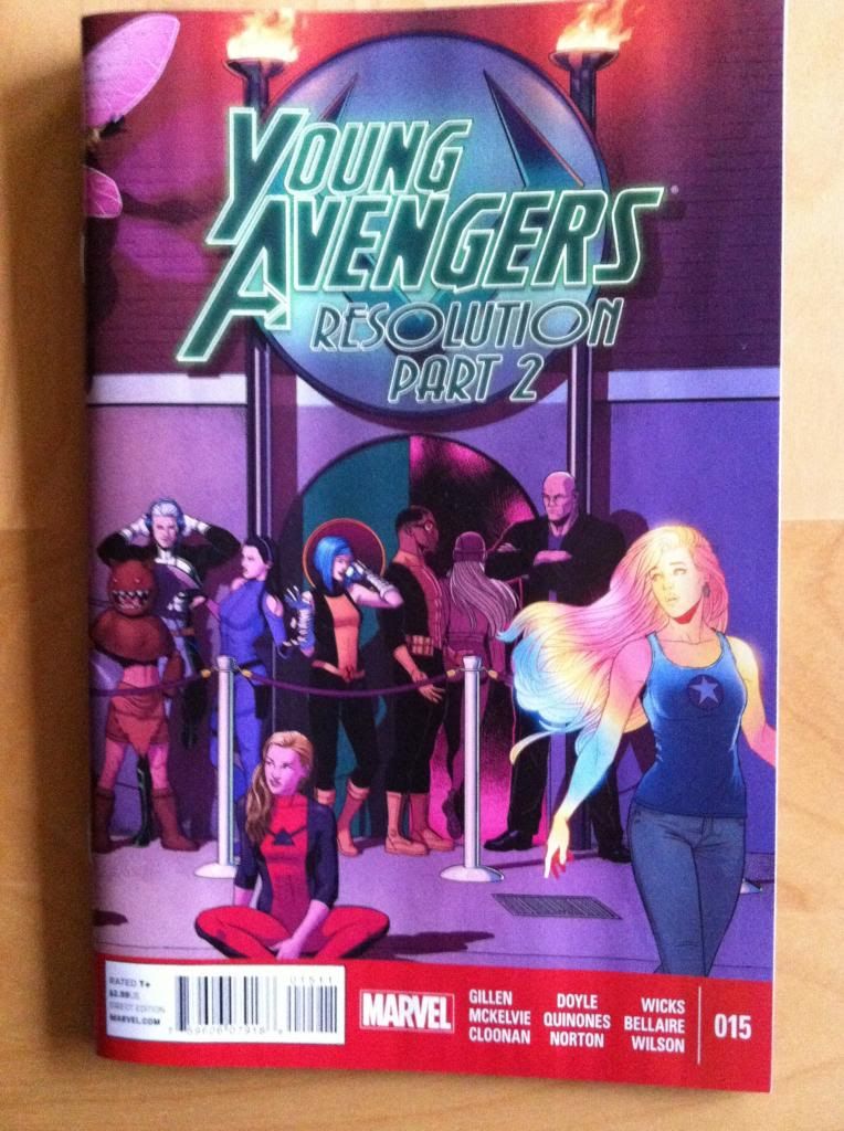
I will be adding Ms. Marvel and dropping Young Avengers.


Why Ms. Marvel: In short because it isn't comics as usual. 

On the day I bought Ms. Marvel #1, the news that Geoff Johns and John Romita Jr. would be writing Superman dropped. While I am sure it will be a perfectly fine comic, I'm left wondering what new or exciting thing is going to come out of that? I suspect that it will be a couple of talented, but very mainstream creators making what I suspect is going to be vaguely nostalgic Superman stories with a new, modern twist. And... ehn? I came to comics in my early twenties and Superman isn't a thing I have a deep nostalgic love for. I'm glad it's out there for people into that, but I'm much more interested in a comic that isn't a retread of the same storylines and manages to try something new and interesting. I love me some superheroes, but I'm finding myself growing ever more bored with business as usual, PACK OF CAPES PUNCHES WORLD CATASTROPHE! I'm finding, more and more, that it's superhero comics with some kind of different take on the genre, or an interesting perspective or thematic approach that are catching my imagination these days. And I think Ms. Marvel is poised to tell me a story I've never really seen before and talk about some interesting and important ideas. Which is why I'm giving it a try.

The concept of the series is that Kamala Khan, a 16 yearold American teenager of Pakistani descent with a very Marvel name suddenly gets superpowers. She is a Muslim and Captain Marvel fangirl and she lives in Jersey City where she tries to navigate, well, life with all of its teenage drama, cultural complexity, and, presumably, the added challenge of superheroics. The comic is written by G Willow Wilson, drawn by Adrian Alphona, and coloured by Ian Herring, which is maybe the perfect group of creators for the story. G Willow Wilson is a great writer who I think is poised to offer a really interesting perspective on the story (among other reasons, she herself is a Muslim living in America), and Adrian Alphona is an artist I really like (Runaways is a favourite early comic for me) and whose style has a youthful, energetic style and sense of cool that is perfect for telling a teenage story. If the first issue is any indication, Ms. Marvel looks like it is going to be both a thematically interesting and really well made comic that looks poised to be fantastic. It is absolutely a top-ten comic.

(I think Ms. Marvel is also an Important comic. For one, I think it's pretty cool to see more mainstream comics that star under-represented groups because everyone deserves to see themselves reflected heroically in comics and because its always interesting to learn about people whose lives are different. But I think it's also Important because it's a comic that is maybe designed to appeal to a different kind of comics consumer. When I bought Ms. Marvel #1, a 38 year old, overweight dude, nazally wheezed that this was "The Ms. Marvel comic no one asked for". I was in a hurry and arguing with garbage skow humans is a waste of energy so I didn't suggest that I very much asked for this book, but I did make a point of interrupting his nazal-wheezing to add Ms. Marvel to my Pull List because screw his stupid face. My point here is this man is a disgusting jackass who represents a side of comics that I think most people find highly loathsome, and that there are people that aren't 38-year old caricatures who might also want to read comics. And I feel that since mainstream comics cater to 38 year old dudes so extensively that they have maybe curbed the market on 38 year old dudes who are interested in comics. Which might mean that if comics want to grow the market (which is good for everyone) they need to start making content for people in their 20s and teens, children, women, and people from diverse cultural and religious backgrounds with various sexual orientations and gender presentations. Basically everyone who isn't an old white dude. And if wheezy garbage skow is any kind of survey, Marvel has succeeded in that.)

(Incidentally, wheeze-bag is very excited for the Johns-Romita Jr run on Superman.)


Why not Young Avengers: Because it's over. Young Avengers was a comic that was beautiful and experimental and expertly crafted and now it's gone. A fact that simultaneously makes me very happy and quite sad. Like all great things that end it has left a space, both in my heart and in my Pull List, and so I formally say goodbye and welcome something new.   Lion King.

(For those keeping score, I think Young Avengers was another Important comic by being diverse and by having a story that also appeals to non-38 year old wheeze dudes.)

Previously:


Friday, 7 February 2014

Pondering About Pretty Deadly #4

Or my favourite impacts from Pretty Deadly #4
by Kelly Sue DeConnick, Emma Rios, Jordie Bellaire, Clayton Cowles; Image Comics


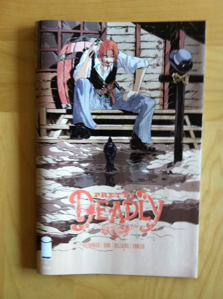
So my usual tactic when writing Pretty Deadly is to talk about the Holy Shit moments of the comic and highlight some of my favourite interesting features of the issue. The trouble with Pretty Deadly #4 is that, unlike other issues which have revelation based, discrete HSMs, PD#4 is an issue that plays out in one grand, brutal payoff that had me "Oh Jesus Wept"-ing all the way through. As such, it's either one very large, drawn out Holy Shit Moment, or a kind of fractal landscape made entirely of tiny Holy Shit Moments. Regardless, HOLY SHIT!... and my usual approach falls apart. So I'm just going to write about some of the cool comics in Pretty Deadly #4, and why I think this comic is such an effective and badass machine.

This issue, climactic as it is, is going to make this post VERY *SPOILERS* heavy. So only read on if you are up-to-date with your Pretty Deadly. (Because you really ought to be reading this comic.)


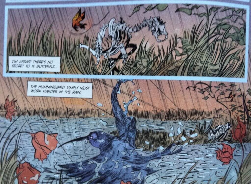
As much as Pretty Deadly is an unflinchingly brutal comic about supernatural vengeance, it's also a comic with some really pretty artwork and poetic moments. Just, you know, kind of brutal little poetic moments. I point this out because this moment here is pretty amazing and emblematic of the eerily beautiful comic that lurks amongst all the hyper violence, sex, and villainy. And I feel like this aspect of the comic: the beauty and innocence threaded throughout the Pretty Deadly provides a kind of emotional anchor for the story that is a constant contrast with the more horrific aspects of the comic. Things always seem darker with a little light, yeah?
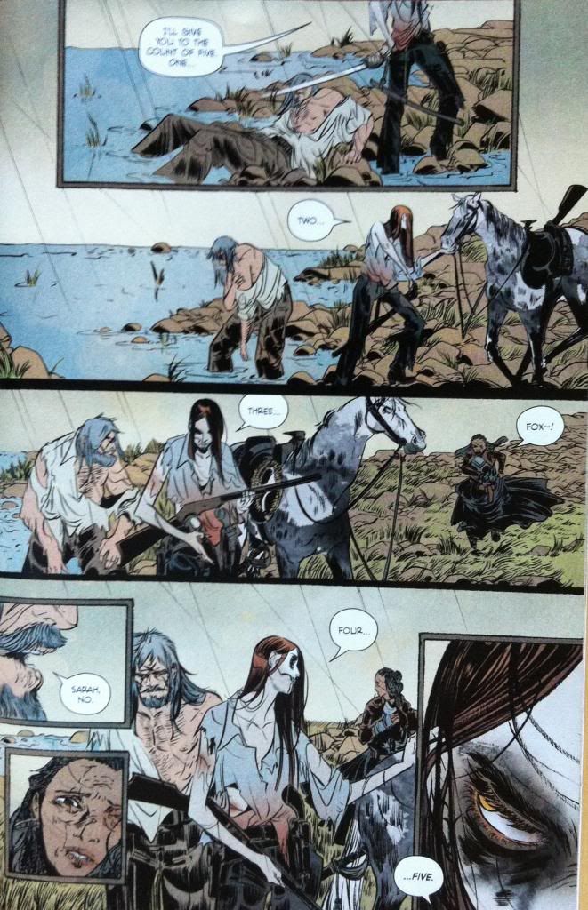


The central story thrust of Pretty Deadly #4 is the climatic battle between Ginny and Fox (aka the Mason). It is by far the most brutal and visceral fight we've seen in Pretty Deadly thus far (which is saying a lot). Part of this is the emotional buildup and context of the conflict: we see a battered, unarmed Foxy being pitted against Deathface Ginny, a woman who we've seen scythe through a gang of armed men and stand toe-to-toe with the fearsome Big Alice. And then there are the stakes: not only is Fox's life in danger, but Sissy's life also hangs in the balance of the conflict. When a fight has context and emotional repercussions, it is so much more dramatic and exciting than some dumb fight with planetary consequences but no soul.

But I think there are also a number of interesting art decisions that make this fight more impactful and different than previous conflicts in Pretty Deadly.
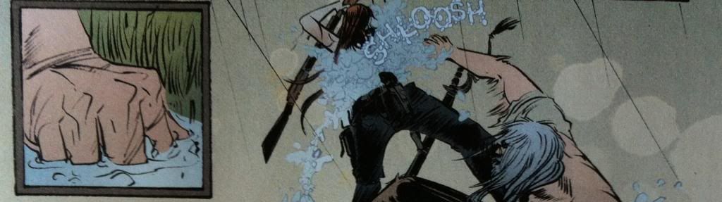
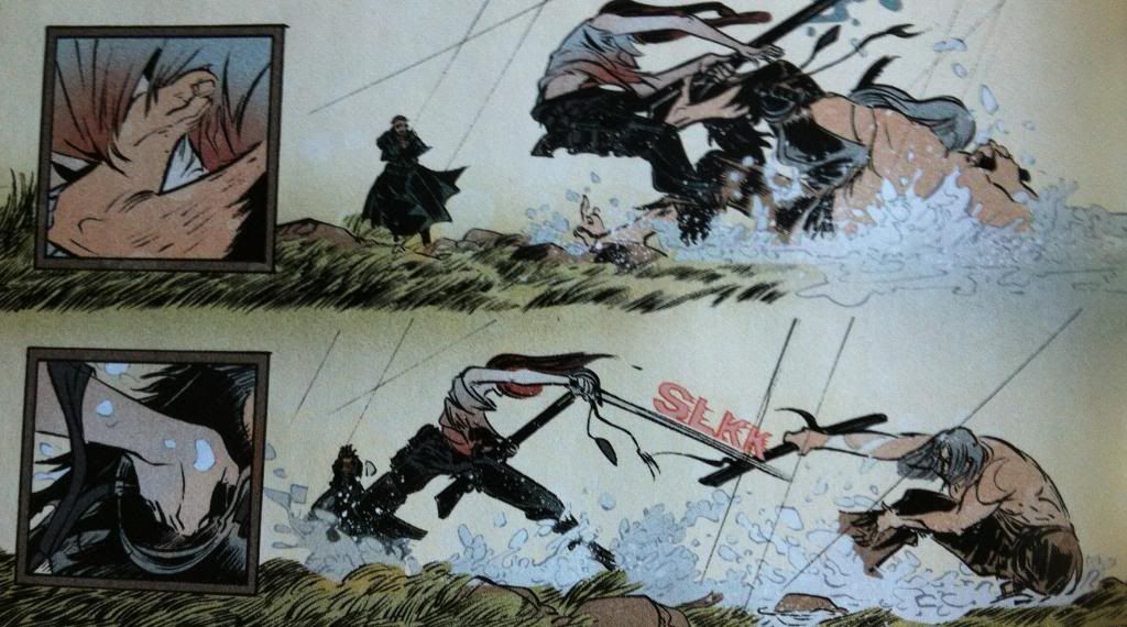
The first of these differences has to do with how the small ad large panels relate to each other. In previous issues of Pretty Deadly the small panels tended to exist within the actions of the page as kind of glimpses of noise or emotion or noise. In this sequence the big and small panels have a kind of cause and effect relationship where the small panels show glimpses of specific actions taken by the combatants and the larger panels show the repercussions of the decisions. The result is a fight broken into these lurching burst of decisions and violence. Which, as opposed to the very-guided, brutally elegant fights in previous issues,  is a much more stumbley, rolling bout. Less glorious spectacle, more dragged out grudge fight. This approach to storytelling also plays into the thematic idea of the stakes of the fight: every burst of violence are these little chains of violence and consequences. It's a really interesting way to present a fight in sequential art.
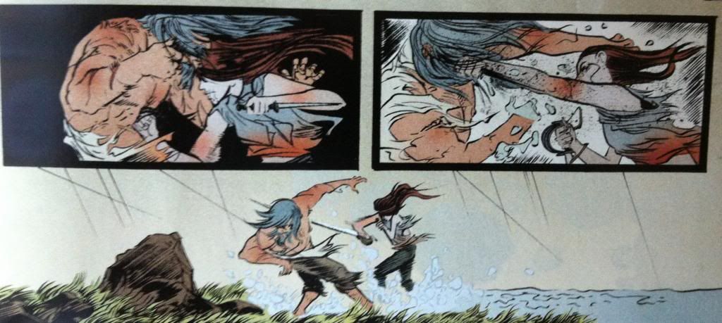

Another difference has to do with the arrangement of motion. In past conflicts Team Deadly has presented events in a way where motions flow organically from panel to panel so the reader moves along the paths of motion to enhance the speed of every slash, shot, and blow. Pretty Deadly #4 often takes a different approach where many moments of violence actually act against the motion of the readers vision. 


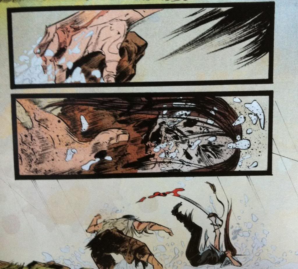
To break down this example of anti-motion composition, the eye moves in a simple straight across the panels from left to right. However, the main motion of the composition is the right to left punch in the second panel, which acts against the readers eye motion. What's more, the main motion in the first panel (well one of them, since there is a punch too) is the dagger-holding hand cocking back in a left to right direction, which means the two motions in the panels act against each other. They are disconnected in a way that disrupts a quick, directed reading of the panels. Which, I thinks provides each panel with a weight they wouldn't have if they had a more connected, flowing progression.


For the sake of comparison, I flipped the panels so that now the the punching motion moves with the direction of the readers eye. Which, for me at least makes the pair of panels connect a lot more, and makes them much easier to read through quickly. It also, I think, adds a certain elegance to the punching motion that isn't present in the other arrangement. 


So if we directly compare the two arrangements, the actual, broken layout as well as my modified flowing approach we can directly see the difference between them. Which is, in my opinion, that the actual layout is much more impactful and brutal. By making the panels harder to work through and avoiding an elegant guiding path, the panels feel disconnected and jarring in a way that absolutely enhances the weight of the blow and the emotional resonance of the violence depicted. It's really great comics.


Between the writing, the context, and brutality enhancing artwork Pretty Deadly #4 is absolutely a big drawn out spectacle of violence and Holy Shit Moments.

Previously:
Wednesday, 5 February 2014

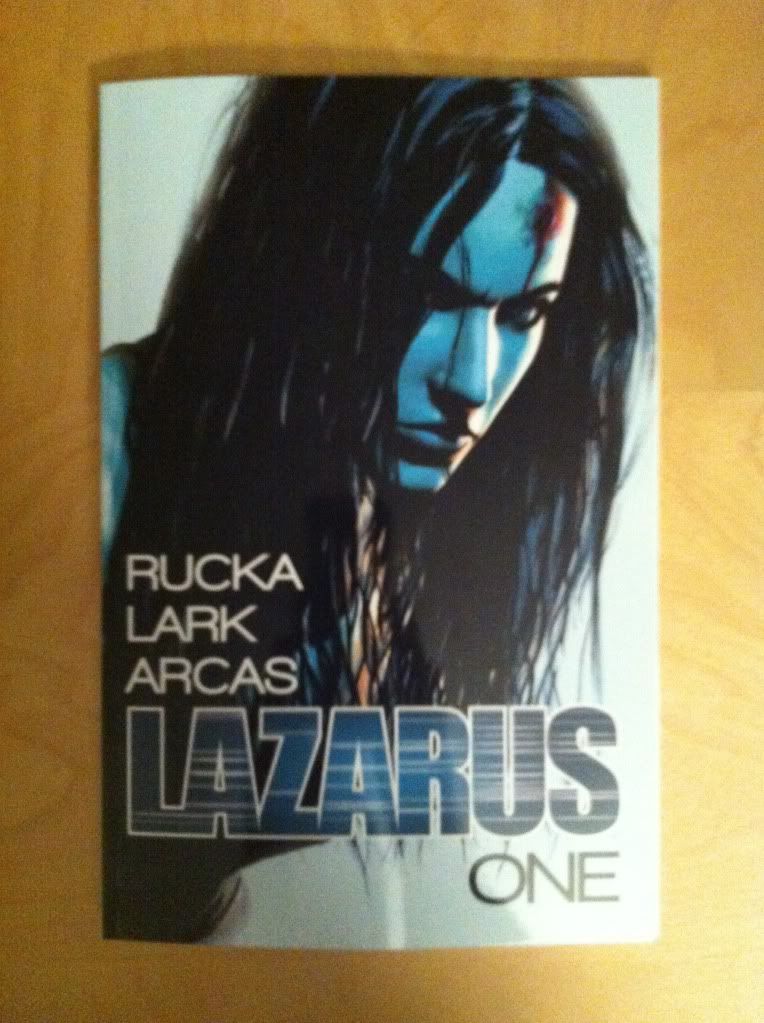
So I Read Lazarus: Family

A 250 word (or less) review of Lazarus: Volume 1 
by Greg Rucka, Michael Lark, and Santi Arcas; Image Comics


So much of our collective imagination is based around the idea that there have been golden ages, times which were morally, or creatively, or materially better than today. Sometimes I wonder if we are in such a golden age today, a golden age that threatens to teeter off into some kind of corporate police state run by an oligarchy of plutocrats. And it seems that Rucka, Lark, and Arcas have worry about this too. In Lazarus they portray a future where a dystopian North America is controlled by extremely wealthy families, who, through their stranglehold on scarce resources and strength of arms, rule as merchant princes over retainer Serfs and piteous, countless Waste. A future that seems like the logical extension of our current economic disparity, of personified corporations, of commodified natural resources, and of uncontrolled climate change. It is in this terrible and plausible future that Lazarus tells the story of Forever Carlyle, the genetically enhanced, superhuman Lazarus enforcer of the Carlyle Family and the complicated familial and situational conflicts she is embedded in. Lazarus: Family, the short first volume of the series, is effectively the opening scene of the ongoing comic: the first chapter succinctly establishing the premise of Forever, and the rest of Family constructs the larger world and the dynamics of Family Carlyle. As such Lazarus Volume 1 is so much more intriguing than satisfying, but it has certainly left me hungry for more. 


Word count: 238