by Kelly Sue DeConnick, Emma Rios, Jordie Bellaire, Clayton Cowles; Image Comics
So my usual tactic when writing Pretty Deadly is to talk about the Holy Shit moments of the comic and highlight some of my favourite interesting features of the issue. The trouble with Pretty Deadly #4 is that, unlike other issues which have revelation based, discrete HSMs, PD#4 is an issue that plays out in one grand, brutal payoff that had me "Oh Jesus Wept"-ing all the way through. As such, it's either one very large, drawn out Holy Shit Moment, or a kind of fractal landscape made entirely of tiny Holy Shit Moments. Regardless, HOLY SHIT!... and my usual approach falls apart. So I'm just going to write about some of the cool comics in Pretty Deadly #4, and why I think this comic is such an effective and badass machine.
This issue, climactic as it is, is going to make this post VERY *SPOILERS* heavy. So only read on if you are up-to-date with your Pretty Deadly. (Because you really ought to be reading this comic.)
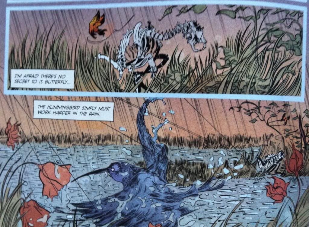
As much as Pretty Deadly is an unflinchingly brutal comic about supernatural vengeance, it's also a comic with some really pretty artwork and poetic moments. Just, you know, kind of brutal little poetic moments. I point this out because this moment here is pretty amazing and emblematic of the eerily beautiful comic that lurks amongst all the hyper violence, sex, and villainy. And I feel like this aspect of the comic: the beauty and innocence threaded throughout the Pretty Deadly provides a kind of emotional anchor for the story that is a constant contrast with the more horrific aspects of the comic. Things always seem darker with a little light, yeah?
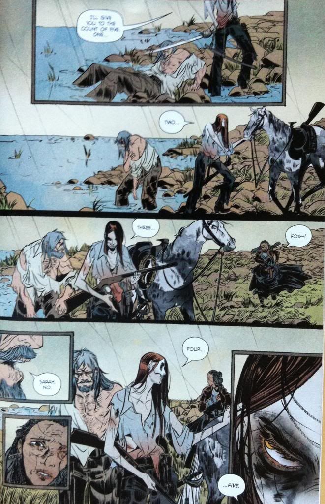
The central story thrust of Pretty Deadly #4 is the climatic battle between Ginny and Fox (aka the Mason). It is by far the most brutal and visceral fight we've seen in Pretty Deadly thus far (which is saying a lot). Part of this is the emotional buildup and context of the conflict: we see a battered, unarmed Foxy being pitted against Deathface Ginny, a woman who we've seen scythe through a gang of armed men and stand toe-to-toe with the fearsome Big Alice. And then there are the stakes: not only is Fox's life in danger, but Sissy's life also hangs in the balance of the conflict. When a fight has context and emotional repercussions, it is so much more dramatic and exciting than some dumb fight with planetary consequences but no soul.
But I think there are also a number of interesting art decisions that make this fight more impactful and different than previous conflicts in Pretty Deadly.
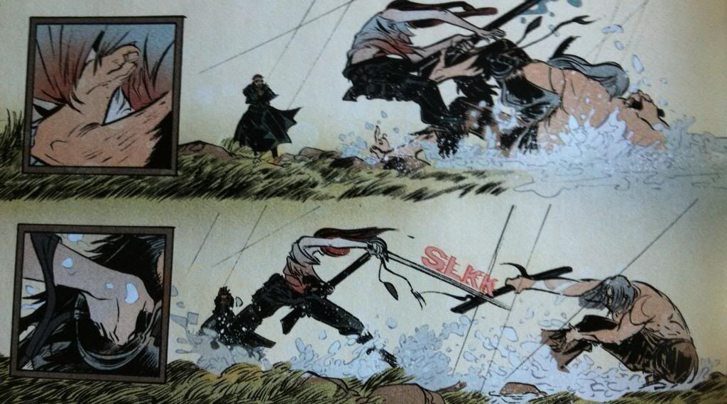
The first of these differences has to do with how the small ad large panels relate to each other. In previous issues of Pretty Deadly the small panels tended to exist within the actions of the page as kind of glimpses of noise or emotion or noise. In this sequence the big and small panels have a kind of cause and effect relationship where the small panels show glimpses of specific actions taken by the combatants and the larger panels show the repercussions of the decisions. The result is a fight broken into these lurching burst of decisions and violence. Which, as opposed to the very-guided, brutally elegant fights in previous issues, is a much more stumbley, rolling bout. Less glorious spectacle, more dragged out grudge fight. This approach to storytelling also plays into the thematic idea of the stakes of the fight: every burst of violence are these little chains of violence and consequences. It's a really interesting way to present a fight in sequential art.
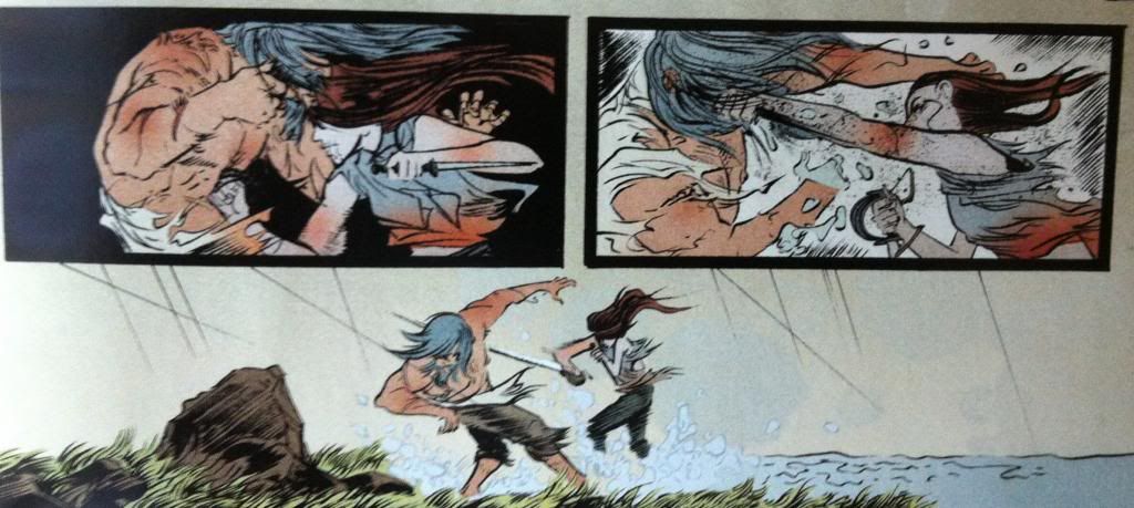
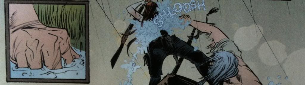
Another difference has to do with the arrangement of motion. In past conflicts Team Deadly has presented events in a way where motions flow organically from panel to panel so the reader moves along the paths of motion to enhance the speed of every slash, shot, and blow. Pretty Deadly #4 often takes a different approach where many moments of violence actually act against the motion of the readers vision.


To break down this example of anti-motion composition, the eye moves in a simple straight across the panels from left to right. However, the main motion of the composition is the right to left punch in the second panel, which acts against the readers eye motion. What's more, the main motion in the first panel (well one of them, since there is a punch too) is the dagger-holding hand cocking back in a left to right direction, which means the two motions in the panels act against each other. They are disconnected in a way that disrupts a quick, directed reading of the panels. Which, I thinks provides each panel with a weight they wouldn't have if they had a more connected, flowing progression.


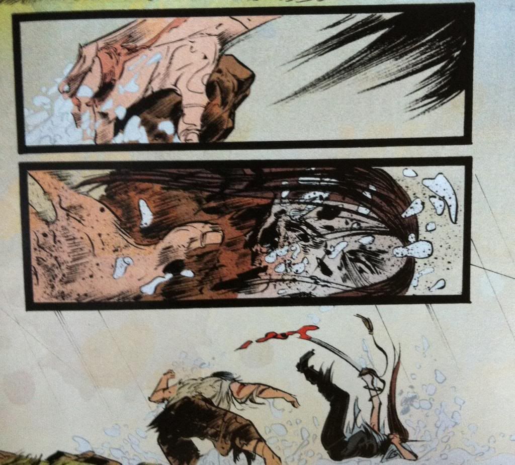
For the sake of comparison, I flipped the panels so that now the the punching motion moves with the direction of the readers eye. Which, for me at least makes the pair of panels connect a lot more, and makes them much easier to read through quickly. It also, I think, adds a certain elegance to the punching motion that isn't present in the other arrangement.


So if we directly compare the two arrangements, the actual, broken layout as well as my modified flowing approach we can directly see the difference between them. Which is, in my opinion, that the actual layout is much more impactful and brutal. By making the panels harder to work through and avoiding an elegant guiding path, the panels feel disconnected and jarring in a way that absolutely enhances the weight of the blow and the emotional resonance of the violence depicted. It's really great comics.
Between the writing, the context, and brutality enhancing artwork Pretty Deadly #4 is absolutely a big drawn out spectacle of violence and Holy Shit Moments.
Previously:
Pretty Deadly #2: Holy Shit Moments depicted with Holy Shit artwork
Pretty Deadly #1 pt. 2: The Song of Deathface Ginny
Pretty Deadly #1 pt.1: Breaking Rules
Pretty Deadly #1 pt. 2: The Song of Deathface Ginny
Pretty Deadly #1 pt.1: Breaking Rules
No comments:
Post a Comment