by Ales Kot, Marco Rudy, and Clayton Cowles; Marvel Comics


There will of course be *SPOILERS* for BB:TWS #3-5 below


The current iteration of The Winter Soldier is a trippy, Sci-fi espionage comic that is filled with exotic locations, psychedelic experiences, and evocative emotion-scapes. It is really impressive how the comic manages to use the structure of the page to give every location a particular visual identity and emotional resonance. In the above selection we see the inside of an alien warship filled with round, gunsight/lense panels that are different than the normal terrestrial grid and evocative of the martial paranoia and technological nature of the guardian spacecraft. Next we see a sequence on the planet that has the panels being drawn into a octogonal panel, which we have previously seen as a motif associated with this world and its Queen in previous issues. The next selection sees a conversation happening in the inner sanctum of the queen, which has an organic, garden motif to the panels. It gives the scene a very biological and intimate sense and really emphasizes the flirtation going on in the panels. Last we see a recurring layout used in a flowery meadow that sees the page revolve around the structure of a flower, which is resonate with the romantic location, but also unexpected and weird, like the dreamy/prophecy subject matter being discussed on panel. All of the pages have a distinct look that is consummate with both the kind of place where the story is happening, but also the emotional flavour of the story. It's great stuff.

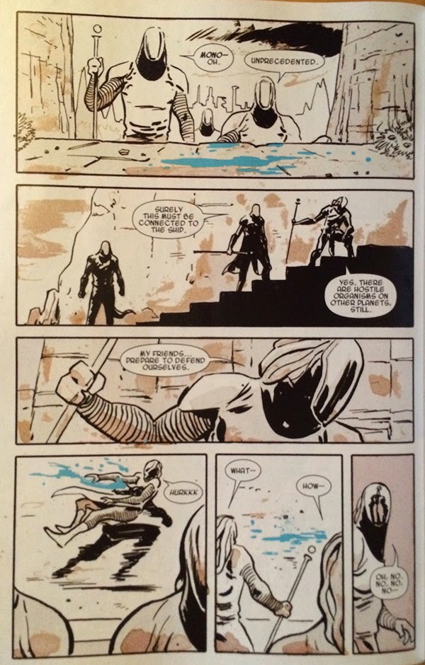


Another cool aspect of BB:TWS #3 is this sequence here. The story of the page is that a troop of psychic alien soldiers find their perceptions altered, presumably because their mental powers are being muted, and then picked off by a dangerous assassin. This is conveyed on the page by a loss of colour when the assassin activates his device. This is a great choice because it viscerally communicates altered perception in a way that changes the way we perceive the page: just like the soldiers who have their senses dampened and changed, so do we. As a visual metaphor for a loss of psychic powers, a loss of colour is pretty great. This choice is also effective as the bright blue of the alien blood in the sequence retains its colour and really pops out. This emphasizes the blood which really enhances the violence and tension of the scene. It's a really effective choice.


I also am really impressed with this page. The page depicts the arrival of three different space ships arriving at the planet Mer-Z-Bow from three separate dimensions and this information is encoded in a bunch of clever ways. For one, Mer-Z-Bow, the central planet has jewel-like facets, including octagonal faces which play into the established visual motif and identity of the planet. And then there are the way the spacecraft, from separate dimensions, are sequestered from each other in panels that appear as layered planes, as if the ships are burrowing through the multiverse to arrive. This effect is enhanced as the spacecraft progress from the highest, closest to the reader panel-plane and recede towards the planet as the panels stack into the page. It's a cool effect. It is also really clever that Bucky and Daisy's ship, the one native to the universe of the comic, exists solely in the plane of the page and does not travel trough layered panels like the foreign ships. Despite being a pretty quiet logistical page, this sequence is pretty interesting.

The layout that I find most fascinating in BB:TWS #3 is this double page spread right at the beginning of the comic. The story of the page is that we are introduced to the alien Queen, Ventolin Xtal, she is discussed as a destabilizer and assassination target, and then Daisy and Bucky have some charming roomate banter about their pet Reznor. The actual panels start with a picture of the Queen and then shift to Bucky doing maintenance on (reloading?) his mechanical arm followed by a sequence of their Reznor playing with a ball. The actual panels portray a story of a pretty casual situation, where Ventolin Xtal is merely part of the broader situation. However! The layout of the double page spread is all about her face: every panel is constructed into her profile. What this does is put all of these seemingly casual panels into context: while Bucky and Daisy might be bantering, their, or at least Bucky's mind, is still focused on Xtal. Despite what we are told she is absolutely the most important aspect of this sequence. It's a fantastic use of layout to tell us something unsaid that is going on in the comic.

This page from BB:TWS #4 might be my very favourite so far. On the page, a stealthy Crossbones ambushes Daisy Johnson and stabs her through the heart. This is depicted in the absolute coolest, most horrifyingly amazing way! We see the figures of Daisy and Crossbones locked in a stabby embrace on a white page that is splattered in a smeared spray of blood red. It is immediately scary and visceral and evocative of the violence of the page. It is also a great way to depict the stabbing: the smeared blood captures the panicked scrabble of the wounded Daisy, and spray of splatter where the knife blade emerges from Daisy's body lends the image a sense of motion and sells the violence of the stabbing. The thing that floors me though, is that the entire blood red smear is in the shape of an explanted heart: the red triangle of ventricular walls, the hollow half circles at the top of atria, and tube like projections and spray at the top where all of the veins and arteries emerge from the organ. This instantly implies to us that Daisy has been stabbed through the heart and really ups the fear and tension of this cliff-hanger. It is, by far, the best depiction of a heart stabbing I have ever seen.
(And, as professional cardiac cell biologist who spends a lot of time thinking about and looking at hearts, this image just floors me. It is incredible.)


Another aspect of Bucky Barnes: The Winter Soldier which I have been quite impressed with is how character motifs are incorporated into the design of pages. This collection of pages from BB:TWS #5 show layouts that are built around the character symbology: the shoulder star of Bucky, the Jolly Roger of Crossbones, and the radial pattern of Daisy Johnson. We can instantly see which character is the focal point of each page by the motifs on display. It's an interesting approach to storytelling.
These selected pages are also noteworthy in that they are kind of awesome. Like, take the top Bucky Star page that has Bucky attacking Crossbones and being tossed across the page in a motion captured by the arc of stars. And then! Then crossbones stabs down with a knife that actually pierces through the layout itself in a truly fearsome moment of comics. Similarly, the Crossbones layout does an incredible job drawing out a truly horrifying and tense moment and the perspective of the knife blade tip pointing down at the reader is jaw dropping. The Daisy Johnson layout not only gives her a triumphant moment of power, but also fractures and splits down the right edge capturing the effects of her seismic attack and showcasing the way things fall apart as Crossbone triggers his contingency plan. Each of these layouts is a nifty use of character symbol motifs and a pretty amazing feat of comics.
Bucky Barnes: The Winter Solider is one of the best layout and design comics being made. You should be reading it.
Previously:
BB:TWS #2
BB:TWS #1
No comments:
Post a Comment