by Mark Waid, Chris Samnee, Matt Wilson, and Clayton Cowles; Marvel Comics
Daredevil is the maybe the comic that epitomizes workhorse for me. Every month it arrives and tells a pleasantly exciting superhero adventure story, often with a clever thematic twist, told in a consistently engaging visual style. It's the kind of comic you can set your clock to (if you could set your clock to a comic...). The more I've read this comic, the more I realize that what makes Daredevil so regularly good isn't any special flourish of elaborate design, which, I mean, it has some great examples of, but instead a commitment to clear, exciting storytelling. An approach to storytelling that is often unsung because it flies under the radar due to it's subtlety and clarity. And I think Daredevil #12, #13, and #14 have some examples in this vein that might help me articulate what I mean.
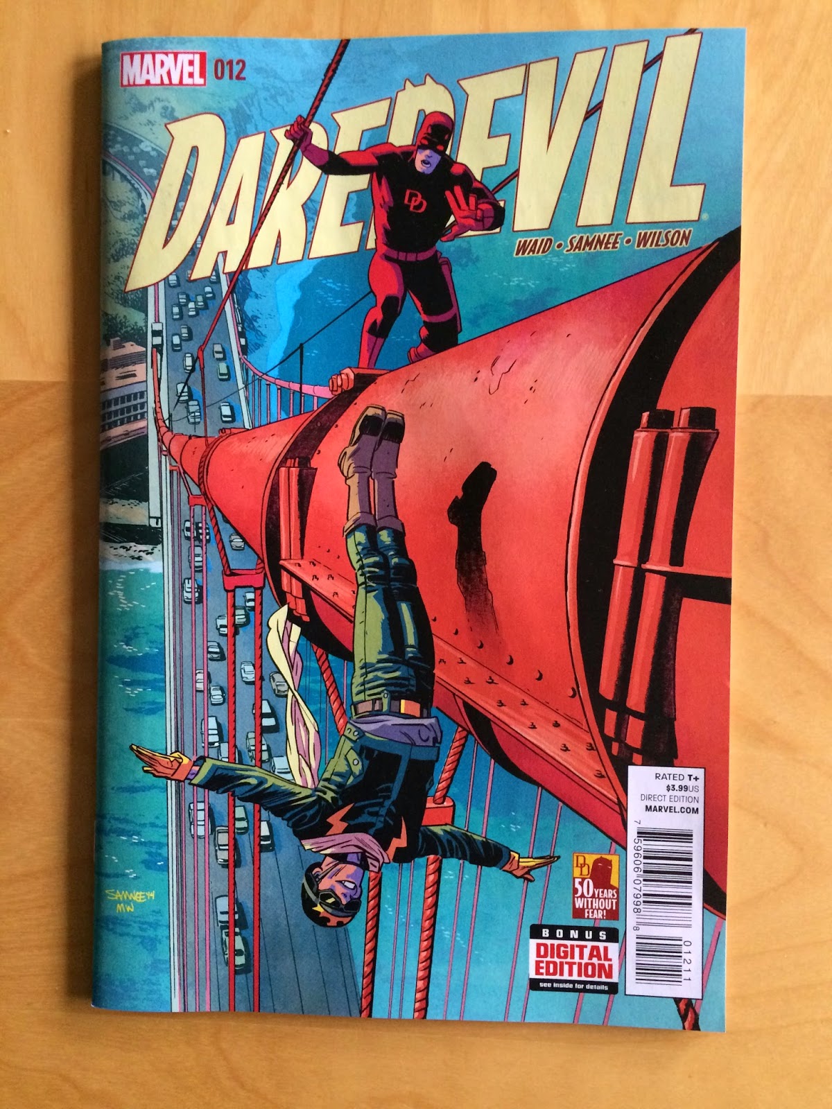
(Also how great are these covers!? The colours and the perspectives on #12 are dynamite!)
There will, of course, be *SPOILERS* for Daredevil #12-14 below.
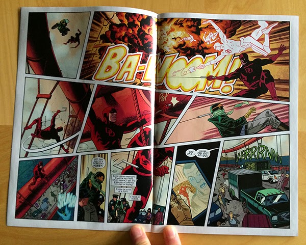
Take this great double page spread here. At first glance it looks deceptively simple, right? Sure it has some pretty dynamic action happening, and yes it is very clearly delivered, but I don't think it is instantly obvious that this page is filled with clever choices to maximize flow and kinetic motion. But the thing is, this page is a treasure trove of subtly smart comics.
Look at the first row of panels: there is a small, short, moment feeling panel that transitions into an especially wide panel of an explosion. It is like the layout of the comic itself has exploded outward. Theses panels also make a really good use of the way our eyes move across the page from left to right to have us move quickly along the blast path where the many silhouettes of DD quickly swing to safety. Then this layout makes a really elegant use of carriage return, the way our eyes quickly swing from the right hand corner of the top row of panels to the left-most panel of the next row, to physically trace the motion of Daredevil's rapid swing to safety. It makes this motion feel faster and more dramatic. In an even more exciting choice, our carriage returning eyes are caught by the swooping-speed-lines in the left-panel which drags our eyes along the path of Daredevil's hairpin twist in the air before firing his grapple to catch the falling Stuntmaster. A motion which is directly to the right across the page, again using our natural path through the page to make things feel fast and dramatic. The layout then uses yet another carriage return to get us moving DOWN on the bottom-left panel so we feel the looming chasm over which Daredevil and Stuntmaster are dangling. The double page spread then moves from left to right and into the next page. It's a simple looking page that takes amazing advantage of eye-motion to feel very fast, dangerous, and exciting.
Here is another deceptively simple page that portrays another batch of exciting action using clever choices that might not be immediately obvious. Take the top row where the two panels are split by a diagonal break. This choice immediately lends this part of the page a kinetic quality because the panels feel less separated than a perpendicular gutter would dictate. This also has the added benefit of creating these vector cones that widen, and project in the direction of motion. In the first panel we have a fan opening in the direction of the leap, like the bike is exploding off the ramp. In the second panel the fan is towards us and down, creating the feeling the motorcycle is widening and approaching the reader. The next row of panels is even cooler: Daredevil surfs his car on two wheels between a truck and a streetcar. What is so neat about this panel is that the canted panel borders create a bunch of planes within this panel that precariously interact. Significantly, the most dominant of these box-planes, created by the panel borders, is perpendicular to the tilt of the car, which creates even more straining juxtaposition of orientation. The entire composition feels unbalanced and out of equilibrium which beautifully captures the moment being depicted. More great stuff. Finally, in the bottom row of panels the reader cruises from left to right and gets drawn to the sound effect along the motion of the car flopping back to four wheels. Which is simple, yet pleasantly evocative. This is a page absolutely filled with keen comics.
Another fairly subtle element in Daredevil #12 is the use of colour in characters. Stuntmaster has a colour design that is primarily green with yellow highlights while red daredevil drives a purple car. I know like, two things about colour theory, which is that some colours are opposites and clash in interesting ways. These are called "complementary colours". Meanwhile, similar colours blend together in a way that is interesting, but less obviously striking, and is called "harmonious colours". Green and yellow are harmonious colours, and red and purple are also harmonious. This means that each character has a consistent visual colour identity. Moreover, the colour identity of these characters are complementary: green is opposite red and purple is opposite yellow on a colour wheel. This means that the character palettes clash in an interesting and striking way. Which in turn means you can effectively mark alternating panels, like above, for either Green/Yellow Stuntmaster or Purple/Red Daredevil. Which helps keep all of the storytelling straight and quick.
The above sequence is also cool from a colour perspective in that the final panel uses colour in an especially interesting way. The background of the panel is yellow, which is harmonius with Stuntmaster's green costume and mostly clashes Daredevil's red costume. What this means is that Stuntmaster sort of blends into the background while Daredevil stands out. Which helps emphasize that Daredevil is victorious over Stuntmaster (he is fading away), and helps add a sense of depth to the panel (Stuntmaster is falling into the background, while Daredevil is popping out towards us). Colouring matters so much, and when used this adeptly it can be a huge storytelling tool.
Speaking of attention to detail and colouring, I love this sequence from Daredevil #13. Beyond just being a lovely and efficient piece of story (I would pay good money to have Team Daredevil choreograph my date nights), this sequence makes a really thoughtful use of colour. The story of the page has Matt Murdock and Kirsten McDuffie going on a date that sees them eat dinner at a fancy restaurant, go dancing, and spend some romantic time at the beach. Looking at the page, it is really obvious which panels on the page translate to which period of the date. While some of this comes from what is drawn in the panel, when greyscaled the page break into six separate moments that don't immediately break into three venues and story sections. But if we only look at the colours, even if we blur out the scenes, it's apparent that there are three tiers of colour on the page that help set every sub-scene apart and give them each a visual identity. Which really makes this page read so much smoother: rather than mentally deciding how the panels fit together, the colours here subtley provide all of that information at a glance which lets us just enjoy the scene.
This page is another great example of effortless looking storytelling built from a bunch of really astute choices. Virtually every element on this page is quietly constructed to make an optimal reading experience. The opening panel provides a cinematic, widescreen look at the pitcher, narrowed for focus and squinting like the angry pitcher. The second panel shows Matt Murdock, delivers some dialogue, and shows the man pointing to the outfield, and incidentally up to the next panel to optimize flow. We then see a great sequence of three panels that wonderfully sell the energy of a fastball. The pitch is so evocative here because of the progression of the three stacked panels: the ball increases in size as it moves down through the sequence while the panels themselves expand in size. This collectively creates the feeling that the ball is coming out of the page and towards the reader which is pretty exciting stuff. This thrown baseball also creates a guide path for the reader, drawing attention and steering eyeballs down the page and suddenly! into the moment of Matt hitting the baseball. This moment is perfectly executed as the vector of motion in the bat-strike panel is against the guide path of the thrown ball making the moment jarring and impactful. Essentially, our experience of the page is knocked askew by the moment of Matt hitting the ball, which is kind of perfect comics.
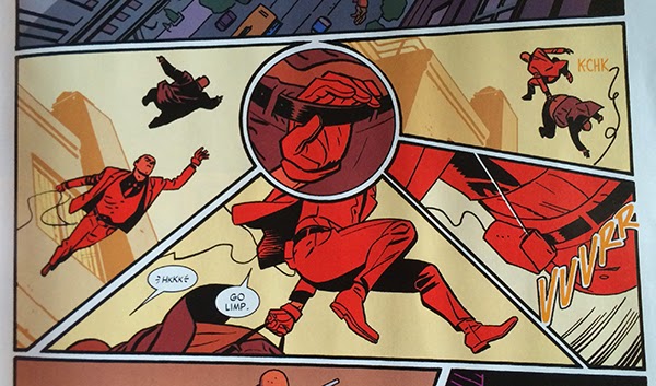
This is another pretty flawless sequence from Daredevil #14. What I love about this series of panels is how the central round panel works as a hub and draws the surrounding panels into its orbit. The action of the sequence drops down into the page, swings across the bottom, and launches back into the sky. With the round panel, everything gets a slightly curved path that lends the motion a smooth, effortlessness. Without this central hub panel, I suspect the page would read in straight lines, down, to-the-right, and up in crisp square lines which would feel more abrupt and choppy and would significantly change the fluid feel of the page. It's in the grand scheme of things a pretty short and minor bit of the larger story, but it is executed in a really interesting and dynamic way. Which is really emblematic of the entire Daredevil experience: everything is just so.
Post by Michael Bround
Previously:
Describing Daredevil 10 and 11: scope and character
Describing Daredevil 9: empathy
Describing Daredevil 3: onomatopoeia
Describing Daredevil 34: before and after
Describing Daredevil 33: condensed motion
Describing Daredevil 30: the vectors of artwork
Describing Daredevil 29: A great page


No comments:
Post a Comment