Or how binary colour schemes are used in The Manhattan Projects Volume 3
by Jonathan Hickman, Nick Pitarra, and Jordie Bellaire, Image Comics
The Manhattan Projects beyond being inane, hilarious, and shockingly horrifying is also a really pretty and visually interesting comic. Obviously, Nick Pitarra, the penciller of the series deserves a lot of the credit for how great the comic looks: his designs and effectively tell the story and enhance the tension or comedy of every scene. But I think part of the magic of The Manhattan projects is the colouring by Jordie Bellaire. I'm particularly interested in the way she colours flashbacks and mental sequences. So here is a look at her use of weird blues and weird reds in The Manhattan Projects: Vol. 3
There will be mild *SPOILERS* for The Manhattan Projects. Proceed with caution and PPC*
(* PPC = Personal Protective Clothing, it's lab jargon for goggles and lab coats and respirators etc...)
The hook of The Manhattan Projects flashback sequences is the contrast between the Blue and Red colours. They are absolutely the colours of madness and Science: these are two very unnatural colours, a kind of textured bright blue, crackling with electricity and Bunsen flames, and a vaguely neon red, glowing like some kind of mutant blood. Neither colour feels entirely real, enhancing the fantastic, afronte-to-nature-ness of The Manhattan Projects, while the yawning contrast between the two extremes is just pure dreamscape insanity. I love it.
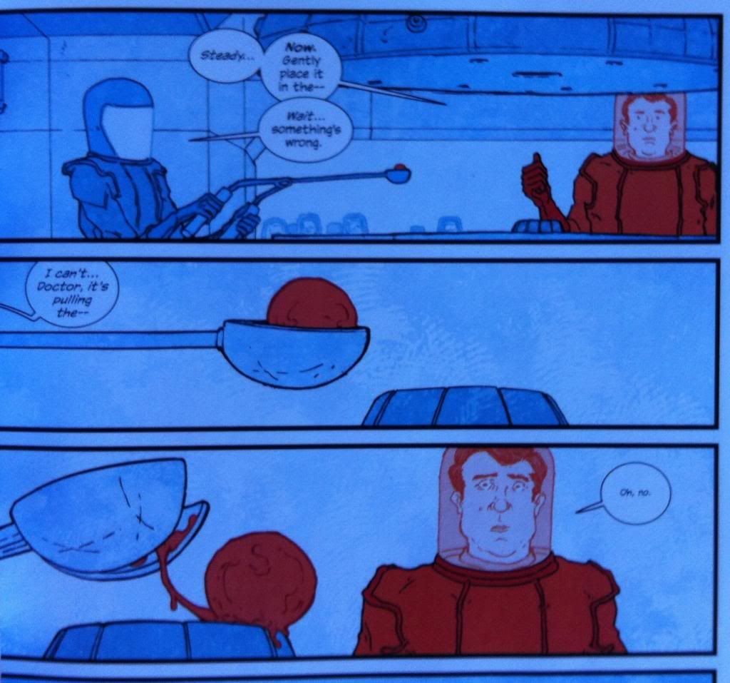
Beyond the interesting colour selection, the use of un-Blue and un-Red is also pretty fascinating. In the above sequence, the red and blue are used to emphasize Daghlian in his red containment suit and the glob of presumably plutonium that would change his life forever. It's a pretty simple approach to highlighting key elements, but it absolutely razor focuses the readers attention to the key elements in the composition.

The un-Red and un-Blue is also used to elegantly highlight the isolation of radiation-monster Daghlian after his accident. By colouring him in the angry, unnatural red and every other human in the blue colour, Bellaire manages to perfectly capture the loneliness, and almost literal alienation of Daghlian from the human world now that he is a walking radioactive disaster. It's great comics.
(Also, note that in this sequence Enrico Fermi is in the above panel coloured in blue. This is going to be important in the second.)
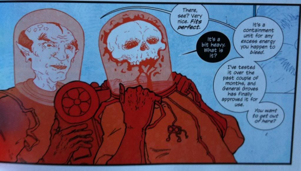
In the same way that colour is used to emphasize the isolation of Daghlian, it's also used to show the end of it. Where previously Fermi was coloured as blue, while Daghlian was coloured red, now, with the gift of the radiation containment backpack thing, Fermi is also coloured red. This colouring really helps establish that Daghlian has now found a kindred spirit and is no longer alone. It also helps cement how important the friendship with Fermi is to Daghlian which is a warm human moment and also great set up for Fermi's eventual betrayal.
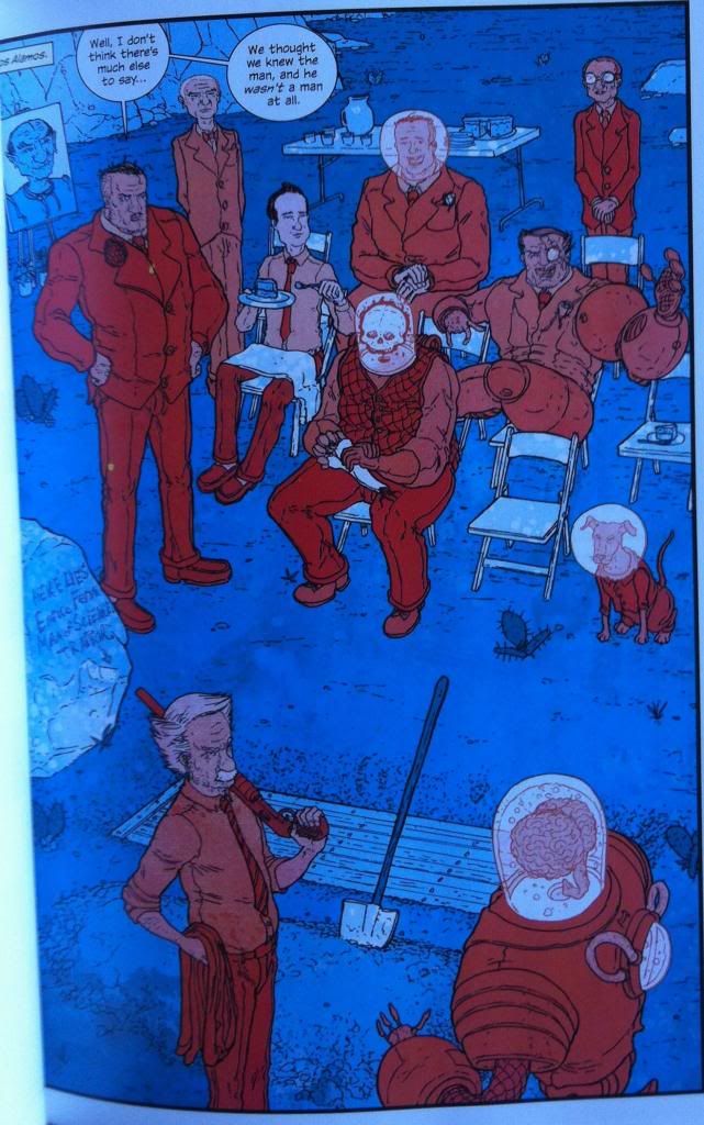
The red and blue colouring is also used at the funeral of Fermi to establish demarcations. In this case, it really helps establish that the deceased, traitorous Fermi has been cast out of The Manhattan Projects. All of the members in good standing of The Manhattan Projects are coloured in un-red while Fermi's casket, headstone, and photo (in the top left) are all coloured blue. This manages to simultaneously emphasize that Fermi is no longer one of the team (he is no longer coloured red) and that he is no longer alive (his elements are coloured in the same blue as the chairs and shovels and cake).

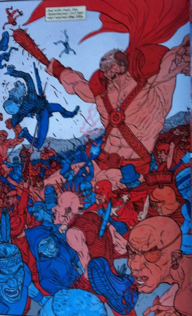
The un-red and un-blue colouring strategy is also during the War of the Oppenheimers in which the cannibalistic Joseph Oppenheimer and the consumed Robert Oppenheimer fight a war for the control of The Oppenhemer's mind. It's very much a war of ideas and imagination fought with metaphors and proxy Oppenheimers co-opted by either primary Oppenheimer. Which is a pretty trippy collection of ideas. However, the colouring keeps it straight forward to look at: the armies of Robert and coloured blue, while the armies of Joseph are coloured red. So visually the whole insane mess is distilled the very understandable red-vs-blue. It's a simple approach, but is stunningly effective.
Previously:
No comments:
Post a Comment