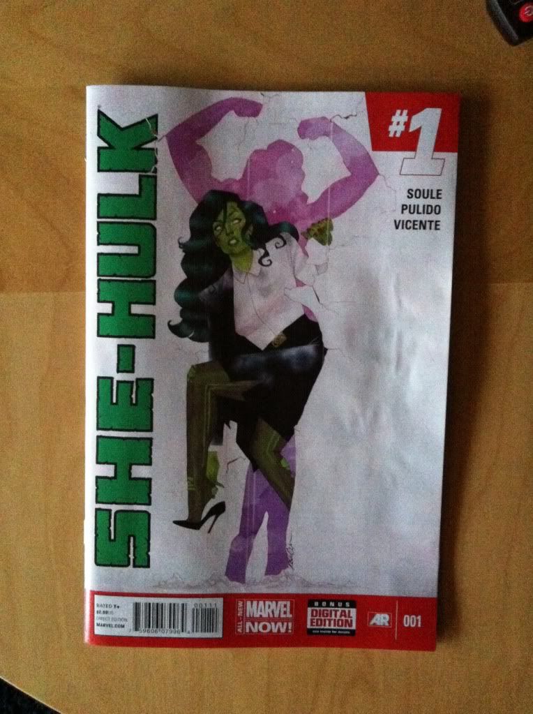
Or a look at some really innovative layouts in She-Hulk #1
by Charles Soule, Javier Pulido, Munsta Vicente; Marvel Comics
I really enjoyed She-Hulk #1. The hook of She-Hulk being the star of a law procedural with a light, comedic-ish air, while not completely original, is always good fun and Charles Soule, with his perspective as a practicing lawyer, really portrays the practice of law in an interesting and nuanced way in She-Hulk #1. It's a really fun comic.
She-Hulk #1 is also a really great looking, and technically interesting comic with some absolutely dynamite layouts by Javier Pulido paired with some fantastic colouring by Munsta Vicente. I'm going to take a closer look at a couple of my favourite layouts.
There will be *SPOILERS* for She-Hulk #1, so don't commit a crime against yourself and read the comic first.
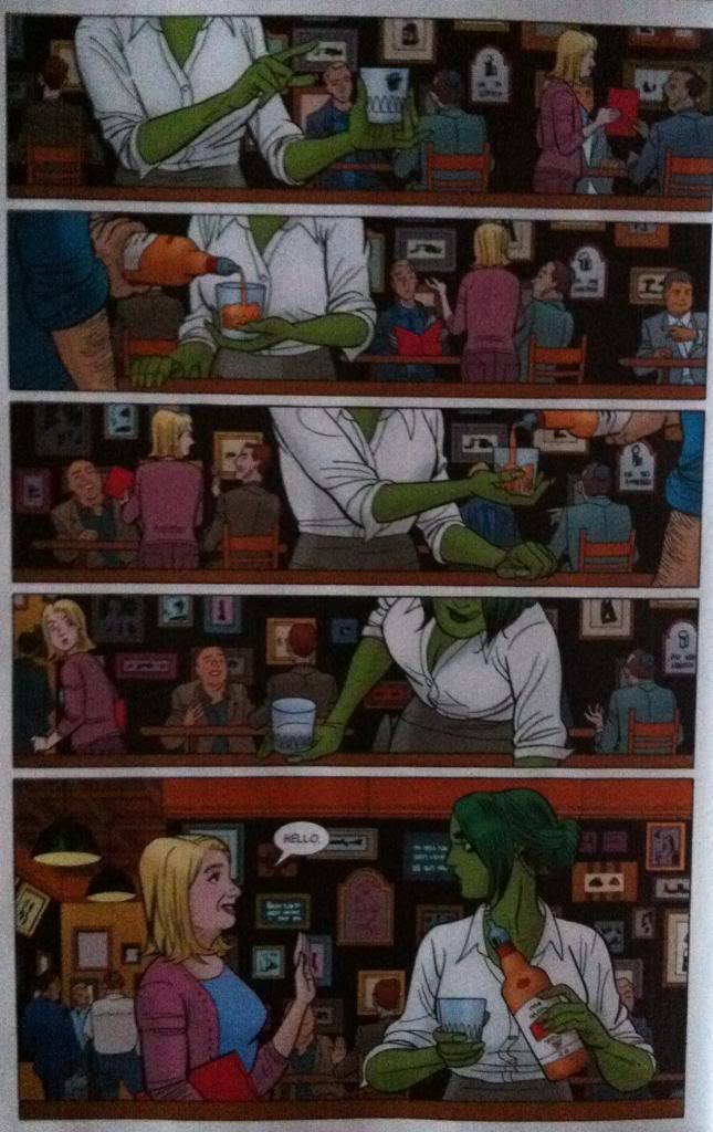
I am absolutely in love with this page: Team Shulkie deliver a really interesting pair of sequences that happen simultaneously. One story on the page is that She-Hulk, having quit her high paying law job hits up the local lawyer bar to unwind with whiskey (as is proper [assuming it is done responsibly]). She-Hulk's story ends in the last panel when a lady suddenly appears and says hello. However, this page has a second story which shows the suddenly-appearing-woman canvassing the lawyer bar with a red folder in the background showing where this woman came from. The way I read the page, I saw the entire She-Hulk story without even noticing the second story of folder-woman, so that I was just as completely surprised by her appearance as She-Hulk. Which is kind of great comics: I experienced the same She-Hulk-self-involvement and then surprise as the protagonist.
Now, admittedly, this might be because I am terrible at reading comics and missed something obvious that everyone else in the world noticed. But, the thing is, I've noticed some design elements that seem designed to trick the reader into only following the She-Hulk story and then doubling back to read folder-lady's tale.
My first pass of this page was governed by She-Hulk. She is the sole character in the foreground and is making a number of interesting, dynamic gestures and motions that change from panel to panel and guide the the reader down the gradual left-to-right line of her positioning. Just by body language and posing there is a rich enough pool of visual information to keep the reader busy and focused on Shulkie. This effect is magnified by the colouring. She-Hulk is coloured her bright, emerald green and is wearing a bright, white blouse, which compared with the drab, cooler colours of the background stands out considerably. Especially, when you account for how BIG the emerald/white colour blocks are compared to the much smaller, broken up colour patches of the people and wall signs in the background. Basically, the colouring of the She-Hulk story is just brighter and bolder and helps keep the reader focused on her story instead of the background.
(And really, the She-Hulk story almost functions without any background since tumblr, bottle, waiters arm, and bar top convey the key setting information in the foreground. Which is a really smart choice if you buy my argument that the artwork is designed to misdirect the reader into paying less attention to the background.)
It was these elements that kept me focusing on She-Hulk and her story on this page and made the appearance of folder-lady such an effective surprise.
Of course, once folder-lady appeared, and I realized she was an important character, I went back through the page and found the whole other story. And many of the same compositional elements used to steer through the foreground are also used to move the reader through the background folder-lady story. Colours highlight the woman's blonder hair and the red of the folder to catch the reader. Similarly the woman's gesture and her relationship to the folder helps make a visual guide that leads the reader through her story so that the folder-lady part of the page ends just as effectively with her looking at She-Hulk. It's a pretty clean, nice little sequence.
And combined, I think, these two layered sequences make this page super interesting. Misdirection keeps the reader focused on She-Hulk and maximizes surprise, and then rewards the reader with a hidden, yet important story of folder-lady failing to find a lawyer. It's really cool, and honestly, how often do you see comics pages designed to be read twice?
This double page spread is also pretty awesome and does some really cool things with panel shape and perspective to emphasize some really interesting elements of the page that makes the drama/comedy of the page work.
The crux of what I love about this spread is the LOOOoooooooonnnnngggg hallway and how the art emphasizes the heck out of this distance to great effect. The composition, with its 18th floor Ding!, takes from the top of the first panel into the top of the second panel. This places us at the end of the hall and then, as we, look down the very tall panel we see, and experience, just how far away She-Hulk is from the end of the hallway. What's even more great about this is Shulkie is on an angle and facing upwards along the hallway which makes the distance loom larger and emphasizes the uphill-climb-challenge of walking down this very long hallway. This leads into the next two panels which show She-Hulk progressing along the hallway, but also walking uphill, continuing to emphasize the gruelling effort of walking down such a long-ass hallway. The composition then doubles back towards the centre of the page where we meet Legal, Tony Starks lawyer. The result of this doubleback is that the reading path takes just about the longest route possible to get from the elevator to Legal which makes us the reader actually experience the length of the hall. It is absolutely an amazing bit of design and layout work.
She-Hulk #1 is a fantastic comic that has me super excited to read more She-Hulk.


No comments:
Post a Comment