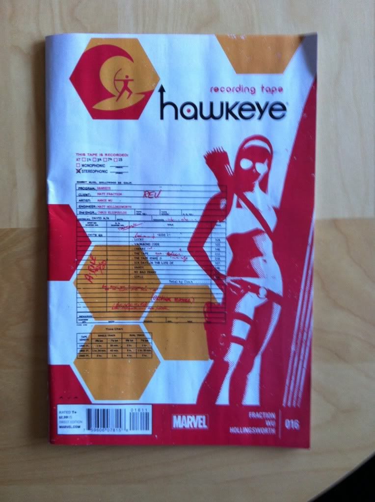
by Matt Fraction, Annie Wu, and Matt Hollingsworth; Marvel Comics
I really like it when I can read a comic, find some particular aspect of it that is exceptional or cool, and then write a focused post about it that sounds halfway intelligent. Sometimes, though, a comic is pretty great in a bunch of ways that maybe don't lend themselves to a lengthy post and so the temptation exists to just do a comics roundup. Hawkeye #16 is totally one of those latter comics. So this here is going to be a hacky comics roundup of some of the things I really liked about Hawkeye #16
There will, as always, be *SPOILERS* for Hawkeye #16
The story of Hawkeye #16 revolves around an aging and mentally unstable recording artist, Wil Bryson, being distraught that the tapes of his incomplete, lost 1960s masterpiece album are being leaked into the world against his wishes. Hawkeye (Kate-Hawkeye) springs into action to save him somehow. At first, because I have very poor general pop culture knowledge, I thought it was just kind of a fun story with an understandable problem. But the internet has made it clear that this is all a thinly veiled meditation on Brian Wilson of the Beach Boys, his lost incomplete album SMiLE, and his troubled history of mental illness and substance abuse. Which is pretty cool. I mean, this is a comic from a Mainstream Superhero comics publisher that is about a really fascinating chunk of music history I had no idea existed. I learned some things. Beyond this though, it's pretty obvious that SMiLE is a thing that Team Hawkeye (or at least Matt Fraction) is pretty passionate about and this really translates into the comic. There is something immediately obvious and great when creators are extra-invested in the themes of a work.
(This is perhaps why Creator-Ownderish comics feel so dynamic: if you can write literally any story than it is likely the story chosen will be one you're exceptionally into. Maybe there is something in giving people working at Mainstream comics publishers that extra degree of freedom to explore whatever they want to in their Superhero comics...)
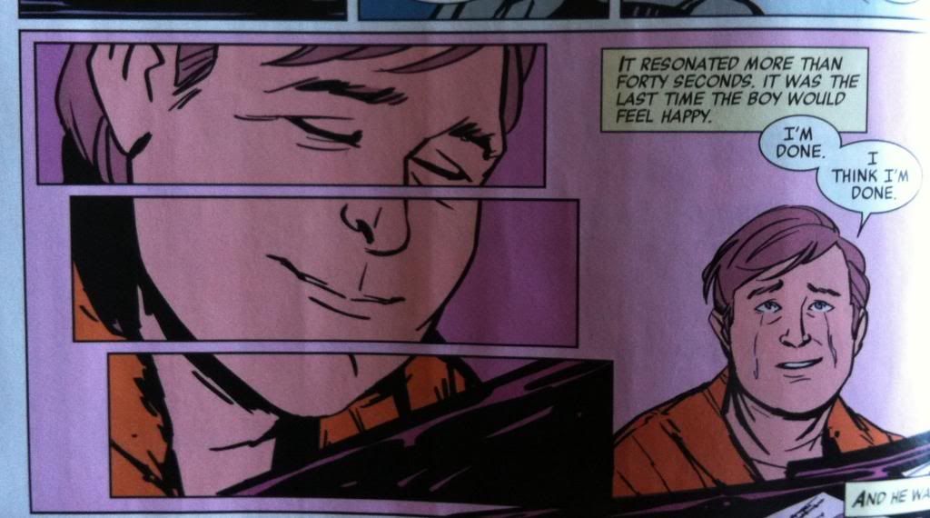
One of the things I kind of love about Hawkeye #16 are these single-moments-split-over-multiple-panels constructions. Taking a single image like this, and chopping it into pieces, just adds so much drama and weight to the moment depicted. It's like those instants that, due to the emotional weight of the moment, just seem to stretch on and on. Which is basically what this composition does: the single image and lack of words suggests the brief nature of the depicted moment, while the multiple panels convey that this moment occupies multiple panel-units of time. It is, like the moment depicted, simultaneously instantaneous and expansive. It's simple but a really great demonstration of the power of the panel in comics.
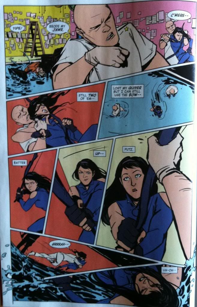
I absolutely love this page of comics. Annie Wu is a master at acting: at drawing just the perfect expression on a face to sell the emotion of a moment. I think everyone who has seen any of her comics appreciates this. What I maybe didn't appreciate as much is that she is also a really great storyteller in action sequences. This page here is perfect evidence of layout skills and is absolutely full of nifty tricks and choices that make every moment of the page kinetic and impactful.
This page makes great use of panel transitions, shapes, and guides to move the audience through the page in a way that really enhances the story. The composition takes advantage of the top-right panel to second row carriage return to swing the readers eye along the path of the headbutt to maximize impact. Following the impact, the next panel does a really brilliant job showing where all of the players are spatially, which sets the stage for the following motion (Kate's bow swing, and the diving tackle). This panel here is like a map legend of all of the fisticuffs in the rest of the page and is just agogglingly good comics. The next three panels are all about emphasizing the swing of the bow. The elements of the panels are designed to lead us along the arc of the swing, with super simple backgrounds, so that readers quickly progress along the page quickly, with force. This is emphasized even more by the shape of these panels which expand, making each subsequent interval of the swing feel bigger and weightier. Which of course culminates with the hand blocking the swing in a really great and surprising way (we really expected the forceful arc to end in collision). The page then takes advantage of another carriage return that brings us to the next panel and is SUDDENLY deflected by the unexpected diving tackle of the other thug which steers us right into the next panel and the splash that sprays into the page gutters. This sequence completely manages to capture the surprise and impact of the tackle, since it clobbers our eye motion as readers. It also manages to capture the kinetics of Kate's fall after the tackle as the eye motion is shunted into the next panel. It is absolutely great comics.
There is also some really cool colouring going on in this sequence which adds an additional layer of emotion and impact to the composition. Specifically, I want to point out how red is used as an impact colour here. In the non-collision panels, we see normal background colours, like the retro-walls in the first panel, or the blue of the pool in the third. But in panels with collisions, like the the headbutt or tackle, the panel flashes RED with the violence of the impact. Which of course adds a certain emotional blast to the panels. What's even cooler, is that in the swinging bow panels, the red of collision disappears as the impending impact is blocked by the goon. It's like a subliminal message that things are not going Kate's way, even before the image of the hand nabbing her swing is shown. It's more really great comics.
Seriously, this page here is the kind of comics people should study and take notes about.
Okay, bigger *SPOILERS* coming, so bail out now if you haven't read the issue!
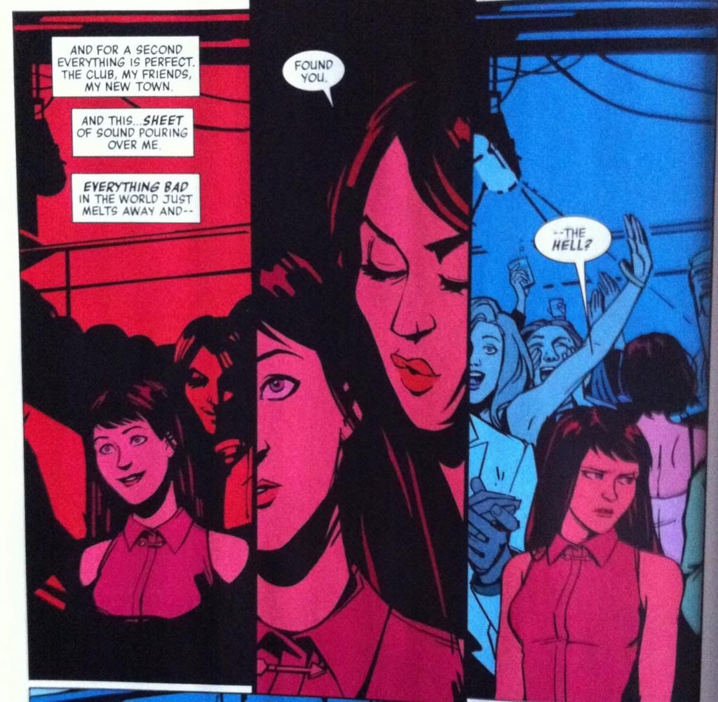
Another thing that I really liked about Hawkeye #16 is this heeby-jeeby inducing bit here. Hawkeye #16, despite a pretty dark moment with a pair of thugs beating up a teenage woman, is a fairly light comic. (Yes, that was a weird statement to write.) I mean, it's exciting and full of stakes, but it wraps up on a pretty happy note with Wil Bryson performing some of his secret opus before an enthusiastic crowd. And then, out of seemingly nowhere, an unmasked Madame Masque pops in to threaten Kate. The sheer, emotional dissonance between the majority of this issue and this sequence, (and the startling and effective switch to red) really made this sequence hit me like a stiletto blade and kicked the cathartic triumph of the moment right out from under me as a reader. Which is so fucking great. I mean, on the one hand it manages to make me feel the exact emotional beats of Kate (triumph turning to unease) and on the other it completely ambushes the sense of safety we were developing in the Kate story arc. It's like a Grills killing moment: awful but essential for changing the stakes of the story. Which is simultaneously terrible and great.
Previously:
Eye on Hawkeye #14: Repetitive panels as a device.
Eye on Hawkeye # Annual Pt. 1: Using silhouettes in arguments
Eye on Hawkeye #12: Setting up the perfect splash page
Eye on Hawkeye #12: Setting up the perfect splash page
Eye on Hawkeye #11 pt. 2: Lucky & Clint, Narrative Similarities
Eye on Hawkeye #11 pt. 1: A Dog's Perspective
Eye on Hawkeye #10: Colours and Mood
Eye on Hawkeye #11 pt. 1: A Dog's Perspective
Eye on Hawkeye #10: Colours and Mood


No comments:
Post a Comment