Wednesday, 4 June 2014

So I Read Big Questions

A 250 words (or less) review of the Big Questions graphic novel
by Anders Brekhus Nilsen; Drawn & Quarterly
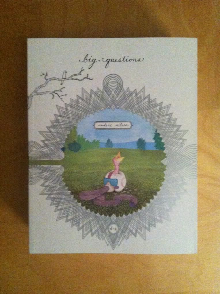


There are certain questions that have plagued the greatest human thinkers throughout history. What is the meaning of life? Is there a god? How can happiness be attained? Where are these delicious donut crumbs coming from? Big Questions is a comic about a flock of tiny grey finches struggling to interpret existence as a violent human world intrudes. It's a comic filled with, well, big questions asked by charismatic little birds as they face tragedy and try to explain inexplicable new events in insightful and unexpected ways. Big Questions is a philosophical textbook presented in a charming, accessible story filled with humour, unexpected violence and horror, and the breadth of life. The artwork of Big Questions is absolutely beautiful: a deceptively simple style that is at once childlike and ghostly stark. This is a graphic novel of immense craftsmanship filled with tiny-bird-grafted humanity and some truly profound thoughts and moments. If you have ever stared up at the sky and wondered what the point of it all is, this is a comic you ought to read. If you just like perfectly crafted and original comics, this is also a must read. Because it is perplexing great comics.

Word count: 197

Monday, 2 June 2014

Describing Daredevl #3

Or some pretty excellent onomatopoeia in Daredevil #3
by Mark Waid, Chris Samnee, Javier Rodriguez, and Joe Caramagna; Marvel Comics


Daredevil is one of the most consistent comics in my top ten: it is always good. The stories from are fun and exciting and usually revolve around some thematic aspect of Daredevil's blindness. Couple that to some of the clearest storytelling in comics from Samnee and Rodriguez, and Daredevil just does not disappoint. One of my favourite things about Daredevil, is how the creative team works to represent Daredevil's powers in really interesting and innovative ways with topographic radar vision and some really adept use of onomatopoeia. Daredevil #3 has some really great examples of the use of sound effects I'd like to take a closer look at.

There will be *SPOILERS* for Daredevil #3. Typey typey type.


Usually I'm not a terribly big fan of onomatopoeia in comics (or typing it). When done poorly, it can look tacky and be a distraction from the dialogue and the acting in the panels... it's extra telling instead of showing. But in Daredevil it's just so thematically appropriate and handled with such skill that I kind of love it. From the blocky mechanical lettering of the gun action noises to the long, bright green arc of the whistle (itself dragging attention to Matt like a real life whistle) to the italicized, shakey sound of the phone vibrator, to the panel commanding in-your-face size of the SLAM, to the low-to-ground progression of the stomping, it's all perfect. In each instance the location, shape, size, and font of the lettering captures the emotional feeling of the sound. It really adds a lot to the comic.


While this is not onomatopoeia, per se, it's in a similar vein and I love it. The sort-of dialogue box with the deathstare symbol really captures the emotional weight of getting eye-knives thrown at you. A properly good glare is able to convey, non-verbally, a paragraph of information and the decision to give the glare here a dialogue box is very cognizant of this. A top-level deathstare also doesn't feel like just a person glaring at you, it feels like an entire universe of negative attention directed your way. So I think it's really adept that the deathstare logo means that Foggy is caught in the crossfire of two glares. The jolly-roger glare is such a small choice, but it really makes this panel and character interaction work for me. 


But this, this is my favourite bit of onomatopoeia in the entire issue of Daredevil #3. I had previously written a big long thing about why the ECG squiggle that is synonymous with heart sounds in comics bugs me because it's actually a symbol of the electrical signalling of the heart and has nothing to do with sound. It especially bothered me because hearts have a characteristic "lub dub" sound, so there really is no need to use the ECG squiggle (it's like using beep-beep-beep sounds instead of heart sounds in a film). But, since the ECG squiggle is so synonymous with heart rate in comics these days, as a symbol that conveys meaning its pretty important. What I LOVE about this onomatopoeia here is that it synthesizes the sound and the squiggle to create a new symbol that is based on sound of a heart beat but still has the ECG symbol that readers know means heart stuff. It's the perfect solution to my comics pet peeve and I fucking love it.

(Incidentally, I would love to know if Team Daredevil read my previous essay on heart sounds and if that had anything to do with the change in heart sound symbology. I'm going to have to go shopping for my next Science gig in the next year and think it would be super fun to have that on my CV...)

Previously:
Describing Daredevil 34: before and after
Describing Daredevil 33: condensed motion
Describing Daredevil 30: the vectors of artwork
Describing Daredevil 29: A great page

Friday, 30 May 2014

Exposing The Secret Avengers #2-3

Or a look at the attention to detail in Secret Avengers #2 and #3 
by Ales Kot, Michael Walsh, Matt Wilson, Clayton Cowles; Marvel Comics


I'm really enjoying Secret Avengers. The formula of gonzo spy stories with a sense of fun is just the kind of mad, accessible comic I want in a Marvel team book. It's also a pretty excellent example of a creative team firing on all cylinders: all of the component parts of the comic are excellent, from the taught, bawdry scripts to the ambitious, clear storytelling of the line art, to the sharp, clean palette of the colours, Secret Avengers is one of Marvel's best made books. That said, for all of its oomph, Secret Avengers most impresses me with its attention to layout and how this enhances every aspect of storytelling.

There will be *SPOILERS* for Secret Avengers #2 and #3.

Before I go spiralling off to panel placements and colour selections and a bunch of other tiny, wonky choices, I want take a moment and explain why I am so enthused by these selections. The fact is there are a lot of very pretty, very well drawn comics being made: Marvel as a mainstream publishing house has really showcased some awesome artists lately. In a pretty large proportion of comics being made the really big moments are delivered beautifully. For me what really characterizes the best comics is a commitment to making every moment as visually interesting as the biggest moments. These are the comics that feature lovingly rendered explosions in space, but also make talking heads feel fresh and interesting. And this is usually a matter of a bunch of small, hard to notice choices that make the entire comic easier to read and more emotionally resonant throughout.

Secret Avengers is currently one of those comics.


You might not immediately realise it, but this is a Talking Heads page. The characters, stranded and floating in space, shooting the shit about their situation with a veneer of hollow bravado. All the action in the page is two dudes talking calmly, but the layout makes this super interesting and adds a layer of unspoken complexity to the situation that adds emotional nuance. The reality of being adrift in space is that there is no (or very little) friction to slow you down, and so any small motion, like falling out of a space station, results in an uncontrolled, spinning tumble. The way this page uses extra panels without a fixed perspective totally sells this motion: the reader, like the characters, has a view that swings wildly between empty space, Earth, and the agents as if they too are careening through the vastness of space. This helps sell the feeling of spacey-ness and quiet majesty, but also just how fucked the agents are. There is something stomach turning and claustrophobic about the tight, tumbling reader's perspective that, despite Fury and Coulson's bravado, really captures the terrifying hopelessness of the agents predicament. So, yeah, this is a talking head page that layout has made awesome and interesting. 


Secret Avengers #2 has four separate storylines that all converge on a single, exciting moment in time. A really important aspect of this structure is that the various plot threads have to feel urgent and simultaneous to really sell the climactic moment. This layout here does a really great job in helping to accomplish this. The key here is that it shows the other three story lines (just after checking in with the agents in space in the last page I showed you) in a way that acts as a time key for them all: the secret avengers in the field arrive at the space station exactly when MODOK is grimly surveying weaponized satellites precisely while something in a duct approaches an injured and very screwed Maria Hill. This provides the temporal context needed to keep track of the various story threads. 

This layout also has some really smart colouring, with each tier of panels having a slightly different palette. The top row has a black/grey/green scheme, while the middle tier shows a lot of blue/yellow/fleshtone, and the bottom tier is done in magenta. This clearly delineates the three bands of panels as belonging to separate narratives and enhances the clarity of the pages.


The climax to one of the story threads in Secret Avengers #2 is a team of Avengers converging on a broken computer and basically, using team work, plugging it back in. This should be the most underwhelming anti-climax ever, and yet, it felt really satisfying and important in the context of the story. And I think this layout is a big reason why. Our heroes enter the page and approach a zoomed in, focussed strip of panels that show the toggles and wire that need repair/reboot. Some fun dialogue happens, and we see our heroes spring to action and fix the computer. The excitement of the moment comes through, I think, due to the tight focus on the computer elements in the second and fourth rows, the repetition (it's important enough to show twice), the elevated moving centre panel in the bottom row, and in the dull to bright green colouring of the wire panels. This page is, for me, a great example of how smart storytelling can sell pretty much any moment.


This large panel from Secret Avengers #3 is another example of really astute storytelling choices. In Secret Avengers #3, our heroes are out to stop a crazy, failed poet with a sentient reality destroying bomb. Black Widow and Spider-woman must find a way to stop the madman while also saving Coulson who is freaking out. What this panel here does is provide a spatial taking stock before all of the action happens. It tells us where all of the characters are in relation to each other, using the face bubbles and colour coding to make the fairly detailed page really quick and easy to suss out. 


What that last layout does is provide context for all of this activity. After seeing the overall layout we can appreciate exactly where all of this frenetic action is happening which helps reader understanding and the speed with which the reader can absorb the scene. It's really smart comics.


I love how these panels are coloured. I'm not sure how to articulate the why of it, though... Have you ever been hit really hard in the face? And have you also smacked the back of your head really hard on something solid, like to the point of blacking out or dazing yourself? Well I have, and the way these two panels are coloured captures the differing sensations of the two collisions. If I ever have to explain how the two things are different, these panels are now my answer.


Of course, Secret Avengers also does the big moments with gusto too. This spread here from Secret Avengers #3 is some varsity level comics. It breaks the page clearly into five discrete narrative regions and moves three different sub-narratives along to their convergent conclusions in a clear way. Beyond just kind of being an awesome couple of pages, I really love how this page splits up the sections: the cliffside combat silouettes without a background split the top row from the bottom, and within the bottom, the use of the tilted panel borders help signify which parts of the bottom half of the spread belong to which narrative region. This is a spread that could be super confusing, but due to really smart storytelling is quick and action packed and crazy.

Just like all of Secret Avengers.  

Wednesday, 28 May 2014

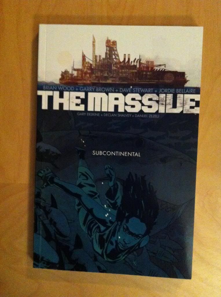
So I Read The Massive: Subcontinental

A 250 word (or less) review of The Massive: Volume Two
by Brain Wood, Garry Brown, Dave Stewart, Jordie Bellaire, Gary Erskine, Declan Shalvey, Danijel Zezelj; Dark Horse Books


For a *SPOILER* free review of The Massive: Volume One, click here.


The Massive is a comic that portrays a realistic and horrifying worst-case scenario of climate change. The series does a really remarkable job providing context for the potential cost of our destructive, polluting ways. The Massive: Subcontinental picks up the story with Captain Callum Isreal and the rest of his Ninth Wave team as they search the world's oceans hunting for The Massive, their missing mothership, lost in the terrible events of the Crash. This volume of the story adds further complications and challenges for the crew of the Kapital that really emphasize just how hopeless the situation is and which should pay off as the series continues. The Massive: Subcontinental is, more than anything, a chapter starting several new, interesting subplots to the series rendered with some great, atmospheric artwork. That said, this chapter of the story was a little unsatisfying as a standalone entity: it didn't answer of any of the intriguing questions posed in the first chapter, substantially advance any of the existing subplots, or really offer an interesting conclusion or cliffhanger. The chapter ends with a very similar, but more complicated, status quo. I feel that when The Massive is complete Subcontinental will work well as a part of a whole (and that it’s fine if you are reading in issues), it's just not a particularly exciting volume if you are tradewaiting. Despite this, I think The Massive is a pretty interesting series and Subcontinental, as a part of the larger series, is worth a read.

Word count: 250

Previously:

Monday, 26 May 2014

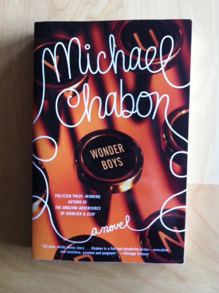
Wonder Boys Is A Good Book

Or why you should read Wonder Boys by Michael Chabon


I think a lot of people who read novels as a hobby feel like they too will one day sit down and write a book. As a person who is always reading a book, I know I sometimes wonder if I have a novel in me. (And if I ever do, I will write in secret, dump it on my most read-dy and kind friends and then hide it from the world because it probably will be kind of terrible!) As an avid reader I'm pretty fascinated by what makes writers tick, what drives someone to not just entertain the notion of spending hours and hours creating an artificial world but to actually do it.

Wonder Boys is a novel that examines why someone might be driven to be a writer. 

The kernel the Wonder Boys is constructed around is that the desire to write fiction novels stems from a kind of personal defect, some kind of internal hole in the author's life that needs to be filled. Maybe it's fiction is the family the author never had, or the lies that are preferable to the author's life. Or perhaps its some perverse need for chaos or excitement that isn't satisfied by real life. Or maybe a need to connect to something larger than mundane life. Regardless, the result is the Midnight Disease where a person is compelled to write even if it is to the detriment of the author's health or sanity or relationships. This is the theme upon which Wonder Boys hangs.

From a plot perspective Wonder Boys is about struggling author Grady Tripp as his life basically falls apart. His marriage is in trouble, the woman he is having an affair with has important news, his talented, attractive student has a crush on him, he smokes too much marihuana, and worse, his editor is coming to town. But Tripp's biggest problem is his next novel, Wonder Boys, a sprawling behemoth of a manuscript nowhere near an ending that is criminally overdue. And so Tripp, along with gawky, film-obsessed, aspiring novelist James Leer, go on a belligerent misadventure of ever increasing complexity that threatens to save them both and promises their ultimate undoing. It's a darkly hilarious story packed full of social awkwardness, emotional complexity, and the Midnight Disease.

I really enjoyed this book.... it's not exactly fun, since its comedy is so fraught and it stabs me, as many dark comedies do, right in the barely-under-control-social-anxiety organ. So reading Wonder Boys was kind of this wonderful borderline panic attack for me. It makes recommending this book a little tough for me, because "Here, try this book, it's really well written and really great and made me want to crawl out of my skin and die while riding the bus," is kind of an accurate summary of my thoughts on this book. But Wonder Boys is beautifully written and provides this fascinating insight into why some people at least are driven to make fiction. If you are not an especially socially anxious person (and maybe if you are) you should maybe try Wonder Boys. That said, if you want to try a Michael Chabon novel that won't make you want to take up being a hermit in the mountains but will still make you feel feels and show you amazing, insightful prose, I 100% recommend you try either The Yiddish Policemen's Union or The Amazing Adventures of Kavalier and Clay.

Previously:
The Amazing Adventure of Kavalier and Clay
The Yiddish Policemen's Union

Friday, 23 May 2014

Marvelling at Captain Marvel #3

Or the tension between punchline and setting in Captain Marvel #3
by Kelly Sue DeConnick, David Lopez, Lee Loughridge, and Joe Caramagna; Marvel Comics


As a general rule I try not to write critical posts. I avoid comics that I don't think I'll like very much, and try to focus my time and money on the best comics I can. As a result, especially for my mainstream comics intake, I read a reliably fantastic collection of comics. When I write about these books, it's much easier to highlight especially interesting positives than trying to find problems to worry at. And when I do notice something about these comics that I don't especially like, it's usually something obvious like deadline rushed art in a crossover or awkward fill in art, neither of which makes for a particularly interesting bit of criticism (It is bad and I don't like it!). However there is a sequence in Captain Marvel that I think, given the collision between two different storytelling priorities, is worth taking a critical look at.

There will be *SPOILERS* for Captain Marvel #3 in this post.

Now, I really enjoyed Captain Marvel #3! In a time when I am becoming increasingly less interested in straightforward super heroics, Captain Marvel remains my example of the best conventional superhero comic being made. The comic is fun, aspirational, rock and roll action packed, has a sense of humour, and manages to provide sufficient character stakes to feel substantiative and dramatic. Kelly Sue DeConnick's dialogue wizardry makes every character interaction a joy to read and her approach to Captain Marvel as a confident, driven, professional whose personality is both her greatest asset and largest challenge is immensely relatable. (I think it's pretty common that the curiosity, competitiveness, or drive of a lot of very talented, successful people can make them simultaneously exceptional and pretty flawed people, and it's pretty great and humanizing that Carol displays this). I'm also really into the way Team Captain Marvel creates challenges that are beyond Captain Marvel's powers to directly address: be it Vol. 1's medical affliction or Vol. 2's diplomacy and plague challenges. A powerful hero who is fallible and has to struggle against broader challenges is great. David Lopez is a pretty fantastic new voice for the comic too: his modern, but very superhero-y style really fits the aesthetic of the comic and does a solid job storytelling. By any reasonable metric Captain Marvel #3 is a very good comic that is completely worth reading.

The thing is, there is one sequence in this comic that I think is super interesting because it is a compromise between two different aspects of comics.


So these two panels here, I think, represent the set up of a joke. The premise is that Carol will have to travel to a planet and act as a diplomat to convince a group of alien refugees to flee their new, toxic home and that Starlord doesn't think it will be an easy task. The set up for the punchline is that Carol has "got some moves", that her diplomatic skills are up the task. And then....


...we get this long, very well thought out storytelling sequence. We see your standard, new planet setting establishing shot, Carol dropping in like this whole thing will be easy, a panel introducing a big, tough looking new character, who then punches Carol in the face. This sequence is very good storytelling that quickly establishes a new setting, introduces a new character, and succinctly displays the thematic challenge of the story (that Carol's help isn't exactly wanted and that she is ill equipped for it.) However, I think, steps all over the joke that was set up on the previous page. By my estimation the punchline of the gag set up in those two previous panels is the punch to the face and because of storytelling clarity needs there are four panels between the set up and the delivery. And this, I think, waters down the effectiveness of the joke.


So there is this whole type of comic which is the short gag strip. Now the best of these, like the above new (ohmygodnew!) Perry Bible Fellowship comic, follow a certain idealized structure. (I mean, there are a lot of ways to skin a cake, but this is one common forumla that works quite well.) The idea here is that in three, immediately connected frames, a premise is etsbalished, a joke is set up, and then an unexpected and impactful punchline is deployed. And those two panels in Captain Marvel at least looked like they were a panel 1 and 2 in a three joke structure gag strip. And then there was a page turn, which set the stage for a great punchline reveal. Which did not materialize.


Instead we get premise, setup, setting. Which, while it is good storytelling to establish where the story is happening, maybe does not fully deliver on the joke setup.


In my opinion this collection of panels is the most direct delivery of the gag. We get premise, the joke setup, and punchline rapidly to maximum impact (ha ha). Of course, this collection of panels makes a pretty big compromise in storytelling: it delivers the joke but with no information about setting, characters, or the context of the punch. This is a pretty big omission and a lot to expect the reader to figure out on their own and, since storytelling is king, probably not the best course. 

So after all maybe the actual layout is best: it maximizes storytelling clarity and still manages to deliver a pretty decent punchline on the gag. If the joke isn't in service to the story, than what's the point?

But I wonder if maybe there is some sort of compromise between the two that would provide the needed storytelling and still maximize the punchline. Maybe something like this?


Or maybe I'm completely wrong?

Regardless, Captain Marvel #3 is a great comic you ought to read and judge for yourself.

Previously
Marvelling at Captain Marvel 17: A meta-fandom salute
Marvelling at Captain Marvel 15-16: On tie ins
Marvelling At Captain Marvel #13-14: On The Enemy Within
Marvelling At Captain Marvel #12: Demarcating reality and fantasy
Marvelling At Captain Marvel #10: A dramatic contract
Marvelling At Captain Marvel #9: How your brain tells time
Marvelling At Captain Marvel #7: Saving a reporter in distress... AND ITS A MAN!
Marvelling At Captain Marvel #1: An alternate reading order that I liked more

Wednesday, 21 May 2014

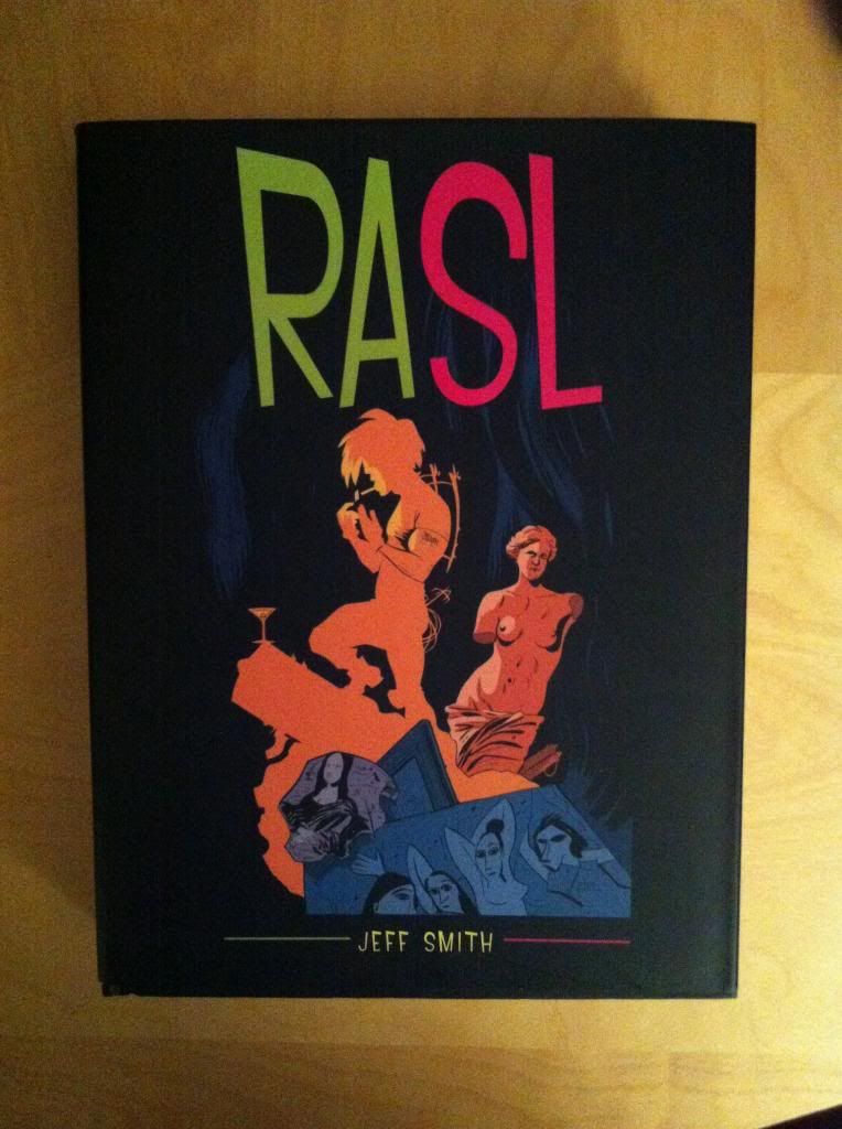
So I Read RASL

A 250 word (or less) review of RASL the complete, collected series
By Jeff Smith; Cartoon Books


Rasl is an inter-dimensional art thief who steals alternate versions of this world’s masterpieces. However, in a past life, Rasl and his best friend and colleague, Dr. Miles Riley, were military engineers developing technologies based on the works of Nikola Tesla. It was during this time that Rasl developed his T-suit, the electromagnetic device that allows him to travel through the Drift and visit other dimensions. Meanwhile Dr. Riley was developing the St. George Array, a weapon which taps into the Earth's magnetic field and promises enormous strategic value. A weapon that can only be completed with knowledge only Rasl possesses. And so Rasl is literally on the run from his past as his former employers pursue him through the multiverse. RASL is a tale of hubris, Mad Science, and personal betrayal. It is very much a proper Thriller comic built around a solid Science muggufin. Despite being yet-another-Tesla-comic and my gigantic pet peeve of inaccurate Science premises, RASL ends up being a really enjoyable read. Part of this is that comic does a really good job not overdoing the Science while also providing a really fascinating biography of Tesla. The other part is that RASL is gorgeous: Jeff Smith manages to imbue his cartoons with a truly remarkable amount of life and style. RASL then, is a comic with a solidly engaging plot featuring artwork completely worth the price of admission.  (I do feel, though, that it takes awhile to really get to speed, so give it a chance.)


Word count: 250