Friday, 18 April 2014

Deep Sequencing: Demo-nstrating Black and White Comics

Or some neat uses of black and white in Demo: Volume 2
By Brian Wood and Becky Cloonan; Vertigo Comics
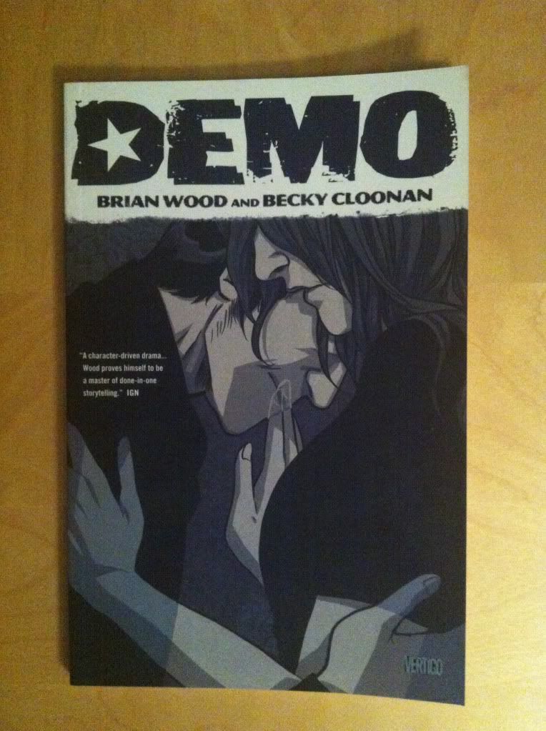

Demo: Volume 2 is this great collection of single issue character studies that use supernatural phenomenon as metaphors for people struggling with everyday problems. It's a comic where dealing with child abuse involves time travel, for instance. It's pretty great comics. It's also a black and white comic that does a really good job using the one available colour to emphasize key parts of the composition. And since it's always a nice to have an excuse to gawk at Becky Cloonan art, I thought I'd take a look at some of the nifty tricks and smart black and white choices in Demo:Volume 2.

There will be mild *SPOILERS* for Demo Vol. 2 in the below post. You are warned.
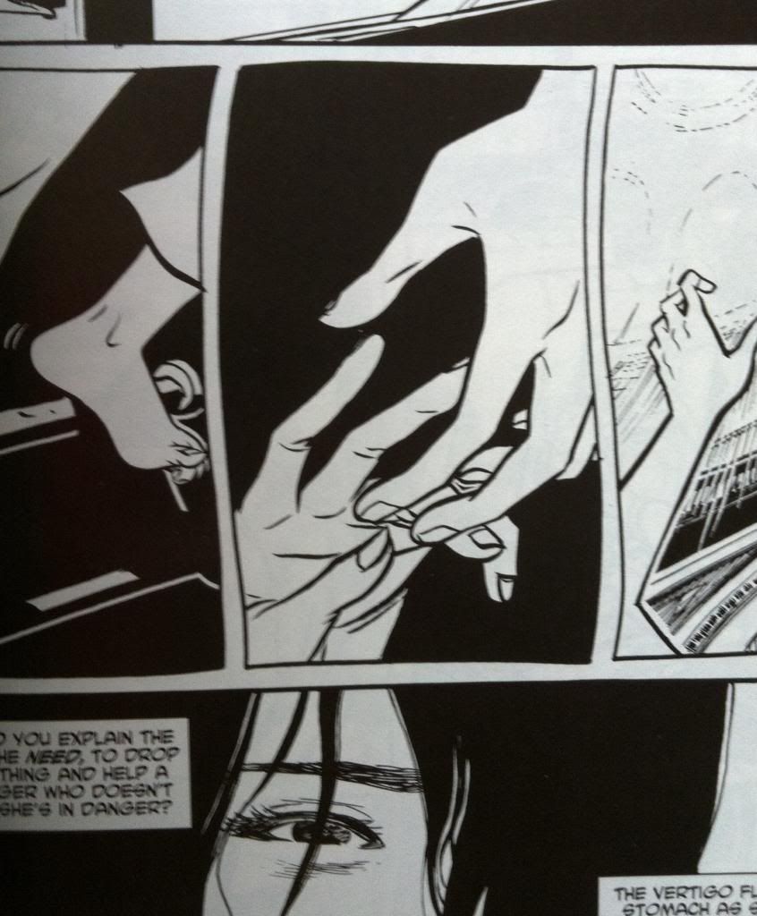

As far as my inexpert, armchair enthusiast sense has been able to determine, the key to making black and white comics pop, is using the two colours to colours to create contrast and draw the eye to the key portions of the composition. Like, the above selection has white hands reaching out to each other on a totally black background that makes the panel focus in completely on the hands. In that moment in the story, and in that panel, those outstretched hands are the most important thing in the universe, and the colouring of this panel is designed with just that purpose in mind. Simple, but effective.
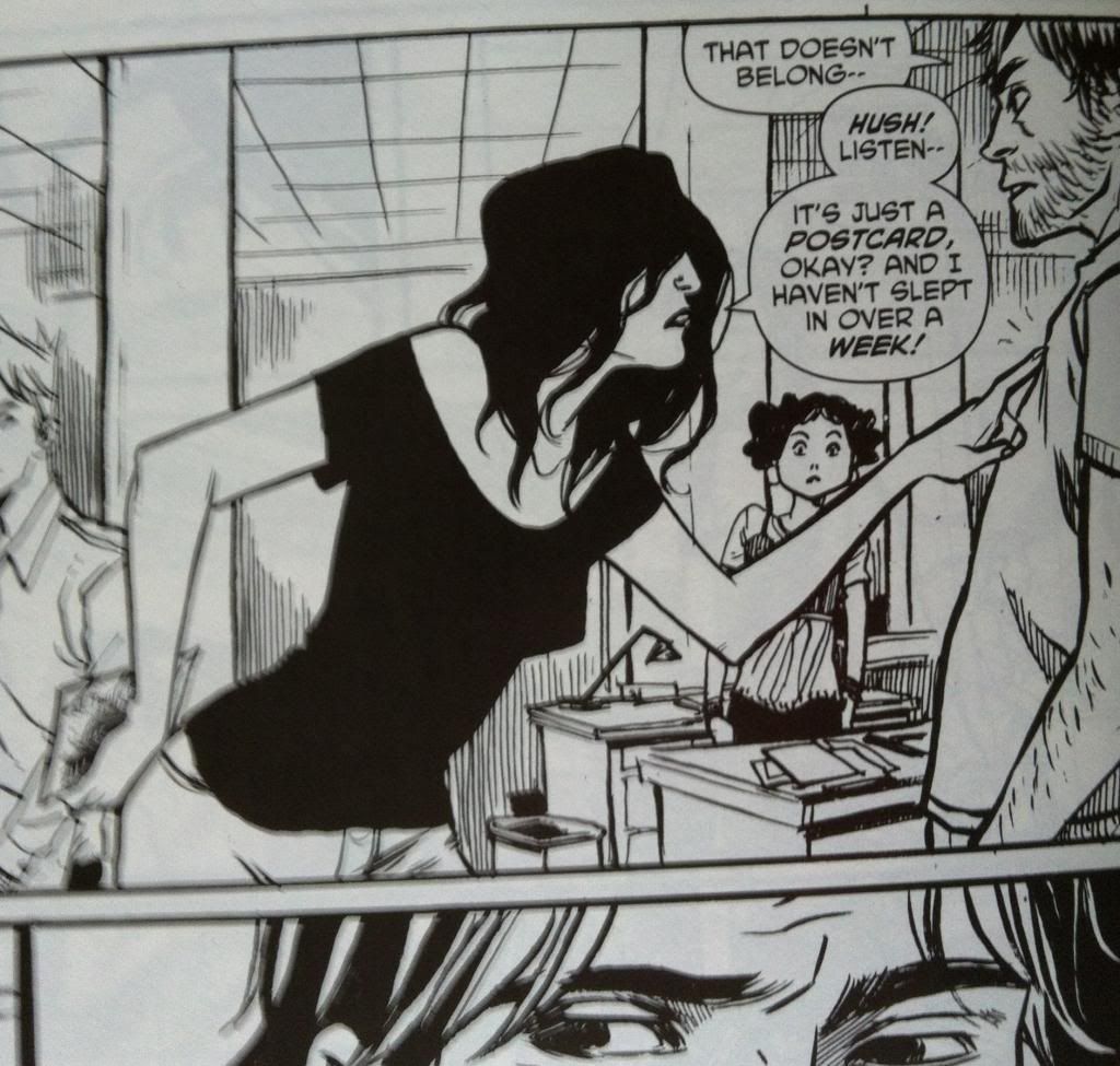

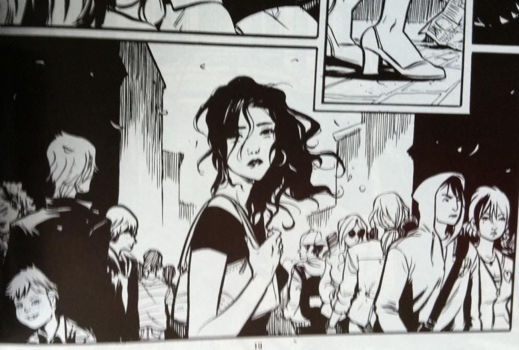


But the first story in Demo: Volume Two has a bunch more really smart tricks that take advantage of the sharp contrast of black and white to make the comic work optimally. This chapter of Demo tells the story of a woman who keeps having a dream about someone, another woman, falling from a great height in some sort of large church. The dreaming woman is convinced her dream is prophecy and goes on a quest to save the falling woman regardless to the personal costs to herself. It is very much a comic about introspection and obsession and being so inwardly focused that the broader picture is missed. And the way the woman is coloured, with her black shirts and black hair entirely plays into this theme: in every scene she is in, no mater how crowded or complex the background, her dark blocked colouring makes her the focus of the panel. It's as if the artwork is driving us to become as obsessive and focused as the woman in the story. It's really great.


Another cool bit of colour use in this chapter has to do with another key character in this chapter. This man in the above panel is also pretty important to the story,  and so he also gets the heavu black treatment that makes him jump out of the surroundings in the same way as the woman-with-the-black-hair. In this way, even in a comic with no colour, the most important characters are instantly emphasized in a way that draws the readers attention.

Demo, particularly Demo Vol.2 is a really great comic that is absolutely worth taking a very close look at.

Previously:
Demo
Demo: Volume 2

Wednesday, 16 April 2014

So I Read Demo: Volume 2

A 250 word (or less) review of Demo: Volume Two
By Brian Wood and Becky Cloonan; Vertigo Comics


Demo: Volume Two is the continuation of Brian Wood and Becky Cloonan's series of one-shot comics about people with unusual powers or traits trying to somehow navigate ordinary life, with the supernatural aspects of the comic operating as a kind of metaphor for real life struggles. Demo: Volume Two shares this overall premise with the first volume of Demo comics, but is so much sharper (which is saying something since Demo is really good comics in the first place). The first series of Demo is almost like a comics laboratory with Brian Wood figuring out his voice for single-issue character studies and Becky Cloonan experimenting with radically different styles of artwork. Demo Vol. 2 is like the thesis resulting from all that experimentation. As a result, Demo: Volume 2 is almost its own thing: the stories are masterfully constructed and the artwork is exclusively drawn in Cloonan's mature, brilliant style. There is actually a bit of a thematic shift between volumes as well, with the stories becoming less supernatural, and more grounded in a kind of plausible unreality that adds to the veracity of every story. Demo: Volume 2 is really an excellent comic that is worth reading on its own, even before the first Demo series. If nothing else, it’s an excuse to read a beautiful comic drawn by Becky Cloonan.


Word count: 222

Previously:

Monday, 14 April 2014

Monitoring Moon Knight #2

Or a look at the chilling, virtuosic layouts in Moon Knight #2
by Warren Ellis, Declan Shavley, and Jordie Bellaire


Moon Knight is turning out to be a downright chilling comic. Beyond the questionable mental status of the titular hero, the series is really going to some dark places. The first two issues of the comic have dealt with serial killers, a slasher out to steal other people's body parts and a sniper out for vengeance. The villains of both issues have also been marginalized in some way, veterans broken down and abandoned like old tools. Moon Knight is dark and engaging and challenging. 

It's also a wonderfully made comic, a great collaboration of writer and artist and colourist with a really cool, smart aesthetic and some really innovative use of colour. Moon Knight #2 also has my so far favourite sequence of the series: a truly smart and disturbed sequence of comics that is completely worth taking a closer look at.

There will be *SPOILERS* here. So go read the comic first.


The crux of this really great sequence is a deceptively simple format, repetition, and a certain crushing ruthlessness. Each page in the sequence shares this simple eight panel grid format, with each panel telling the story of a different workaholic, lonely financial worker. And on every single page of this sequence one of these workers is murdered.


Every time one of the characters is murdered, in a flash of red their story ends. The space that story occupied is then simply left empty in the grid. What was once a page filled with stories is chewed down systematically, until all that's left is emptiness. White. Dead.

As a visual metaphor for murder it's brilliant. The world starts complicated and rich, full of stories about the guy hiding his terminal cancer from his family, or the workaholic woman with the strained relationship. However, due to the action of the murderer, one by one, each of these stories are snuffed out. Ended. Leaving only an empty gaping hole of unfulfilled potential in the world. And as more people are murdered these spaces grow until the whole page is diminished and barren. It is chilling and crushing and hard.

This sequence is also an astute visual representation of a sniper. Each of the murdered people are unsuspecting, observed by us and the killer as they walk blithely into the path of a bullet. At the same time we don't see the sniper, who kills somewhere out of view, anonymous except for the bodies and the spaces in the world he leaves. His voice, when we hear it, is written in the empty spaces where a living character once occupied, further emphasizing this calculated, anonymous murder. We hear the sniper in the effects of his grim work. It's fucking brutal comics and a fantastic creative choice.

If this level of comics craft continues to be applied to the darkest corners of the human psyche, then Moon Knight is a must read comic.

Friday, 11 April 2014

Deep Sequencing: Unknown Colourist

Or a look at how changing colouring styles alters storytelling in Unknown Soldier
by Joshua Dysart, Alberto Ponticelli, Oscar Celestini; Vertigo Comics 


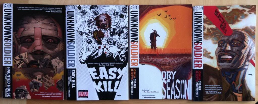
Unknown Soldier is a great comic that functions as an important glimpse into a pretty important and dark topic while also telling an exciting and accessible story. It's journalism and activism through fiction which is pretty cool.

It's also a comic that uses two radically different colouring/inking styles in different chapters. What's especially interesting about this artistic shift is that both chapters are done by the exact same creative team. What this means is the two chapters share many common elements: an identical authorial tone from the same writer, a consistent approach to storytelling and overall style in the same penciller, and even the same colourist. But at the same time, the style changes, even with the same creators, makes the comic feel radically different. It's like one of those accidental, ideal economic experiments but for colouring. Which I think, make it a pretty cool thing to take a look at.

There will be the mildest of *SPOILERS*.


The majority of Unknown Soldier has what I would call a more conventional comics style. Characters and backgrounds are rendered with clean, but heavy inks that draw eye to the depth of the underlying pencils. The colouring enhances this: colours are mostly flat, with a single primary colour for most subjects, which is then judiciously rendered to provide lighting effects (particularly in night scenes, like above). Coupled to a pretty muted and harsh colour palette, Unknown Soldier is a pretty harsh looking comic that works very well for an action comic set in a horrific warzone.


Dry Season, one of the four main chapters of Unknown Soldier, is set in a refugee camp during a period of extreme heat and dryness. In many ways it is the most journalistic of chapters, given that Unknown Soldier takes a break from war stories to focus on the human cost and tell a more low key, mystery based story. This chapter also features a shift in artwork to a much more painted style. Instead of the very-comics clean, heavy inks and flattish colouring, Dry Season has heavily rendered colours done right over the pencils. The result is something much drier and stiller, which is really appropriate to a story about static refugees dying of thirst. This style is also much more realistic: real life doesn't have inks, and we understand the world around us using light and shadow like a painting, and this style captures this better.

Overall though, I think I like the Dry Season colouring approach more for Unknown Soldier. While I usually prefer simpler, flatter colouring since it doesn't distract from the lineart and  because I think it is often more elegant, I feel like a comic with such journalistic goals benefits from a more photorealistic style. The default style of Unknown Soldier is great, but it looks like a comic, a fictional universe we are visiting. Dry Seasons looks more like the real world, like field sketches of a grim reality. And for the humanitarian goals of this comic, that sense that this horrible shit is really happening makes it so much more affecting. 

Which I guess conveys two things: that a dramatic change in colouring approach can radically change the emotional feeling of a comic and that different types of stories beg for different styles of colouring.

Previously:
Unknown Soldier

Wednesday, 9 April 2014

So I Read Unknown Soldier

A 250 word (or less) review of Unknown Soldier: Haunted House, Easy Kill, Dry Season, Beautiful World
by Joshua Dysart, Alberto Ponticelli, Pat Masioni, Oscar Celestini, and Jose Villarrubia; Vertigo Comics


While I think I’m a reasonably well-informed person, I really don't know much about Subsaharan Africa and the conflicts afflicting the region. I think this is typical of many North Americans. Unknown Soldier is a comic that aims to educate an ignorant Western audience about the fight against messianic-madman and insurgent leader Joseph Kony and his Lord's Resistance Army during the height of the conflict in Uganda. The comic provides an unflinching look at this truly monstrous thing, from the use of child soldiers and child sex slaves to the desperate plight of the displaced and marginalized Acholi minority in Uganda. Unknown Soldier uses the lens of Dr. Moses Lwanga, a crusading activist and doctor who returns to Uganda from the United States with the intention of building a better future. However, Dr. Lwanga is heir to a dark secret and the violence that confronts him awakens something that sends him charging into the maelstrom. It’s a brutal comic that takes a really hard, uncomfortable look at these events and attempts to make them understandable through fiction. Unknown Soldier is also an action comic that orbits some pretty engrossing mystery and drama so it's also a pretty exciting comic. Unknown Solder does suffer from a very abruptly ending that leaves story potential untapped and it, out of necessity, shows a very narrow view of life in Uganda which maybe feeds the idea of Africa as an exclusively wretched place. On balance, it's an interesting and informative comic well worth reading.


Word count: 250

Monday, 7 April 2014

Deep Sequencing: Admiring The Hole

Or some of the brilliant design choices and motifs in Transmetropolitan
By Warren Ellis and Darick Robertson; Vertigo Comics


Transmetropolitan is a comic that, I think, is justifiably very well regarded by a lot of people. It's certainly one of my all time favourite comics. And there are a lot of reasons why I am so crazy about this comic: the thematic examination of the intersection of politics and journalism is fascinating, the way tension in the story builds is breath-bating, the gonzo Science Fiction is fun, and the relentlessly juvenile humour is a joy. Transmetropolitan is also a comic with some really adroit artwork and storytelling, with some of my favourite sequences in comics and a superdense, highly developed sense of place. It's a really great comic.

One of the things I am most interested in Transmetropolitan is how certain recurrent visual elements are used to drive theme and character in the comic. Transmet is, buried in all of the bowel disrupters and sex puppets, a comic that does some remarkably smart things with symbols and motifs to subtly relay information to the reader. And since comics blogging is about obsessing about small, interesting choices I'm gonna show you some of my favourite.

There will, as always, be *SPOILERS* for Transmetropolitan in the following.


THE GLASSES: One of the most obvious recurring elements in Transmetropolitan is Spider Jerusalem's glasses. In the story, the eyewear operate as Spider's hightech personal screens and cameras that record the world around him. But they are also a key part of his character design that convey a lot of information about him. Like, the green and red different coloured lenses are reminiscent of 3D glasses and suggest Spider sees the world in greater depth and detail than those around him. Or, and I'm stealing this from a great character design essay by Aaron Diaz of Desden Codak, the shape of glasses give Spider a permanent cocked eyebrow type of look, which is the perfect expression of inquisitiveness, and the basis for a sardonic smirk. But it maybe even goes a little further than that: Spider is a character very much defined by his paradoxical ability to be a massively cynical analyst while still appreciating the truly remarkable aspects of life. And I think this is captured in his glasses which are split between a wide-eyed awed look and an analyzing scowl.

And the glasses are not limited to Spider. As Transmet progresses The Filthy Assistants progress from caregivers/coffee fetchers to junior journalistic comrades, and by the end of the comic they become chain smoking, glasses wearing truth seekers themselves. Admittedly, both women go through a few different phases of eyewear, but the ones they have on at the end,  I think tell us something about their characters. I have a theory that the shape of their glasses are reflective of their character as journalists. Yelena Rossini takes to wearing very narrow shades, maybe representing her evolution as a cynical, Spider Jerusalem style reporter. Channon Yarrow takes up wearing round glasses, which is maybe symbolic of her eventual career path as a novelist with a more big  picture, less cynical view of the world. Which maybe captures the round-lense, dreamer half of Spider's writing views. 


THE TATTOO: Another recurrent element in Transmet that gets used in interesting, subtle ways is Spider Jerusalem's forehead spider tattoo. It's a great piece of character design: a creepy tattoo drawn directly on the face really cements Spider as a counter-culture figure and acts very much as a symbol of him. A spider for Spider. But this tattoo also gets used in this really clever way to subtly hint at the health status of Spider. When he is healthy the tattoo appears as a crisp, unbroken black tattoo. As Spider's brain condition becomes more prominent and he is injured, the spider tattoo is split in a wide, bloody gash. Spider is symbolically cut asunder. Following this the tattoo shows the steps of Spider's recovery, beginning bandaged and hidden, and then emerging broken, split by a new scar. Symbolically Spider is recovered, but still broken and flawed. And all of this is conveyed only by the status of Spider's head ink. 


The Spider tattoo also tells us things about Yelena. As she becomes more of a journalist and begins to become, more and more, a kind of disciple of Spider, she gets the Spider Jerusalem style spider tattoo on her bottom. A symbolic representation of her growing Spider-ness. In the final chapter of the story, when Yelena is her own, mature, journalist we see her with her own spider-ish tattoo: a female symbol with spider legs: kind of an amalgamation of her Spider-ness with her own, special voice. All shown through symbols.


SMOKING: Another ongoing motif I love in Transmet is cigarettes. Throughout Transmetropolitan smoking is used as a signifier of someone telling the truth. Spider Jerusalem, the vulgar truth spilling asspot himself, chain smokes like an industrial chimney and becomes a plume of smoke when he is telling the truth. The Filthy Assistants, as they become journalists take to smoking. Royce, Spider's editor, chain smokes, particularly in scenes where he trumps his papers management to further the truth. Spider's sources, from the vile Fred Christ to the sympathetic Liesl, a former transient hooker, smoke cigarettes while they tell their truths. And even a lowly TV producer lights up when she decides to fuck the censors and display important news damn the consequences. It's a great visual signal that is not only handy, subtle information for readers, but is also just visually great: it's like the truth is a fire in the belly that billows out as smoke. It's great comics.

Previously:
So I Read Transmetropolitan
Deep Sequencing: My favourite Transmet sequence.

Friday, 4 April 2014

Deep Sequencing: Bowel Disruption

Or one of my all time favourite comics sequences that makes me lose my shit in Transmetropolitan
By Warren Ellis and Darick Robertson, Vertigo Comics


Way before I started writing about comics and really looking at sequential art as a series of story telling choices, there were some sequences in comics that were immediately, obviously great. And this sequence in Transmetropolitan has stuck with me forever as a fantastic comics sequence. It's been my example of how smart composition enhances storytelling from before I had any need for such examples. And now that I actually need such examples of great comics, you better believe we are going to take a closer look.

There will be mild *SPOILERS* for Transmetropolitan below.


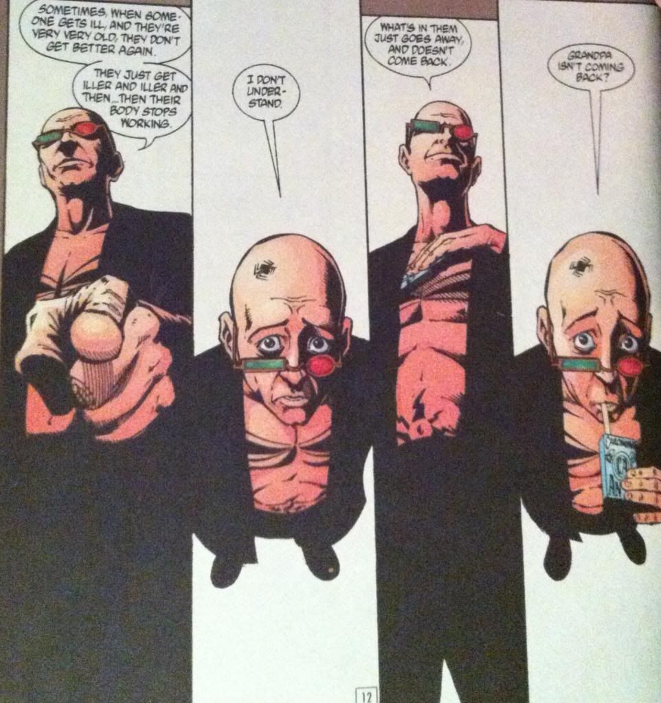
This sequence tells the story of Spider Jerusalem relaying an anecdote about his grandfather's death when he was but a boy. As part of this anecdote Spider delivers the dialogue of the conversation between him and his parent, presumably using affected voices.What I love about the sequence is just how clearly it delineates the adult dialogue from the child dialogue in the anecdote. The crux of this is the way the angle of the panels changes so that the "camera" is aimed down at "child" Spider and aimed up at "adult" Spider-parent. What this essentially does is give the reader alternately the perspective of an adult looking down at child or the gaze of a child looking up at a stern parent. It also, has the added effect of presenting Spider in two very different ways: from above he looks smaller, seems to have a larger, disporportionate amount of head, and you can clearly see his eyes, while from below he looms over the frame and his eyes are hidden behind his glasses. These alternating perspectives make this a pretty good sequence.

But the thing that, for me, that makes this sequence so completely memorable, is how the cigarettes are used throughout the composition. In the third panel, Spider reaches into his coat to grab a pack of smokes, making a very adult, commanding hand gesture, reminiscent of a hand cocked to smack a child. While in the fourth panel, and this is my favourite, Spider pulls a cigarette out of the box with his mouth in a way that looks like he is drinking from a juice box. A very childlike activity. Add, in the next page, "adult" Spider performing the very grown up activity of actually smoking and you have cigarettes used to completely enhance the adult/child split in this composition in a way that is super clever and unique to this series of panels. It's perfect.

Previously:
So I Read Transmetropolitan