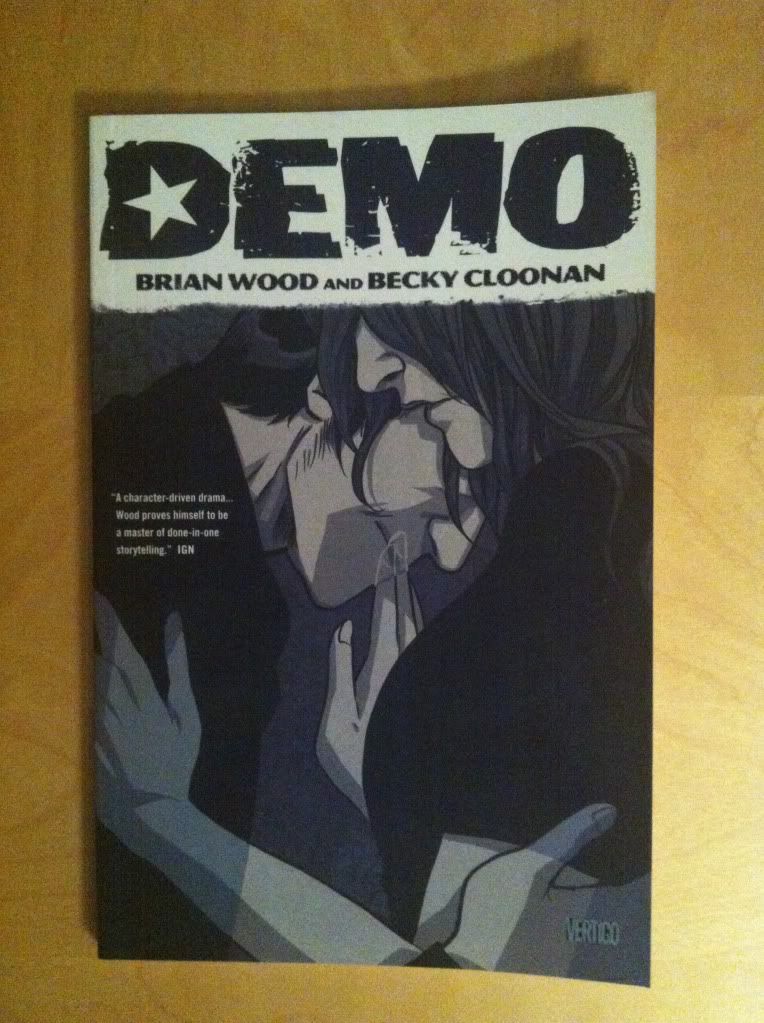
By Brian Wood and Becky Cloonan; Vertigo Comics
Demo: Volume 2 is this great collection of single issue character studies that use supernatural phenomenon as metaphors for people struggling with everyday problems. It's a comic where dealing with child abuse involves time travel, for instance. It's pretty great comics. It's also a black and white comic that does a really good job using the one available colour to emphasize key parts of the composition. And since it's always a nice to have an excuse to gawk at Becky Cloonan art, I thought I'd take a look at some of the nifty tricks and smart black and white choices in Demo:Volume 2.
There will be mild *SPOILERS* for Demo Vol. 2 in the below post. You are warned.
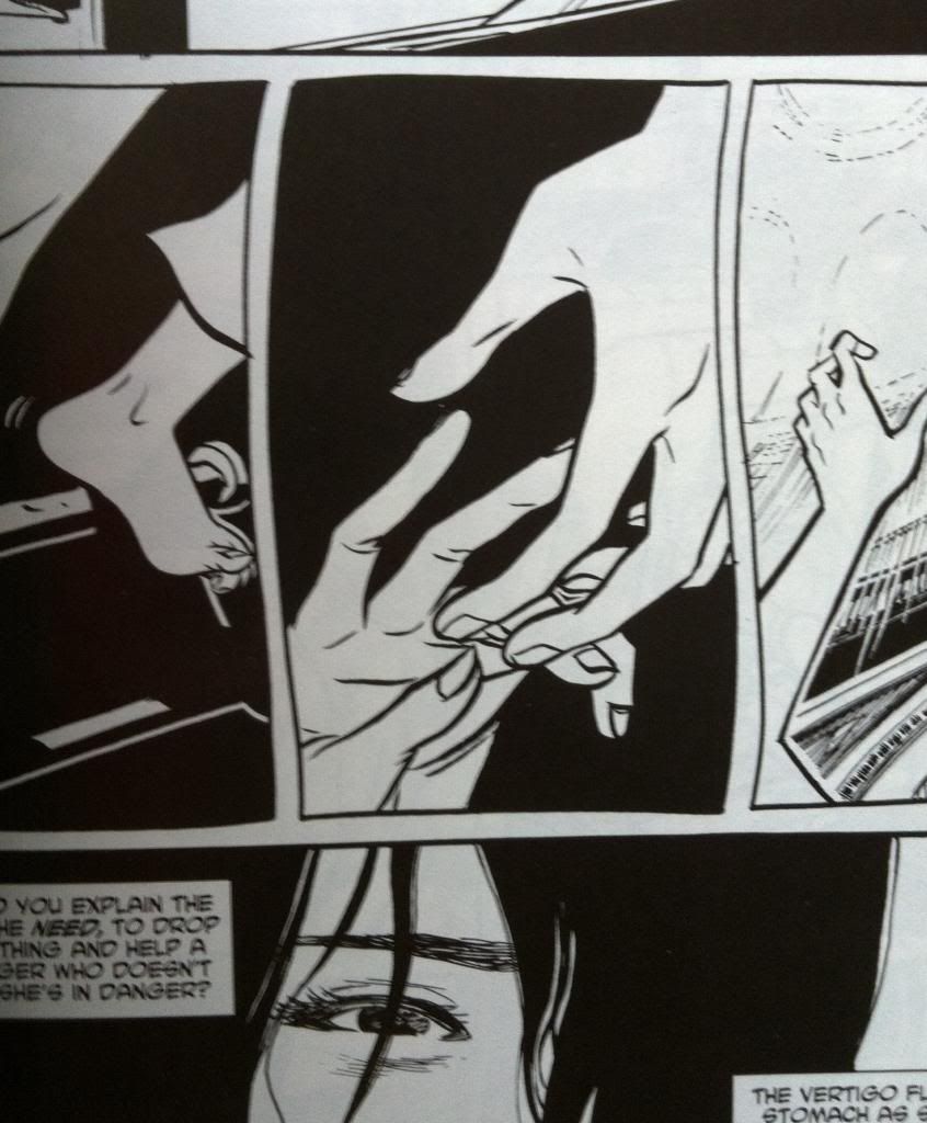
As far as my inexpert, armchair enthusiast sense has been able to determine, the key to making black and white comics pop, is using the two colours to colours to create contrast and draw the eye to the key portions of the composition. Like, the above selection has white hands reaching out to each other on a totally black background that makes the panel focus in completely on the hands. In that moment in the story, and in that panel, those outstretched hands are the most important thing in the universe, and the colouring of this panel is designed with just that purpose in mind. Simple, but effective.
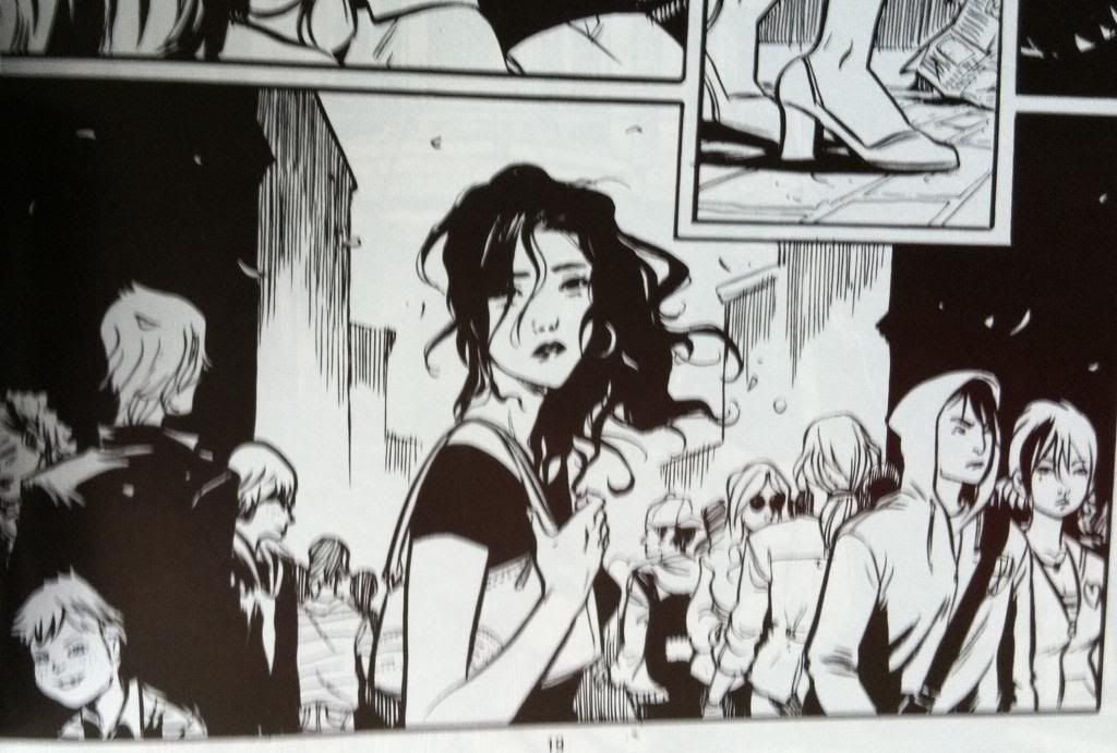
But the first story in Demo: Volume Two has a bunch more really smart tricks that take advantage of the sharp contrast of black and white to make the comic work optimally. This chapter of Demo tells the story of a woman who keeps having a dream about someone, another woman, falling from a great height in some sort of large church. The dreaming woman is convinced her dream is prophecy and goes on a quest to save the falling woman regardless to the personal costs to herself. It is very much a comic about introspection and obsession and being so inwardly focused that the broader picture is missed. And the way the woman is coloured, with her black shirts and black hair entirely plays into this theme: in every scene she is in, no mater how crowded or complex the background, her dark blocked colouring makes her the focus of the panel. It's as if the artwork is driving us to become as obsessive and focused as the woman in the story. It's really great.
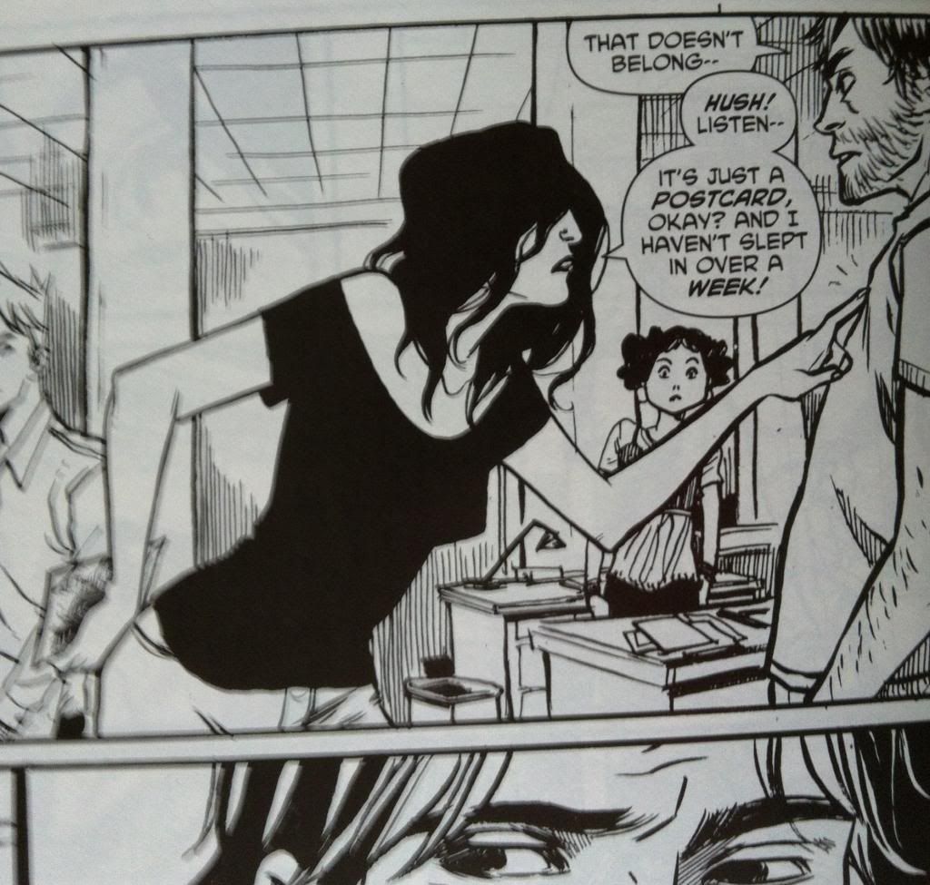
Another cool bit of colour use in this chapter has to do with another key character in this chapter. This man in the above panel is also pretty important to the story, and so he also gets the heavu black treatment that makes him jump out of the surroundings in the same way as the woman-with-the-black-hair. In this way, even in a comic with no colour, the most important characters are instantly emphasized in a way that draws the readers attention.
Demo, particularly Demo Vol.2 is a really great comic that is absolutely worth taking a very close look at.
Previously:
Demo
Demo: Volume 2


No comments:
Post a Comment